I met with a client a few months ago that has a beautiful growing family. They had an existing dining room that was tiny! They needed a bigger one but didn't know how to make that happen.
Read moreSouthlake Home ready for Thanksgiving Guests
Last week we completed a home for a client. It was an exciting day, especially since their home has been in a mess for the past 6 months. They started by repainting the entire home this past summer. A 2 hour walk through took place and then while they were out of town, they had the entire home updated with the ideas I presented to them. They also had hardwood floors and carpet installed, put in new windows, as well as new plantation shutters installed in the front rooms of the home. Wow, did this ever make a difference to the curb appeal!
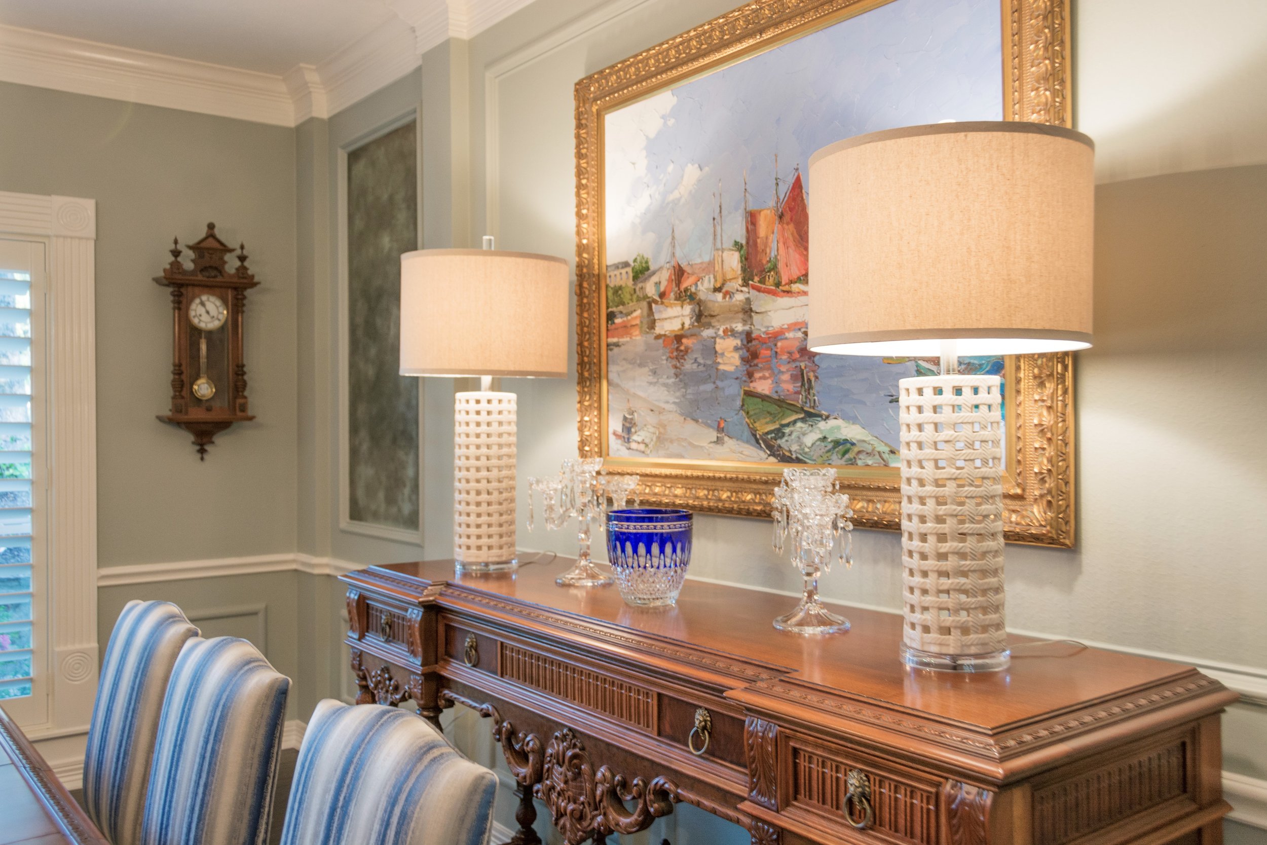
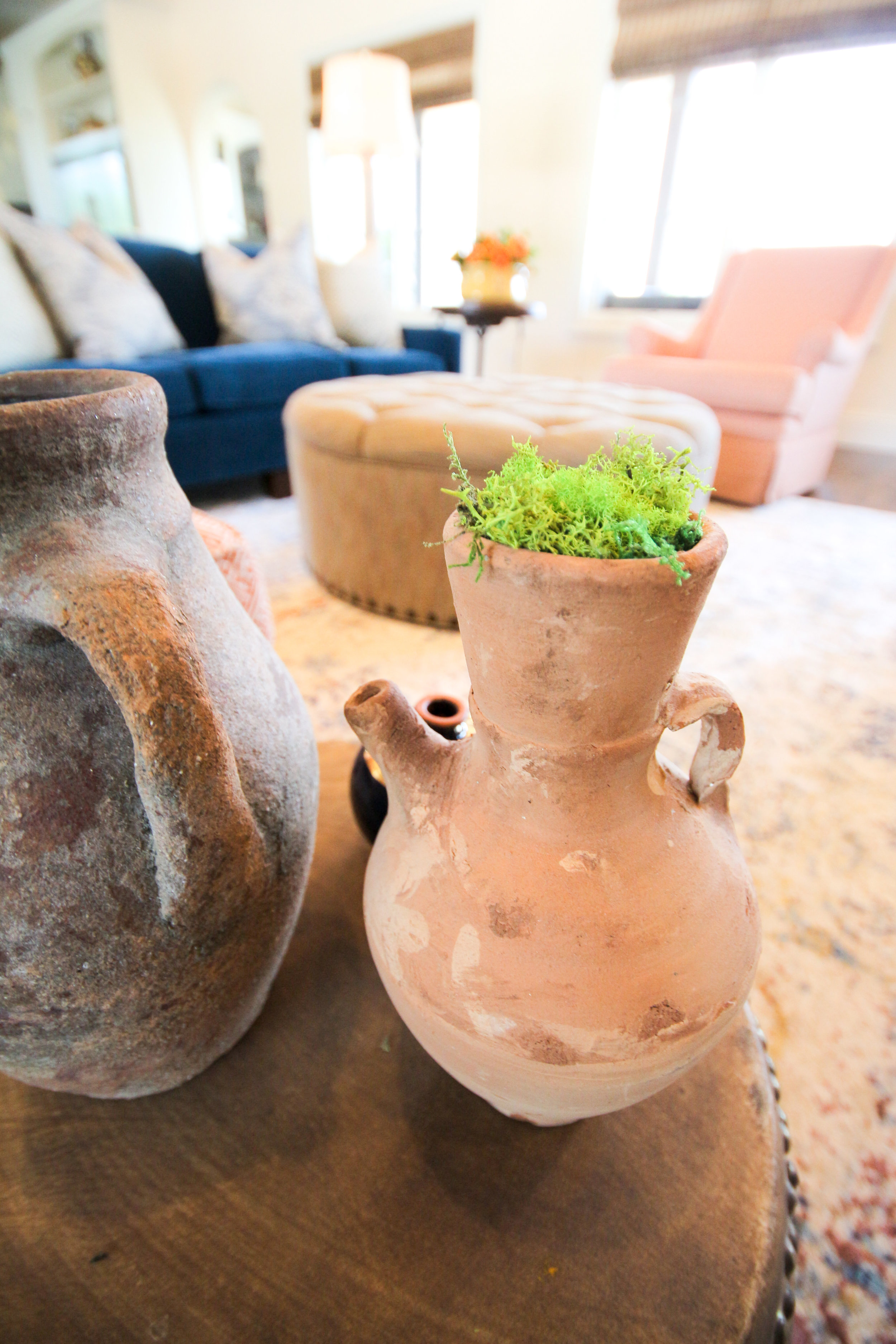
After all that work was completed, it was my job to decorate the home. The client hired me to revamp their dining room, formal living, family room and entry. We wanted to use as much of the existing furniture as we could. The antique dining room table is beautiful but just needed some repair. We had the chairs reupholstered in a gorgeous blue and off white striped fabric and used an off white leather for the seats so they can be wiped, especially since they do see grandkids in their near future. The urn on the table was filled with moss for that touch of nature and a pop of green to coordinate with the painting.
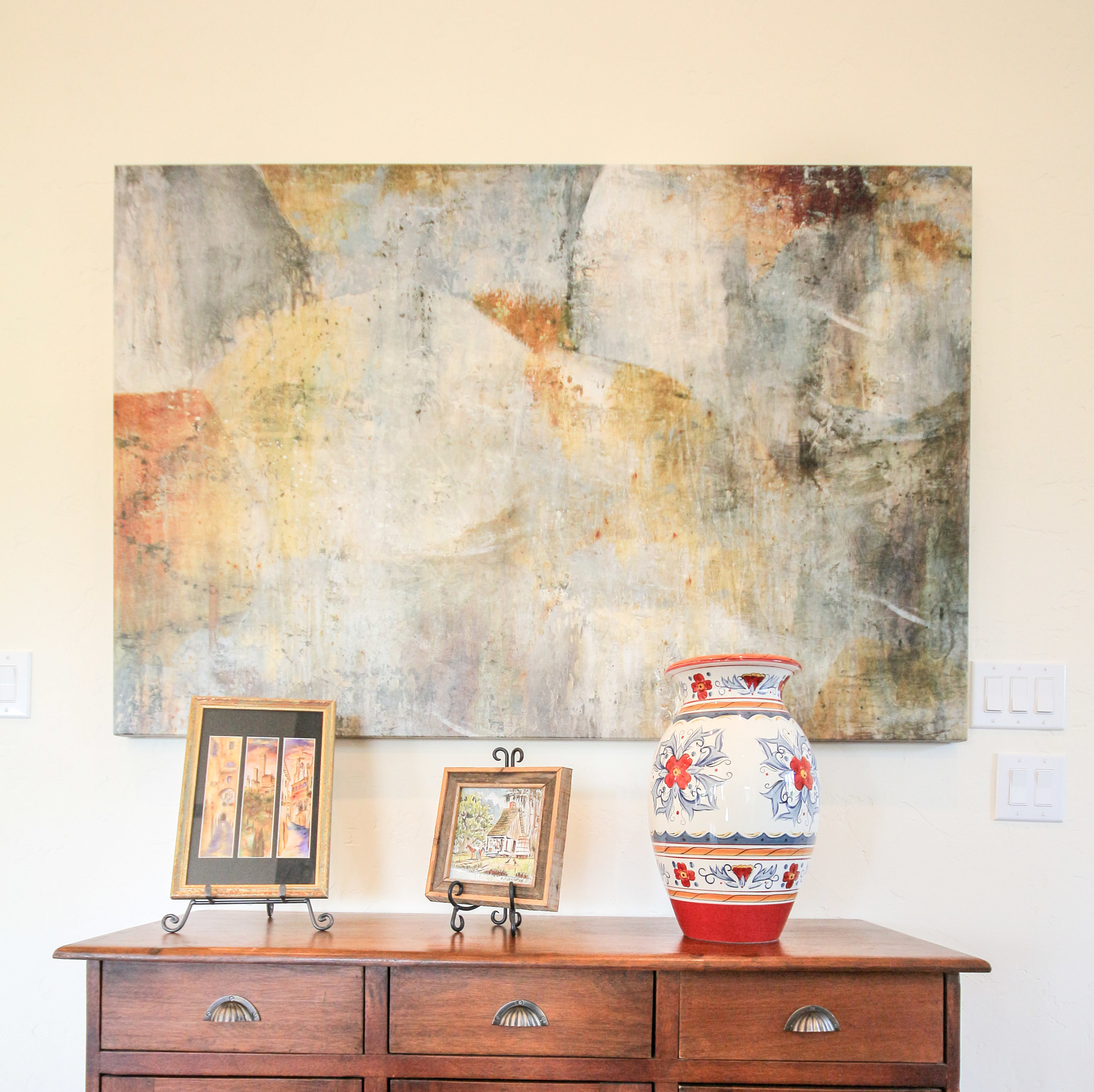
The client had the artwork commissioned and we designed the room around it. They are not real formal people so I wanted to add a bit of fun to the room and knew that a zebra rug would do the trick with the fabrics we used. Isn't it fabulous? We chose a chandelier that doesn't hide the painting so I chose this one that has open arms and little fuss, keeping the painting the star in this room. We moved the existing chandelier into the adjacent piano room because it was too small for the room (see photo below)
Before, the mirrors in the dining room looked very 80's so I had an artist come and make them look aged by antiquing them. We experimented with several techniques prior to her coming and finally came up with this patina. I think they turned out beautifully and they now go with this collected look.
I chose these lamps for the console table because they were also open and didn't feel too bulky up against the painting. We used the clients existing crystal from her family members and their travels, to accessorize the console.
The entry was our next challenge. The client wanted to use the existing glass round table. We added a lamp to add some accent lighting. Of course I wanted one that was interesting and fun. I then layered a bamboo tray with books and other collections to make an interesting assortment to look at for all those guests that visit. It is the first thing you see when stepping inside their home, it had to be lovely.
A little bit of wicker, crystal, wood, natural elements and ceramic always makes a nice collection. Old books that have some history or tell a story about the homeowner is always a good idea. Don't you just love the silver coral accent piece?
The piano room was next... right across from the dining room. This room was never used by the client before. If you know anything about the way I decorate, you know that I want every room in your home to be used. We decided to make this room more of a sitting room. Again, we wanted to make it feel approachable and not too stuffy. You can see that we moved the chandelier above the piano. The client's grandma would be so happy to see it here. It is beautiful and much more to scale in this room. This room can now be used for laptop time or Sunday morning coffee or Friday evening cocktail hour. Oh, can we also just notice how peaceful the color on the wall is.
Ruthie Tip: When hanging artwork where there is picture molding, just IGNORE it, it makes it dissappear and is so much easier to work with.
We had these wingback chairs custom made for the client and they really are elegant and have a touch of a masculine flair. The round ottoman is perfect for extra seating, if needed. We also had the piano bench reupholstered in a whimsical black and white fabric by Waverly. I used an antique table the client had between the chairs, and added the lamps and accessories that I found around their house.
I wanted to use a vintage rug in this room with muted tones. Keeping it peaceful and relaxing. The artwork was in the home already, I just shopped the house for artwork that I thought looked good together and grouped them together, forming a gallery wall. The pillows really added a subtle pop of color and interest.
The rest of the accessories were found in the home and reused in a different way. I took a plant from the kitchen and put it in a blue and white pot to bring in some of the blue and white from the dining room.
I went shopping with the client to find a club chair that he felt comfortable in. I then had an ottoman made that worked with it and coordinated with the rest of the furniture we either had made or ordered from local furniture stores. I love this little side table/stool that I found. Perfect for a glass of wine or a cup of coffee. The rug shag pillow was the perfect touch of the unexpected.
The mantel was very crowded before so I made it look simpler and less cluttered. The blue and white vases match the small side table but I found them at two different places, yay!
This room had absolutely nothing in it. The client got rid of all their furniture which was all dark brown leather. I wanted to mix it up and have a lighter, brighter room that could seat their entire family when they are all gathered together to watch TV or play games.
The room had hardly any lighting so I added two floor lamps to help with ambient light at night when they are watching TV and don't want all the lights on but still want to be able to see a bit.
We met at Weirs to find a couch the family all decided on. We chose this Navy velvet fabric which is soft and cozy. I opted not to use the pillows that they usually include (too matchy matchy) and added my own Navy and yellow pillows to the couch. A blue and gray vintage rug was chosen to pull the room together.
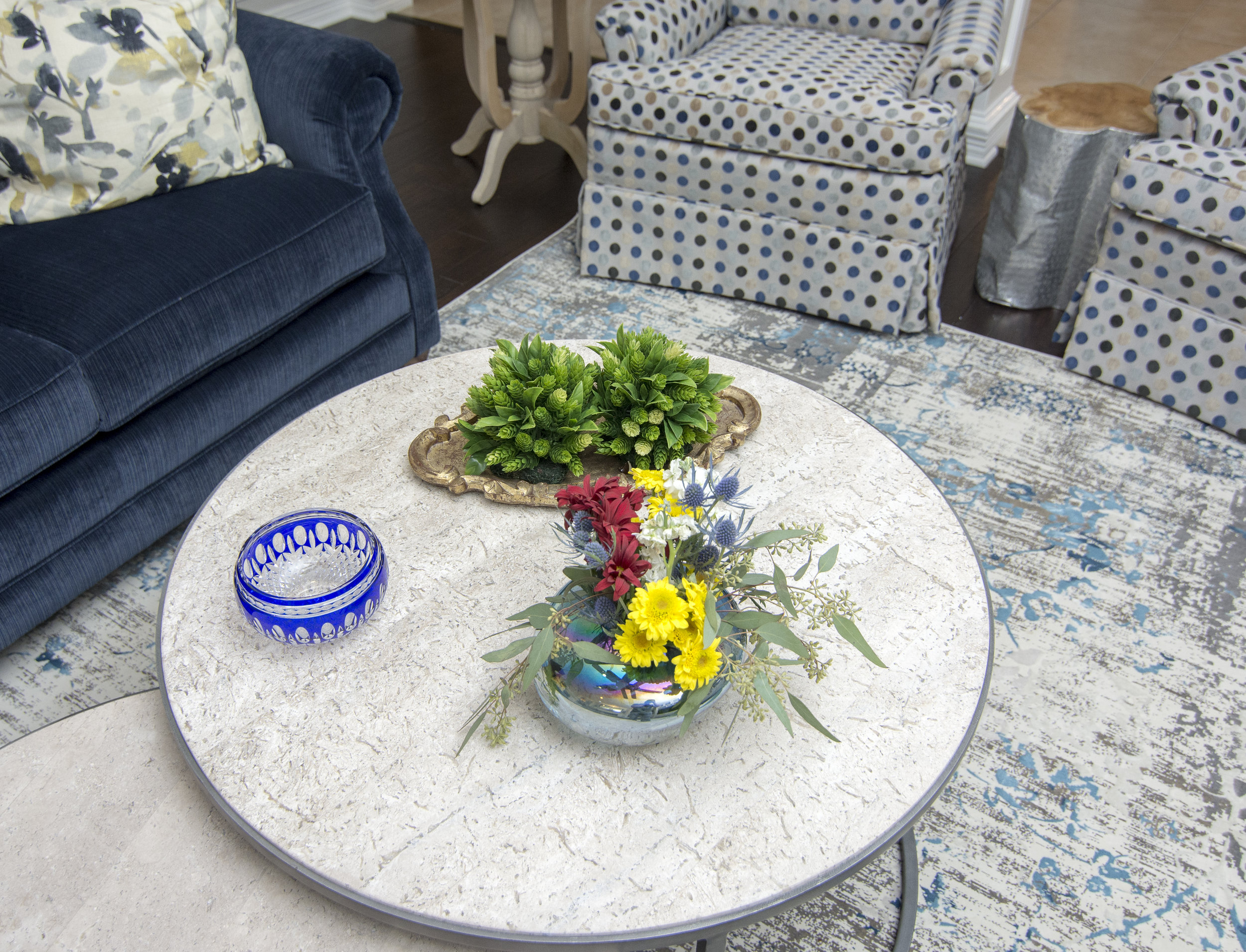
These two chairs were found at a local resale store and I had them redone with new insides and reupholstery. Swivels were added afterwards with a skirt to hide the swivel mechanism.
Don't you just love the rug? Oh, and the silver side table? I'm in love with it all! Notice that the polka dot fabric was used on the ottoman adjacent to it to pull the two seating areas together.
 We spent the entire day placing all the furniture, accessories and details in this home and it was a very exciting reveal.
Just in time for their first grandbaby due any day now as well as family coming into town for Thanksgiving!
I won't be posting until after Thanksgiving! Until then, I hope you and your family find time to gather around your tables and in your living rooms, not only on Thanksgiving Day but throughout the rest of the year!
Modern Style Spanish Home
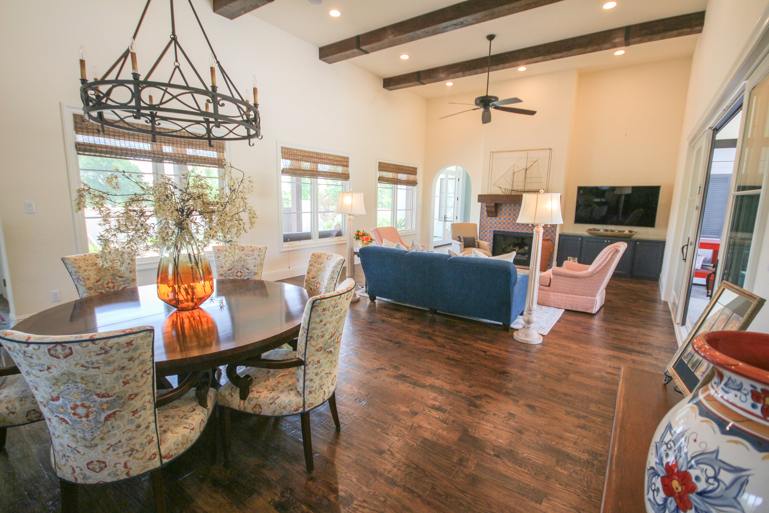
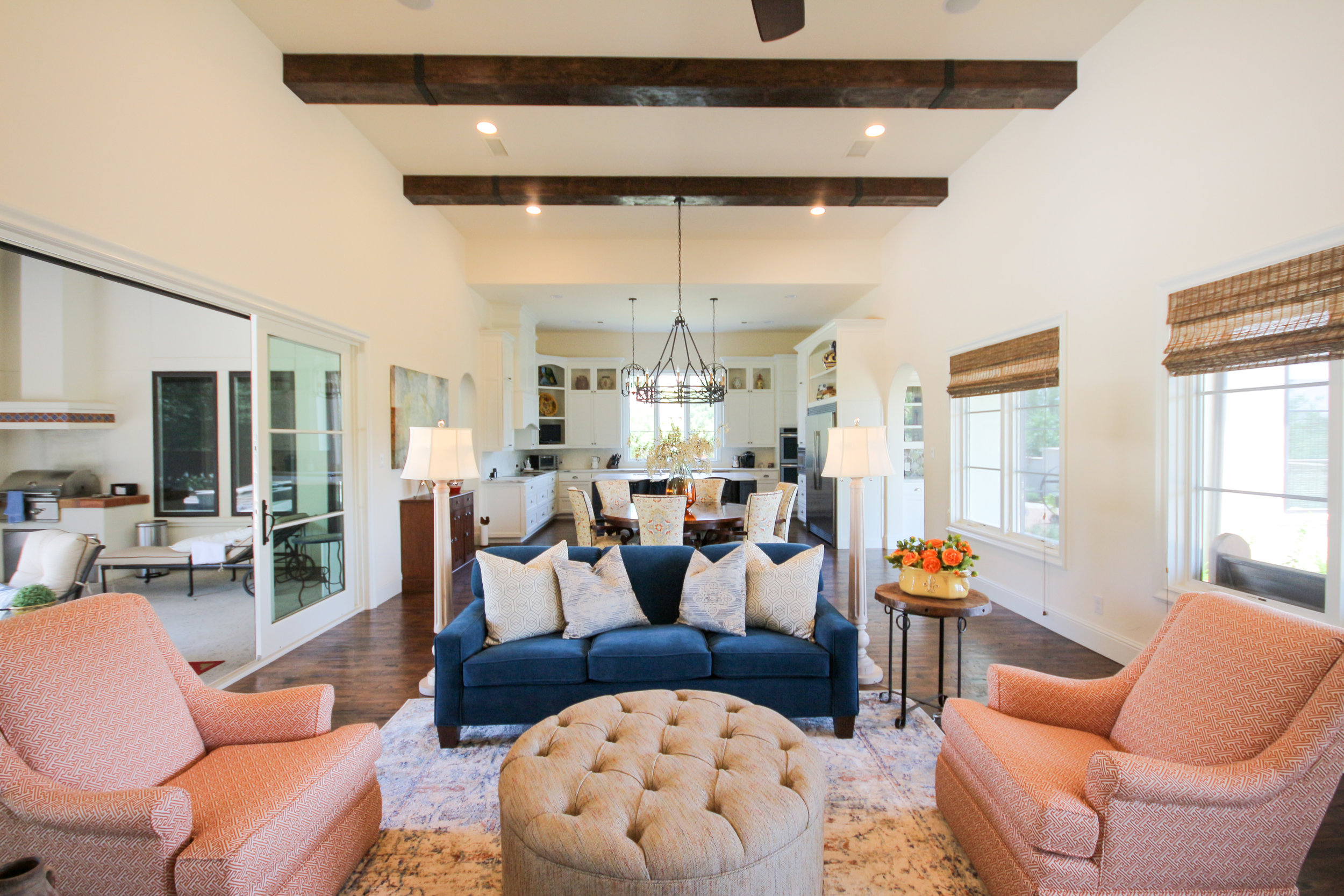 We recently completed decorating a home for a client that built their home several years ago. They were tired of living in the space without the details. We came in and added accessories, lighting, rugs and some furniture to complete the home.
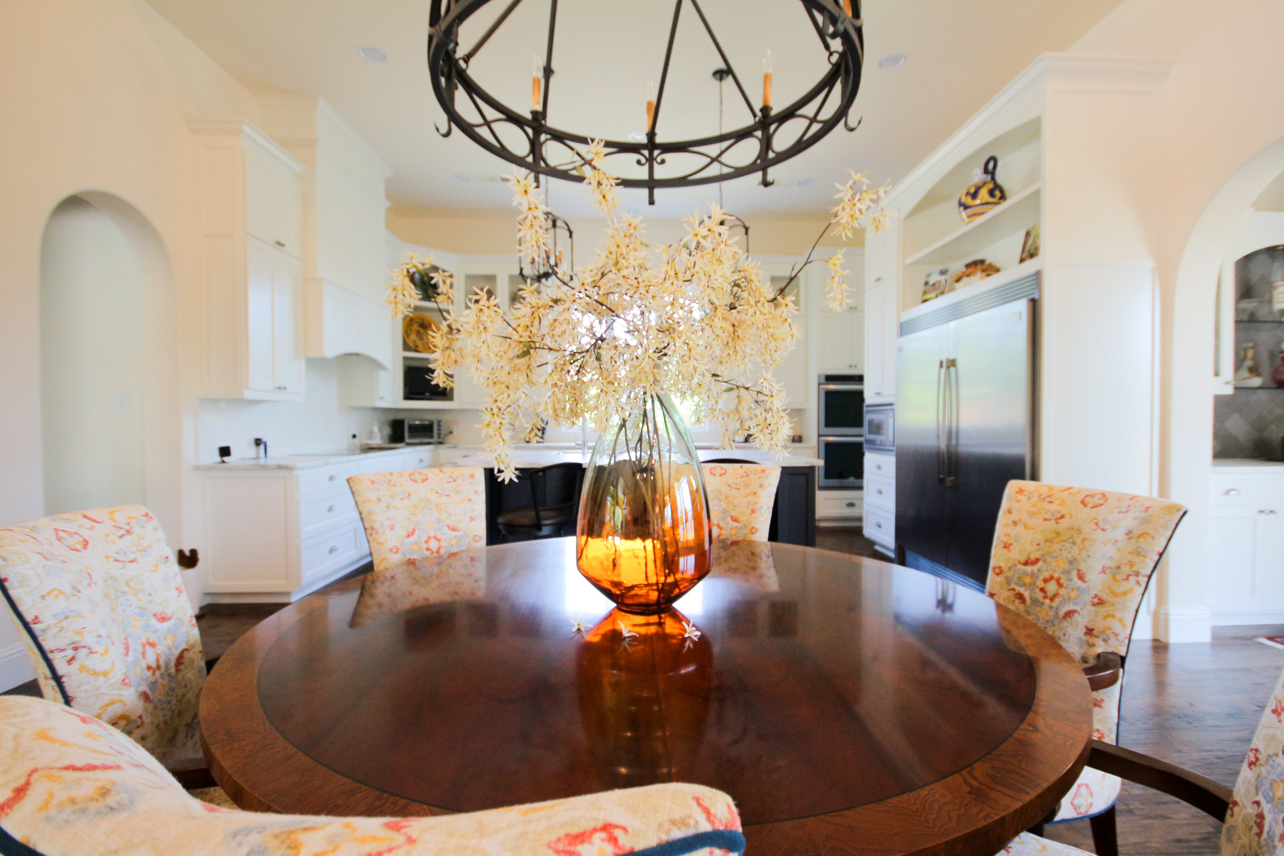
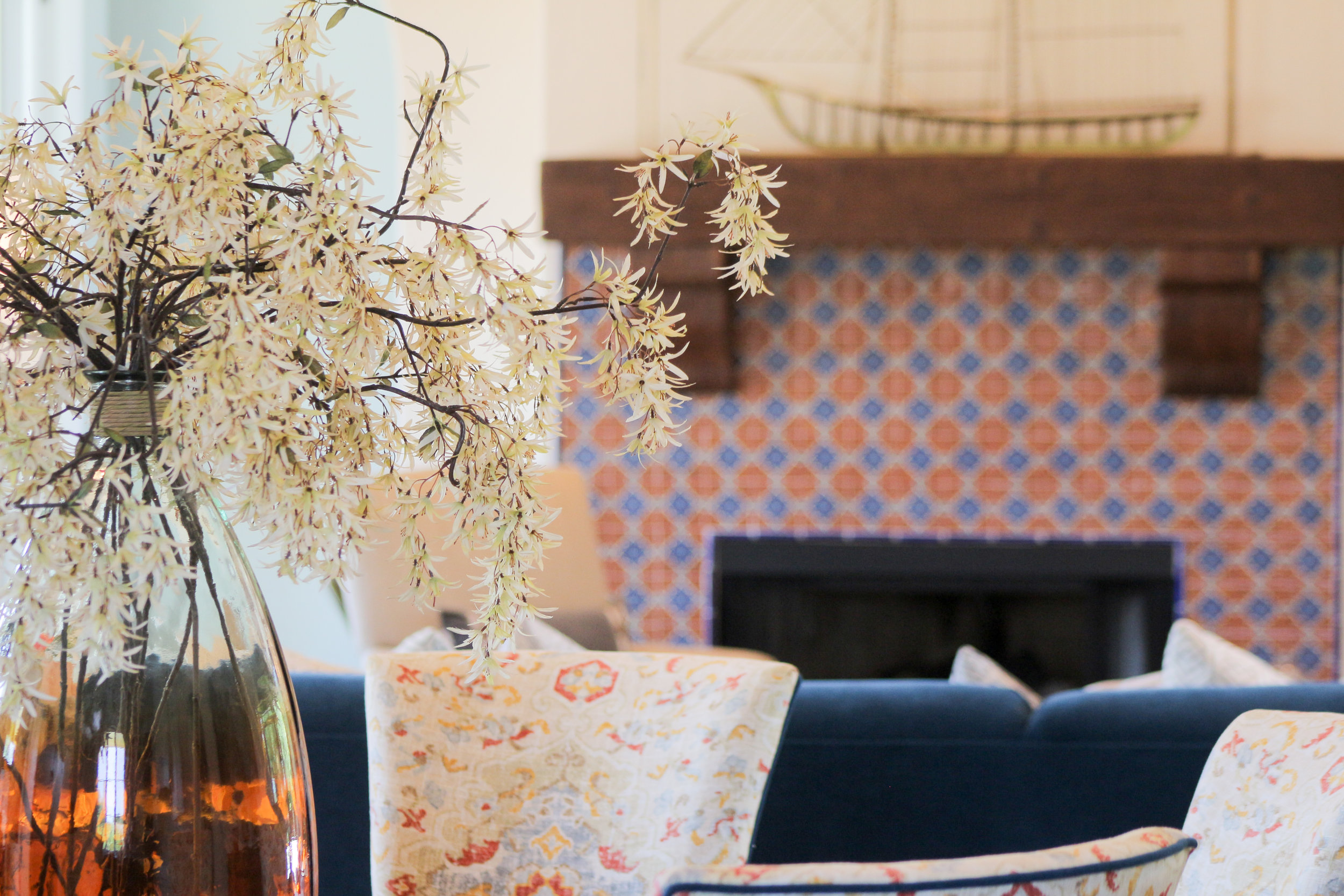
We had the dining room chairs upholstered in this colorful pattern outlined in the blue velvet that matches the couch.
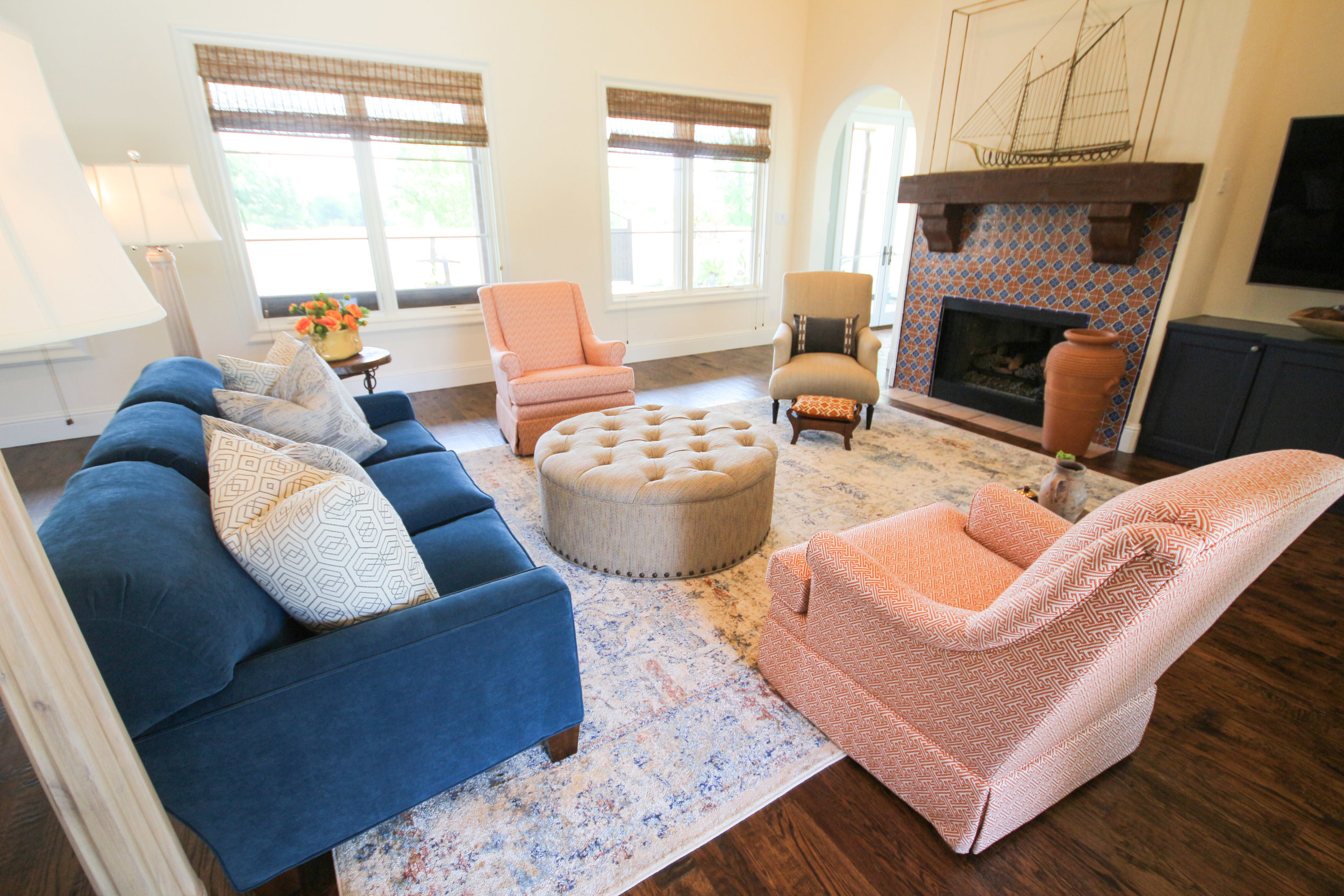
The client had a couch that they LOVED because of comfort and quality but the style was outdated. We had the entire couch redone and reshaped into something much more stylish with modern lines.
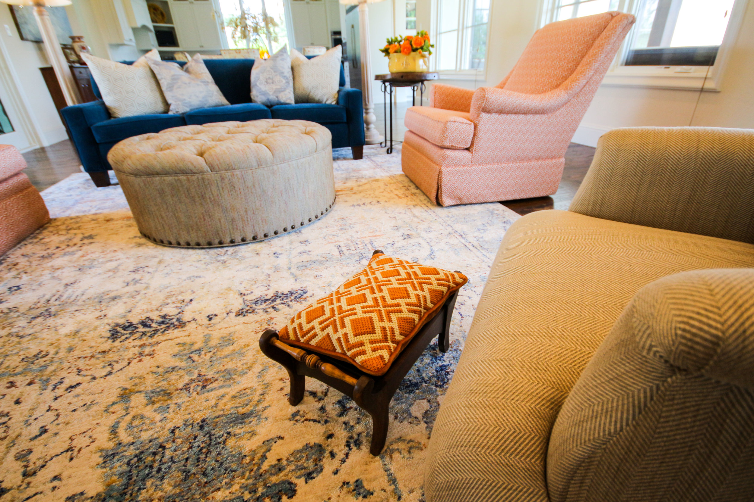
Custom swivel chairs with a geometric pattern, paired with a vintage style rug and round ottoman. As you can see, the fireplace with the Spanish tile was definitely our inspiration for the colors in the room. Don't you just love the gold ship that my client already had in their closet.
Grandma's old stool looks great with an antique embroidered pillow and newly made round ottoman.
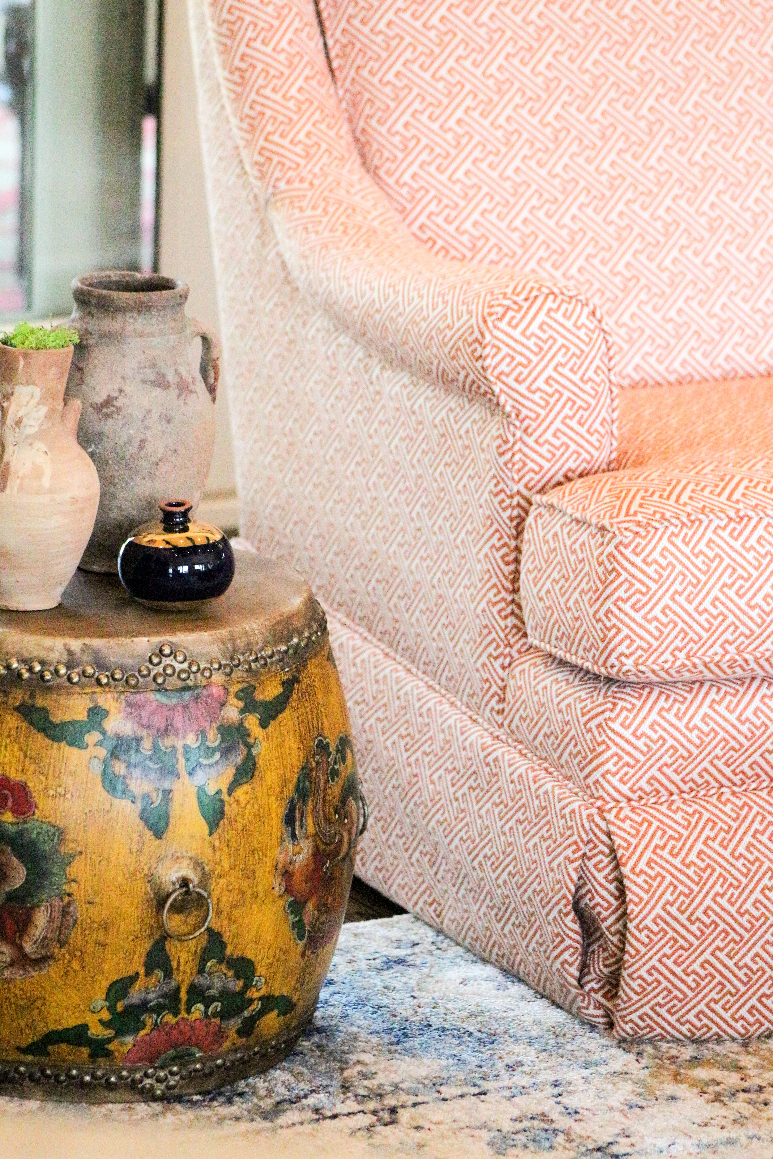
This drum was in their entryway but I thought it looked better as a side table. I found the pottery scattered on bookshelves and picked a few that I thought looked nice paired together.
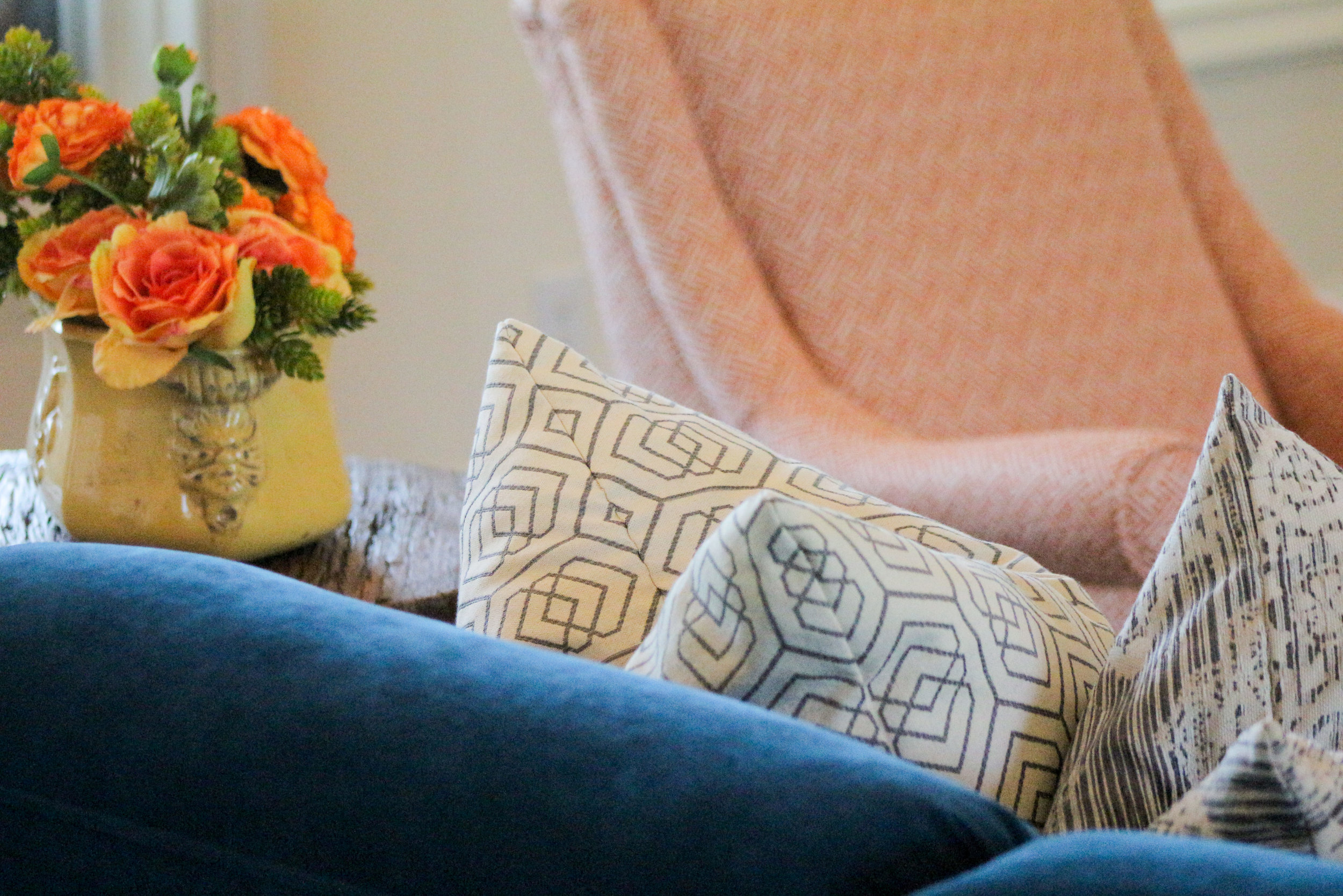
Pillows really made the couch pop!
She still needs a grouping of artwork above the TV but she is waiting for something that really captivates her.
This home sits on a beautiful treed lot and is so peaceful and quiet. Their pool is absolutely stunning and can be seen from most of the rooms.
I'll be posting another job we finished this week soon.
Blessings to you! XOXO
Las Colinas High Rise Makeover
It has been an exciting week as we finished decorating a Dining Room for a "Tour of Homes" in a Las Colinas High Rise.
I created a design plan for my client where I presented all my ideas for fabrics, accessories, lighting, etc. for the space. She wanted a total transformation!! She loved my ideas and we tweaked and adjusted and confirmed everything and immediately started the process. Some things changed along the way but most of it turned out just as expected.
We first added a new chandelier and 2 wall sconces. Of course,the sconce I originally proposed was on backorder so I found these for "in the meantime" and we actually think we like them better. I just couldn't see having an "Open House" with 2 holes in the wall. Nope, no way, not happening, are you kidding me? We had to have a backup plan.
We then had the wallpaper installed and Lester did a fabulous job! The pyramid nail heads were then added to frame the wallpaper edge. I love how it turned out and it really made the niche look finished out.
My client and her hubby found this painting Downtown Grapevine one Saturday afternoon. The colors work beautifully with her living room and her kitchen as well as with all the new fabrics we chose. You will see below!
We purchased a new table and 2 gorgeous painted bamboo captain chairs for each end of the table. The mirror was added to the other niche. It was really tricky finding the right size for that space because of the light switches in the way.
I then designed the rest of the chairs and had my workroom make them for me. To me a custom chair is the way to go. I got to watch the process and decide every detail. The rounded chairs give shape to this very square room.
The front side is a faux leather so that when her grandkids come to visit, they can be wiped off. You can see the wonderful newly painted blue wall in the background.
They are comfy and oh so stylish. The table extends so they can seat 8. The chandelier came with those shades but we didn't care for the pleats they had. My workroom reupholstered them for us and now they look perfect!
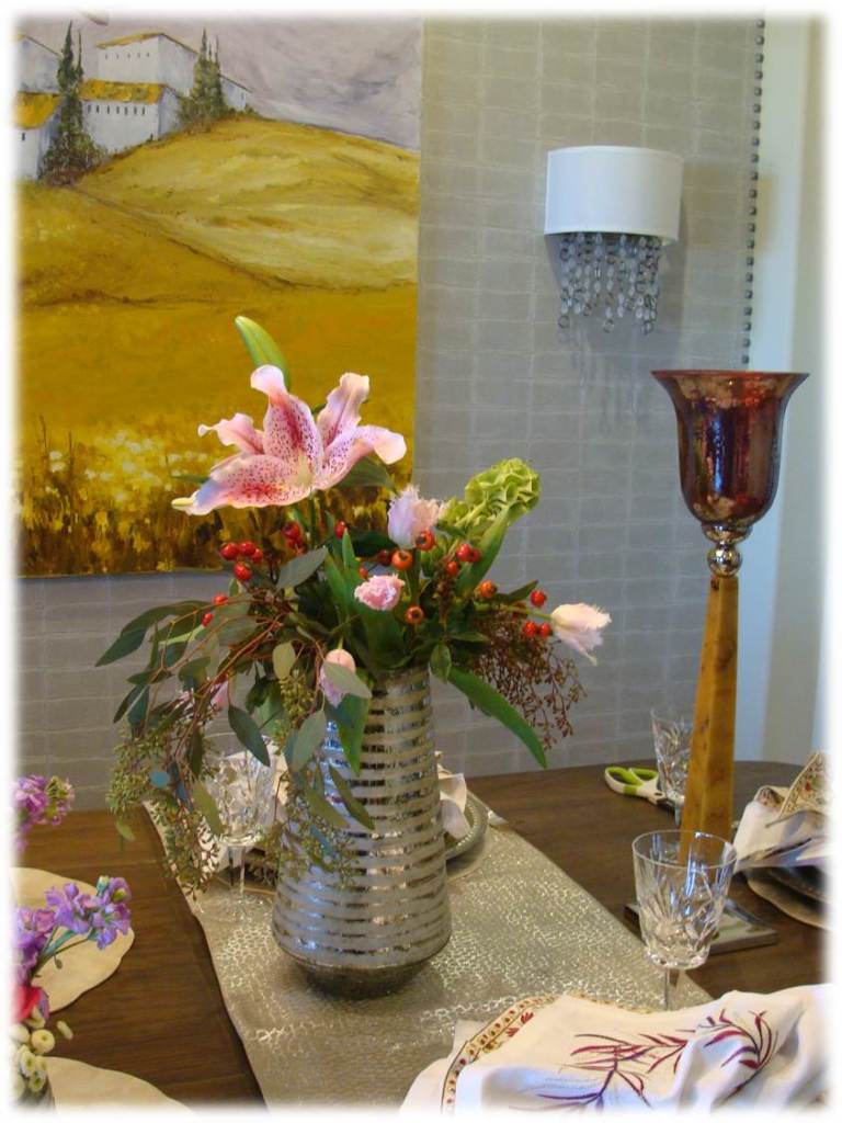
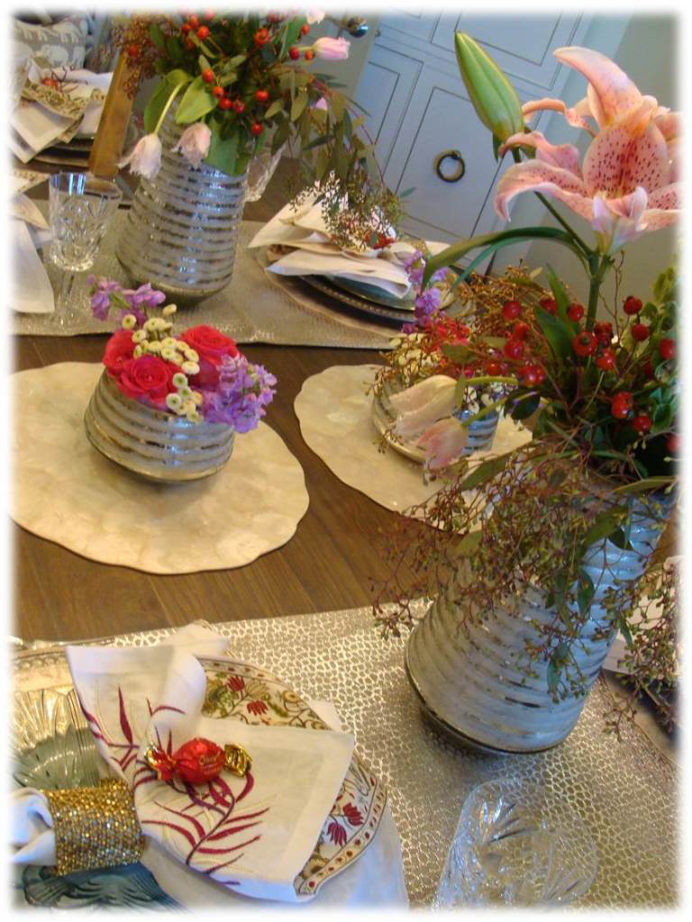
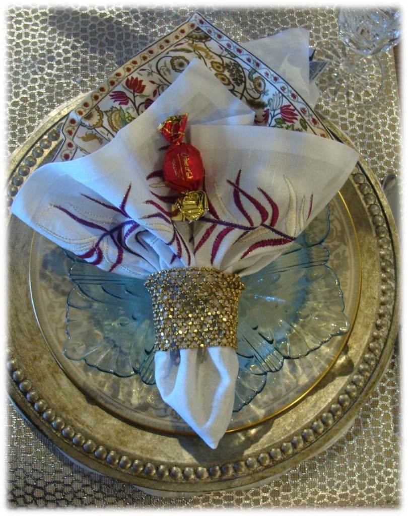
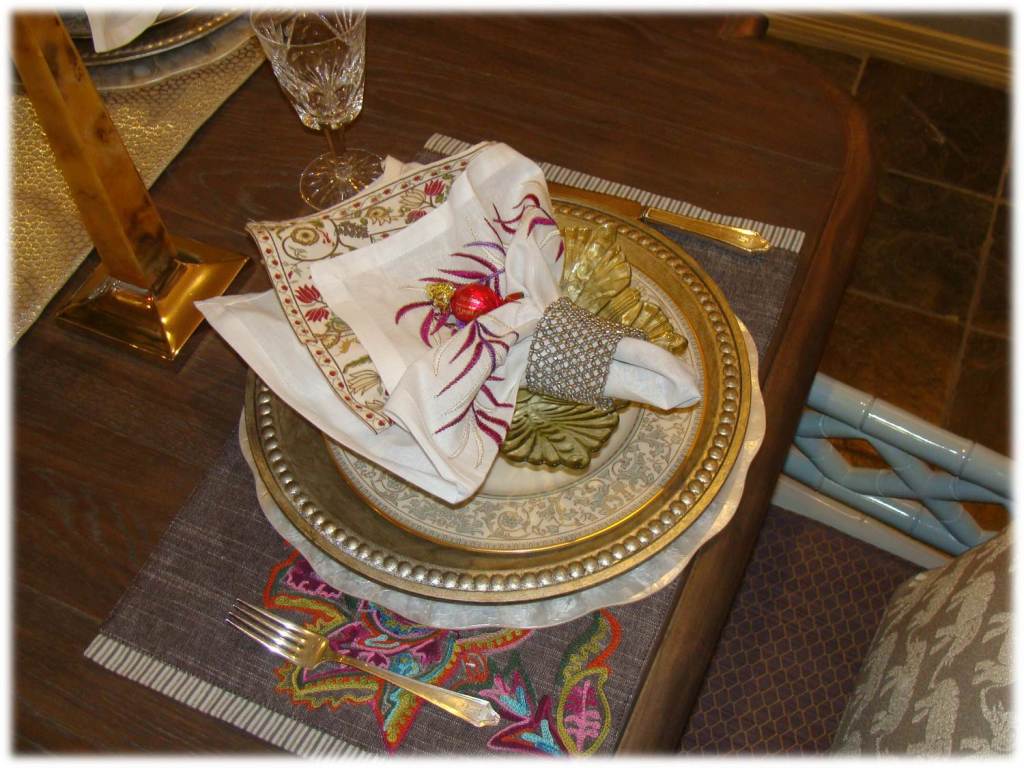
Because we were preparing for a Tour of Homes, we set the table beautifully for her! We layered napkins, used table runners, placemats, chargers and then finished the napkins off with a beaded bracelet which works great as a napkin ring.
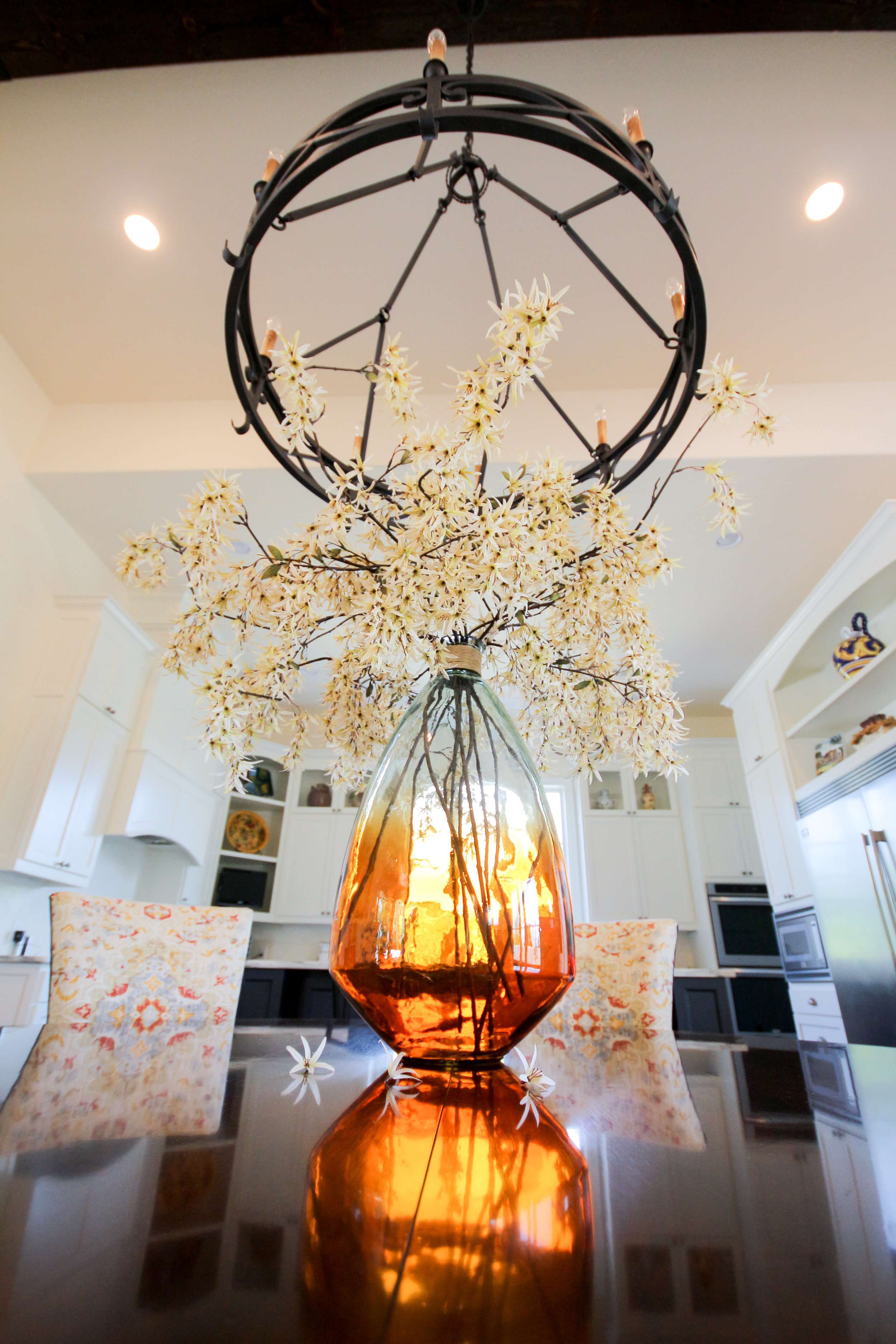
Arranging the flowers is always my favorite part of the install. They can really make all the colors pop!
I especially loved how these flowers were so similar to the painting.
We had pillows made for the bamboo chairs. Don't you love the elephants?
We added this GORGEOUS tall cabinet to her entry. It is stunning!
You can see why she loved the painting. It couldn't be more perfect with her blown glass pendant lights in her kitchen.
I also made sure that all the napkins and placemats coordinate with her daily china (see above) as well. That way she can mix and match and not have to worry about whether they go with each other.
The adjacent family room got some sprucing up as well. We added bolster pillows to her chaise lounge. It was kinda blah before. Now it looks like it belongs in the room.
We painted her fireplace wall a gorgeous dark blue to make it more of a feature wall. Her existing couch also got some new pillows to spruce it up a bit.
We added this fun colorful geod rug too!
She collects porcelain ring boxes and she has them displayed on her coffee table. Each one has a story which is so cool. This couple has traveled all over the world so they have some fabulous treasures.
What a fun day it was! She was so excited and we kept hugging each other because we were so happy with how everything turned out.
Even my installer had a good time! It takes LOTS of coordination and lots of hands to make a day like yesterday come together. Needless to say, I slept well last night!

Hope it was a great Halloween weekend!
Montclair Estates Elegance
This past week a had a quick getaway to Arkansas to kick off the summer with my family. It was an incredible time. It was eye opening to me to see how my "DecRenew" team took care of everything while I was away! I am extremely grateful to the contractors that work along side me, they are continually making my job such a pleasure.
It was hard to come back after being in paradise at Lake Greeson in Arkansas.
My mind was renewed (as much as it can be for a few days away) and I was ready to get back to work the day after we returned.
A wonderful family hired me to decorate their piano room, dining room and entry. They have been in their home several years now and have remodeled each room. They just hadn't done any decorating to their 3 front rooms. Of course, these are the first rooms guests see first. They hired me to make it look inviting, comfortable, classy and welcoming. This is Phase I of the decorating. We will be adding some additional items sometime next month.
The dining room was already furnished and had all the lighting. We just added draperies, artwork and accessories.
BEFORE
Amazing what a difference color, texture and draperies can do to a room.
AFTER
The artwork was inspired by the drapery fabric. Mary Howe from Divine Inspirations did the painting for us. I outlined the concept and colors and she did her magic like she always does, such talent!
I created the urns by adding moss to a round Styrofoam ball and then surrounding them with grapevine to give it a really natural look. I just love using greenery that has lots of branches incorporated. Truly looks like you picked it off a tree. The urns were aged with an aging solution.
My camera died in the middle of taking these photo's so I apologize for the "not so vibrant" shots.
The piano room was cleared out completely. We kept the piano where it was because it is the star of the room.
BEFORE PIANO ROOM
AFTER PIANO ROOM
BEFORE
AFTER
BEFORE
We had the fireplace fauxed with layers of grays. It now is more of the focal point in the room and coordinates with the colors in the entry. We added all new custom furniture, rugs and accessories, leaving the piano as the focal in this room.
AFTER
This oil painting is the mom of my client. She is perfect for above a mantel in a piano room don't you think?
BEFORE
We created a gallery wall with all of the oil paintings that were done by family members. Framing them all in the same frame made them a grouping that works together, even though they are all quite a bit different.
AFTER
I didn't use the oil painting with the fruit because I felt like that one is more appropriate for a kitchen.
Substantial dark frames changed the look of the artwork drastically! Grouping them together makes it more of a collection. Spreading them out all over the home would have lost their impact. Seeing them all together tells a better story and showcases the collection.
I found the glass lamp bases and changed out the shades with something a little more decorative than plain white. The muted chevron pattern is gorgeous with the rug.
These custom chairs are my favorite thing in the room! The colorful pillow makes the entire room come together. Well....I love the gallery of artwork too!
BEFORE ENTRY
AFTER
The entry accent wall was painted a similar color to the fireplace surround, uniting the rooms together.
I found the chair at an estate sale and had it painted a light gray.
Reupholstered the seat to match the pillows in the piano room and united everything together with a cream Brazilian hide.
These Spanish doors were added to the stairway wall and are an incredible statement to the home with their weathered texture and color.
The amount of work that goes into one of these installs in incredible. It always blows my mind to see the ideas that have been swirling around in my head come together within an 6 hour time frame. Months of preparation and organization. Such an awesome feeling to see it all put together.
The reveal is always so exciting and this family all gathered together to do the final walk thru after being gone all day.
The moment you drive away from a client and watch as the family walks back into their home is always such a rewarding feeling. I love knowing that as they enter the front door, new memories will be created as they have friends and family gathered around for meals around their dining room table. I can imagine lots of gatherings around the piano too, especially for holidays and special occasions.
Thank you Lord for the blessing of using my gifts to warm the hearts of others. It's a gift that comes back to me ten fold.
