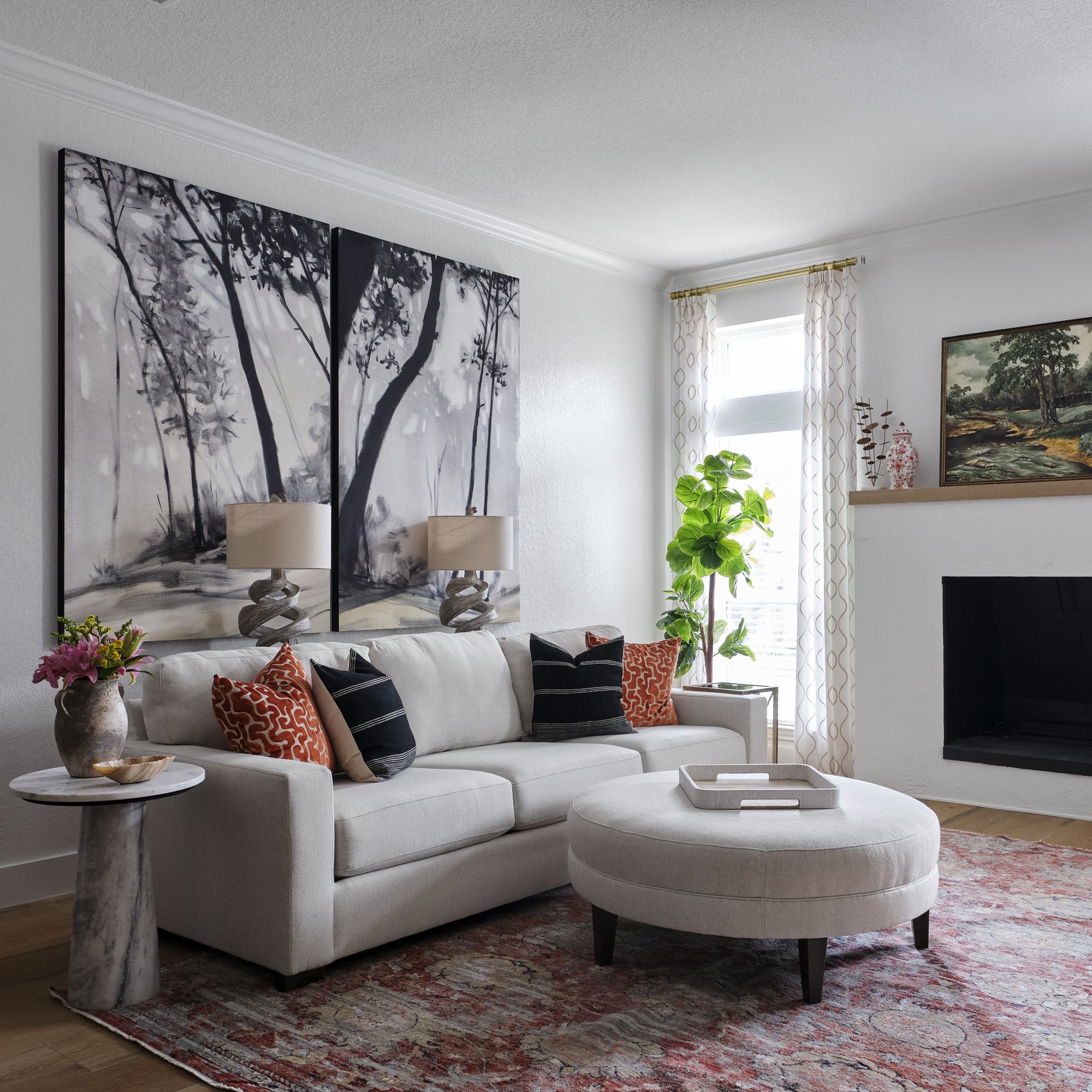
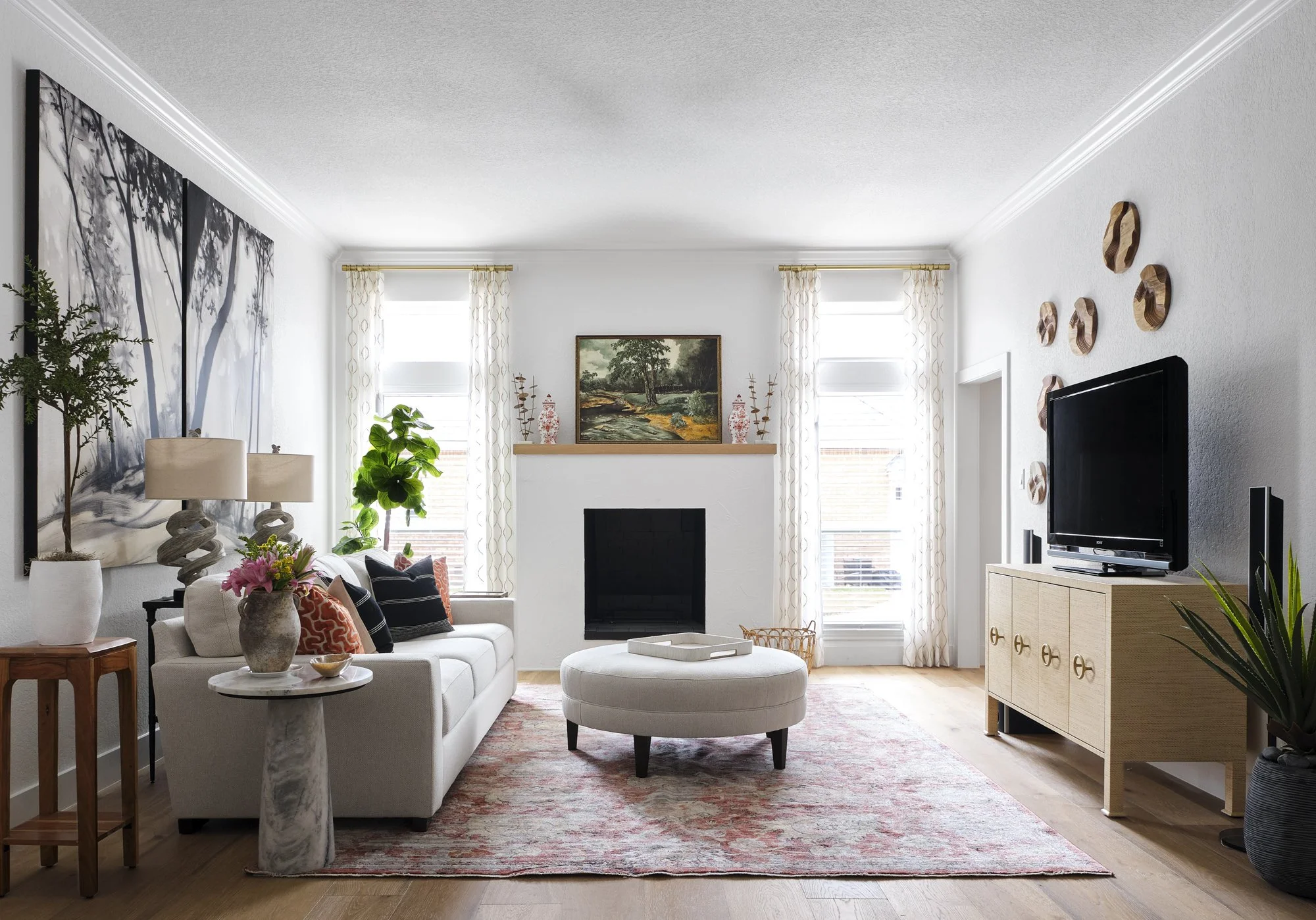
We finished a whole house remodel about 3 weeks ago. The client hired me to consult with them throughout the remodel which took a year. They actually moved out and rented an Airbnb for a year. I worked alongside their contractor and helped them select everything for the remodel and then did all the furnishings as well.
BEFORE OFFICE/DINING ROOM
When entering the home, the entry is on the left and there was an office and small dining room towards the back. I suggested that we join the office space and the small dining space to make one big dining room. The client really wanted a large table that seats 10-12 for their large family. The ceilings were different heights and that couldn't be changed because of the roof line. I knew we could just ignore the different heights and make it one room, (a new beam was put in) no problem just a lot of $$.
AFTER
Being that the walls and the ceiling are the same color, you can see that it works! We did a herringbone wood floor in the entry and dining room and it looks spectacular.
The table and chairs were custom made by a local artisan and all are so fabulous! The detail of the wood top and the base :)! We painted the fireplace mantel black and it is just stunning in person and works well with the front door which is black as well.
AFTER
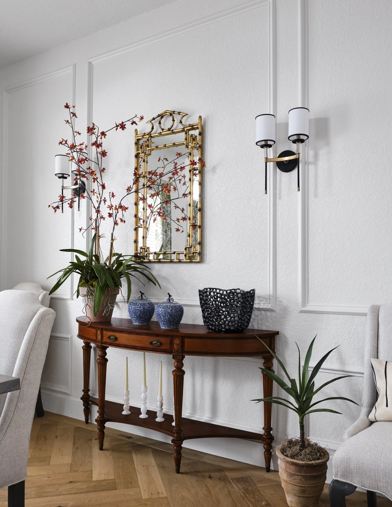
Mixing traditional with transitional was key here because the client had traditional pieces that we mixed in throughout the house amongst the new items, keeping their personality and family legacy a part of this newly renovated house.
ENTRY BEFORE
ENTRY AFTER
We used textured wallpaper in the entry and it really adds a nice touch to this small space.
BEFORE FORMAL LIVING
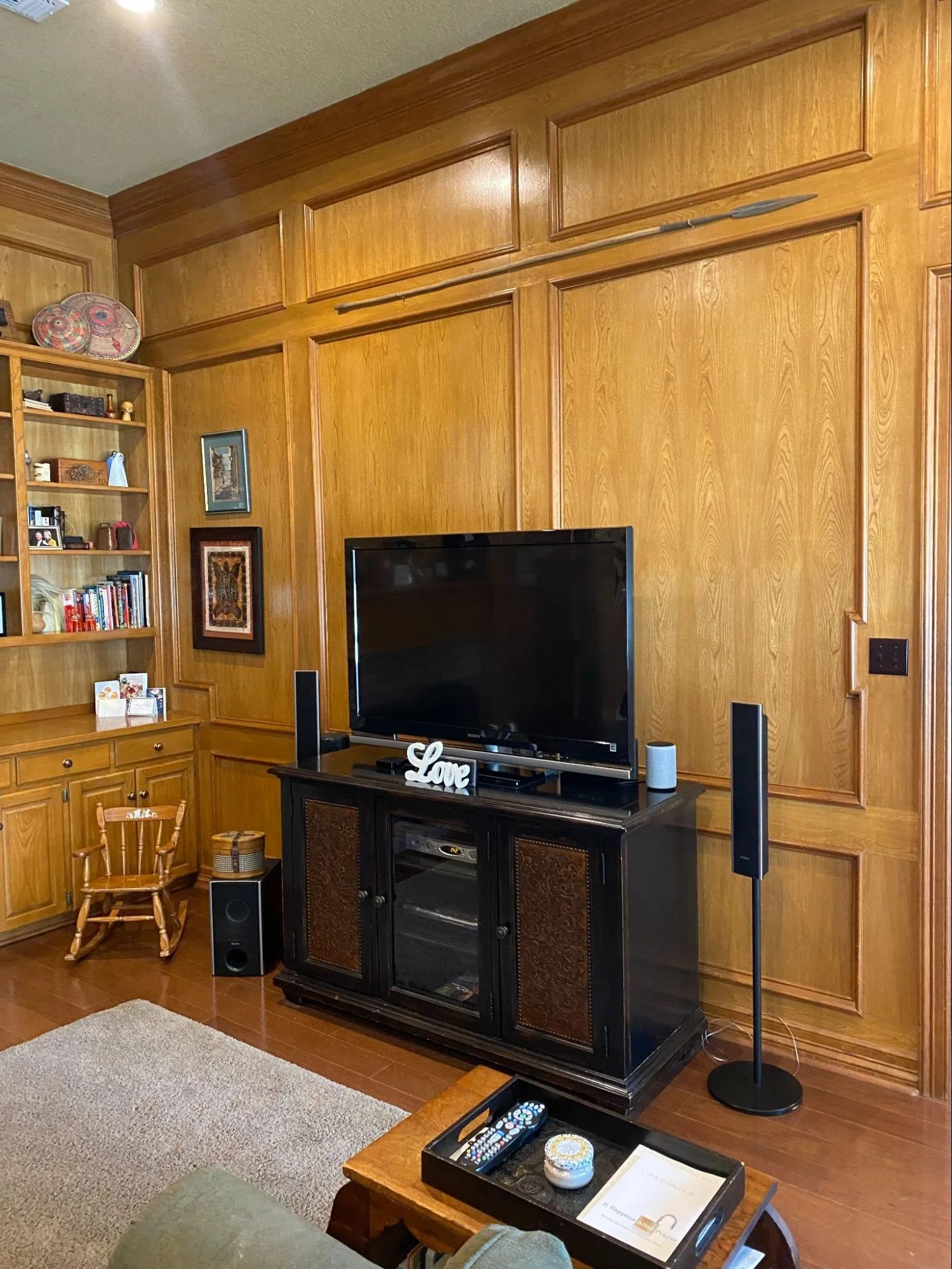
The family room was paneled and I encouraged the client to keep it but paint it a gorgeous color. I adore the look of painted paneling if done right and knew this room could handle some color.
We knew we wanted to add some storage so we built bookshelves along this wall to expand the space and allow us to add accessories (see after below).
AFTER
We used Sherwin Williams Emerald paint on the paneling and it worked fantastically. It has a slight sheen which elevates the look. We wanted this space to be a cozy sitting room to sit by the fire and relax and chat with morning coffee or evening cocktails. There is no TV in this room but there is one in their family room and in the upstairs addition. The two camel colored leather sofas are super comfy and the swivel chairs were custom made for the tall men in their family. The fireplace stone really adds that light and bright feel to the space, keeping the room looking fresh and bright. This room has tons of windows overlooking their acreage backyard with a pool, which makes it even more inviting.
BEFORE
We took all the shelving down above the piano because it was dated and needed to be retired.
We kept their upright piano because they have grandchildren that will be learning how to play.
BEFORE KITCHEN
The kitchen was really tired and ready for a makeover and they were so excited for this change and my creative juices really had fun here. The client loves to cook so we knew we had to create a bigger island for the entire family to enjoy. We took out all of the cabinetry and started from scratch. Some of the cabinetry was reused in his garage.
BEFORE
AFTER
The wood floor continues throughout the house. We chose a beautiful quartzite from (Burlington Design Gallery, mike add link) that has some warm veining in. We purposely added more drawers vs. doors because they are easier to access, no more crouching down to look for items. We took out the wall to the right of the coffee bar to open up the kitchen to the family room. It really made the space feel so much bigger. We created a coffee bar with drawers underneath to keep their cups and coffee fixings. We styled the shelves for the photo shoot but they can use them for whatever they please.
If you look through the greenery arrangement on the island, you can see a peek of the colorful vintage fruit art which is hanging in the now butler's pantry. That room used to be the laundry room (photo of butler’s pantry shown later in this post).
We also took all the cabinets and backsplash tile to the ceiling, which really makes the space feel so much bigger!
AFTER
We really wanted to do a mix of painted cabinets and wood for the kitchen. I felt like the wood floors needed a companion, especially in the kitchen. It gives it interest instead of an all white kitchen. The warmth of the painted island grounds the space and I knew it would work so well with the rug runners (the same diamond shape) I proposed on the design plan for all the furnishings, etc. This client hired us to do all the furnishings, lighting, accessories, rugs, etc. once the remodel was finished.
As a designer, we are not only thinking of the details of each item in each room as the remodel is happening, we are looking ahead to the final design so it all works well together and is cohesive from room to room.
AFTER BUTLER’S PANTRY
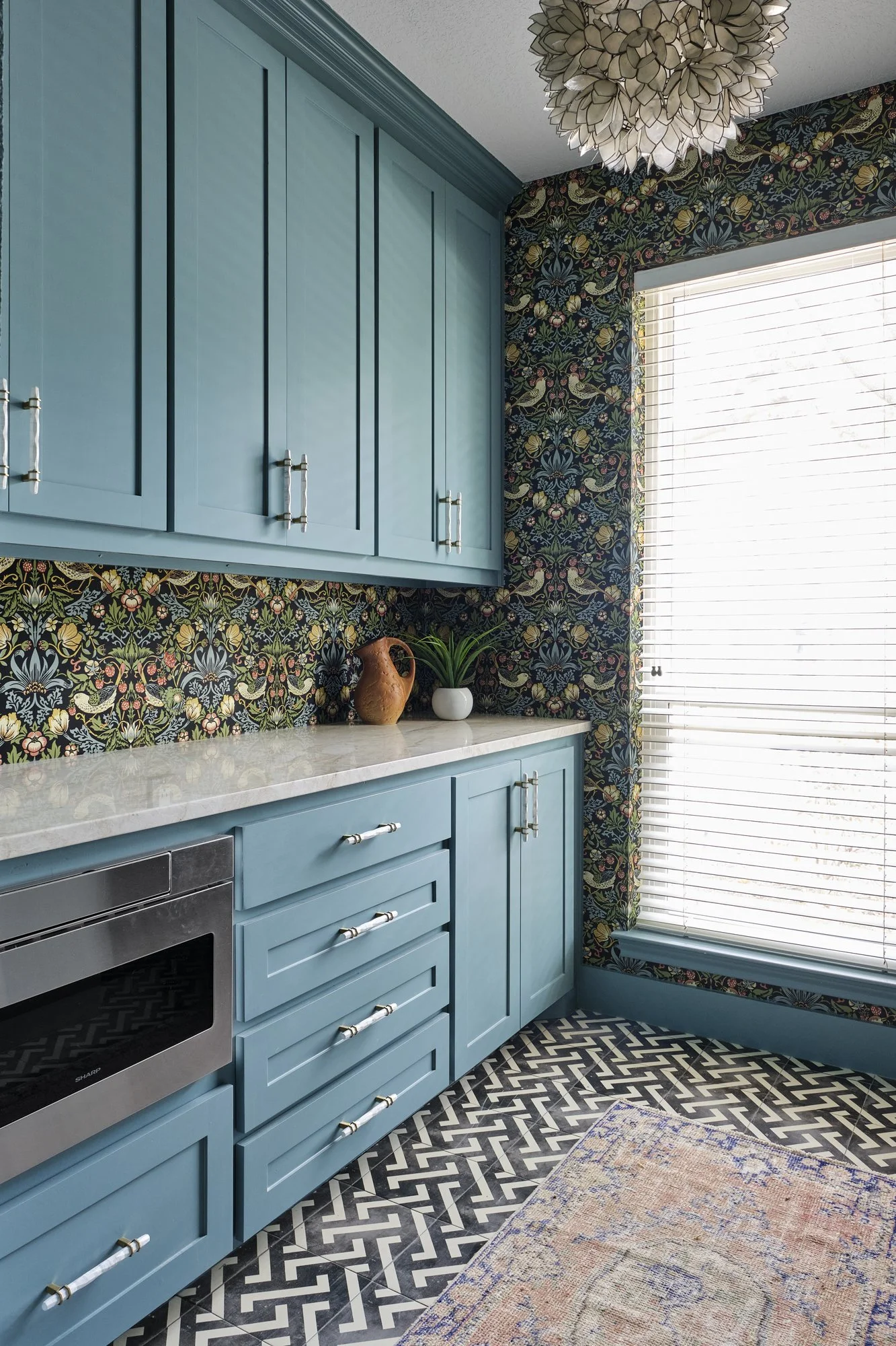
This room used to be the laundry room but we decided it would make a great butler’s pantry and is right off the kitchen. The bird wallpaper was the inspiration for the color of the cabinets as well as the laundry room. The chandelier was purchased at Roundtop while shopping there earlier this year.
We demoed this whole bedroom/bathroom/storage area (water heater is now in the attic) and knew it would be the perfect spot, right off the kitchen and butler’s pantry.
MORNING ROOM
It is now the space where she can fold laundry, do projects, set up an office area and have fun with their grandkids. I just love the vintage look of the black and white tile. We knew we were adding an addition over the garage for guests to stay and we could recreate this space into something the client really wanted, we are calling it the “Morning room.” Again, in this space we used drawers instead of doors. We also used acrylic hardware so it wouldn't look too busy since there are a lot of drawers.
I happened to find rug runners that are a very similar pattern to the butler’s pantry which really ties the two rooms together. The washer dryer is on the left side of the island which we didn’t photograph because they hadn’t completely installed them yet.
PRIMARY BEDROOM AFTER
Colorful and rich, yet peaceful and calming, right? The primary bathroom feels the same way.
The bed was custom made because I wanted a nice tall headboard. This room is a mix of masculine and feminine so it is loved by both. The draperies ALWAYS finish off the rooms and make all the patterns complete.
PRIMARY BATHROOM AFTER
A large comfy throw is always a must for those long Sunday afternoon naps. As you can see, the bathroom has extra storage which we added for linens, etc.
PRIMARY BEDROOM AFTER
This oversized antique bergere chair I found at a local antique store and knew right away it would be perfect in their bedroom. This velvet fabric really made it feel more modern and feels so luxurious to sit on. The tiger pillow breaks up the “traditional” and adds some fun to the vignette. If you look careful to the left of this vignette, the art on the wall was something that the client had already. It is a quilted textile piece that meant something to them and we loved the colors. It was our inspiration for the primary bedroom.
PRIMARY BATHROOM TRANSFORMATION
The primary bathroom was totally updated as well.
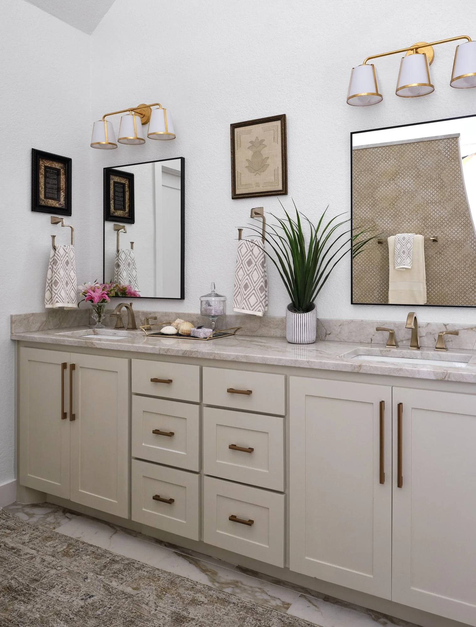
There used to be two sink areas but we made one long vanity instead and added a built-in for storage.
PRIMARY BATHROOM TRANSFORMATION
We took out the bathtub and added a large walk in shower. No door, just a nice curved wall and lots of space to take a leisurely shower. Perfect for as they age as well.
The hexagon tile really adds some warmth and character and is like no other shower I’ve ever seen.
FAMILY ROOM BEFORE
FAMILY ROOM AFTER
We transformed their fireplace!
DOWNSTAIRS GUEST ROOM
NEW UPSTAIRS ADDITION BEDROOM
We didn’t take photos of the entire space but this is the bedroom nook. There is also a living area with two nice big reclining swivel chairs for watching TV.
The bathroom vanity is painted this same gorgeous kelley green. The client wanted all of her family's memorabilia framed so we had that done for her. She now has about 6 shadow boxes with items to remember family members that are no longer with them.
Hope you enjoyed the tour of this newly renovated home in Colleyville, Texas. It was a joy to do and the client loves it, which is the most important thing!
Photos by Nathan Schroder’s Photography
