Grapevine, TX Master Bathroom Remodel

Wow, we finished another master bathroom.  What a transformation this one is.

The requests from the client were:  

More storage space to hide the clutter,  updated shower with niches and a bench, new floor tile, new countertops, new lighting, blue paint, updated bathtub and a vanity to do makeup.

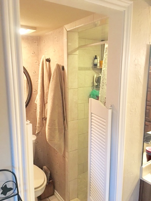
BEFORE

As you can see it was in desperate need of a makeover. I suggested that we open up the closed "cave like"  shower to make the bathroom feel more open.  They didn't need the toilet to be separate because it was functional to them without the swing doors and they don't have anyone else that lives in the home with them.

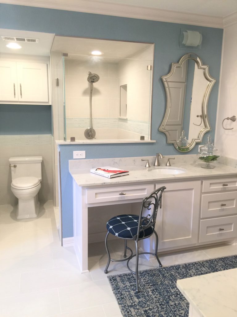
AFTER

We took the bathroom down to the studs and started over!!!

 You can see in the above photo that the shower is now opened up and now we get to admire the gorgeous tile work too.  Nobody wants to shower in a cave.  Why did they make showers like that before?   Just look at it now!  So much better don't you think? We also brought the tile up the walls and behind the toilet because that keeps things cleaner and fresher. We added the same glass accent tile as we have in the shower above it.

BEFORE

AFTER

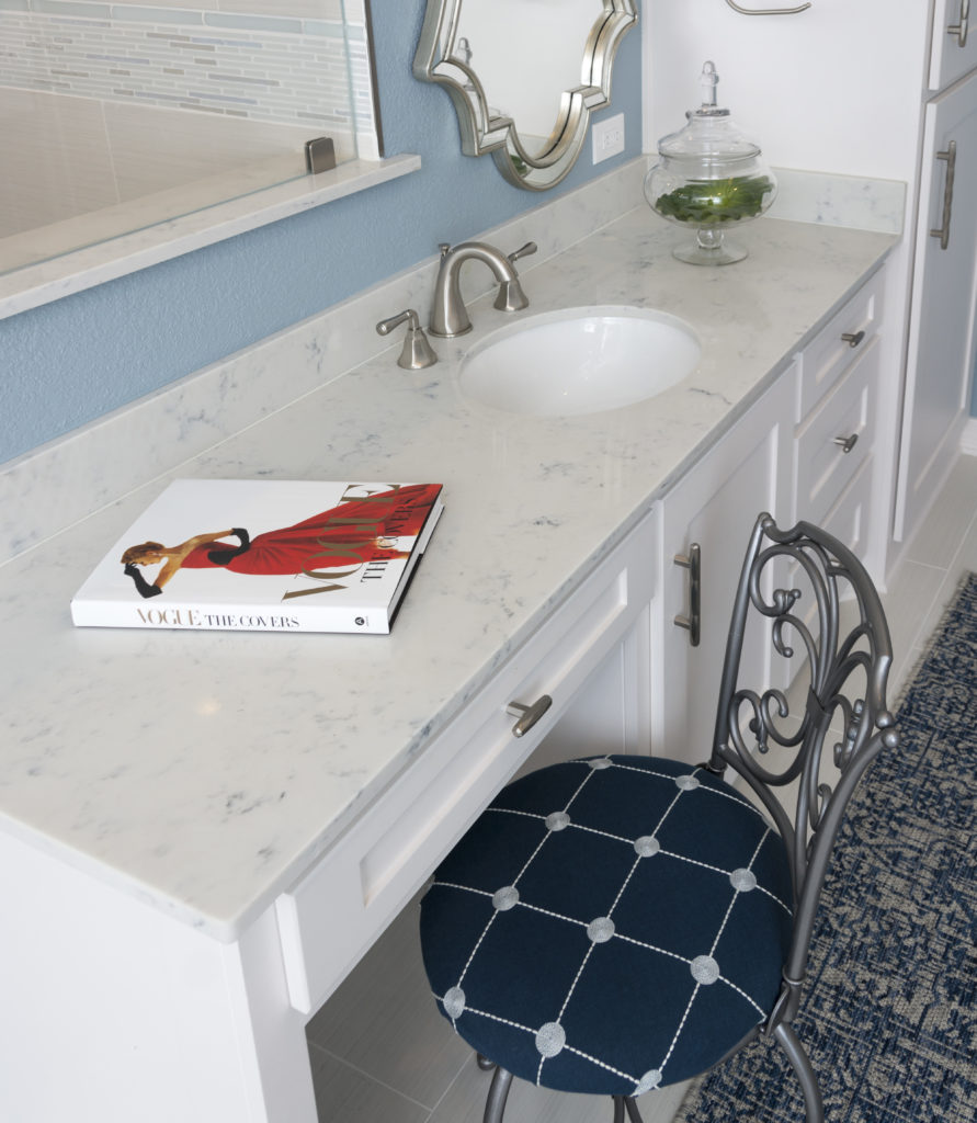
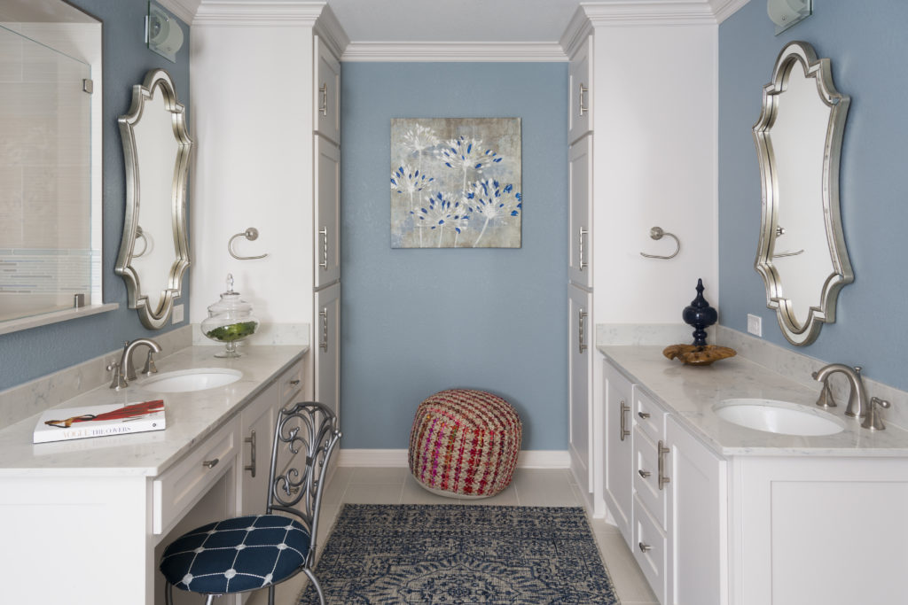
We added new cabinets with quartz countertops.

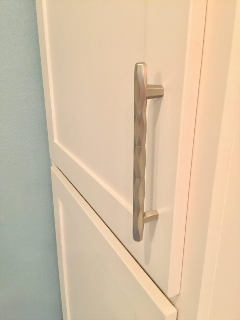
The hardware is the jewelry!

We weren't able to center the sink under the mirror due to opening up the shower, storage needs as well as needing the vanity but the client had no problem with that.  Priorities, priorities.

The client really wanted a vanity so she could sit and do her makeup.  I was so proud of her, she spray painted her existing vanity stool and did a weekend upholstery job.  I gave her a thumbs up because you know I love to repurpose if I think it works and helps us stay on budget.

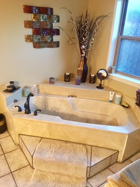
BEFORE

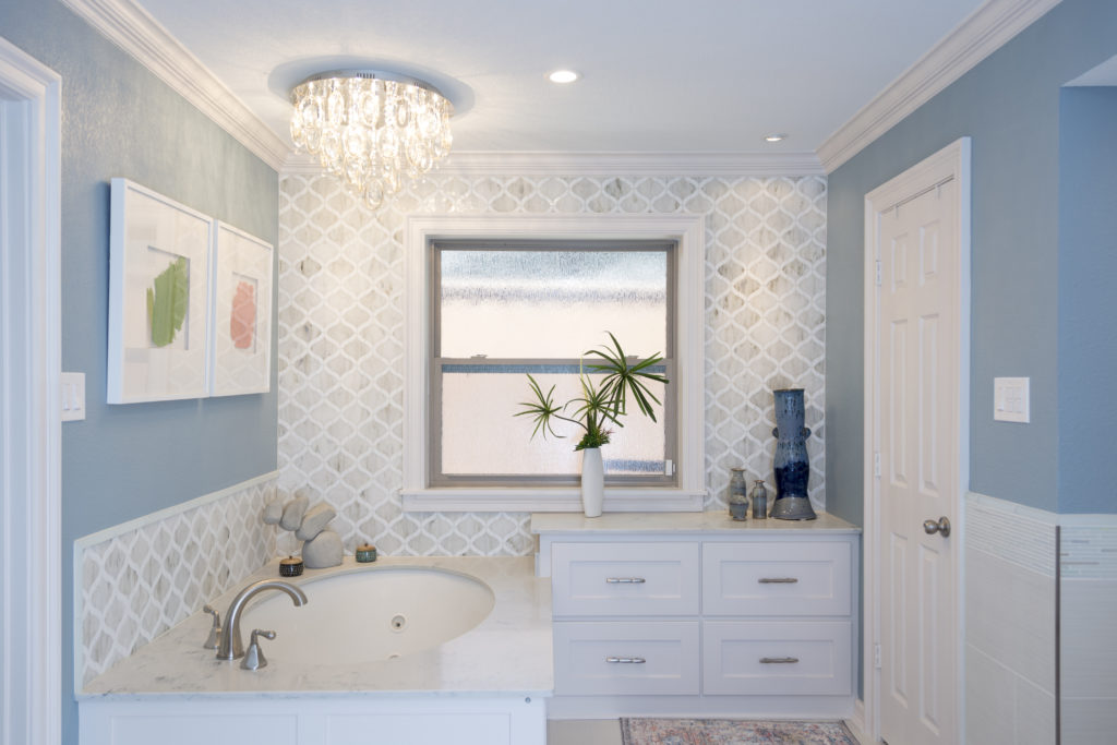
AFTER

Singing the Hallelujah chorus!

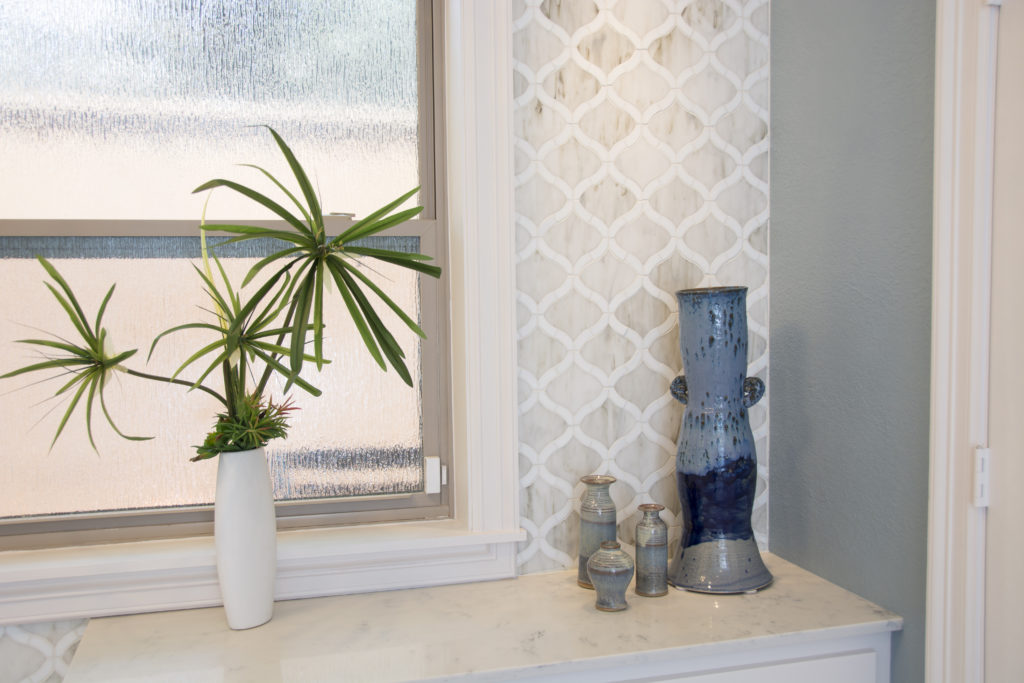
We had space next to the tub so we decided to add the 4  drawers for extra storage space. It would have been wasted space otherwise.  Can you believe how gorgeous the accent tile is?  The Arabesque pattern is just amazing made out of pearl. I suggested we put it around the windows to balance the bathtub side with the tower cabinets on the other side of the room.  It is stunning and was quite a challenge to install!

 Can we also take a moment of silence and stare at the chandelier!  It's on a dimmer for soaking  moments.

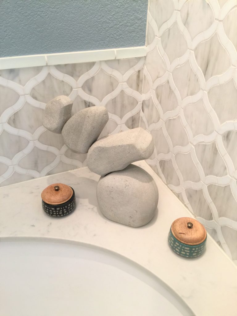
Every "spa like" bathroom needs a tower of rocks.

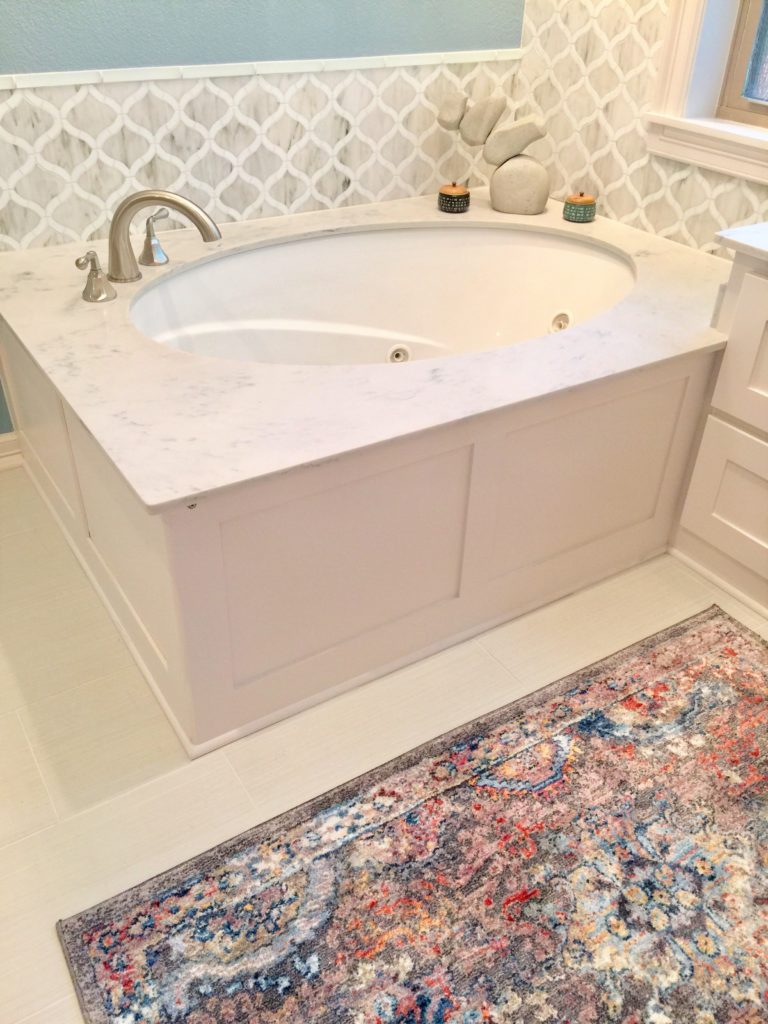
and a colorful rug! Rugs bring everything together. I like to use rugs that aren't the typical rugs you would use in a bathroom. It just makes the room more spectacular and bumps it up to the next level.

The client had the large blue pottery made by a local artist and I found the baby pottery to go with it.  Perfect for fresh flowers when you are feeling like treating yourself.

BEFORE

Oh my!  Can you believe this?

AFTER

We opened up the entire bathroom by taking out the wall to wall cabinets.  Instead we did tower cabinets and put pull out drawers in each one so things could be hidden away.   We took out the fur downs and that opened things up a ton too.  Made the entire bathroom feel taller and more spacious.

 As you can see, this bathroom coordinates beautifully with the bedroom we transformed for them.

See the before and after photo's from a previous post

https://www.ruthiestaalsen.com/grapevine-master-bedroom-makeover-2/

We are busy working on some design plans and I also have some very exciting news to share with you!

Stay close! Happy Sunday!

Grapevine Master Bedroom Makeover

What a priviledge it is to make over a master bedroom for a client.  This room is always the biggest treat to me. It is usually the one place in the house that is neglected but is the one place we spend the most time.  When couples decide to take the leap to create a haven for their master, I'm all on board because it is an investment in their marriage.

BEFORE


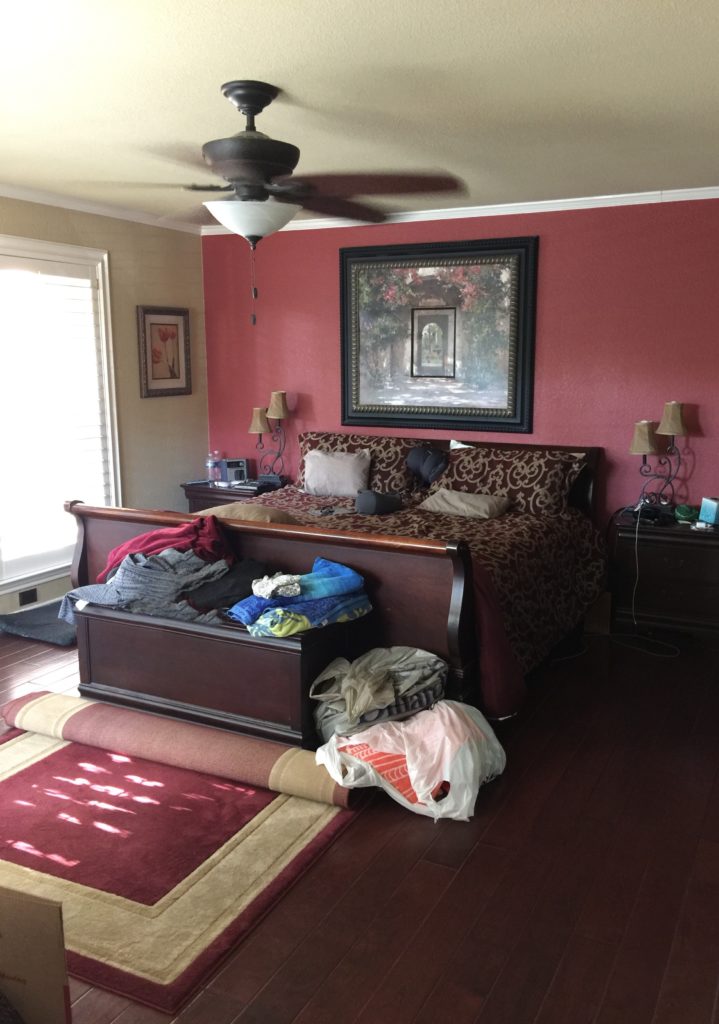
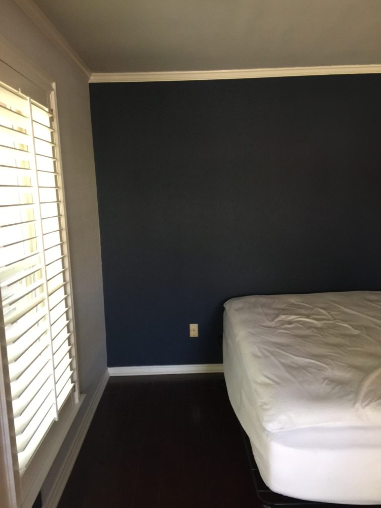
The client was going through a master bathroom remodel so this is not a fair before pictures since they were living in chaos (after photos of bathroom coming soon).

The client has been married 19 years and needed a refresh.  They celebrated their anniversary this month and so I got the priviledge of giving them this makeover in time to celebrate.

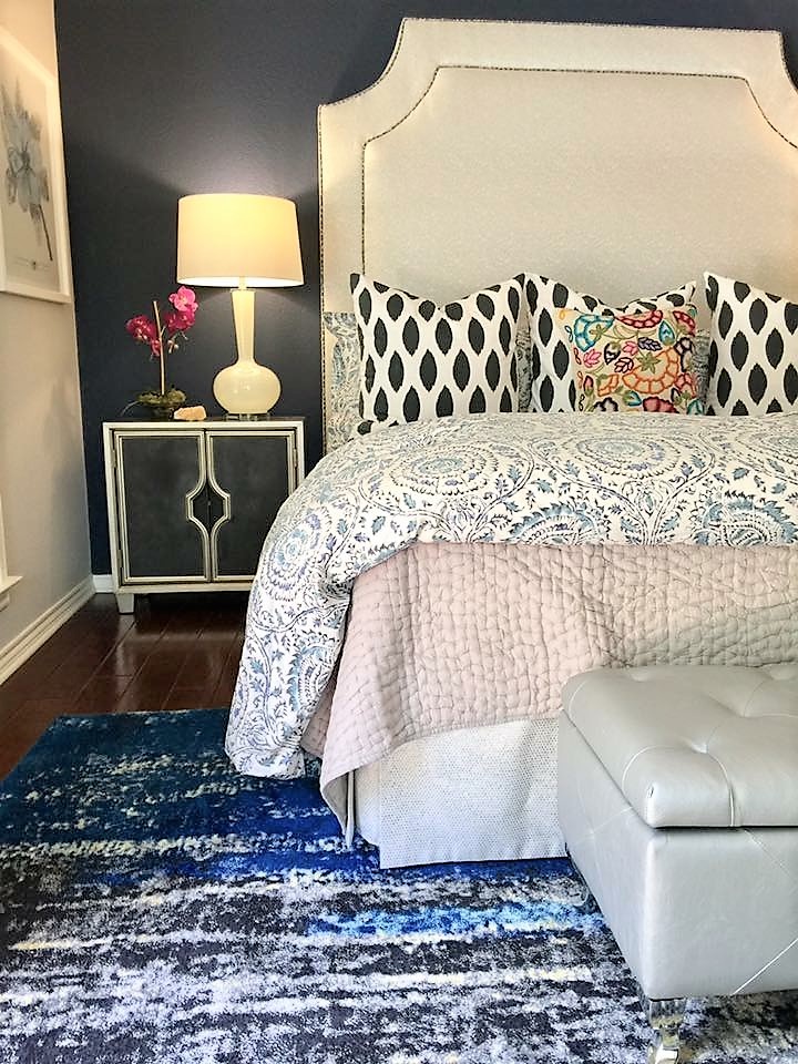
Their main problem with their bedroom was that everything matched.  Their furniture and their bedding all came in a set. I like to break things up so it looks more interesting and collected, rather than all the same.

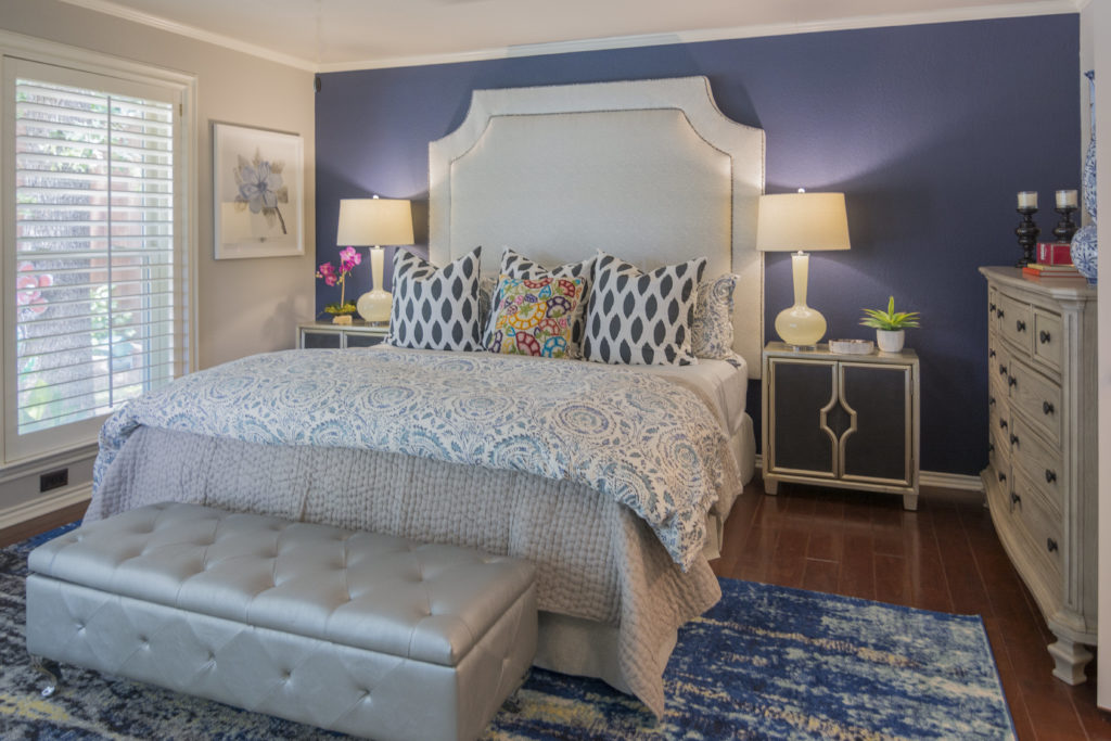
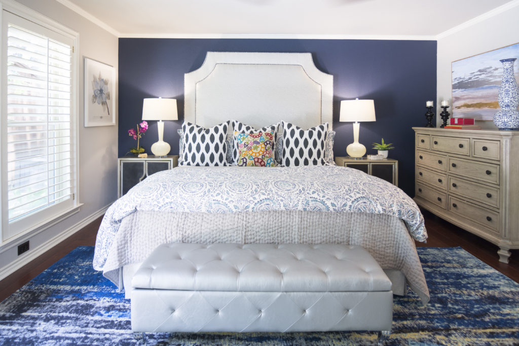
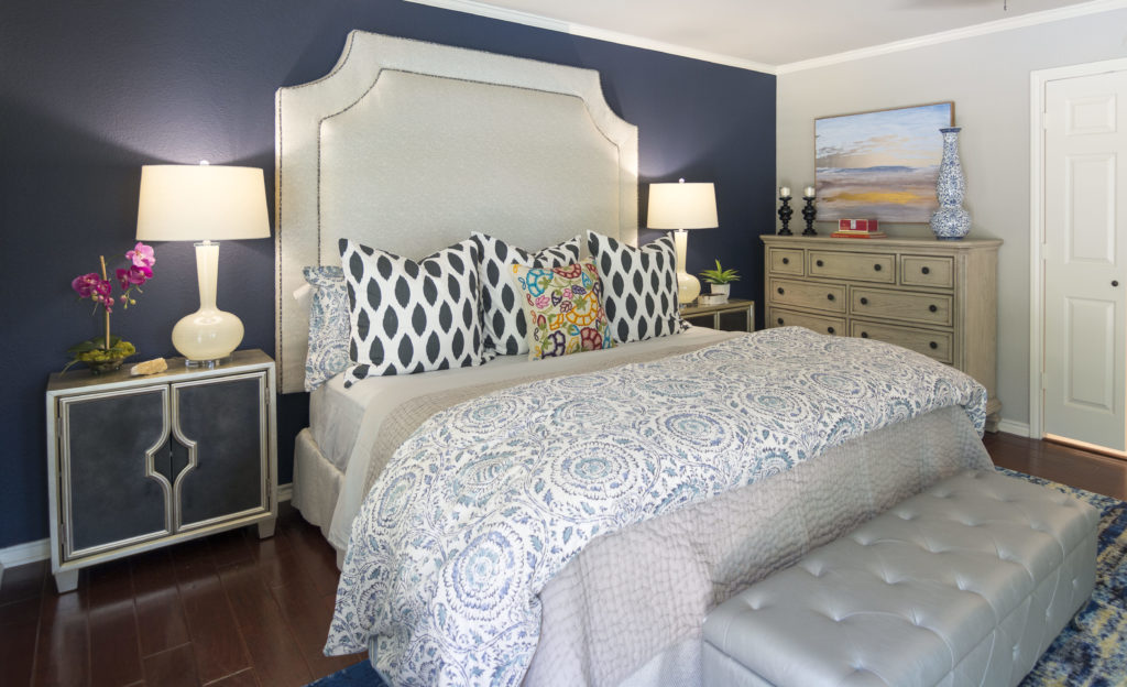
AFTER

Big difference don't you think?  See how much more interesting it is with less "matchy matchy"?

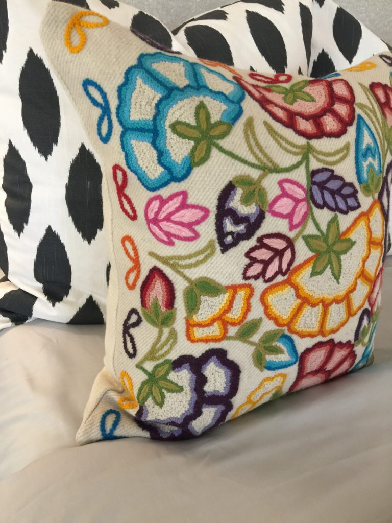
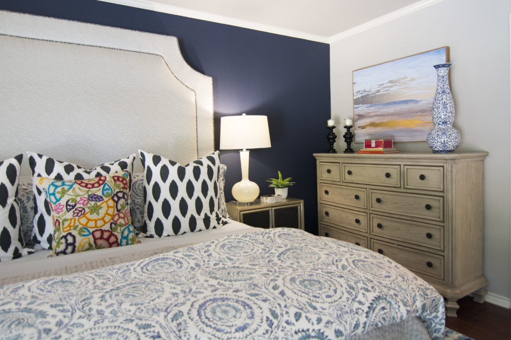
The embroidered pillow was my inspiration for the room and it grew from there.

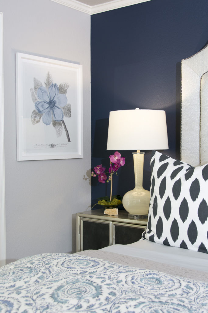
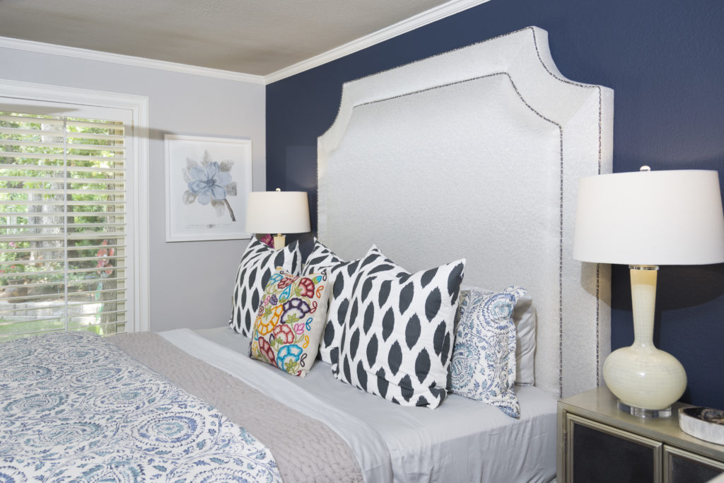
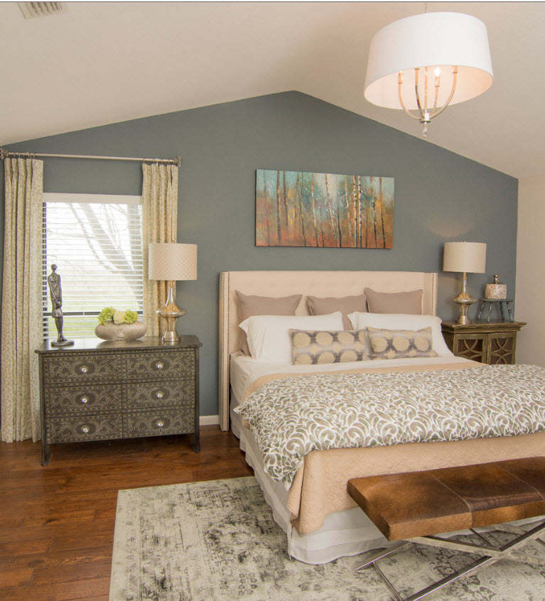
We knew we wanted a light headboard to brighten up the room, so a dark navy wall was the perfect solution to make the headboard stand out.  The rest of the room was painted a soft gray.  I found a design for the headboard that the client liked and my workroom did an amazing job creating it for us.


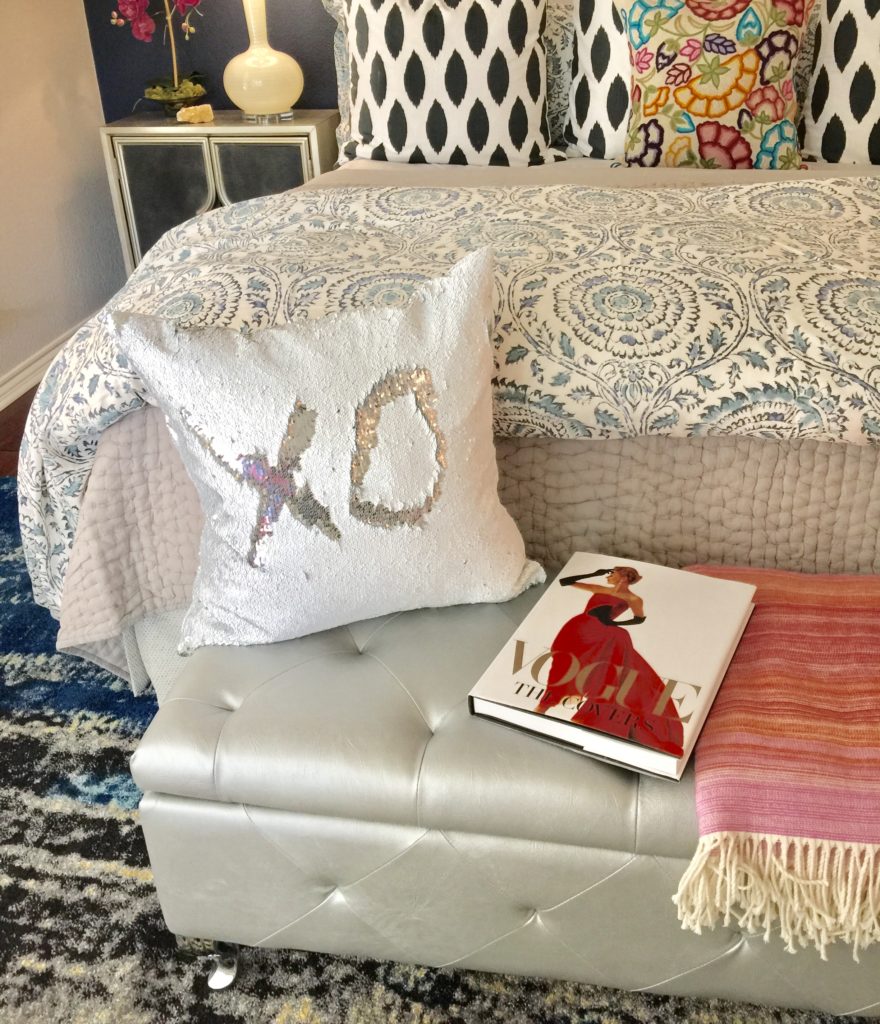
Can we just take a moment and stare at the rug!  It's perfect for their dog  because it hides any shedding that will take place.  The client also wanted storage for blankets, etc. so that is what she got!

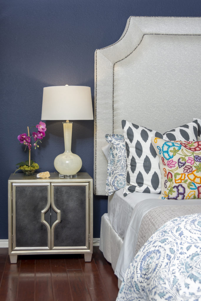
The side tables were chosen because they are just gorgeous and then I found the euro shams. I love how they compliment each other so well. The client purchased the dressers.

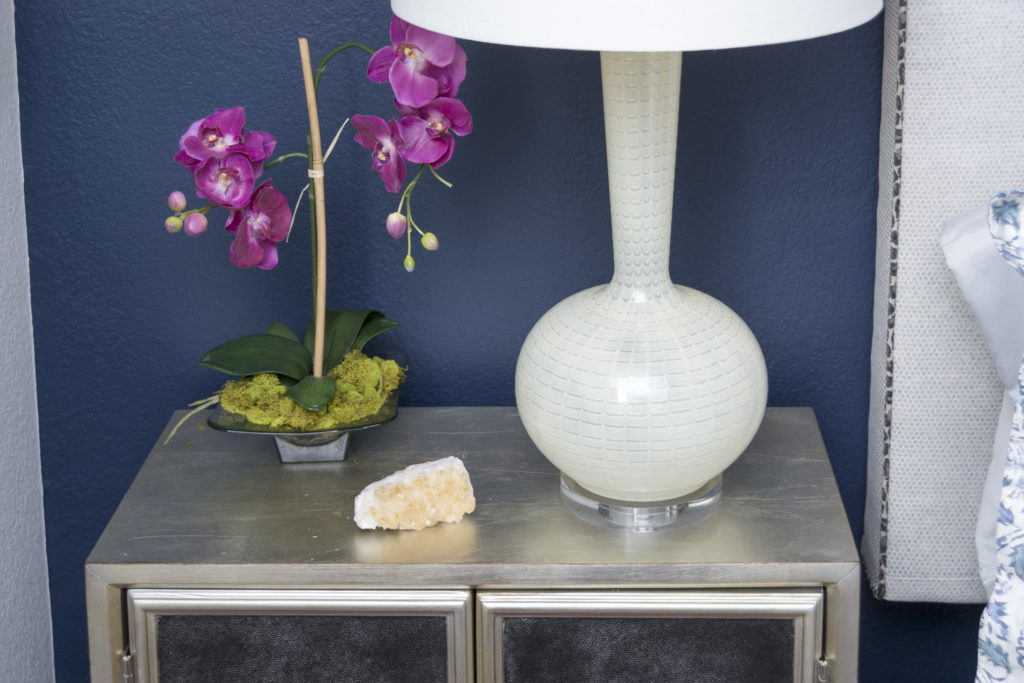
The soft yellow lamps work beautifully with the rug.

A coverlet is always perfect for any bed because it isn't too hot.  I like to place a duvet at the bottom of the bed in case they need extra warmth at night.  I know I need extra blankets because my hubby freezes our room when we sleep.

Her side got a touch of floral and bling.  Notice the cording on the custom made headboard, we needed that touch of dark animal print to work with the side tables and euro shams. These details are what keep me up at night and that is why you hire an interior designer because most people don't think about all these details.  However, they are what make the entire design come together so beautifully.

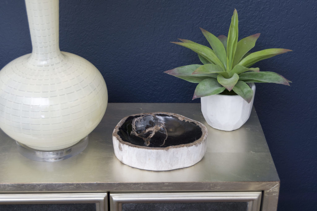
His side of the bed got a succulent and a petrified wood bowl.

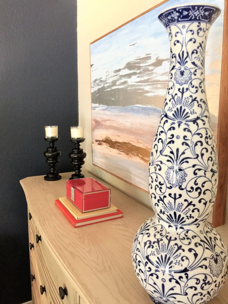
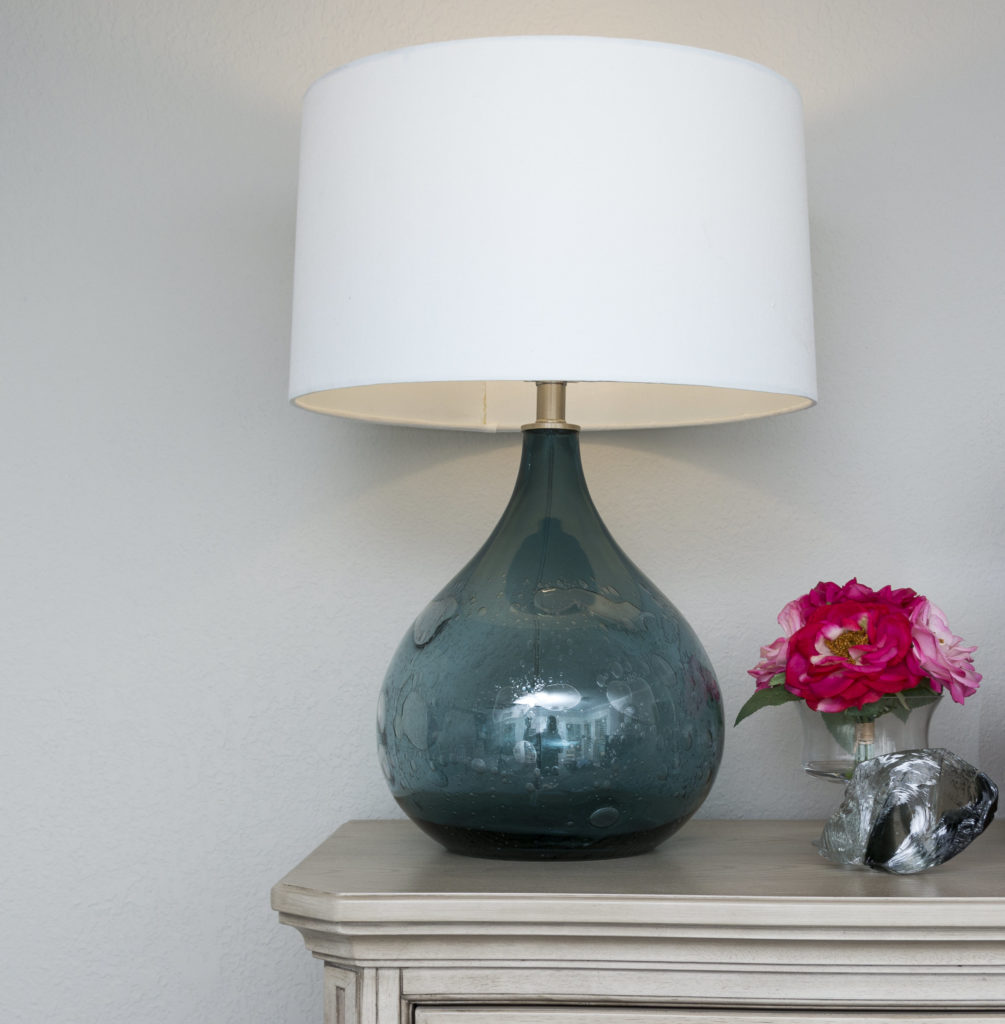
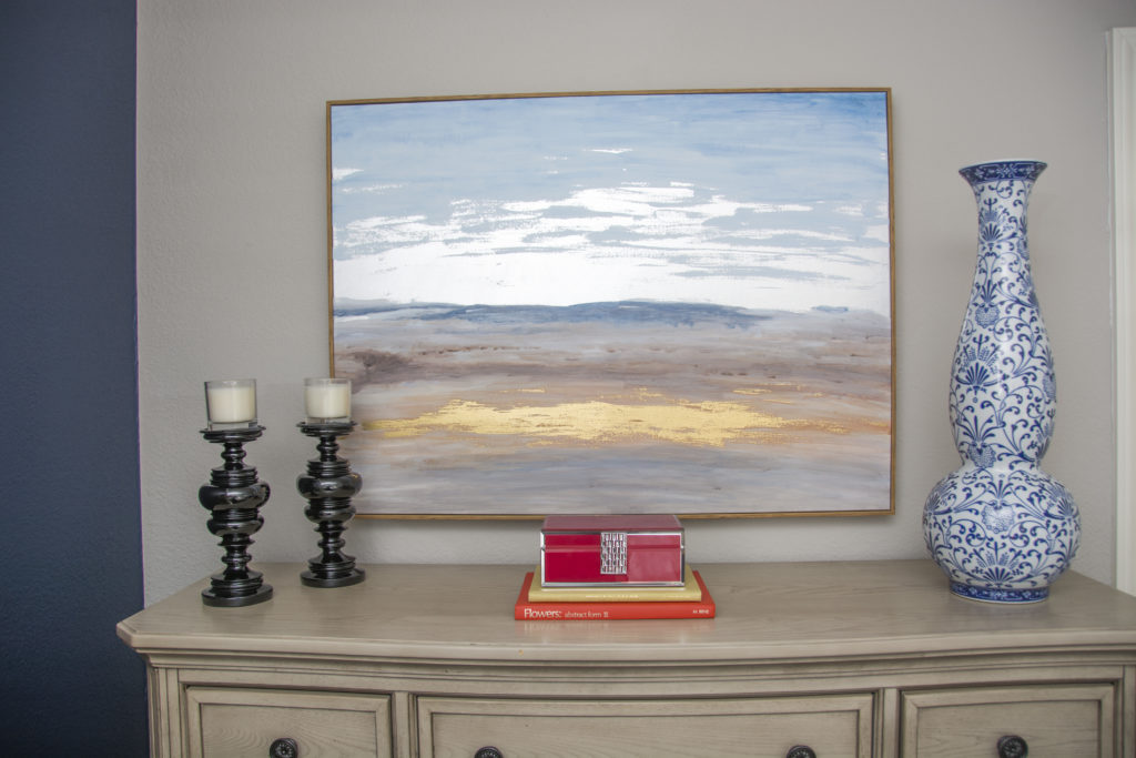
To marry the colors together, I used a blown glass lamp, a glass rock and some gorgeous florals on top of their tall chest of drawers.

The artwork is glorious! It has the perfect amount of blue, a touch of yellow and the glow it projects is so beautiful.  Notice how the accessories all bring out the colors from the embroidered pillow.

You see, details are IMPORTANT!

BEFORE

(Beginning of install day)

AFTER

(End of the install day)

It takes a village on install day, but it all comes together nicely.

Hope this inspires you to do some decorating in your master bedroom.

Ruthie tip:  When our girls were younger, we purposely made our master bedroom a place we could escape to. It has been our refuge and haven to restore our souls. We have spent hours sitting in our wingback chairs chatting about life, relationships and creating memories. When entertaining teens, we had to have a place we could go to so they felt like they could have the house to enjoy with their friends without their parents hovering.  Don't forget about your master bedroom, it is an ingredient to sanity with teens and a contribution to a healthy marriage.  Totally worth the investment, I promise.

XOXO

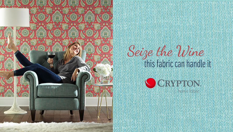
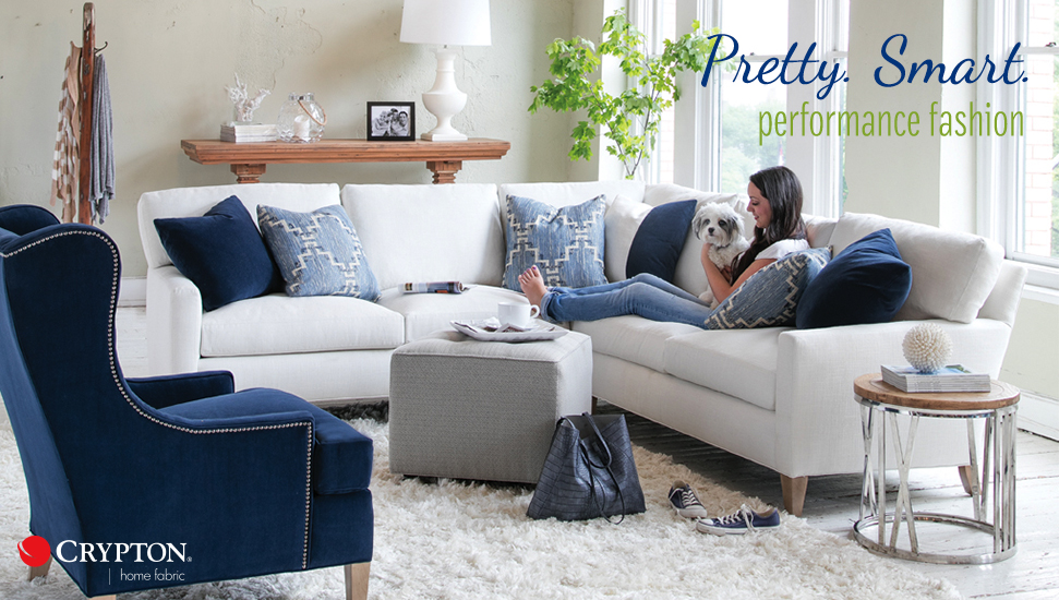
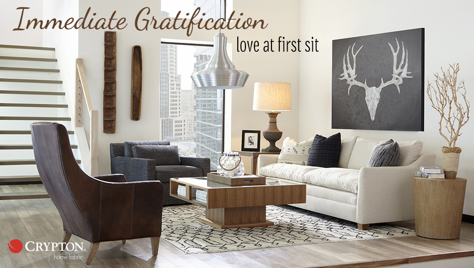
Need pet and family Friendly? Try Crypton Home Fabrics

My home is always full of family and friends. I really LOVE to entertain and find that to be the joy of my life. However, there are those times when my guests leave and I  have a heart attack because I notice a wine or food stain on my furniture that cannot be removed. As I scrub, it becomes worse and worse. I actually have a chair in my garage at the moment for that very reason.

I don't know about you but I want my furniture to be durable, stain resistant and pet resistant so it lasts as long as possible.

  I was recently at Highpoint Market and participated in the Design Bloggers Tour, sponsored by Esteem media.com

Crypton was the sponsor for several of the showrooms that we visited. Their fabrics were scattered throughout each showroom on our tour, including Joybird, Huntington House and the M/T Company.

I wanted to share what I learned about Crypton's amazing, stain resistant fabrics while visiting these fabulous showrooms.

Crypton Home fabric is designed to handle anything your family can dish out, literally.

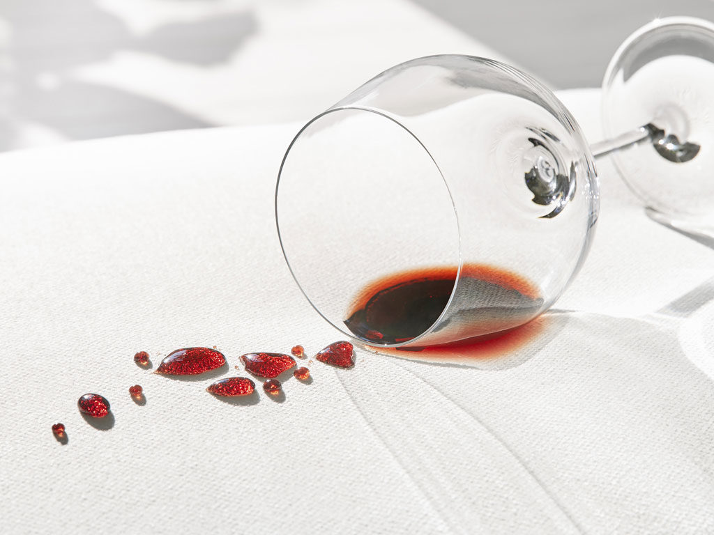
Performance technology is engineered into every fiber, so spills bead up, stains clean easily, and odors don’t cling. They literally poured a bottle of wine on a sofa at the Joybird showroom to show us the durability of the fabrics that have Crypton in them. The wine literally rolled off the sofa!

Crypton Home fabrics are beautiful and functional. They are suitable for heavy-duty indoor use.  With that in mind, I was shocked to see how soft the fabrics feel.  You would think that the fabrics would be rough and stiff but you would never know they have this fabulous product weaved in.

Stain repellency and soil release are built in, so you can clean it easily with soap and water. Crypton fabrics resist odors and are perfect for households with pets.

Our pup, AVA looks so sweet and innocent but she has done some serious damage to one of my chairs recently! I'm investing in some Crypton Fabrics for sure!

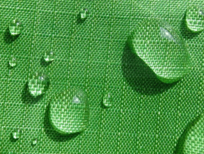
With Crypton, the barrier is permanently integrated into each fiber strand, so you don't need to worry about it ever separating or failing to protect because of extended or heavy use or cleaning. 

See for yourself how this fabric works.

INCREDIBLE RIGHT?

Ask your local designer about these fabrics!

Crypton is available in some retail stores like Joanne's fabrics and Calico Corner, See for yourself and become a fan like me!

Ruthie Staalsen - What my design philosophy is and why!

I wanted to share with you a snippet from my book that was published a few months ago. This portion of my chapter truly describes what I am all about.

Ruthie Book

"My main objective is to create environments that are gathering places for families and friends to do life together.

However, I am about more than that.  I believe that the home is a special hub for the best moments in life.

  It is the place where you watch your kids dance around the kitchen.

It is where you and your hubby carry your kids to their bed because they fell asleep on the couch.


It's where your daughter brings a boy home for the first time, and where  your family laughs around the dinner table so hard that you choke on your food.

Home is where real life happens and sometimes real life is a little bit messy.

That is why I want the homes I decorate to be a place for peace and solitude.  Our society is so busy and hurried that spending time AT HOME is almost a lost art.

My goal is to connect these wonderful moments of life to the home through interior design.

  I have a different perspective on design in that it isn't totally about a specific look.  It's more about finding the soul of the people living in the home, and helping the client find the surroundings that makes them feel good. Decorating is about creating a quality of life, a beauty that nourishes the soul.

Our homes should reflect what we are about, our beliefs, our experiences and family traditions.  After all, homes are not just about nice things, they are about a place where you want to spend time.

I want to be known as the designer that connects these dots."

I'm working on a project at the moment where I get to do exactly what I've described above. I get up each morning, ready to make lives and homes more beautiful!

McKinney Large Island Kitchen Makeover

I just finished up a kitchen renovation this past week.  The client wanted to enlarge their island so it was more functional for their busy family.

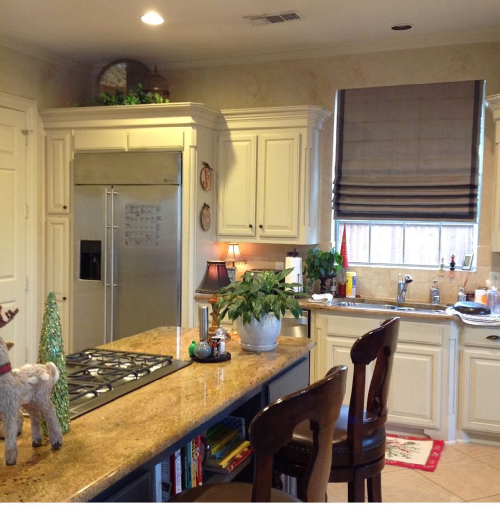
They wanted to keep the existing floor as well as the cabinet color.   I am alwasys happy to work around a budget because sometimes it just isn't affordable to totally gut a kitchen and start over.  I'm know as the designer that can work within the clients budget and pull it all together beautifully.

BEFORE


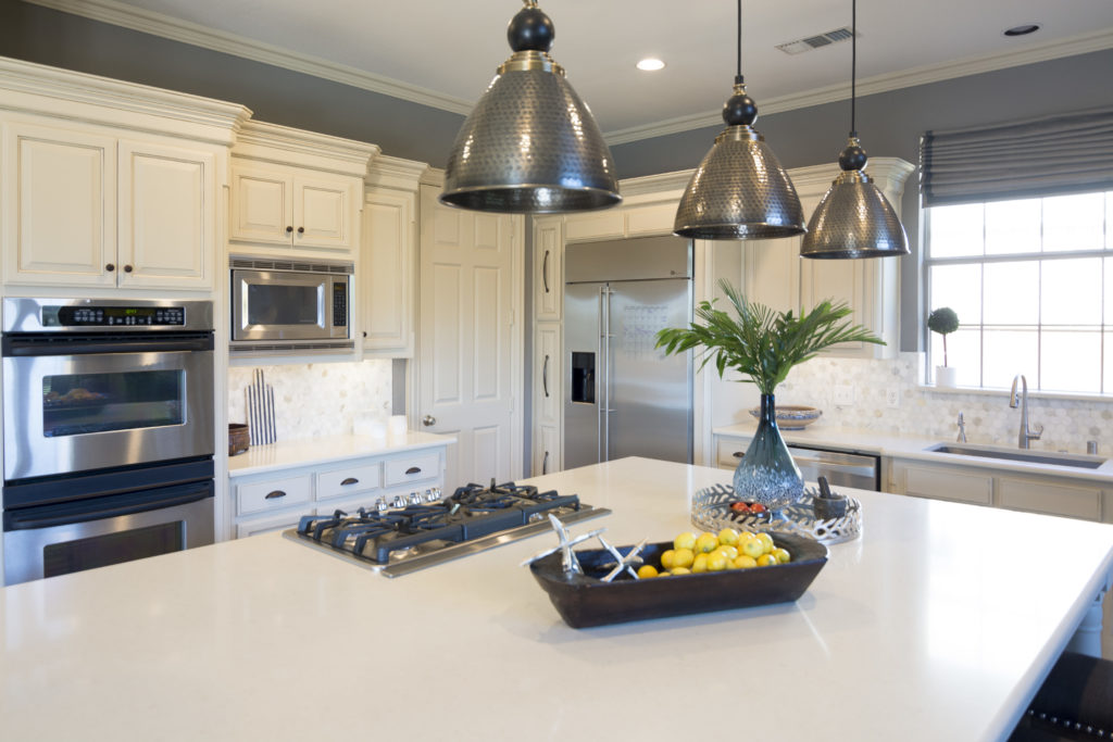
AFTER

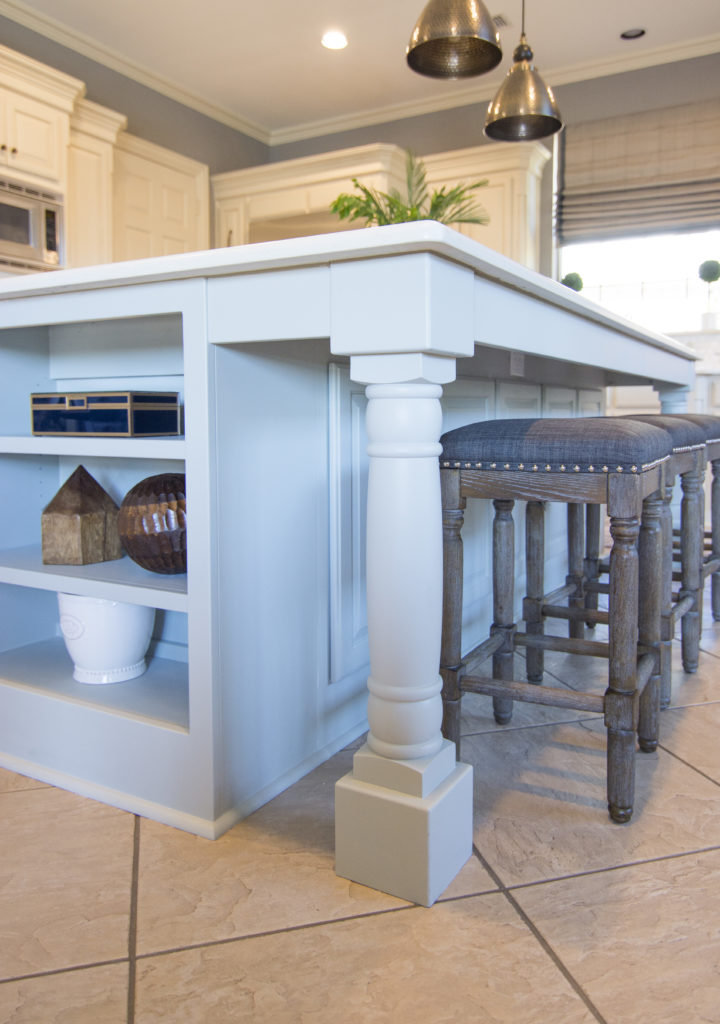
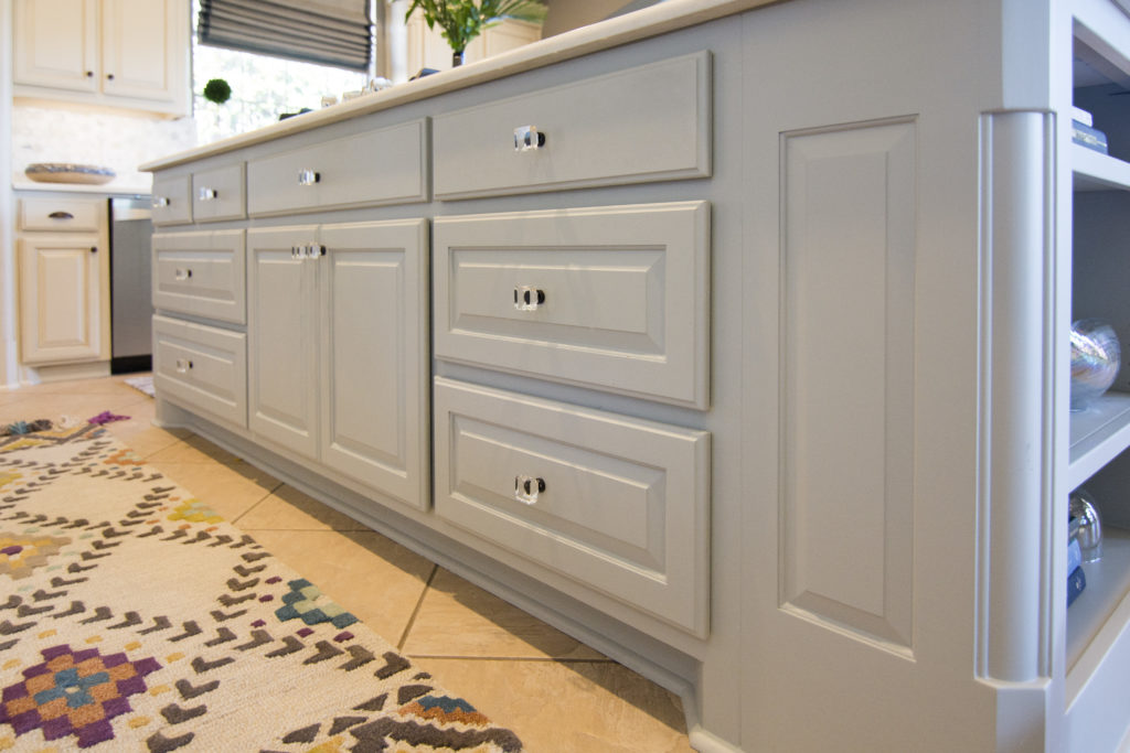
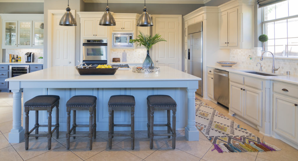
We took out the old island and had a new one made for them.  We added storage to the side of it and some great column legs. We painted the island a nice blue/green color from Sherwin Williams to  make it the center of attention.

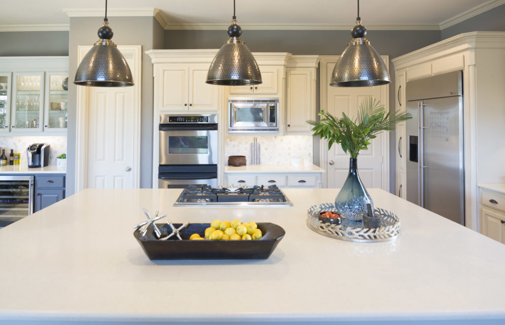
 We chose a creamy white quartz countertop and made sure it worked with the cabinet color. We chose beautifully.

I just love the new legs!  They really add some charm to the kitchen.

We added crystal knobs to the island.  They are brushed bronze like the rest of the cabinets but the crystal makes the island unique.

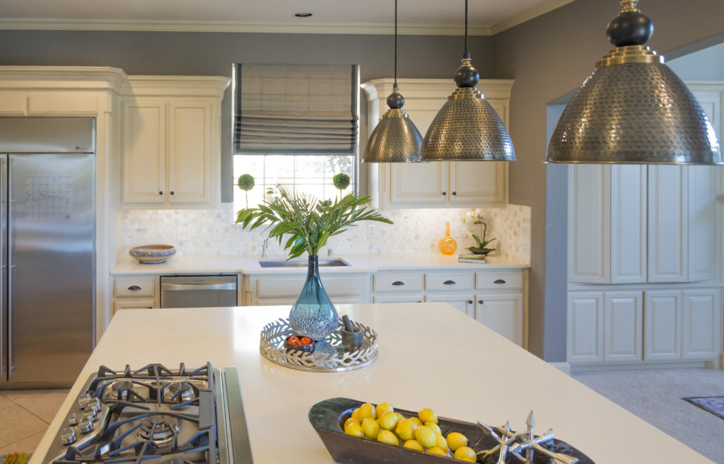
We added 3 new pendant lights and painted the wall too.

BEFORE AND AFTER

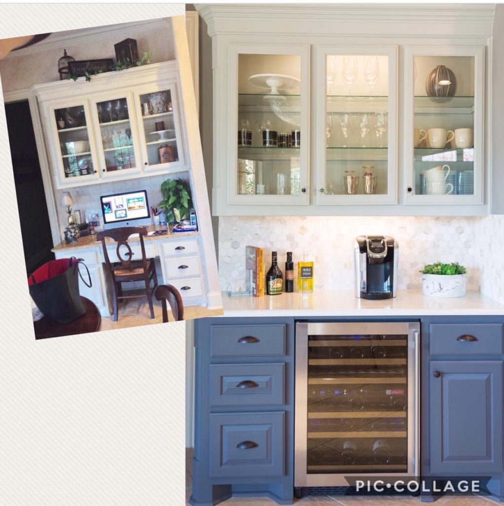
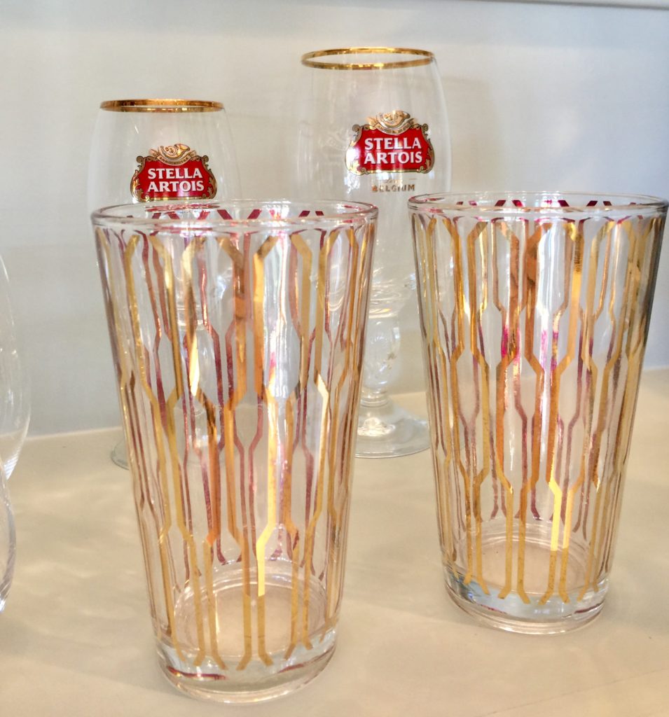
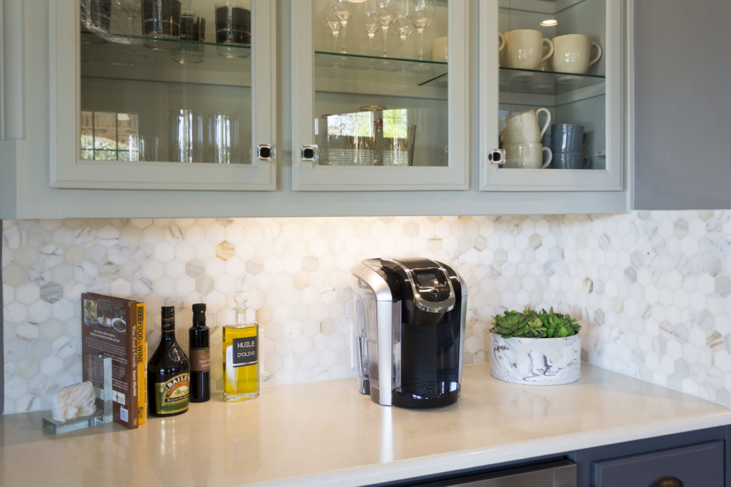
They had a built in desk area that wasn't used too often, other than a dumping ground for clutter.  We turned it into a coffee/wine bar.  We added glass shelving and lighting so we could display some pretty glasses and mugs.  Painting the bottom half darker really made it stand out and gave it a sophisticated, classy look.

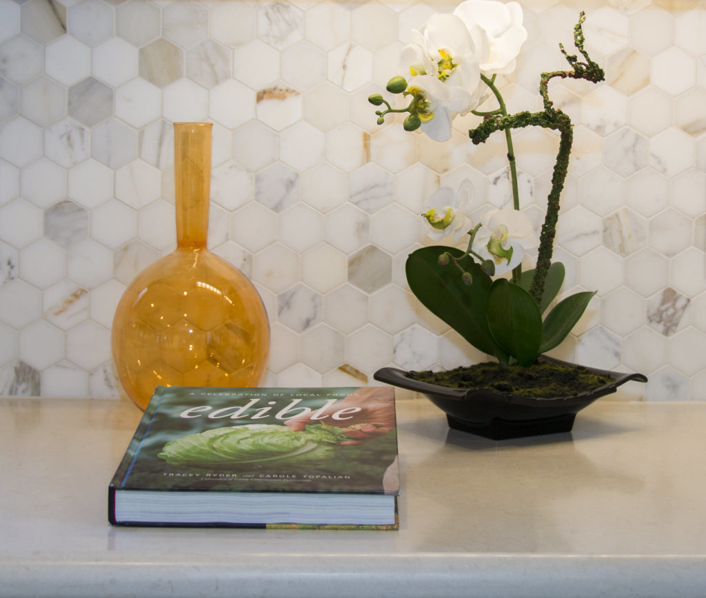
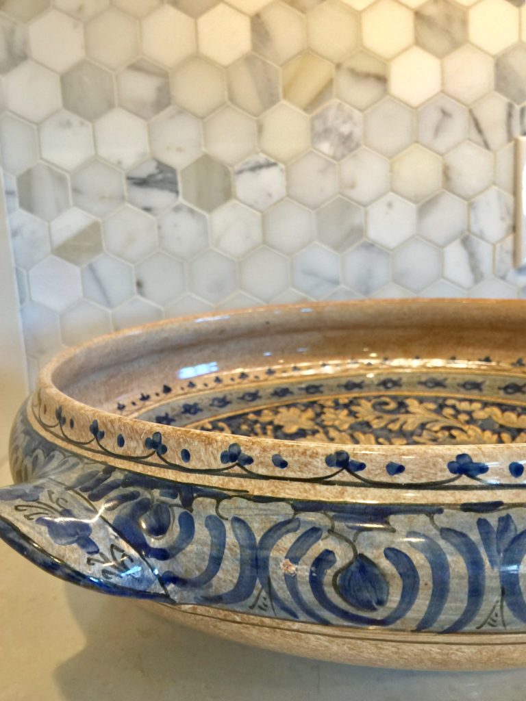
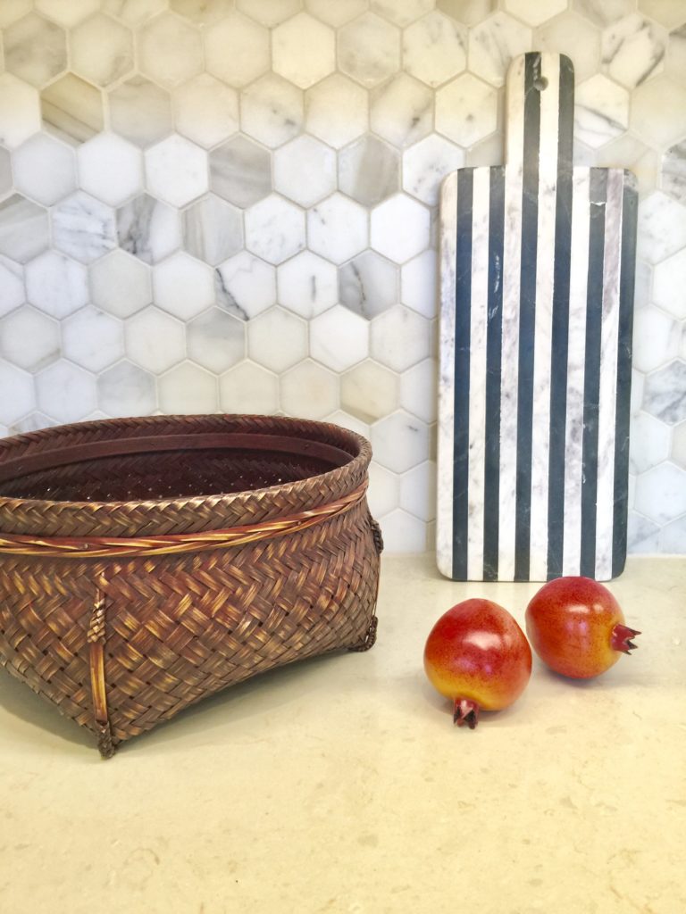
We changed the backsplsh in the entire kitchen.  The honeycomb marble backsplash is to die for and makes the floor we couldn't change work.  There is a touch of the floor color in the marble.

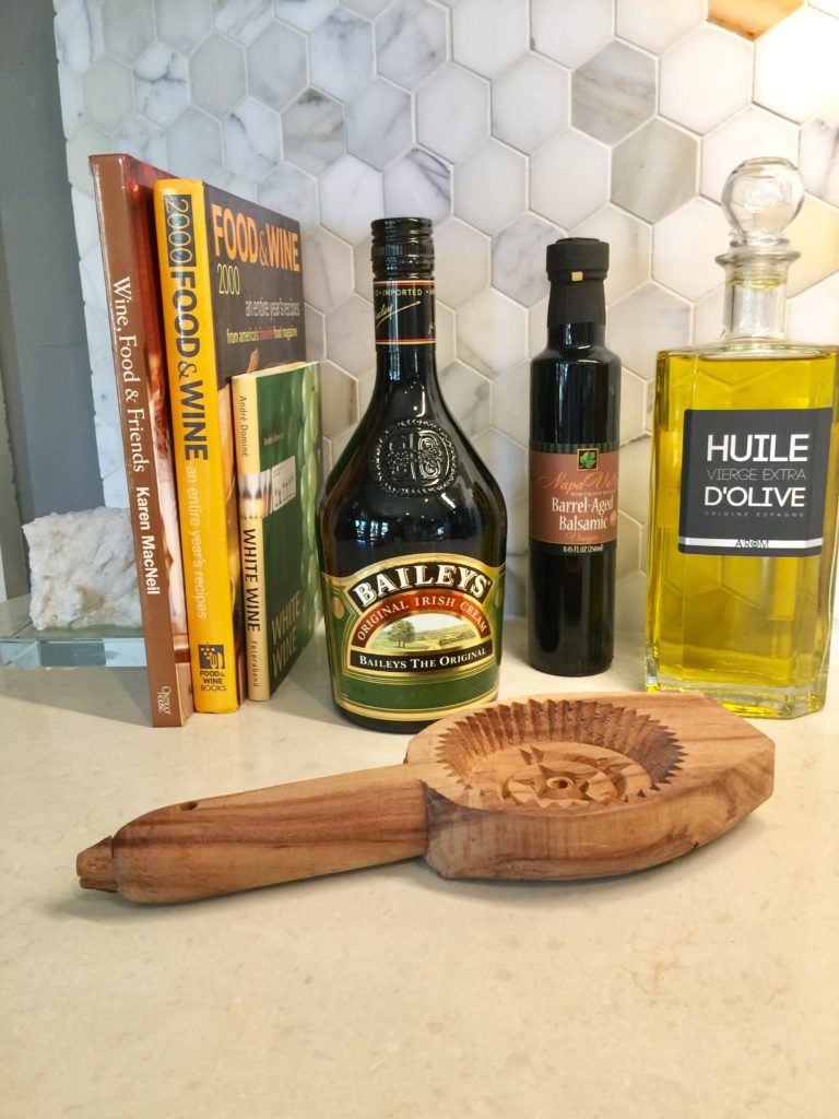
I'm always on the hunt for unique accessories.  I found the above wooden antique pastry press and it adds a touch o whimsy to this bar area.

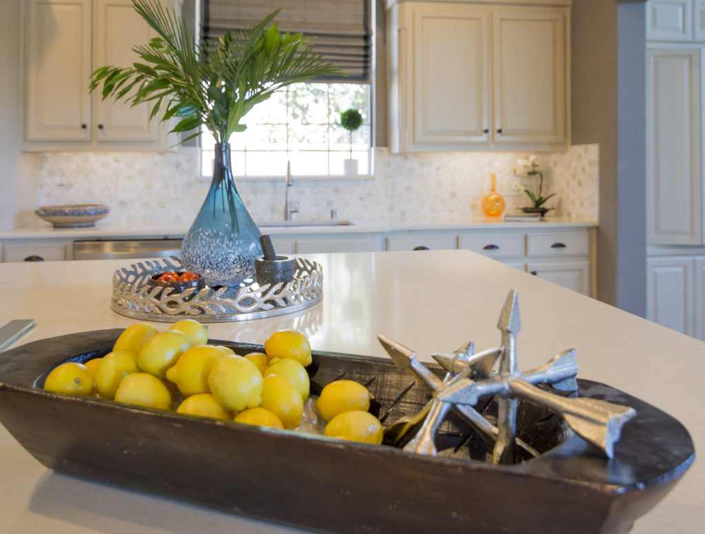
I accessorized the kitchen for them to add some color and texture.

I love adding baskets to my decor.  They add such beautiful texture, especially up against white or cream.

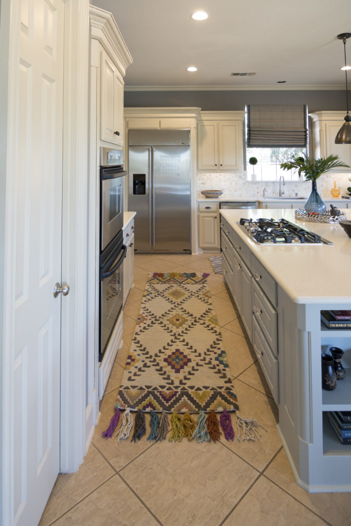
I'm so in love with this Tassel  Loloi Rug that I found!  Totally makes the kitchen come alive.

Hope you enjoyed the tour.