McKinney Large Island Kitchen Makeover

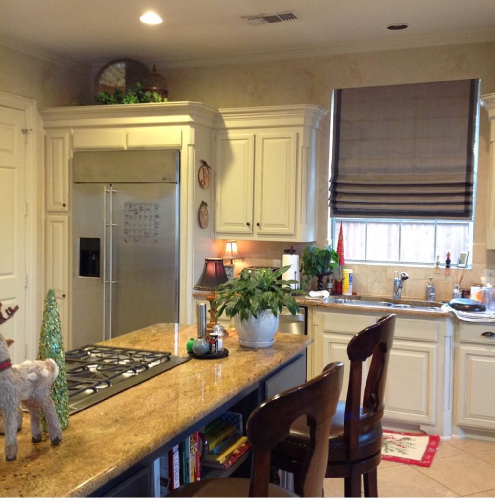
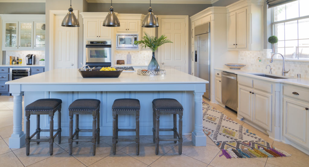
I just finished up a kitchen renovation this past week.  The client wanted to enlarge their island so it was more functional for their busy family.

They wanted to keep the existing floor as well as the cabinet color.   I am alwasys happy to work around a budget because sometimes it just isn't affordable to totally gut a kitchen and start over.  I'm know as the designer that can work within the clients budget and pull it all together beautifully.

BEFORE


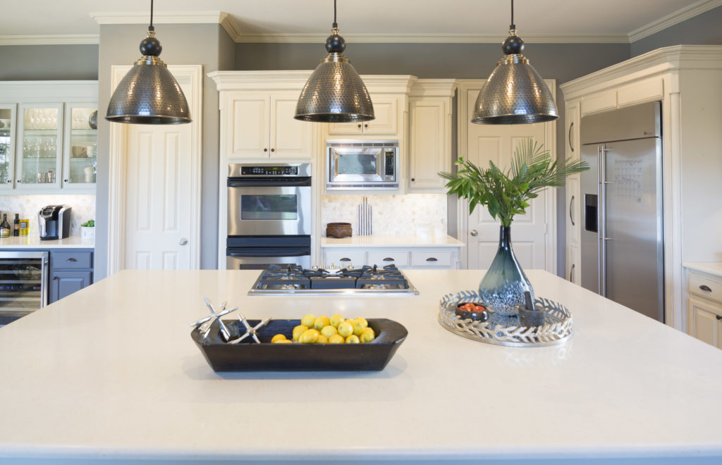
AFTER
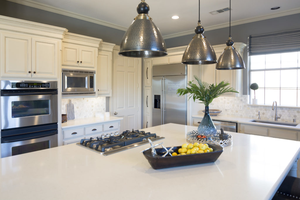
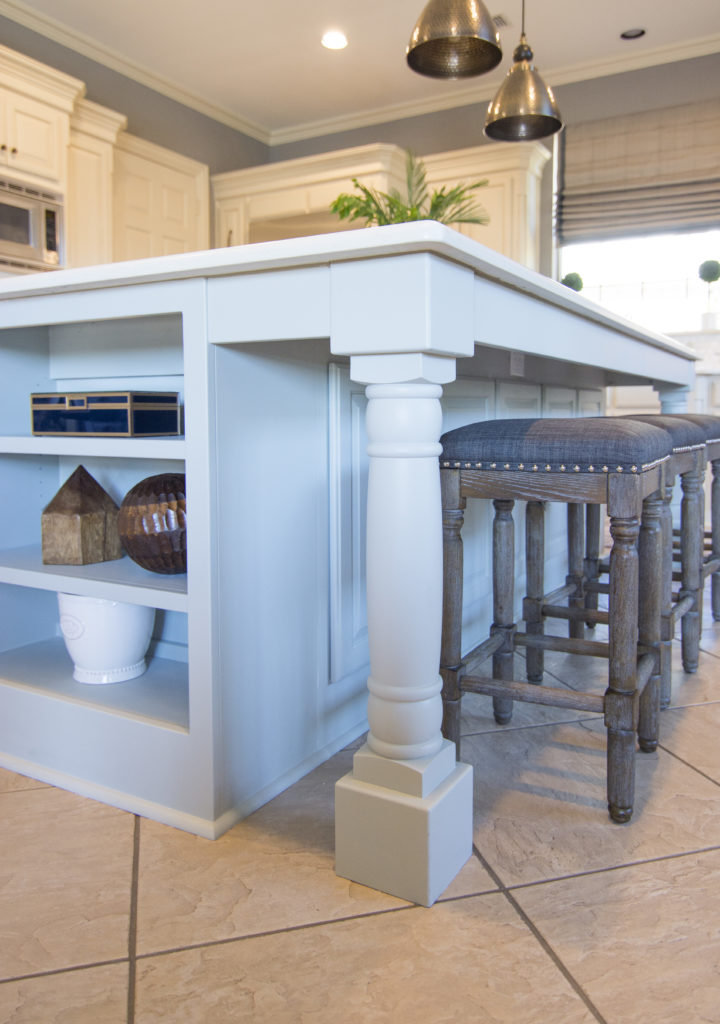
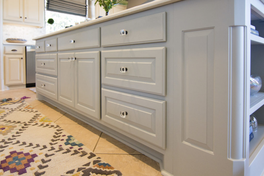
We took out the old island and had a new one made for them.  We added storage to the side of it and some great column legs. We painted the island a nice blue/green color from Sherwin Williams to  make it the center of attention.

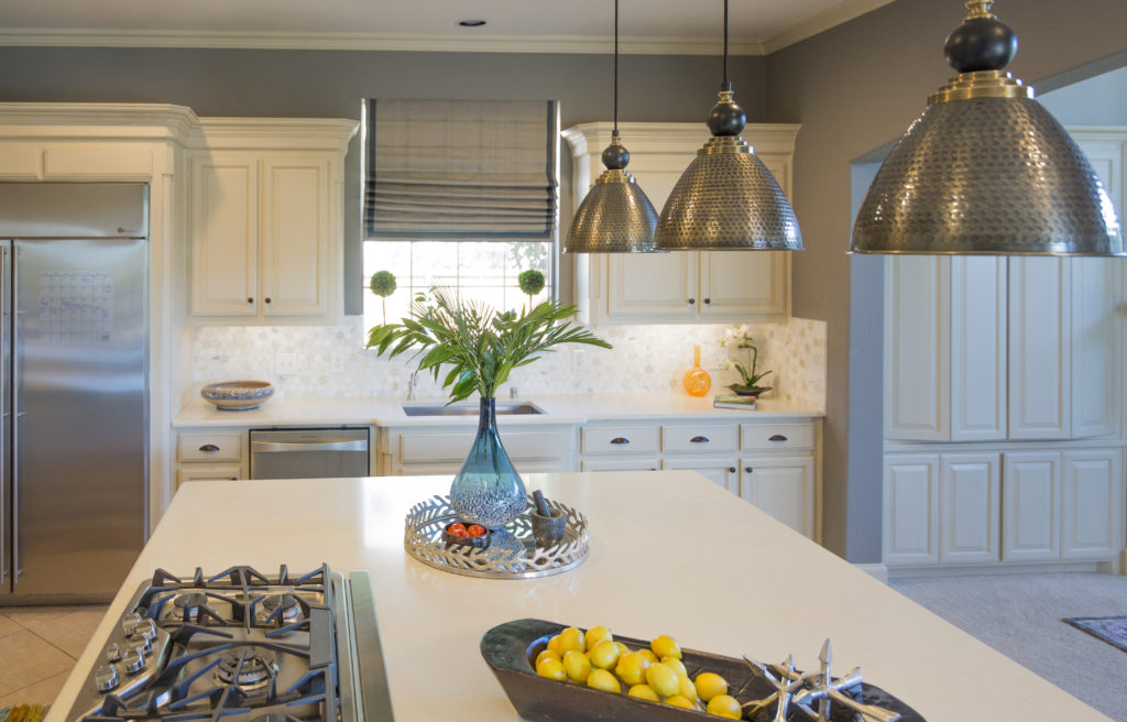
 We chose a creamy white quartz countertop and made sure it worked with the cabinet color. We chose beautifully.

I just love the new legs!  They really add some charm to the kitchen.

We added crystal knobs to the island.  They are brushed bronze like the rest of the cabinets but the crystal makes the island unique.

We added 3 new pendant lights and painted the wall too.

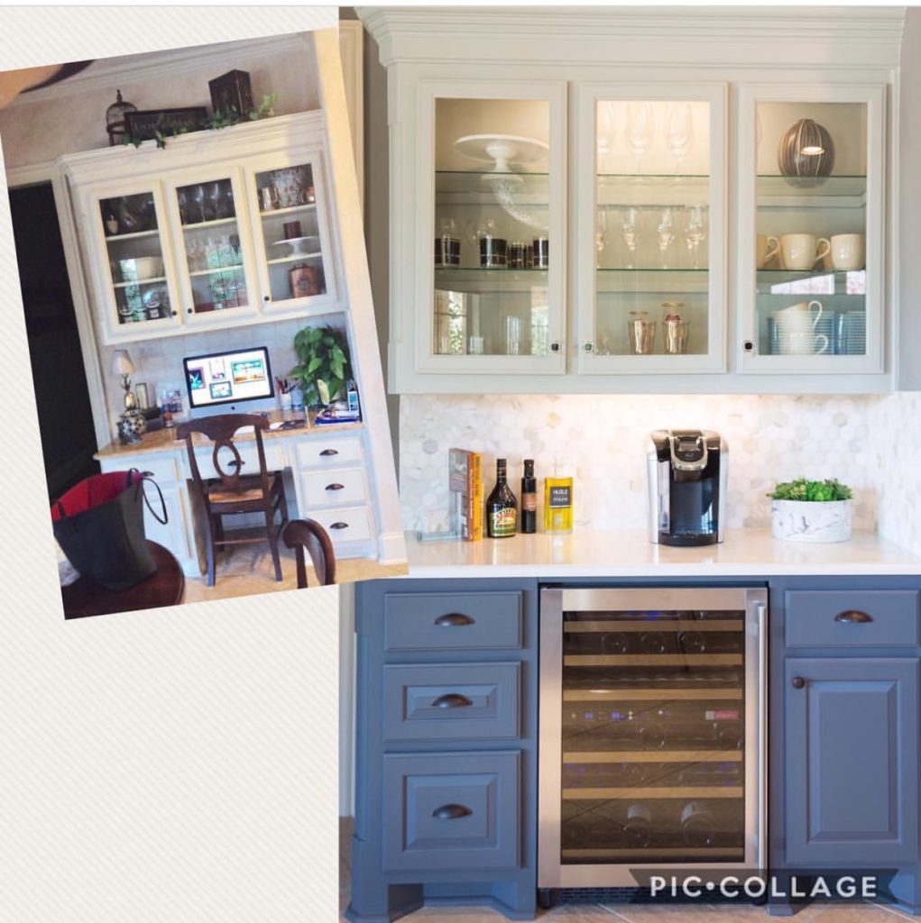
BEFORE AND AFTER

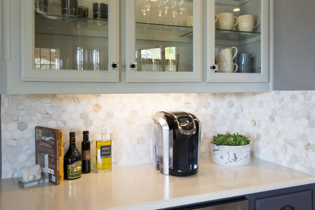
They had a built in desk area that wasn't used too often, other than a dumping ground for clutter.  We turned it into a coffee/wine bar.  We added glass shelving and lighting so we could display some pretty glasses and mugs.  Painting the bottom half darker really made it stand out and gave it a sophisticated, classy look.

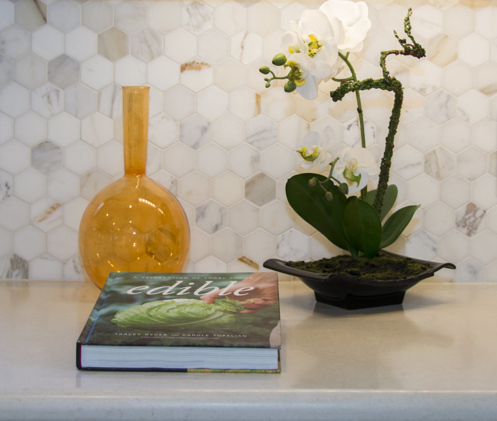
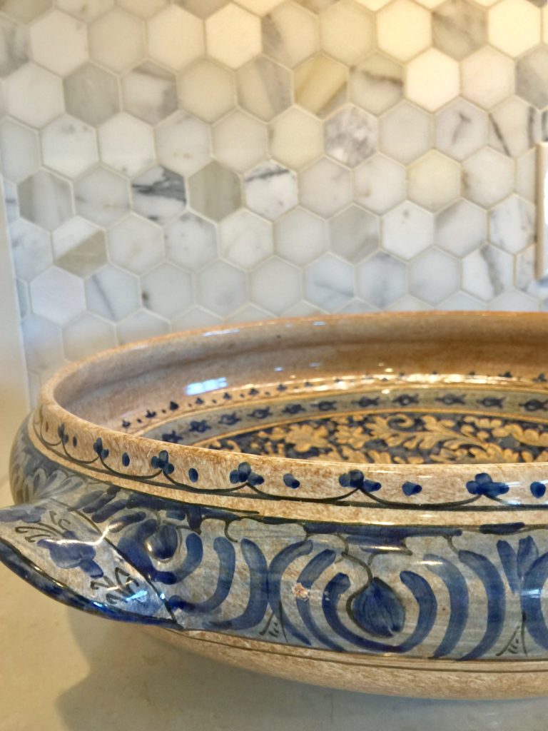
We changed the backsplsh in the entire kitchen.  The honeycomb marble backsplash is to die for and makes the floor we couldn't change work.  There is a touch of the floor color in the marble.

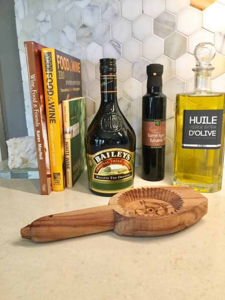
I'm always on the hunt for unique accessories.  I found the above wooden antique pastry press and it adds a touch o whimsy to this bar area.

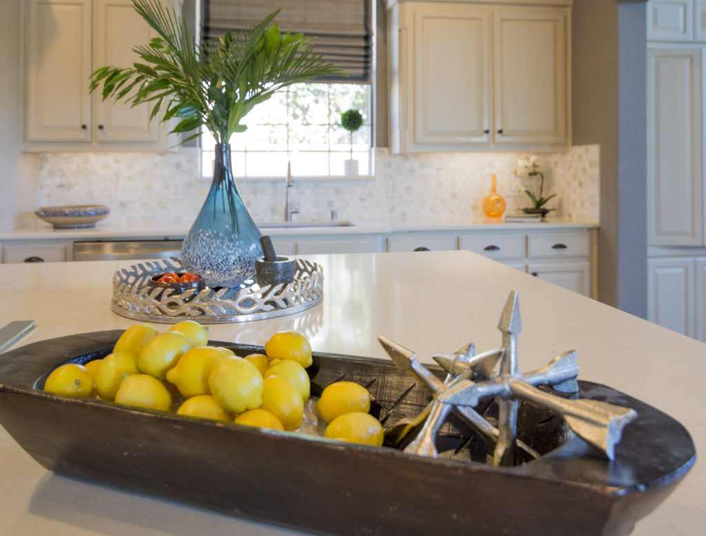
I accessorized the kitchen for them to add some color and texture.

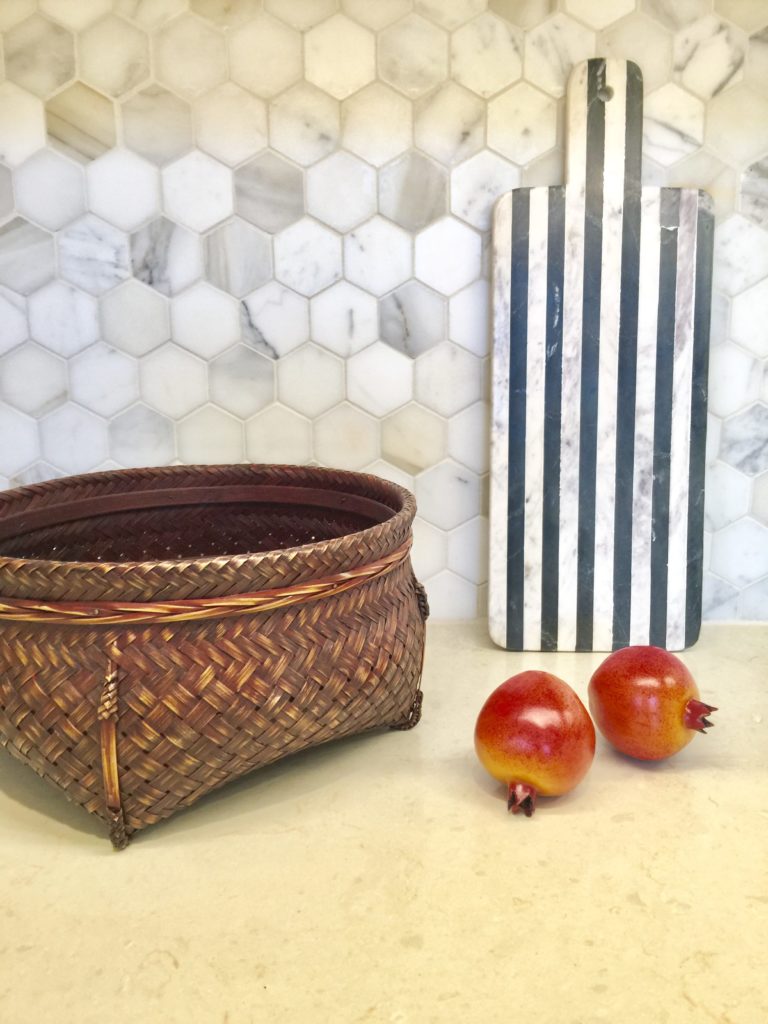
I love adding baskets to my decor.  They add such beautiful texture, especially up against white or cream.

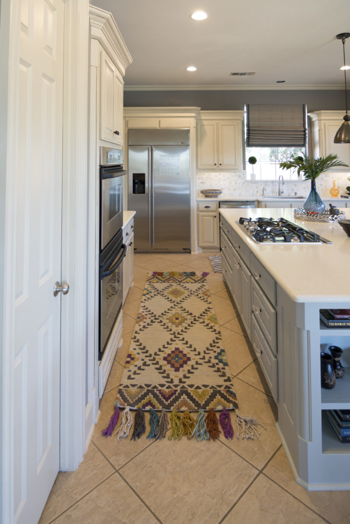
I'm so in love with this Tassel  Loloi Rug that I found!  Totally makes the kitchen come alive.

Hope you enjoyed the tour.


"Rocky" Inspired Kitchen Remodel

 There has been lots of labor going on with DecRenew Interiors the past few months!

decrenew interiors 12

I've been working with these clients on several projects over the years in their home.  The kitchen was Phase II of the projects we have done so far.  Next week we start on all their bathrooms!

Picture8

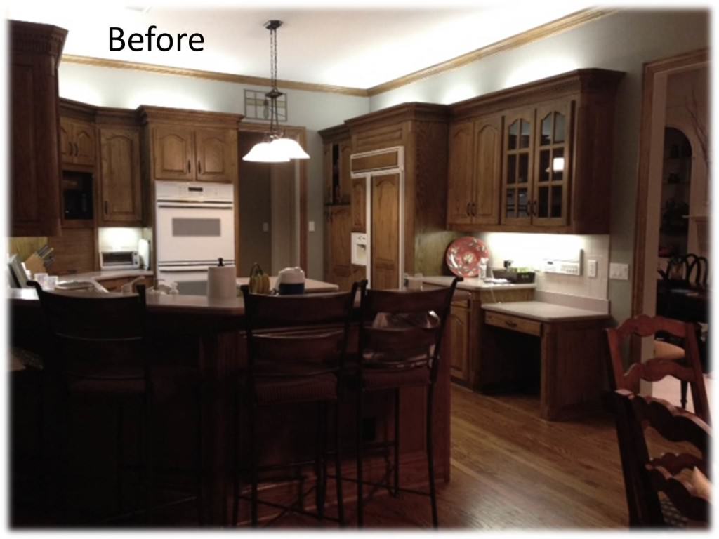
They have a wonderful home in a very wooded area.  They purchased the home because of the amazing backyard and the rustic, casual feel of the home.  They love all the wood that is in the interior but felt that the kitchen was too dark. I totally agreed.
BEFORE

Picture2

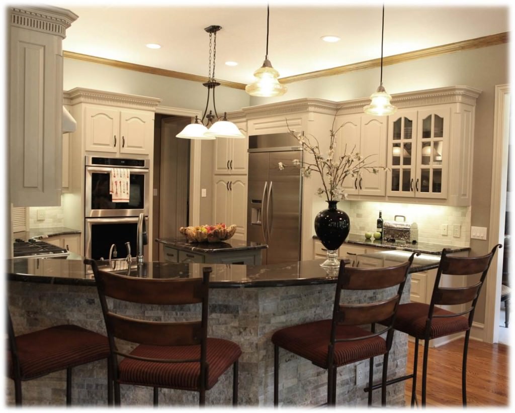
So we lightened it up!  They were really hesitant about changing the kitchen because they didn't want it to feel out of place with the rest of their home.  They were nervous that it would look updated and everything else would look out of date.  I assured them that we could update the kitchen and make it look fantastic with the rest of the rooms that flow from the kitchen.

AFTER

Picture3

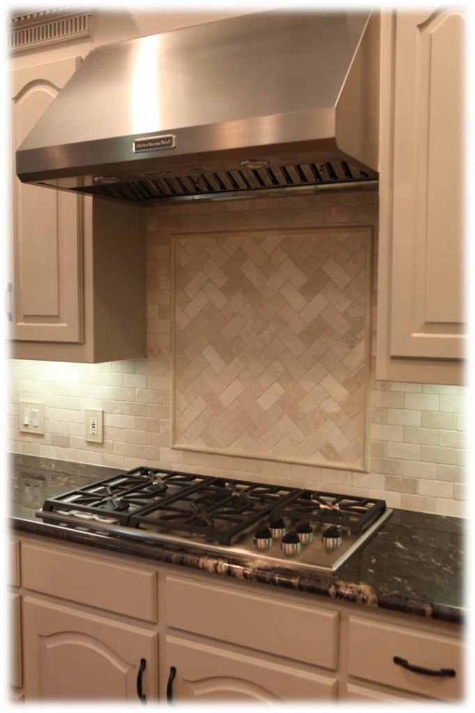
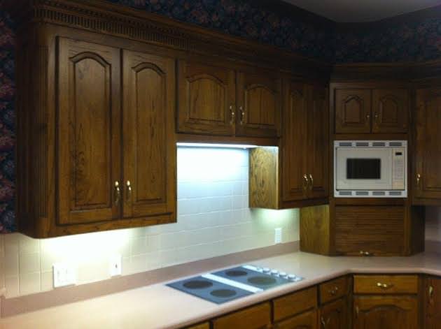
We got to work and selected cabinet color, granite, venta hood, faucet, sink, hardware, stone work for bar, gas stove, double oven, refrigerator and lighting.

BEFORE

before

AFTER

decrenew interiors 12

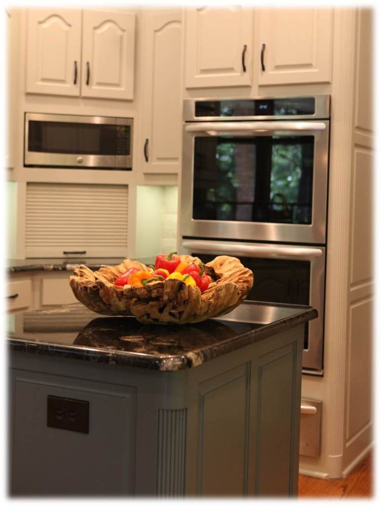
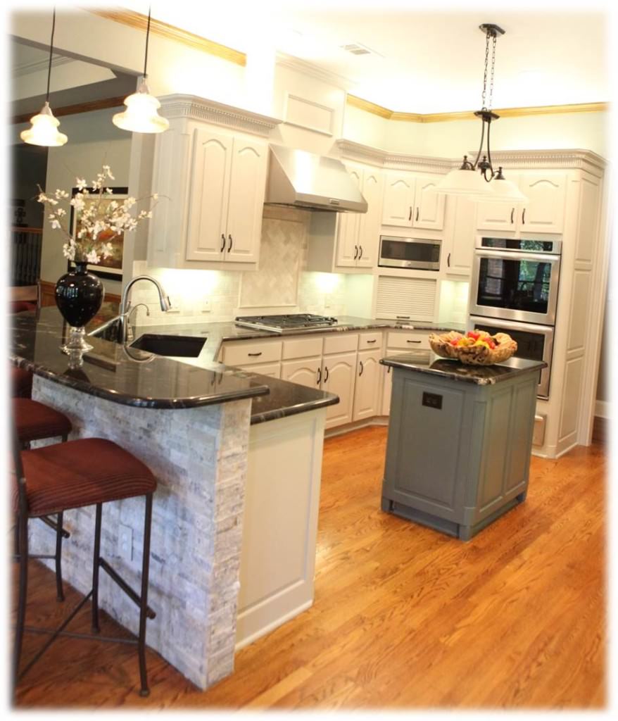
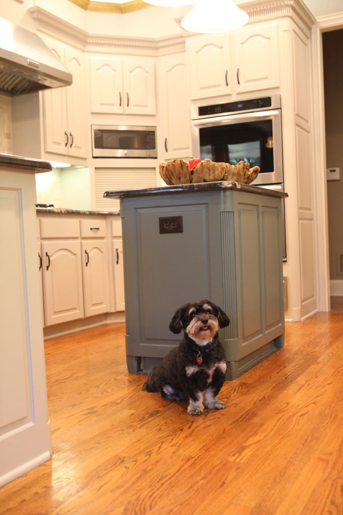
We adjusted the cabinets above the bread box for a bigger microwave.  The island also got a makeover with new legs and a new stylish color.

IMG_7002-317

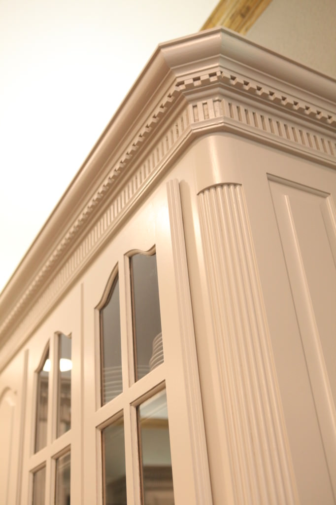
We worked with the paneling in the other rooms and made sure that we kept some consistency in the kitchen with what is going on everywhere else.  We left the crown molding wood so it ties in with the adjacent dining room.

IMG_6905-134

We added new lighting to the cove in the dining room and that really made it look fabulously updated.

Picture6

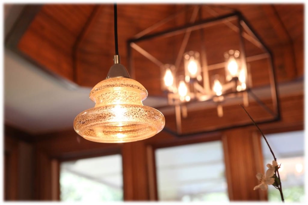
Love these mercury glass pendants that we placed over their curved bar area.  The client wanted to keep her existing island lighting since they had just replaced it a year ago.

Picture1

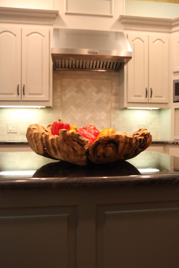
The granite we selected was the one thing that my client was terrified of.  She felt like it would make the kitchen darker.  I assured her that it would be the focal point in the kitchen and would be beautiful with the woodwork in the home.

Picture8

AFTER

decrenew interiors 13

BEFORE

8-30-2014 12-14-06 PM

AFTER

 decrenew interiors 20

So bright and still looks very warm!

decrenew interiors 18

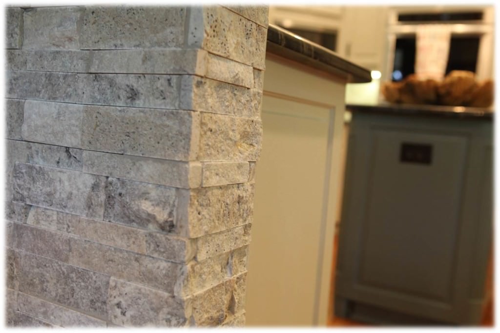
The stone work on the bar is my favorite, it really makes the kitchen fresh and it adds a masculine feel to the space.

IMG_7011-326

Rocky the dog is happy because his coloring matches the kitchen beautifully!

I'm now taking the long weekend off to hang with my family! Hope you take time to enjoy Labor Day too!

Kitchen Renovation Sneak Peak

Today I finished up my part of a kitchen remodel that we have been working on for the last 5 weeks.  My team has been working hard to get it completed so my client can get back to regular family life in her kitchen.  Here are some up close shots of the details.  I'll be posting before and after pictures of the whole room soon.
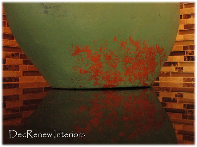
I loved this picture of this turquoise vase on her new counter top.  I happen to set my camera down and came back later and caught a glimpse of this capture on my screen.  I'm glad I decided  to take this shot because it's my favorite.    The textures are so beautiful and represent all the colors we used in this kitchen.  Her laundry room that adjoins her kitchen is going to be painted this wonderful turquoise in Phase II of this project.
We painted the walls Sherman Williams "Brandy Wine" including the ceilings, making the room feel incredibly warm and inviting.  Yeah, no more popcorn ceilings.  Wait until you see the lighting in this new kitchen!!!!
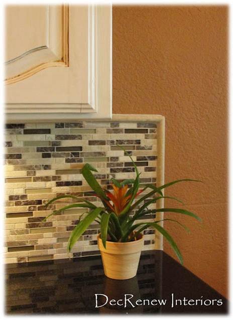
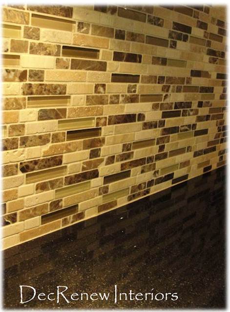
The new back splash has tumbled stone, granite and glass tiles that make a huge statement when you enter the room.
We had a cabinet custom built for her new double oven.
The black counter tops are the jewel in the room!  The light ceramic floor tile has opened the room and makes this galley kitchen feel more open and airy.  The thin grout lines were a big part of making this tile look so fabulous!
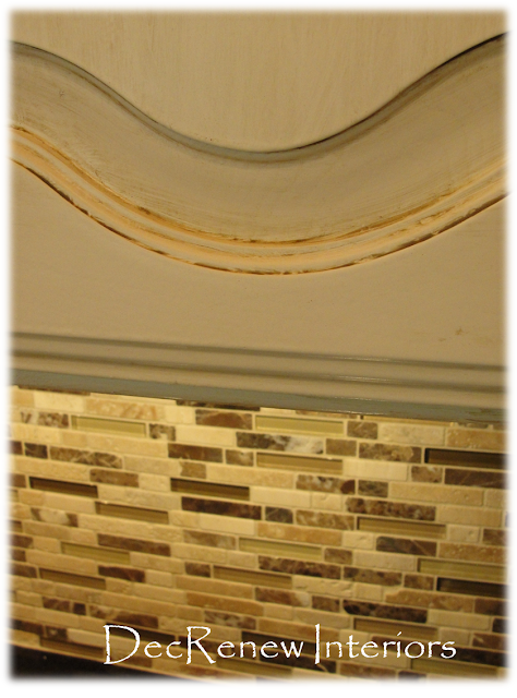
The cabinets got a fresh new coat of paint (yeah, no more pickled wood) and now have an old world finish that looks stunning with the back splash!
Can't wait to show you the rest of it!
If you would like to see more of my work, visit my website  DecRenew Interiors to see my Design Portfolio.
(All above photo's taken by Ruthie Staalsen)