Transitional Southlake Kitchen Remodel

_DSC9285

It is always such a wonderful feeling to complete a remodel.  I always feels so bad for the clients that have to live in the space while the chaos is going on.

_DSC9323

 This kitchen got a total transformation. Originally it had 2 islands which really was not very functional.  The cabinets were too busy and they needed a lift with a fresh color.  The pickled "pink wood" is no longer in as we all know.

_DSC9191

before and after

 As you can see, we left all the appliances.  We made one large island,  extended the cabinets to the ceiling and added glass cabinets with lighting.  We refaced the cabinet doors so they weren't so fussy, added undercounter lighting, took out the desk area and made it into a mini bar with a wine refrigerator.

_DSC9225

New backsplash, granite and hardware.  The lighting in the shelving really makes the accessories look beautiful.  I really love the rain glass for cabinets.  Allows you to see the items but hides the dust.

_DSC9325

 Don't you just love the tile wall behind the shelves?  The hardware on the cabinets is fab too.

Ruthie Tip:  If you want to do a quick update to your kitchen, hardware is a great way to revamp it instantly.

_DSC9197

_DSC9260

_DSC9265

_DSC9261

New recessed lighting.  We also moved all the plugs down so that they aren't in the middle of our beautiful backsplash!

_DSC9281

 The island is the star in this kitchen.  The pendant light is from "Restoration Hardware."  I LOVE IT!

_DSC9191

We added a pull out garbage drawer and some extra storage.  We painted the island a different color than the cabinets, it really makes it feel rich.

_DSC9321

Gorgeous granite!

_DSC9282

 We made the pantry door taller to match the other doorways in the home.  Amazing the difference that made!

_DSC9255

Added accessories and it was a wrap!

_DSC9275

_DSC9292

_DSC9297

_DSC9341

Don't you just love the glass backsplash all the way around the windows?

_DSC9316

New hardwood floors throughout the entire downstairs really makes this kitchen so warm!

Now it's the perfect kitchen for entertaining!

_DSC9308

Thanks to Debbie for allowing me to make her home beautiful and to T. Lamar Photography for doing such a great job with the photo shoot!

_DSC9332

Traditional Home Magazine & Great Kitchen's Digital Edition!

Sneek Peek
 
 
Several months ago I received information about a Traditional Home contest and immediately felt it would be something I should enter. (see above).
 
 
They gave us an option to choose from 5 categories. 
 
1.  The Ultimate Kitchen
2. Entertaining Secrets
3. Favorite Kitchen Designer
4. At Home Event Theme & Menu
5. Best Dressed Table
 
 I couldn't decide whether I wanted to enter for the "Best Dressed Table" or enter one of my Kitchens in the "Ultimate Kitchen" category. 
 
 
As you know if you follow my blog, I'm not only crazy about decorating and design, I'm passionate about entertaining, food, parties, gathering friends and families together and all things beautiful! 
 
 
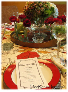
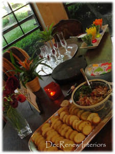
 I wrote a post last year about one of the Gourmet Dinner club parties that my husband and I hosted.  See the Tablescape, Food & Menu that I thought would have been great for the "Best Dressed Table" or "At Home Event Theme and Menu" submission.


In the end I decided to enter one of my kitchen remodels that I am so passionate about.  One of the main reasons is that it has a fabulous family story that I knew many would LOVE and enjoy if I shared it!  The kitchen is absolutely gorgeous too because my client has great taste!  I checked with her to make sure it would be okay to submit the entry and she was elated.  My client and I shared fun & happy moments and as I worked on this kitchen with my contracting crew.  My team grew to love their family and were sad when the job was over.  She even made all the guys her famous "iced"  brownies when the job was done and they devoured the entire pan.  They said they were "off the chain", An expression that I had never heard!!
 
I collected my thoughts, pictures, etc. and submitted my kitchen with crossed fingers and held my breath, hoping that I would win......


Well, the other day I was notified by Traditional Home Magazine that my kitchen (my client's kitchen to be correct) did win in this contest!!! 
 
I am beside excited and so is my client!  Thank you Traditional Home for this honor of being chosen.
 
 
My kitchen remodel will be a part of the Great Kitchens Digital Edition, full of fresh inspiration—from design tricks and cooking tips to entertaining must-haves that will be live May 24th so keep a watch out for it! 
 
A sneak peek into the kitchen.


Traditional Home is also having a Great Kitchens Sweepstakes. Enter for a chance to shop, cook, eat, and enjoy California hospitality alongside Thermador chefs, Traditional Home editors, and the bloggers and designers featured in our Great Kitchens online magazine at the Thermador Design & Experience Center! One lucky winner and guest will have the chance to join the celebration, July 22-24, in Irvine, California. 
YOU can Enter to win here.
 
Thanks for being excited for me!
 

Kitchen Renovation Sneak Peak

Today I finished up my part of a kitchen remodel that we have been working on for the last 5 weeks.  My team has been working hard to get it completed so my client can get back to regular family life in her kitchen.  Here are some up close shots of the details.  I'll be posting before and after pictures of the whole room soon.
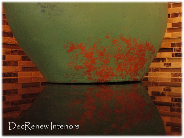
I loved this picture of this turquoise vase on her new counter top.  I happen to set my camera down and came back later and caught a glimpse of this capture on my screen.  I'm glad I decided  to take this shot because it's my favorite.    The textures are so beautiful and represent all the colors we used in this kitchen.  Her laundry room that adjoins her kitchen is going to be painted this wonderful turquoise in Phase II of this project.
We painted the walls Sherman Williams "Brandy Wine" including the ceilings, making the room feel incredibly warm and inviting.  Yeah, no more popcorn ceilings.  Wait until you see the lighting in this new kitchen!!!!
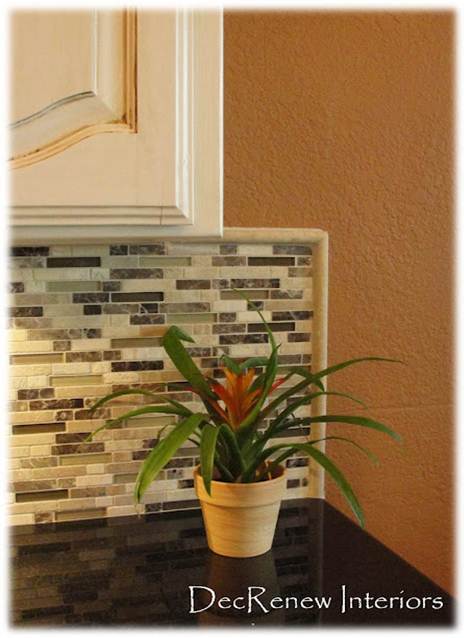
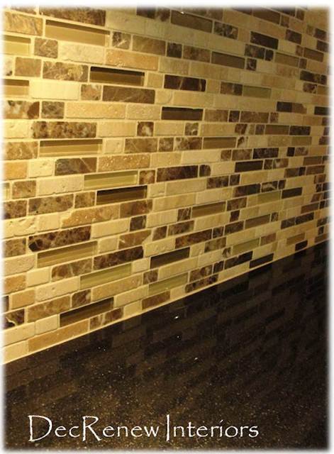
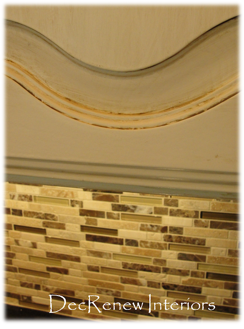
The new back splash has tumbled stone, granite and glass tiles that make a huge statement when you enter the room.
We had a cabinet custom built for her new double oven.
The black counter tops are the jewel in the room!  The light ceramic floor tile has opened the room and makes this galley kitchen feel more open and airy.  The thin grout lines were a big part of making this tile look so fabulous!
The cabinets got a fresh new coat of paint (yeah, no more pickled wood) and now have an old world finish that looks stunning with the back splash!
Can't wait to show you the rest of it!
If you would like to see more of my work, visit my website  DecRenew Interiors to see my Design Portfolio.
(All above photo's taken by Ruthie Staalsen)

Kitchen Sitting Rooms

(Reihl Designs)
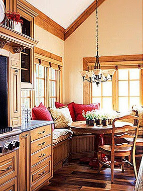
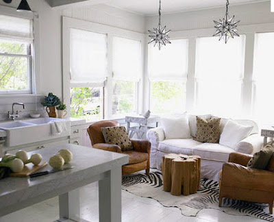
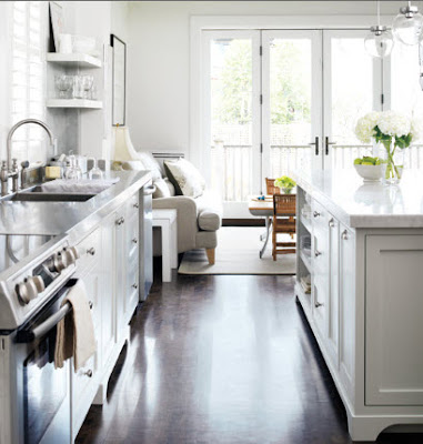
I love a kitchen that has a little sitting area.  We all gather in the kitchen and it totally makes sense to have a couple comfortable chairs in the kitchen for those that you are entertaining. 
Most kitchens these days allow for a kitchen table to be in the kitchen.  However, if you have two eating areas in your home you have options.
(Apartment Therapy)
If your kids are grown and you really don't have a need for a table then I'd suggest you get rid of it and turn the area into a sitting area.
(Horchow)
Purchase 2 comfy chairs and if you have room, get some ottomans too.  Create a wonderful area where you can curl up and read or chat with your husband or with a friend. 
(House Beautiful)
Or you can go all out and create an entire sitting area.  You should USE the space in your home.  If it's not working for you with table and chairs, make it an area for great conversation.
The above eclectic mix has such style.
(Traditional Home)
I'm still in the stage where I need my kitchen table.  However, I'm in the process of trying to find great comfortable chairs to go with my farm table.
This photo above is ideal!  A wing back chair, wicker chairs and a sofa!  Conversational and practical for family meals as well as incorporating the table so it's functional for the family meals.
(Richard Taylor Architects)
It's not always possible to have extra furniture in your kitchen but this kitchen looks like there is plenty of room to have a table and a sitting area.
(Style at Home.com)
This kitchen definitely has a "gathering place"
Sweet!
Just because your "eat in area" is meant to be for a table doesn't mean you have to do it that way.  Mix it up and make your home work for your lifestyle!
Visit my website DecRenew Interiors to see my before and after portfolio.

Kitchen Island Makeover

BEFORE

What a beautiful kitchen!  My client loves the flow of this kitchen and the feel.  My job was to come in and add some spunk and personality to it.  Notice that everything in this kitchen is the same color.  There is nothing that truly grounds it and makes it feel personalized. 
AFTER

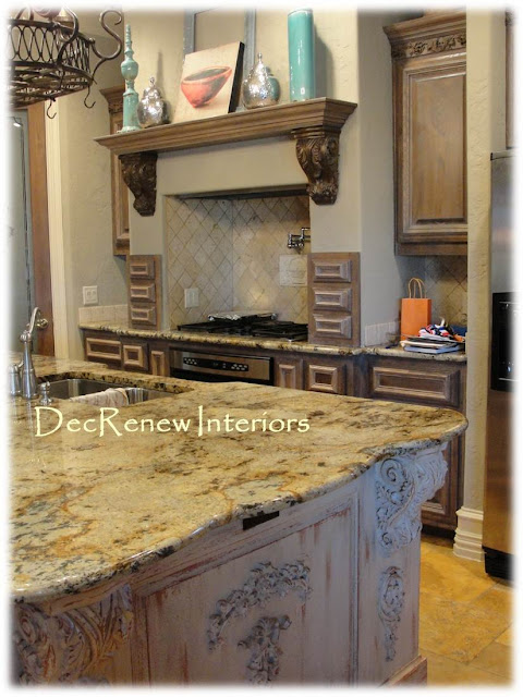
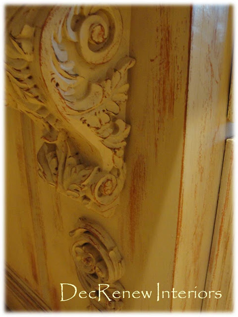
I lightened the kitchen up by having the main center island faux refinished in this wonderful distressed patina.  The island had LOTS of ornate work that seemed to dominate and over power the room.  This technique toned all of  it down and made it more beautiful.  The island is now the artwork in the space!

  I did take down the scrollyscroll work below the shelf.  See in the above "BEFORE" picture.  It was just too much of a good thing.
The color we used for the base color was the color that we used on the walls in the adjoining room.
Perfection and the client LOVED it!
The wall color! 
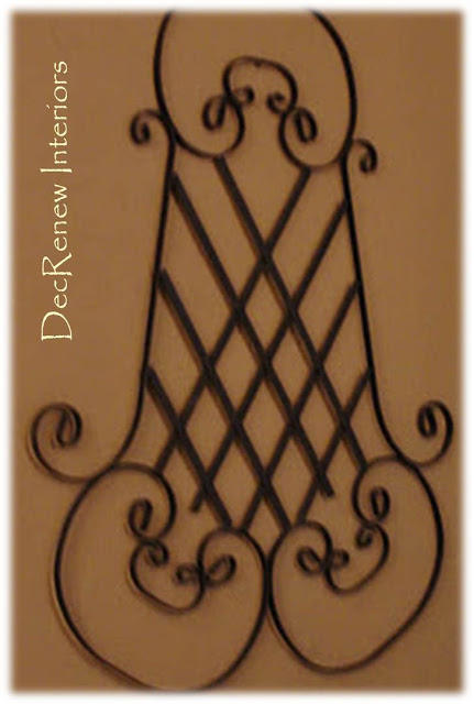
Found this wrought iron piece at an antique store and thought it went beautifully with the artwork I chose for the room.
The color goes beautifully with the stone too making the rooms flow together!
Think about painting your kitchen island!  It can change the look of the space instantly.
I'm dragging Christmas out of my attic today, wish me luck!
Visit DecRenew Interiors to see my before and after portfolio.