BEFORE
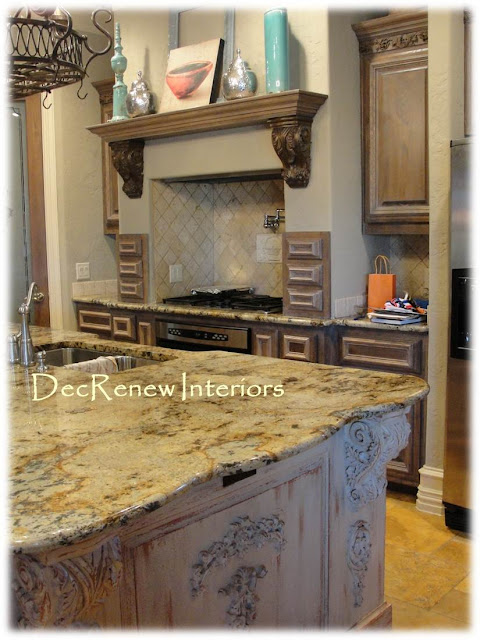
What a beautiful kitchen! My client loves the flow of this kitchen and the feel. My job was to come in and add some spunk and personality to it. Notice that everything in this kitchen is the same color. There is nothing that truly grounds it and makes it feel personalized.
AFTER
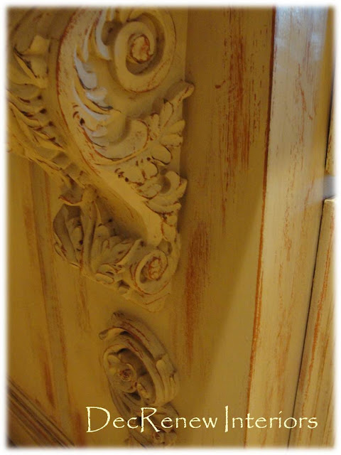
I lightened the kitchen up by having the main center island faux refinished in this wonderful distressed patina. The island had LOTS of ornate work that seemed to dominate and over power the room. This technique toned all of it down and made it more beautiful. The island is now the artwork in the space!
I did take down the scrollyscroll work below the shelf. See in the above "BEFORE" picture. It was just too much of a good thing.
The color we used for the base color was the color that we used on the walls in the adjoining room.
Perfection and the client LOVED it!
The wall color!
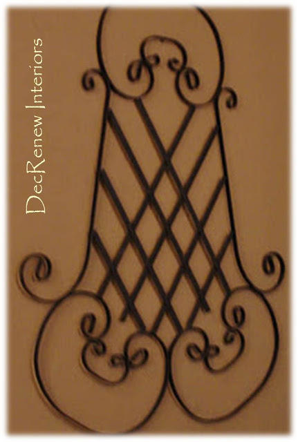
Found this wrought iron piece at an antique store and thought it went beautifully with the artwork I chose for the room.
The color goes beautifully with the stone too making the rooms flow together!
Think about painting your kitchen island! It can change the look of the space instantly.
I'm dragging Christmas out of my attic today, wish me luck!
Visit DecRenew Interiors to see my before and after portfolio.


