"Rocky" Inspired Kitchen Remodel

 There has been lots of labor going on with DecRenew Interiors the past few months!

decrenew interiors 12

I've been working with these clients on several projects over the years in their home.  The kitchen was Phase II of the projects we have done so far.  Next week we start on all their bathrooms!

Picture8

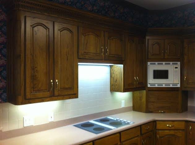
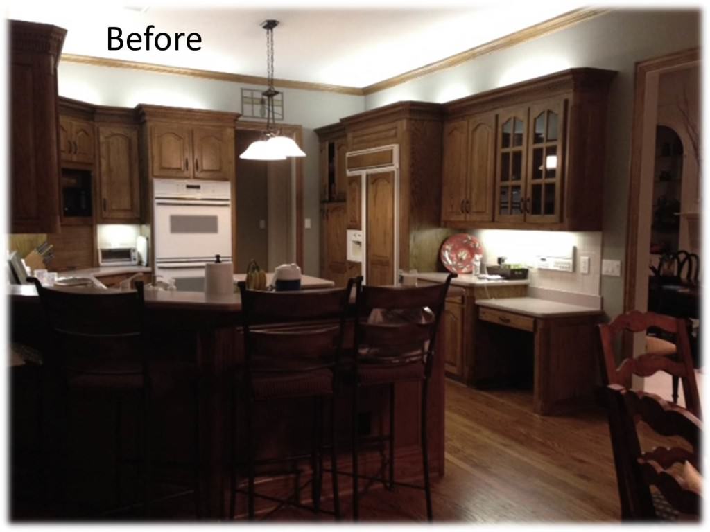
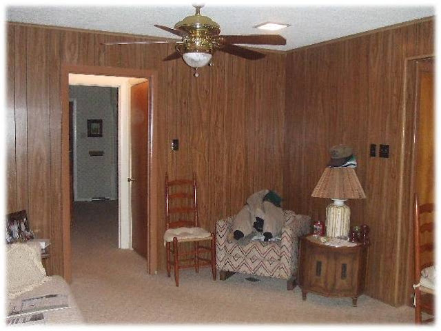
They have a wonderful home in a very wooded area.  They purchased the home because of the amazing backyard and the rustic, casual feel of the home.  They love all the wood that is in the interior but felt that the kitchen was too dark. I totally agreed.

BEFORE

Picture2

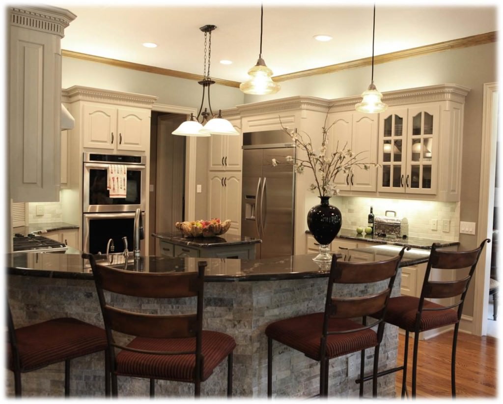
So we lightened it up!  They were really hesitant about changing the kitchen because they didn't want it to feel out of place with the rest of their home.  They were nervous that it would look updated and everything else would look out of date.  I assured them that we could update the kitchen and make it look fantastic with the rest of the rooms that flow from the kitchen.

AFTER

Picture3

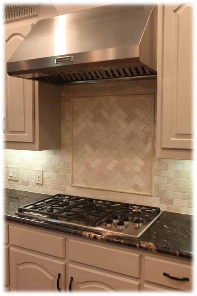
We got to work and selected cabinet color, granite, venta hood, faucet, sink, hardware, stone work for bar, gas stove, double oven, refrigerator and lighting.

BEFORE

before

AFTER

decrenew interiors 12

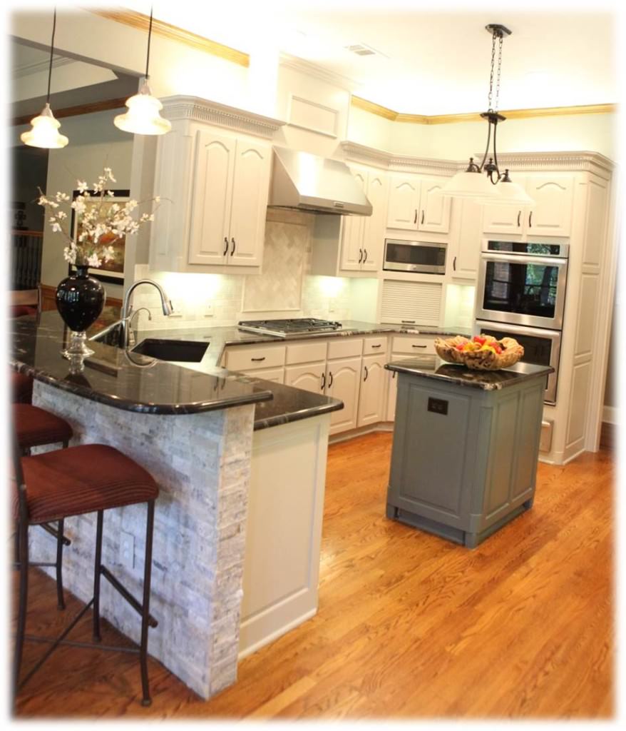
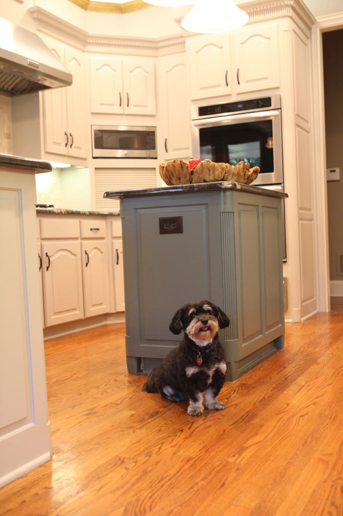
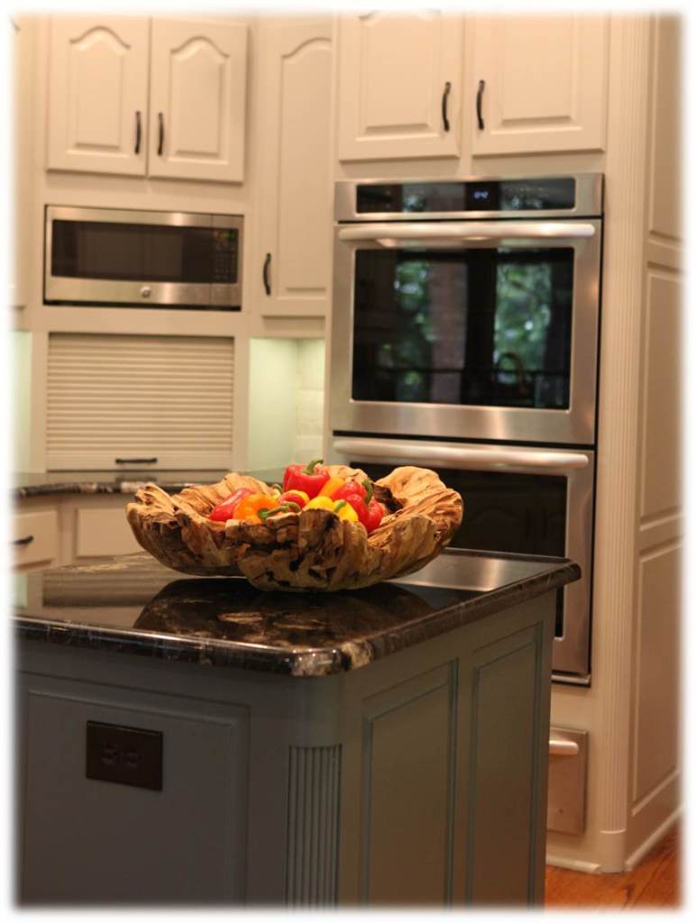
We adjusted the cabinets above the bread box for a bigger microwave.  The island also got a makeover with new legs and a new stylish color.

IMG_7002-317

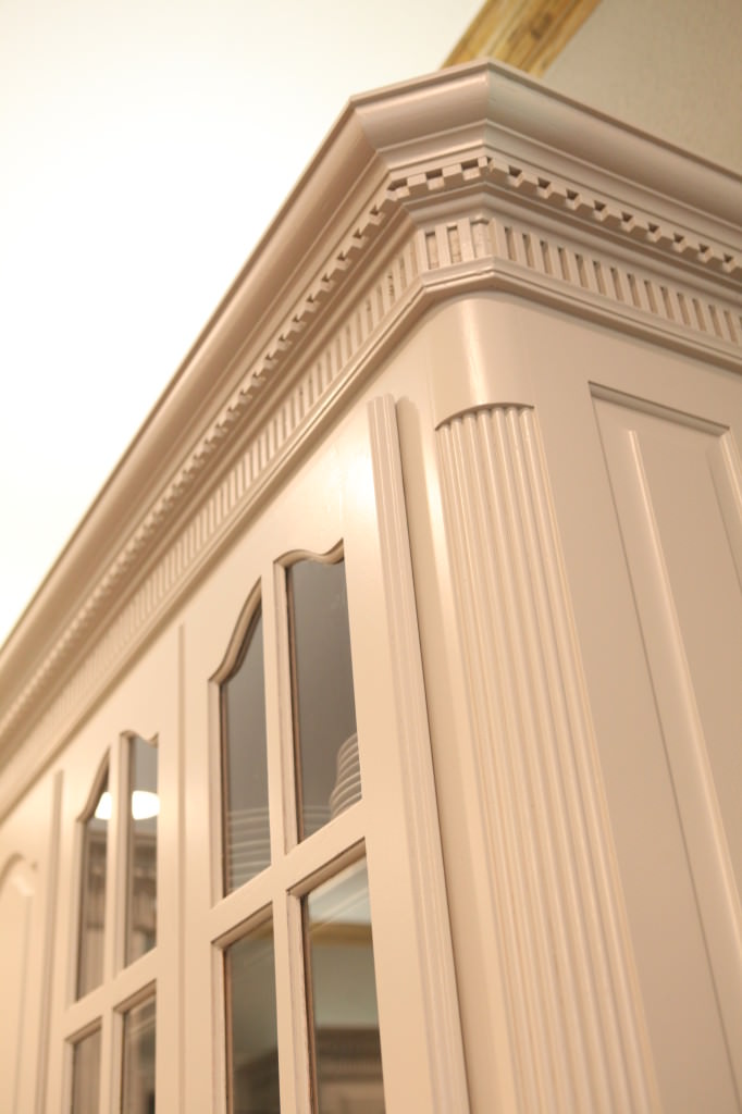
We worked with the paneling in the other rooms and made sure that we kept some consistency in the kitchen with what is going on everywhere else.  We left the crown molding wood so it ties in with the adjacent dining room.

IMG_6905-134

We added new lighting to the cove in the dining room and that really made it look fabulously updated.

Picture6

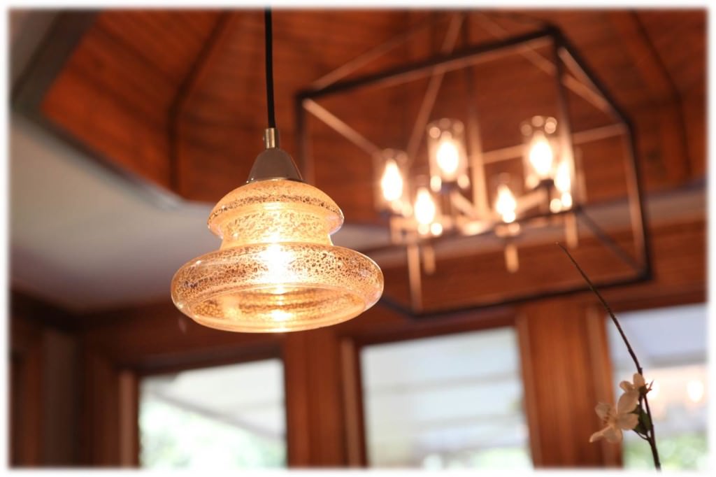
Love these mercury glass pendants that we placed over their curved bar area.  The client wanted to keep her existing island lighting since they had just replaced it a year ago.

Picture1

The granite we selected was the one thing that my client was terrified of.  She felt like it would make the kitchen darker.  I assured her that it would be the focal point in the kitchen and would be beautiful with the woodwork in the home.

Picture8

AFTER

decrenew interiors 13

BEFORE

8-30-2014 12-14-06 PM

AFTER

 decrenew interiors 20

So bright and still looks very warm!

decrenew interiors 18

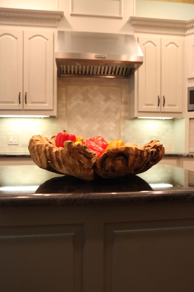
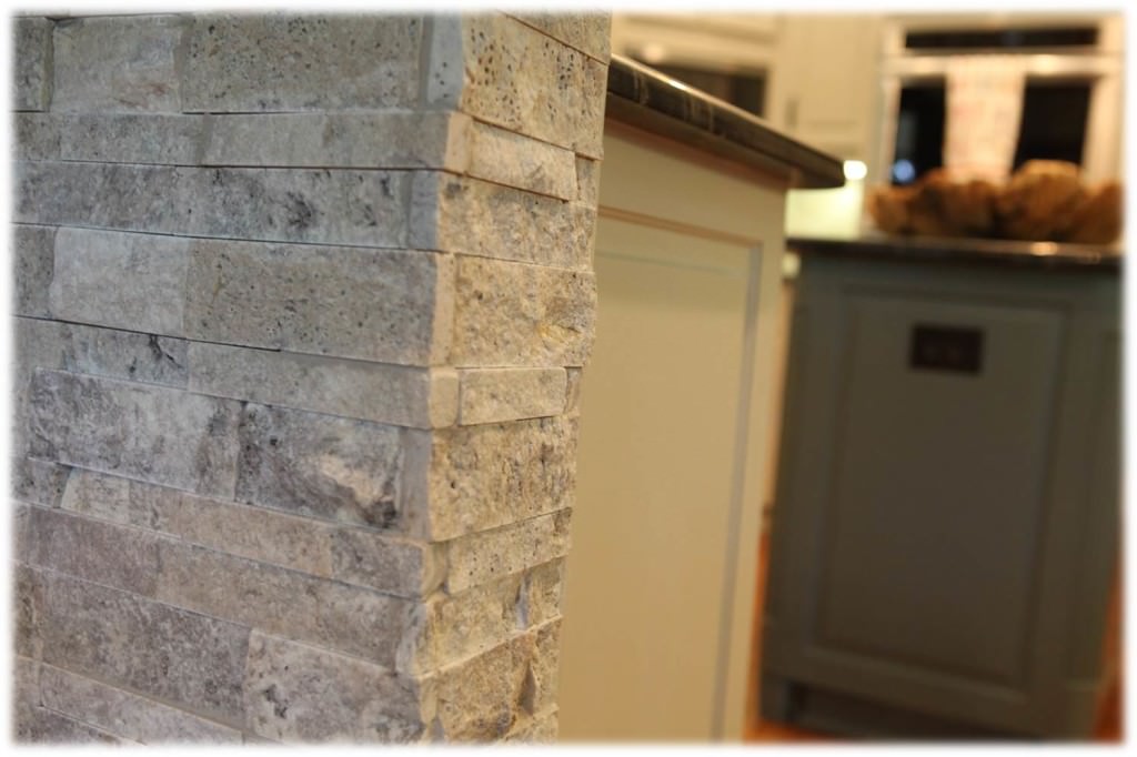
The stone work on the bar is my favorite, it really makes the kitchen fresh and it adds a masculine feel to the space.

IMG_7011-326

Rocky the dog is happy because his coloring matches the kitchen beautifully!

I'm now taking the long weekend off to hang with my family! Hope you take time to enjoy Labor Day too!

Traditional Home Magazine & Great Kitchen's Digital Edition!

Sneek Peek
 
 
Several months ago I received information about a Traditional Home contest and immediately felt it would be something I should enter. (see above).
 
 
They gave us an option to choose from 5 categories. 
 
1.  The Ultimate Kitchen
2. Entertaining Secrets
3. Favorite Kitchen Designer
4. At Home Event Theme & Menu
5. Best Dressed Table
 
 I couldn't decide whether I wanted to enter for the "Best Dressed Table" or enter one of my Kitchens in the "Ultimate Kitchen" category. 
 
 
As you know if you follow my blog, I'm not only crazy about decorating and design, I'm passionate about entertaining, food, parties, gathering friends and families together and all things beautiful! 
 
 
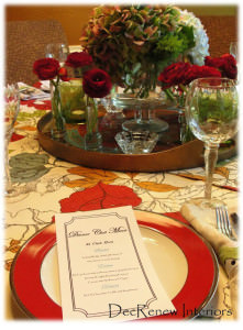
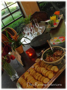
 I wrote a post last year about one of the Gourmet Dinner club parties that my husband and I hosted.  See the Tablescape, Food & Menu that I thought would have been great for the "Best Dressed Table" or "At Home Event Theme and Menu" submission.


In the end I decided to enter one of my kitchen remodels that I am so passionate about.  One of the main reasons is that it has a fabulous family story that I knew many would LOVE and enjoy if I shared it!  The kitchen is absolutely gorgeous too because my client has great taste!  I checked with her to make sure it would be okay to submit the entry and she was elated.  My client and I shared fun & happy moments and as I worked on this kitchen with my contracting crew.  My team grew to love their family and were sad when the job was over.  She even made all the guys her famous "iced"  brownies when the job was done and they devoured the entire pan.  They said they were "off the chain", An expression that I had never heard!!
 
I collected my thoughts, pictures, etc. and submitted my kitchen with crossed fingers and held my breath, hoping that I would win......


Well, the other day I was notified by Traditional Home Magazine that my kitchen (my client's kitchen to be correct) did win in this contest!!! 
 
I am beside excited and so is my client!  Thank you Traditional Home for this honor of being chosen.
 
 
My kitchen remodel will be a part of the Great Kitchens Digital Edition, full of fresh inspiration—from design tricks and cooking tips to entertaining must-haves that will be live May 24th so keep a watch out for it! 
 
A sneak peek into the kitchen.


Traditional Home is also having a Great Kitchens Sweepstakes. Enter for a chance to shop, cook, eat, and enjoy California hospitality alongside Thermador chefs, Traditional Home editors, and the bloggers and designers featured in our Great Kitchens online magazine at the Thermador Design & Experience Center! One lucky winner and guest will have the chance to join the celebration, July 22-24, in Irvine, California. 
YOU can Enter to win here.
 
Thanks for being excited for me!
 

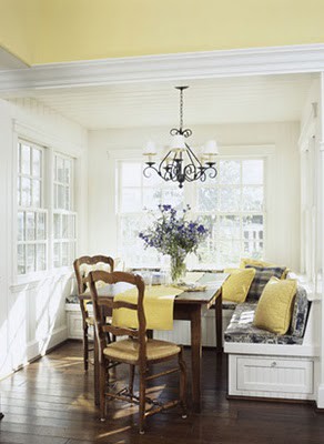
Before & After Banquette

(Pinterest.com)
I'm preparing a design plan right now for a client that wants a banquette in her kitchen.
(Pinterest.com)
I've always loved the feel that this kind of seating brings to a kitchen/dining room.  It's welcoming and comfortable.  I especially like the idea of storage underneath the banquette.  Especially if you have a small space and storage is a problem.

(Pinterest.com)

Bench seating is a great way to solve a problem with form and function if space of your dining or kitchen room is small. You can maximize your kitchen space by building your own kitchen banquette seating.

(Pinterest.com)

Definition of banquette seating, a French word for “bench”, is a long upholstered bench/seat placed against or attached into a wall of a space.

(Pinterest.com)

The curved banquette is also so attractive and works beautifully with a round or oval table.   The fabrics on a banquette can make the kitchen have such personality and class.
I discovered the below photo's from a project that I finished about 4 years ago and thought you might enjoy the before and after shots of the room.

BEFORE
(Photo by Ruthie Staalsen)
AFTER
(Photo by Ruthie Staalsen)
Amazing what a change the banquette made to this space.  It use to be a "catch all" space and now it's a room that is used for gatherings.  The table opens up into an oval shape and they can pull in the additional chairs when they have more people they need to seat!  It's a great space now for better entertainment and the client was so happy to get a buffet for all her linens.
To see more before and after pictures of my work, visit my website DecRenew Interiors.

Kitchen table dilemma SOLVED

Go Here for this recipe
Over the holiday we had family over for hot potato soup.  Silly me wasn't paying attention and didn't have the kids use place mats on the table!  I don't like a high maintenance table like this but that's what kind I have so I won't complain.
Yikes, when everyone left...this is what I noticed!  7 nice burn circles all the way around the table.   I have tried everything to try and remove the marks but it is hopeless.  Every trick in the book has been tried.
 It just looks awful but I knew that I could find a solution without having to replace the table.  I didn't want to have to sand the whole thing down and redo it either!  Don't have time these days for that!
Pier 1 (used my 25% off coupon)
What I ended up doing is buying a glass top for the table.  For  now, I've put a piece of fabric that I already had underneath the glass. It looks great and is functional too!
It solved the problem and didn't cost me much.

I'd love to change it up a little too.  I enjoy change so I know that this fabric will start getting old and I'll need something new.  Here are a few things I've been thinking about trying.
According to Lonny Magazine, one of the top trends for 2011 is Typography. It would be fun to add some lettering like this under the glass! 

See Michelle Adams (Lonny Magazine) Top 5 Design Trends on the The Nate Show.
So many fun things out there.

.

I thought I could also put my kids artwork under the glass.  I've got stacks of these fun little treasures!  I wish I could rewind time that's for sure.
There are tons of wallpapers and wrapping papers that I could use as well.
For Christmas next year I'm going to put all the photo cards we get from all our friends under the glass.  Won't that be fun!  Can it be Christmas already?    Well, maybe NOT.
This is what one blogger did.  Very cute.  See Kim Saulter's post here at It's a miniature life.  I think I will do all black and white photos.
Imagine the fun I'll have with Valentines Day!
I love when a problem turns out to be something that is better in the long run.  We are going to have such fun with this table now!  
 Imagine what you can do during birthday months, graduations, baby showers, etc.  I'm really going to enjoy this! 
Thanks kids for inspiring me!!
For more before and after photos to inspire you, visit my website.

Easy updates to your kitchen.

In this economy, I'm noticing more and more that my client's are wanting to update their kitchens but don't have the budget they would like to be able to spend on remodeling.  In speaking to other designer's around the country, they are all saying the same thing.  Some of you are planning a large-scale makeover but some of you are simply wanting to freshen up a room.  My goal as a decorator, has always been to bring ideas to you so you don't feel stuck and can have a beautiful home whatever your budget. 

Here are some quick changes you can make to your kitchens that say "WOW" without having to break the bank.

Traditional Home Magazine
Notice how the above kitchen has several paint colors used for their cabinets.  Their island is a light oak, their main cabinets are creamy white and they created a focal point by painting the shelf and the surrounding wood work black.  This immediately creates a focal point in this kitchen.  They finished it off by adding black chairs to the space creating a very inviting space that has character and charm.
This is something that you could do to your kitchen.  Maybe it's painting your island black or maybe you could paint the cabinets above your stove?  Sometimes painting the pantry cabinets is the solution.  Look around in your kitchen and see what you can do to update with paint.  It could be that all you do is add a large shelf to one of your walls creating a focal point and a place for your to display some of your favorite things.
House Beautiful Magazine
In the above picture all they did was put in a screen door for their pantry and paint it black.  Perfect solution for adding charm to your kitchen. If you are willing to keep your pantry neat, go for it!  I also love how they used subway tile and brought it all they way up to the ceiling.  The rustic farm table adds amazing charm to this country kitchen.  The light fixture is quirky and whimsical too.
Traditional Home Magazine
In the above kitchen, they chose to paint their built in storage cabinet black. It's beautiful and I love the openness of it.  Allows you to display some of your beautiful things.  Another great idea is to add wainscoting to your island.  Here they have painted it a creamy white and then glazed it with a tea stain.    It looks so beautiful with their stone floor.
Adding glass to some of your cabinets can also update your kitchen without having to replace cabinets.  The low modern stools (without backs) simplify the strong "black" color in this kitchen.  If they had used chairs with backs, the black would have overpowered this kitchen and made it feel too busy.
House Beautiful Magazine
If you really want to make a bold statement, the above red is simply gorgeous and adds a strong presence to this space!  These islands stand alone in the above kitchen and are not built in.  They have two separate pieces of furniture that can be taken out if they needed to.  I love the "vintage" feel that the red island and the painted tile adds to this kitchen.  The blackboard paint and cork board added to the refrigerator doors is a wonderful solution for family life.  We always have "to do lists, schedules to follow and pictures to hang. 
Our kitchens are where our families live!  They should be a place that have character and make entertaining your family and friends fun!   We all know that our kitchens are our second living room.   Even if your kitchen is tiny, think of something to add to it to give it a boost, update or splash of color.
Try one of these ideas and let me know if you make some changes to your kitchen. You might have your own "quick update" too.   It could be something as little as changing the fabric on your kitchen chairs, adding a new light fixture or lamp, adding a rug, new artwork, new colorful kitchen towels, adding a bulletin board or blackboard, repainting, adding stools, adding a new accessory to your island, removing all the dusty greenery from above your cabinets and adding some "new" accessories, etc. etc. 
Send your pictures to Ruth@decrenew.com and I'll have a blog entry soon displaying all the pictures.
Happy Decorating!
Ruthie