Montclair Estates Elegance

decrenew inteirors 4

This past week a had a quick getaway to Arkansas to kick off the summer with my family.  It was an incredible time.  It was eye opening to me to see how my "DecRenew" team took care of everything while I was away!  I am extremely grateful to the contractors that work along side me, they are continually making my job such a pleasure.

10383490_649024145187745_628111124241632559_n

 It was hard to come back after being in paradise at Lake Greeson in Arkansas.

10297661_650436531713173_2465293432621986123_n

My mind was renewed (as much as it can be for a few days away) and I was ready to get back to work the day after we returned.

decrenew interiors 18

A wonderful family hired me to decorate their piano room, dining room and entry.  They have been in their home several years now and have remodeled each room.  They just hadn't done any decorating  to their 3 front rooms.  Of course, these are the first rooms guests see first. They hired me to make it look inviting, comfortable, classy and welcoming.  This is Phase I of the decorating.  We will be adding some additional items sometime next month.

 The dining room was already furnished and had all the lighting.  We just added draperies, artwork and accessories.

BEFORE

photo9


 Amazing what a difference color, texture and draperies can do to a room.

AFTER

decrenew interiors 1

The artwork was inspired by the drapery fabric.  Mary Howe from Divine Inspirations did the painting for us.  I outlined the concept and colors and she did her magic like she always does, such talent!

decrenew interiors 4

I created the urns by adding moss to a round Styrofoam ball and then surrounding them with grapevine to give it a really natural look.  I just love using greenery that has lots of branches incorporated.  Truly looks like you picked it off a tree.  The urns were aged with an aging solution.

decrenew interiors 3 (2)

 My camera died in the middle of taking these photo's so I apologize for the "not so vibrant" shots.

decrenew interiors 19

decrenew interiors 20

The piano room was cleared out completely.  We kept the piano where it was because it is the star of the room.

BEFORE PIANO ROOM

photo6

 AFTER PIANO ROOM

decrenew interiors 15

BEFORE

photo4

AFTER

decrenew interiors 14

BEFORE

photo5

  We had the fireplace fauxed with layers of  grays.  It now is more of the focal point in the room and coordinates with the colors in the entry. We added all new custom furniture, rugs and accessories, leaving the piano as the focal in this room.


AFTER

decrenew interiors 13

decrenew interiors 19

 This oil painting is the mom of my client.  She is perfect for above a mantel in a piano room don't you think?

BEFORE

We created a gallery wall with all of the oil paintings that were done by family members.  Framing them all in the same frame made them a grouping that works together, even though they are all quite a bit different.

photo2


AFTER

decrenew interiors 7

decrenew interiors 9

 I didn't use the oil painting with the fruit because I felt like that one is more appropriate for a kitchen.

decrenew interiors 8

decrenew interiors 11

Substantial dark frames changed the look of the artwork drastically!  Grouping them together makes it more of a collection.  Spreading them out all over the home would have lost their impact.  Seeing them all together tells a better story and showcases the collection.

I found the glass  lamp bases and changed out the shades with something a little more decorative than plain white.  The muted chevron pattern is gorgeous with the rug.

decrenew interiors 6

 These custom chairs are my favorite thing in the room!  The colorful  pillow makes the entire room come together. Well....I love the gallery of artwork too!

decrenew interiors 21

BEFORE ENTRY

photo8

AFTER


decrenew interiors 1

 The entry accent wall was painted a similar color to the fireplace surround,  uniting the rooms together.

decrenew interiors 18

 I found the chair at an estate sale and had it painted a light gray.

 Reupholstered the seat to match the pillows in the piano room and united everything together with a  cream Brazilian  hide.

decrenew interiors 3

 These Spanish doors were added to the stairway wall and are an incredible statement to the home with their weathered texture and color.

The amount of work that goes into one of these installs in incredible.  It always blows my mind to see the ideas that have been swirling around in my head come together within an 6 hour time frame. Months of preparation and organization.  Such an  awesome feeling to see it all put together.

decrenew interiors 2

The reveal is always so exciting and this family all gathered together to do the final walk thru after being gone all day.

The moment you drive away from a client and watch as the family walks back into their home is always such a rewarding feeling.  I love knowing that as they enter the front door, new memories will be created as they have friends and family gathered around for meals around their dining room table.  I can imagine lots of gatherings around the piano too, especially  for holidays and special occasions.

Thank you Lord for the blessing of using my gifts to warm the hearts of others.  It's a gift that comes back to me ten fold.



Fresh Decorating Ideas for the Color Blue

decrenew interiors10

Yesterday was a great day!  It is always fabulous to have a job in your head for so long and watch it come to life.  I put together a design plan for my client after our Initial Consultation and I listened carefully to what they wanted their family room to look and feel like once it was totally transformed.

DSC03906

They desired something comfy, crisp,  relaxing and wanted blue and gray to be the color scheme, combined with warm tones as well.

decrenew interiors5

I presented the plan to her and she LOVED it.    A design plan is a great way for the client and I to get on the same page before we start the job which is ALWAYS a good idea.  It is a chance for my client to see my vision for their space and helps them visualize themselves what it could look like.

DSC03817

Some of the items I actually know where I'm going to purchase, other items are a concept or an idea and will be selected/created as I go.

My job is to then make that vision come to life.  After all the main items are finalized, all the details start falling into place. It's a process and my creative juices are constantly working while choosing every single item.

decrenewinteriors17

I pour myself into my designs and it's my baby for about 6 weeks.

decrenew interiors 8

Every selection is chosen for a reason and I make sure each item is the right color & scale.  I'm known for adding a touch of fabulous texture, and I always  incorporate accessories soft curves and shape.

decrenewinteriors10

decrenewinteriors11

The Design Plan also allows us to get realistic about the budget and helps us prioritize what we really can and can't do.   Of course, there are always changes and adjustments to the plan and budget, and some special surprises I save for the install day which always makes it fun!

decrenewinteriors13

So yesterday, we cleared the room with the old furniture & rug.  We installed the custom sectional which the client loved because it is super comfy and perfect for their family life. The only piece they wanted to keep was their bookshelf which I agreed to (because I had a plan)  and I suggested that we reuse their console table since it was the perfect height and color.

BEFORE

unnamed

AFTER

decRenew interiors

What a difference!  What do you think?

Here is the console table in it's new spot,  just cleaned it up (thanks to good "Old English").

decrenewinteriors7

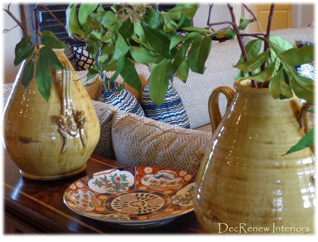
We added these gorgeous ginger jars with some branchy greenery to create height.

decrenewinteriors15We have a new coffee table on order but in the meantime, we used their existing one.  We added an incredible bench which is made from an an old door.  I had it custom painted to work with the room.  There are tiny bits of blue paint peeking through.  The artwork is so cool and I almost kept it for ME!  This was my added bit of texture!

DSC03806

I originally planned for the painting to be above the bench, but once we placed it, it wasn't as beautiful there.  I opted to hang it to the left of the bookshelves because the colors really came to life on that wall.  On install day, my client usually trusts me to make the best decisions and believe me, we make sure each item is in the perfect place.  Things get moved around several times before they find their true home and sense of belonging :)

decRenew Interiors4

The painting was created especially for the room.  We knew what fabrics we were using so the artist "Mary Howe" with Design Inspirations created this one for me.  The two of us make a great team, I give her my ideas, concepts, colors, etc. and she creates it based on the vision I've presented to the client.   She is incredibly talented and the artwork in the room always makes the space have personality.

decrenew interiors 10

DSC03909

DSC03809


Ruthie Tip:  If you have a dark bookshelf in your living space, a way to lighten it up and update it, is to use lighter accessories.  Don't use items like wrought iron or dark photo frames, they just disappear with a dark background. As you can see above, I used a lot of gray and white accessories to make the items show up on the dark bookshelf.  This same concept applies to your fireplace mantel.  I actually found the ceramic books at an estate sale (they were bright gold)  and had them painted and they are now gorgeous.

These two dark blue velvet chairs were added underneath the window for another little sitting area.  They swivel so you can turn them around to watch TV.  I'm in love with the draperies too.  The blue glass lamp is stunning up against the window.

DSC03857

I have 2 more installs this month so I'll post pictures as soon as I'm finished with those.  Hope these images have inspired you to make your home beautiful!

If you would like to see more of my work, visit my website at https://www.ruthiestaalsen.com