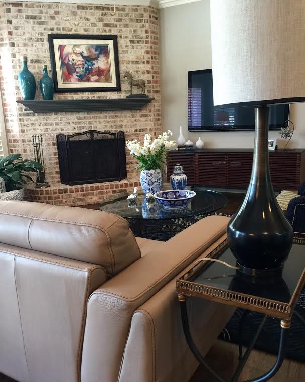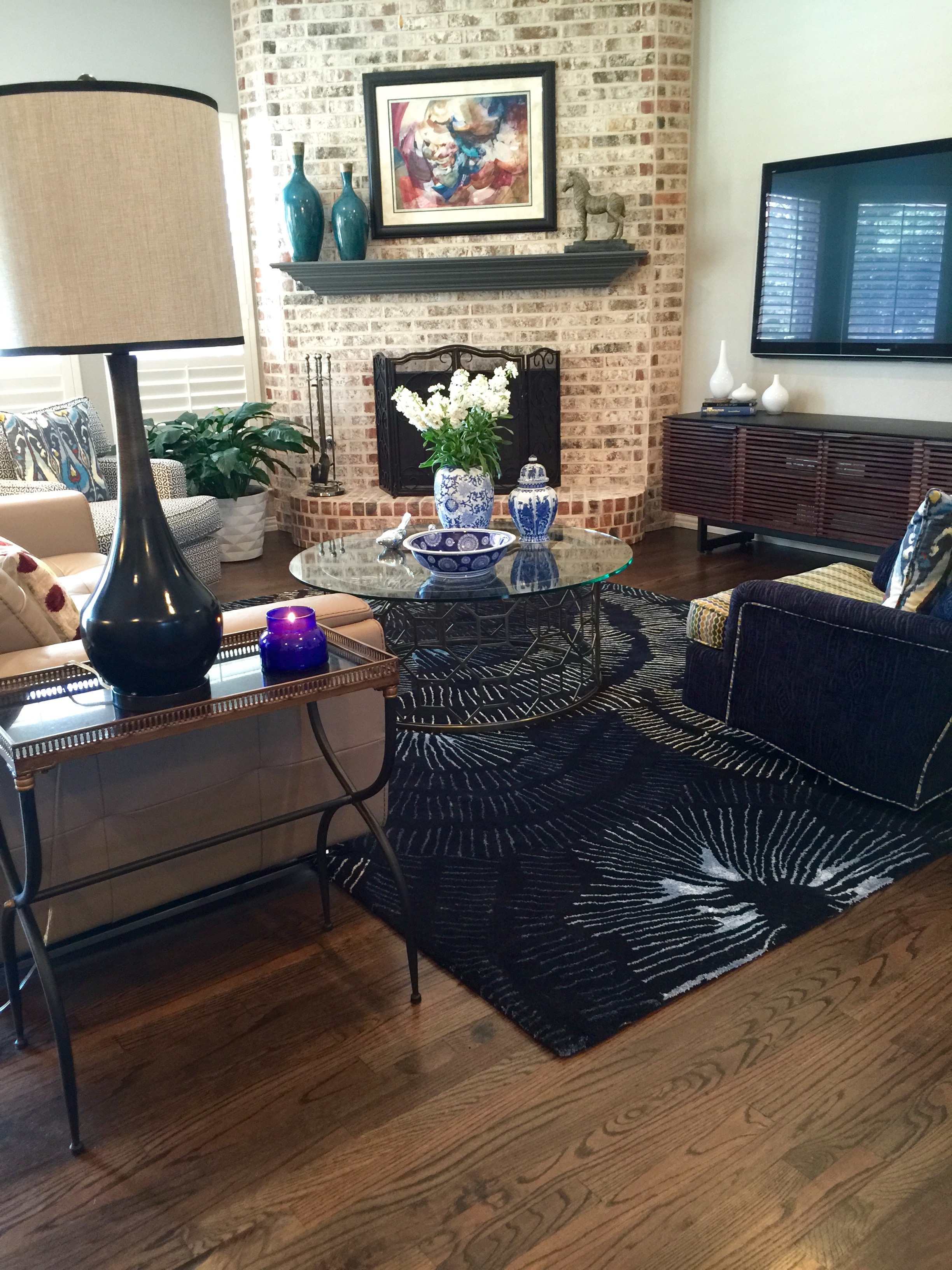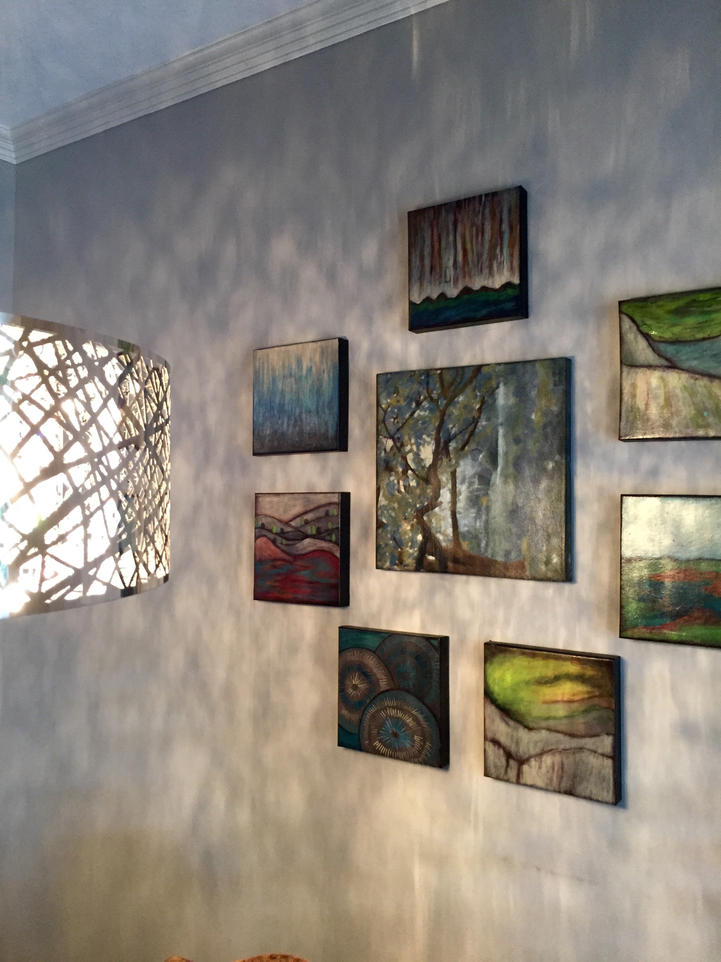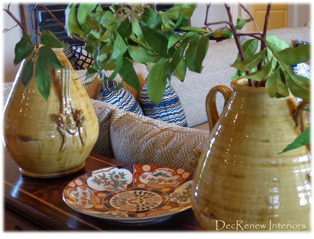
Yesterday was a great day! It is always fabulous to have a job in your head for so long and watch it come to life. I put together a design plan for my client after our Initial Consultation and I listened carefully to what they wanted their family room to look and feel like once it was totally transformed.

They desired something comfy, crisp, relaxing and wanted blue and gray to be the color scheme, combined with warm tones as well.

I presented the plan to her and she LOVED it. A design plan is a great way for the client and I to get on the same page before we start the job which is ALWAYS a good idea. It is a chance for my client to see my vision for their space and helps them visualize themselves what it could look like.

Some of the items I actually know where I'm going to purchase, other items are a concept or an idea and will be selected/created as I go.
My job is to then make that vision come to life. After all the main items are finalized, all the details start falling into place. It's a process and my creative juices are constantly working while choosing every single item.

I pour myself into my designs and it's my baby for about 6 weeks.

Every selection is chosen for a reason and I make sure each item is the right color & scale. I'm known for adding a touch of fabulous texture, and I always incorporate accessories soft curves and shape.


The Design Plan also allows us to get realistic about the budget and helps us prioritize what we really can and can't do. Of course, there are always changes and adjustments to the plan and budget, and some special surprises I save for the install day which always makes it fun!

So yesterday, we cleared the room with the old furniture & rug. We installed the custom sectional which the client loved because it is super comfy and perfect for their family life. The only piece they wanted to keep was their bookshelf which I agreed to (because I had a plan) and I suggested that we reuse their console table since it was the perfect height and color.
BEFORE

AFTER

What a difference! What do you think?
Here is the console table in it's new spot, just cleaned it up (thanks to good "Old English").

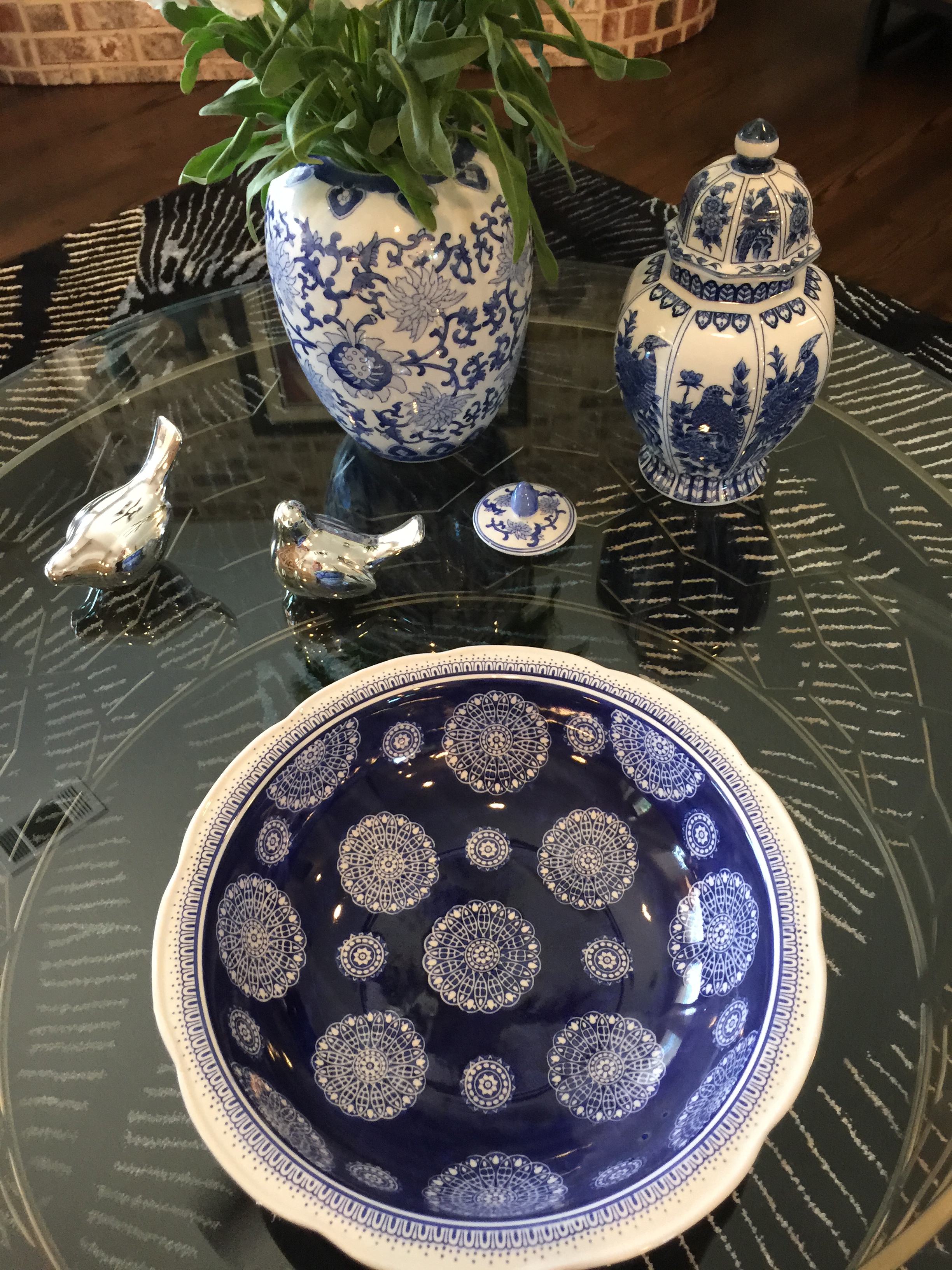
We added these gorgeous ginger jars with some branchy greenery to create height.
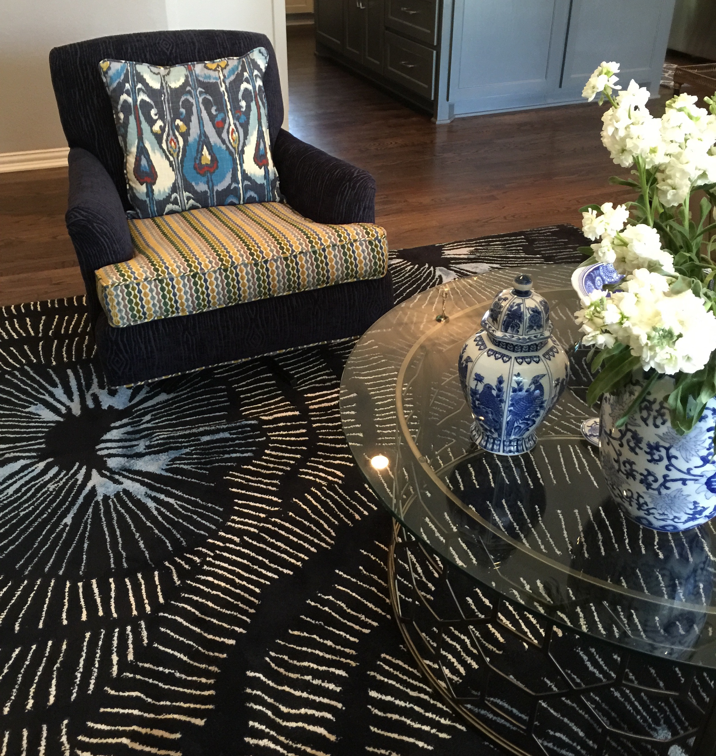
 We have a new coffee table on order but in the meantime, we used their existing one. We added an incredible bench which is made from an an old door. I had it custom painted to work with the room. There are tiny bits of blue paint peeking through. The artwork is so cool and I almost kept it for ME! This was my added bit of texture!

I originally planned for the painting to be above the bench, but once we placed it, it wasn't as beautiful there. I opted to hang it to the left of the bookshelves because the colors really came to life on that wall. On install day, my client usually trusts me to make the best decisions and believe me, we make sure each item is in the perfect place. Things get moved around several times before they find their true home and sense of belonging :)

The painting was created especially for the room. We knew what fabrics we were using so the artist "Mary Howe" with Design Inspirations created this one for me. The two of us make a great team, I give her my ideas, concepts, colors, etc. and she creates it based on the vision I've presented to the client. She is incredibly talented and the artwork in the room always makes the space have personality.


Ruthie Tip: If you have a dark bookshelf in your living space, a way to lighten it up and update it, is to use lighter accessories. Don't use items like wrought iron or dark photo frames, they just disappear with a dark background. As you can see above, I used a lot of gray and white accessories to make the items show up on the dark bookshelf. This same concept applies to your fireplace mantel. I actually found the ceramic books at an estate sale (they were bright gold) and had them painted and they are now gorgeous.
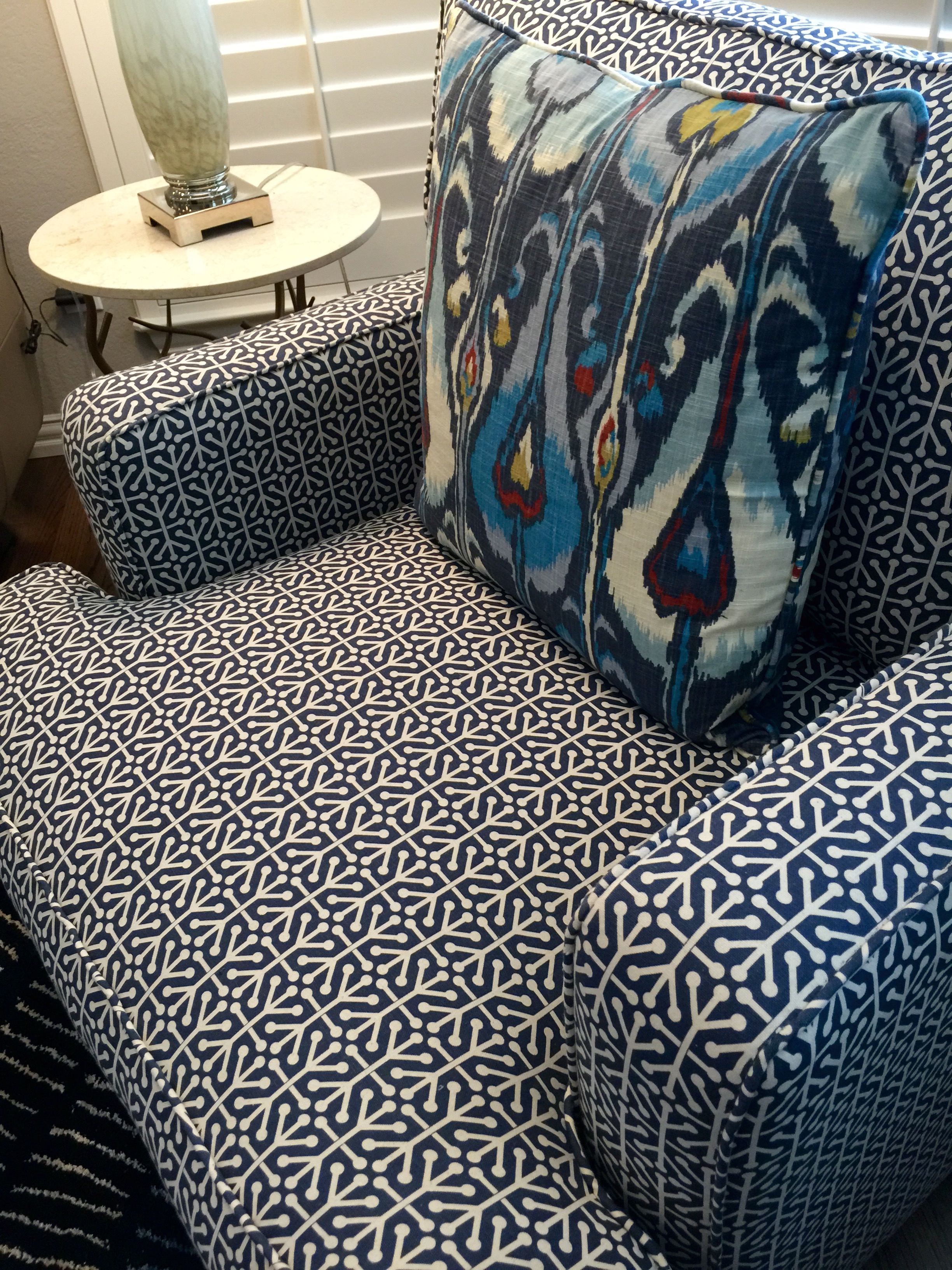
These two dark blue velvet chairs were added underneath the window for another little sitting area. They swivel so you can turn them around to watch TV. I'm in love with the draperies too. The blue glass lamp is stunning up against the window.

I have 2 more installs this month so I'll post pictures as soon as I'm finished with those. Hope these images have inspired you to make your home beautiful!
If you would like to see more of my work, visit my website at https://www.ruthiestaalsen.com
