Colleyville Townhome Master Bedroom

pic  

This holiday season seems to be the time for master bedroom makeovers.  We have been so busy here at DecRenew Interiors but loving it!

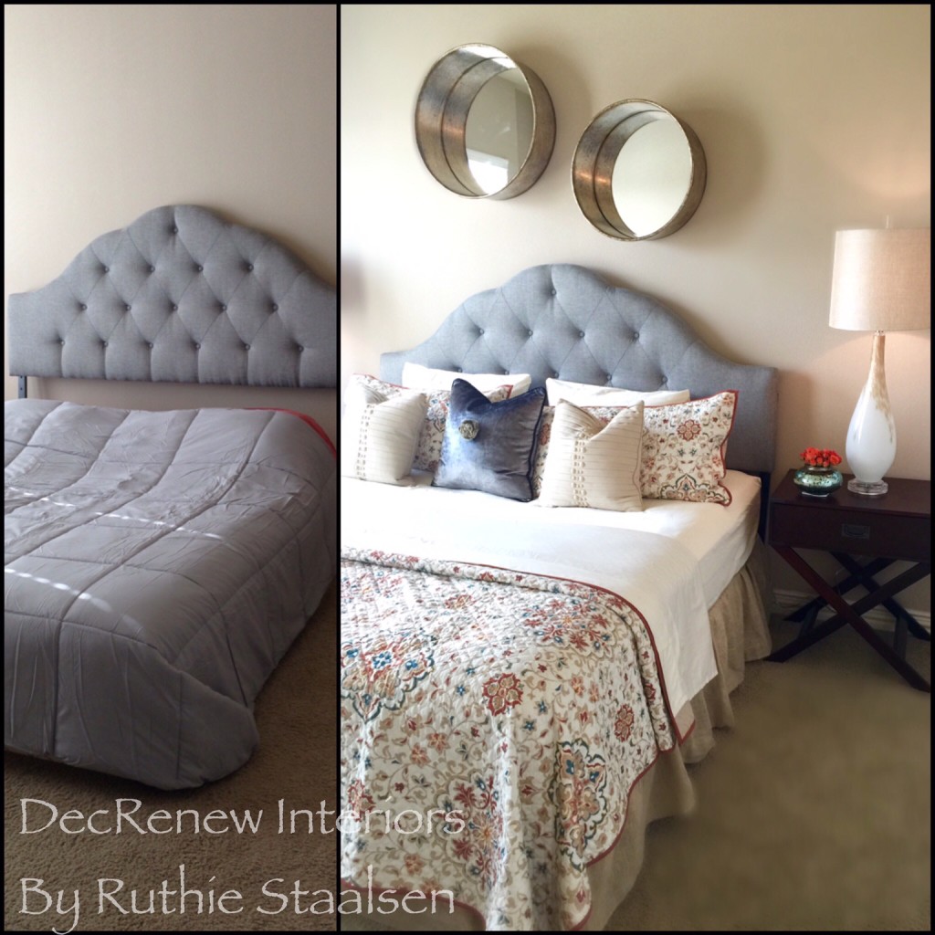
We finished this bedroom a few weeks ago for my client that just moved into a townhome.  We finished her family room a few months ago and she called me back to do her master bedroom.  She wanted it to be simple but beautiful.

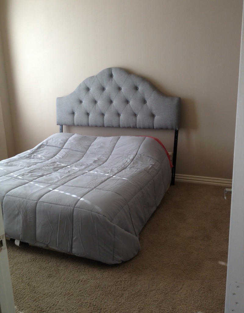
BEFORE

before

All she had in the room was a mattress and a dresser.  Everything else, we provided.

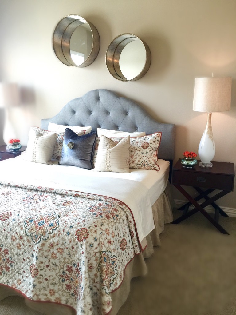
AFTER

decrenew interiors2

FullSizeRender

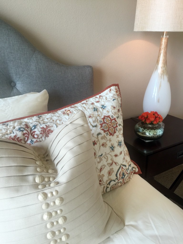
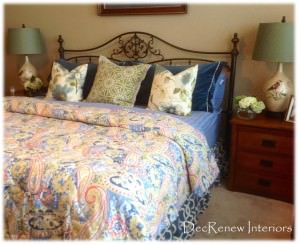
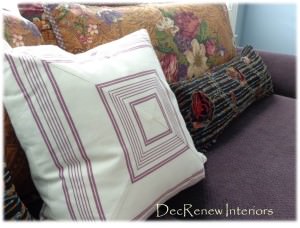
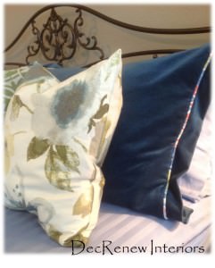
The button details on the pillows are my fav.  The blown glass lamps totally rocked the room!

decrenew interiors4

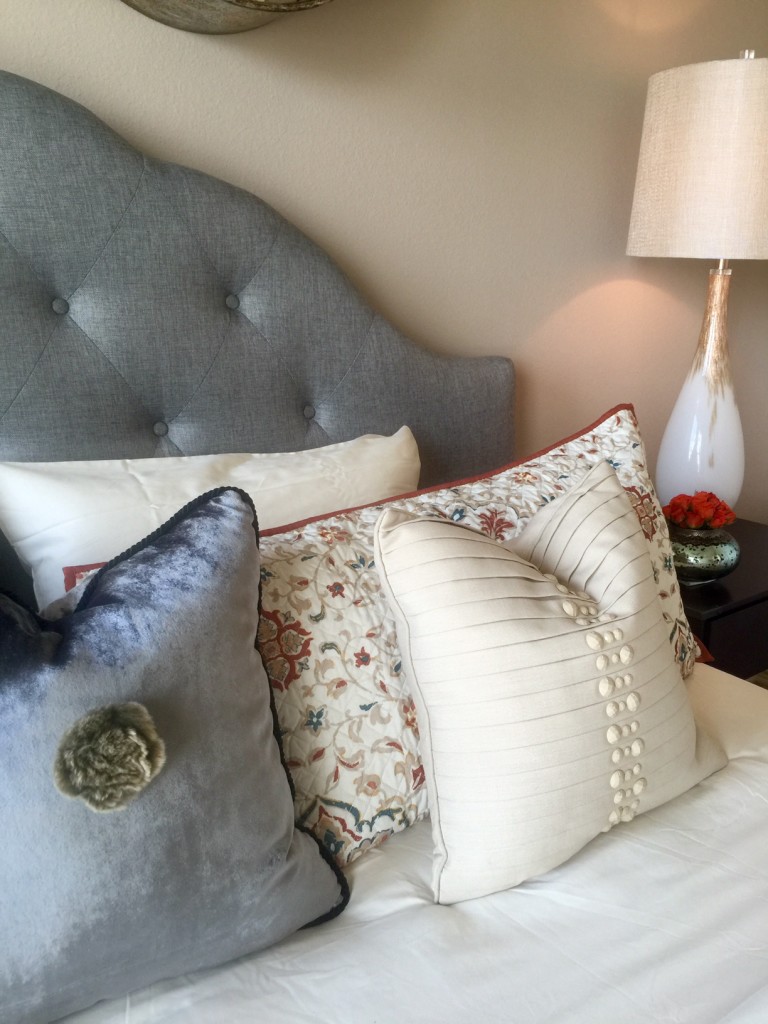
The gray velvet pillow looked a little boring so I added a vintage broach I found at an antique show.

beforeandafter

So inviting don't you think?

My team and I spent half a day at her house hanging things and getting it all ready while she was at work.  She couldn't get off in time for us to reveal it to her.  However, she called me when she got home just balling her eyes out because she was so happy that I did exactly what she was wanting. Made my day as you can imagine!  I really try to listen to my clients and make sure I understand what they are wanting.
35DSC04492-e1447890853818

I'll be posting another home soon where we used what the client had to make her remodeled home shine!
Stay tuned.

Creating homes as unique as you are!

 True fulfullment is being able to enrich a families life by creating a home that suits their lifestyle. My goal at DecRenew Interiors is to create a space that is as unique as the client.

 Our tag line is: "Creating homes as unique as you are."

Picture1

 I  met with this client after they had been living in their newly built home for a year.  This is the second home that I have had the opportunity to decorate for them.  It is always such a pleasure to work with the same client over and over again.

IMG_4969-31

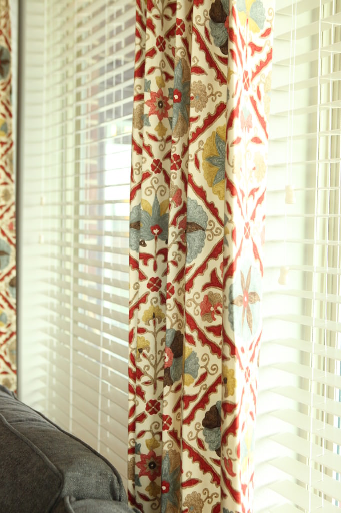
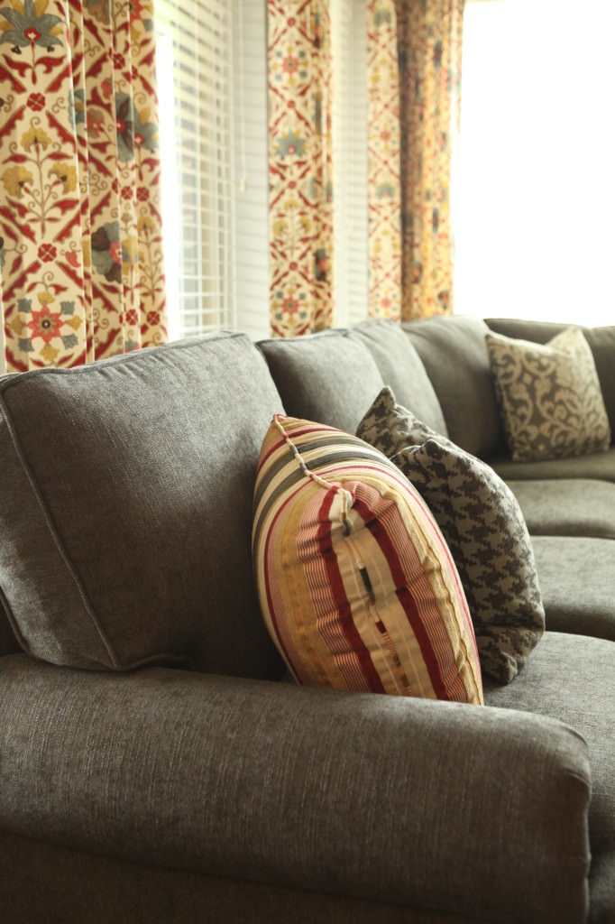
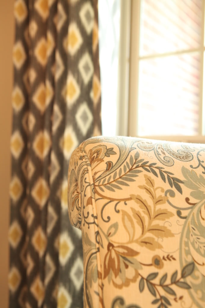
 The drapery fabric (mainly the colors)  was my inspiration for pulling the entire room together.  I adore all the  vibrancy and so does  my client.  As you scroll through the after pictures below, you will see how I made sure these colors were all married together somehow.  Different textures, patterns, shapes, etc. together created a mixed up, eclectic style with a transitional flair.

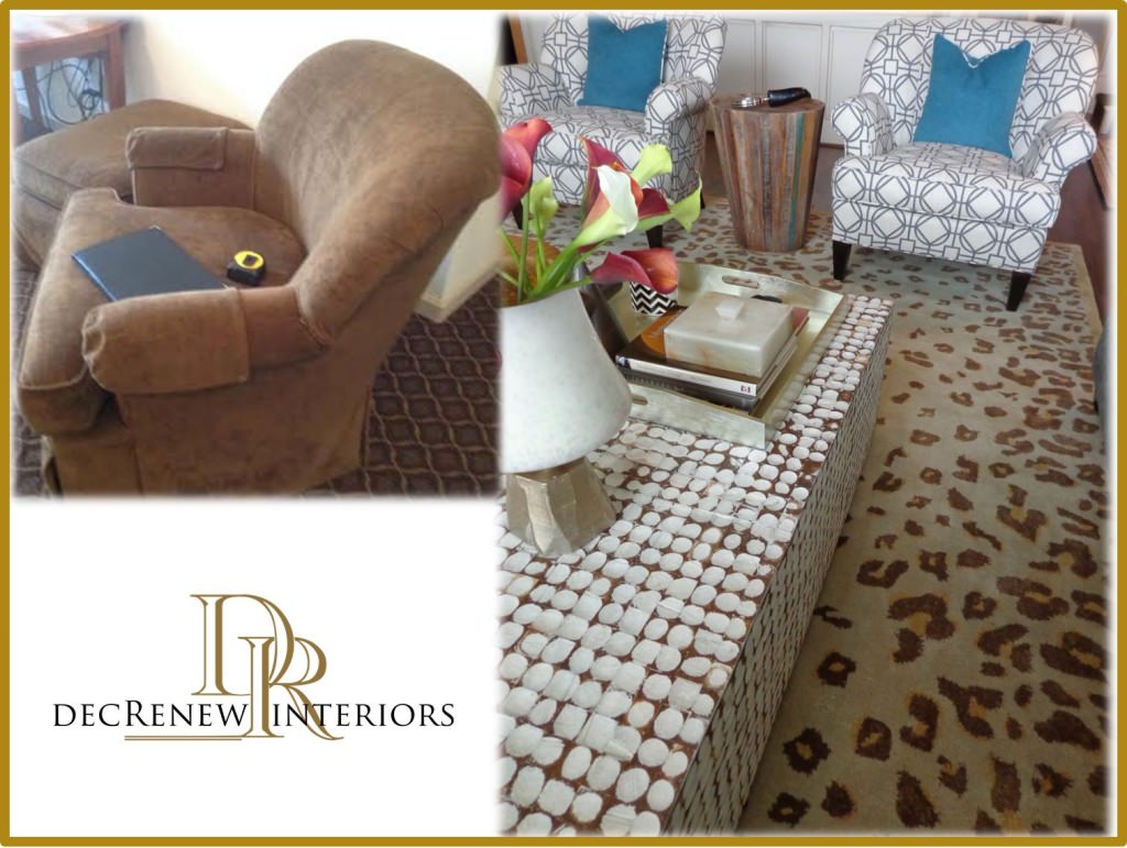
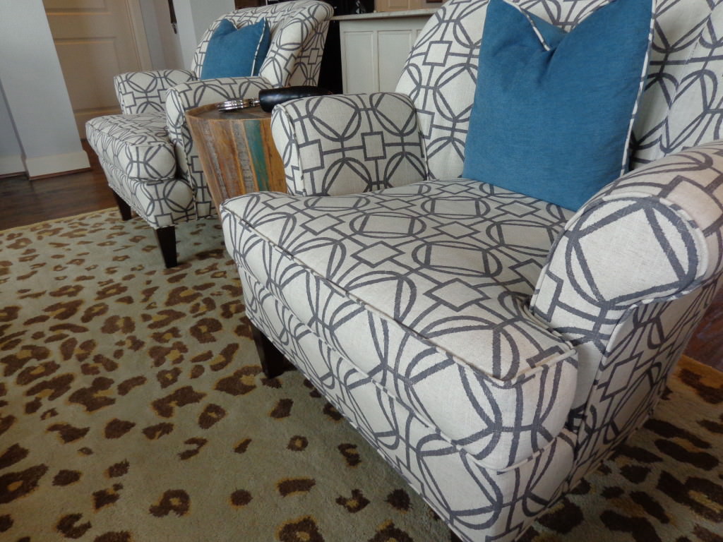
They had some things that I knew we could repurpose.   These two club chairs were reupholstered because the client loved them and they were super comfy.

DSC04229

 They just needed a makeover after being used in their gameroom surrounded by kids and all that goes with that!

before and after

My goal is to use as much of what the client "already have" in order to save them as much money as possible.  Of course, only if the item was  still stylish :)  Often times, my clients will say "really, keep these old things" and I say "yes, they/it has HUGE potential."

IMG_5022-84

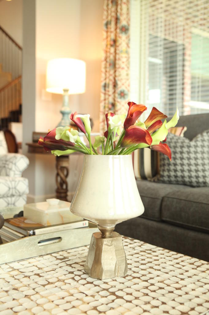
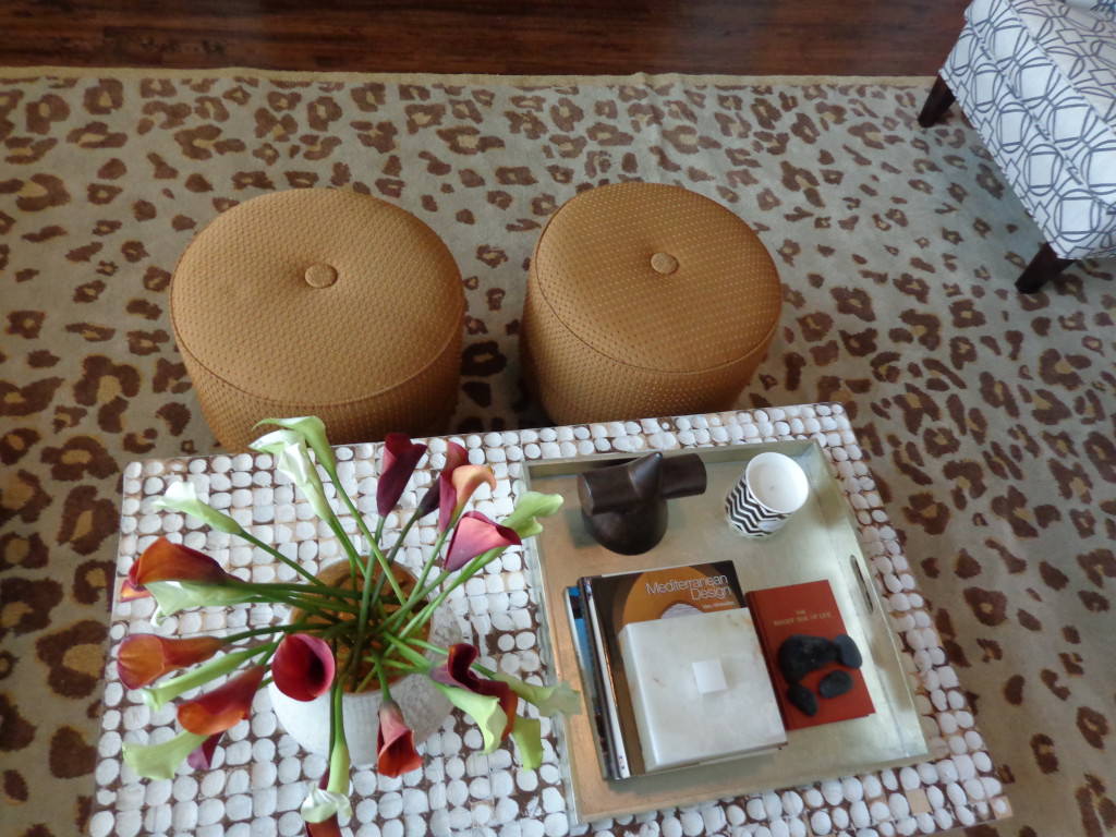
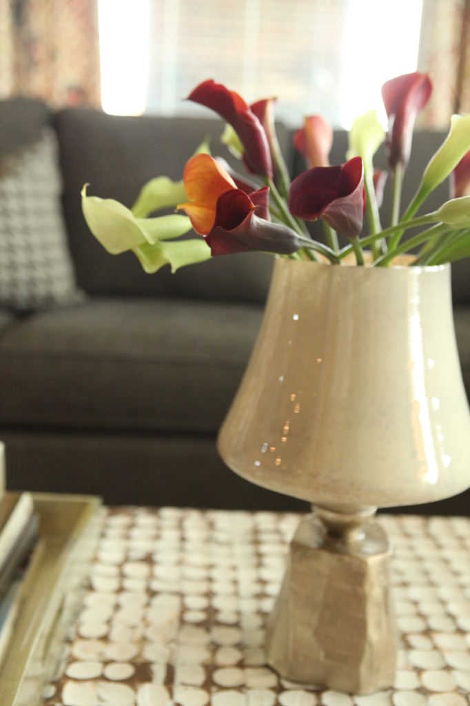
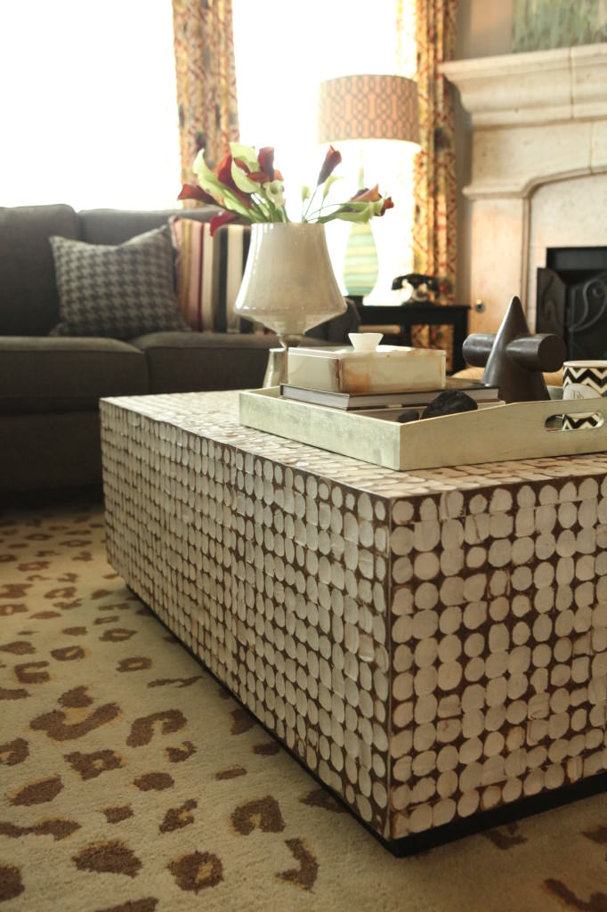
Ruthie Decorating tip:  Use unique items for your flowers. This candle holder was perfect for the fresh flowers on the coffee table.  Make sure that the item is not pourous if you place the flowers directly in the vase.  If it is, I put a small drinking glass inside the vase and use that for the flowers.  

IMG_5005-67

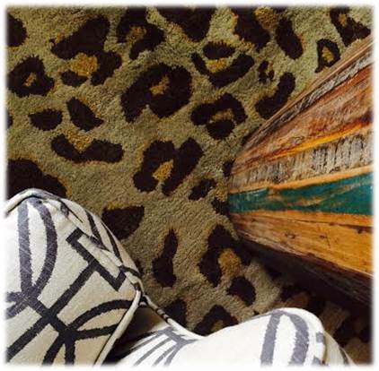
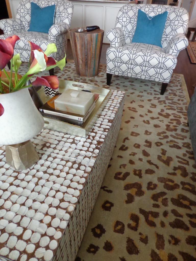
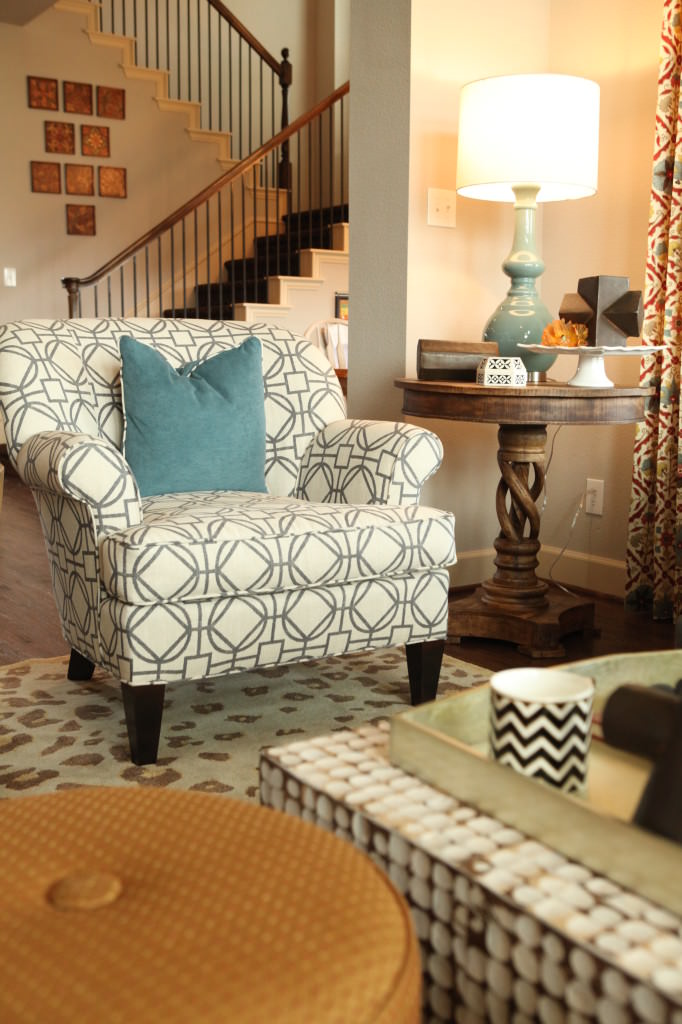
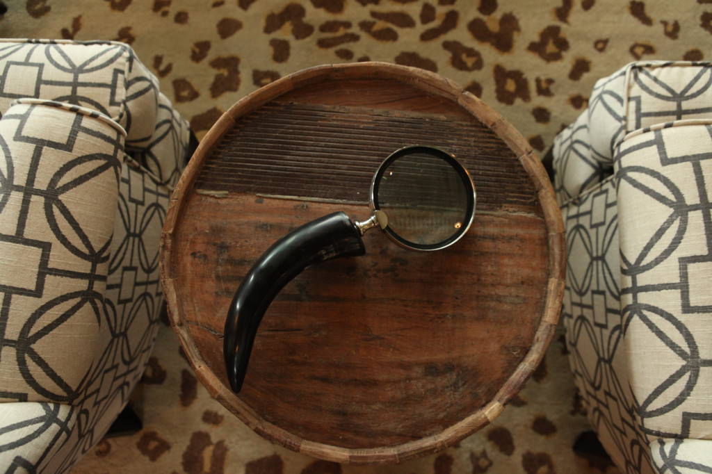
 We were going to redo these two ottomans.  As the room started to come together, I thought they could stay "as is" since they go beautifully with the animal print rug.  I'm crazy about the round side table.  Such great detail!

Picture3

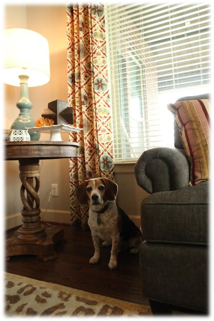
Gus loves his new home too!

DSC04266

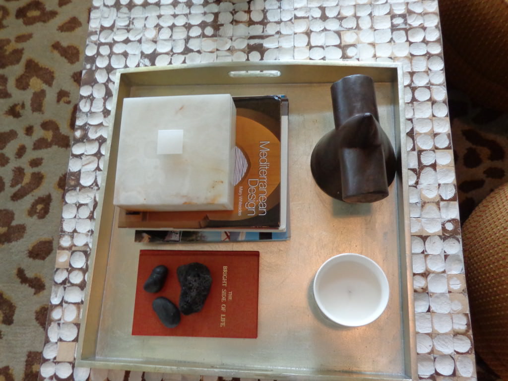
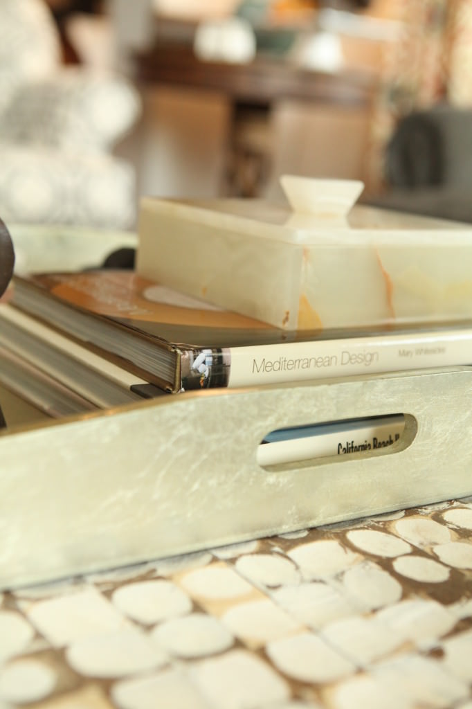
 The coffee table is so unique and the texture and color make the reupholstered chairs united.  See how the detail of the book on the coffee table pulls together the ottoman color?

DSC04258

Those are the details that I think about for days and days before the installation.  I often wake up in the middle of the night and get up and write things down.

IMG_4941-3

What color florals to use is also a huge decision.  

IMG_4939-1

Notice how these flowers make the entire room pop.

IMG_5024-86

IMG_5027-89

The new gray sectional is perfect for their family life.  This family room is where everything happens in their house.

decrenew interiors 11

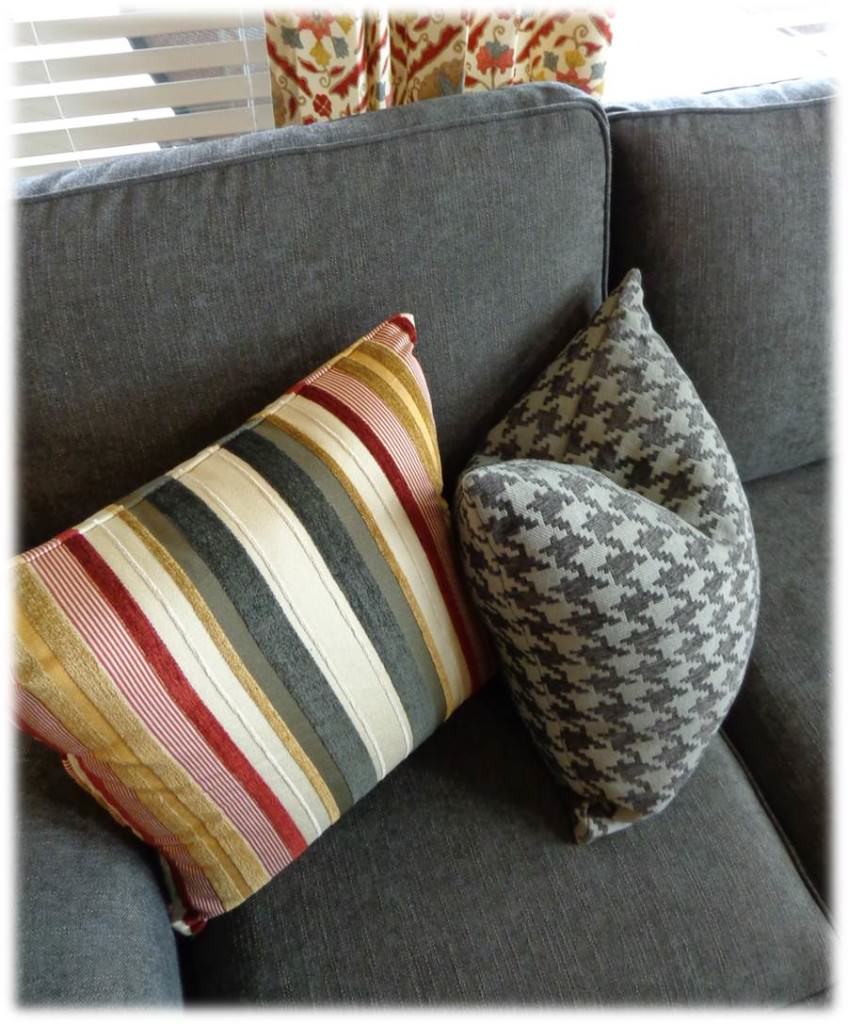
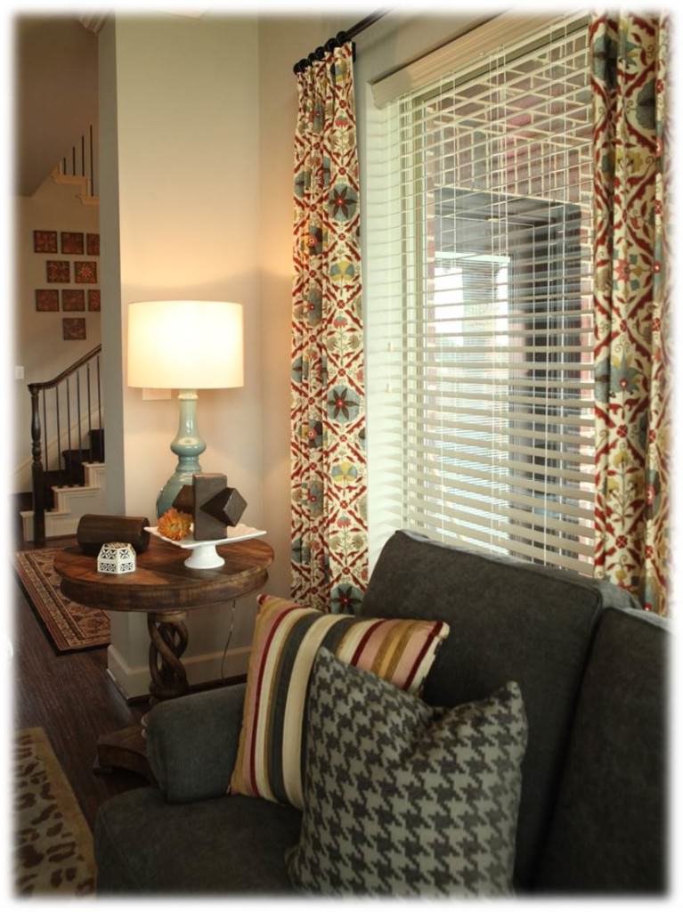
The stripes and houndtooth patterned pillows add a masculine touch against the more feminine draperies.

IMG_5015-77

Adding unique wooden side tables makes the room feel warm and cozy.  With the high ceilings in this room, we needed that.  Also adds that shape that we needed to soften the edges.

IMG_4955-17

DSC04263

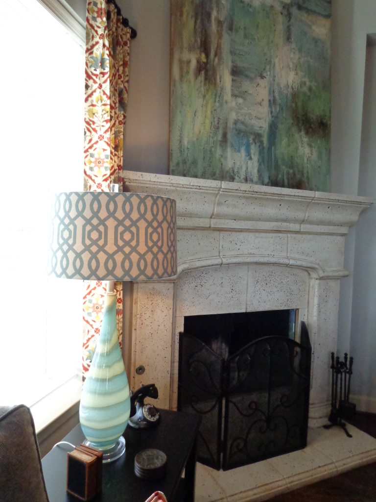
Unique lamps and a fun shade add personality, fun and a more relaxed feel.  The painting on the mantel is huge and is all the mantel needs to make a statement.  Less fussy!

decrenew interiors 5

DSC04184

The chair pillows add a punch of turquoise without going over the top with this bold color.

DSC04257

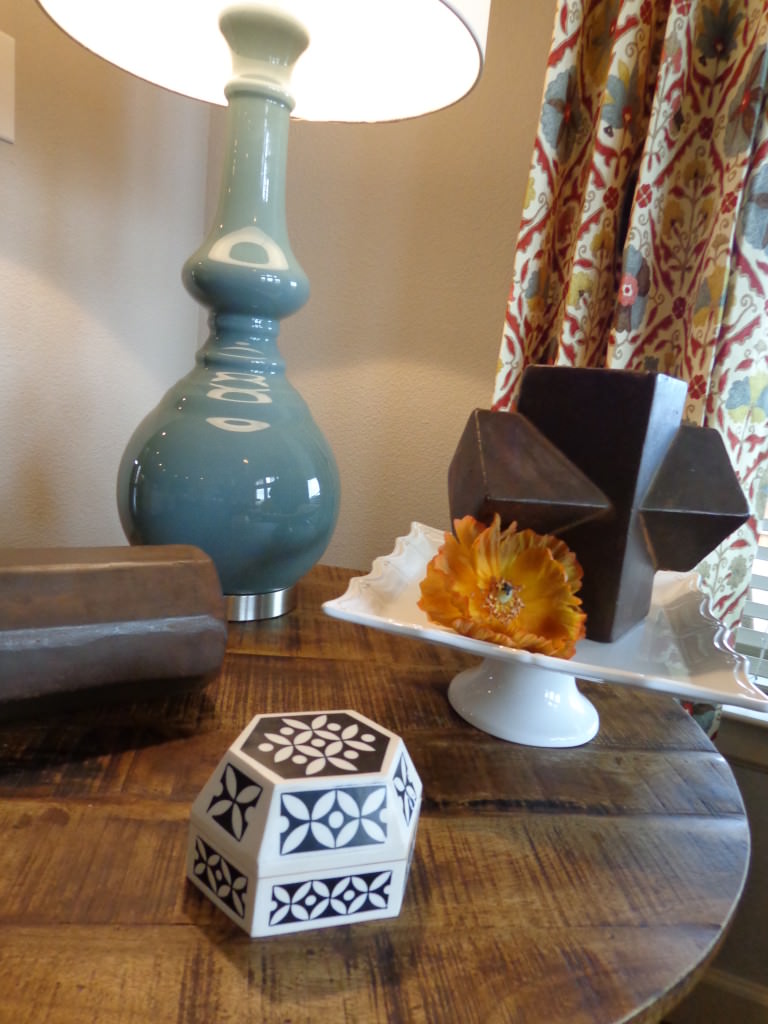
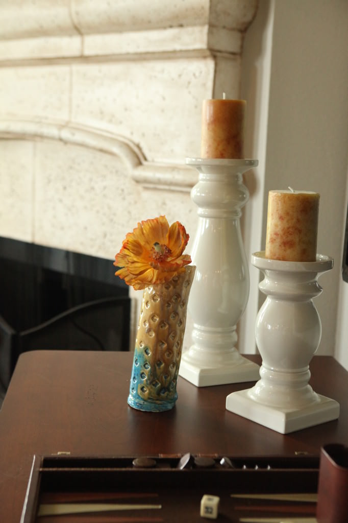
  I found a cake platter in one of the kitchen cabinets and created this vignette.

Ruthie Decorating Tip: Accessories placed in different heights make more of  statement and draws your eye into each item.  Look for bowls, books, boxes, etc. to raise things up.  It's more appealing to your eye. 

DSC04263

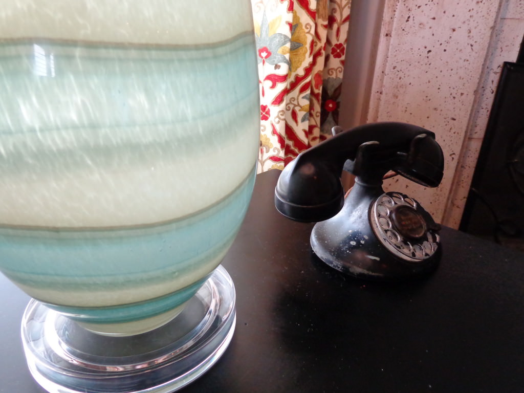
This telephone was in their junk pile.  I rescued it because I think it adds some history to the room.

DSC04177

I have a love for lamps and this one is to die for!

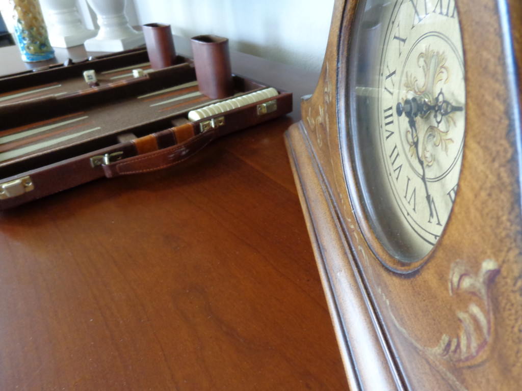
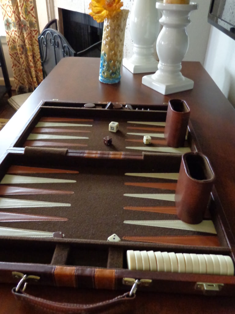
The family also enjoys playing batgammon.  I placed it out as decor since it is used often.  The kids loved seeing their treasures out and displayed.  I also placed some of their other items like family pictures, grandma's clock, etc.

DSC04189

DSC04270

Paired with this cute piece of pottery that their son made a few weeks ago, it makes for a nice combination.

IMG_4959-21

IMG_4973-35

IMG_4951-13

So you probably want to see a totaly before and after right?

It's a hard room to get a good picture of the entire space because of the light that pours in (a good problem to have).  These are the best we could do but it gives you an idea of the dramatic transformation.

BEFORE

unnamed

AFTER

DECRENEW INTERIORS14

I loved what my client said when she walked in her new family room.

 "Is this really my house?  I don't feel worthy of this gorgeous space!"  

Yes, you are worthy!!!!  I so appreciate the opportunity to work with such a wonderful, worthy family!  Thanks for trusting me and for allowing me to be part of this project.

IMG_5053-115

Thanks for joining me for this recap! I'll be posting before and after pictures of their dining room next.

See above!

Geometric fabrics & Blue Master Bedroom

My Intern and I had a great install yesterday afternoon for a wonderful retired couple that needed a master bedroom revamp!  I've really enjoyed working with my intern, Audra, she is a lovely high school student who is going into Interior Design when she goes off to college next year! 
 She is an honor student and is excited about an Interior Design career.  I hope to have her working along side me the rest of her senior year which is an amazing opportunity for me and for her!  It was especially helpful because I've lost my voice and could hardly communicate!
 
BEFORE
 
If you know me, I don't do the "matchy matchy" thing. 
 
AFTER
 
My clients had friends over from out of town so they were in the living room waiting anxiously while they sipped wine.  It was fun to hear them enjoying each other as they had a wine tasting of several different wines they had purchased!   They were so excited for the reveal!
 
 
Mixing it up makes it WAY more interesting. You don't want your "custom" space to look like it was a bed in a bag where all the fabrics are the same. 
 
 
At least that's what I prefer for my designs.
 
BEFORE
 
 
AFTER
 
The boxes on the bed are filled with chocolates now.  However, they can be used later for putting items that you want to hide to alleviate the clutter (medicines, remotes, tissues, etc.)
 
 
We had all the bedding custom made (my workroom is fantastic) and then incorporated some of the items the client had already into the design. 
 
 
This beautiful tapestry is important to them and is  from their travels together.  Therefore, the colors were my inspiration  for the room.  They really wanted this treasure placed in their bedroom. 
 
 
It really looks great with the new fabrics would you say?  They already had the bed, dressers and side tables so I was happy to incorporate them into the design.
 
 
They have a beautiful home on the golf course and love to bird watch. 
 
 
 I thought the lamps I chose were perfect for them and I couldn't believe I found them!
 
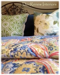
   I especially love the velvet pillow shams with the bedspread fabric on the cording.  Really pulls all the colors together.  DETAILS, DETAILS, DETAILS.  Soft cotton down filled pillows are a nice contrast against the velvet.
 
 
My client absolutely loves every shade of blue so we added this amazing bed skirt to the bed.  I'm  just crazy about this geometric pattern and the pleating is not too fussy.
 
 
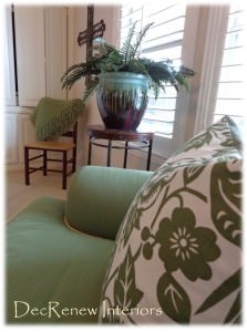
I always love to add an unexpected pop of color to my designs.  In this room it was an apple green pillow with a crisp linen floral medallion pattern.  A happy surprise in this traditional bedroom.  My job is to stretch my clients a little which means taking risks and stretching them a bit.  I chose several fabrics for them to choose from for the bedding and then fortunately they completely trusted me in the pillow selections (I've decorated her entire home so we've built that trust :)  and she LOVED the combinations we selected!
 
Shhhh.....we tucked a few chocolates under their pillows!
 
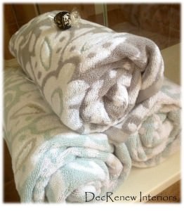
We added some new towels and bath mats to their bathroom too and they feel like butter!  Soft and luxurious.  NEVER skimp on towels and linens.  Spend more money on these items that you come in contact with each time you step out of the bath or shower.
  
Visit my website, https://www.ruthiestaalsen.com to see my Design Portfolio!
Follow me on Pinterest and be inspired with all the photo's I pin! Happy pinning!


House Beautiful in a day.

 
I always enjoy my ONE DAY installs.  My client and her husband just moved to their new home and hadn't a clue where to start with all of their decorating.  They were consolidating homes and had a bit of this and a bit of that and a lot of wonderful collections too!  They hired me to "use what they had" to make their home beautiful.
 
 
I met with them for a "Walk-thru" consultation first and I helped them select paint colors for certain rooms.  I then took an inventory of the items they had and made a list of some accessories that we could add to their mix to make the final reveal look more complete.  Doing "One Day" installs is one of my favorites, it's my passion!  I want everyone to be able to have a beautiful home and it doesn't always mean purchasing ALL brand new items.  Mixing it up and adding some creativity to your home is what makes it personal! 
 Isn't that what Pinterest is all about these days?
 
 
On the day of the install (a week later) I made them leave for the day (so they could be surprised) and we got to work!  Half way through the day, I heard the front door open and it was my client, she couldn't wait and wanted a peak....I immediately told her she wasn't allowed to peek :) and sent her on her way :)  She was just so excited and thought I'd let her see a glimpse into what we were doing.  I was just as excited :)
 
BEFORE
 
 AFTER
 
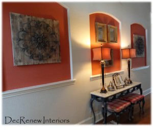
My team and I went through each room and pulled things from other rooms, shopped in closets, the garage, and even the patio.  We also placed some new items (lamps, accessories, pillows, wall art, mirrors, etc.) as well.   These three niches are something you see a lot in new houses. I don't like them because they limit what you can do and make new homeowners that don't have a clue about decorating even more frustrated!


I recommended they paint the insets Sherwin Williams "Foxy" to go with their rug and other furniture they have in the house.  In the past, I've wallpapered, faux finished, tiled with a metallic pearl tile, stenciled, etc. but for these niches it was more cost effective to paint them.
 
 
The  homeowners had a formal flair to their decorating style and I suggested that we break that up a bit. Adding old and new items, formal and casual, makes a room feel a lot warmer and more inviting.  I want rooms that I decorate to be spaces that people actually go in and enjoy!  Their house needs to have "lived in" spaces not just "for show" rooms.
 
 
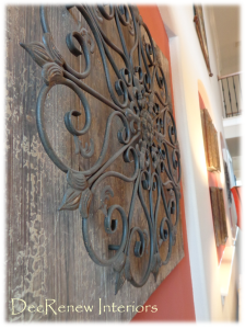
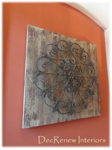
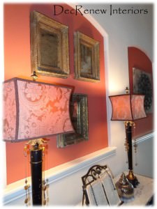
Adding the rustic panels to two of the niches added the casual, comfortable, rustic flair.  For the middle niche, I added three antiqued & distressed mirrors in gorgeous frames.  They look really stunning with the  buffet lamps I purchased for them.  
 
 
Their family Bible that has been passed down for generations was placed between the lamps because that is the one thing the homeowner really wanted!
 
 
BEFORE
 
 
The dining room was painted a wonderful sage green. 
 
AFTER
 
I took a leaf out of the table as it was way to big for the room.  The leaves can be added with no problem but for every day, it needed to be smaller. 
 
 
I grouped special artwork that was done by family together on one wall.  I added a few embroidered throw pillows for color (the same red that is in the entry niches) and they made this dining room come alive and united this room with the entry.  An "all natural" arrangement added to the table and it looks fresh and updated now. It brings me great joy when I can incorporate things that have special meaning to the family.
 
 
I spruced up their family room too.


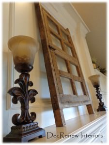
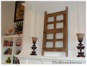
I found this old window in their garage and decided it would be beautiful on their mantel.  Again, breaking up the formal feel and adding a bit of character and "old world" charm.
 
Rearranged the bookshelves and added some height to the room with artwork and wrought iron.
 
 
The butler pantry got a new look with her collection of baskets.  We hung them on the wall because they are all so beautiful and did not need to be hidden in the closet.


The Master Bedroom got an animal print throw pillows to add to the mix and broke up the "matchy matchy" of her duvet set.
 
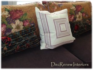
 The couch back pillows were getting worn and had lost their form so I got rid of those.  I then took the floral bed pillows off their bed and added them to the couch and I  must say it looks wonderful. I made a nice quiet reading/chatting space for the couple to sit and have coffee each day together.
 
 
It's amazing how a few throw pillows can "update" a space instantly.
 
 You have to have those things that are special to you close to you.  Placed this treasure on "HIS" side, so sweet and obviously hand made with LOVE!
 
 
The baby room got a few throw pillows and we moved things around a little.


The upstairs rooms got some freshening up too.  Their children come home a lot to visit so they wanted them to have some personality based on what each child likes.  Again, we "used what they had" and made it work beautifully. 
 
 
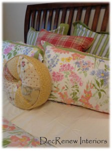
Ruthie's tip:  If you buy a "bed in a bag" mix it up with other pillows so it isn't so matchy.  I brought in the plaid pillow and the round pillow from another room and it happened to work perfectly.  It isn't always that easy but buying a few pillows that didn't come with the set is a great way to mix it up.


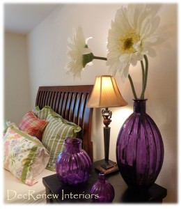
Found the large flowers in another room too and thought they deserved to be more of a focal point with these purple vases they already had.  I've made a shopping list for a few things the upstairs rooms need and will place them in Phase II of the project.
 
 
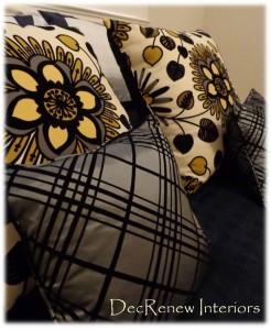
The pillows are stunning in the "Architects" room.


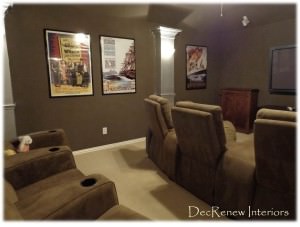
We had the theatre room painted a rich espresso and the columns got a nice silver metallic finish on them.  We hung new posters and this room is ready for the show to start!
 
 
It was a fun, exhausting but a very rewarding day! 
 
If you need help with your decorating, visit my website,
 DecRenew Interiors to see my Design Portfolio.
  Remodels, updates, one day decorating, hourly consultations and much more!
 
 
Follow me on Pinterest and be inspired!
 

New Dining Room & Family Room and a time to be thankful.

What a great install we had yesterday! 
 
I put a Design Plan together several months ago for a client that wanted a Dining Room, Family Room and office transformed "using what she had" as well as incorporating some new pieces.  We had the install yesterday so here are the before and after's.  I was quickly taking snapshots so sorry my pictures aren't as clear as usual. It was getting dark out too and I was trying to finish up so we could do the big reveal! My clients were waiting next door anxiously.
 
BEFORE
 
Previously Formal Living Room
 
My client wanted to change her existing formal living room into her dining room.  They never used this space and she needed an office.  We made her old dining room into a great space for her now to have a desk. 
 
AFTER
 
NOW the Dining Room
 
Painted this room and her "new" office (across the way) a dark rich blue/green.  We transformed her existing chairs by painting them a soft distressed grey.  Her china cabinet got the same treatment. 
 
BEFORE
 
Chairs and china cabinet BEFORE.
 
 She had the parson chairs in storage so we had those reupholstered for each end of the table.  I tried to use as much as "what she had" as possible to save on the budget. 
 
AFTER
 
Painted and waiting to be picked up to be re-upholstered in a great red fabric.
 
 It not only saves on the budget but it gives us the "collected over time" look that I love so much and what my clients usually request!  The table has an extension so we painted and reupholstered ALL the chairs so they can be pulled out when entertaining.
 
BEFORE
 
Old dining room
 
AFTER
NEW DINING ROOM where formal living use to be.  You can see the china cabinet peeking out.  Sorry it's not a great picture but you get the idea.
 
Grandma's silver tray was put on the table and a blown glass vase was added along with the flowers.

Added electric wall sconces and a chandelier. We kept the existing rug and added new draperies and the large mirror. I love how now the mirror reflects the chandeliers in both rooms beautifully.


FAMILY ROOM TRANSFORMATION
 
BEFORE

 
Goodbye yellow paint!  Their family room needed personalizing.  The "matching" set of leather furniture wasn't working for the room and made it feel very dark, especially since they have wood floors throughout. We decided to keep the entertainment center and the large leather couch.  The rest of it got put in another room and we added lighter wall paint and brighter colors.
 
AFTER
 
 
Our rug was the inspiration for the color scheme we went with in this room.  The new custom draperies really add style and height to the room and added the color and pattern we needed.
 
 
 I had the two club chairs made from scratch and they turned out beautifully and are extremely comfortable.  New pillows and some lamps and the room is good to go.  A round coffee table is coming soon. 
 
I asked my client to clear the rooms before I got there and create a shopping room for me.  As I worked throughout the day, I shopped in that room for items to place that were important to their family. 
 
 
I was so pleased with the chairs and they go beautifully with the rug and draperies.  I found these pillows on one of my shopping excursions and thought they brought in the brown from the leather couch and pulled the room together nicely.
 
  
BEFORE
 
 
AFTER
 
 
 The fireplace was painted a darker color and the green dated fireplace surround tile will be replaced eventually with a nice slate tile when the new carpet goes in upstairs. 
 
BEFORE
 
 
See what I mean about everything being the same color?  It made it boring and dull.
 
AFTER
Now it's light, open, fresh and stylish.   Much more like the homeowner's personality!  We add that island light fixture in the background too!
 
 
Getting darker outside by the minute.  My client was scared of this fabric because it resembled an animal print.  However, she trusted me when I told her that it would be the star in the room and she was pleased to see that it was!
 
Crazy over this lamp.
 
 
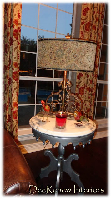
If you follow me on Facebook, you saw that I posted about this little side table.  The base of it was a cherry wood before, passed down from the family.  My client wanted to keep it for memories sake so we gave it a makover.
 
A peppermint candle filled the air during the reveal and these little wooden handpainted birds were a gift from me.
 
 We had it painted this wonderful metallic silver with a turquoise undertone.  Placed the heavy marble on top and it looks fantastic in the room now and totally updated.
 
The inside of the lampshade has a leopard print that is to die for.
 
 
These velvet embossed down filled pillows are one of my favorite things in the room.
 
BEFORE
 
 
AFTER
 
 
Added this beautiful console under the stairs and stacked some of their favorite artwork.
 
I used their existing buffet that was in the dining room in their "new office" and it makes a nice welcoming statement to guests who walk into the entryway!  This rustic metal mirror makes the traditional space feel less stuffy and pretentious.  I wish I had been able to take some photo's of their new office but the lighting wasn't good by that time at all!  I'll have to go back and snap a few.
 
 
I found this glass candlestick holder that was filled with potpourri in one of her rooms and got rid of the potpourri (a dust collector by the way) filled it with moss and artificial floral stems.  No vase needed now and we "used what they had".
 
BEFORE


AFTER
 
 
I learned a wonderful thing during this install!
 I was disappointed  that I didn't get good pictures because of time and it getting dark.  However, when the client came to the door to see the big reveal they were so overjoyed, tears and all.  The neighbors came over and we walked from room to room talking about all the items that had been passed on from family or painted by special people in their lives, I realized something
 at that moment..........
I don't need pictures to capture that moment!  An even better thing to have is that memory of making their house a home for them.  The memory of their reaction (yes it was like on HGTV)  will always be in my heart and that is way better than a picture any day.   That's why I started DecRenew Interiors in the first place.  I wanted to be able to use my gifts that God gave me to help others make their humble abodes feel like a place that they want to spend time with friends and family.  No picture can ever capture what I felt last night and it was a special  gift and a reminder of the blessing of my business.  It was a good way to start the Thanksgiving break with my family. 
 
I drove home  with tears filled in my eyes feeling truly Thankful!
Happy Thanksgiving to all of you! I'm taking the week off to spend with my family!
 
 Visit my website at DecRenew Interiors to see more before and after photo's as well as my Design Portfolio.  Let me make your house a home!