Are you a fan of painted furniture?

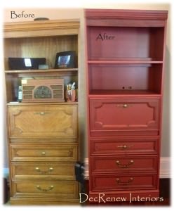
Thought you might want to see this wonderful secretary transformed into a beautiful new & updated piece.  Painted  SW Rembrandt Ruby it is now a gorgeous piece that will look amazing in my clients piano room.  As you can see, it was dated and need to either be donated or renewed.  You know that if I see a good piece with great bones, I usually recommend keeping it and revamping it.  That's what we did here and it turned out beautifully.  Professionally painted inside and out! 
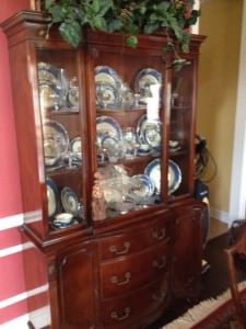
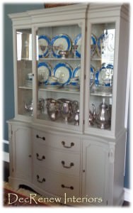
This china cabinet was beautiful but felt so formal and all the pieces matched in the room making it even more formal!  My client really wanted a more relaxed feeling in her dining room.  We had it custom painted in this wonderful soft gray and it transformed the piece.  The antique blue china is now showcased and it wasn't really noticed in the room before.
 I just loved her blue antique china!
BEFORE
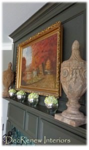
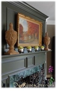
This mantel looked so formal and stark. The family that lives in this house is not formal and wanted a more relaxed feel without totally redoing their mantel ($$$$)
AFTER
Painting the entire mantel and the surround, including the trim, made it look more masculine and smart!  Works beautifully with the new furniture we placed in this room.
 
Mixing masculine and feminine pieces is one of my trademarks.
 BEFORE
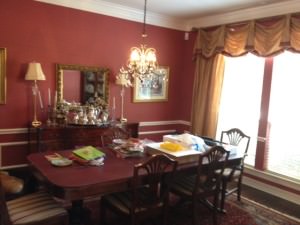
This formal dining room furniture was painted (the chairs) and moved to the formal living area.  We painted this red room and made it an office so she could meet with clients when she needed to downstairs (see after below).  Now she uses every square inch of her home.    Who uses formal living rooms anyway?
AFTER
(previously the dining room - see above)  We moved the chandelier from her entry into her new office and it worked beautifully.
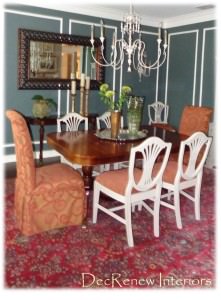
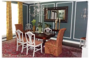
This is her new dining room (use to be formal living room).  We painted her chairs and mixed it up a little by adding parson chairs.  She wanted an eclectic mix which is more her style.
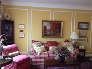
Ruthie Tip:  When you have picture frame molding in a room it is hard to know how to hang pictures.  My suggestion is to ignore the molding and hang large scale artwork, or in this case a mirror, and it makes it work.  Eliminate a bunch of things hanging in each section, this makes it look crowded and cluttered (see below before)  Keep it simple and tailored.
BEFORE
AFTER
Fresh and new without having to get rid of the family table that got passed down to them.
Are you a fan of painted furniture?
I definitely am!  However, I do think that you can go overboard.   You don't want every piece in your home to be a bright bold color or all the same color.  Keep if fresh by having a few painted items and mixing them with antiques and other finishes.  This will keep it from looking too "trendy" and your home won't have to be "updated" every few years.  You don't want too much of a good thing!
My friend Christian at Noteworthy Home is doing an amazing job locally with transforming old pieces into NEW gorgeous works of art!  Check out some of their cool pieces!
My friend Jennifer in Kansas at The Magic Brush is another company that is so creative!  Her blog is filled ideas and inspiration.
Visit DecRenew Interiors to see my design portfolio.
If you haven't read Traditional Home's "Great Kitchens" Special Edition, it's really awesome.  I'm featured on page 42 Traditional Home.

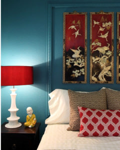
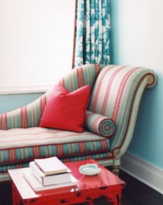
Turquoise & Red Decor

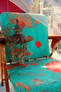
This shabby little chair makes my heart sing.  The color combinations are beautiful.  Of course, I 'm all about textures like this too so that's why I'm drawn to it.   
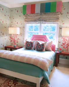
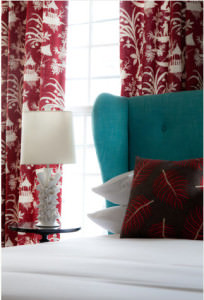
This post is all about turquoise and red combinations.  I talked about "all things pink" last post being that we are heading into the season of LOVE.  Red is the color of Love so let's see some beautiful combinations of turquoise and red.  Some will find that these colors are too strong for their taste but for decorating for Valentines Day, it's a wonderful combo.
 Can you believe these Blackened Broad Bills!!!  Just look at what God created to make our world a more beautiful place.  Their beaks are incredible.  How can we not use those colors as inspiration for our designs.
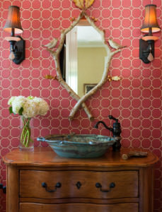
This tile is a little more pink than red but I adore the handmade pottery sink and the branch mirror.
(House of Turquoise)
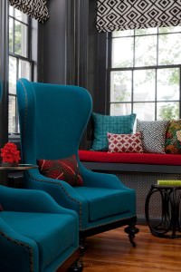
These large chairs are divine along with the red window seat covered in geometric pillows.
 (Tobi Fairley)
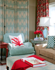
Another shade of turquoise with coral.  Gorgeous.  Tobi always does things so beautifully and is a genius at color combinations.
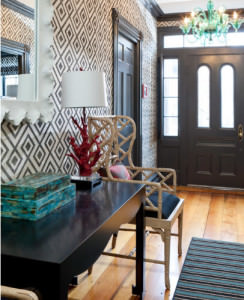
Small accessories like these stacked boxes with a Coral lamp adds such charm to this entry with a sparkly turquoise chandelier.
 (Lucy and Company) 
Love the rug, lamp and pillows in the above bedroom. Definitely an eclectic combination.
  
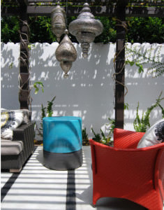
A touch of turquoise with this red wicker chair on the patio.
(Laura U. Inc)
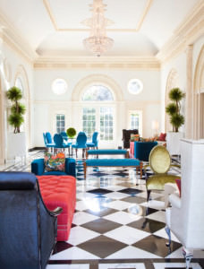
The black check floor makes a great backdrop for these bright color combinations.
I'd sleep tight in this bed.
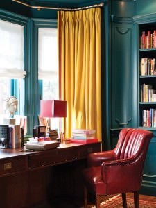
The yummy glossy walls and the shiny leather chair  make a great marriage.  The yellow draperies pulls both colors together!
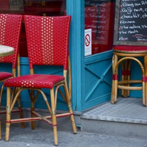
I'd want to stop at this little cafe for a Latte because of the charming color combinations.
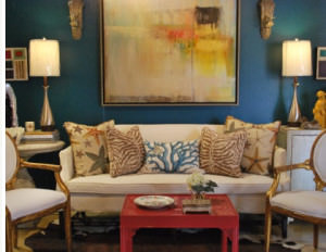
Yellow is a beautiful compliment to this shade of turquoise and raspberry.  The gilded gold side chairs are one of my favorite things in this room, along with the painting. 
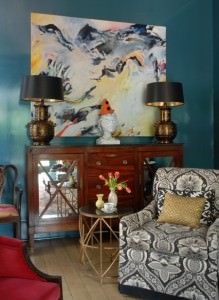
Antique pieces mixed with updated fabrics and modern artwork that pulls all the colors together.
A zen feeling in this room.
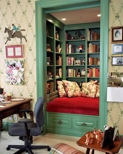
A charming little corner in a room to read.
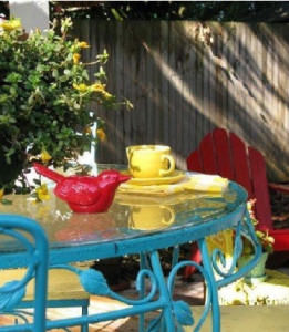
Wrought iron patio tables look amazing painted turquoise along with raspberry Adirondack chairs.  Again, paired with yellow is amazing.
 (Heavenlypins.com)
A different shade of turquoise with a velvet red.

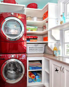
 Why not add a touch of turquoise to your laundry room.
Or your front door!  This door makes me wonder who lives here?
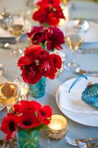
Who wouldn't want to eat at this table?  Cute little turquoise vintage glasses used as vases.

Until next post!  Enjoy decorating!

 Visit my website DecRenew Interiors to see my Design Portfolio and book your consultation today. I'm known for creating luxurious, relaxing homes where families come together to enjoy life.

Follow me on Pinterest and see my Design Boards that will Inspire you even more!

New Dining Room & Family Room and a time to be thankful.

What a great install we had yesterday! 
 
I put a Design Plan together several months ago for a client that wanted a Dining Room, Family Room and office transformed "using what she had" as well as incorporating some new pieces.  We had the install yesterday so here are the before and after's.  I was quickly taking snapshots so sorry my pictures aren't as clear as usual. It was getting dark out too and I was trying to finish up so we could do the big reveal! My clients were waiting next door anxiously.
 
BEFORE
 
Previously Formal Living Room
 
My client wanted to change her existing formal living room into her dining room.  They never used this space and she needed an office.  We made her old dining room into a great space for her now to have a desk. 
 
AFTER
 
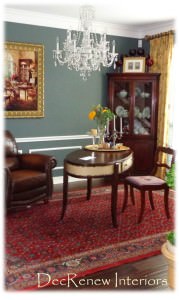
NOW the Dining Room
 
Painted this room and her "new" office (across the way) a dark rich blue/green.  We transformed her existing chairs by painting them a soft distressed grey.  Her china cabinet got the same treatment. 
 
BEFORE
 
Chairs and china cabinet BEFORE.
 
 She had the parson chairs in storage so we had those reupholstered for each end of the table.  I tried to use as much as "what she had" as possible to save on the budget. 
 
AFTER
 
Painted and waiting to be picked up to be re-upholstered in a great red fabric.
 
 It not only saves on the budget but it gives us the "collected over time" look that I love so much and what my clients usually request!  The table has an extension so we painted and reupholstered ALL the chairs so they can be pulled out when entertaining.
 
BEFORE
 
Old dining room
 
AFTER
NEW DINING ROOM where formal living use to be.  You can see the china cabinet peeking out.  Sorry it's not a great picture but you get the idea.
 
Grandma's silver tray was put on the table and a blown glass vase was added along with the flowers.

Added electric wall sconces and a chandelier. We kept the existing rug and added new draperies and the large mirror. I love how now the mirror reflects the chandeliers in both rooms beautifully.


FAMILY ROOM TRANSFORMATION
 
BEFORE

 
Goodbye yellow paint!  Their family room needed personalizing.  The "matching" set of leather furniture wasn't working for the room and made it feel very dark, especially since they have wood floors throughout. We decided to keep the entertainment center and the large leather couch.  The rest of it got put in another room and we added lighter wall paint and brighter colors.
 
AFTER
 
 
Our rug was the inspiration for the color scheme we went with in this room.  The new custom draperies really add style and height to the room and added the color and pattern we needed.
 
 
 I had the two club chairs made from scratch and they turned out beautifully and are extremely comfortable.  New pillows and some lamps and the room is good to go.  A round coffee table is coming soon. 
 
I asked my client to clear the rooms before I got there and create a shopping room for me.  As I worked throughout the day, I shopped in that room for items to place that were important to their family. 
 
 
I was so pleased with the chairs and they go beautifully with the rug and draperies.  I found these pillows on one of my shopping excursions and thought they brought in the brown from the leather couch and pulled the room together nicely.
 
  
BEFORE
 
 
AFTER
 
 
 The fireplace was painted a darker color and the green dated fireplace surround tile will be replaced eventually with a nice slate tile when the new carpet goes in upstairs. 
 
BEFORE
 
 
See what I mean about everything being the same color?  It made it boring and dull.
 
AFTER
Now it's light, open, fresh and stylish.   Much more like the homeowner's personality!  We add that island light fixture in the background too!
 
 
Getting darker outside by the minute.  My client was scared of this fabric because it resembled an animal print.  However, she trusted me when I told her that it would be the star in the room and she was pleased to see that it was!
 
Crazy over this lamp.
 
 
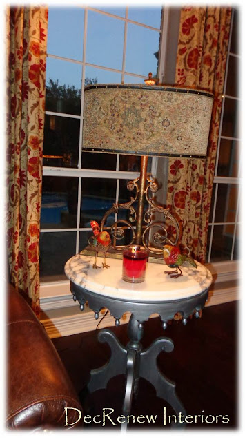
If you follow me on Facebook, you saw that I posted about this little side table.  The base of it was a cherry wood before, passed down from the family.  My client wanted to keep it for memories sake so we gave it a makover.
 
A peppermint candle filled the air during the reveal and these little wooden handpainted birds were a gift from me.
 
 We had it painted this wonderful metallic silver with a turquoise undertone.  Placed the heavy marble on top and it looks fantastic in the room now and totally updated.
 
The inside of the lampshade has a leopard print that is to die for.
 
 
These velvet embossed down filled pillows are one of my favorite things in the room.
 
BEFORE
 
 
AFTER
 
 
Added this beautiful console under the stairs and stacked some of their favorite artwork.
 
I used their existing buffet that was in the dining room in their "new office" and it makes a nice welcoming statement to guests who walk into the entryway!  This rustic metal mirror makes the traditional space feel less stuffy and pretentious.  I wish I had been able to take some photo's of their new office but the lighting wasn't good by that time at all!  I'll have to go back and snap a few.
 
 
I found this glass candlestick holder that was filled with potpourri in one of her rooms and got rid of the potpourri (a dust collector by the way) filled it with moss and artificial floral stems.  No vase needed now and we "used what they had".
 
BEFORE


AFTER
 
 
I learned a wonderful thing during this install!
 I was disappointed  that I didn't get good pictures because of time and it getting dark.  However, when the client came to the door to see the big reveal they were so overjoyed, tears and all.  The neighbors came over and we walked from room to room talking about all the items that had been passed on from family or painted by special people in their lives, I realized something
 at that moment..........
I don't need pictures to capture that moment!  An even better thing to have is that memory of making their house a home for them.  The memory of their reaction (yes it was like on HGTV)  will always be in my heart and that is way better than a picture any day.   That's why I started DecRenew Interiors in the first place.  I wanted to be able to use my gifts that God gave me to help others make their humble abodes feel like a place that they want to spend time with friends and family.  No picture can ever capture what I felt last night and it was a special  gift and a reminder of the blessing of my business.  It was a good way to start the Thanksgiving break with my family. 
 
I drove home  with tears filled in my eyes feeling truly Thankful!
Happy Thanksgiving to all of you! I'm taking the week off to spend with my family!
 
 Visit my website at DecRenew Interiors to see more before and after photo's as well as my Design Portfolio.  Let me make your house a home!