Ruthie Staalsen; Behind Her Brand

My co-authors and I have been working on a fabulous new book that launched on February 6. It’s designed for the emerging entrepreneur who is ready to step out, step up, and step into what they feel called to do in business. I am super excited and I just wanted to share it with you guys.

Ruthie Book

The name of the book is Behind Her Brand: Entrepreneur Edition, Vol. 6.

Each chapter takes you on journeys of real life lessons, obstacles, think tank processes, disappointments, and the victories of 12 successful female entrepreneurs who turned their brand into catalysts for their business successes. I can’t wait for you to read it and GROW!

We answer some of the following questions:

How have you defined your voice in your market?

What three things do you wish you had known when  you started?

What makes you a woman of impact?

What advice would you give someone who is wanting to take their business to the next level?

What 3 characteristics describe what made you successful and why?

I have found that the best way to learn is from those that have gone before you.  I share the challenges I face as an entrepeneur as well as the joys and rewards of being in business for yourself.  I share the story of my childhood living overseas and how that shaped and formed me to become an Entrepeneur.

If you are just getting started out there as an Entrepeneur, or are considering starting a business, this book will be very helpful.

I hope that the the things I share about my experiences as a business owner will inspire you.

I wrote a poem for my book launch, as part of my speech. My husband said I should share it, so here goes......

CONNECTING LIFE AND HOME

by Ruthie Staalsen

_________________________________________________________________________

HOME is where we get carried across the threshold for the first time,

or bring our babies home from the hospital.

It’s where we gather around our table laughing so hard it hurts

and where dad flashes the porch light indicating it’s time to bring in his daughter……pronto.

It’s where your friend calls and tells you she has cancer

and where we evaluate life’s tough questions and instill values and traditions.

HOME is where we get encouragement over a cup of earl gray tea

or cry tears nobody else can see.

It’s where we stand together in our kitchen, united as a family, praying for a hurting loved one.

It's where we watch our kids drive away for the first time

and where your dog snores louder than your husband.

HOME is where good friends cook breakfast for dinner just because they love the experience of being together.

HOME is where you hope to hear the words, “Mom, I got accepted into nursing school!”

and HOME is a haven where we can let our guards down.

It is our refuge, our strength, and our safe place.

As an interior designer, I have the honor of creating beautiful environments so that these memories and traditions can take place.

It’s a joy, a gift, and a privilege.

You can order my book by clicking this link: http://store.decrenew.com

A big shout out to Kimmberly Pitts, Founder of Ulmpact Publishing Group for compiling this wonderful book. http://www.uimpactpublishing.com

Ruthie Staalsen wins Best of Houzz 2017


DecRenew Interiors by Ruthie Staalsen is so honored to have been awarded "Best of Houzz" once again this year.

Houzz.com is definitely a growing website with millions of photos of  homes across the world.  Designers and contractors add photos to their galleries and we get to be inspired by them.
I have found this website a  great way for designers to work with clients when trying to determine what their style is.  The client can save photos of their favorite interiors to ideabooks so we can sit down together and identify their wants, needs and desires for their projects.

Check out my design profile http://www.houzz.com/pro/decrenew/__public to see my design galleries as well as our Rave reviews.  Thank you to all my wonderful clients that have written these reviews and have supported me since I started in 2002.

Thank you Houzz.com for this honor.
Decorating ideas for a cozy winter home!

I'm back at it after a wonderful holiday break.

 My girls just drove off to go back to college and I'm reminiscing about the time we had over the break.

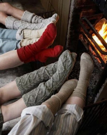
We sat around the fire, read books and took long naps. My house was filled with laughter, long conversations, cooking, shopping and lots of the Gilmore girls series.

Now that they are gone, I've been thinking about what makes us want to hang out at home. What is it about the environment that we like?   Of course, its the people that make it home but it really does have a lot to do with the environment we create in the home.  It's about our collections and the overall feel that has evolved that makes us want to hang out in the space.

I thought I'd share with you what I've come up with that makes us feel warm and cozy during the winter months.

So here goes......

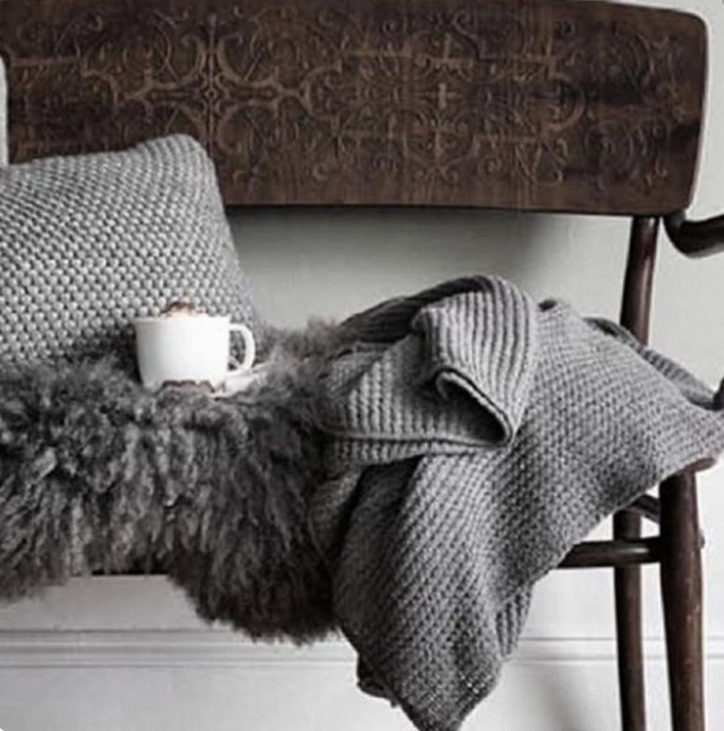
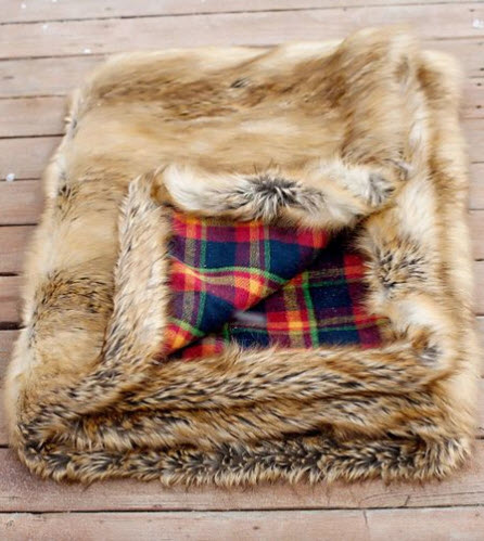
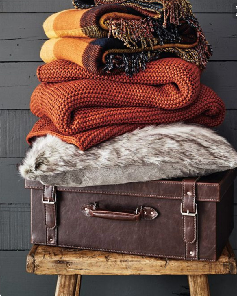
Incorporate warm blankets that feel soft to the touch.

In our house, we fight over who gets the best blankets. We love to snuggle up underneath them while watching our favorite shows. We all have our favorite one.  I have stacks all over the house and it is first come first serve!

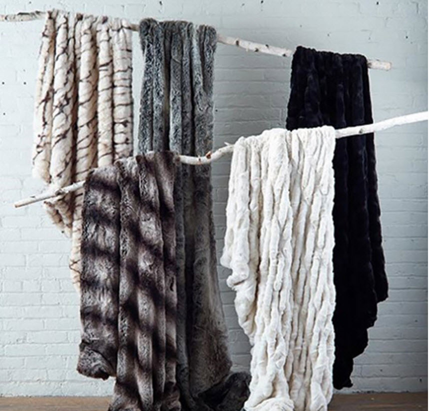
My favorite are the fur ones. Arhaus.com (click photo for link) has these that look so cozy. That black and white one catches my eye and looks nice and large, great for snuggling with two on a couch or comfy sectional.

Blankets look so glorious and romantic on a master bed or guest bed and makes you want to curl up with a cuppa tea. There are evenings all four of us are in our master suite watching a movie together because it is comfy!

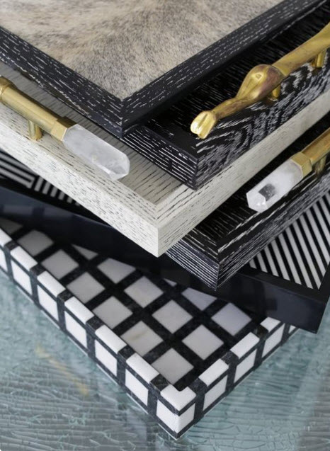
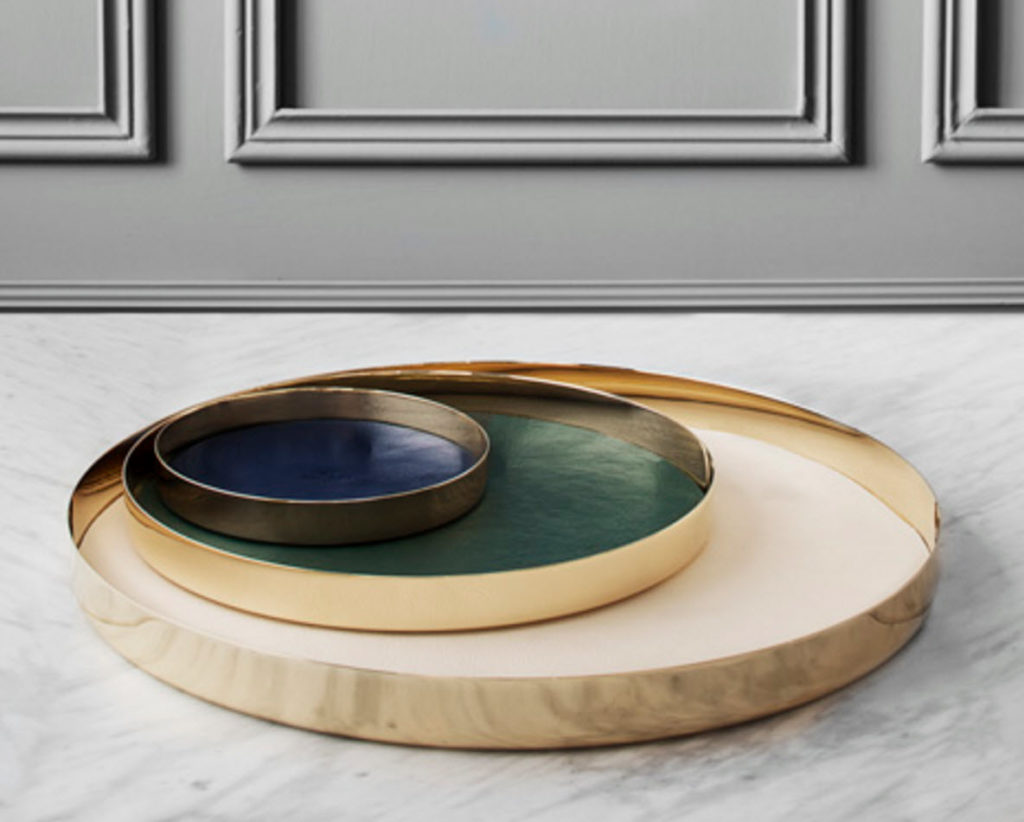
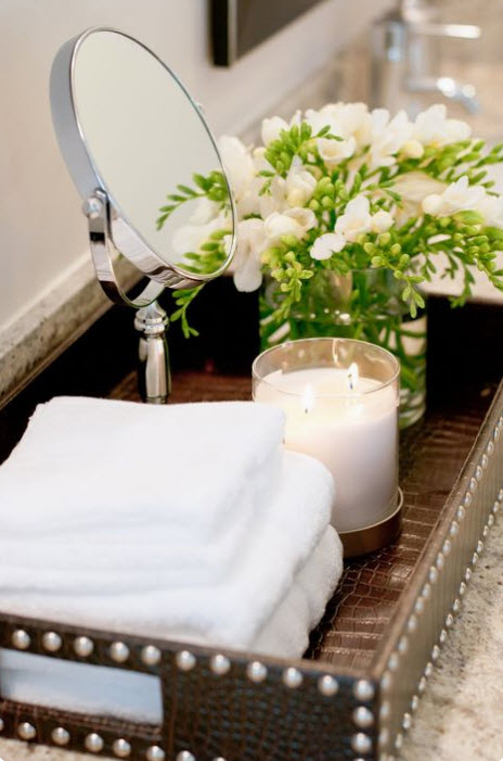
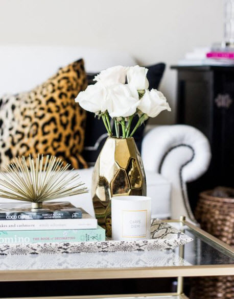
Add trays with texture and pattern.

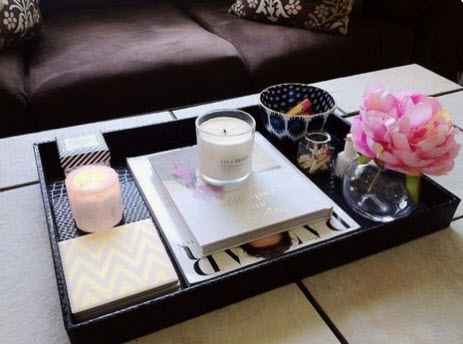
They can be added to a coffee table, under a lamp, on your bedside table with a lamp on it, or on your kitchen or bathroom counter top with a variety of candles.
The more interesting, the better. The trays I use are all so very different.

Nail heads on trays are cool too.

A black tray works great for layering accessories because the items pop nicely, especially when you layer with a black and white book.

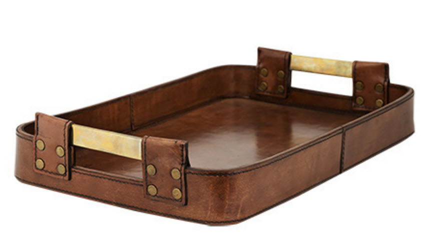
Leather trays add warmth. This leather one is so perfect for next to a guys bed.  Mixing feminine with masculine is how I love to decorate my spaces.

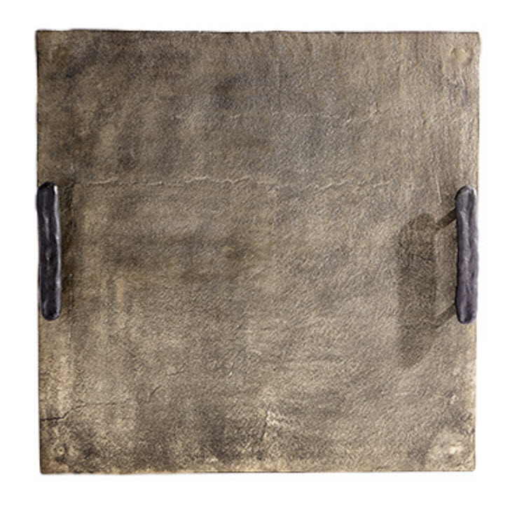
This slate tray works beautifully in the kitchen to hold your salt and pepper, olive oil and maybe a floral arrangement.

Layer rugs

It is an easy way to add color, texture and character to a room.

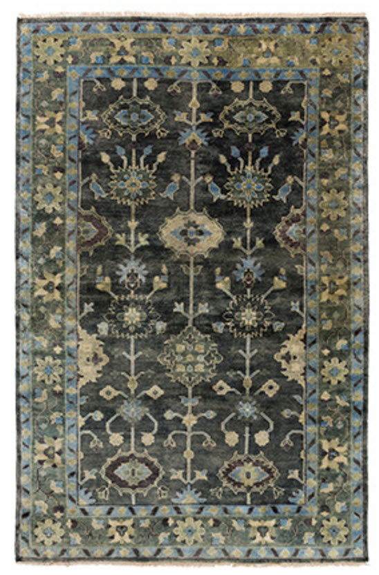
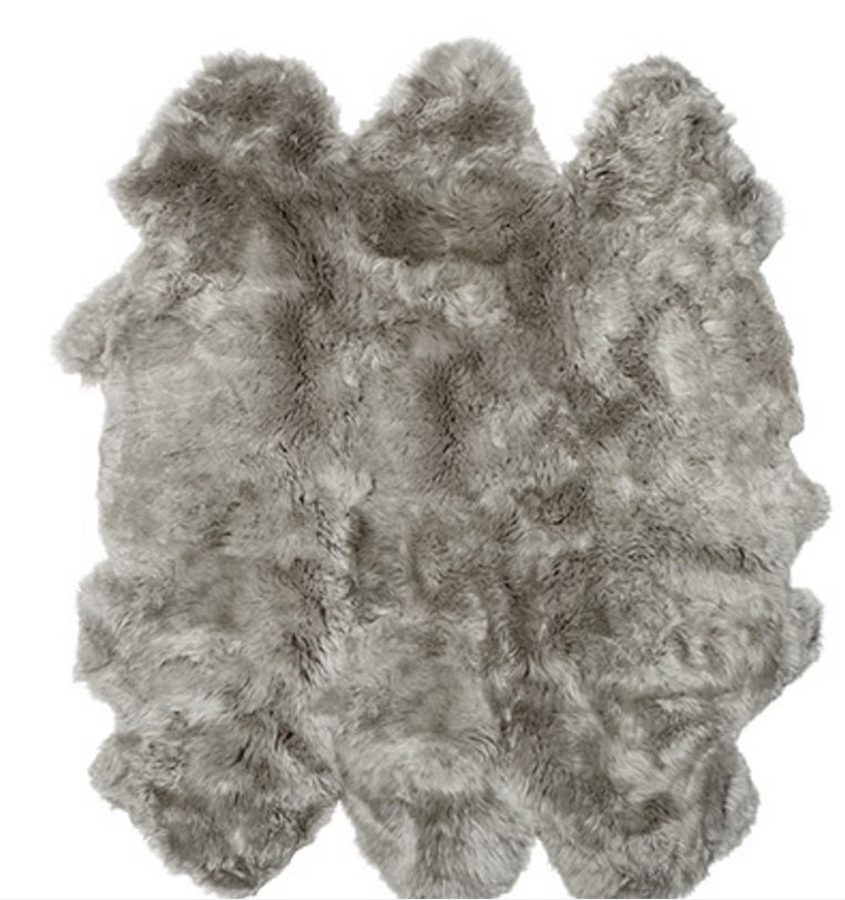
This warm and inviting rug from Arhaus.com would be beautiful layered with their gray sheepskin rug.  Of course, you want to make sure if you have a sheepskin rug, you probably shouldn't have a blanket that looks similar to it.  That would be too much of a good thing! It's all about balance, choose one or the other.

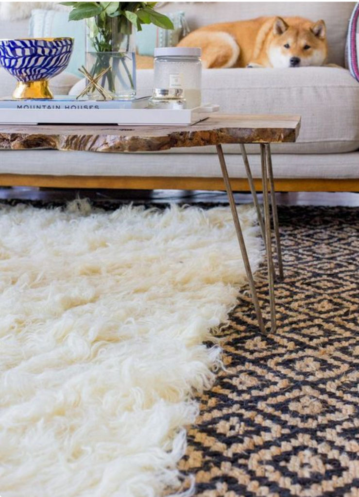
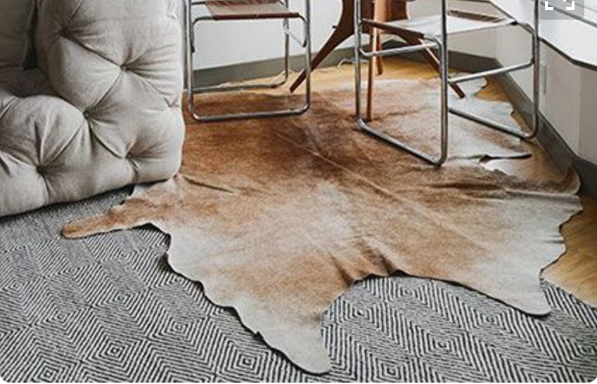
Cow hides do well for layering too. I especially love them paired with black rugs.

Add baskets throughout your home.

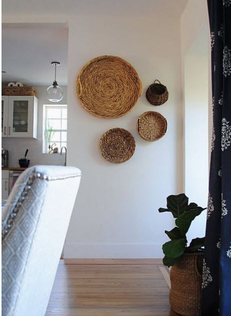
It's amazing how texture can add a drastic change to the feel of a room.  These baskets on the wall in the hallway are a bit of the unexpected.

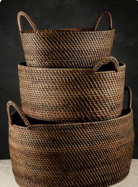
 This fun basket can be found at Target!

Add plants and they don't have to be real.

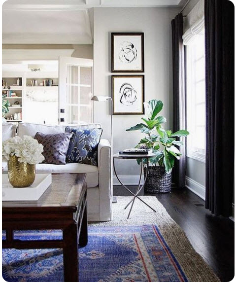
Plants add life during the winter months.  The pop of green this fig tree adds, makes things feel alive inside the home, especially since everything outside looks brown and dead (here in Texas at least).

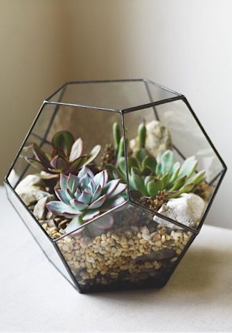
Add something as small as a terranium with succulent plants in it. This touch of life from the outdoors makes us think of warm summer days.

Change out a lamp or lampshade.

Adding a black shade to a lamp dresses is up a little and changes the ambiance. It feels a little more moody.

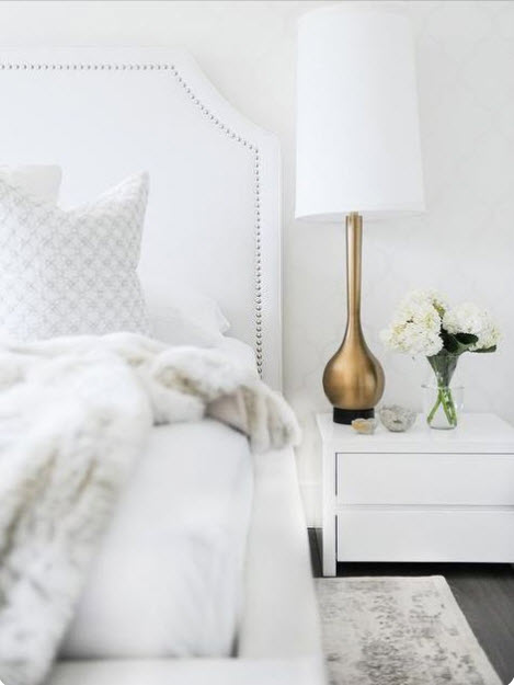
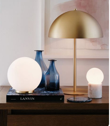
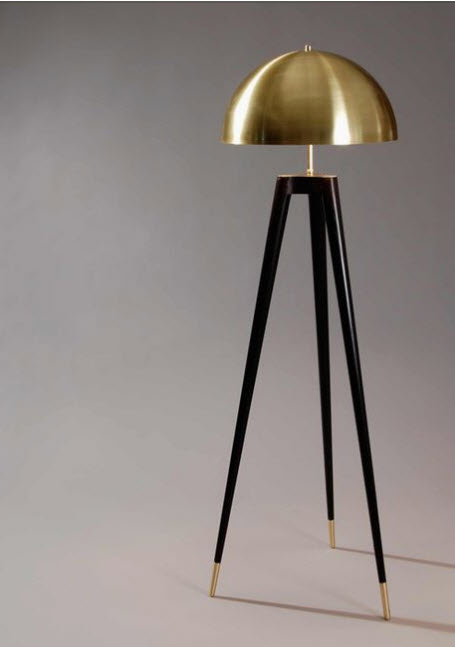
Add a lamp with a touch of brass.

Brass adds a classy, sophisticated touch.

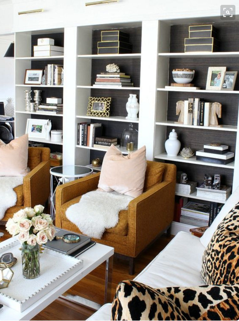
Change up your bookshelves.

Add warm color books to your collection. Colors like navy and orange work beautifully.

Ruthie tip:  Collect books that tell people about you. I have books about Safari's, Africa life, Australian life, old bibles, travels, glamping, fashion, architecture, entertaining, parties, etc. These are all books that say something about our history and what we are all about.

Paint or wallpaper behind your bookshelves with a warm/darker color.

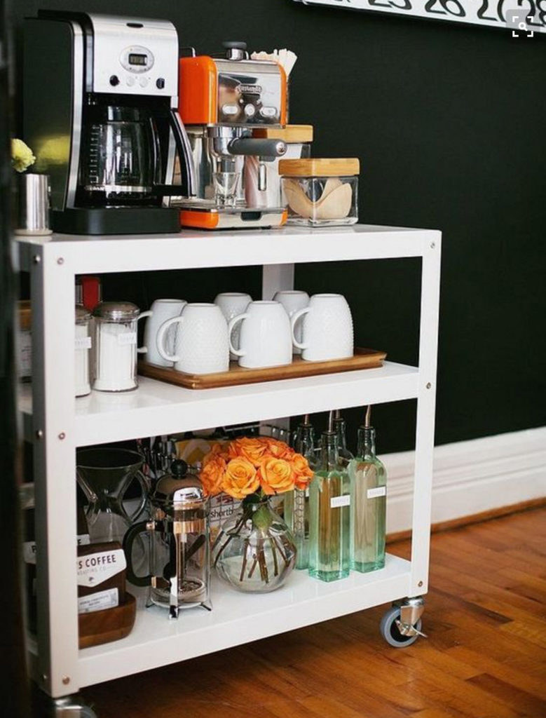
Set up a drink cart and have it ready to go at all times.

You can even add your Keurig coffee maker to the cart so coffee and hot chocolate is available whenever.

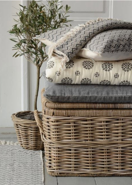
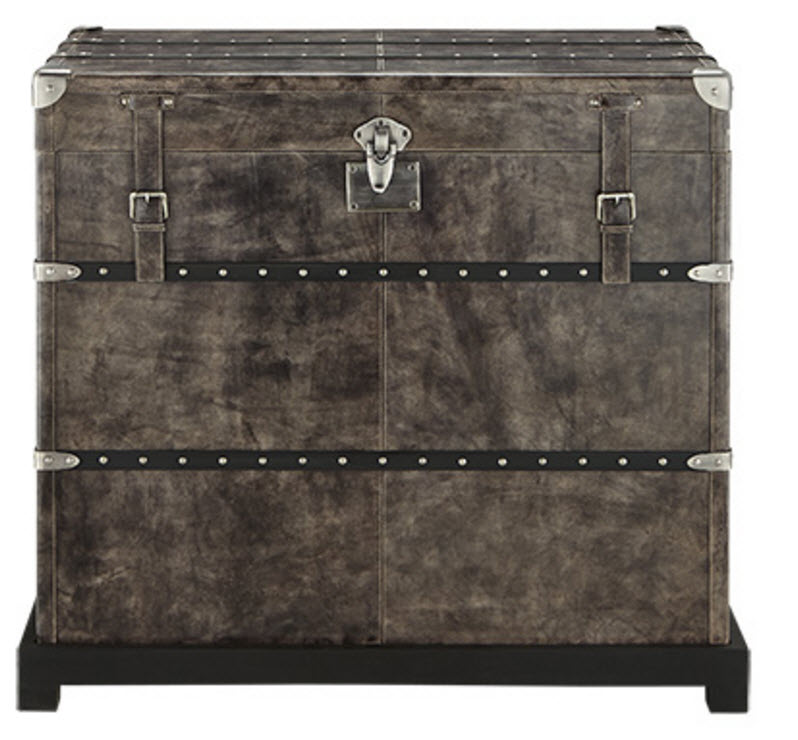
Add a small or large trunk for blankets.

Trunks give a collected look.  If you know my style, you know I strive to achieve that look.

 Add some plaid.

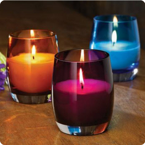
  Add jewel tones.

A grouping of jewel tone candle holders look so awesome on a mantel or on a coffee table.

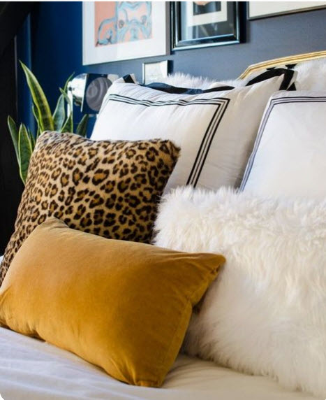
 Add a touch of animal print (always, because I'm an Africa girl)

You know I love a touch of animal print in my home! It is part of my brand for sure.  It adds so much warmth for sure,

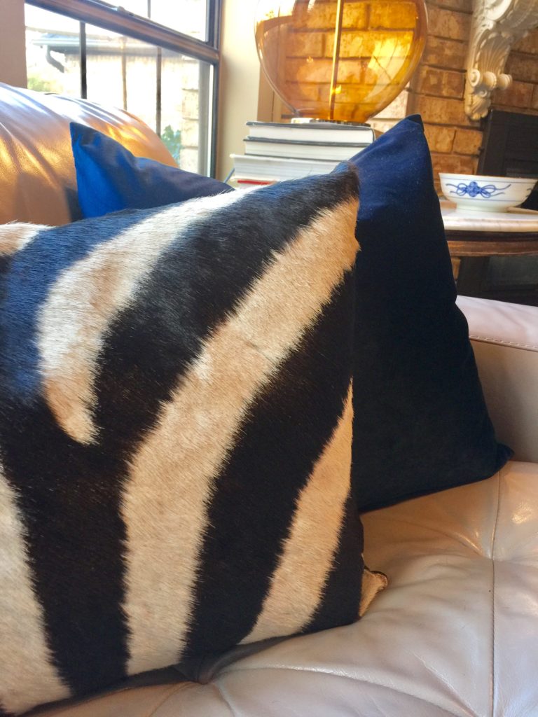
This is my living room with my jewel tone pillow and my zebra print pillow from one of my trips to Africa.

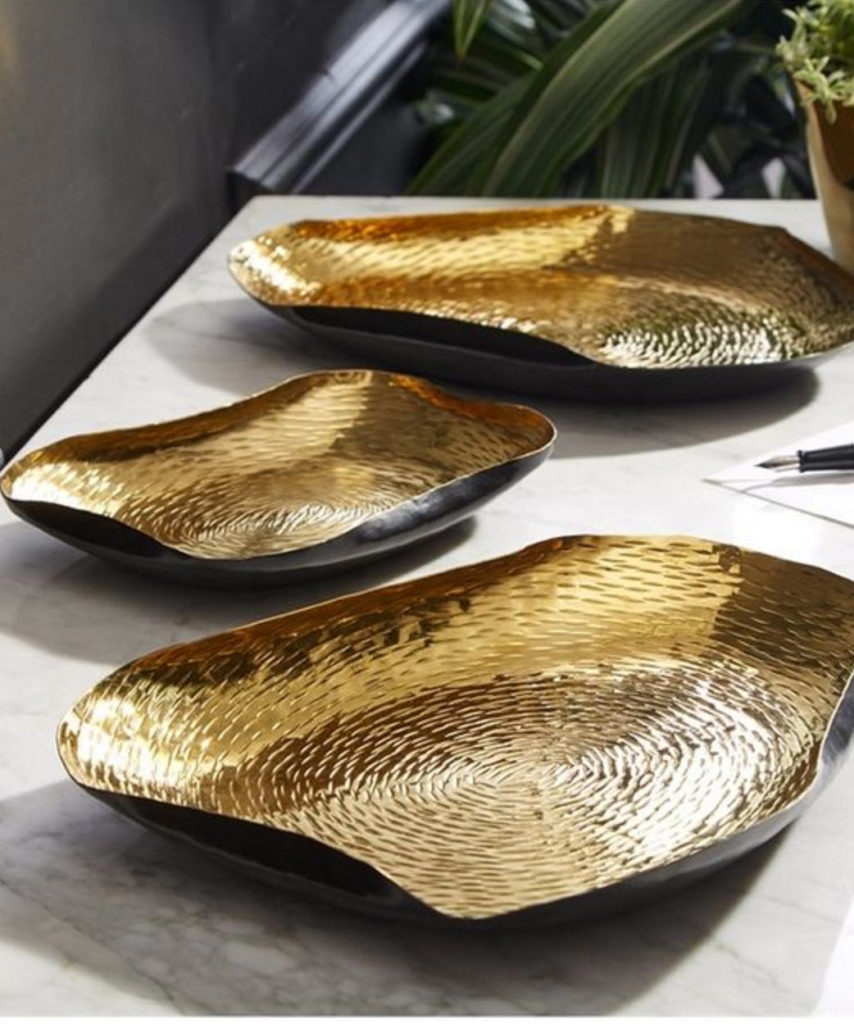
Add some gold accessories.

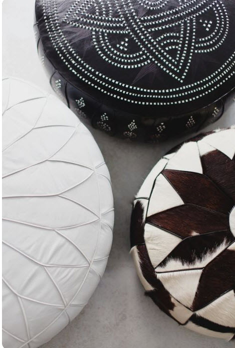
Add poufs.

They are perfect for putting under your head while laying on the floor when you have a house full of teens.

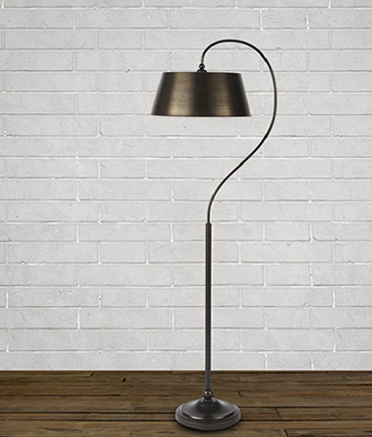
Add floor lamps

Having floor lamps in a room for evening light is something most people don't think about. We love to turn all the lights out in a room and just have a few lamps on. This creates a nice comfortable mood for conversation and entertaining. Choose interesting lamps and don't choose ones that are too short for the space.

Add colorful rugs to your kitchen.

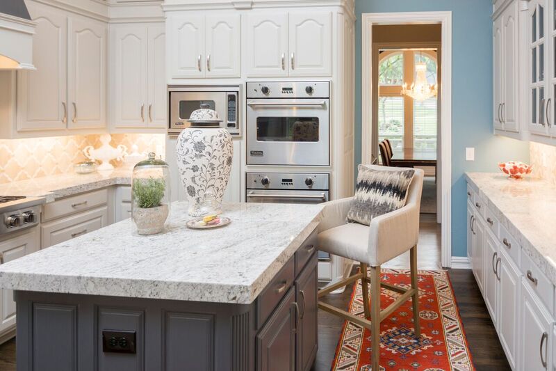
The above kitchen is one we finished several months ago.  When you add a rug to a kitchen, it instantly makes it have personality and unites all the colors in the adjoining spaces.

If you scroll up and look at all these photos again, you will see the consistency of warmth that they all have.  I hope this post gave you some ideas for making your home feel cozy during these cold winter months.

Keep warm!

Connecting Life and Home in our "Home away from Home"

It has been a busy few weeks here at the Staalsen home and I've had a wonderful vacation.  I'm back to work, but thought I'd give you a little glimpse of what life has looked like over the past month.

We had a special Christmas together with our family! We hosted 18  for dinner on Christmas Day, which  was a ton  of work but so much fun. Getting all the food on the table hot was a chaotic challenge, but we did it.

decrenewinteriors2

decrenewinteriors4

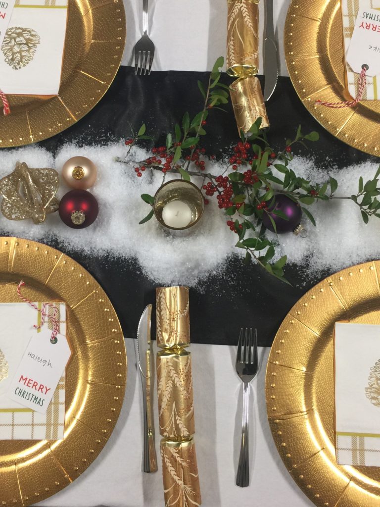
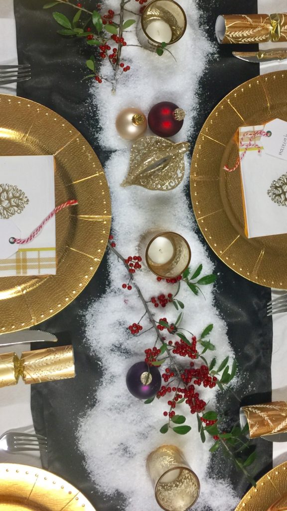
Because there were so many of us, I opted to use paper plates which made all the teen dishwashers happy.  I found these gorgeous paper gold chargers. I used clear plastic plates for the food and it looked amazing.

decrenewinteriors1

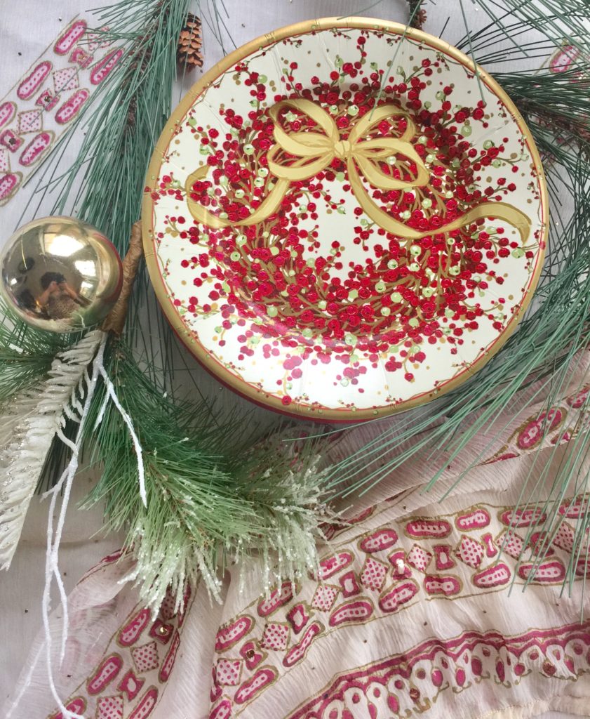
My favorite part of hosting is setting up the main table and the buffet tables.  This year I used one of my sari's from India on the dessert table.

decrenewinteriors7

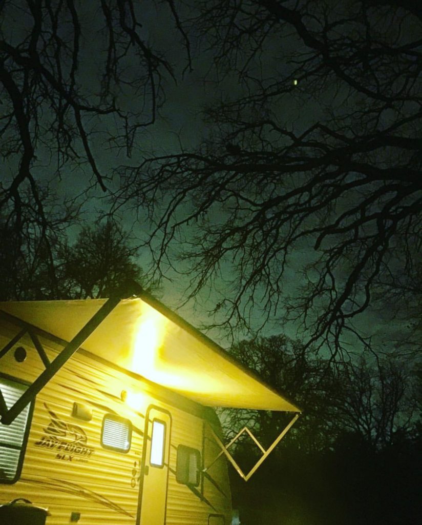
 For bringing in the New Year, we  took 20 college kids camping. We were the cooks! I was glad to be in our "home away from home " with my heater, Keurig and shower.

decrenewinteriors5

 The kids were brave and slept in their hammocks. Brrrrrrrr

img_2041

Thanks to Kennedy with Perspectives Photography for the pictures below.https://www.facebook.com/perspectivepics/

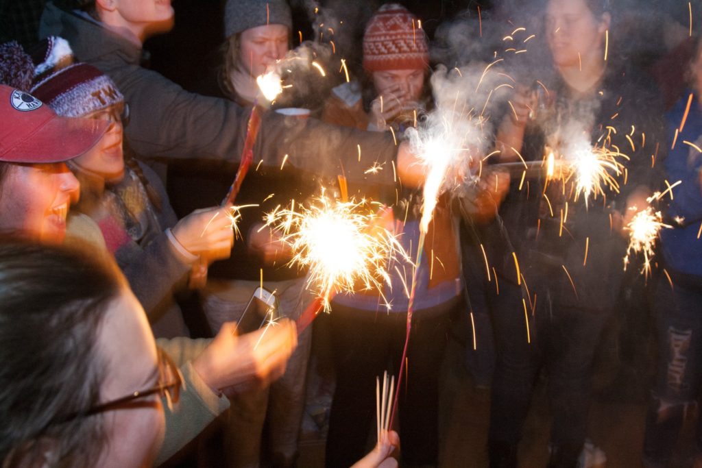
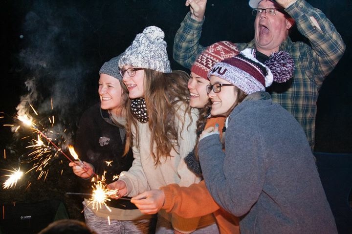
We brought the New Year in around the fire with sparklers and lots of loud fun.

img_2042

We made memories and continued our tradition from last year.

img_2040

Life is about these moments!  Community with those we love, even the crazy ones.

decrenewinteriors6

There is something about being around a roaring fire that makes us bring life back to the basics. It is the  imple things in life that makes it so rich.

img_2038

HAPPY NEW YEAR TO EACH AND EVERY OF YOU.

My 2 words for this year are BE PRESENT.

be-present

Life is too short to not be in the moment with those we love. I challenge you to think on these words as you continue with your goals for the year.

Be present and be connected!

I have lots of fun things to announce in the next few weeks so stay tuned!

Southlake Home ready for Thanksgiving Guests

_dsc1889

Last week we completed a home for a client.  It was an exciting day, especially since their home has been in a mess for the past 6 months.  They started by repainting the entire home this past summer. A 2 hour walk through took place and then while they were out of town, they had the entire home updated with the ideas I presented to them.  They also had hardwood floors and carpet installed, put in new windows, as well as new plantation shutters installed in the front rooms of the home.  Wow, did this ever make a difference to the curb appeal!

_dsc1895

After all that work was completed, it was my job to decorate the home. The client hired me to revamp their dining room, formal living, family room and entry. We wanted to use as much of the existing furniture as we could.  The antique dining room table is beautiful but just needed some repair.  We had the chairs reupholstered in a gorgeous blue and off white striped fabric and used an off white leather for the seats so they can be wiped, especially since they do see grandkids in their near future.  The urn on the table was filled with moss for that touch of nature and a pop of green to coordinate with the painting.

_dsc1879

The client had the artwork commissioned and we designed the room around it.  They are not real formal people so I wanted to add a bit of fun to the room and knew that a zebra rug would do the trick with the fabrics we used.  Isn't it fabulous?  We chose a chandelier that doesn't hide the painting so I chose this one that has open arms and little fuss, keeping the painting the star in this room.  We moved the existing chandelier into the adjacent piano room because it was too small for the room (see photo below)

Before, the mirrors in the dining room looked very 80's so I had an artist come and make them look aged by antiquing them.  We experimented with several techniques prior to her coming and finally came up with this patina.  I think they turned out beautifully and they now go with this collected look.

.decrenewinteriors

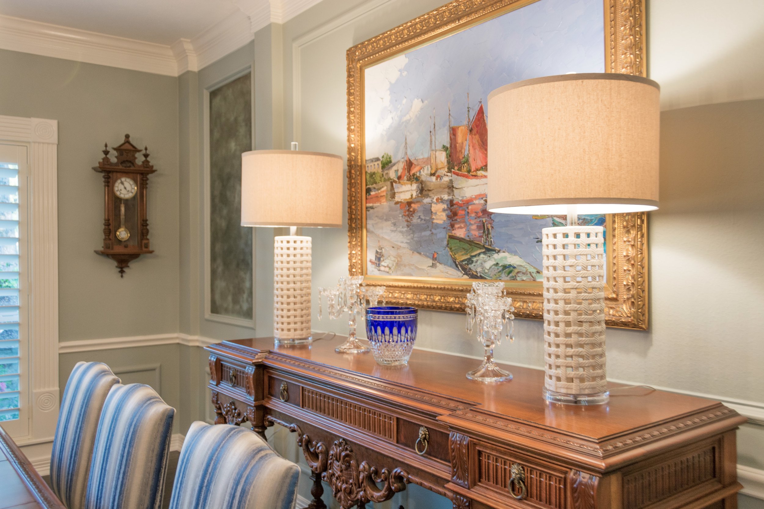
I chose these lamps for the console table because they were also open and didn't feel too bulky up against the painting.  We used the clients existing crystal from her family members and their travels, to accessorize the console.

_dsc1905

The entry was our next challenge.  The client wanted to use the existing glass round table.  We added a lamp to add some accent lighting.  Of course I wanted one that was interesting and fun.  I then layered a bamboo tray with books and other collections to make an interesting assortment to look at for all those guests that visit.  It is the first thing you see when stepping inside their home, it had to be lovely.

_dsc1909

A little bit of wicker, crystal, wood, natural elements and ceramic always makes a nice collection.  Old books that have some history or tell a story about the homeowner is always a good idea.  Don't you just love the silver coral accent piece?

_dsc1835

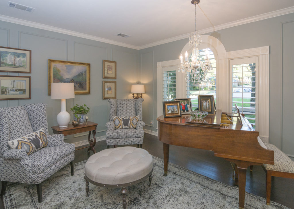
The piano room was next... right across from the dining room.  This room was never used by the client before.  If you know anything about the way I decorate, you know that I want every room in your home to be used.  We decided to make this room more of a sitting room.  Again, we wanted to make it feel approachable and not too stuffy.  You can see that we moved the chandelier above the piano.  The client's grandma would be so happy to see it here.  It is beautiful and much more to scale in this room.   This room can now be used for laptop time or Sunday morning coffee or Friday evening cocktail hour.  Oh, can we also just notice how peaceful the color on the wall is.

Ruthie Tip:  When hanging artwork where there is picture molding, just IGNORE it, it makes it dissappear and is so much easier to work with.

_dsc1865

We had these wingback chairs custom made for the client and they really are elegant and have a touch of a masculine flair.  The round ottoman is perfect for extra seating, if needed.  We also had the piano bench reupholstered in a whimsical black and white fabric by Waverly.  I used an antique table the client had between the chairs, and added the lamps and accessories that I found around their house.

_dsc1840

I wanted to use a vintage rug in this room with muted tones.  Keeping it peaceful and relaxing.  The artwork was in the home already, I just shopped the house for artwork that I thought looked good together and grouped them together, forming a gallery wall.  The pillows really added a subtle pop of color and interest.

_dsc1856

The rest of the accessories were found in the home and reused in a different way.  I took a plant from the kitchen and put it in a blue and white pot to bring in some of the blue and white from the dining room.

_dsc2012

I went shopping with the client to find a club chair that he felt comfortable in.  I then had an ottoman made that worked with it and coordinated with the rest of the furniture we either had made or ordered from local furniture stores.  I love this little side table/stool that I found.  Perfect for a glass of wine or a cup of coffee.  The rug shag pillow was the perfect touch of the unexpected.

The mantel was very crowded before so I made it look simpler and less cluttered.  The blue and white vases match the small side table but I found them at two different places, yay!

_dsc1923

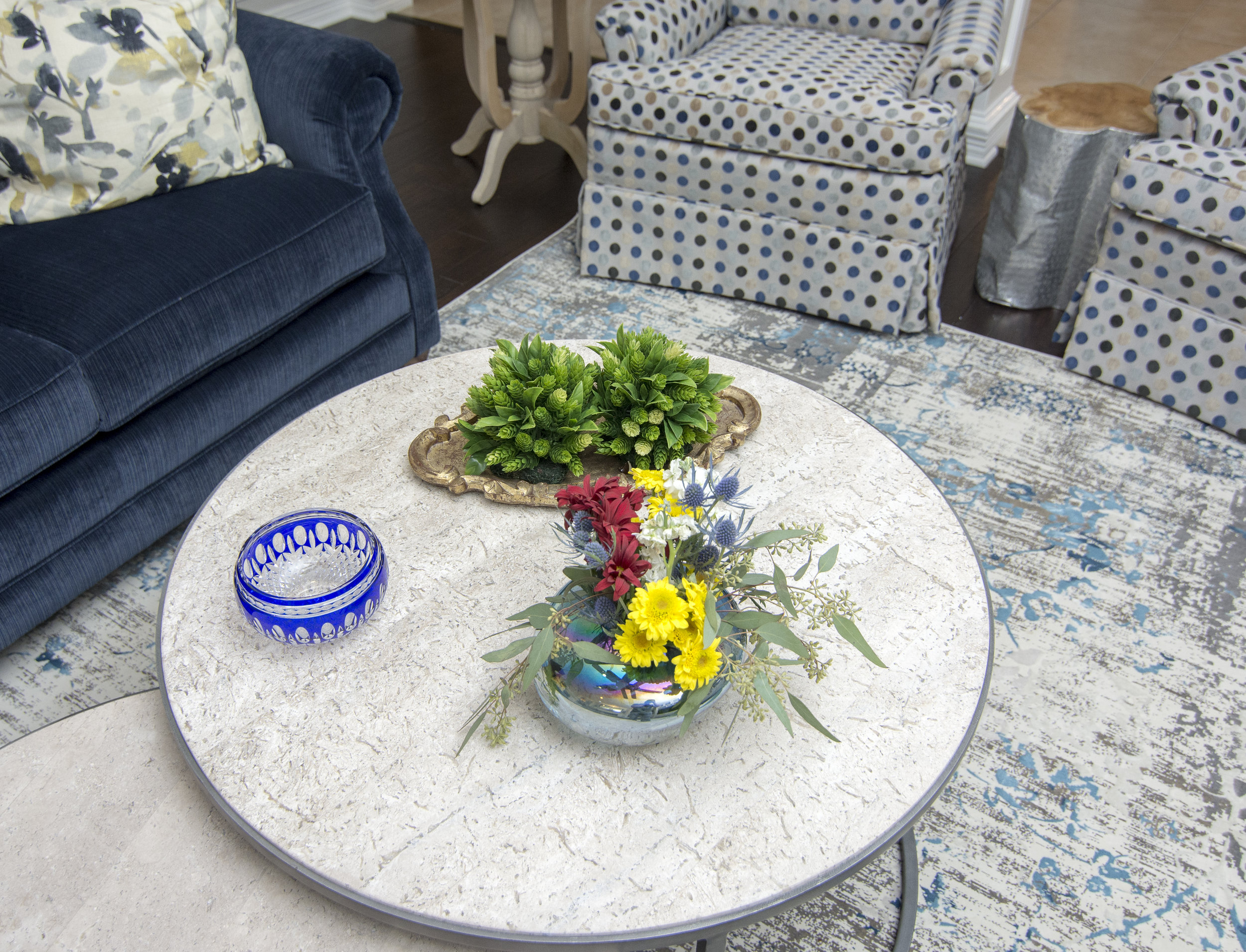
This room had absolutely nothing in it.  The client got rid of all their furniture which was all dark brown leather.  I wanted to mix it up and have a lighter, brighter room that could seat their entire family when they are all gathered together to watch TV or play games.

The room had hardly any lighting so I added two floor lamps to help with ambient light at night when they are watching TV and don't want all the lights on but still want to be able to see a bit.

_dsc2004

We met at Weirs to find a couch the family all decided on.  We chose this Navy velvet fabric which is soft and cozy.  I opted not to use the pillows that they usually include (too matchy matchy) and added my own Navy and yellow pillows to the couch.  A blue and gray vintage rug was chosen to pull the room together.

_dsc1943

These two chairs were found at a local resale store and I had them redone with new insides and reupholstery.  Swivels were added afterwards with a skirt to hide the swivel mechanism.

Don't you just love the rug?  Oh, and the silver side table?  I'm in love with it all!  Notice that the polka dot fabric was used on the ottoman adjacent to it to pull the two seating areas together.

_dsc1989We spent the entire day placing all the furniture, accessories and details in this home and it was a very exciting reveal.

Just in time for their first grandbaby due any day now as well as family coming into town for Thanksgiving!

I won't be posting until after Thanksgiving!  Until then, I hope you and your family find time to gather around your tables and in your living rooms, not only on Thanksgiving Day but throughout the rest of the year!