Tips to giving your entry a designer look.

decrenewinteriors12

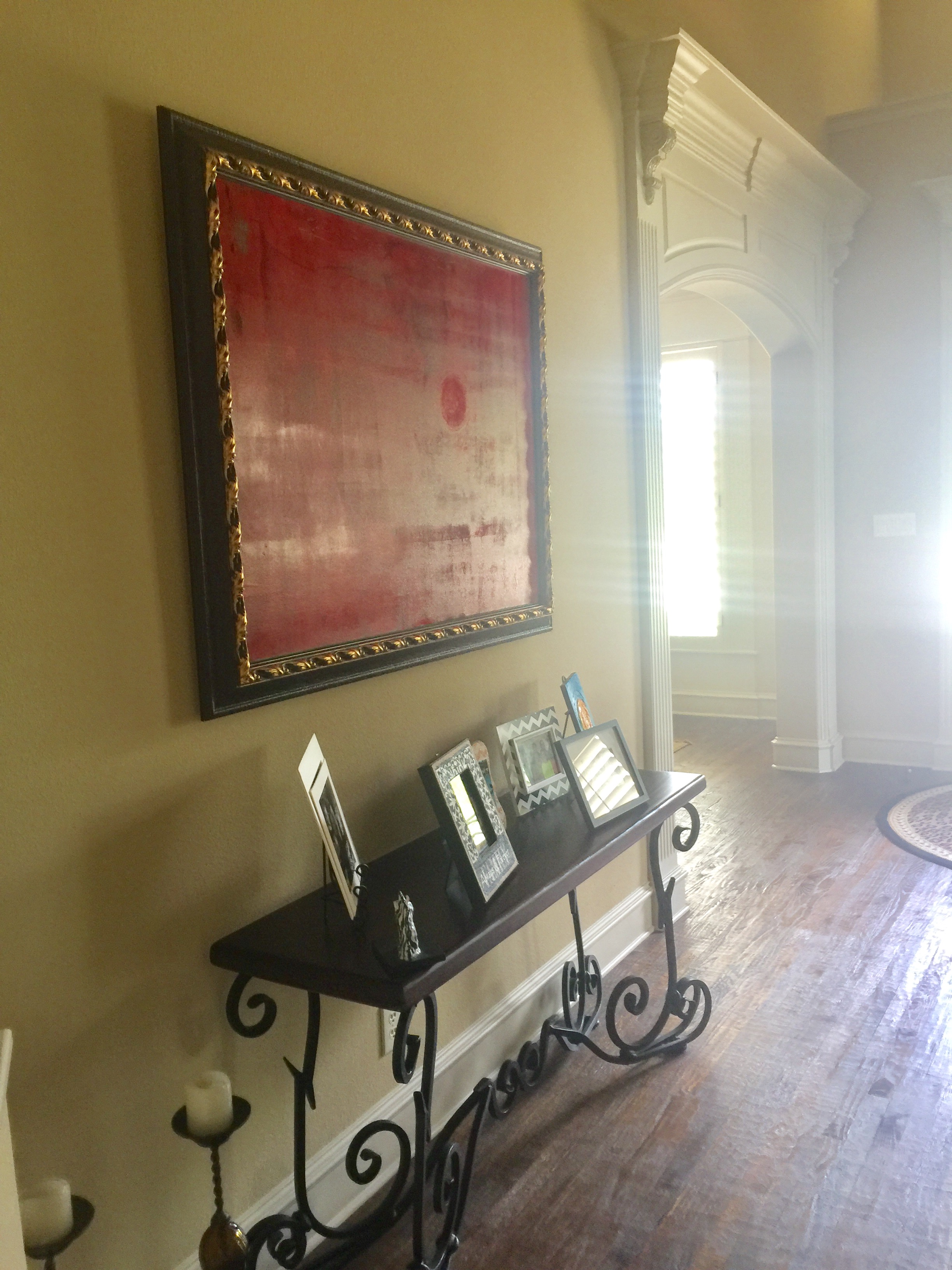
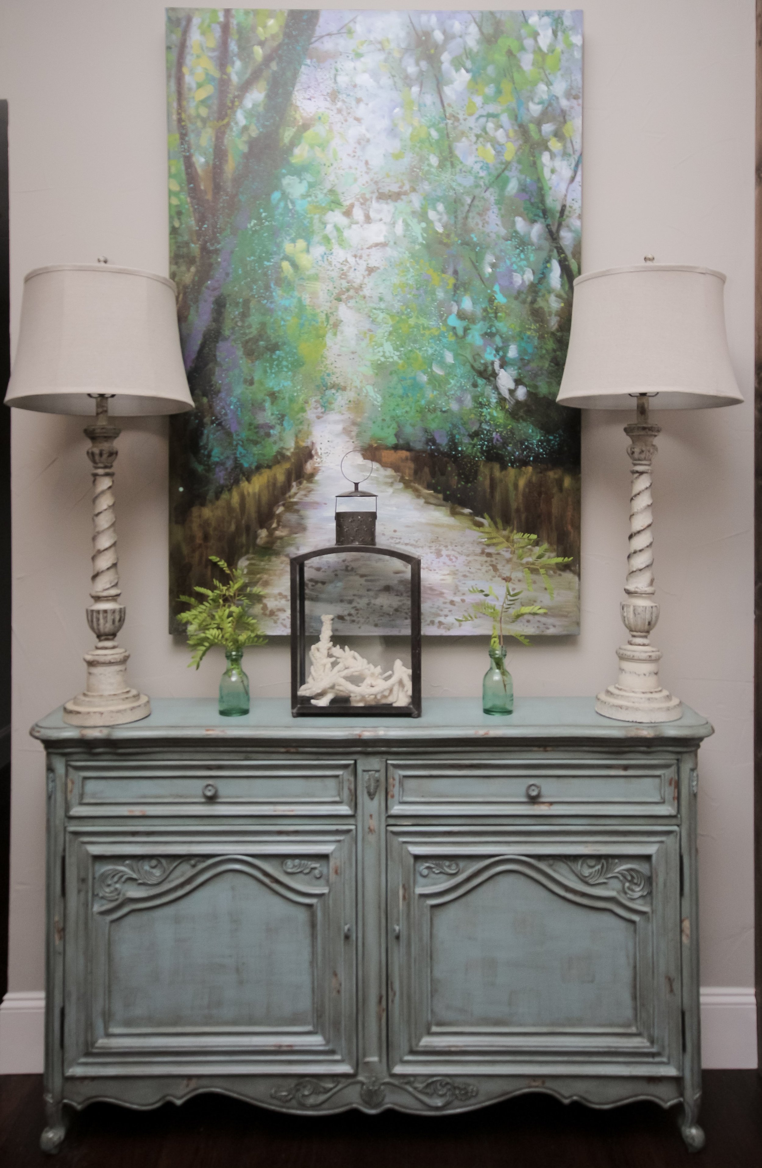
This week I completed an entry for one of  my clients.  When I met with her, she explained to me that she really loved her entry table because it was a gift from her mom who she recently lost.  She also loved her artwork that she and her husband chose together on one of their trips.  She wanted me to add color and personality to the space to make it feel BRIGHT, HAPPY and WELCOMING.

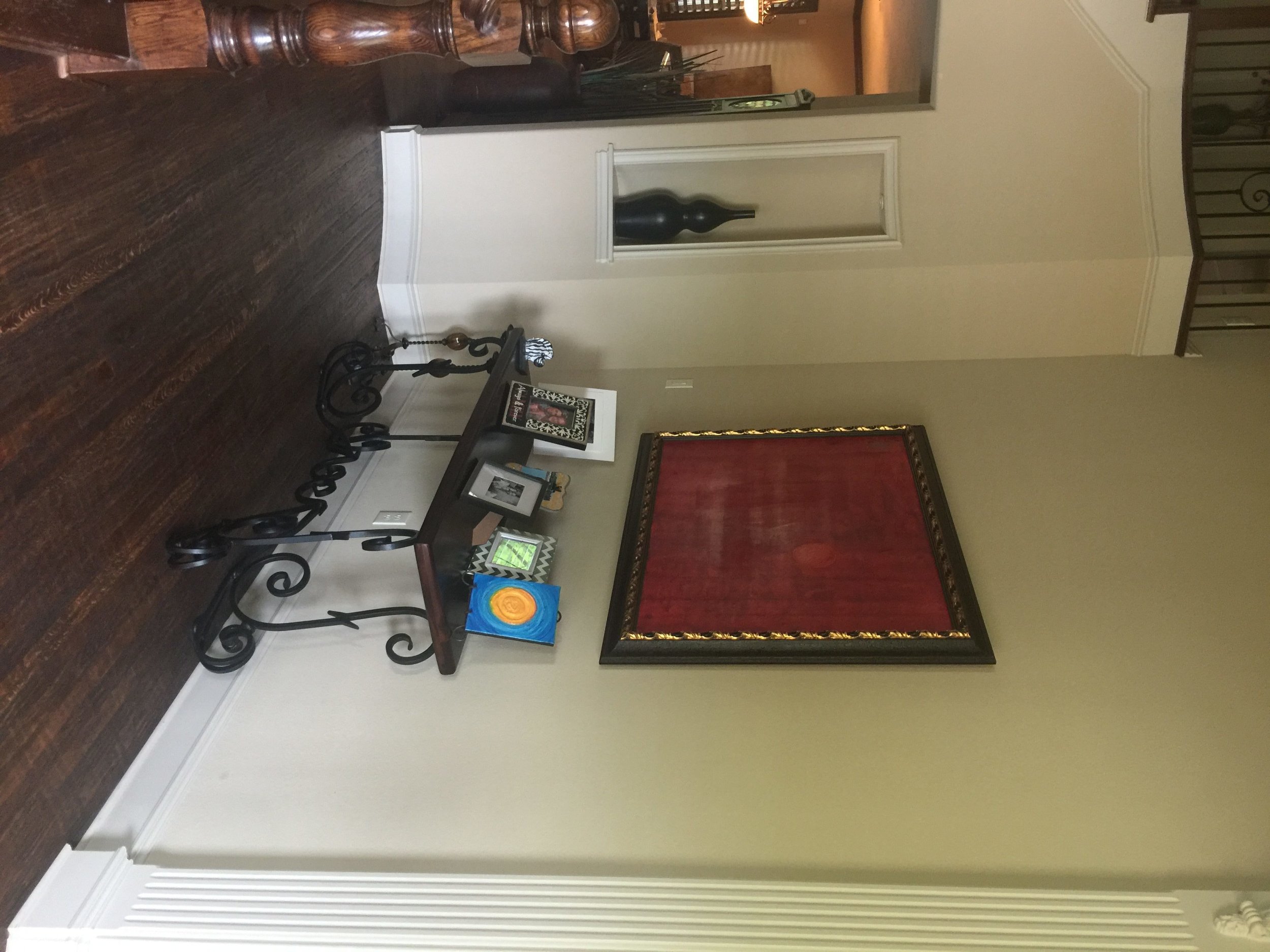
BEFORE ENTRY

decrenewinteriors24

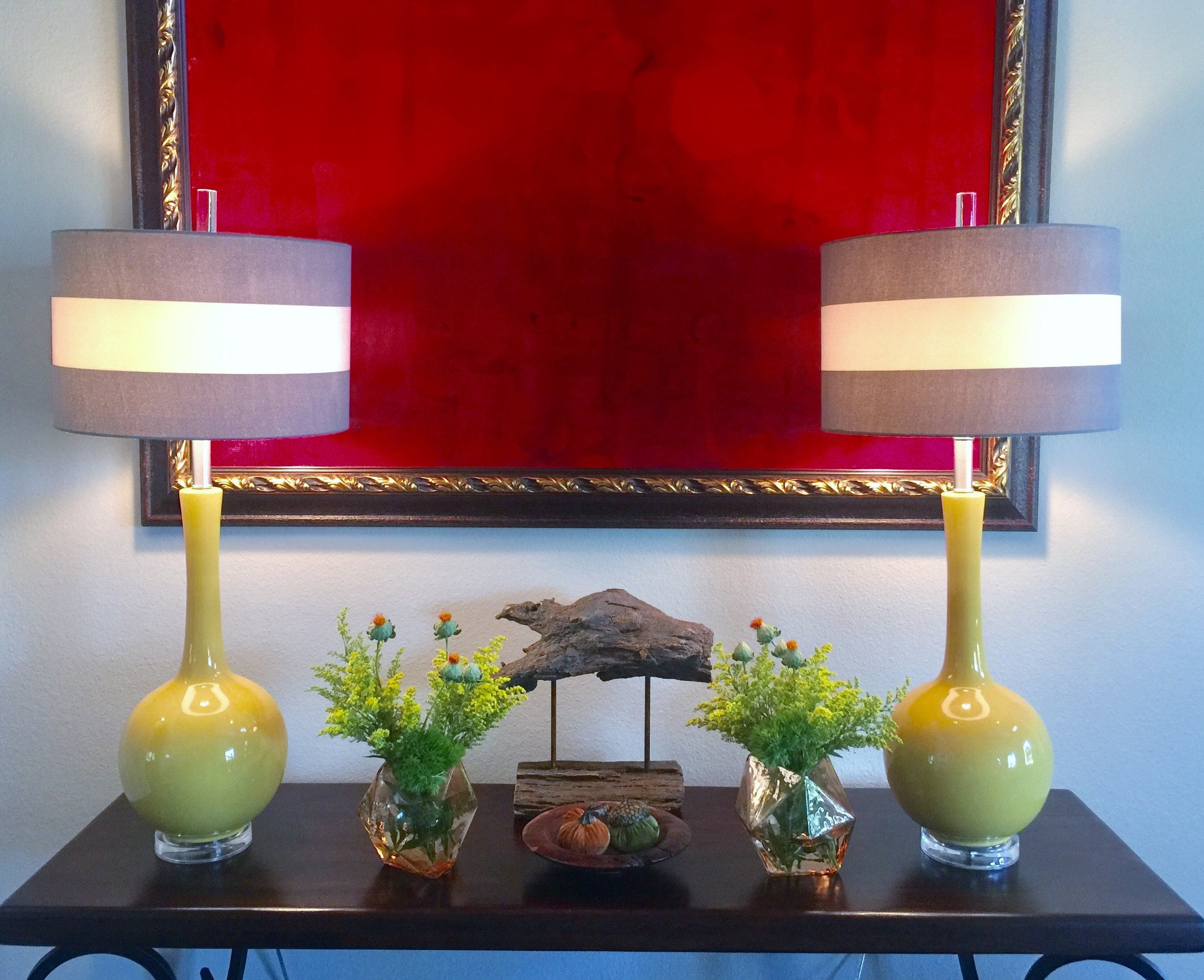
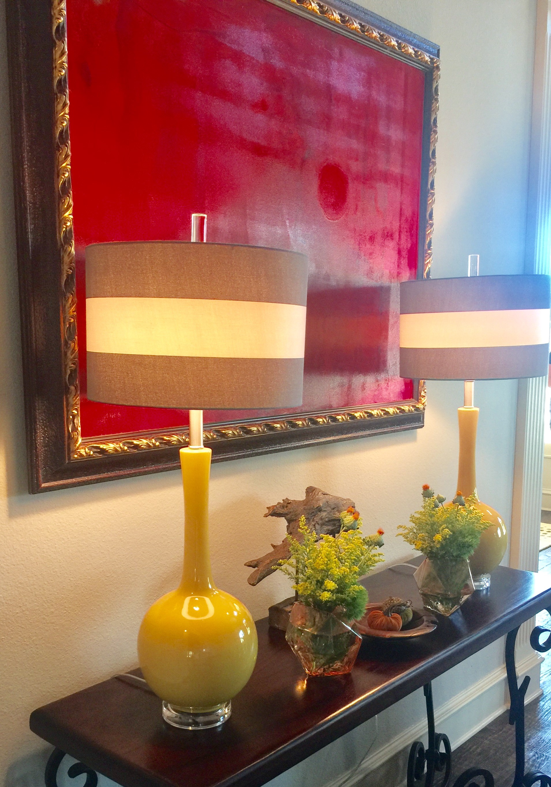
AFTER

decrenewinteriors14

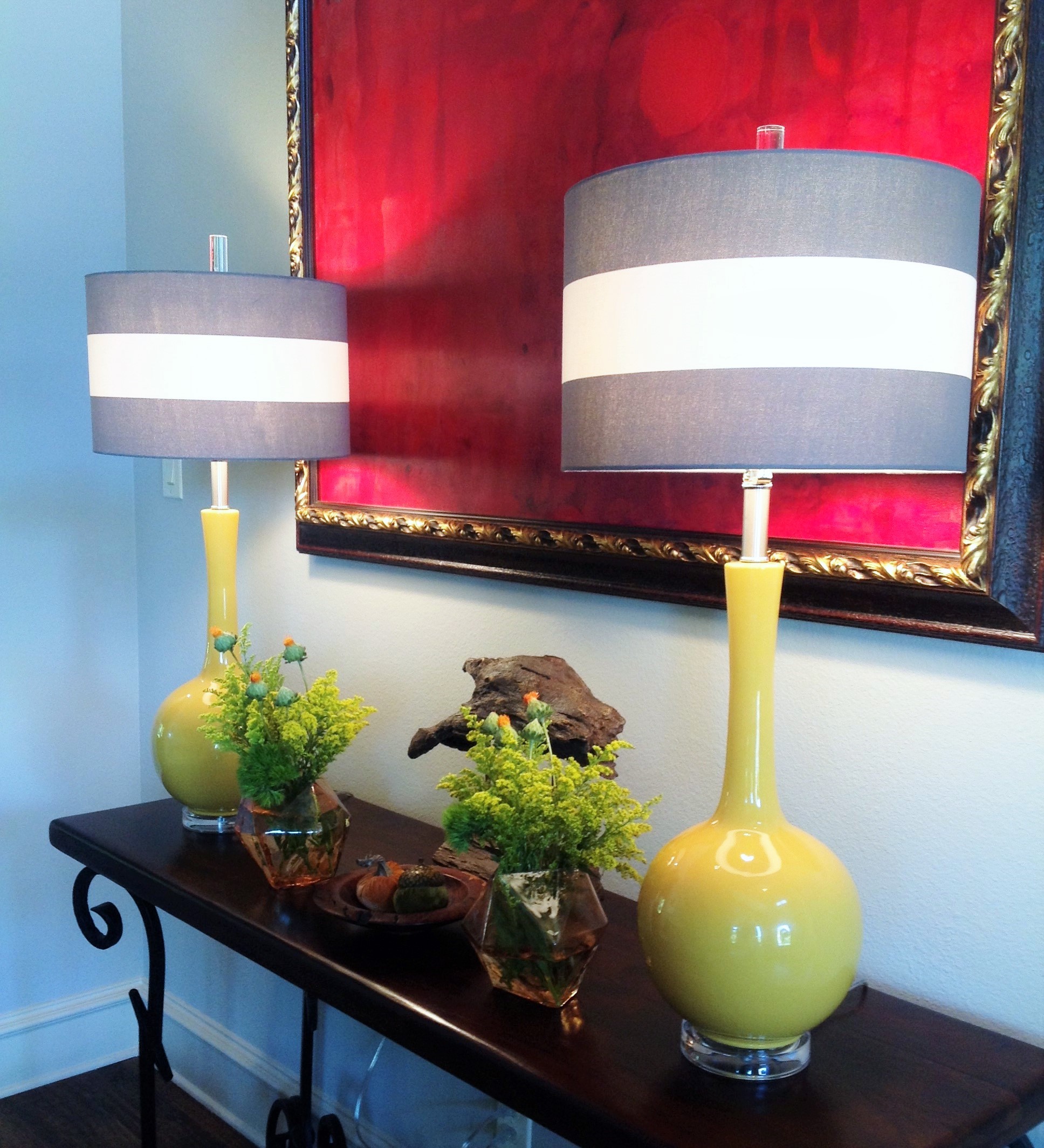
No Problem!  I found these wonderful yellow lamps and knew they would make the space so much more inviting and happy.  They came with black shades but that wasn't going to give me the look I wanted.  I traded them out for these fabulous striped gray and white shades.

Ruthie Tip:  If you find lamps you absolutely love, trade out the shade to bring it up to the next level.  A patterned shade can change the look completely.

entry-2

Ruthie Tip:  If your lamps don't come with beautiful finials then add some gorgeous ones to make them have grandeur and class.  You will be so surprised how that one thing can bring them up to the next level.  I personally love large crystal ones like the ones above.

BEFORE

decrenewinteriorsbefore

Placing family photos on your entry table is a nice thought, however, in this case they are off scale with this large painting.

AFTER

decrenewinteriors29

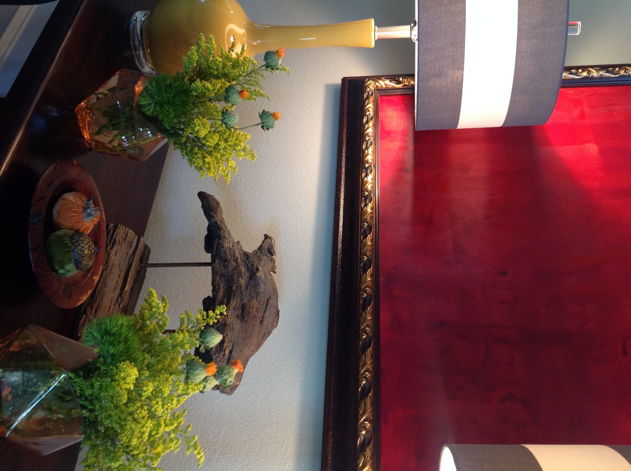
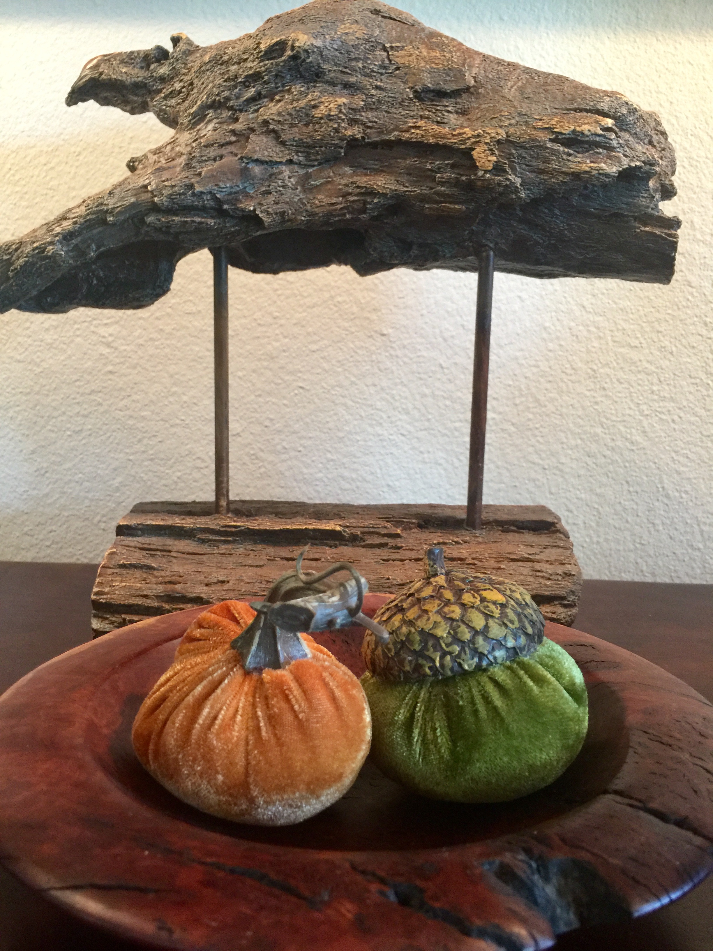
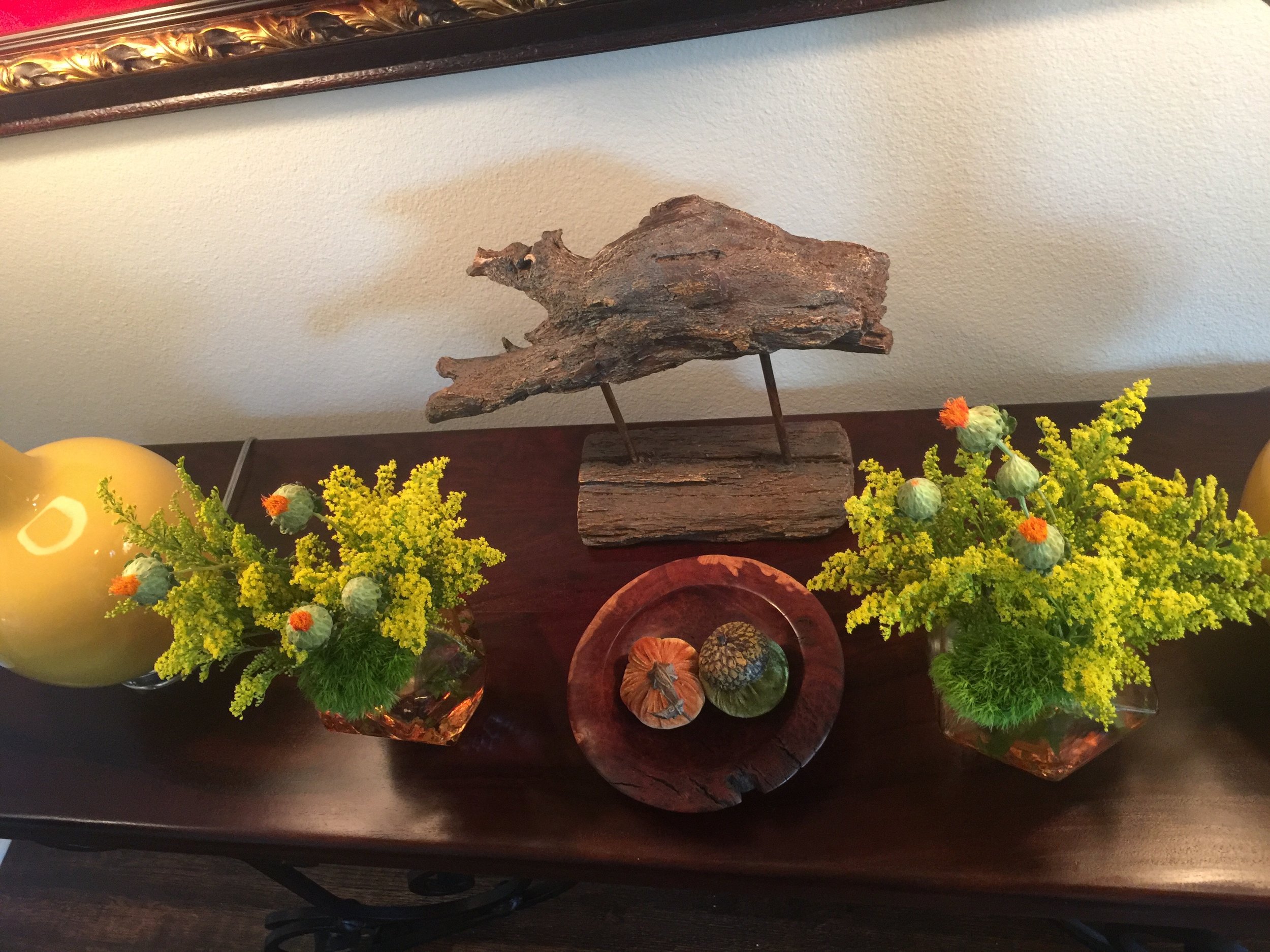
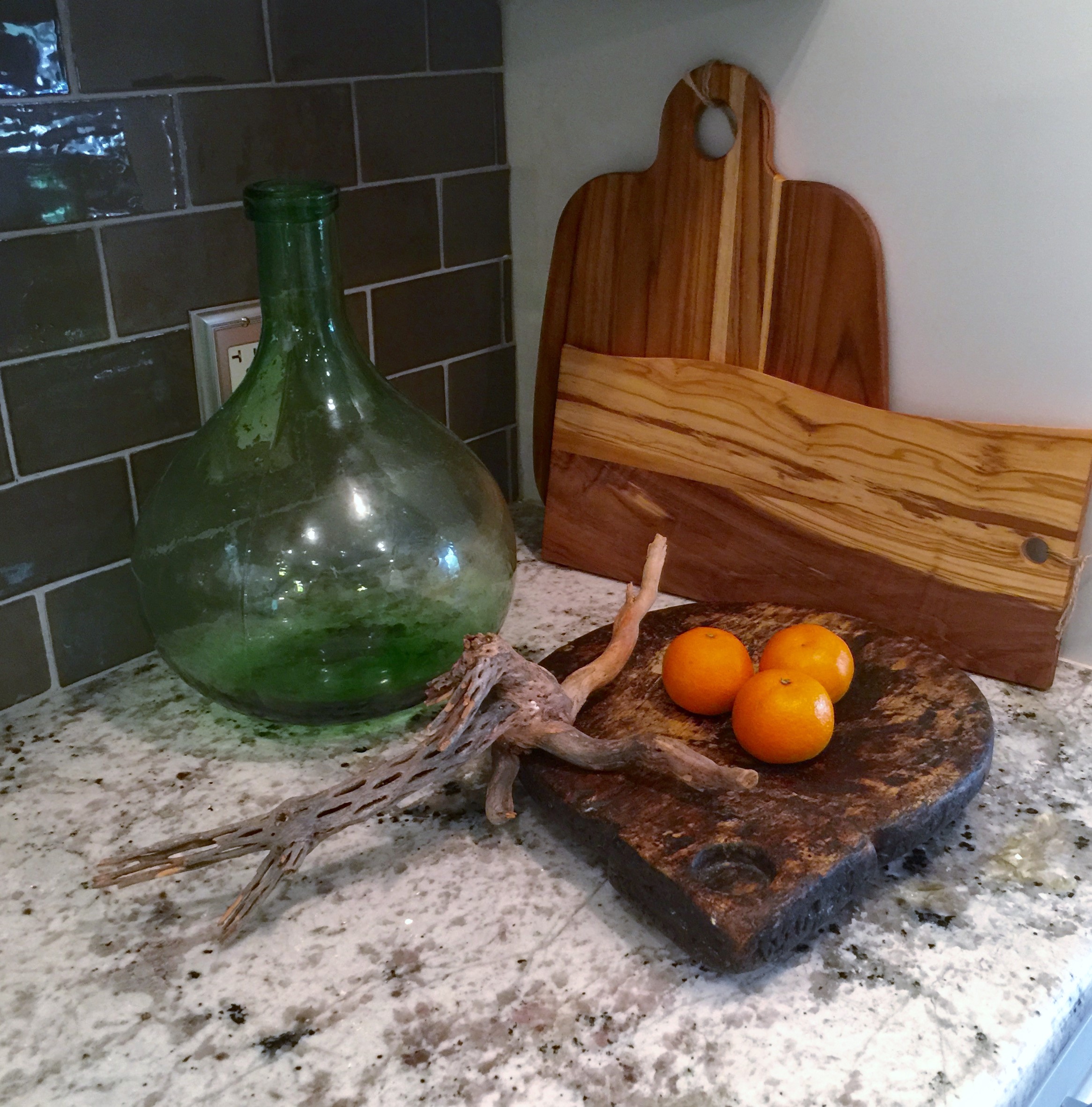
Ruthie Tip:  Layer your accessories and choose items that either have a unique shape or texture.

decrenewinteriors26

If you look at my website you will see that I always use something from nature to make my designs come to life.  This driftwood looks fab against the wall color.

decrenewinteriors30

Ruthie Tip:  Fresh flowers always makes an entry feel alive and happy.

BEFORE

decrenewinteriors25

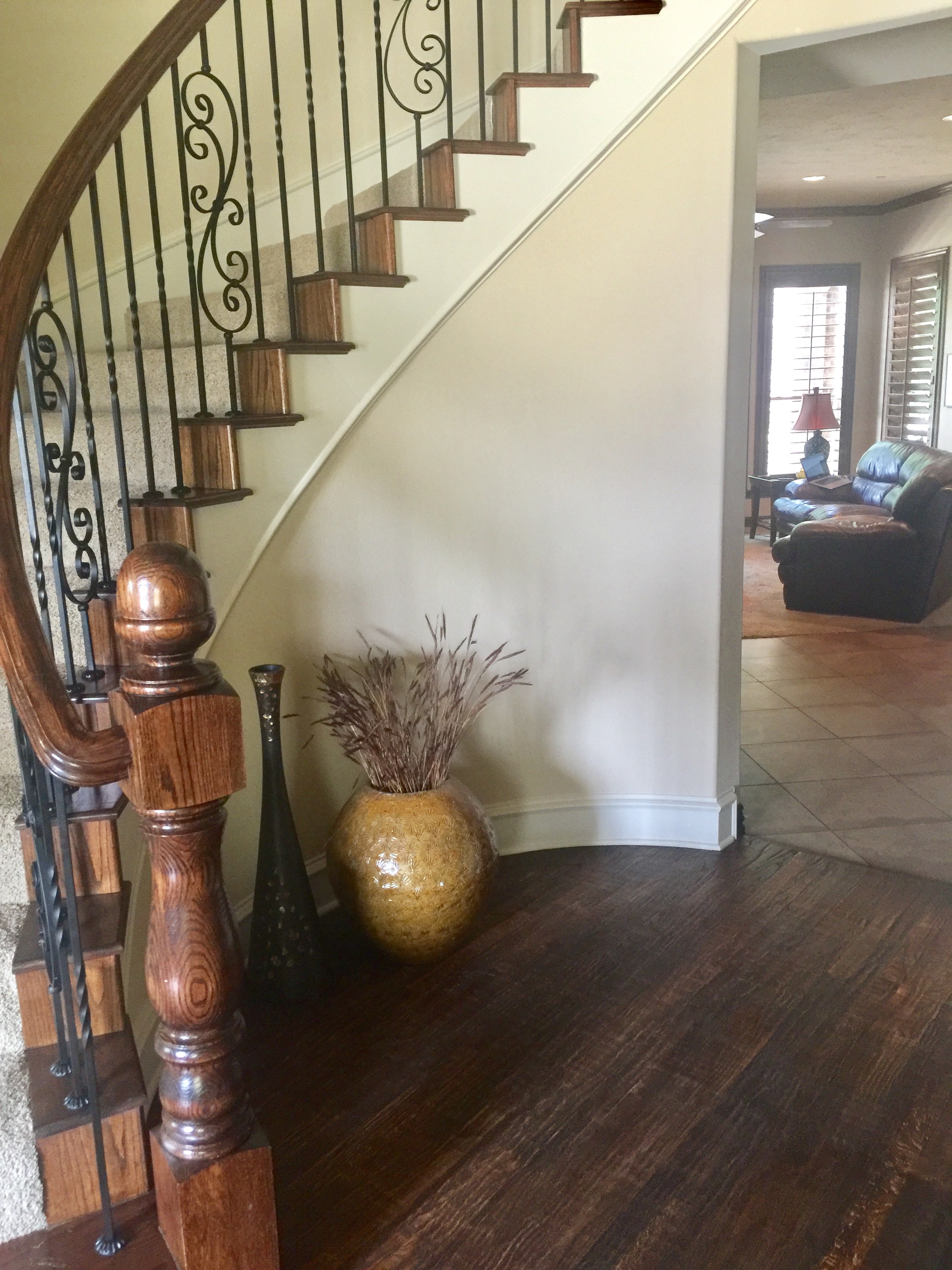
Curved entry walls are always a challenge.  Because we were on a strict budget for this entry, I had to be creative without going over budget.

AFTER

entry

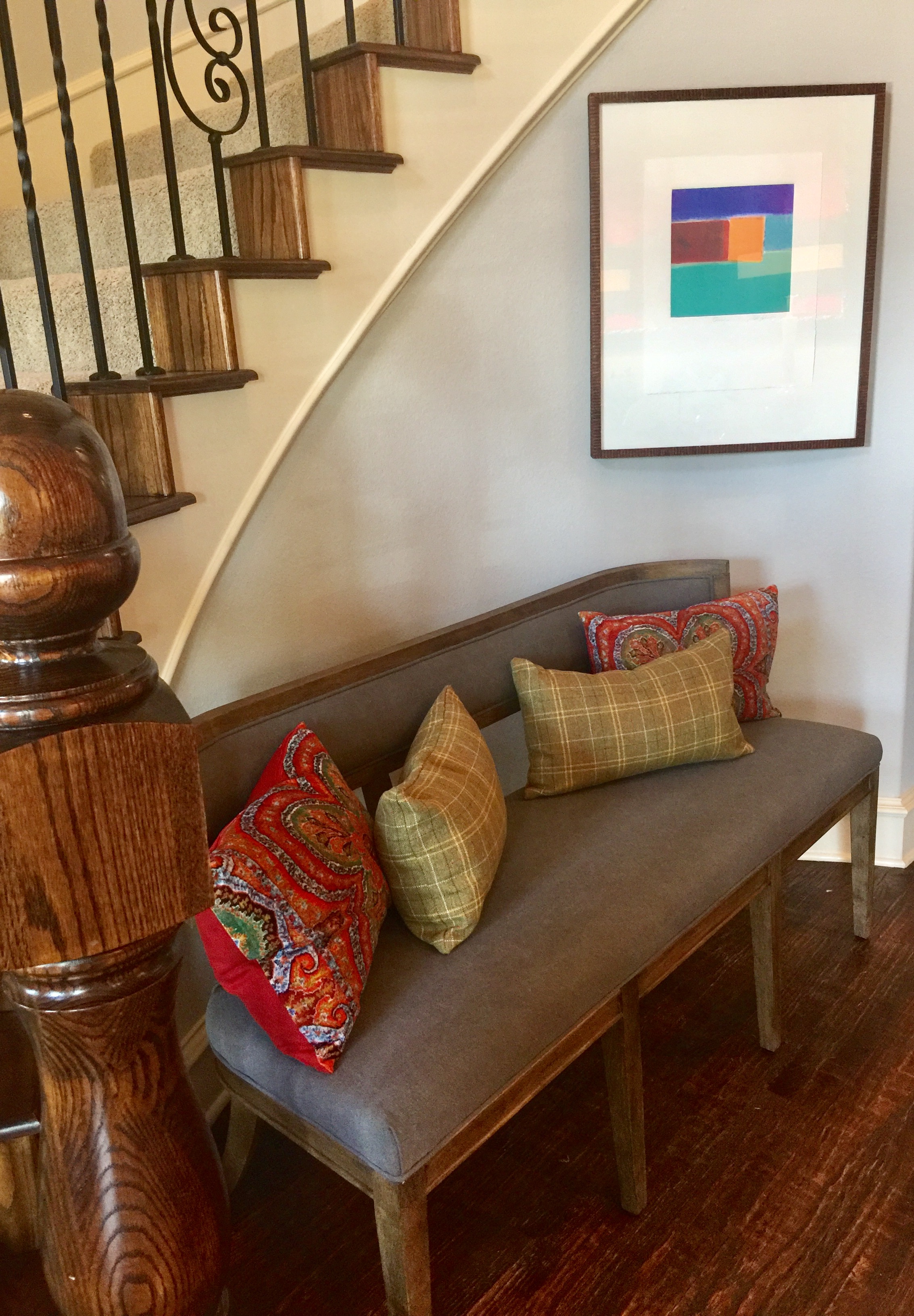
I found this wonderful bench with a curved back.  It fit perfectly in the space.  I added colorful pillows that coordinate with the artwork and we were all set.

Ruthie Tip:  If you have a large open entry, don't put small items there.  Choose large items that fill the space so the scale looks right.  I'd rather have one larger item that makes a statement than lots of clutter that says nothing.

decrenewinteriors27

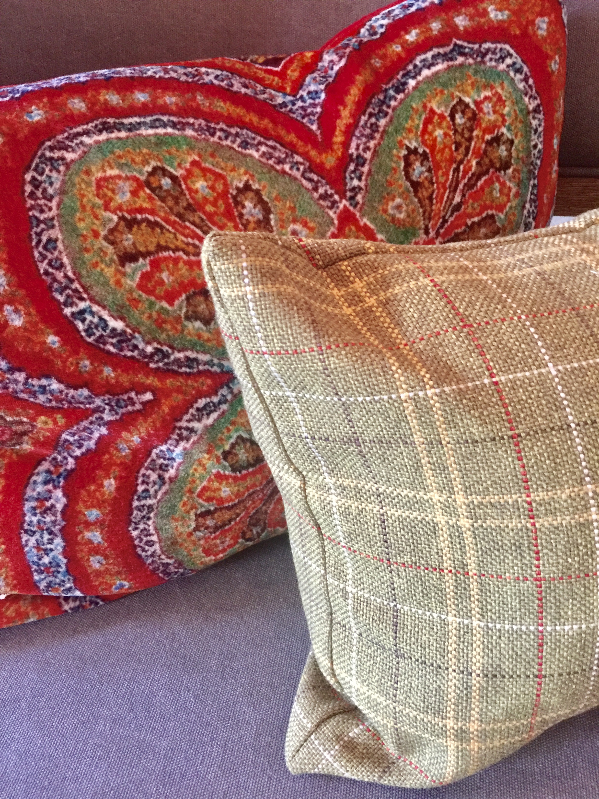
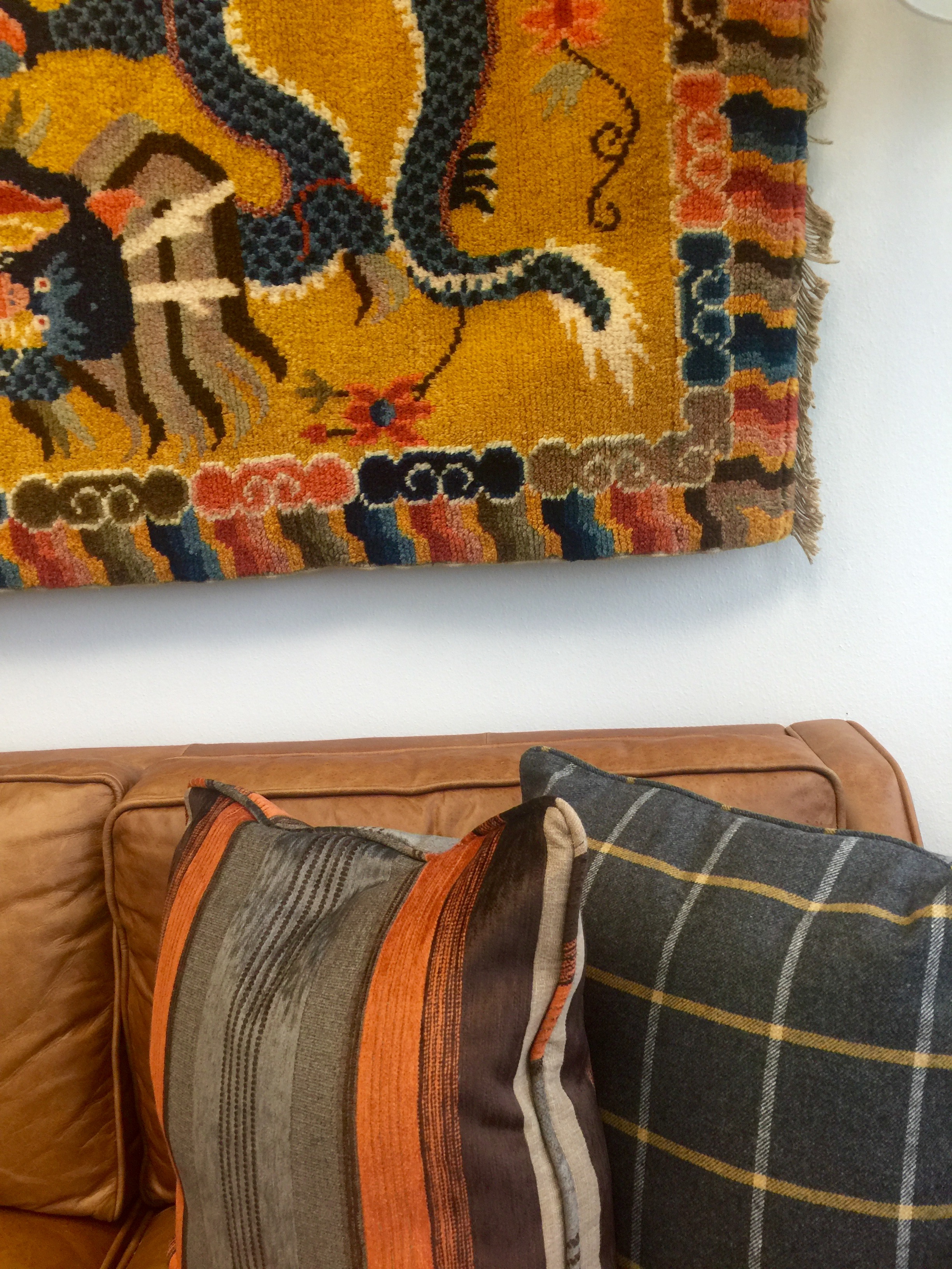
Ruthie Tip:  When using a bold, colorful pattern, tone it down with a masculine print like a plaid, stripe or houndstooth.

Hope you are inspired to go decorate your entry this weekend.

Enjoy!

 

Traditional kitchen gets a new soul

The past four our team has been working incredibly hard on a  kitchen transformation and had the photo shoot about a week ago.  I thought you might like to see the before and after transformation so here goes.....drum roll please!
BEFORE

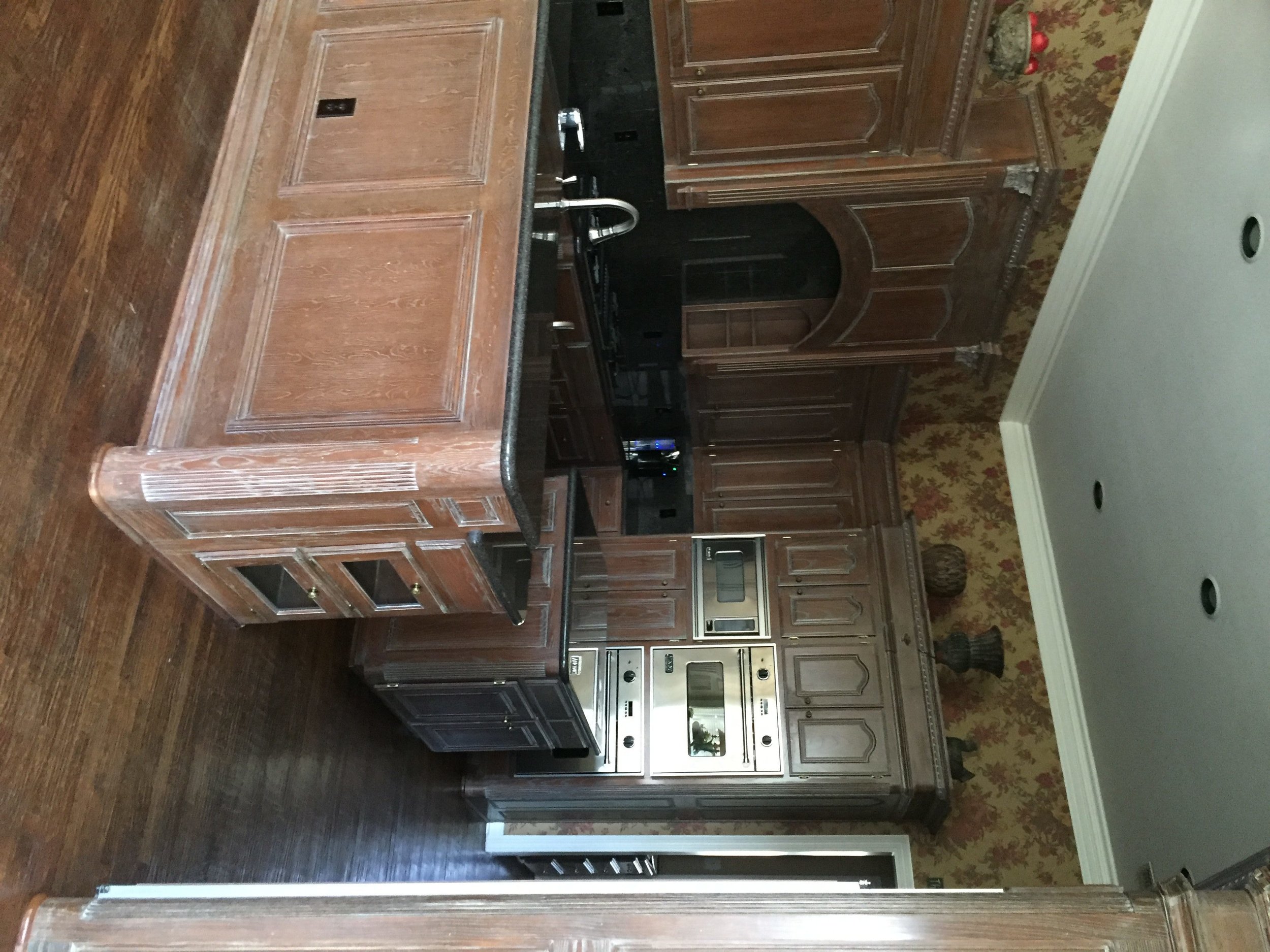
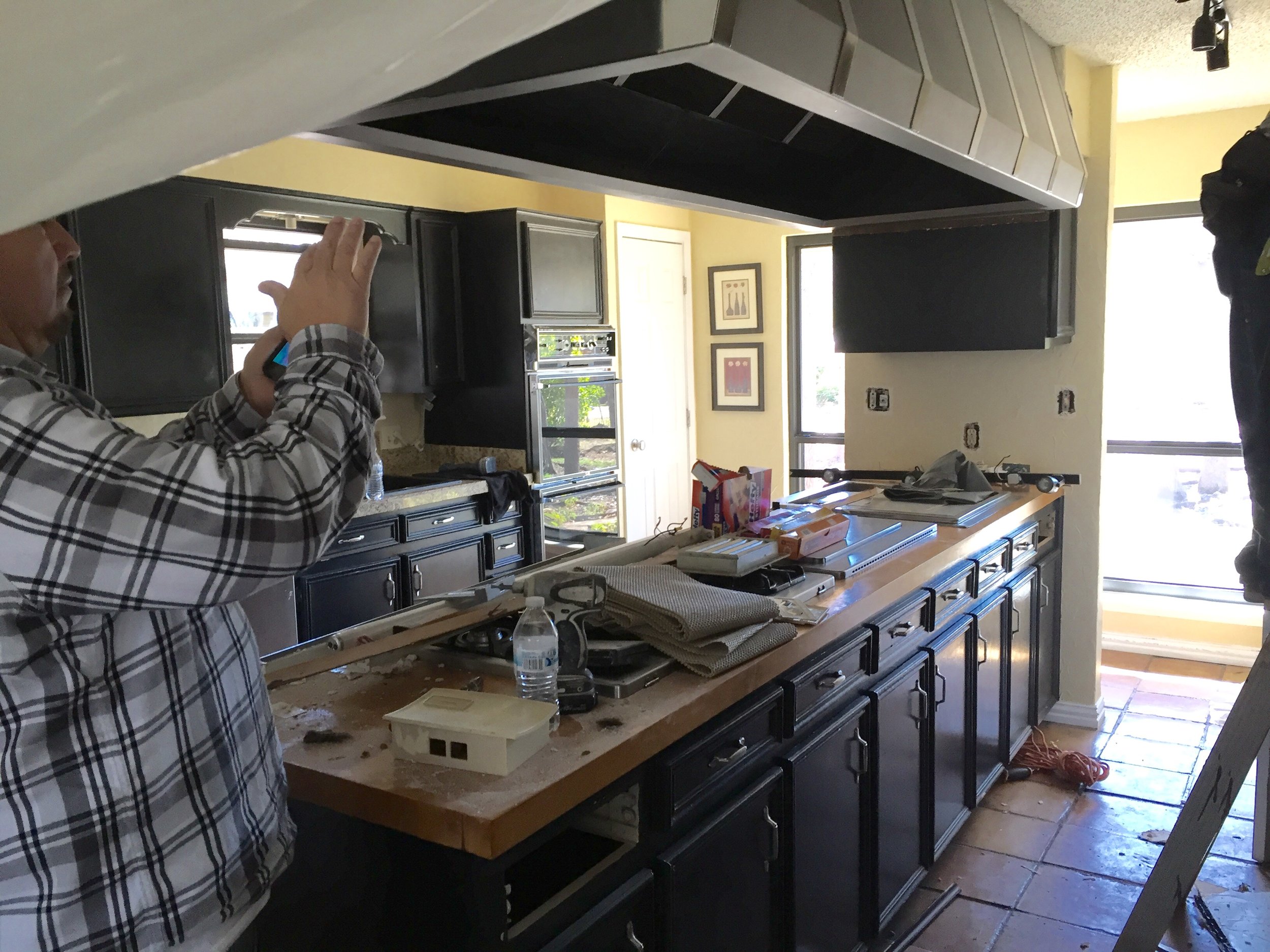
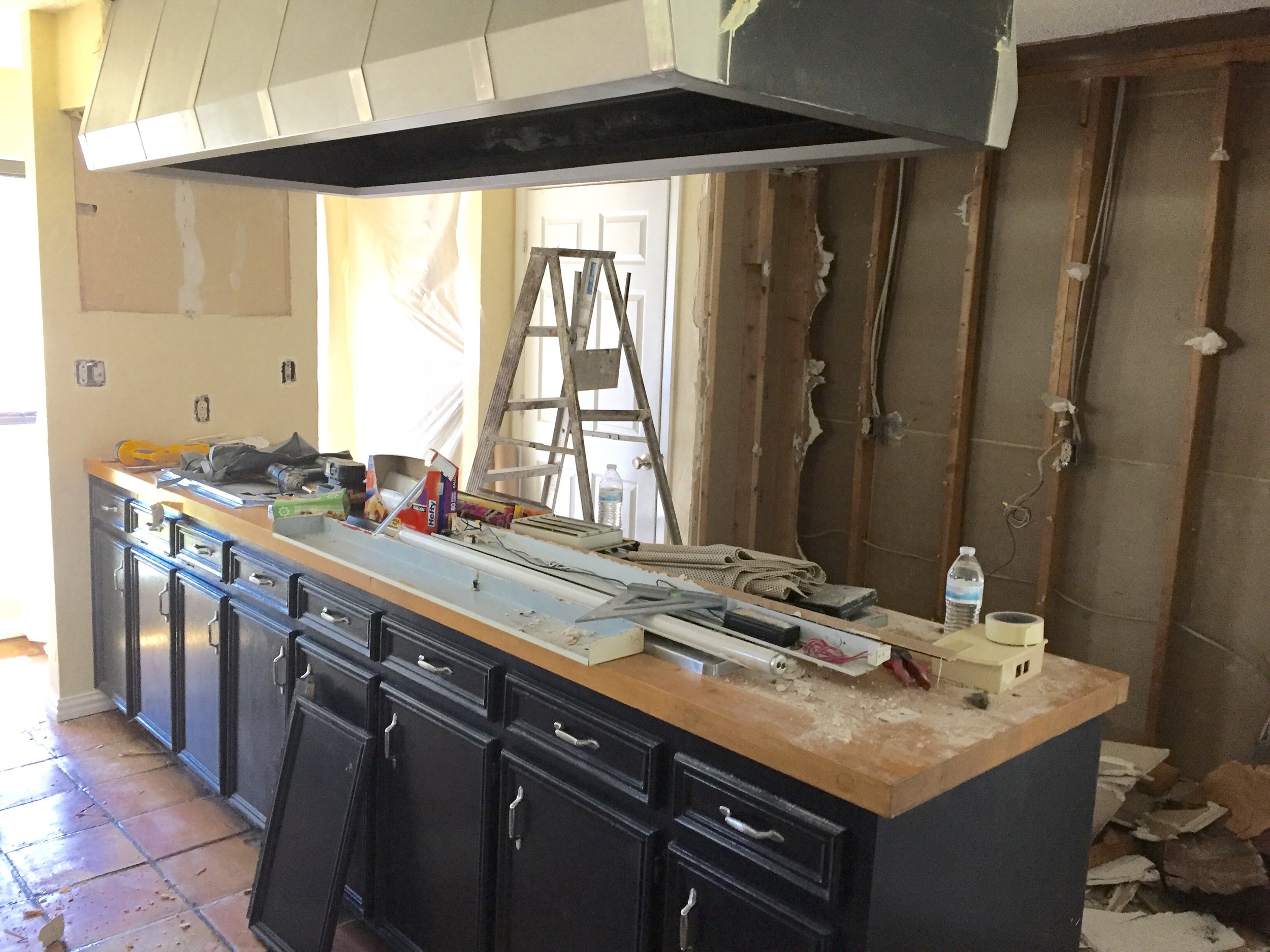
This kitchen was dark and dreary before.  It had pickled wood cabinets that dated the space and made you feel like you had gone back in time.  My client really hated it and explained that it made her feel depressed.  We can't have depressing so we came up with a design for the space and immediately started the transformation.  Just removing the wallpaper made it feel like it had a facelift.

before

The above picture was included in an email from my client before the renovation started.  The subject line said "ugh" and that is all!

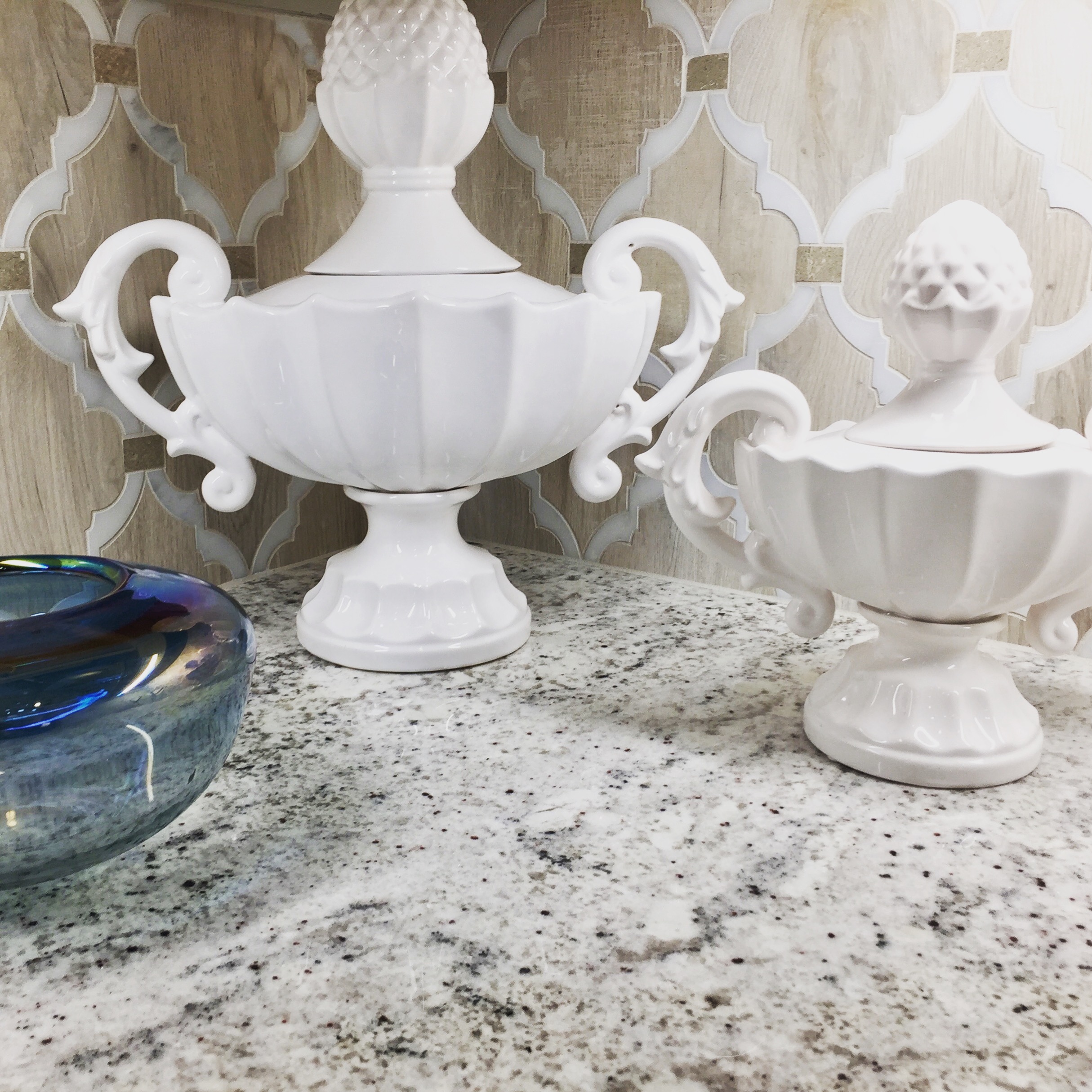
We found the below backsplash and my client decided she wanted this no  matter what!  We both fell in love with it.  It became our inspiration for the kitchen.   It had to be custom made because it was several tiles and included some marble.   There is a story there because it took weeks and weeks but I will spare you of the details.

decrenewinteriors29

AFTER

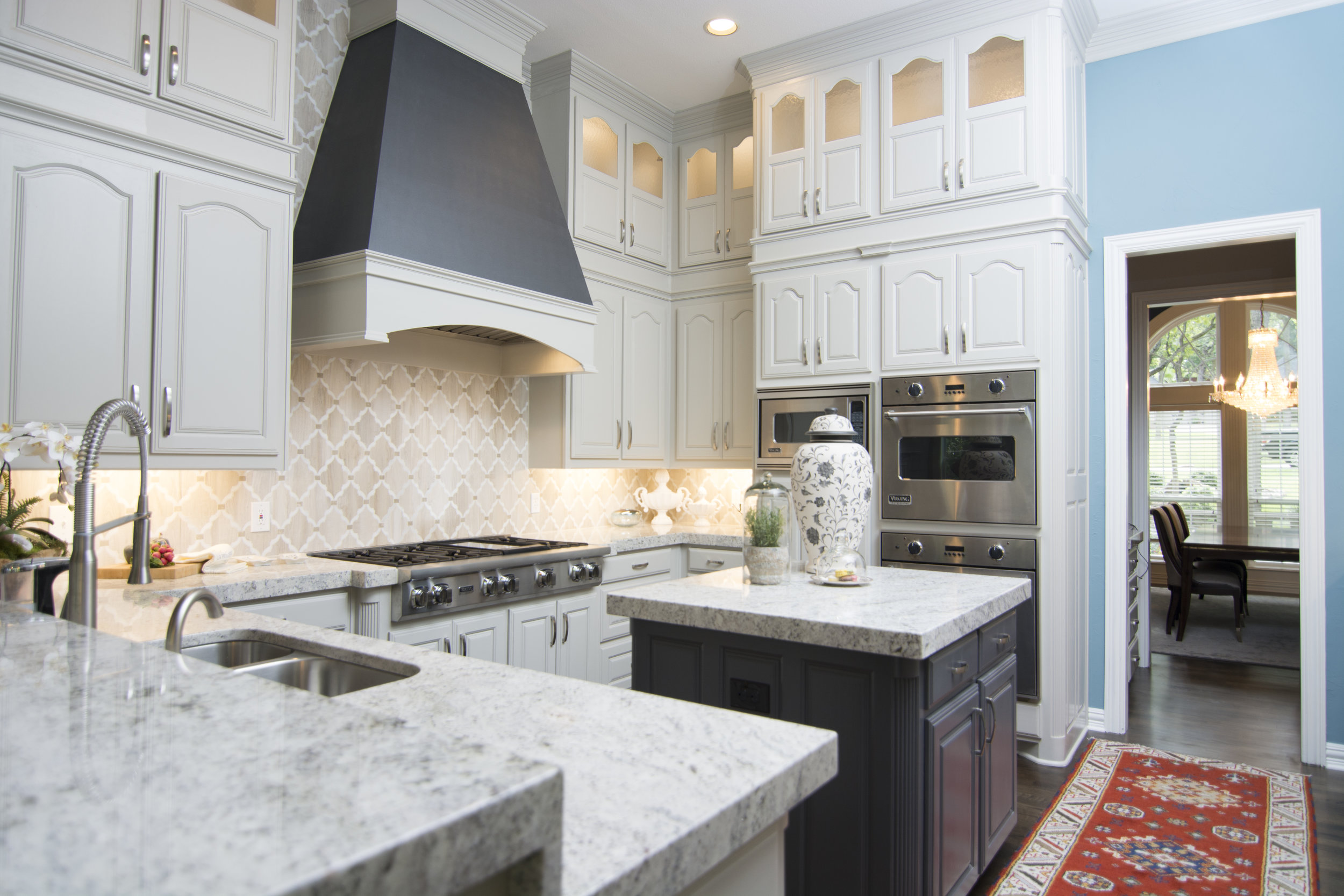
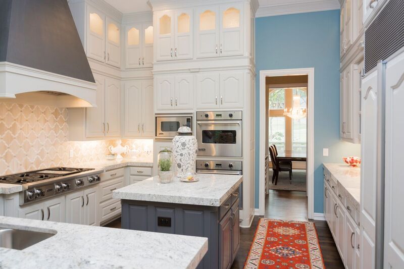
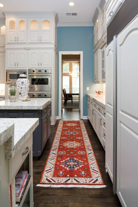
So one of the things we did was add additional lighted cabinets above the existing ones for additional storage. This was scary for my client because they felt like it was going to make the kitchen feel smaller.  I assured them that it would not!  In fact, it makes a kitchen feel taller and gives it more grandeur, don't you think?

_dsc0770

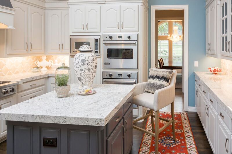
We took the existing vent-a-hood out and created a brand new one that is now the focal point of the kitchen. We purchased a brand new gas stovetop.  We kept the other appliances because they still worked and looked good.   I really wanted the backsplash to wrap around the ventahood because I knew it would make a nice statement.  My client trusted me on this one and we all think it turned out awesome.

decrenewinteriors6

 decrenewinteriors23

The entire home was repainted, revamped  and refreshed, including adding and refinishing their hardwood floors.  Some of the rooms were carpet so we added wood and had it all stained a nice dark color.  The wood floors were all hand scraped before but my client really wanted a more clean line look, so now they are all smooth and look absolutely fabulous.

decrenewinteriors7

The countertops are granite and work beautifully with the backsplash.

decrenewinteriors21

decrenewinteriors25

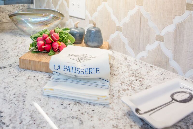
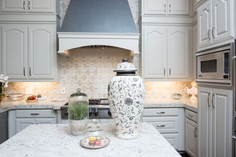
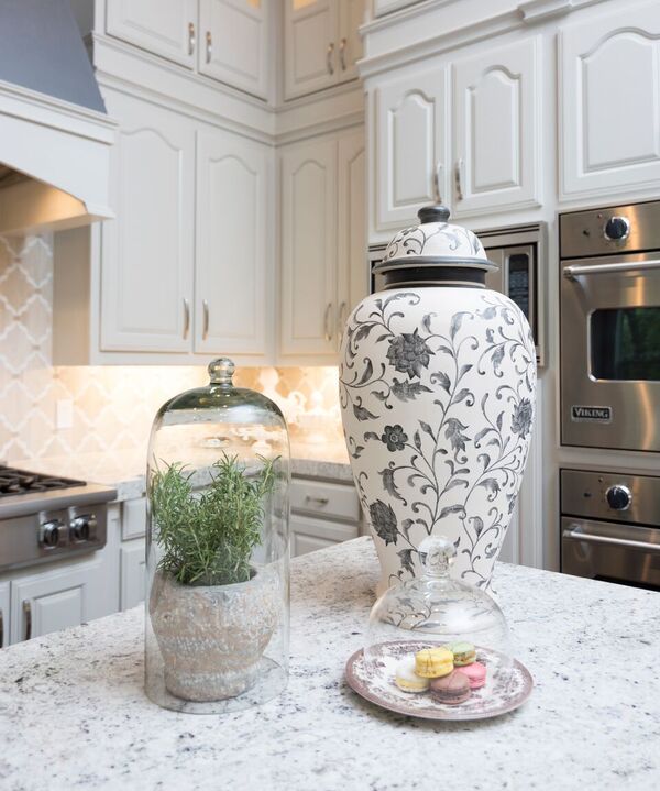
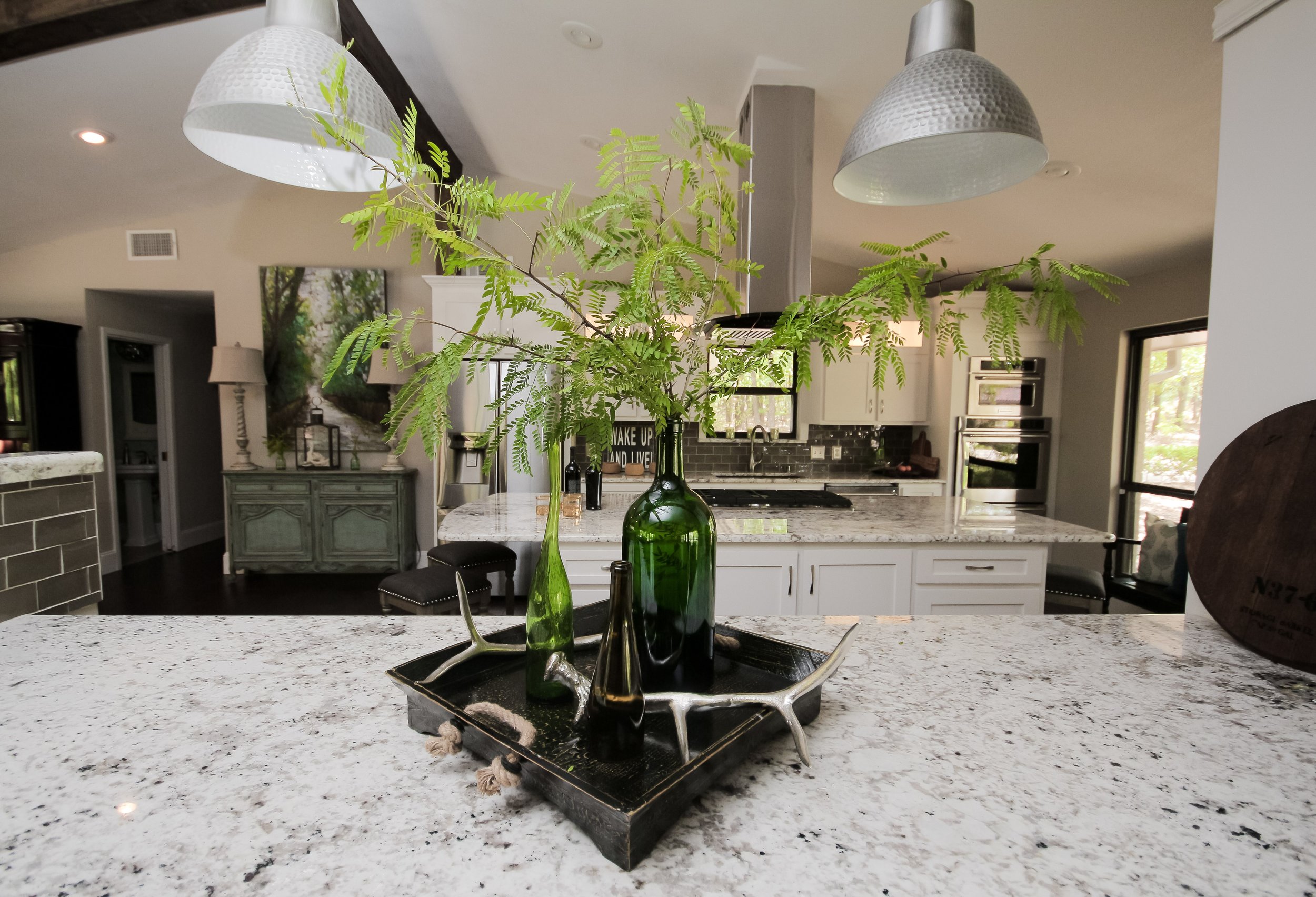
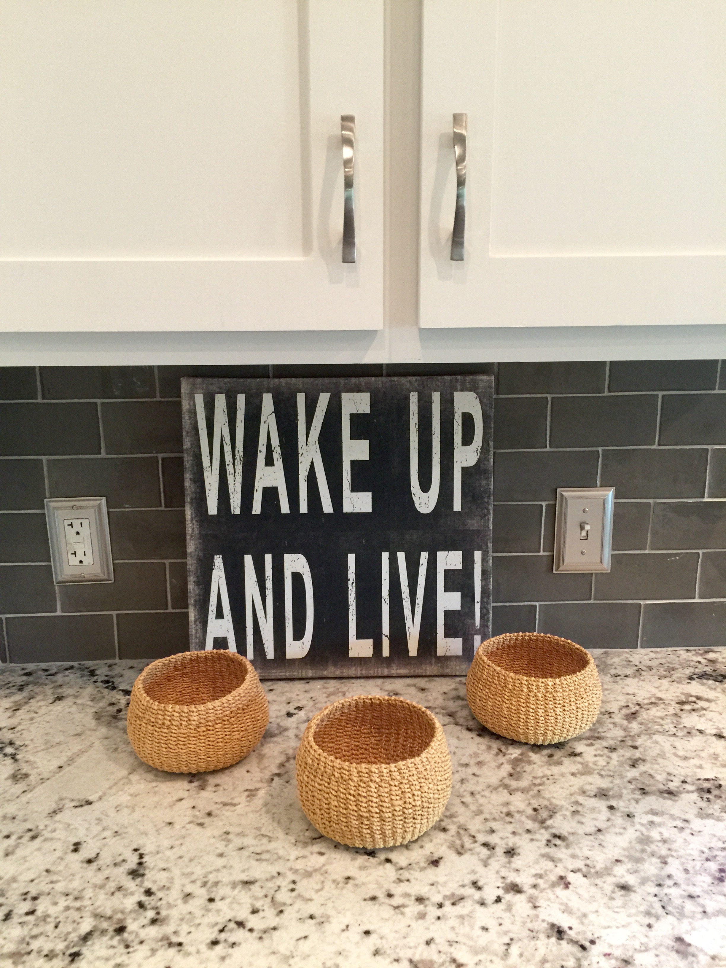
After the kitchen is all completed and its photo shoot time, my favorite thing is to style the kitchen.  I usually add bolder items that make a statement, rather than a lot of little things.

img_9846

You can see how gorgeous the backsplash is in the below picture.

img_9855

Doing a renovation while you are living in the home it really not fun. My clients had all their furniture and belongings moved into a pod for several months!  These clients were troopers and lived in their master bedroom for months while their entire home was torn apart.

decrenewinteriors4

Thankfully it  is all over now and they are ready for Thanksgiving and Christmas in their newly updated home.

Hope you enjoyed the tour!


The Face Behind DecRenew Interiors; Introducing Ruthie Staalsen

I always love to be able to see the face behind a business. It makes it more personal and makes me feel more comfortable with the company I'm getting ready to hire. In this day and age, we are able to see behind the scenes so much more than we ever have. With Facebook Live, Instagram stories and so many other social media platforms, it really is amazing how you can feel like you know more about a person before you hire them. Sometimes hiring an Interior Designer to come into your home is a scary and intimidating thought. Hopefully this video gives you an inside look into what we are all about here at DecRenew Interiors. We want to be known for our commitment to our clients and  CONNECT LIFE AND HOME. We are all so busy and rush from one thing to another these days. Our goal is to bring families HOME to their humble abodes where memories begin and family time happens. Let us help you make your House a Home.

[x_video_embed type="16:9"][/x_video_embed]

If you would like to follow me to see more behind the scenes adventures, click on the links below.

Facebook

Twitter

Google+

LinkedIn

Periscope

YouTube

Instagram

Pinterest

Industrial Farmhouse Chic Kitchen

IMG_0210

What a fun few weeks we have had here at DecRenew Interiors by Ruthie Staalsen!

IMG_0217

We finished up about 4 big remodels about a month ago so have been doing  some photo shoots!  Photo shoot days always involve a lot of packing, lugging, wrapping and sweating but it is always worth it!

FullSizeRender

I thought I'd post this Industrial Farmhouse kitchen first since I just love it!  We only have a few before pictures of this kitchen which makes me sad.  I met with the client for a walk thru consultation to discuss what they wanted done and how we were going to proceed.  It was a fantastic consultation with loads of brainstorming and thinking on our feet with my team.  Before I left their house they said they would let me know when they were ready to proceed with the demo.

decrenew interiors

  The next day I got a call from them saying that they were leaving on vacation that week and decided they wanted the demo to go ahead and start while they were gone.  Ok then, I love decision makers!  So refreshing!

My team got busy but we forgot to take before pictures, urggg! We did get these few!

pic

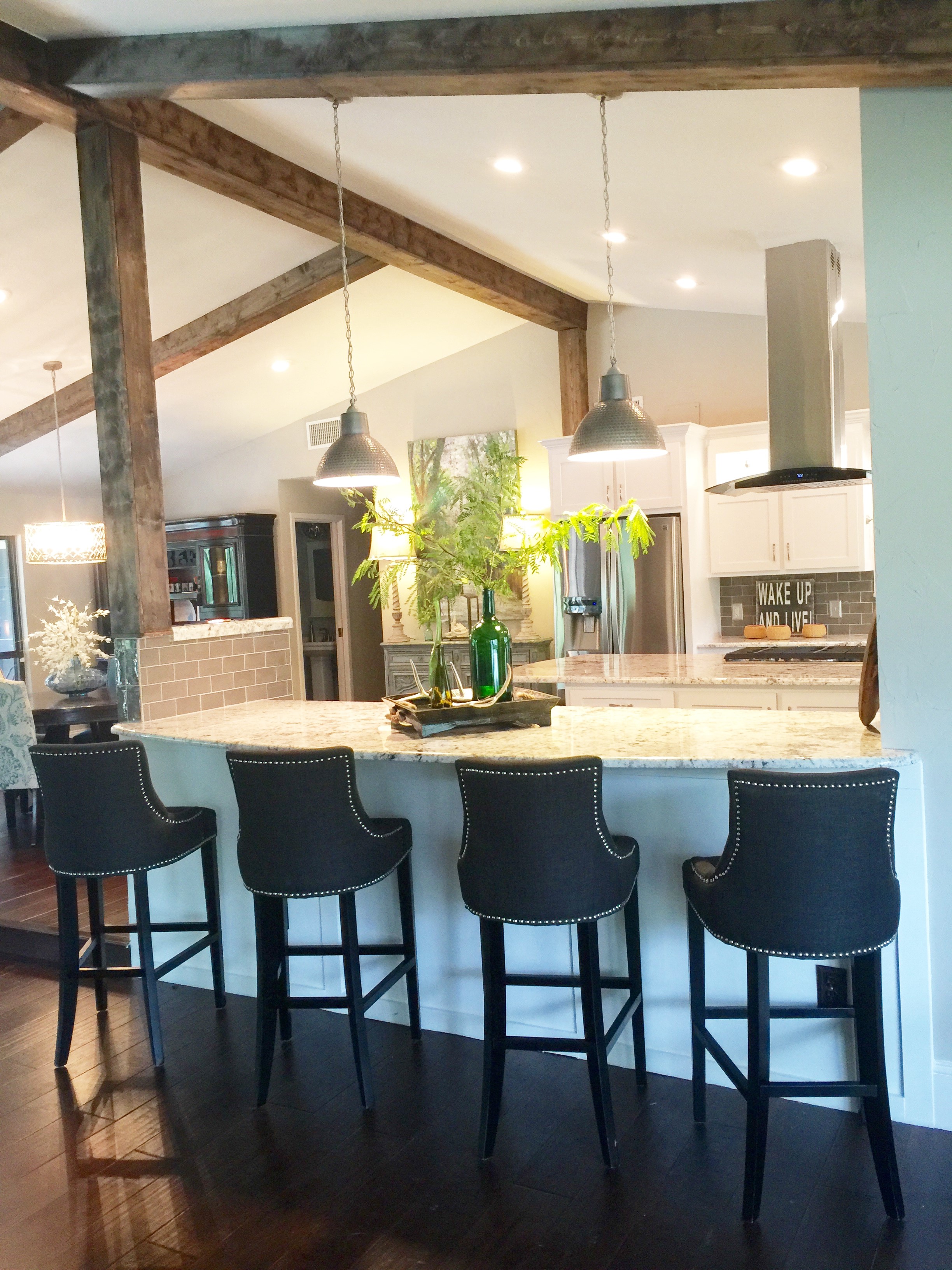
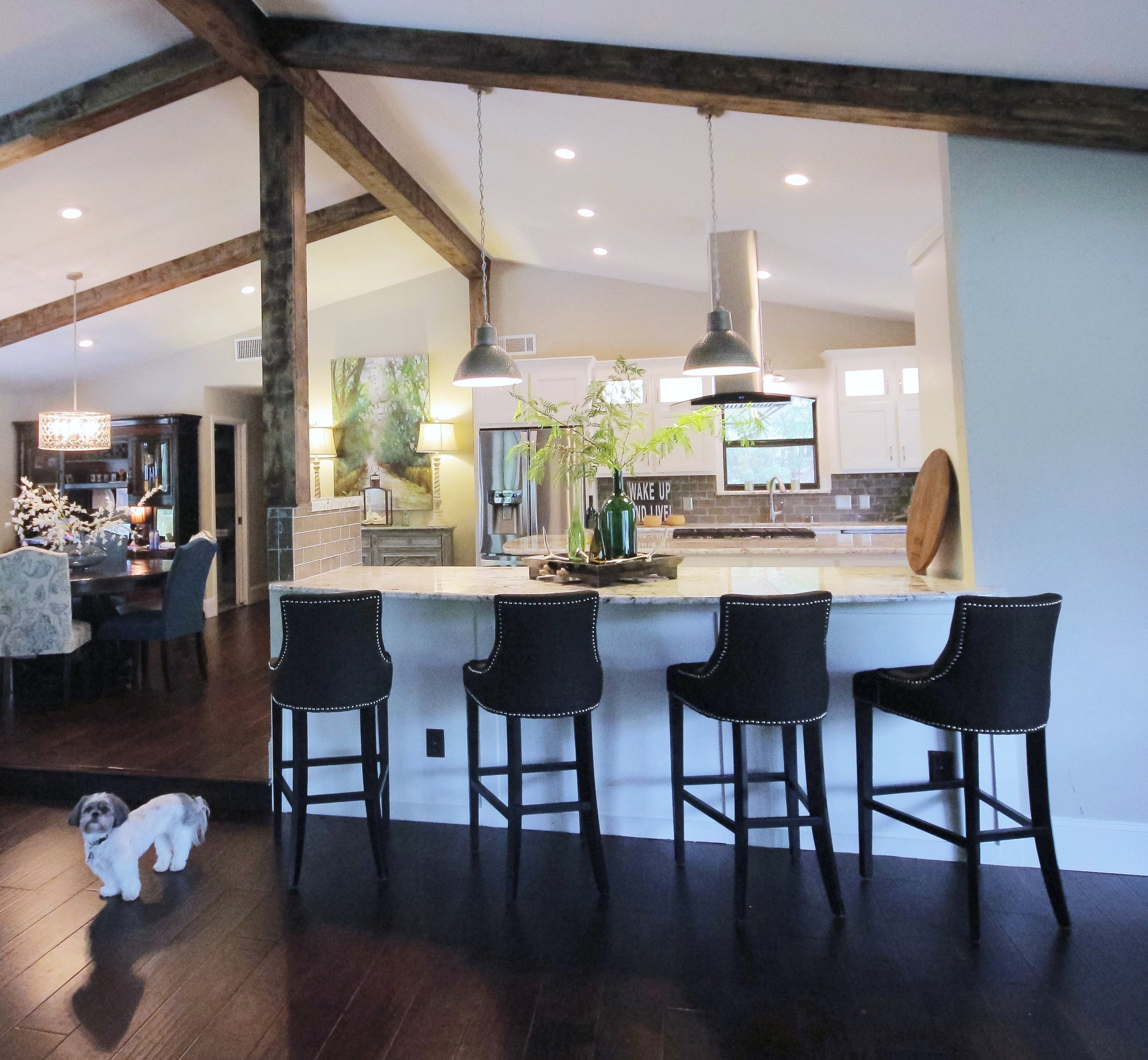
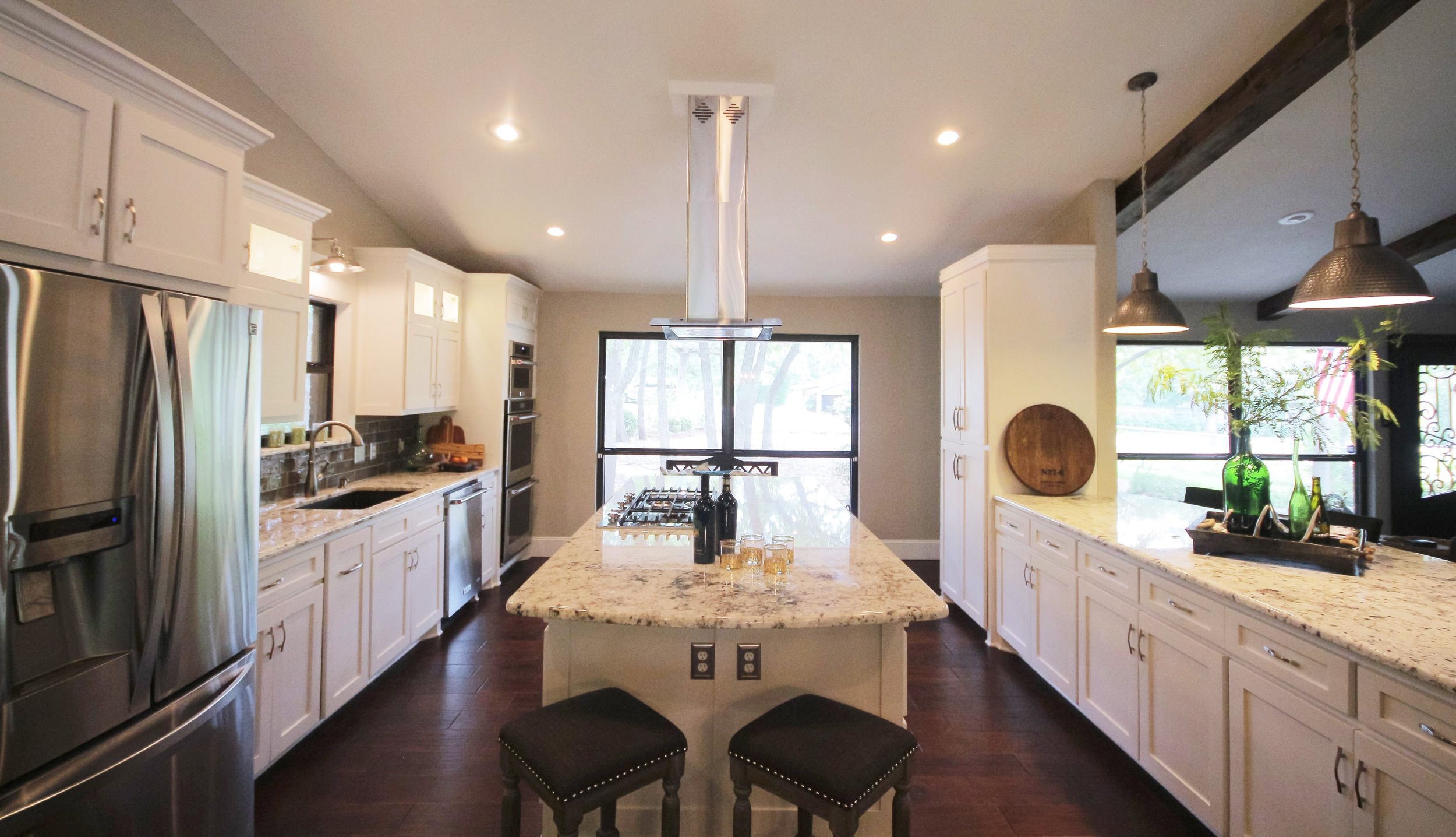
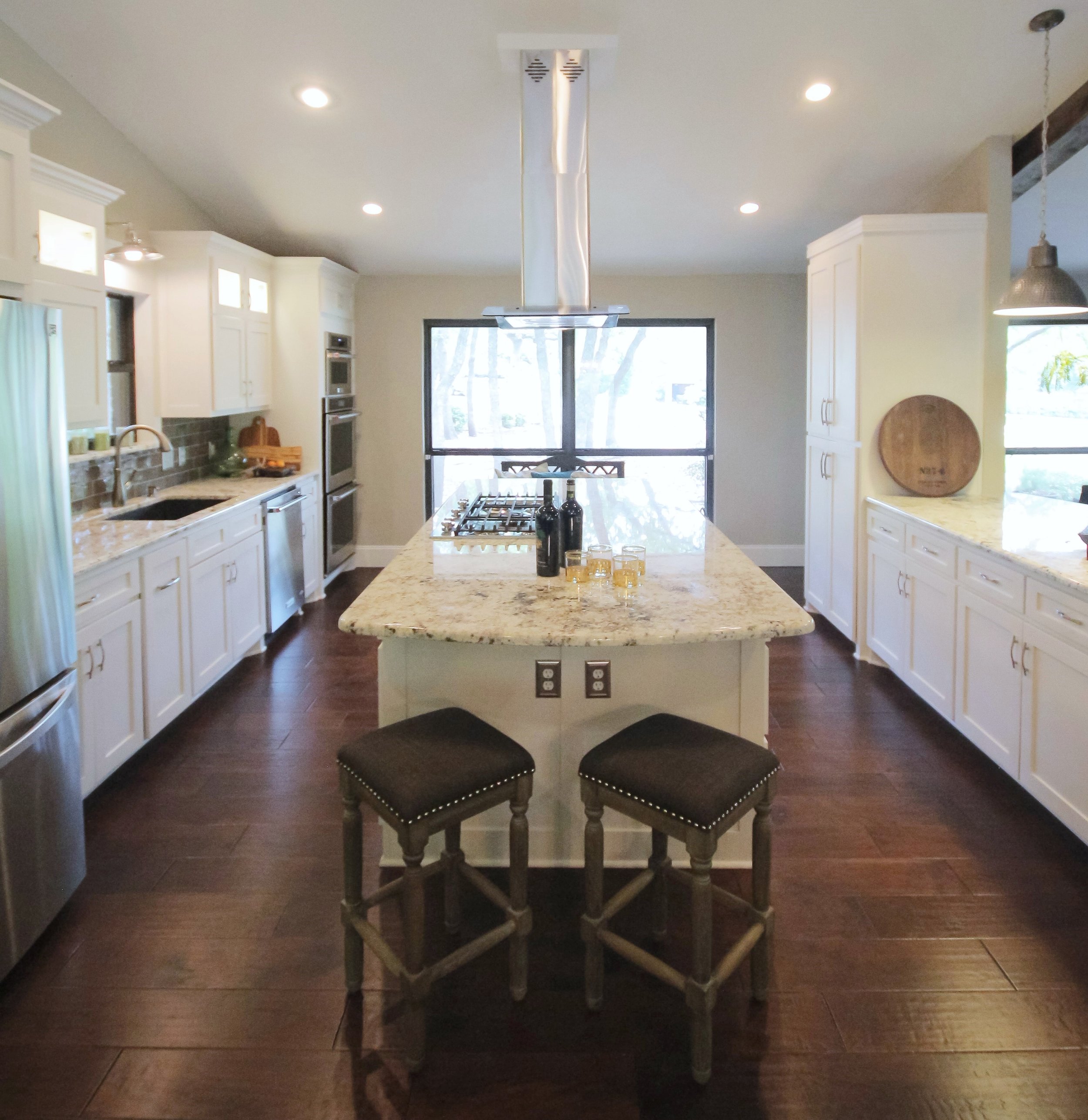
The kitchen was incredibly un-functional and was closed off to the rest of the house.  I suggested we open it all up and create two islands.  One in center of the kitchen for their prep work, etc. and the other one where we opened up the space into the family room.

Aviary Photo_131166264343828772

They had a formal living room that they hardly ever used so opening up the space into that room made sense.

decrenew interiors 2

They had a round dining table in the kitchen area that they used daily. We made the bar area nice and big so the family can sit and do their homework while mom or dad cooks.

IMG_0271

The family room had beams but they were off scale. We widened them and added new beams to the area where we tore down walls.

IMG_0280

There are barstools on each side of the island as well because we all know the kitchen is where everybody hangs!

IMG_0246

Aviary Photo_131166265680217033

The kitchen was totally gutted and we started from scratch.

IMG_0290

The wood floors were the last thing to go in and once they were down it all came together beautifully, just like I saw it in my head during our walk thru consultation :)


I just love the handmade subway tile and the lighting we chose, it really gave the kitchen that industrial farmhouse feel. I think Jo Jo would approve, don't you?

decrenew interiors 3

IMG_0174

Stay tuned for more before and after from some of our other remodels!

Asian Inspired Office with a Texas Twist

decrenew interiors

I always love decorating office spaces.  The accessorizing is what makes an office feel inviting! There is no reason an office needs to feel stuffy and stale.  Your spaces create a mood and can instantly make a client feel at ease which equals profits for you in the long run.

BEFORE


IMG_7705

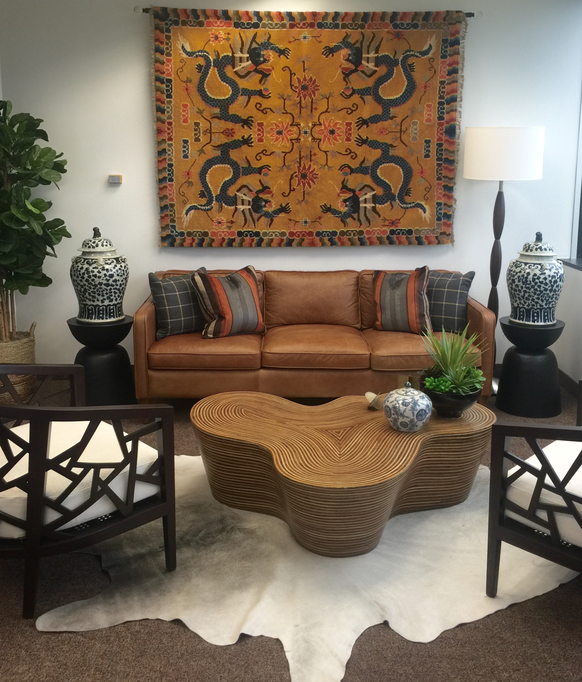
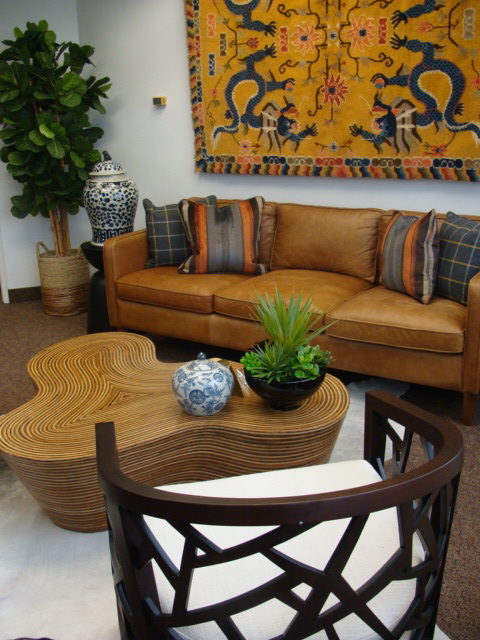
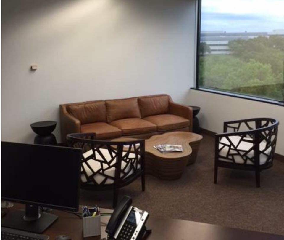
My client had all the furniture pieces but needed me to add the detail.  They wanted an Asian influence with a Texas flair.  The main problem here is the scale of the couch.  It seems small for the room.  I knew we could make it work with whatever we put above the couch.

AFTER

full room

My inspiration for the entire room was this vintage oriental rug that I found.  If you follow me regularly, you will see that I like to add an international flair to my designs. This project was perfect for me because of that.

Ruthie Tip:  Never under estimate the power of pillows.

DSC04746-1-e1464212152176

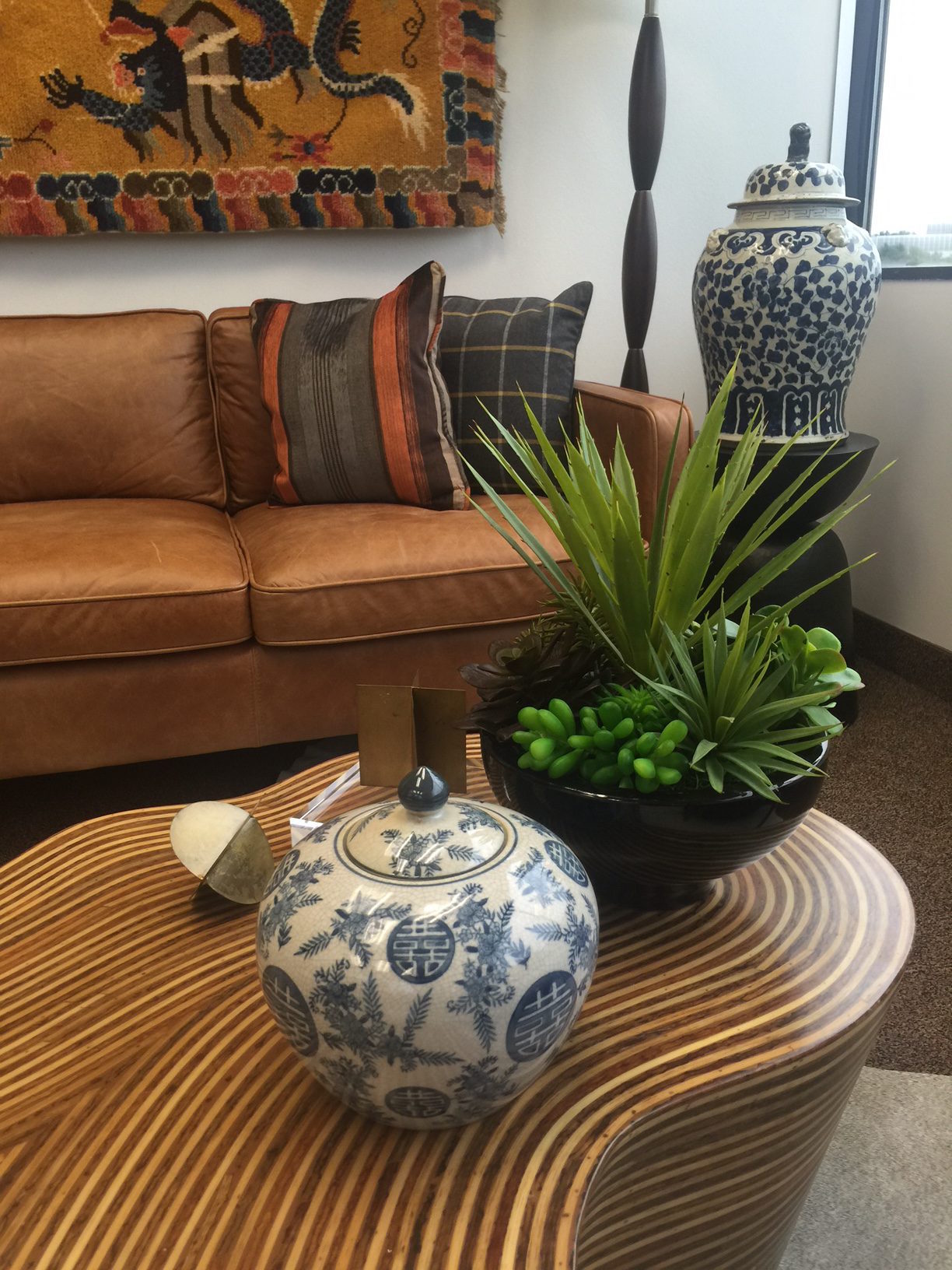
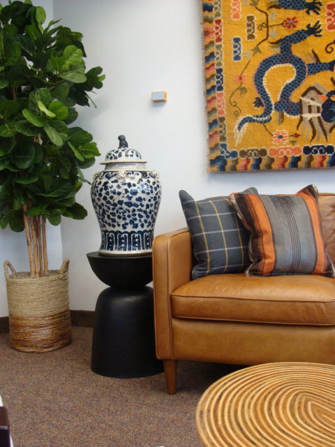
The large antique blue and white ginger jars added such charm to the room.  I wanted the flannel plaid on the leather couch to create a masculine feel.

The white cow rug is the twist of Texas!

The floor lamp is really nice in an office for evening working. Also, creates height in the space and makes everything come together nicely.

IMG_7257-e1464212203460

Pops of green on the coffee table as well as the fig tree makes the space feel alive.

DSC04722-1-e1465859492889

I always love how fig trees look. They are so lush and green. I put this one in a basket which is a bit of a Texas flair and adds interest and texture vs. a typical planter.

IMG_7210

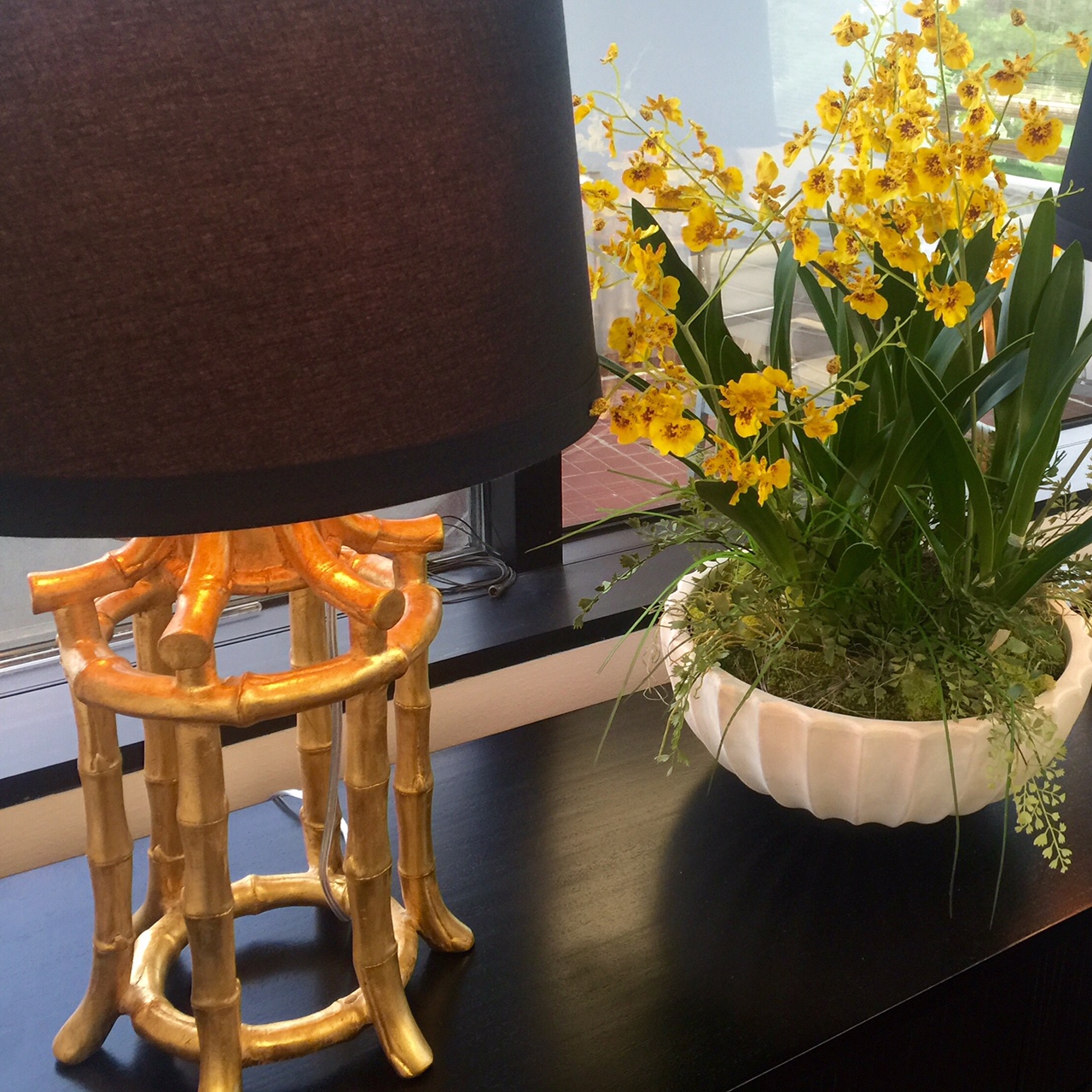
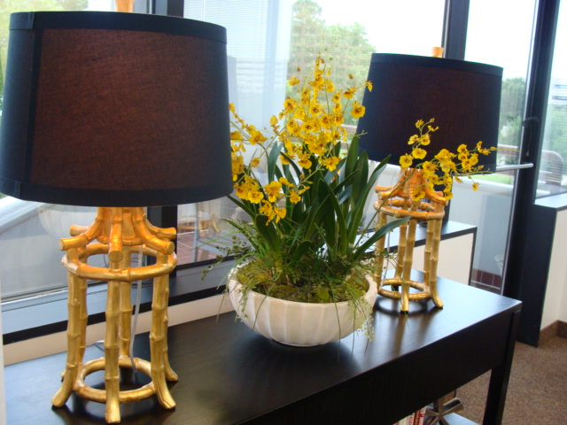
Two gold bamboo pagoda lamps really added a fun flair to the console table.

DSC04740

Yellow florals pop against the black console table and definitely add an Asian flair.

DSC04698

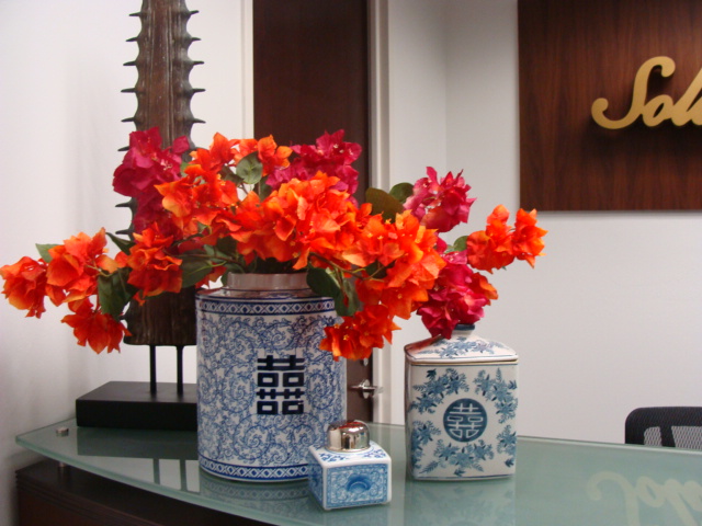
The reception area is very welcoming now with the blue and white pottery and the striking florals.

DSC04700

 The artwork was custom made by "Divine Inspirations" and I love it!  So colorful and striking when you walk in.

I'm busy working on some design plans and will be posting pictures as soon as those jobs are finished.  We finished up 3 kitchens this week so photo shoots will be happening sometime soon too.