Kitchen Island Makeover

BEFORE

What a beautiful kitchen!  My client loves the flow of this kitchen and the feel.  My job was to come in and add some spunk and personality to it.  Notice that everything in this kitchen is the same color.  There is nothing that truly grounds it and makes it feel personalized. 
AFTER

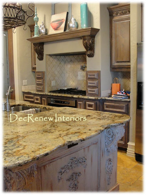
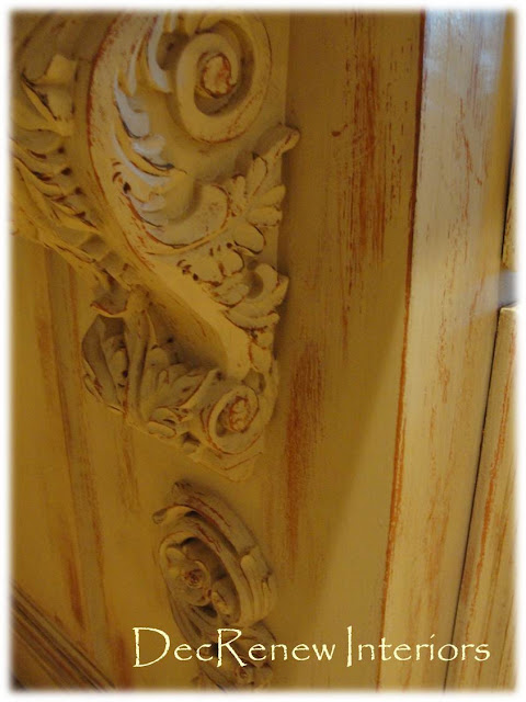
I lightened the kitchen up by having the main center island faux refinished in this wonderful distressed patina.  The island had LOTS of ornate work that seemed to dominate and over power the room.  This technique toned all of  it down and made it more beautiful.  The island is now the artwork in the space!

  I did take down the scrollyscroll work below the shelf.  See in the above "BEFORE" picture.  It was just too much of a good thing.
The color we used for the base color was the color that we used on the walls in the adjoining room.
Perfection and the client LOVED it!
The wall color! 
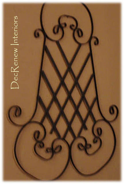
Found this wrought iron piece at an antique store and thought it went beautifully with the artwork I chose for the room.
The color goes beautifully with the stone too making the rooms flow together!
Think about painting your kitchen island!  It can change the look of the space instantly.
I'm dragging Christmas out of my attic today, wish me luck!
Visit DecRenew Interiors to see my before and after portfolio.

Family Room Before and After

So much fun to finish this project for my client just in time for Thanksgiving with their family.  We gave their family room and kitchen an update with paint, new furniture and accessories.

BEFORE
The fireplace was a cream stone and had such beautiful detail.  However, the detail was lost because the fireplace didn't make a grand statement, it just blended into the wall color.
AFTER

We fauxed the fireplace surround a graphite gray and it now has much more grandeur. I suggested they paint their bookshelves an off white so their accessories could be showcased. Collectibles always look better against white.

AFTER
They had a patterned carpet in the room already but my client wasn't too fond of it!  I found a rug that complimented it well that we  placed on top of it.  This added dramatic color and interest to the room and made my client really happy!  The leather sectional was a must because this is their TV watching room where lots of football watching goes on!
Of course you have to have reversible pillows for those that love instant change!

A seven foot mirror really added a WOW to the room! 
This console table matches the fireplace color.
I found this metal urn and painted it and then aged it.  Added some driftwood and it's a fantastic addition to the bookshelves.  Notice the wonderful cinnamon color behind the bookshelves!

Every room needs a touch of animal print.
Sorry for the TV reflection. I couldn't figure out how to turn it off!  I really tried to personalize the room so it didn't look staged! Family photos and special items were hung on the walls to make them feel surrounded by their special things.  The crosses were gifts from family and friends.

This stone was our inspiration for the color palette for the paint colors.

Adding candles in the same color scheme really adds a magic to the space.

Enjoy your weekend! 
I'll post more about their kitchen later. Wait til you see what we did with their enormous island!
Visit DecRenew Interior's Website to see Ruthie's Design Portfolio.

Doilies and Ornaments

Someone shared this idea with me today.  I just had to share it with you because if you are like me,  you are looking for great ideas to make for Christmas gifts or just looking for some pure fun crafts to make to celebrate the season. 
 All they did here was spray paint a crystal or clear ornament.  They overlayed it with a doily and used silver spray paint to get the beautiful design.  Any metallic spray paint would be awesome! 
Adding some glitter after you paint it would add sparkle too!
(Google Images)
What a great gift to give this season.  You could make 6 and put them in a fun decorative box.  Everybody loves something "made with love" . You could even keep them for yourself and display them in a pretty box or large candle lantern like the above!
(Pinterest)
Love these Christmas Trees in their large pots! 
I'm getting all the boxes out of the attic this week.  I'm decorating early this year.  I want my house done before I do everybody else's!  I CAN do it!!
Visit my website DecRenew Interiors to see my Design Portfolio.

Rancho Del Ingles - Alhaurín de la Torre

La Case Grande - Built in 1985
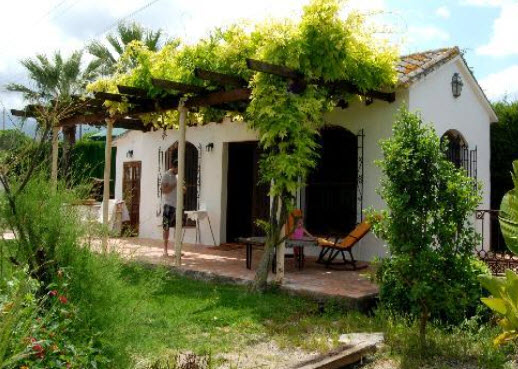
Rancho Del Ingles is a place that will forever be etched in my memory.  This is the venue we stayed at during our retreat a couple weeks ago.  This ranch is nestled peacefully in the foothills between the mountains and the sea, just outside Alhaurín de la Torre.  
It is an estate filled with character, charm, grandeur, history and most of all has a story to tell.
David and Miyuki are the owners of this incredible Ranch and really know how to entertain their guests.  They became our friends and filled our hearts with their kind gifts of hospitality.
  David is a collector of "treasures" and has slowly incorporated architectural items, windows, beams, doors, shutters, vintage light fixtures, antiques, statues, etc. into this Ranch, their dream home. 
(windows in the living room)
 He sat and chatted to me about where and how he found all these incredible items that he built the Ranch around. He is a reclaimed treasure enthusiast that's for sure.   Some treasures were found in garbage bins, others were thrown out treasures that he found of the side of the road, others were pieces from demolished and abandoned buildings.  Of course, lots of the items were purchased but they even have great tales to tell. 
 He told us that he purchased a large storage container many years ago and just started putting things he found in it.
He knew that one day he would have the opportunity to build his dream home and that "one day" is now here.  When they bought the ranch, there was an original farm house on the property that was built in 1859.  David is slowing adding buildings using what he has collected over the years.
Everywhere you look on the Ranch, they have incorporated treasures that David has found.  This  makes the architecture incredibly interesting and full of character. They now rent out the Ranch for weddings, receptions, parties, celebrations, yoga retreats, etc. for others to enjoy.
Entry to courtyard.
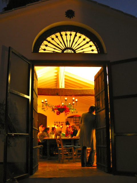
You see loads of character and beauty as soon as you pull up to the entry of the Ranch.  These large wooden doors welcome you as you enter the courtyard to the main house.
They were purchased in Malaga, Spain.
Beautiful wrought iron work is everywhere.

The courtyard is where we ate all our meals.  It's a bright, sunny, inviting place to be. 
Miyuki has made every inch of this property feel like home.  She has the gift of hospitality and she and David make a great team.
The back of the main house.

The view from the main house to the Studio. 

Doesn't it look like a painting? I thought my camera captured it well. 
The pool area is a wonderful place to relax and read.
Lots of patio seating and creative landscaping throughout the property.
Love this.

This gazebo reminded me of the one my husband just built for us.
.
Each little house/villa on the property is tucked away somewhere incredible and has loads of interest. 
These shower doors are actually train cabin doors.  Brilliant way to use them.
The bathroom vanity above was one of my favorites.  David found this carpenters bench and added two sinks to it so it could be used as a vanity.  It is perfect because it has all kinds of nooks and crannies for guests personal items.
Old vintage light fixtures are all over the property.
A newly painted spiral staircase leads up to incredible views. 

I can't imagine all the hard work that has gone into this garden.
Terra cotta pots are placed randomly everywhere.
The property is so inviting at night.  The candelabra was my favorite in the main house and I loved adding fresh flowers each day.
This outside sitting area was used a lot during our stay at the Ranch.  This Indian window is spectacular and is absolutely perfect grouped with these Moroccan lamps.  The concrete table took my breath away too.
Can you believe how beautiful this outside room is at night?

This is another outside patio area.

The main dining/living area had a large farm table for everyone to enjoy. 
The front door is from Arabia.
Arab door up close and personal.
 All the interior doors of the house were found by David and were either being thrown out or not wanted.  He saved their lives!  Who wouldn't want these doors and where was I?

Notice these wonderful arched windows.  There were about 8 of them that were going to be thrown out.  David rescued them paying about 4 pounds each (I couldn't believe that) and he didn't do a thing to them.  

 The rustic patina on them hasn't been touched, it's just real age!

This Moroccan bed is in one of the main bedrooms and is so cool.
Stain glass windows are incorporated throughout the house.
Loved this ledge that was built in one of the rooms.  So rustic and charming.
All the rooms are cozy, clean and so eclectic.
The property goes on and on.
Statues are tucked in the garden her, there and everywhere.  According to the season you can pick your own avocados, oranges, lemons, walnuts, almonds, figs, asparagus, pomegranates and olives.
Old rustic tools and vintage garden equipment is placed in fun places throughout the property.
There are reading places everywhere for peaceful contemplation.
El Estudio

This is a large meeting room where the big events take place.  The row of columns on the outside of this building are from a church that was being demolished in London. 

David rescued them before they got destroyed.  How could anyone destroy these beauties?

They make an incredible statement on the outside of the building and he didn't have to do a thing to them. 
The greatest patina ever!  David placed some of the columns on the inside of the building too.
This little sitting area is on the porch and was used the entire week by woman taking naps!
This massive farm table was put to good use too.
What a view to wake up to.  To top it off, the weather was PERFECT!
Just look at the detail of this patio floor around the columns.
On the last night, I got to stay in the room above with the balcony.  The balcony on the left is the "outside" bathroom. 
There is great freedom showering on a rooftop, I must say!
It was spectacular! 
This is what I looked at while brushing my teeth!
If you would like to go visit David and Miyuki's website.  Here's the link.
Thanks David and Miyuki for all you have put into this Ranch for others to enjoy!  Blessings to you from Texas!  If you ever come to Texas, come stay in our home at Casa de la Roca.
I have a feeling I'm going to be reading about you someday in Architectural Digest Magazine.

Visit my website DecRenew Interiors to see my design portfollio.

Kitchen Makeover Before & After

Everybody wants their home to reflect how they live and who they are.
This is especially true when you purchase a new home and it doesn't have your personality anywhere to be found.  My client who purchased this new home was smart when they decided to buy this incredible gem because it had great bones and character.  It just lacked those special touches that made it feel like home.  It needed an extreme makeover and lots of TLC.
BEFORE

Dark and dreary but not for long.  The center island and the back counter top was black tile with a stainless steel back splash.  Way too modern for my client who wanted a open, fresh and inviting kitchen.
It's been about a 5 week process but this week we finished their kitchen remodel. I stopped by today to take a few AFTER pictures while the cleaners were there. They were busy getting everything ready for the homeowners to move in this weekend.  My client is incredibly pleased with all the finished detail and loves the way every room now flows together with a purpose. 
AFTER
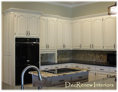
New crown molding added to the top of the cabinets, new paint and glaze, wrought iron hardware (the jewelry of the kitchen), new counter tops (with a different color for the center island), new back splash, and new wood floors throughout most of the house. 
 The entire house had different tile in each room which looked crazy but not anymore.  We also stained the bar area the same color as the wood floors and that really made a HUGE difference to the feel of the kitchen. 
It's hard to see in the photos  but the cabinets do have a subtle glaze like the above gently rubbed on them. 
The adjoining dining room..  It is so beautiful with the complimentary crown molding!  Sherwin Williams "Breezy"

The homeowner keeps telling me how refreshing and rewarding it has been to work with a decorator.  Having a professional by their side to assist them with ALL the overwhelming choices that come with remodeling or updating a new home has been a life saver to them.  In the long run it has saved them thousands of dollars because they have avoided bad decisions that could have cost them a significant amount of money if they had made wrong decisions during this process on their own.

The distressed floors turned out beautiful
From paint colors, floor selections, grout color, lighting placement, granite color choices, carpet color, vanity selections, etc. it is so overwhelming to make these decisions alone.   The homeowner can honestly say now that it's all done...."WOW, we love it and it feels like US" 
BEFORE
It was a construction zone for about a week with all the tile demolition in the house.
AFTER
(before grout)
BEFORE
AFTER
From a different angel but you get the idea.  The back splash really looks beautiful with the center island granite.  The client was really hesitant to do something different like this but now that it's done, it's their favorite part of the kitchen.  The granite is like a piece of art.
AFTER

Hope you enjoyed the tour.  The Slate fireplace is being installed as we speak so I'll post pictures of that later on. 
Have a great weekend!
Visit my website (DecRenew Interiors) to see more before and after photos.