Southlake Home ready for Thanksgiving Guests

_dsc1889

Last week we completed a home for a client.  It was an exciting day, especially since their home has been in a mess for the past 6 months.  They started by repainting the entire home this past summer. A 2 hour walk through took place and then while they were out of town, they had the entire home updated with the ideas I presented to them.  They also had hardwood floors and carpet installed, put in new windows, as well as new plantation shutters installed in the front rooms of the home.  Wow, did this ever make a difference to the curb appeal!

_dsc1895

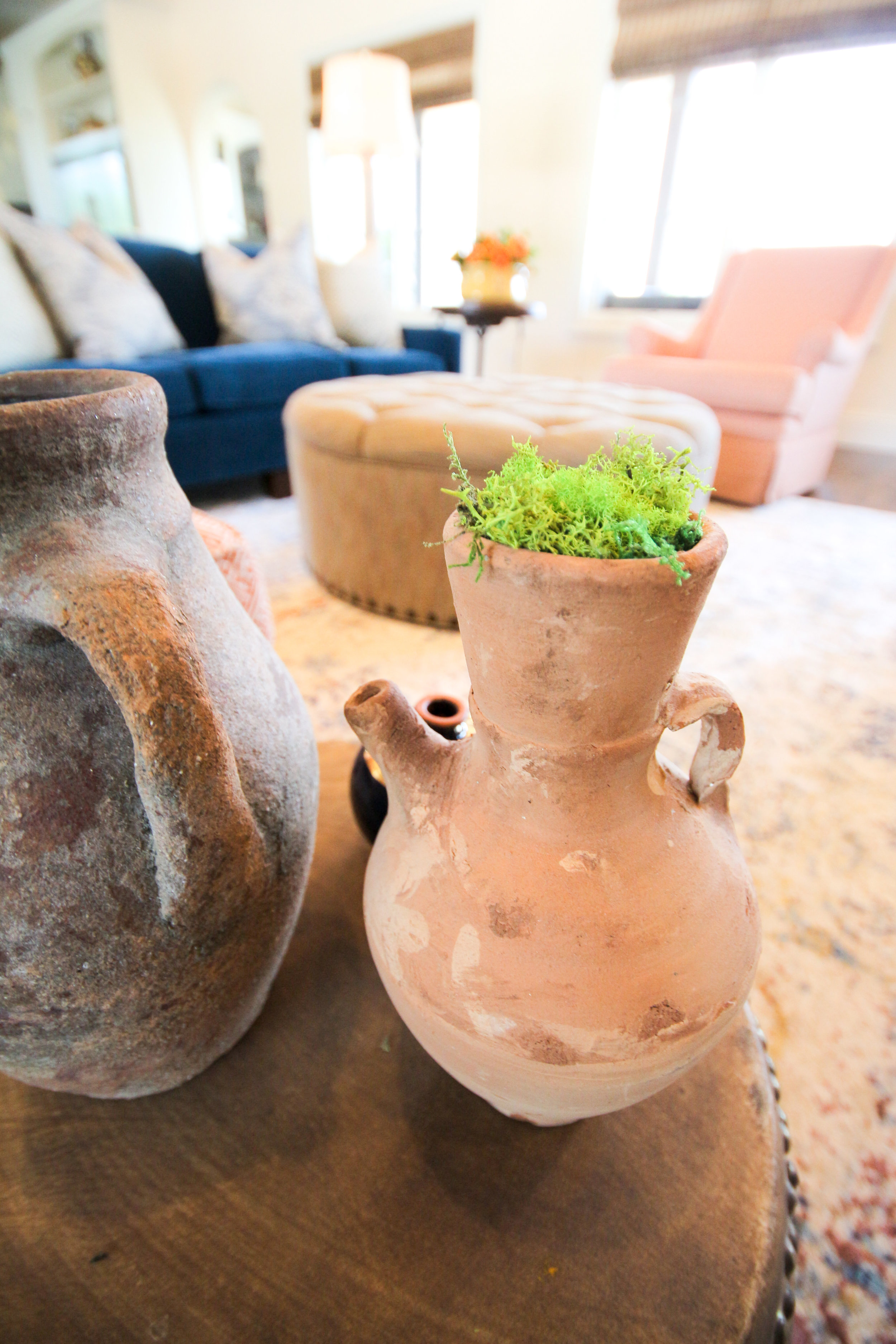
After all that work was completed, it was my job to decorate the home. The client hired me to revamp their dining room, formal living, family room and entry. We wanted to use as much of the existing furniture as we could.  The antique dining room table is beautiful but just needed some repair.  We had the chairs reupholstered in a gorgeous blue and off white striped fabric and used an off white leather for the seats so they can be wiped, especially since they do see grandkids in their near future.  The urn on the table was filled with moss for that touch of nature and a pop of green to coordinate with the painting.

_dsc1879

The client had the artwork commissioned and we designed the room around it.  They are not real formal people so I wanted to add a bit of fun to the room and knew that a zebra rug would do the trick with the fabrics we used.  Isn't it fabulous?  We chose a chandelier that doesn't hide the painting so I chose this one that has open arms and little fuss, keeping the painting the star in this room.  We moved the existing chandelier into the adjacent piano room because it was too small for the room (see photo below)

Before, the mirrors in the dining room looked very 80's so I had an artist come and make them look aged by antiquing them.  We experimented with several techniques prior to her coming and finally came up with this patina.  I think they turned out beautifully and they now go with this collected look.

.decrenewinteriors

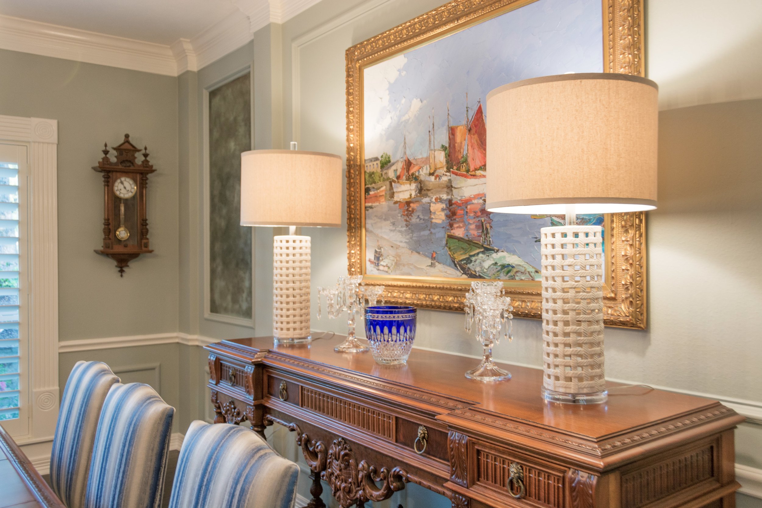
I chose these lamps for the console table because they were also open and didn't feel too bulky up against the painting.  We used the clients existing crystal from her family members and their travels, to accessorize the console.

_dsc1905

The entry was our next challenge.  The client wanted to use the existing glass round table.  We added a lamp to add some accent lighting.  Of course I wanted one that was interesting and fun.  I then layered a bamboo tray with books and other collections to make an interesting assortment to look at for all those guests that visit.  It is the first thing you see when stepping inside their home, it had to be lovely.

_dsc1909

A little bit of wicker, crystal, wood, natural elements and ceramic always makes a nice collection.  Old books that have some history or tell a story about the homeowner is always a good idea.  Don't you just love the silver coral accent piece?

_dsc1835

The piano room was next... right across from the dining room.  This room was never used by the client before.  If you know anything about the way I decorate, you know that I want every room in your home to be used.  We decided to make this room more of a sitting room.  Again, we wanted to make it feel approachable and not too stuffy.  You can see that we moved the chandelier above the piano.  The client's grandma would be so happy to see it here.  It is beautiful and much more to scale in this room.   This room can now be used for laptop time or Sunday morning coffee or Friday evening cocktail hour.  Oh, can we also just notice how peaceful the color on the wall is.

Ruthie Tip:  When hanging artwork where there is picture molding, just IGNORE it, it makes it dissappear and is so much easier to work with.

_dsc1865

We had these wingback chairs custom made for the client and they really are elegant and have a touch of a masculine flair.  The round ottoman is perfect for extra seating, if needed.  We also had the piano bench reupholstered in a whimsical black and white fabric by Waverly.  I used an antique table the client had between the chairs, and added the lamps and accessories that I found around their house.

_dsc1840

I wanted to use a vintage rug in this room with muted tones.  Keeping it peaceful and relaxing.  The artwork was in the home already, I just shopped the house for artwork that I thought looked good together and grouped them together, forming a gallery wall.  The pillows really added a subtle pop of color and interest.

_dsc1856

The rest of the accessories were found in the home and reused in a different way.  I took a plant from the kitchen and put it in a blue and white pot to bring in some of the blue and white from the dining room.

_dsc2012

I went shopping with the client to find a club chair that he felt comfortable in.  I then had an ottoman made that worked with it and coordinated with the rest of the furniture we either had made or ordered from local furniture stores.  I love this little side table/stool that I found.  Perfect for a glass of wine or a cup of coffee.  The rug shag pillow was the perfect touch of the unexpected.

The mantel was very crowded before so I made it look simpler and less cluttered.  The blue and white vases match the small side table but I found them at two different places, yay!

_dsc1923

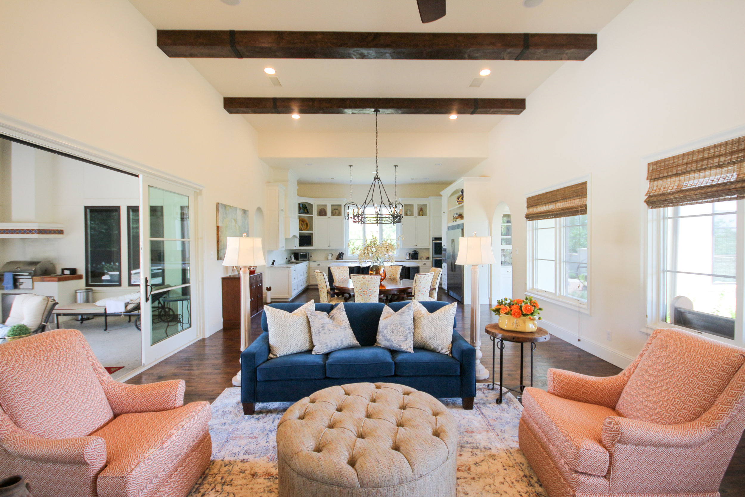
This room had absolutely nothing in it.  The client got rid of all their furniture which was all dark brown leather.  I wanted to mix it up and have a lighter, brighter room that could seat their entire family when they are all gathered together to watch TV or play games.

The room had hardly any lighting so I added two floor lamps to help with ambient light at night when they are watching TV and don't want all the lights on but still want to be able to see a bit.

_dsc2004

We met at Weirs to find a couch the family all decided on.  We chose this Navy velvet fabric which is soft and cozy.  I opted not to use the pillows that they usually include (too matchy matchy) and added my own Navy and yellow pillows to the couch.  A blue and gray vintage rug was chosen to pull the room together.

_dsc1943

These two chairs were found at a local resale store and I had them redone with new insides and reupholstery.  Swivels were added afterwards with a skirt to hide the swivel mechanism.

Don't you just love the rug?  Oh, and the silver side table?  I'm in love with it all!  Notice that the polka dot fabric was used on the ottoman adjacent to it to pull the two seating areas together.
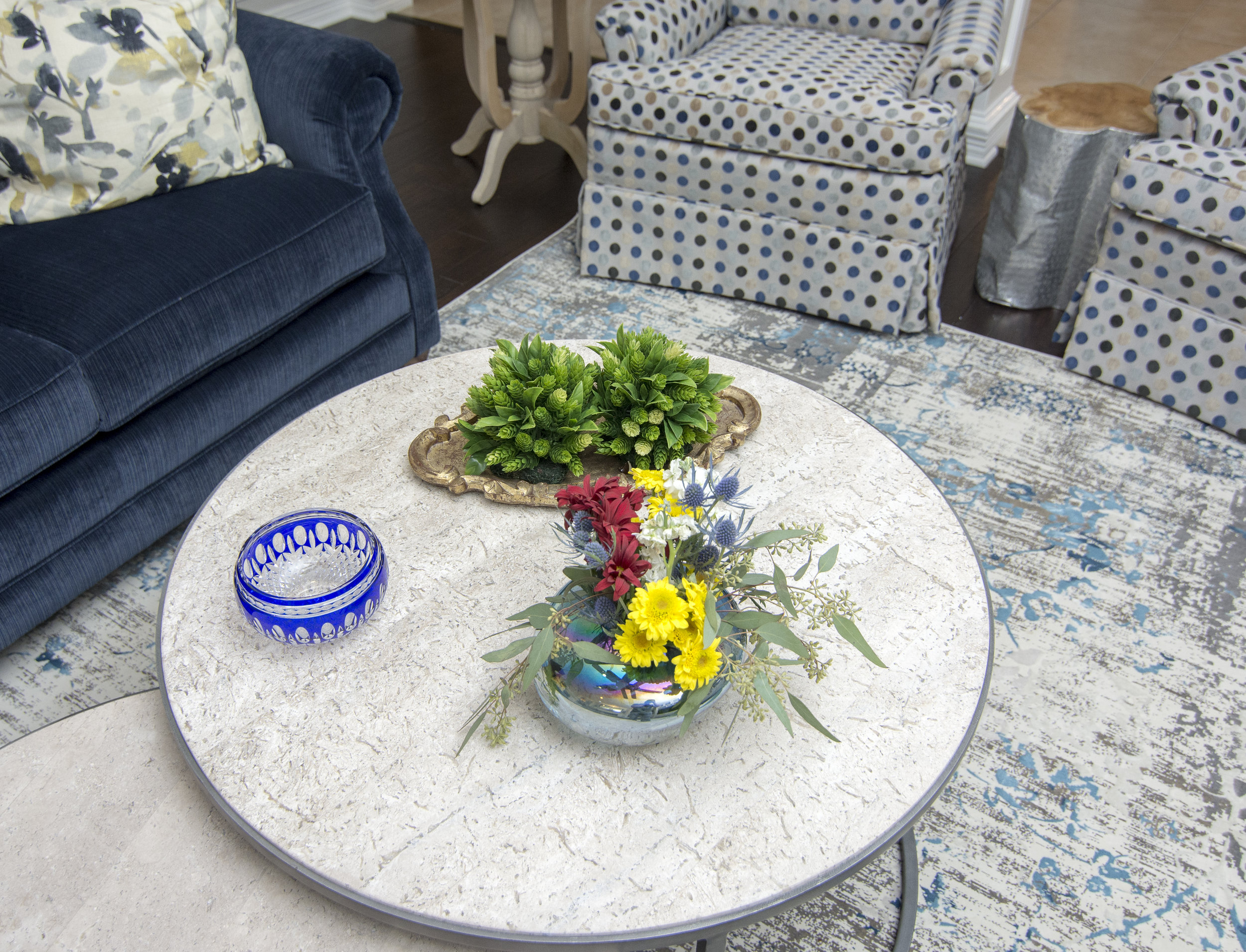
_dsc1989We spent the entire day placing all the furniture, accessories and details in this home and it was a very exciting reveal.

Just in time for their first grandbaby due any day now as well as family coming into town for Thanksgiving!

I won't be posting until after Thanksgiving!  Until then, I hope you and your family find time to gather around your tables and in your living rooms, not only on Thanksgiving Day but throughout the rest of the year!

Traditional kitchen gets a new soul

The past four our team has been working incredibly hard on a  kitchen transformation and had the photo shoot about a week ago.  I thought you might like to see the before and after transformation so here goes.....drum roll please!

BEFORE

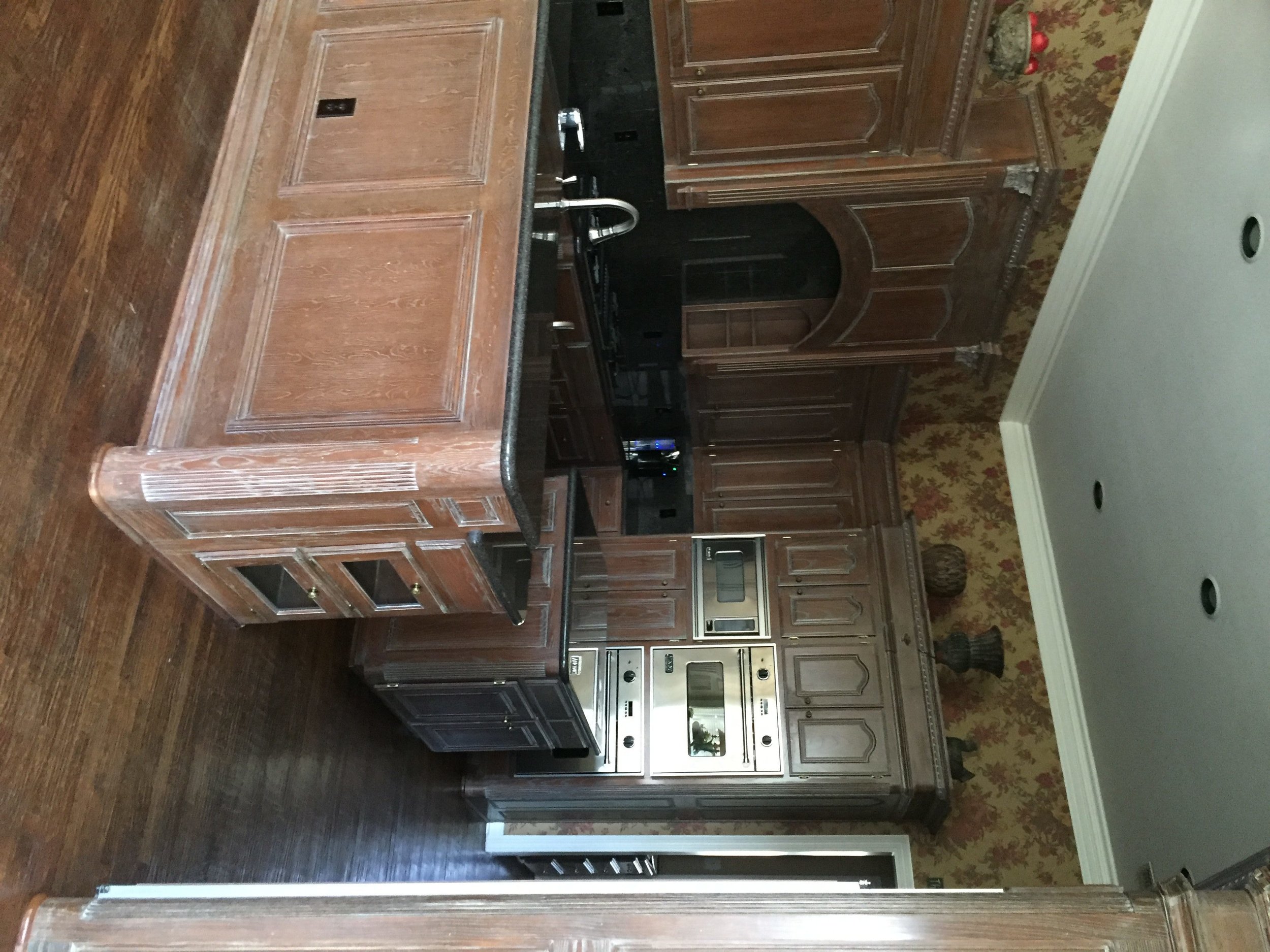
This kitchen was dark and dreary before.  It had pickled wood cabinets that dated the space and made you feel like you had gone back in time.  My client really hated it and explained that it made her feel depressed.  We can't have depressing so we came up with a design for the space and immediately started the transformation.  Just removing the wallpaper made it feel like it had a facelift.

before

The above picture was included in an email from my client before the renovation started.  The subject line said "ugh" and that is all!

We found the below backsplash and my client decided she wanted this no  matter what!  We both fell in love with it.  It became our inspiration for the kitchen.   It had to be custom made because it was several tiles and included some marble.   There is a story there because it took weeks and weeks but I will spare you of the details.

decrenewinteriors29

AFTER

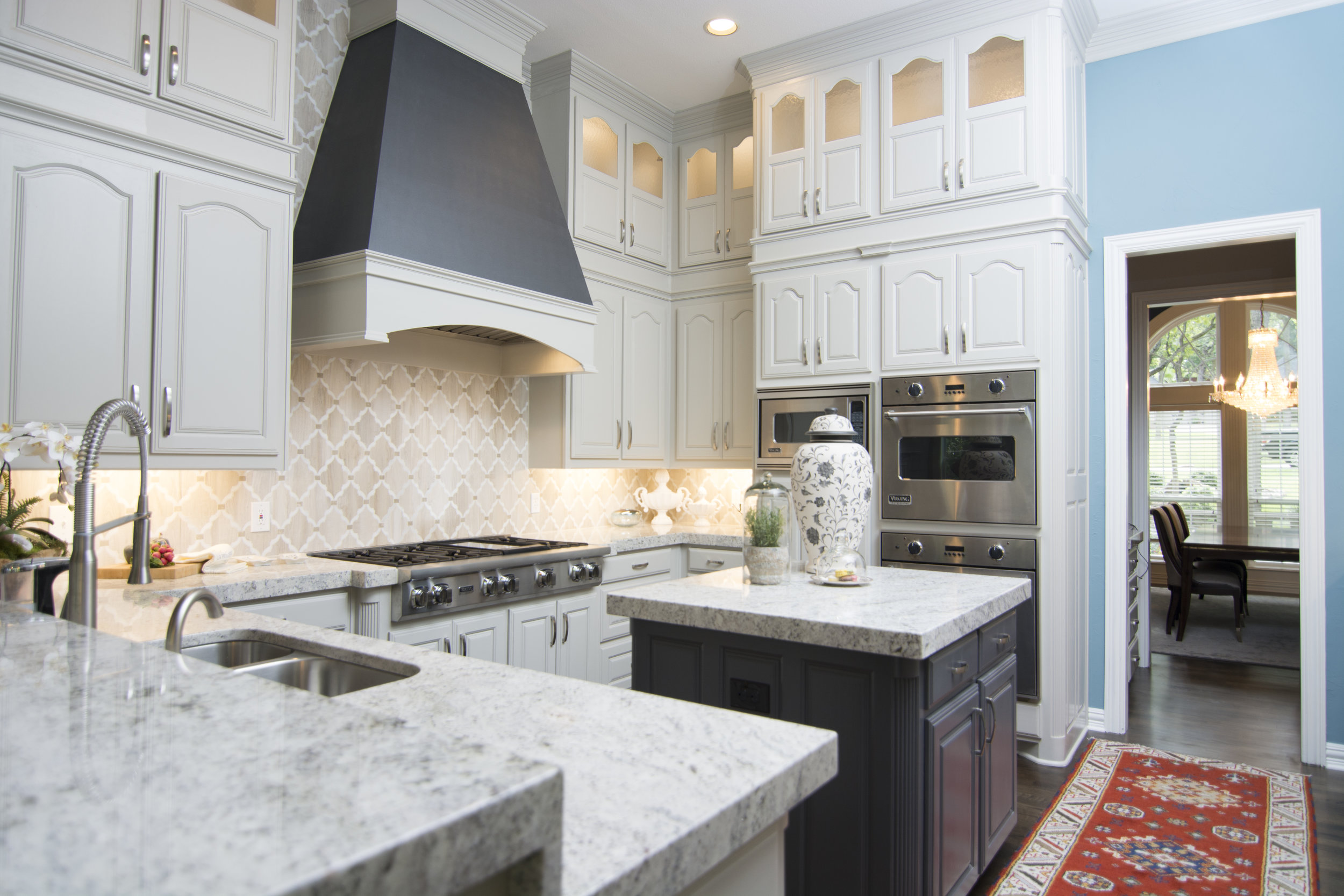
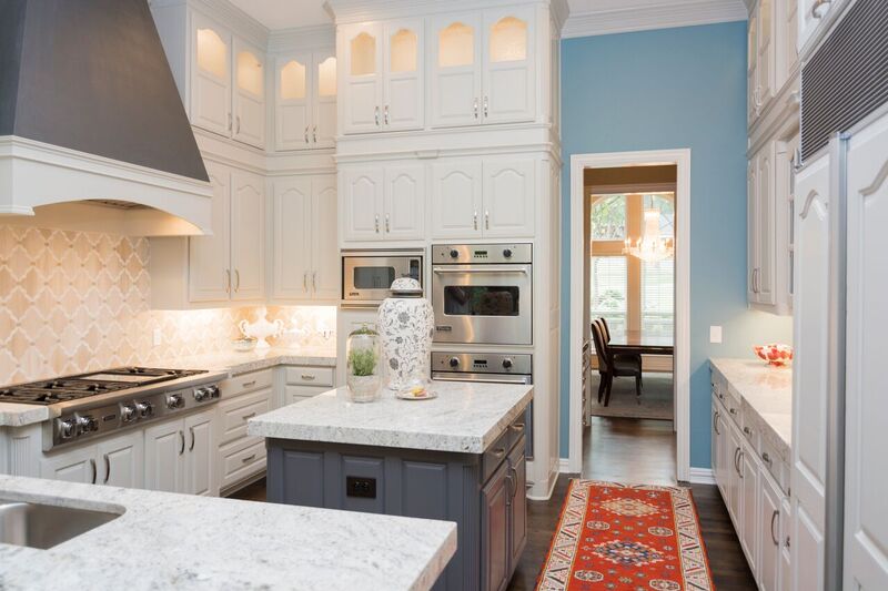
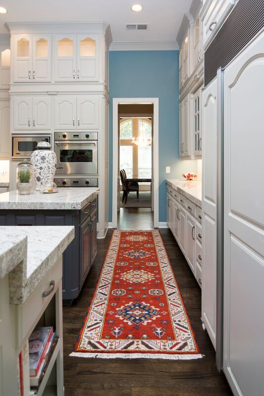
So one of the things we did was add additional lighted cabinets above the existing ones for additional storage. This was scary for my client because they felt like it was going to make the kitchen feel smaller.  I assured them that it would not!  In fact, it makes a kitchen feel taller and gives it more grandeur, don't you think?

_dsc0770

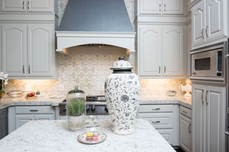
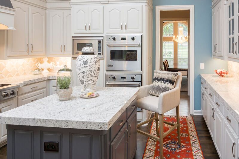
We took the existing vent-a-hood out and created a brand new one that is now the focal point of the kitchen. We purchased a brand new gas stovetop.  We kept the other appliances because they still worked and looked good.   I really wanted the backsplash to wrap around the ventahood because I knew it would make a nice statement.  My client trusted me on this one and we all think it turned out awesome.

decrenewinteriors6

 decrenewinteriors23

The entire home was repainted, revamped  and refreshed, including adding and refinishing their hardwood floors.  Some of the rooms were carpet so we added wood and had it all stained a nice dark color.  The wood floors were all hand scraped before but my client really wanted a more clean line look, so now they are all smooth and look absolutely fabulous.

decrenewinteriors7

The countertops are granite and work beautifully with the backsplash.

decrenewinteriors21

decrenewinteriors25

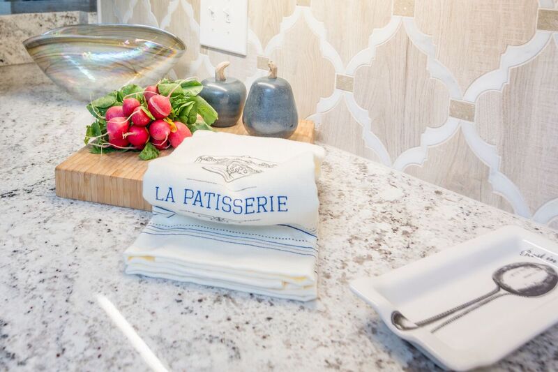
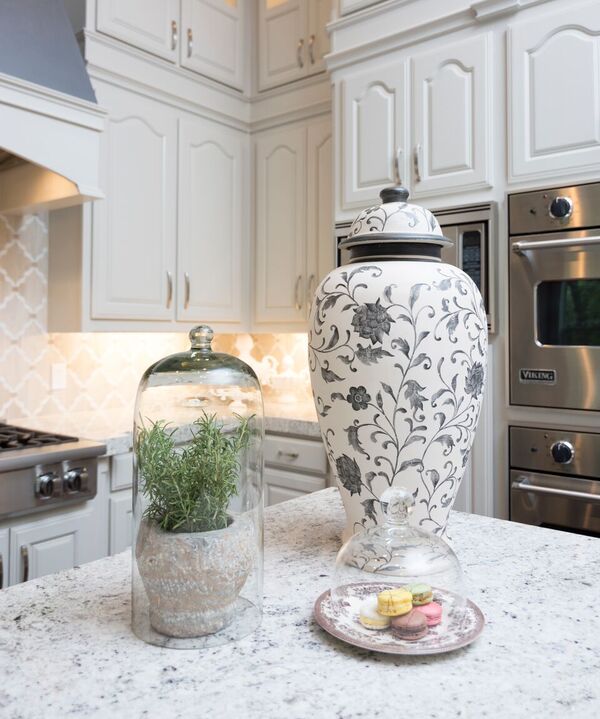
After the kitchen is all completed and its photo shoot time, my favorite thing is to style the kitchen.  I usually add bolder items that make a statement, rather than a lot of little things.

img_9846

You can see how gorgeous the backsplash is in the below picture.

img_9855

Doing a renovation while you are living in the home it really not fun. My clients had all their furniture and belongings moved into a pod for several months!  These clients were troopers and lived in their master bedroom for months while their entire home was torn apart.

decrenewinteriors4

Thankfully it  is all over now and they are ready for Thanksgiving and Christmas in their newly updated home.

Hope you enjoyed the tour!


Modern Style Spanish Home

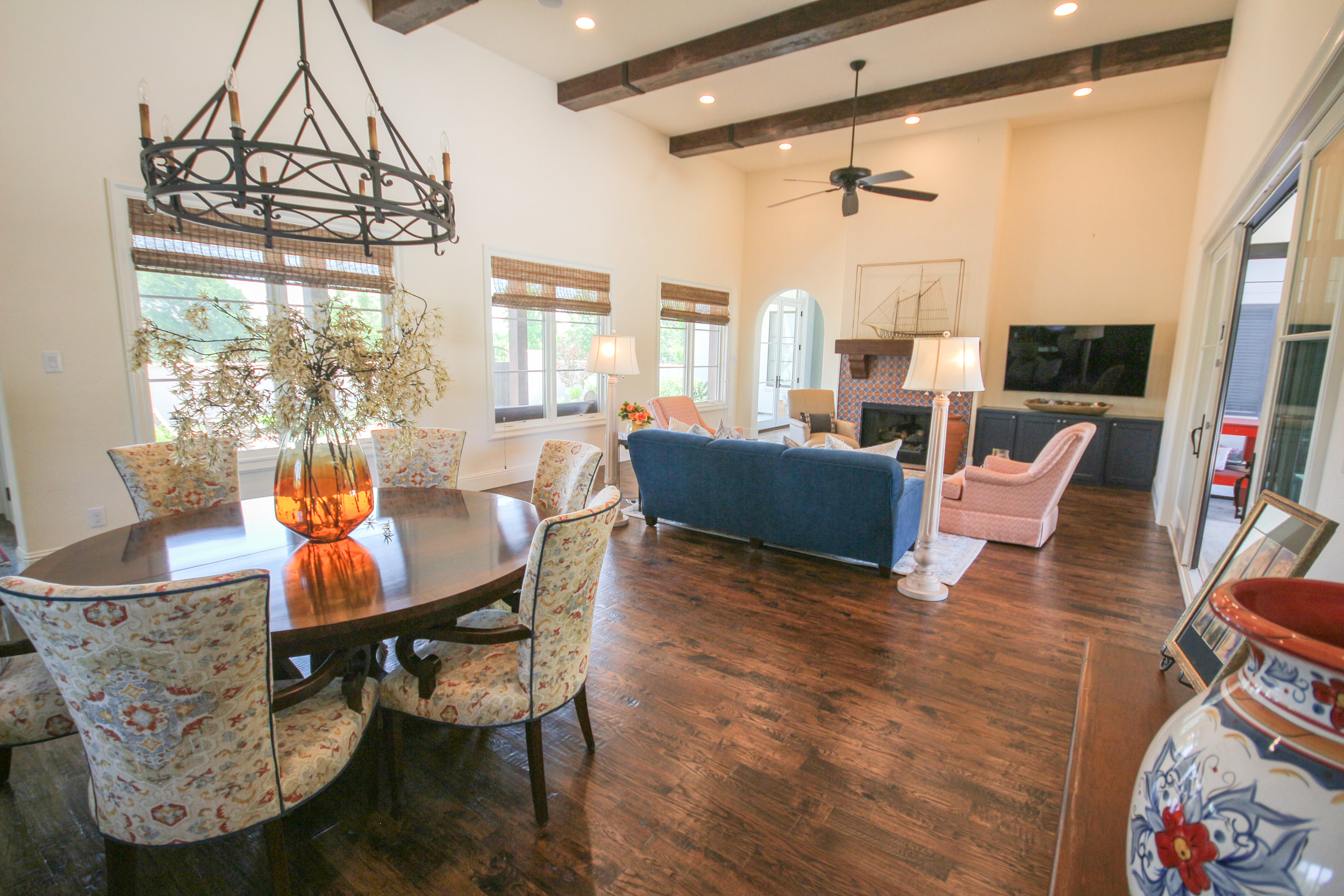
IMG_7650 We recently completed decorating a home for a client that built their home several years ago.  They were tired of living in the space without the details. We came in and added accessories, lighting, rugs and some furniture to complete the home.

IMG_7637

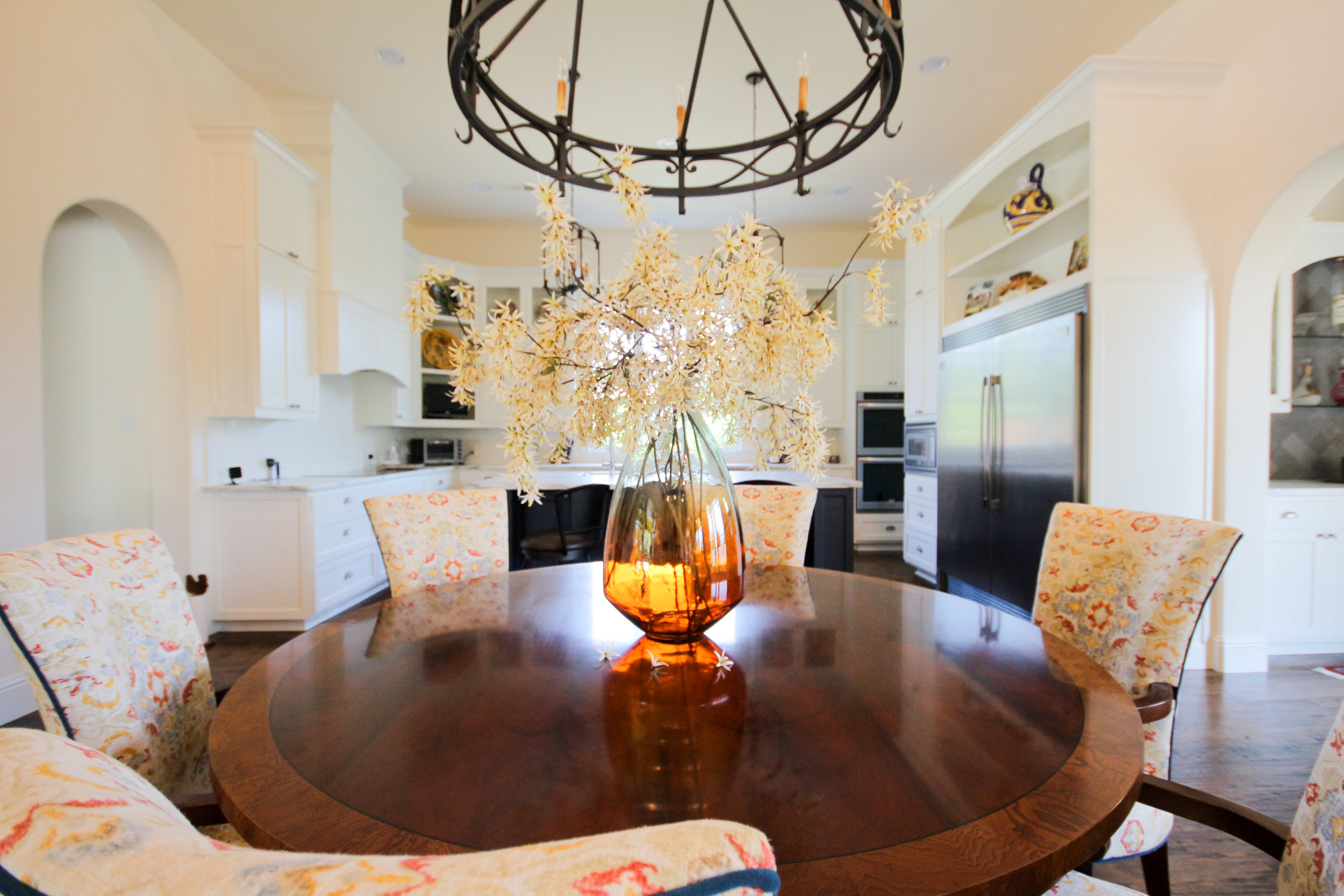
We had the dining room chairs upholstered in this colorful pattern outlined in the blue velvet that matches the couch.

IMG_7691

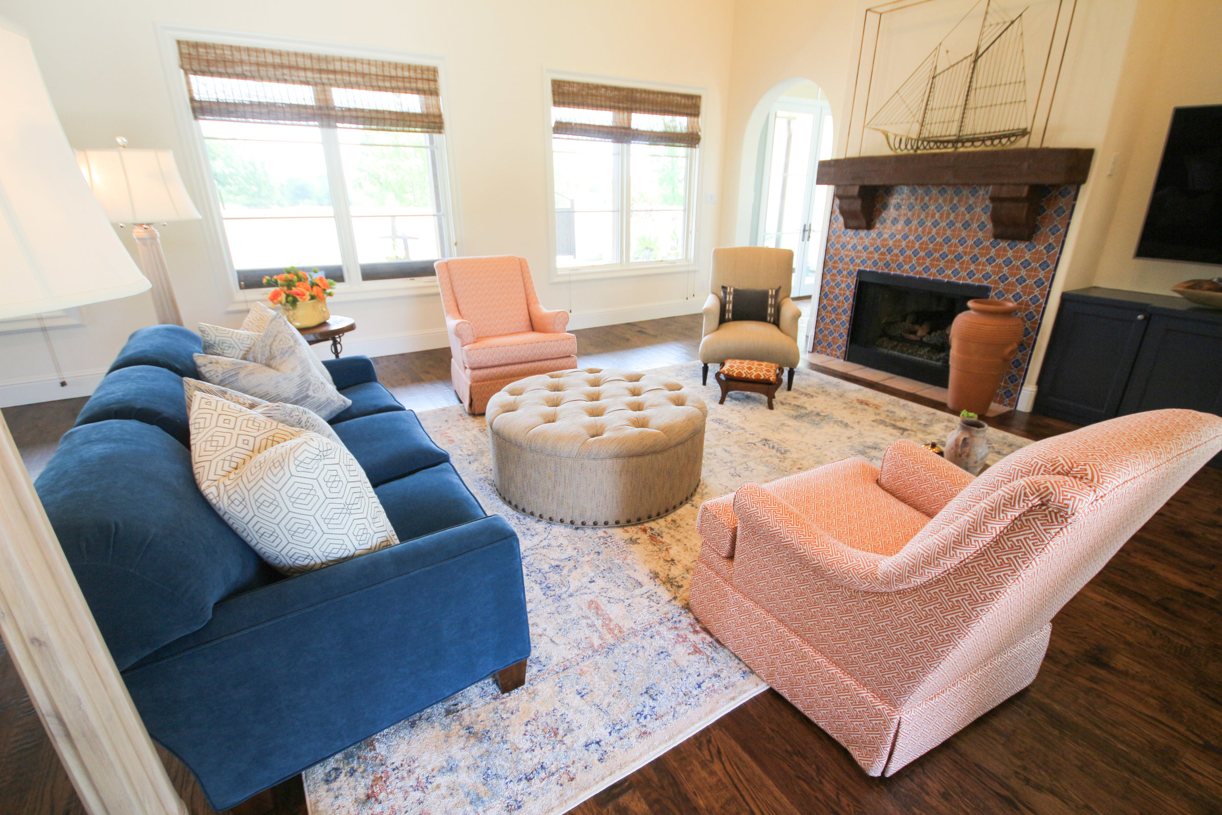
The client had a couch that they LOVED because of comfort and quality but the style was outdated.  We had the entire couch redone and reshaped into something much more stylish with modern lines.

IMG_7666

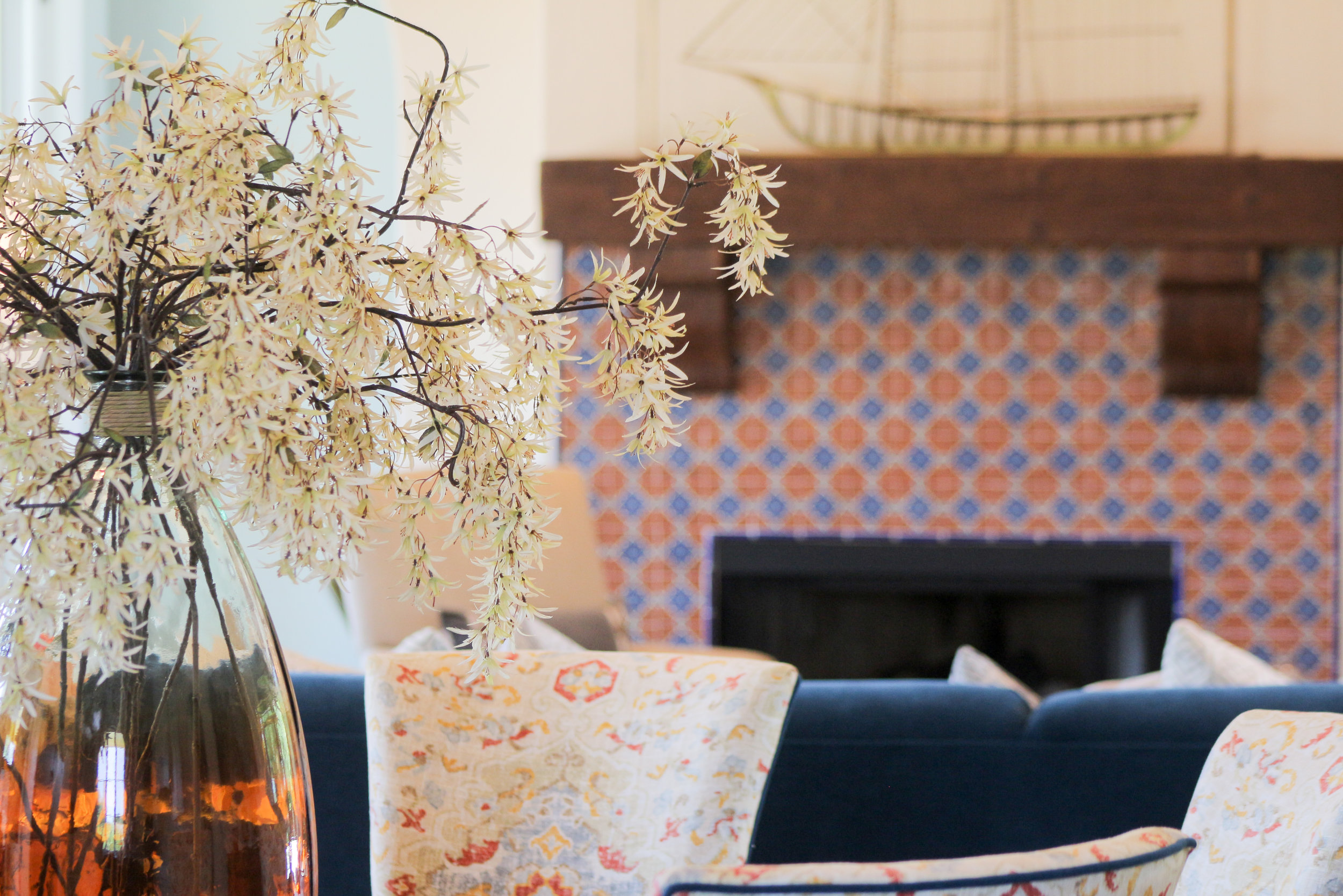
Custom swivel chairs with a geometric pattern, paired with a vintage style rug and round ottoman.  As you can see, the fireplace with the Spanish tile was definitely our inspiration for the colors in the room.  Don't you just love the gold ship that my client already had in their closet.

IMG_7656


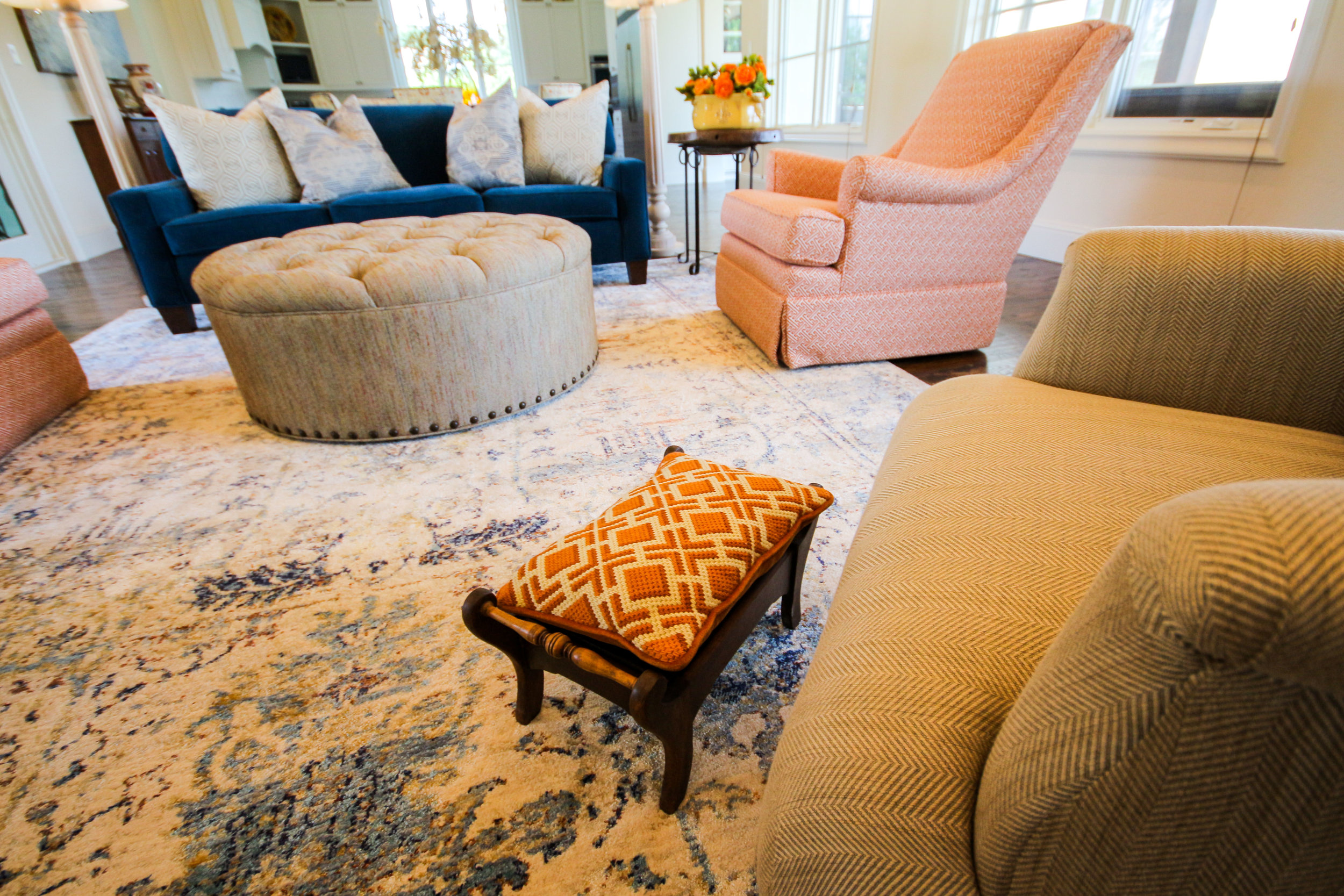
Grandma's old stool looks great with an antique embroidered pillow and newly made round ottoman.

IMG_7711

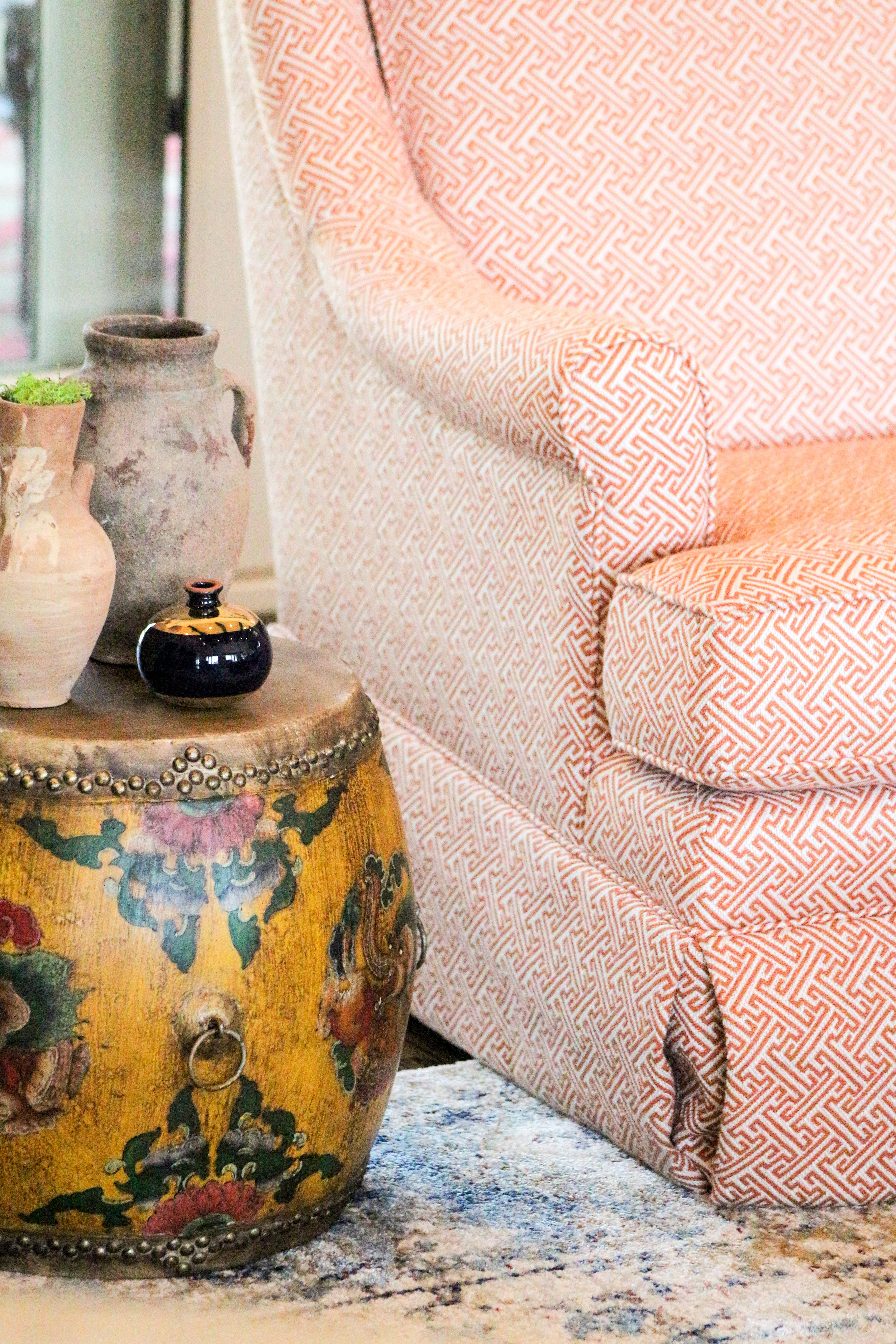
This drum was in their entryway but I thought it looked better as a side table.  I found the pottery scattered on bookshelves and picked a few that I thought looked nice paired together.

IMG_7732


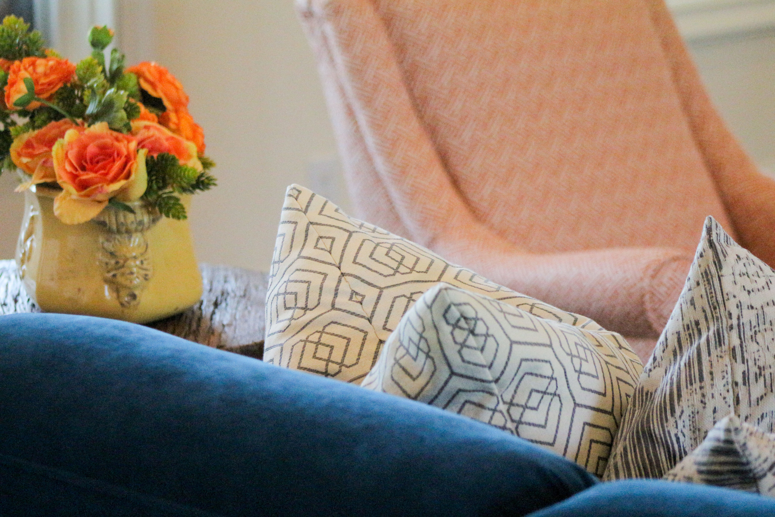
Pillows really made the couch pop!

IMG_7676

She still needs a grouping of artwork above the TV but she is waiting for something that really captivates her.

IMG_7683

IMG_7659

IMG_7755

This home sits on a beautiful treed lot and is so peaceful and quiet. Their pool is absolutely stunning and can be seen from most of the rooms.

IMG_7670

I'll be posting another job we finished this week soon.

Blessings to you! XOXO

Houzz 5 Year Anniversary and DecRenew Interiors Award

IMG_4718

"Rave Reviews" Award

Feeling very honored today after receiving an award last night at the 5 year anniversary party for Houzz.  It was a great event at Pirch in Dallas.

If you haven't heard of Houzz, you definitely must know about it!  They are a platform for home remodeling and design, bringing homeowners and home professionals together in a uniquely visual community.

 2016-03-04_5-14-38

I have been a part of Houzz since 2010 and have built my design profile which has 37 of my projects and 57 reviews. Besides my website, Houzz is where most people land when searching for an Interior Designer in their area. It is also where my clients go to review me after we have completed their job.

2016-03-04_5-40-22

Houzz is a platform that I use every day.  It has been an incredibly useful tool for me as a designer. My clients are able to save photos to idea books that we can then discuss in detail during their consultation.  They can write notes with each photo to help them remember why they saved that particular photo. I find that having photos that the client can show me that they like or dislike helps me define their design style more efficiently.

Link to my profile: DecRenew Interiors on Houzz

2016-03-04_5-15-43

The Houzz Story

"Houzz started with a house. When founders Adi and Alon remodeled their home, they started the way these projects often do: with a tall stack of magazines and referrals for home professionals from people they knew. But after those piles of torn out pages failed to make their dream a reality, they felt stuck. There had to be a better way.
So they built Houzz. A place to browse and save beautiful home photos. A place to find the right design and construction professionals. A place to connect with others who have been there too. Houzz started as a side project but has become a community of more than 35 million homeowners, home design enthusiasts and home improvement professionals—across the country and around the world.
Whether you are starting a complete kitchen remodel or just looking for the perfect bedside table, the Houzz community of homeowners and professionals is here to help. And when you are ready to start your project, Houzz is the best way to get inspired, discover products and to find and collaborate with the perfect architect, designer or contractor."
IMG_4724
Everyone wants to read reviews right? I read reviews before I purchase just about anything. I just met with a client yesterday that told me she could tell what kind of person I was by the reviews she read. I LOVED that because the relationships I have with my clients are extremely important to me.


Thank you HOUZZ for this "Rave Reviews" award! Also, to all my clients out there that have cheered me on and written such great reviews, I thank you!

Grapevine Master Bedroom Makeover

BEFOREFullSizeRender

We completed a master bedroom for a client right before Thanksgiving.  They are recently empty nesters and are slowly starting to redecorate and remodel their home.

BEFORE (on day of install)

IMG_1929-e1449144298594

I got the privilege of assisting them, oh what a joy it was!

They decided to start with their master bedroom so it could be ready for the holiday season.

 AFTER

decrenew interiors

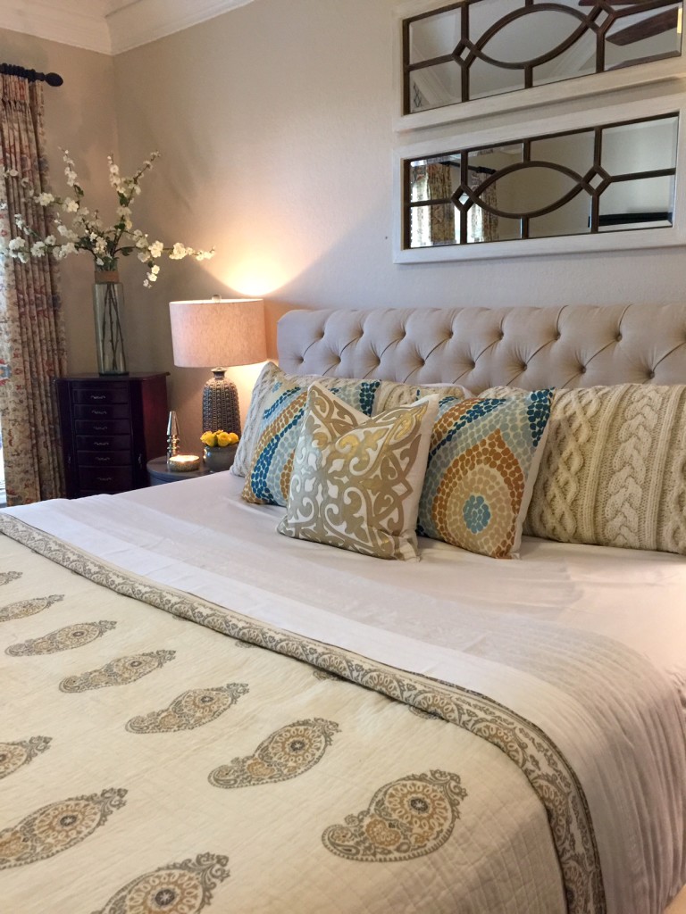
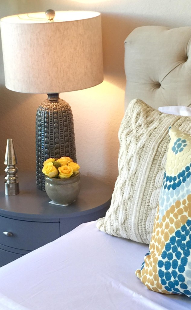
They had the bed already.  We added new bedding, side tables, lamps, artwork, accessories and draperies.

decrenew interiors 2

As you know, I love to use items the client already has.  I shopped their home for treasures and added them to the items I purchased to give it a "collected" feel.

DSC04577

These pillows!!  Love the textures and variety of patterns. It is always amazing to me how a room comes together.  I started with an inspiration fabric (the draperies - see below) and go from there!  Layering textures on a bed is so luxurious and really makes a statement.  I do think that too many pillows can be overdone.

DSC045861-e1449142441699

For a king size bed, I usually use two king pillow shams or 3 euro shams.  For this room, I decided to use 2 king shams because I didn't want to cover up the tufting detail on the bed.  I then added three throw pillows.

21decrenew-interiors-61

Side tables with drawers are a must in a master bedroom. The lamps look so amazing with the dots on the pillows.  Subtle repetition of detail.

decrenew interiors 23

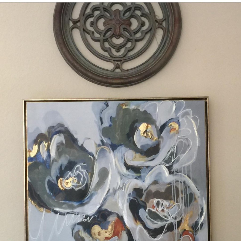
The artwork I found is PERFECT with all the colors and has just enough gold to work well with the pillows.

DSC04604

The draperies were hard to photograph because of the light.  You can see the colors well in the above photo.

Such a great project for a fun couple!

23DSC04578

Her grandma's rocking chair even got a makeover.

The joy the client receives. on the day of the installation, has no comparison to the joy and blessing that I receive in being able to make yet another home beautiful!  Connecting Life and Home is such a pleasure.

Hope you are enjoying the Christmas season so far.

IMG_2247

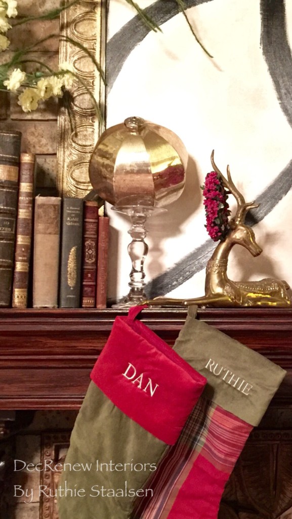
I've started some of my decorating, at least the mantel is done and the stockings are hung!  I am purposely doing simple décor this Christmas.  I'd rather spend more time with my family than stressing about making it all perfect.  Plus, I have to put it all away in a month!  Simple can be beautiful too!