Several months ago I got a call from a client who needed help with her entire home renovation. We had worked together before, but now they were ready for a total home renovation.
They hired me as a design consultant to help them with selections and decisions throughout the entire remodel process.
Let me walk you through what we did during this process.
BEFORE
The main delimna's with this space was:
-There was a column, and half wall, seperating this living space from the kitchen/dining space. The problem with this, was that it limited how you could arrange the furniture, and made access to the room difficult.
-The fireplace was brick and just didn't add much interest to the room. It also seemed off scale and needed to be wider.
-The bookshelves were tight and cluttered.
-Of course, we knew the mirrors on the left had to go!
-The ledge above, was just a place to attract dust and create clutter. Who knows what to do with spaces like these anyway.
-The carpet was tired and needed to be replaced.
-The mantel needed to be more substantial and interesting.
-We needed to get rid of a lot of stuff to make it simpler and more taylored.
-It needed MORE color and less of a monochromatic look.
We decided to take the column out, along with the half wall. This allowed the room to feel more open, and made it easier to get in and out of the room. It also allowed us to use the same flooring throughout the joining spaces.
AFTER
We took the brick down and added stacked stone to the fireplace. We also added adjustable shelves- this created a space for us to place artwork inside the shelving. The result was a more interesting, and less cluttered look. The drawers we added were another feature I loved, because they are awesome for hiding stuff. We extended the fireplace stone all the way to the bookshelves to make it more to scale for the space. The bookshelves are simpler, and have adjustable shelves and drawers underneath for storage.
All the windows were replaced throughtout the entire home. This simplified the look in the space, because now we don't have all the window panes.
New flooring (it is tile that looks like hardwoods) isn't it cool?
We had the contractor wrap the ledges with a dark rustic wood, and had a mantel built to match. Now we don't need anything up above the ledge. It breaks up that huge wall! We like it with less clutter!
BEFORE
AFTER
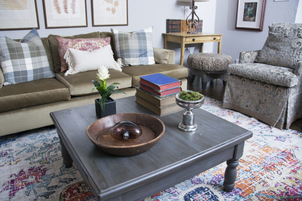
Before the remodel, the client had stored their items in a pod in their driveway for a few months. We were happy to get it all out for them, and redecorate with the items they had. The only thing we added to this room that was new is the rug, sofa pillows and floor lamp. All the items you see here, the client had already. They had an amazing collection of interesting items from all over the world. That made my job so much more fun.
I was able to incorporate my client's artwork that she created. The colors were perfect for the design. These are the touches that make it feel like home.
Pillows can make a sofa come to life. Notice how they aren't all matchy matchy? They are all different, and that's okay!
BEFORE
AFTER
I absolutely love the "collected look" of this home. Amazing how we could reuse their furniture and accessories and it looks totally different! We pulled things from different rooms and created a totally new feel to this space. I found that these kind of spaces are my favorite to decorate. It is so much easier to create a room from scratch. Creating as you go is much harder, but I find it so much more fun and exciting
I just love these round antique mirrors. Placeing them together in a grouping made them special.
We found a box of old antique books in the garage, and incorporated some of them into the design. I love them all lined up behind the wrought iron lamp.
BEFORE KITCHEN
The kitchen was totally gutted and reworked to make it more functional. New cabinets with lots of drawers were installed for easier access to things. The new cabinets were taken to the ceiling to eliminate the wasted space above them previously. The pantry was relocated to the desk area that they didn't need anymore. The island was extended and new subway tile was installed. To me, the biggest change was the lighting. New LED lights and the two new light fixtures made this space so beautiful and bright.
AFTER KITCHEN
BEFORE
AFTER
BEFORE
AFTER
Such a beautiful difference!
In the kitchen dining room, there was a chandelier over the table before. However, it locked us into a box as to where we needed to place the table. We took the light fixture out and put in recessed lighting. This allowed us to place the table wherever we wanted to.
BEFORE
AFTER
The stairway was redone. New spindles and carpet. You can see the tile floor here!
BEFORE
AFTER
The sitting room located off the entry, had french doors that we removed. Instead, we added a barn door that slides back and forth. A barn door is so great if you have tight spaces.
This room is off the entry and is considered the formal room. We wanted to make it a relaxed, conversation room. We again, used what they had to make it cozy.
AFTER
Much better, right?
The client lived in chaos for a few months. They are so happy to finally have their home back in order. Everything looks so fresh and beautiful, just in time for Christmas.
MERRY CHRISTMAS TO YOU ALL!


