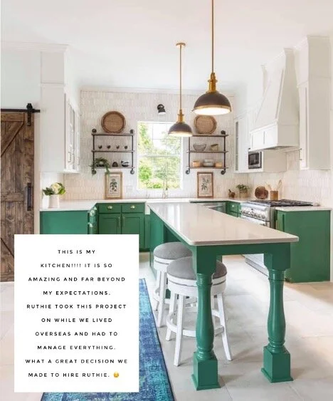
My client lived in England and purchased this home with their realtor, here in Aledo, Texas. The crazy part is that they purchased the home virtually with the realtor and a family member walking throughout the home and property showing them all around on FaceTime. They have a beautiful family of five and they knew they loved the house, they just needed it to work for them and as it was, it was not going to work well.
They needed a designer to assist them with their kitchen remodel since there were so many decisions to make and they needed connections to good contractors as well. We decided we could work virtually and handle the design, coordination, and details for them until they returned, right before Christmas.
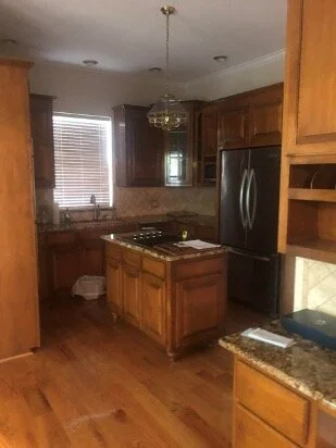
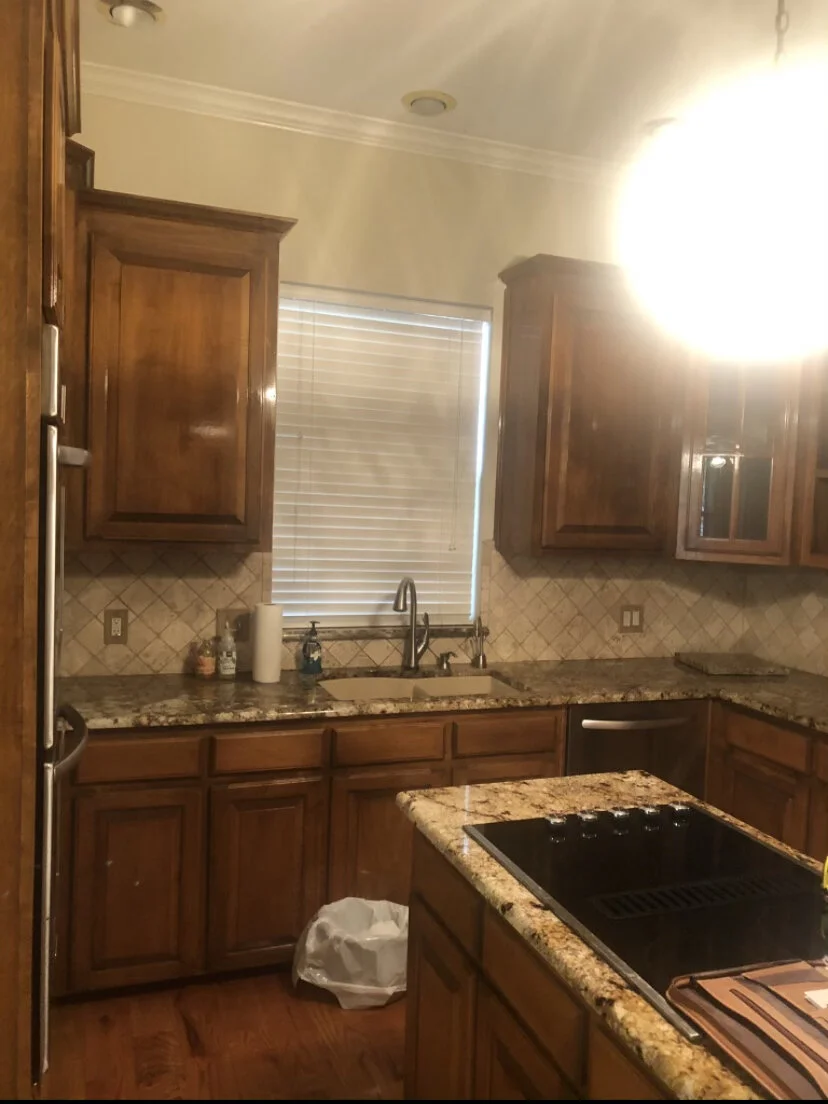
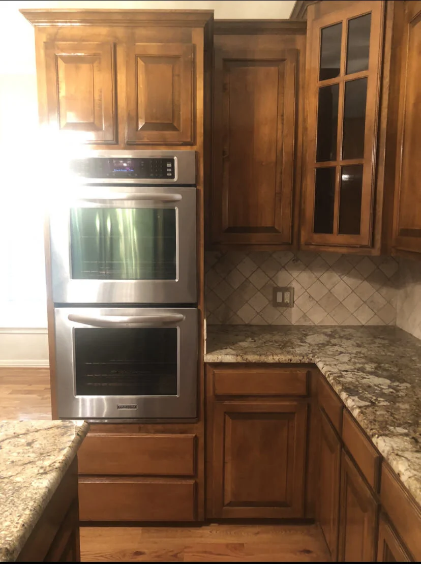
The kitchen was dark, tight, and dated and was not open to the family room. They wanted it to have a bit of a farmhouse feel with a charming English cottage vibe. Being that I have spent a lot of time in England, I knew exactly what they were describing and was excited to get to the drawing board.
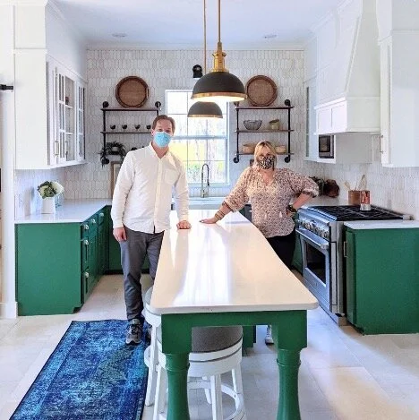
I knew that the kitchen could be opened and reworked to allow an extra-large island, open shelving, beams, and gorgeous tile work.
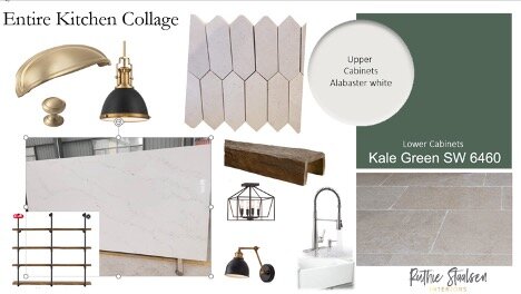
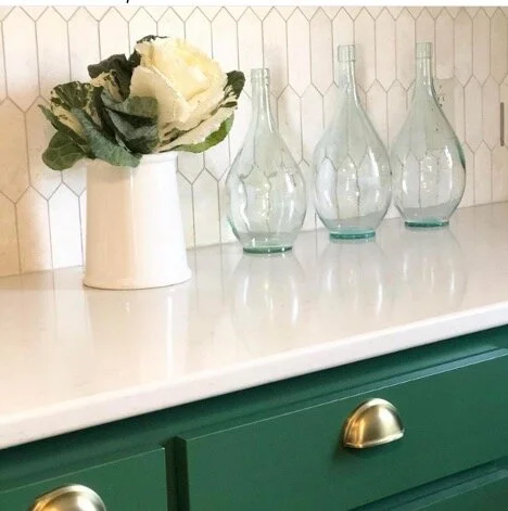
I put together a design plan for them and we discussed it via FaceTime. Here is one of the slides we created to give them an idea of what direction we wanted to go.
We downloaded the WhatsApp app and that was the way we communicated during the process. The client also added cameras in the house so they could see what was happening while they were sleeping, lol.
BEFORE
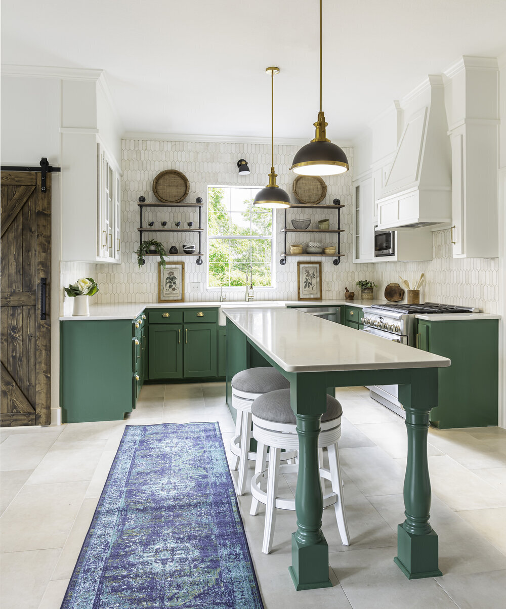
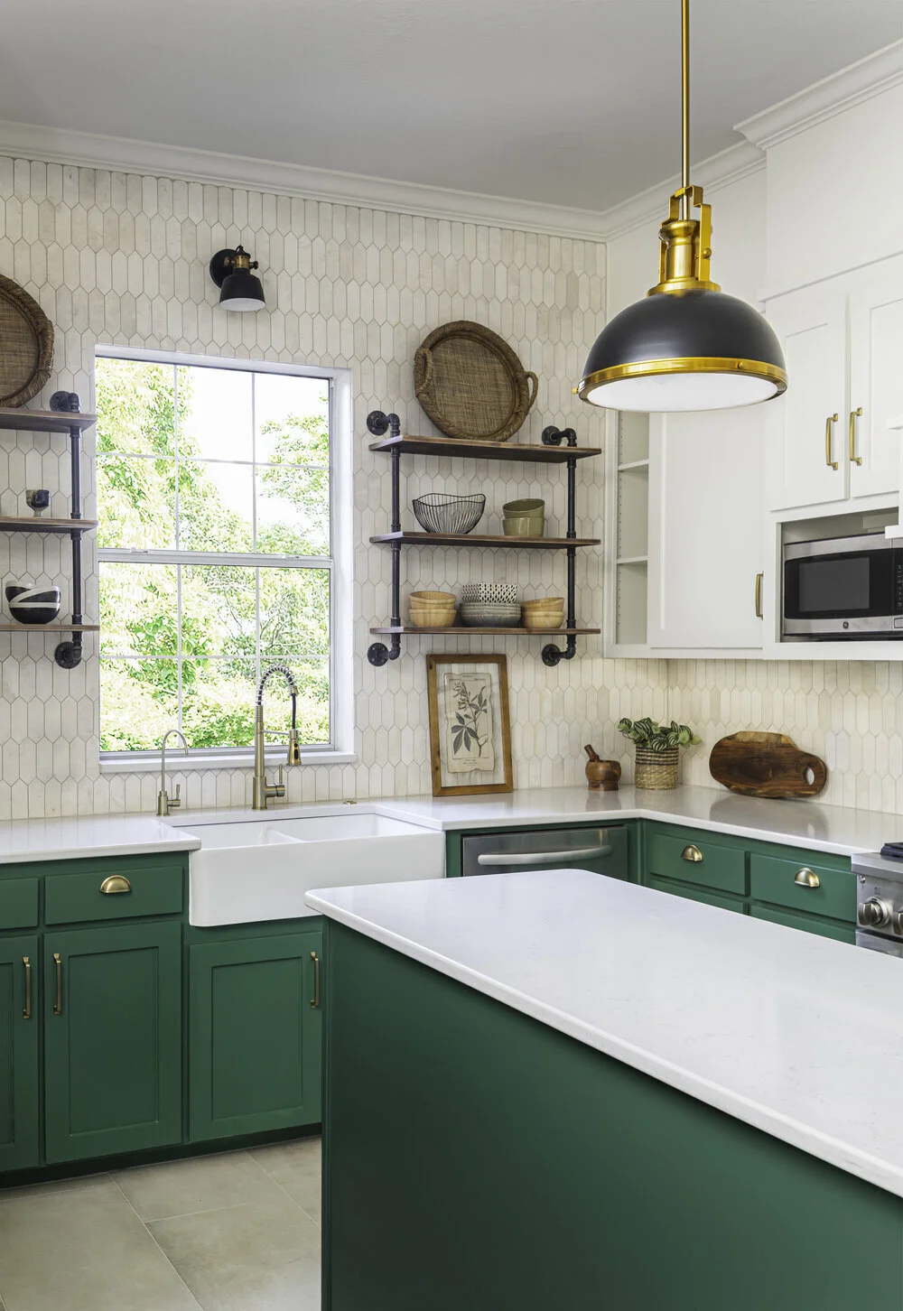
AFTER
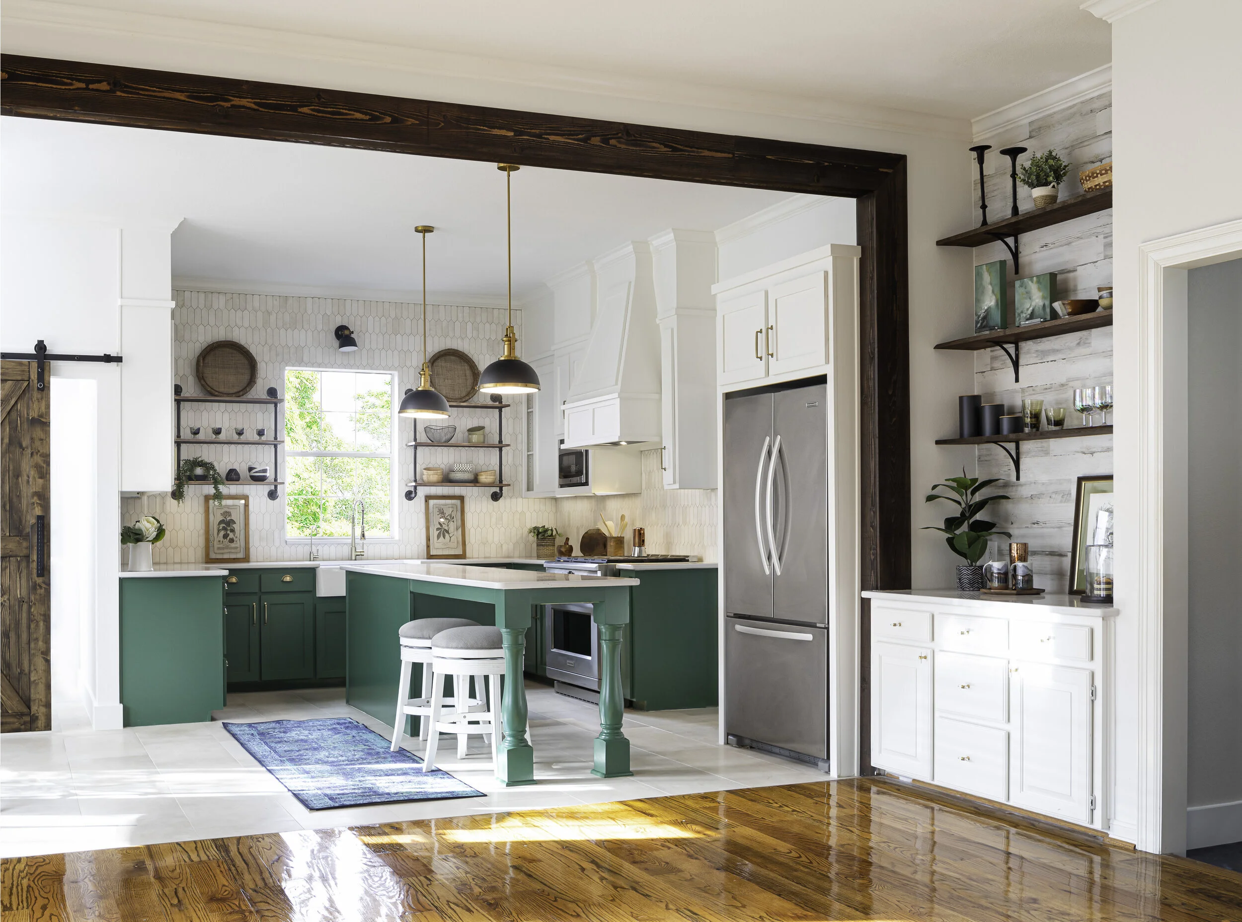
We needed to keep the wood floors in the family room, due to the budget but we were definitely able to make them work in the space. We stained the beams a darker color so we didn’t “match” the floors as they will eventually replace them.
The client originally saw my work on Houzz.com. The looked through my work from previous remodels we had done and loved how we a home feel very cohesive when doing a remodel. It is important that the spaces feel like they work together with the charm and history the home has. They wanted the kitchen remodel to look as if it had always been there.
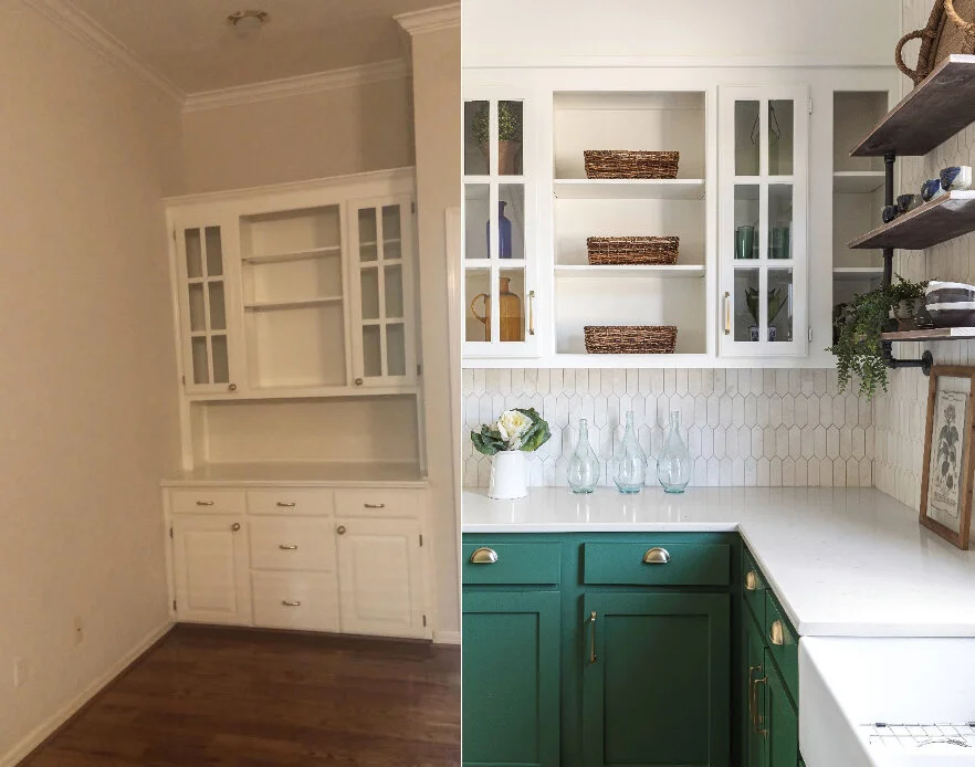
BEFORE
AFTER
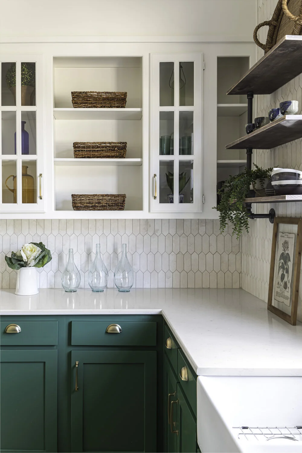
I suggested to the client that we paint the lower cabinets green because I felt like it would give the kitchen a warmer more inviting feel. Because everything else we went with was in the white/cream family, I knew a strong, bold color would bring life into the kitchen. When I think of England, I think of lush green fields and beautiful green pastures. I chose Sherwin Williams “Kale green-6460” for lower and SW Alabaster 7008 for the upper cabinets.
I also suggested that we do the tile all the way up around the window to the crown. It scared them because it seemed like a lot of tile. I assured them that it would make the kitchen feel bigger and it certainly did!
I found the swivel stools on Facebook Marketplace and we were able to reupholster them.
We repurposed as many of the cabinets in the kitchen as we could (the fridge cabinet for example) and then had the rest of them custom made. The cabinets that we did not use, we repurposed in the laundry room for extra storage above the washer and dryer and created a new pantry for her in there as well, re-using the oven cabinet that was previously on the left side of the kitchen.
We took down some upper cabinets because there was plenty of storage in the kitchen. I’m usually not a fan of open shelving because it can make a kitchen look cluttered and busy. However, the client really wanted to display some of her pottery collections from her travels and saw what she had and realized it would look beautiful.
My favorite part is the new Thermador gas stovetop and the farm sink.
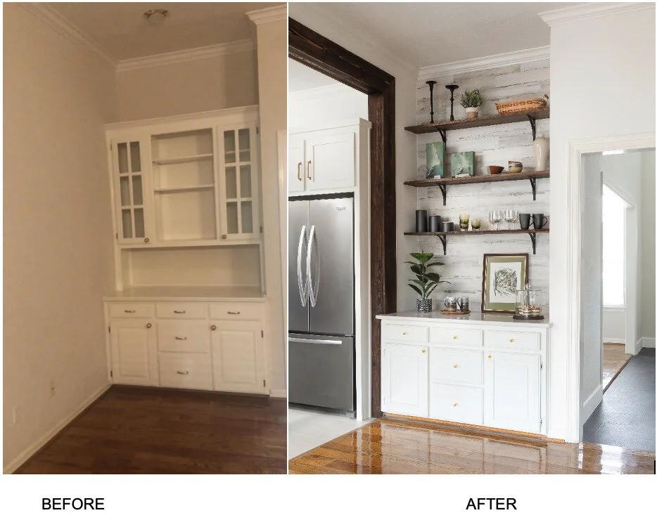
BEFORE
AFTER
I also redid their coffee bar which use to be more a part of the family room. We took down the storage cabinet above, added some rustic beadboard and custom walnut shelving to display accessories. It now feels as it it’s a part of the kitchen and I know they will use this space a lot for a drink station, appetizers, etc.
We took the upper French door cabinets in the bar area and moved them to the main part of the kitchen. This added interest, glass doors and perfect lighting to make the kitchen feel collected and a little more farmhouse. The client can’t wait to display her teapots and other treasures in there.
I incorporated neutrals, color and loads of texture. The custom beams really added that bit of history to the house. I tried to keep the space clean and fresh, so it has a timeless feel. Don’t you love the hardware from Amerock Hardware.
We were running on a tight timeline with the client coming home right before Christmas and all during a pandemic. The client was anxious to get back to America before they shut down England again. We had to work around the clock to make sure we got all the details done in time for them to return. Some of the guys worked through the night just to finish up. Thankful to my team for working so hard to make my client happy.
The photoshoot was done by Aaron Doughtery and he made it fun. Photoshoots are not easy, there is a lot that goes into preparing for all the details for each individual photo.
Styling by Ruthie Staalsen
The best part of the project was getting to meet the client in person once they arrived back in Texas. After working with them for 6 months, it was such a joy to be able to welcome them home. They said they home definitely looks bigger in person and that was a big surprise for them.
Best Christmas present ever, for us and them!
