Wow, what a year we are all having, right?
It has been a busy year for us, in spite of Covid raining on our parade. We have had some wonderful clients that we have had the opportunity to work with and for that I’m so thankful.
I want to share our latest install we completed last week. A dallas home and our client has traveled a lot in their lifetime and have some art and artifacts that are really meaningful to them. The hired us to help pull all their collections together to make it feel like home.
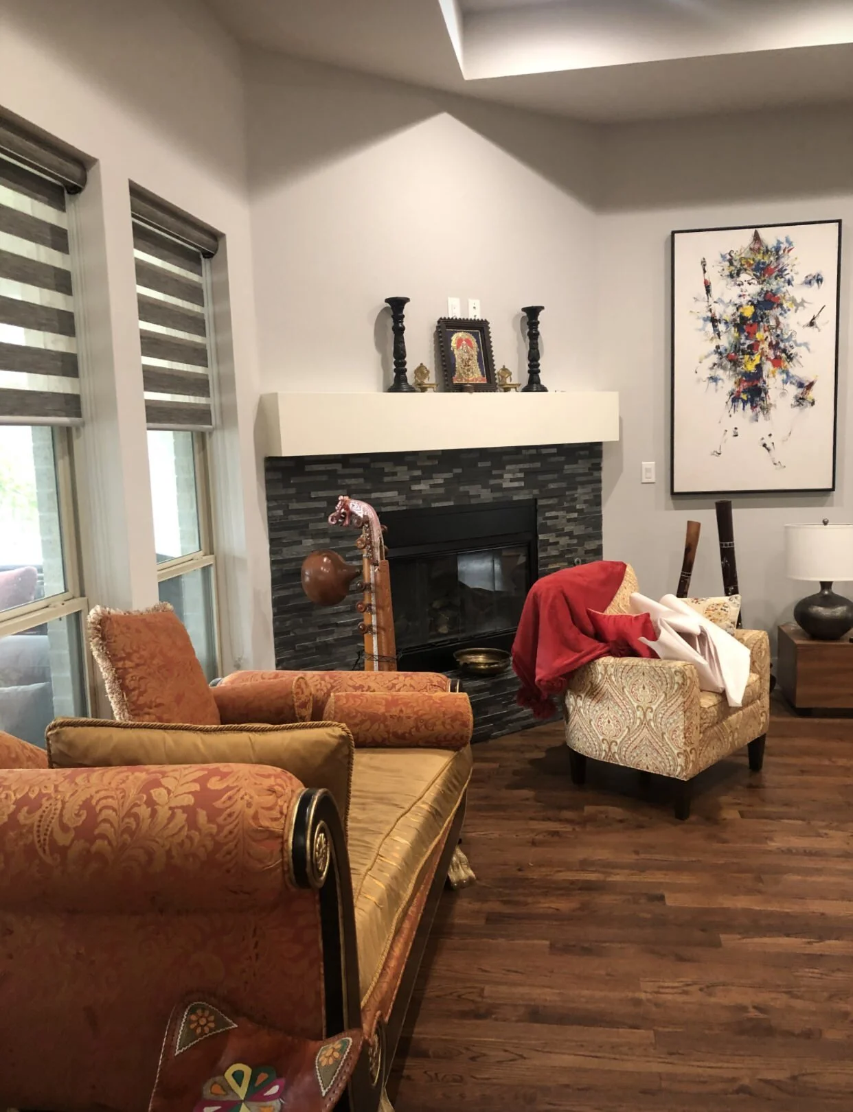
BEFORE
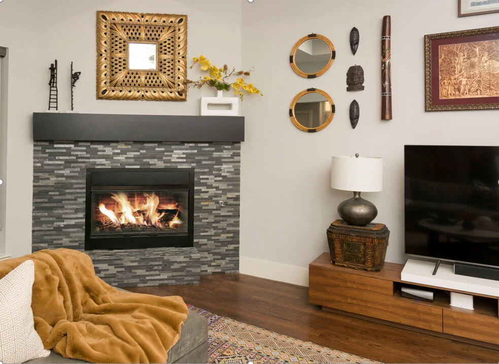
AFTER
It can get tricky when you are dealing with different textures and artwork from different countries. So many colors and patterns that need to be unified somehow. As a designer, that is my passion and speciality.
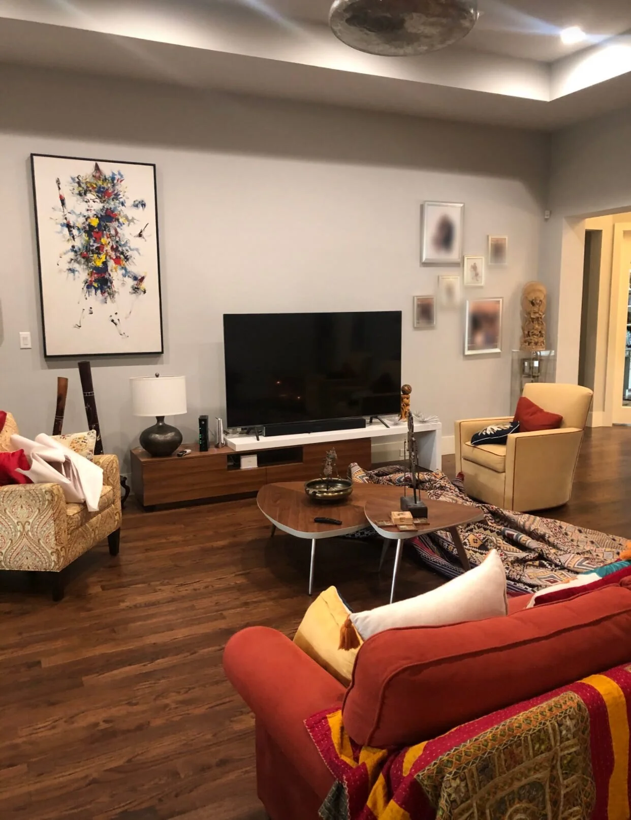
BEFORE
We decided to move all the family photos (the blurred ones in this photo) to a hallway. I usually suggest keeping a few framed photos of the family out but keep the rest of them in places like game rooms, hallways and bedrooms.
AFTER
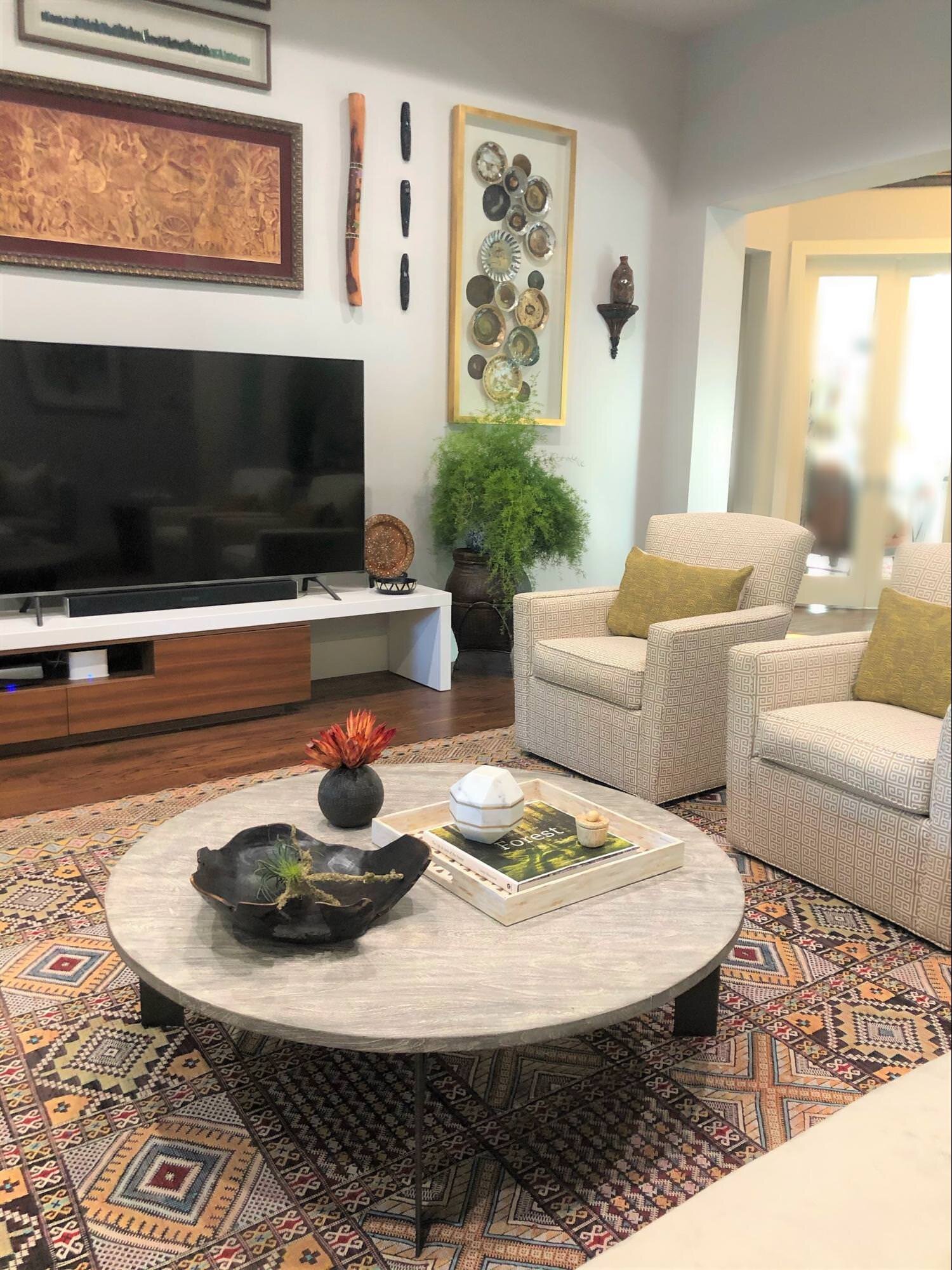
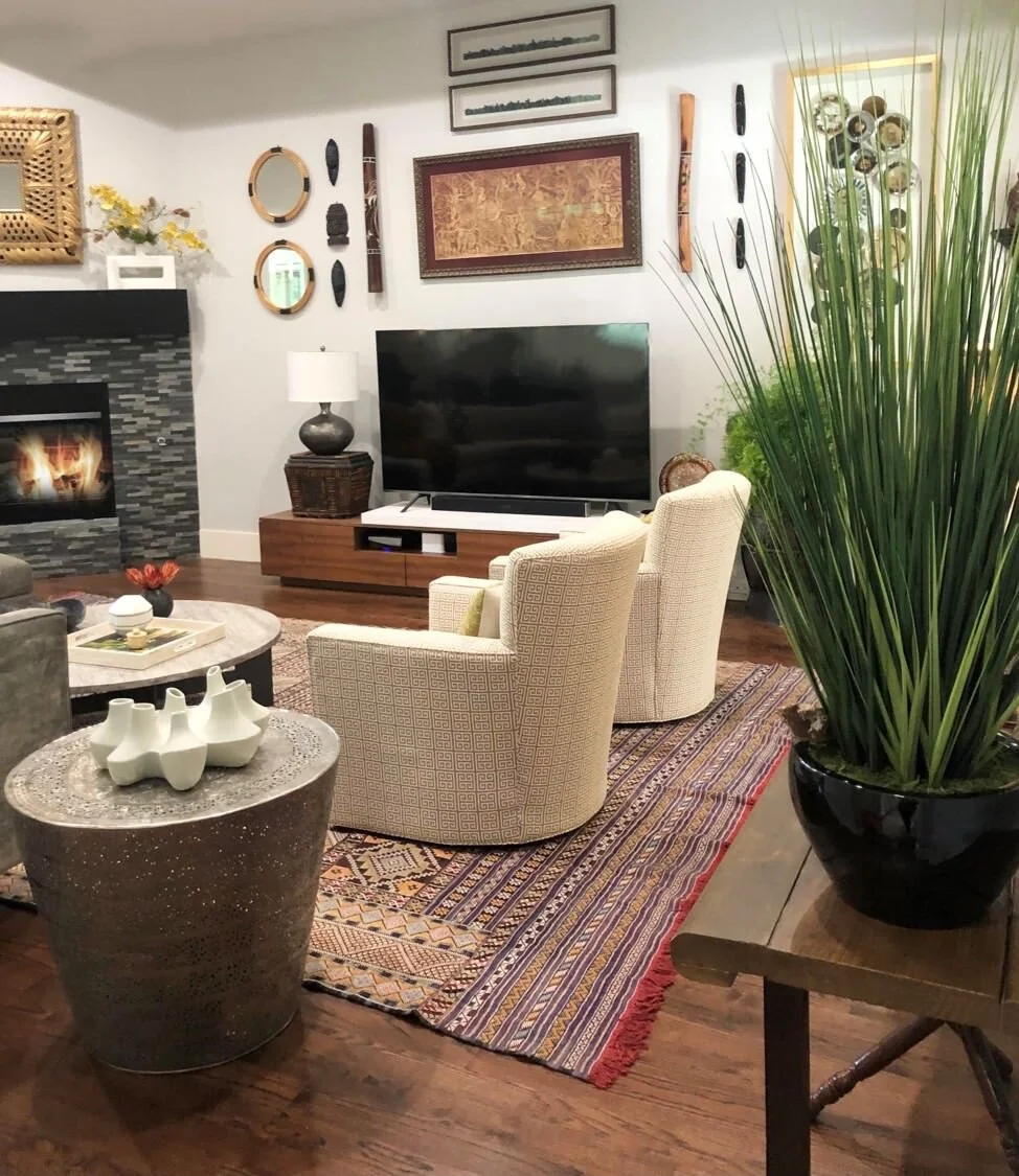
As far as the furniture was concerned, the client had the rug and the TV console. They also had the two swivel chairs but we reupholstered them in performance fabrics to make them more family friendly. If there are spills or food stains, they can easily be wiped clean, thanks to Revolution Performance Fabrics.
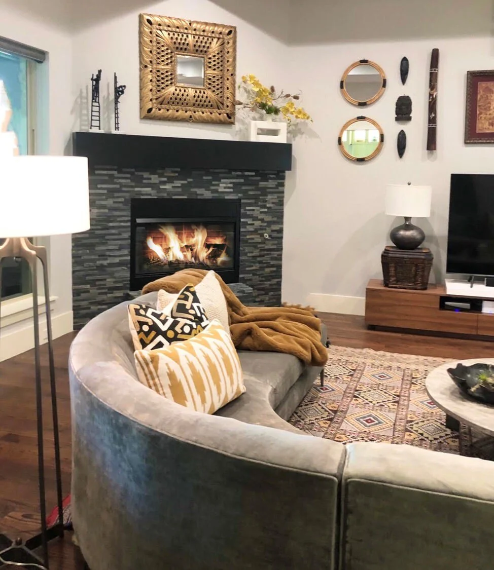
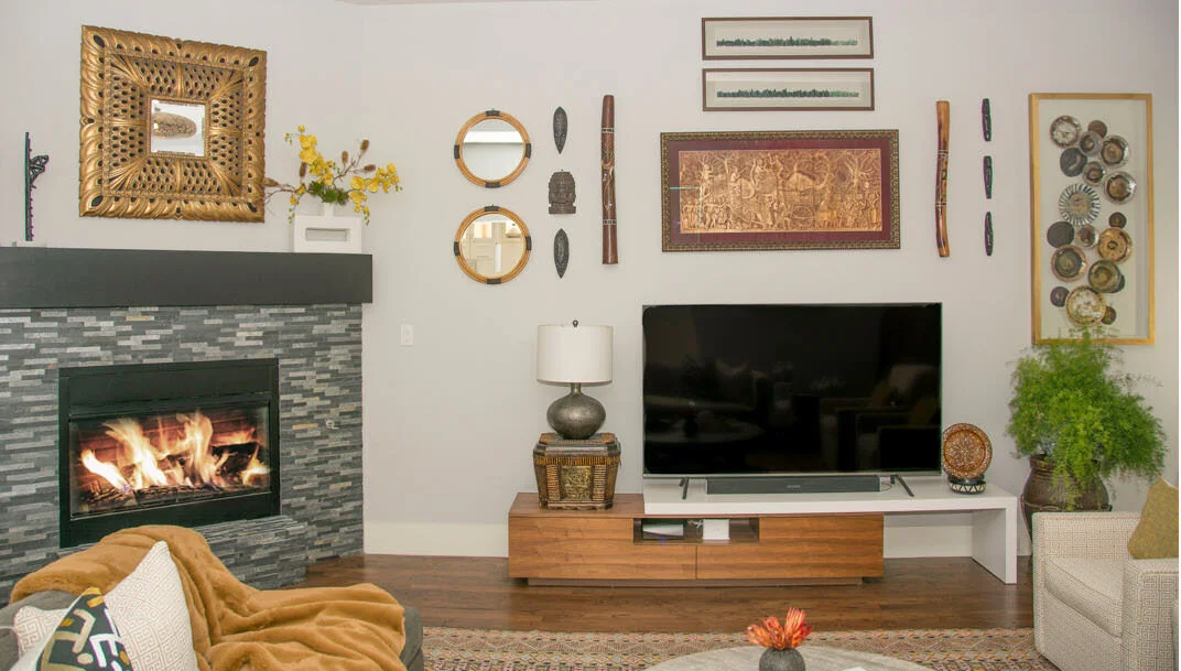
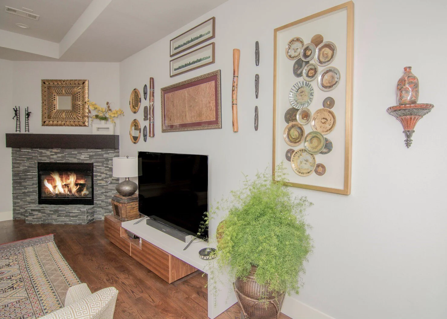
The mantle was already installed, we just suggested that it be painted black. We created the gallery wall with existing artwork they had and added some new pieces as well. We borrowed pieces from everywhere in their home.
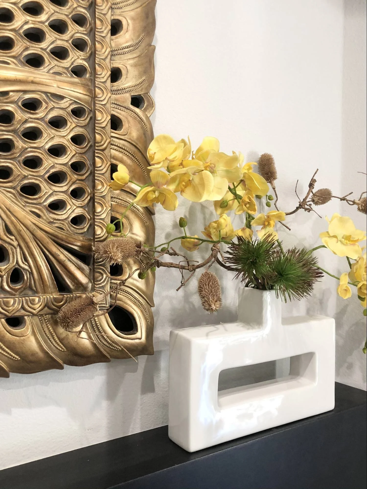
The pops of yellow along with natural textured florals really brought out the colors in the rug.
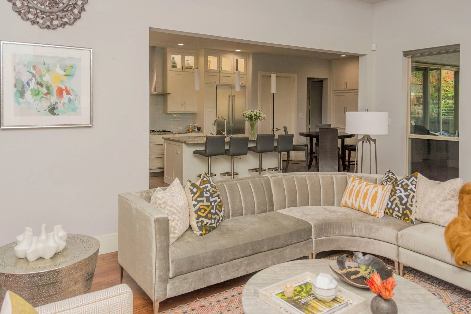
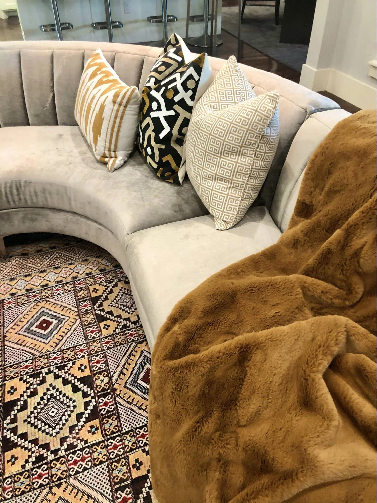
The curved sectional works beautifully in this room. The client purchased it from Z-Gallerie. This room is not the only room their family can watch TV in and they wanted it to feel relaxed but have some formality to it as well.
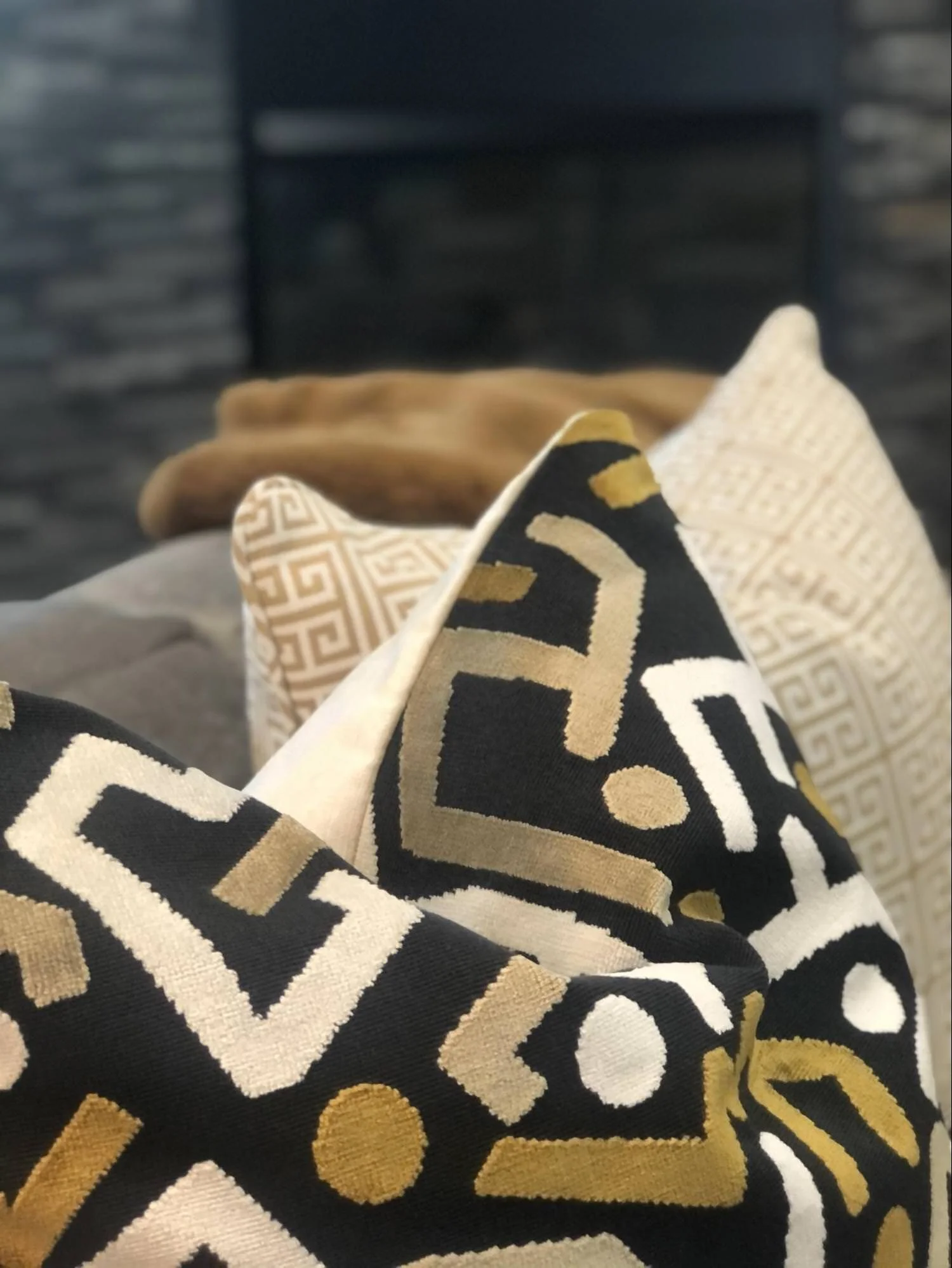
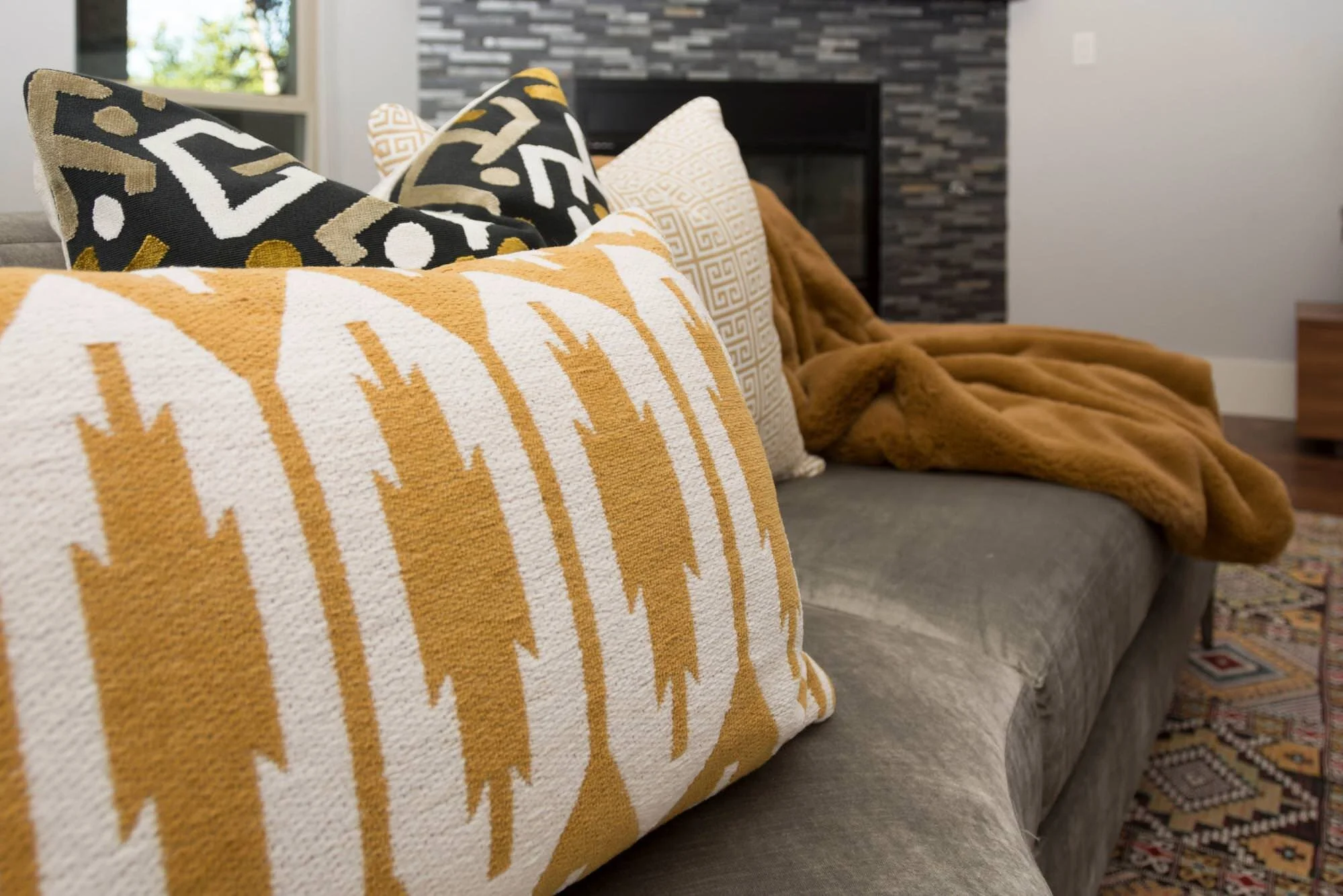
Don’t you love the pillows we selected?
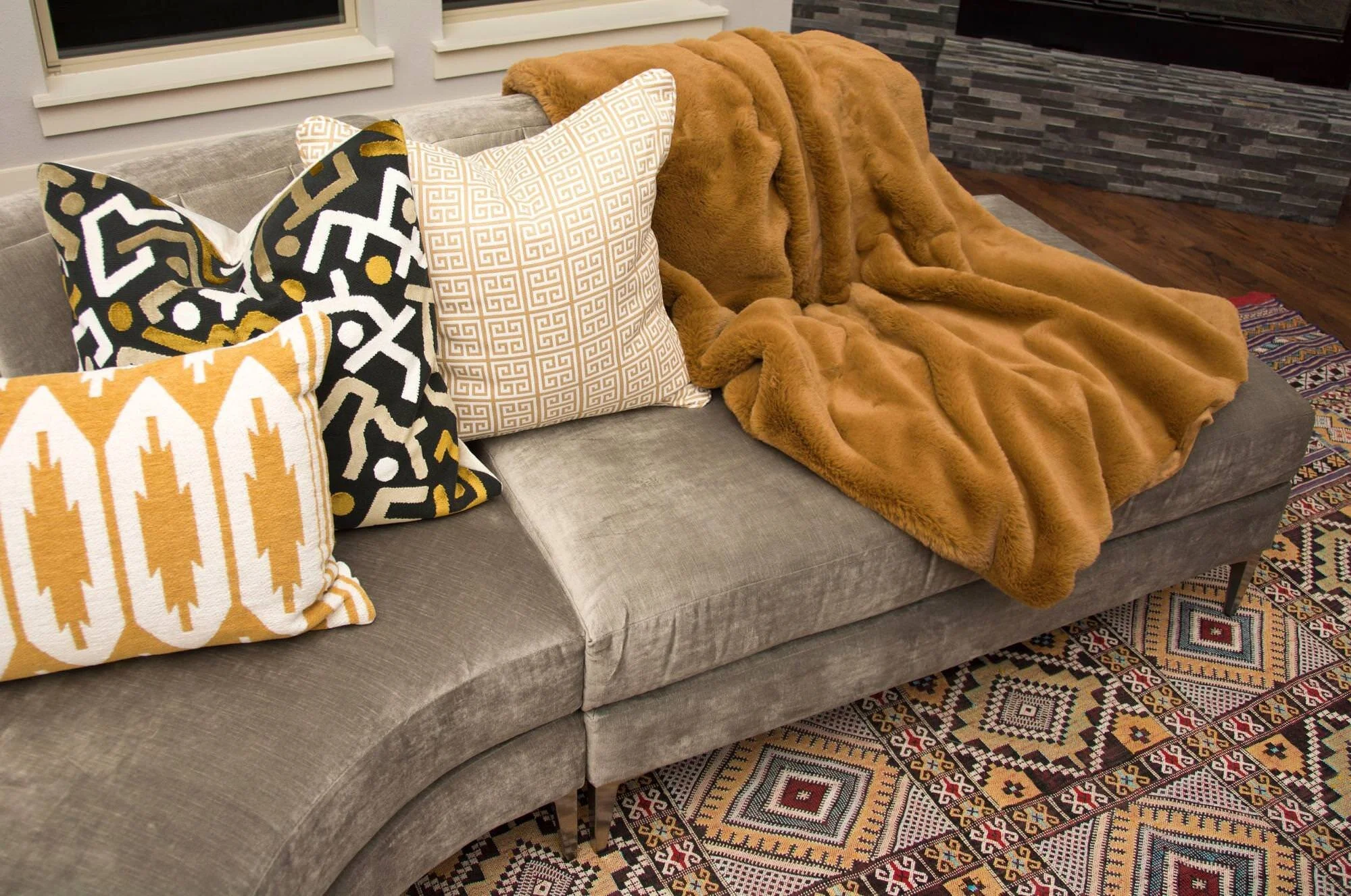
The rug was purchased by the client in India during one of their vacations. It’s tricky to find just the right pillows to work with a colorful, patterned rug. I feel like we nailed it!
We chose this lush warm and cozy throw blanket for the sofa to bring in that winter feeling.
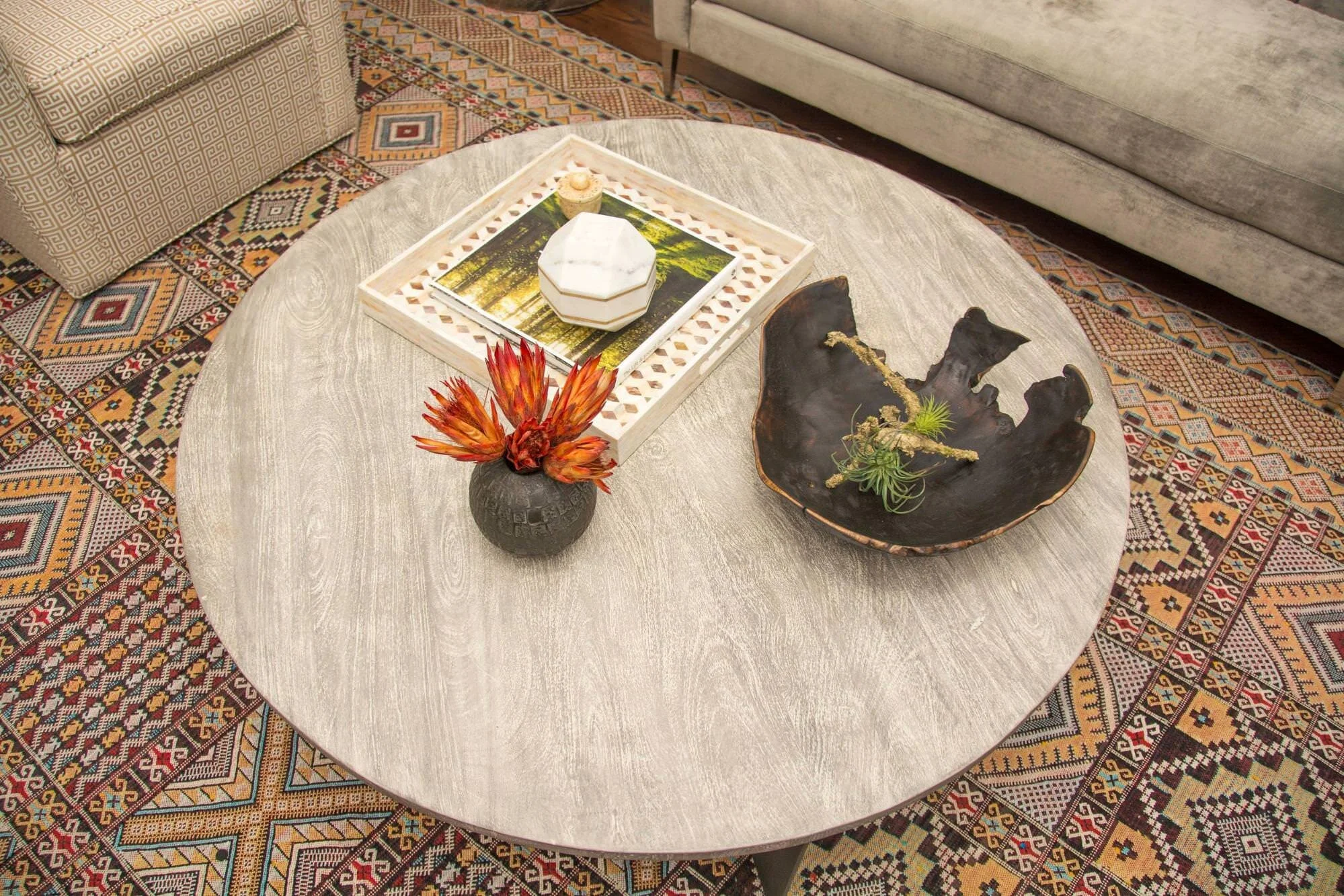
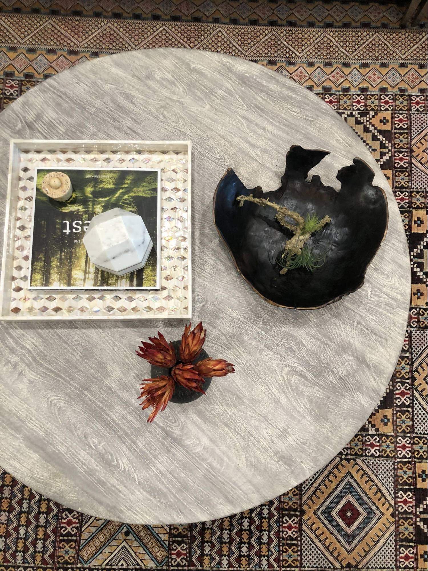
This raw edge black wooden bowl really works well on the round coffee table. The heavy marble ball with the gold rim works well with the fireplace mirror. Notice how we purposefully layer accessories. We add just the right groupings together so it doesn’t feel too cluttered and busy.
The gallery wall is my favorite part of this room. They had so many great pieces of art that we knew we could really make a statement behind the television. Masks from different countries, rain sticks, framed tapestries and pottery.
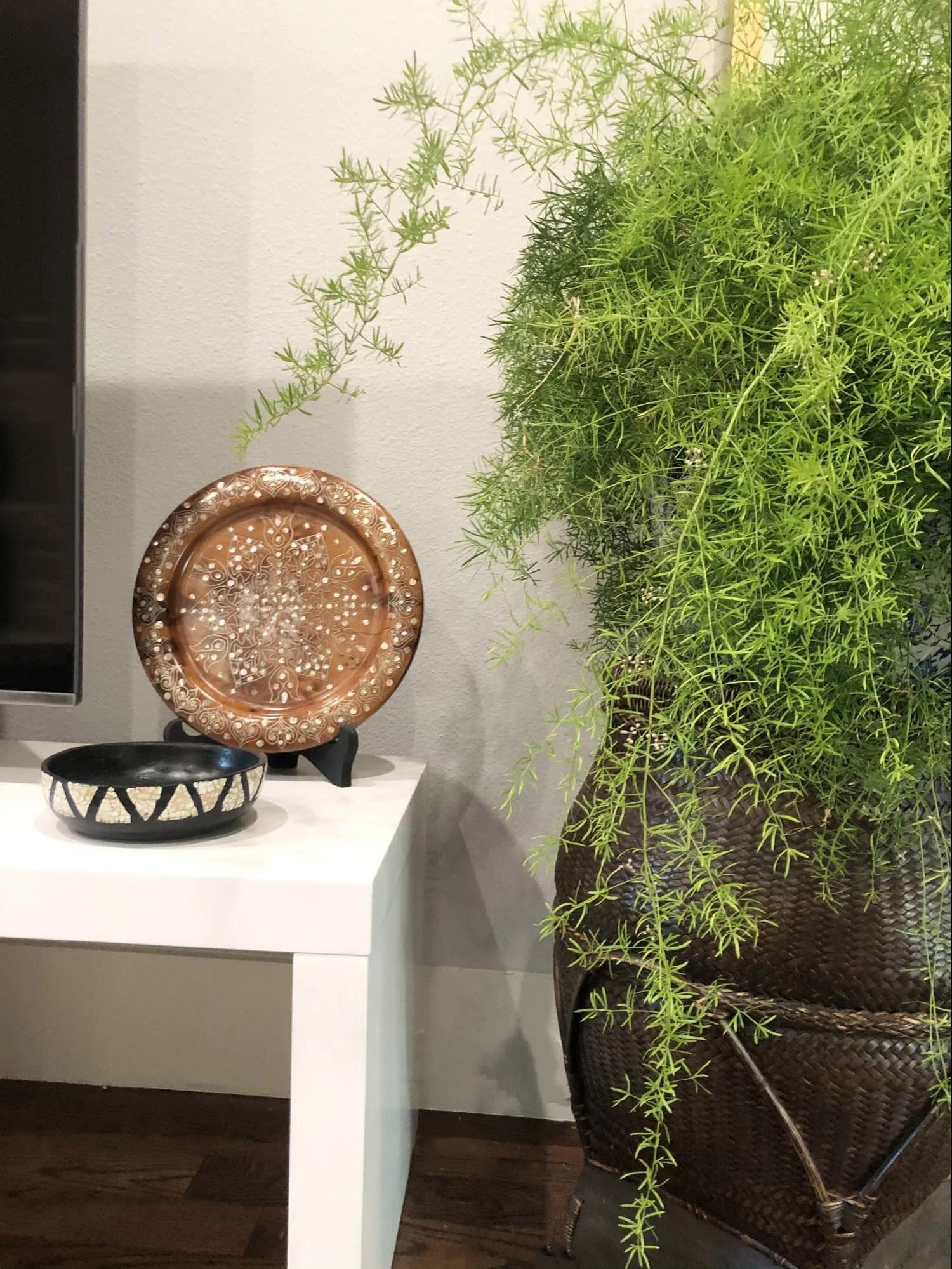
Adding plants is also a must when we do an install day. Not all of them have to be real, we just want that touch of life in a home.
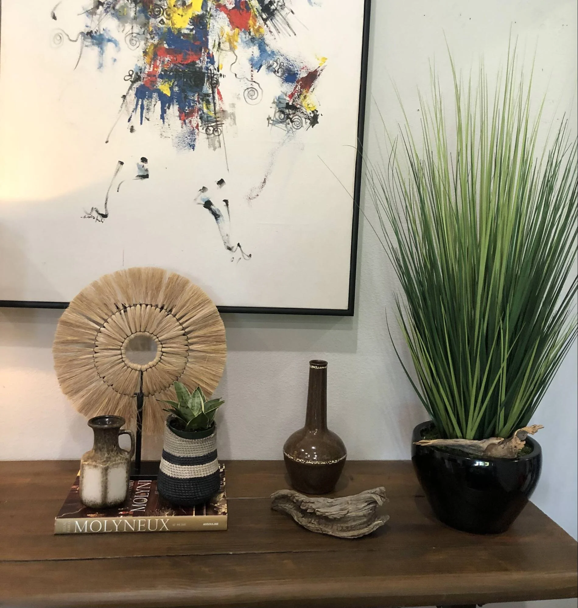
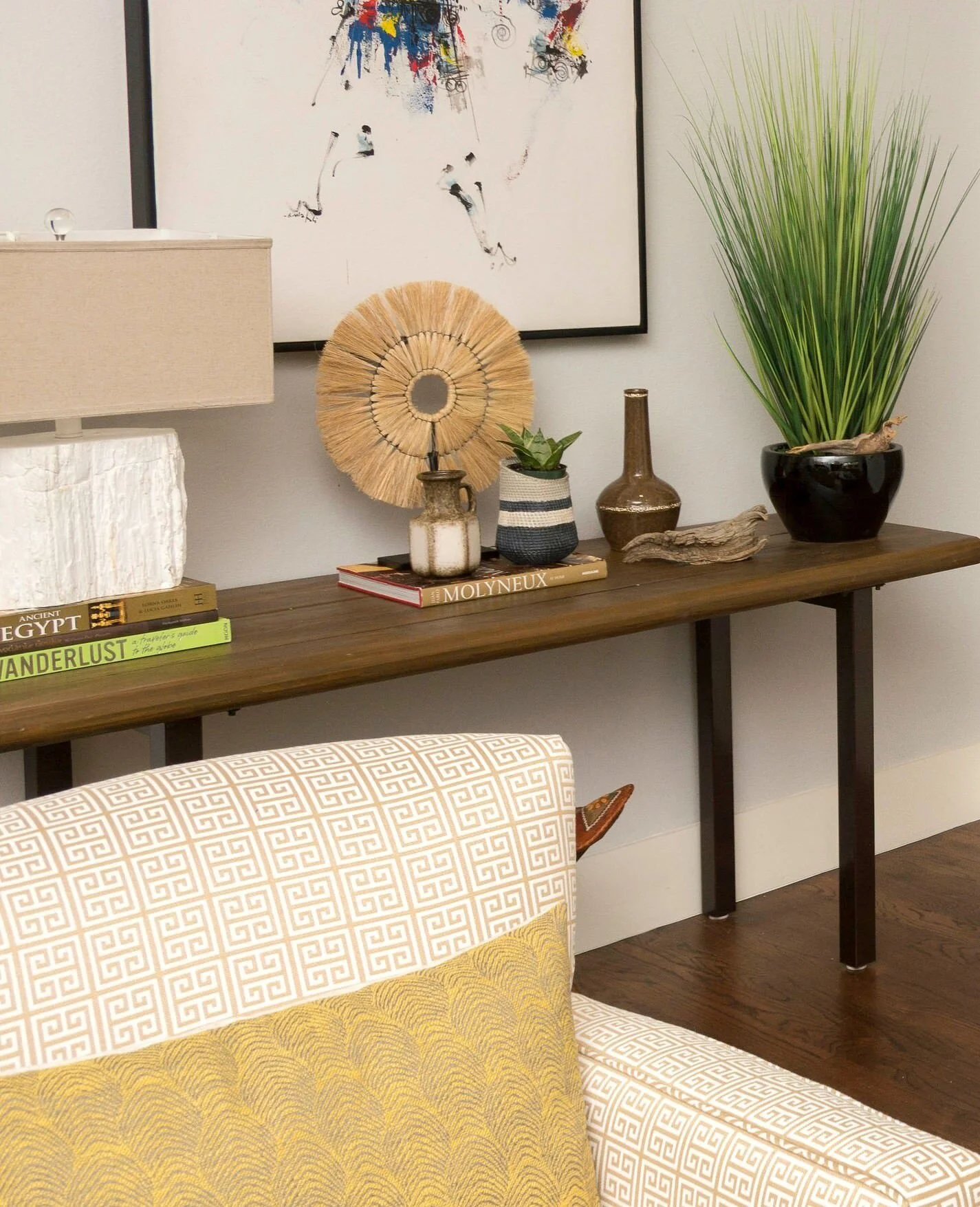
Using a narrow console table is always a great idea in a hallway/walkway space. We were able to use a big piece of their colorful artwork above the console table and it added that splash of color on that side of the room. Again, we used some of their accessories and added in some new ones as well.
We used a shell inlay tray to layer some books with accessories. The dried African proteas bring out that touch of red to compliment the rug.
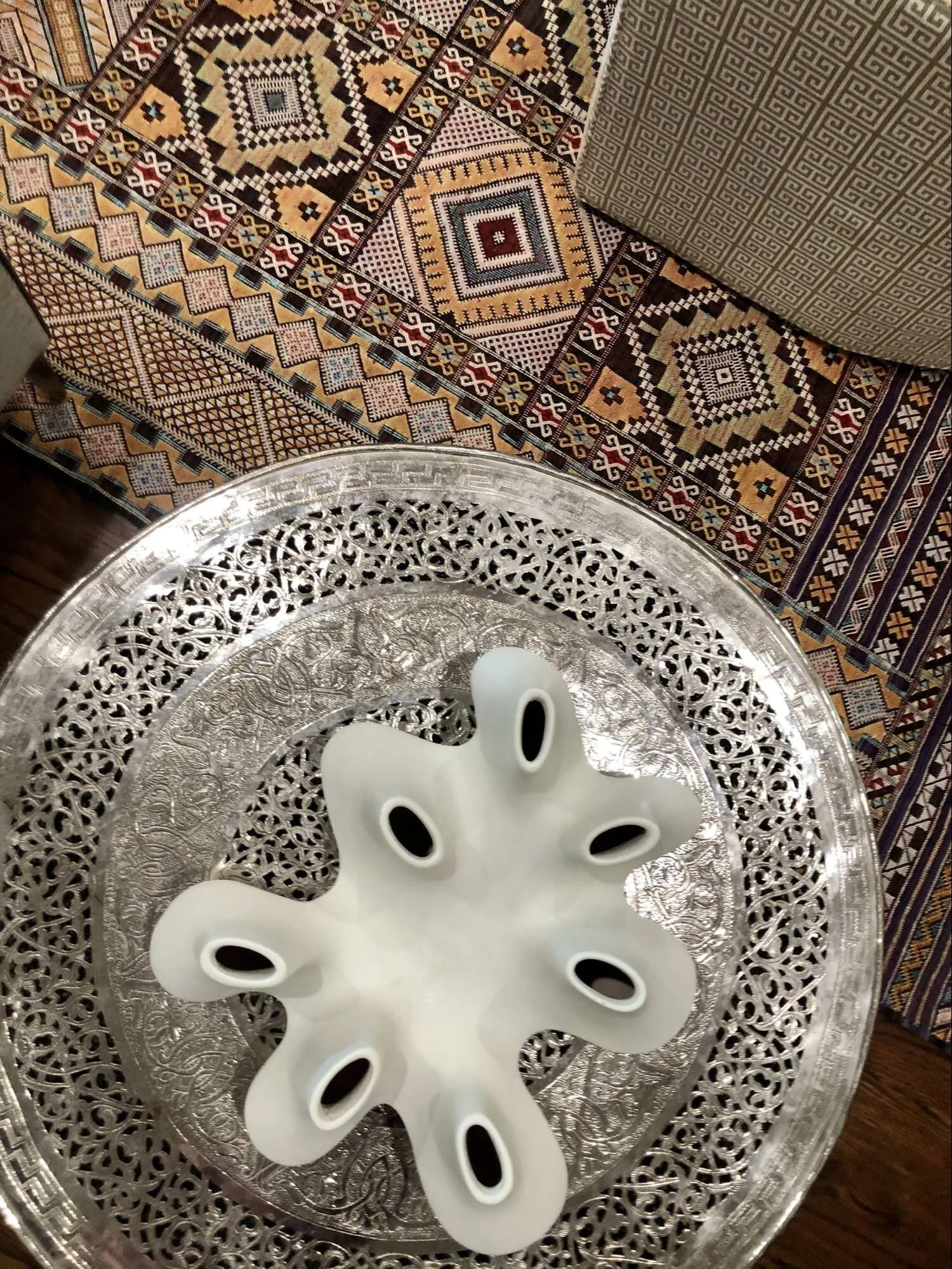
The client bought this side table in Morocco and it plugs in and lights up. Perfect for a night light and is so gorgeous!
We placed this white ceramic vase on the side table and it really adds a fun and unexpected element. I can see the client adding fresh flowers to this for the holidays.
DINING ROOM
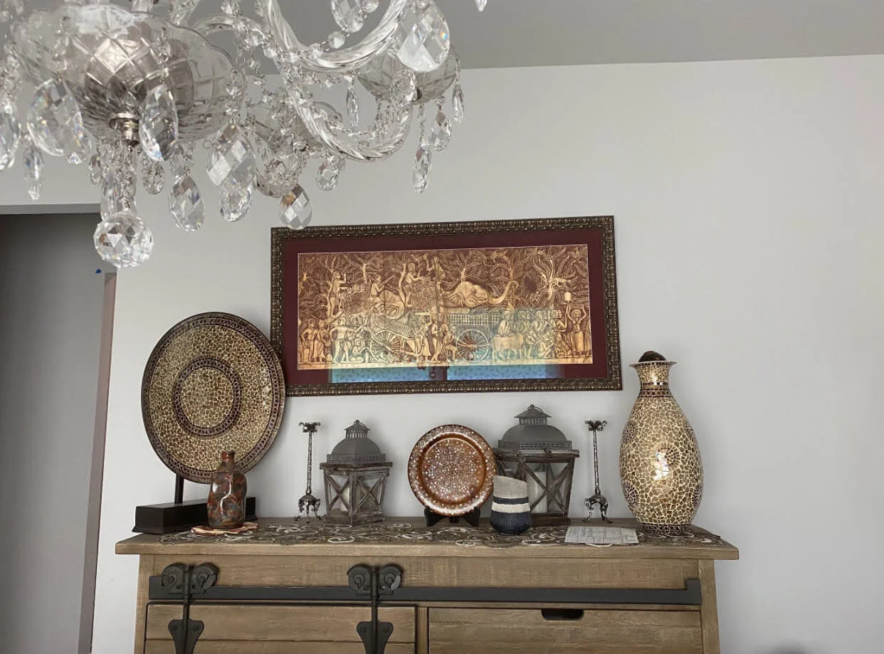
BEFORE
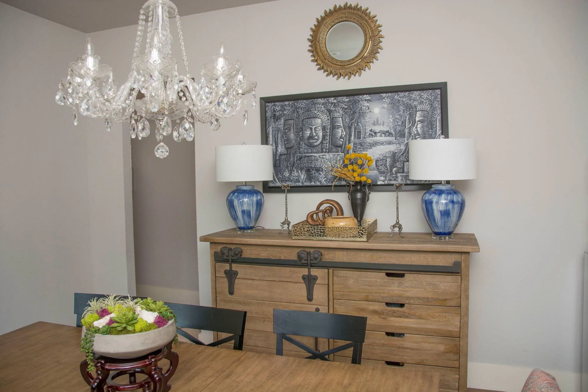
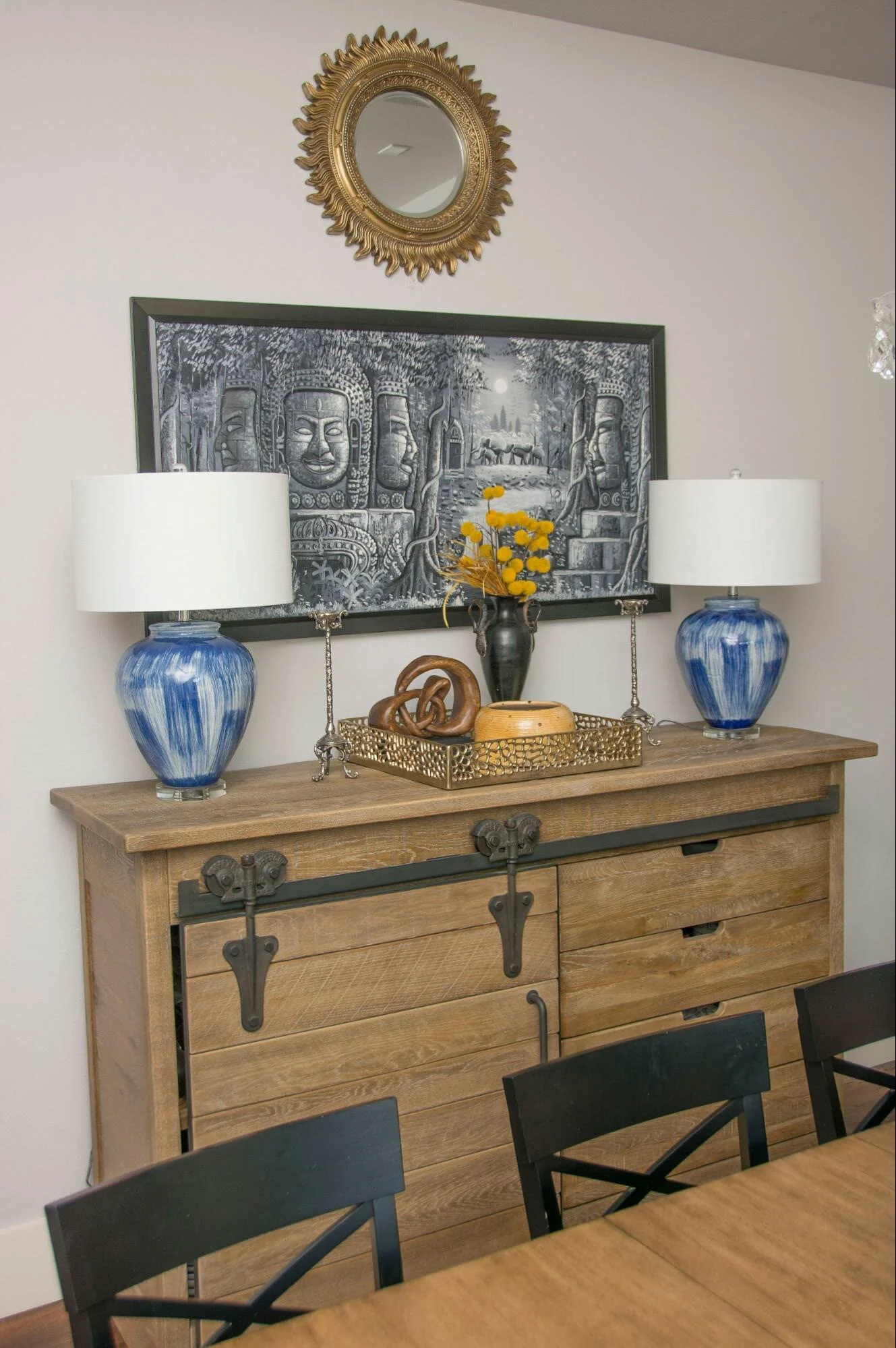
The dining room needed a few touches. We cleared the existing buffet and brought in new accessories.
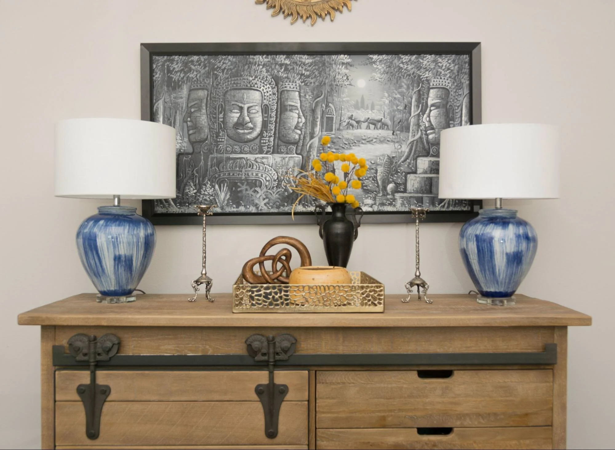
AFTER
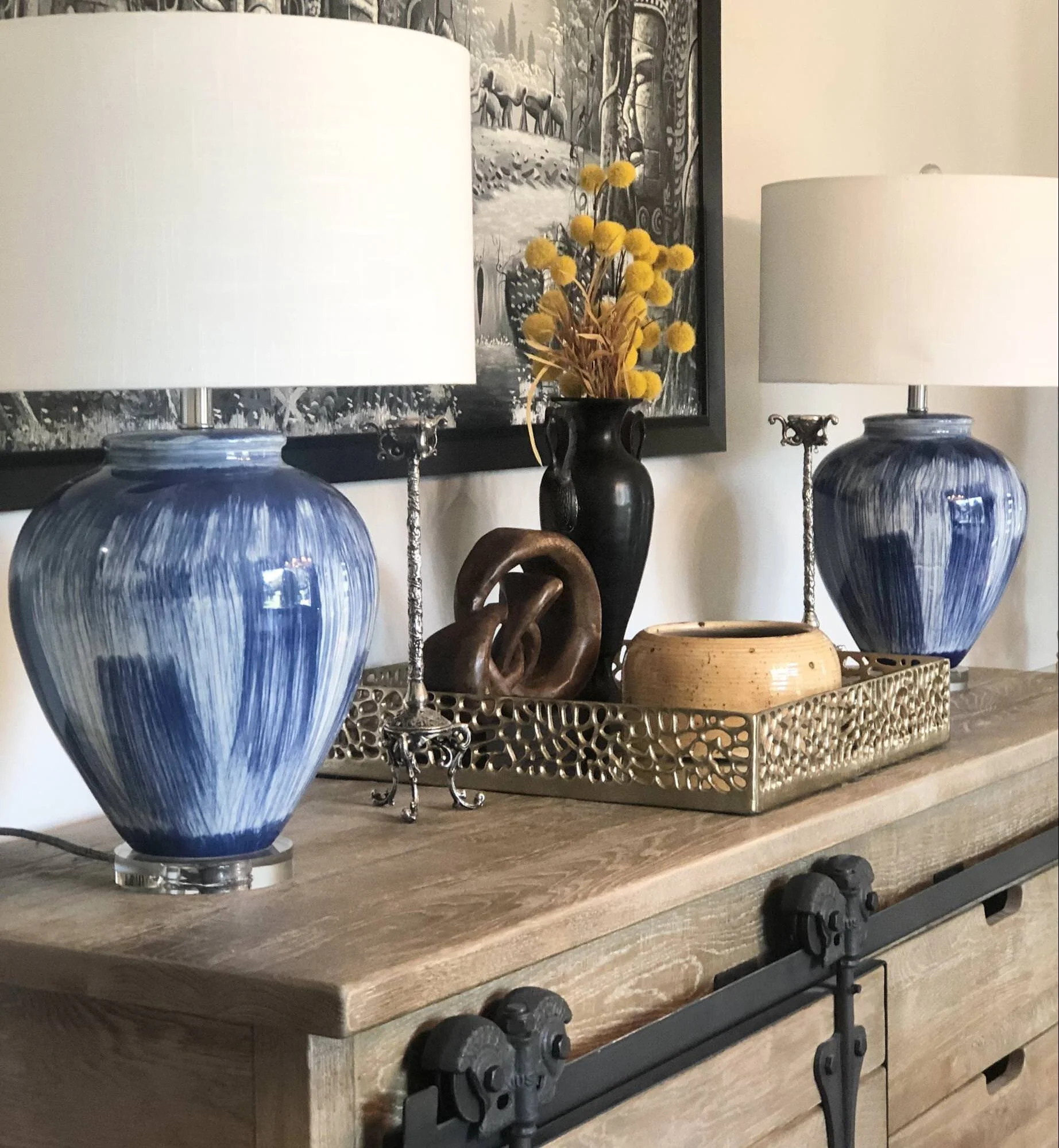
The before photo shows you that the client had a lot of the same textures and colors which makes nothing stand out. We brought in art from another part of the house and paired it with these blue and white lamps, aren’t they fabulous? Again, we layered accessories of different shapes and sizes on the buffet with a pop of texture and color. The lamps will work beautifully with the blue and white draperies.
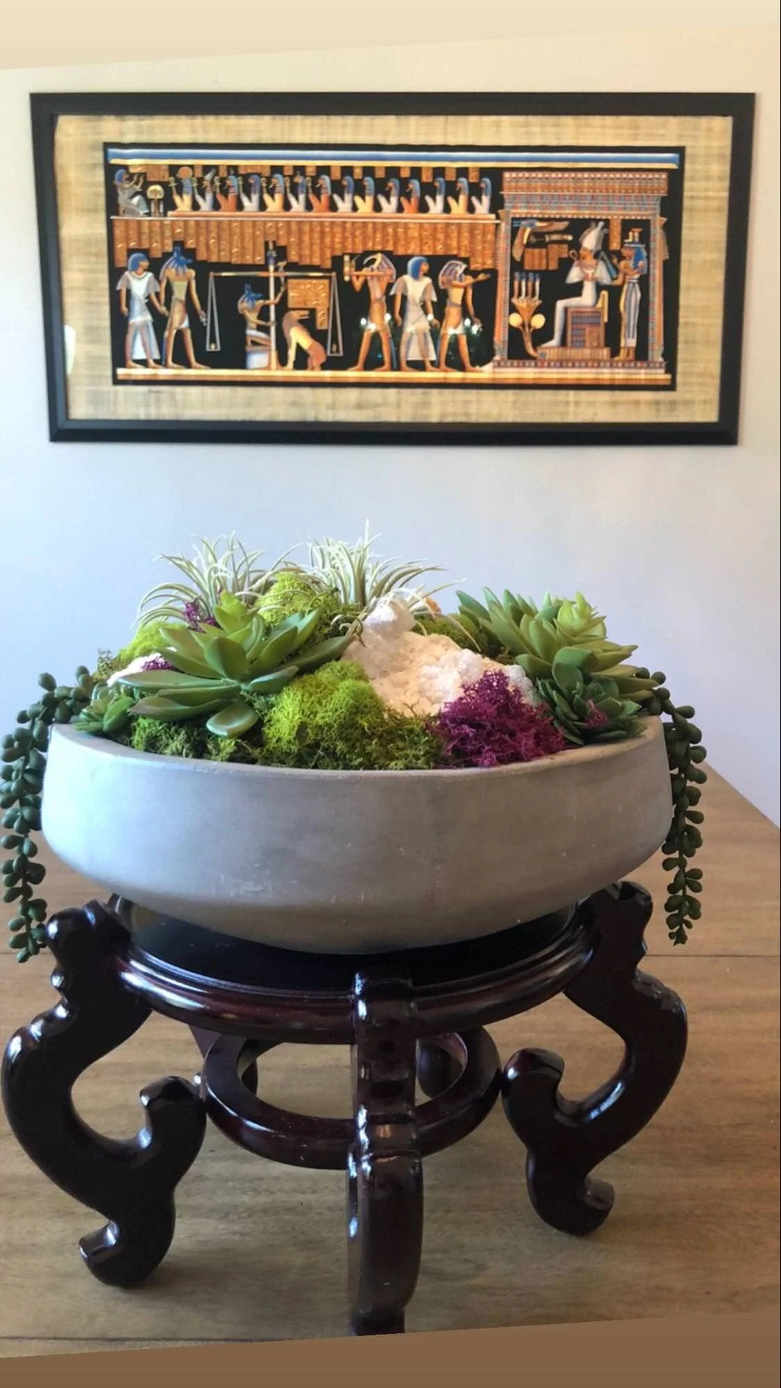
We had this cool Egyptian Papyrus framed and hung on the largest wall in the dining room.
The colors are so vibrant and I love the electric blue! Paired with this succulent and gemstone arrangement it really invites you into the room.
The client wanted to use the existing furniture for now so we worked around it and it turned out great. We weren’t able to hang the draperies on install day, due to Covid delays but we will eventually get a full room photo.
Our job is always so rewarding when we can make their house feel more like their personality. The fact that they had amazing artwork to work with really helped this home come together beautifully. The reveal was so much fun and their youngest daughter told me she wants to be a designer when she grows up! You go girl, dream big.
That’s a wrap my friends!
*Photo credits to T Lamar Photography
