We recently finished an install for a client. The crazy part it that due to the pandemic, we had to wait two and a half extra months to do the install for them. They were so patient and luckily were able to get some of the painting done before we arrived.
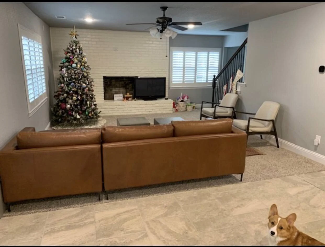
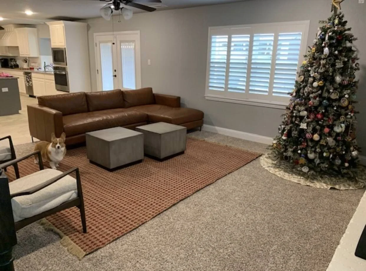
BEFORE FAMILY ROOM
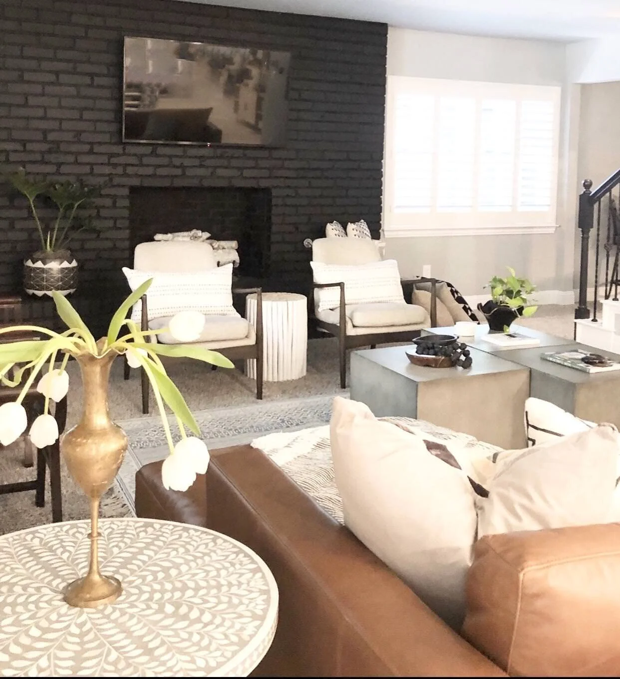
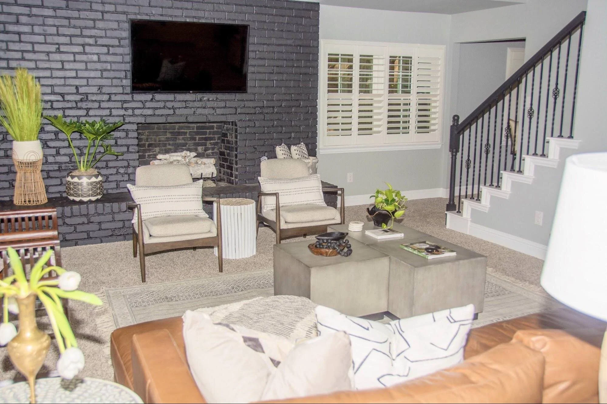
AFTER FAMILY ROOM
I suggested that we paint the brick black so that the TV disappears. If you are going to hang a TV above your fireplace, this is a great solution.
For the modern look we were trying to achieve, it really works beautifully and gives the space strength!
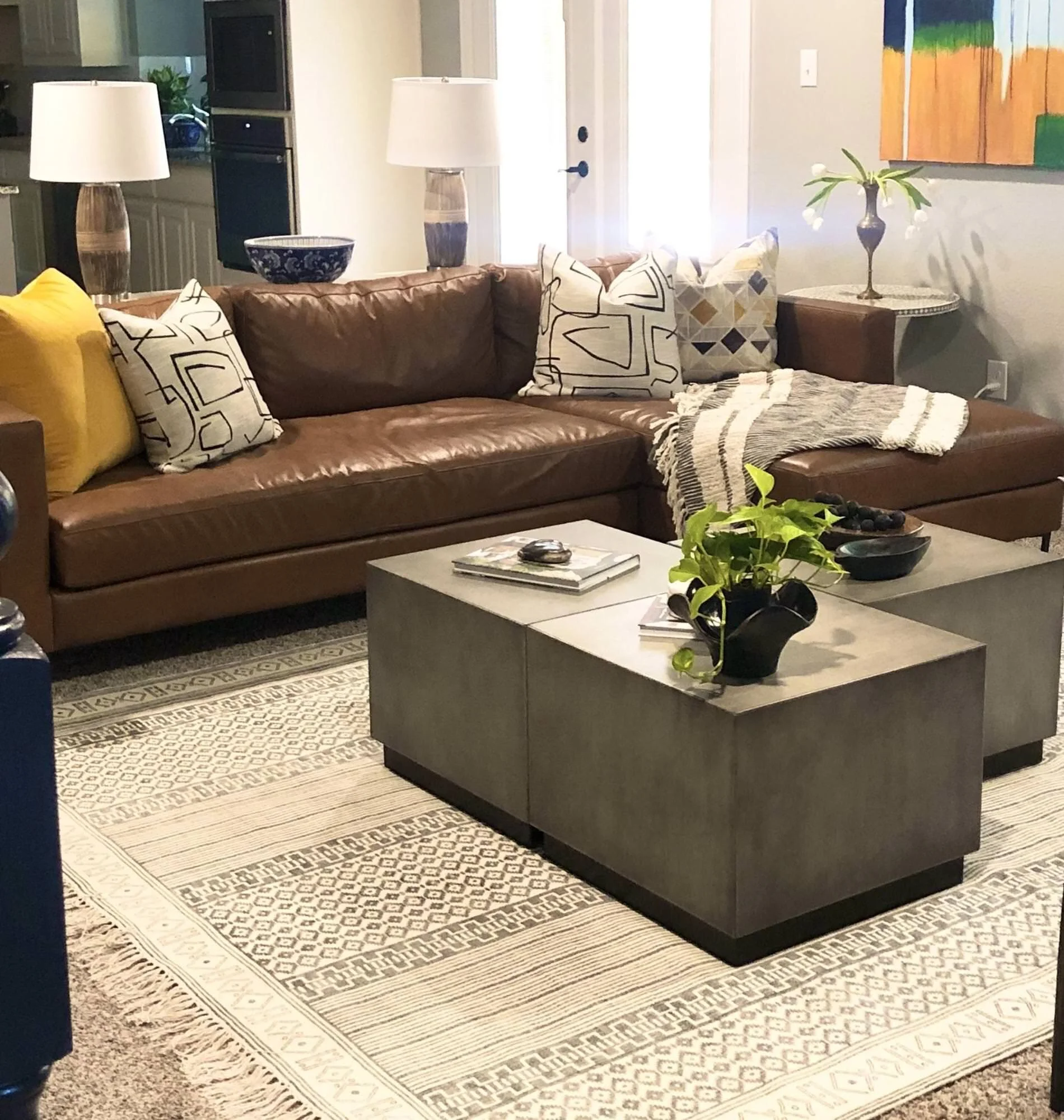
The client had the sofa and the two chairs already, we just did all the finishing touches.
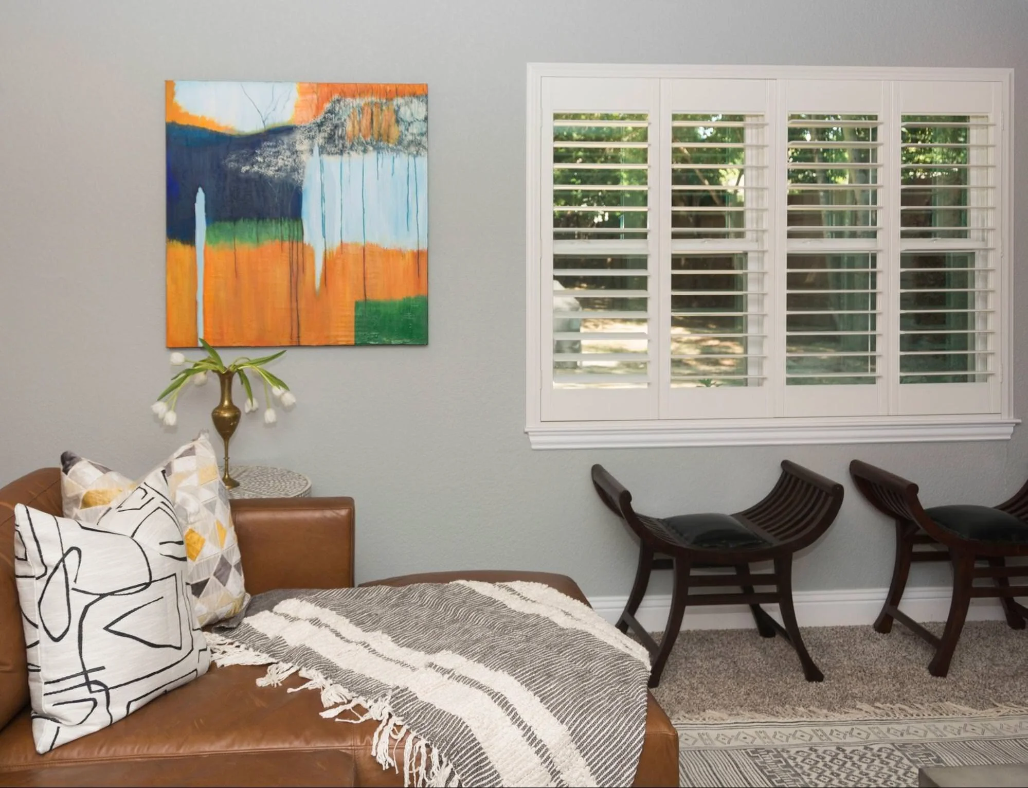
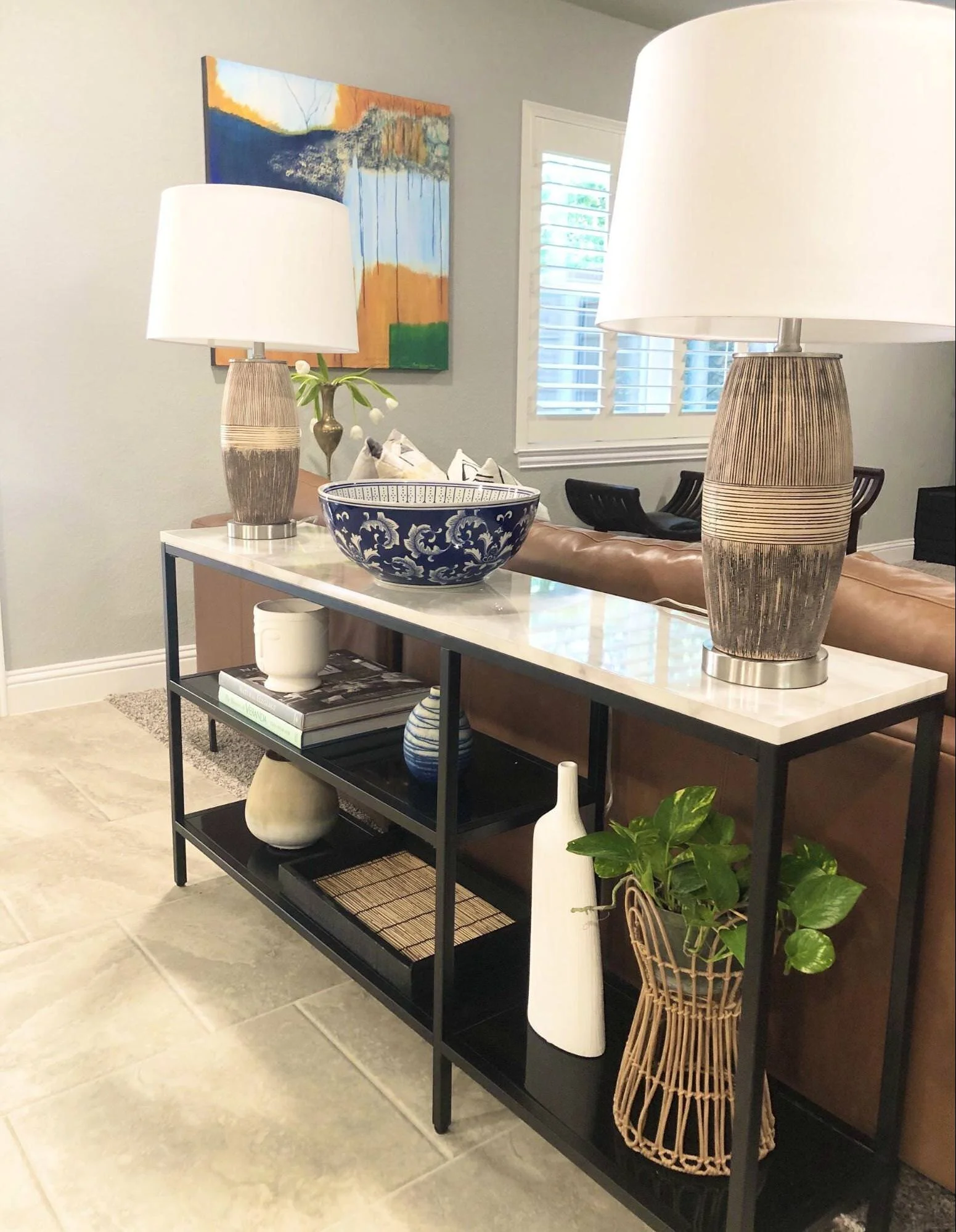
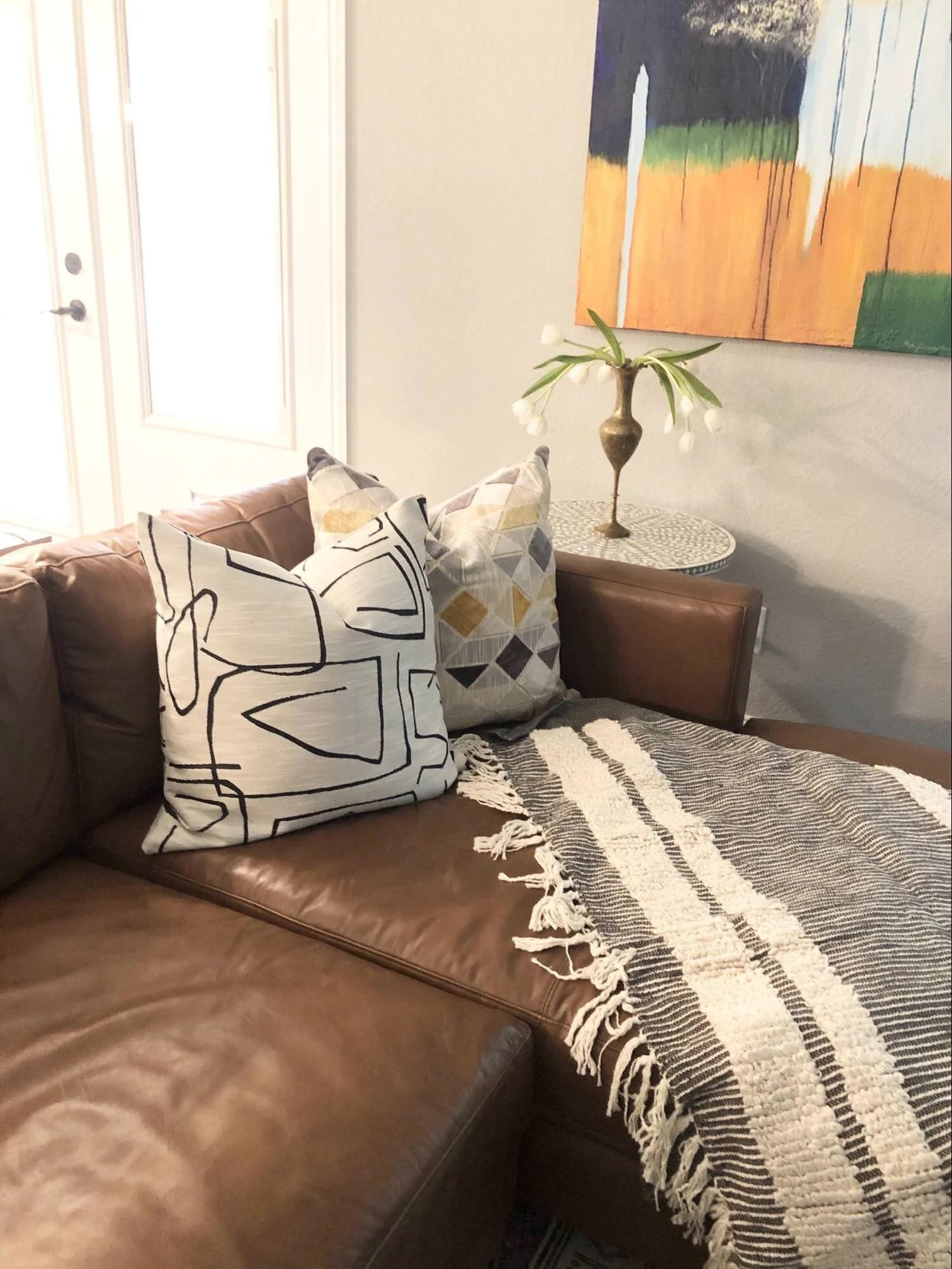
The art was created by a local Grapevine Artist, Mary Howe.
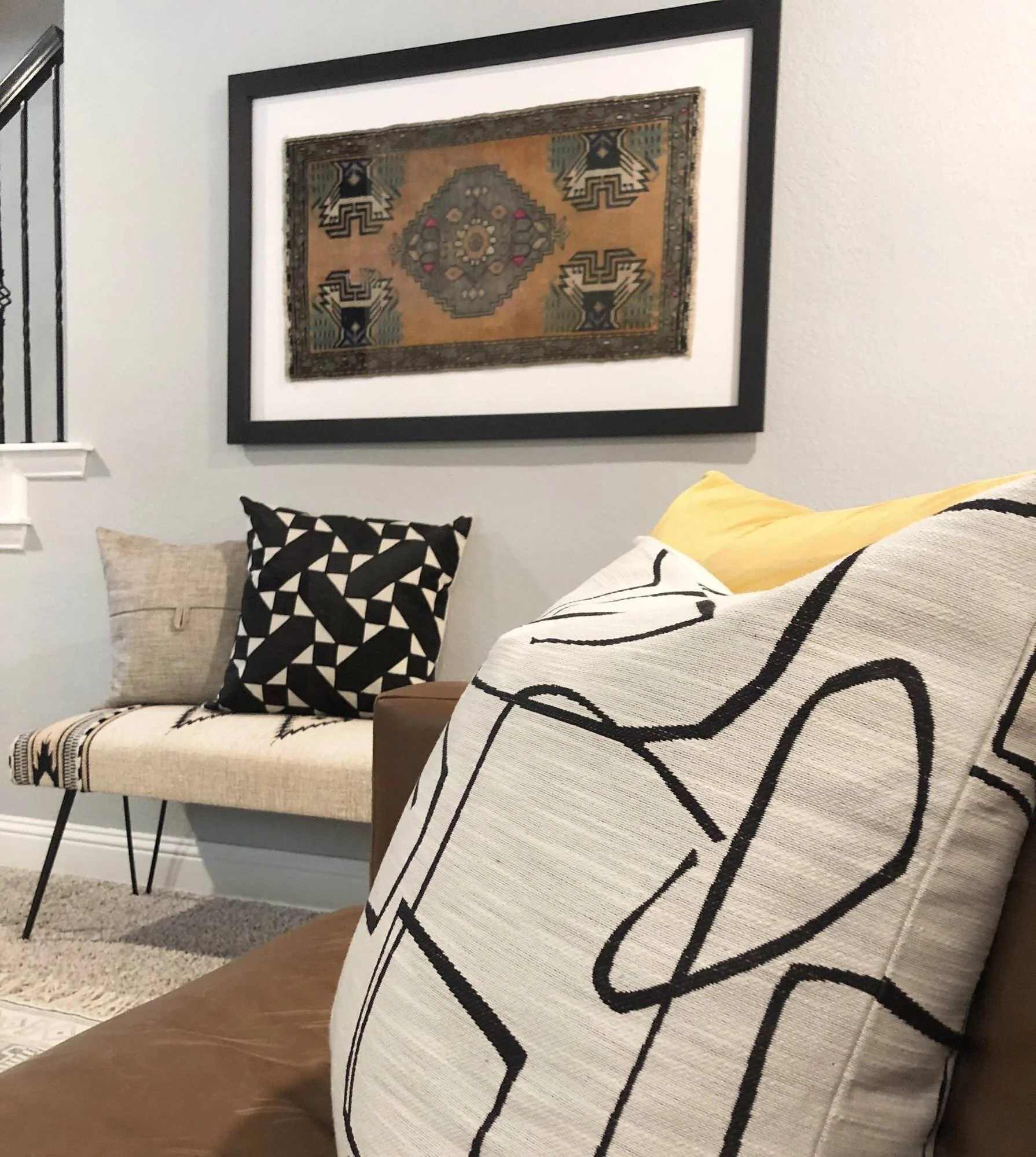
We added two curved wooden benches for extra seating.
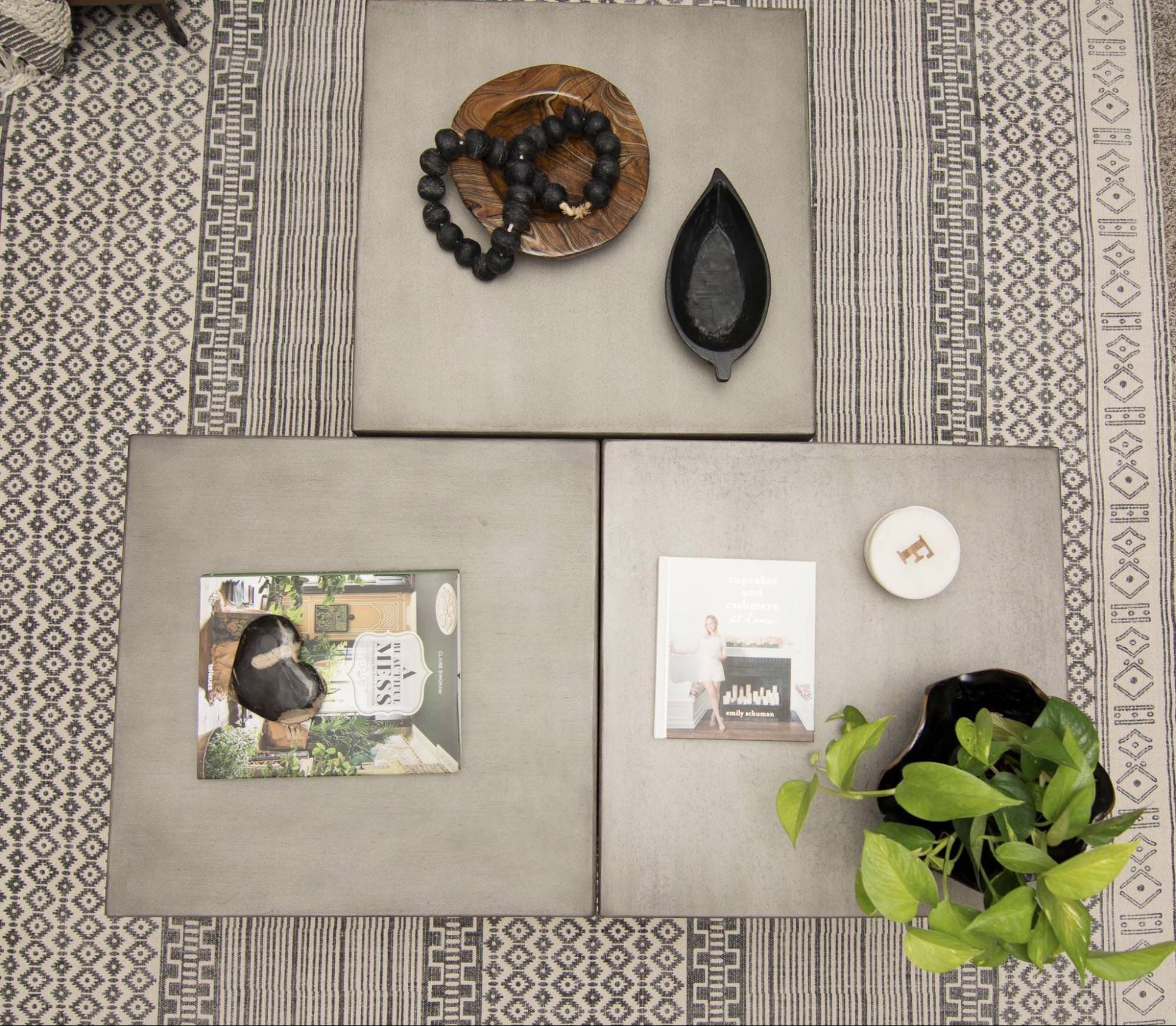
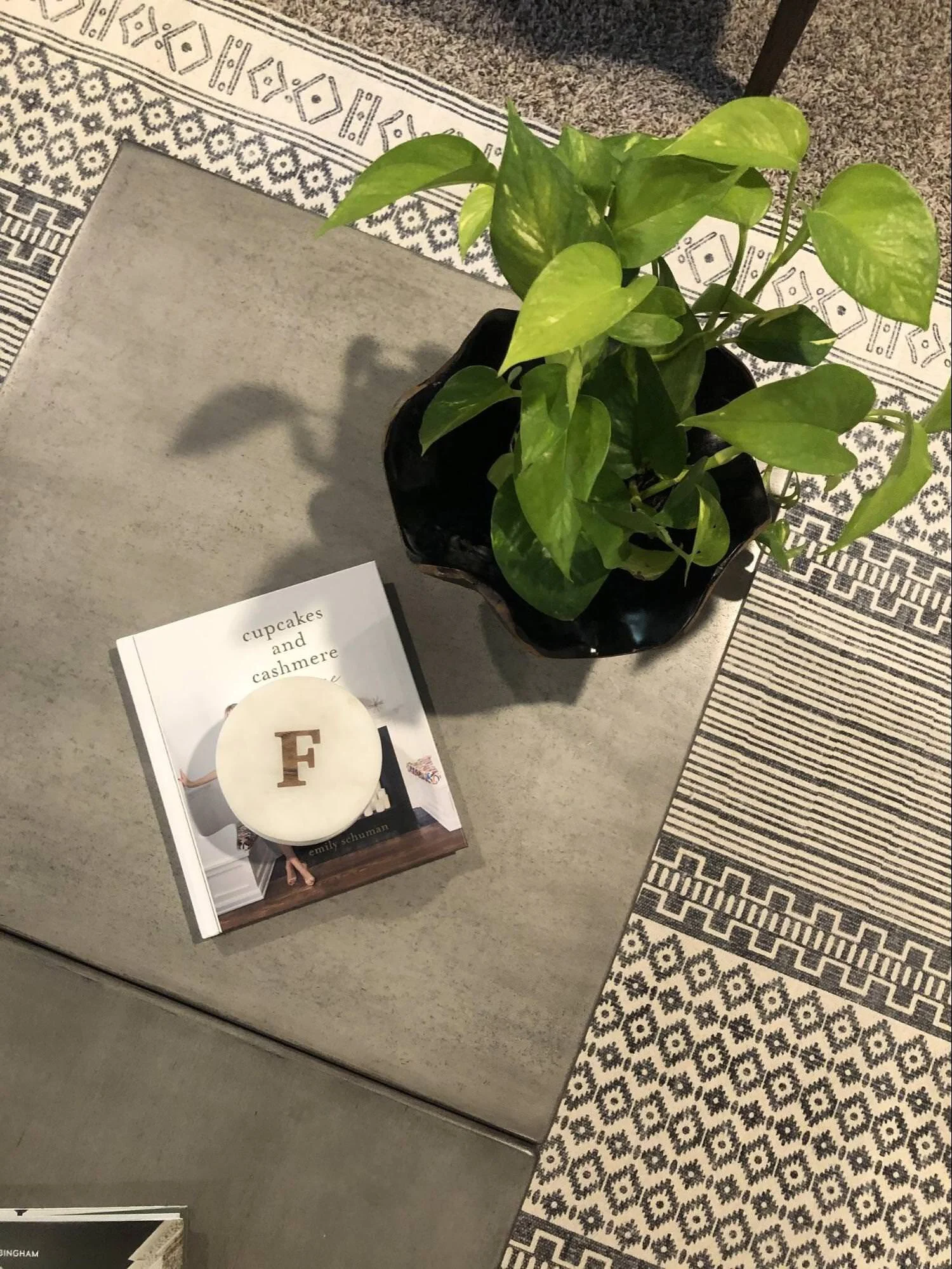
The client had two of these concrete cube coffee tables and I had them purchase an additional one. 3 together looks more interesting and gave us more space and made it all feel to scale for the room.
We added a black and white rug and it really pulled the black from the fireplace and united the space. We added accessories that can easily be moved if they decide to have dinner or party food in front of the TV.
Live plants always make a room come alive! I knew we needed to use some texture in the space and a rattan plant stand was the solution.
BEFORE FAMILY ROOM
AFTER FAMILY ROOM
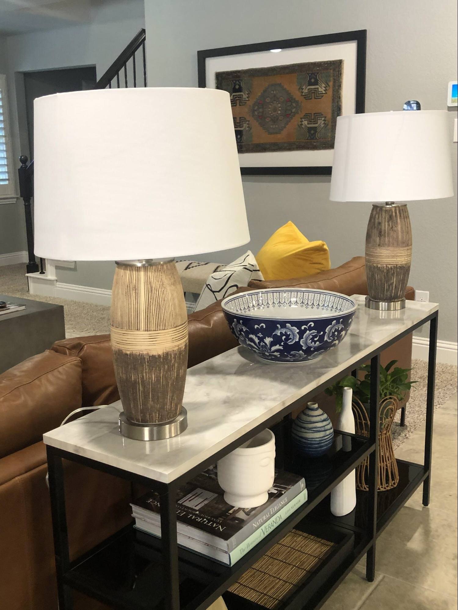
We added a console table behind the sofa because it was a perfect place to add accent lighting in this small living space. It created balance to the room.
The stair banister was painted black too!
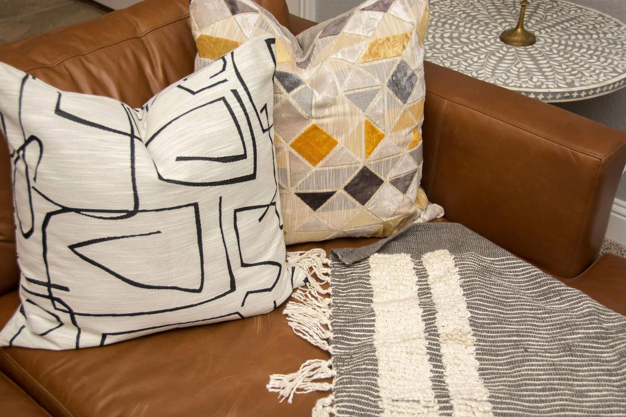
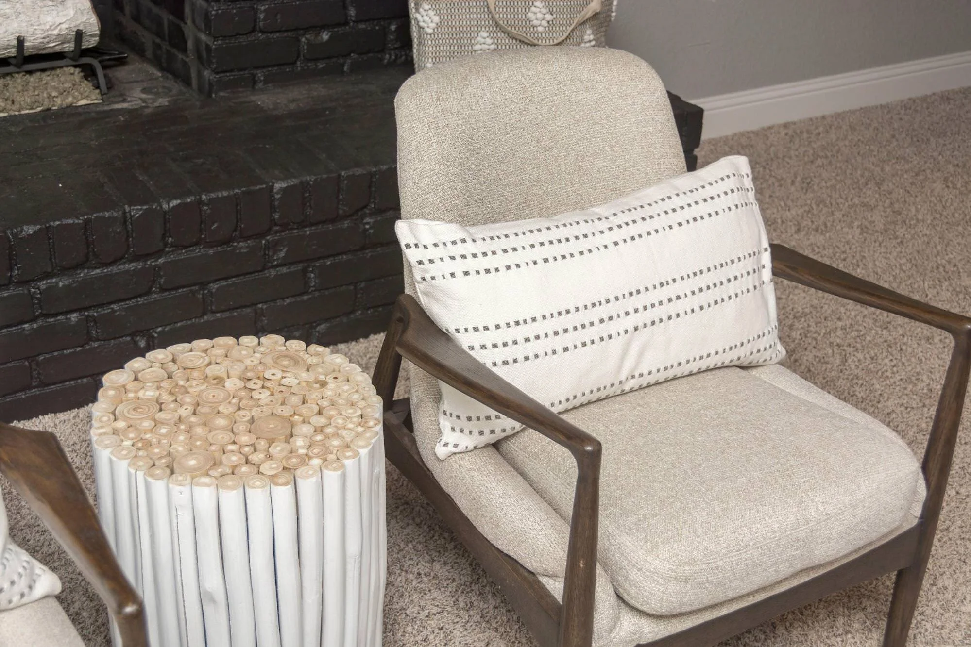
White lumbar pillows added a softness to the chairs modern curves. The wood side table was one of my favorite pieces that we added.
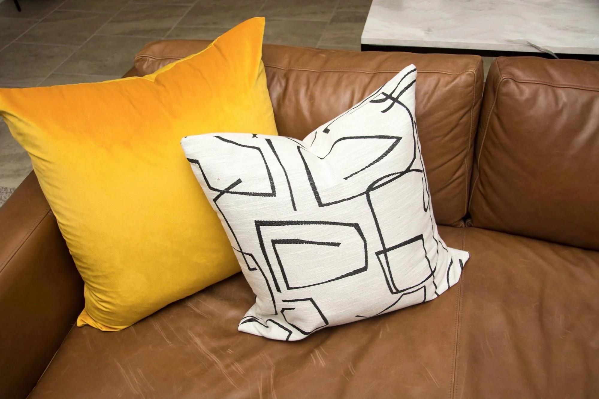
If you know me, my spaces usually have pops of color.
This yellow velvet pillow makes a gorgeous statement and pairs well with the artwork!
BEFORE FAMILY ROOM
AFTER FAMILY ROOM
I found this vintage rug and had it framed! Placed above this hair pin bench worked lovely with the warmth from the sofa!
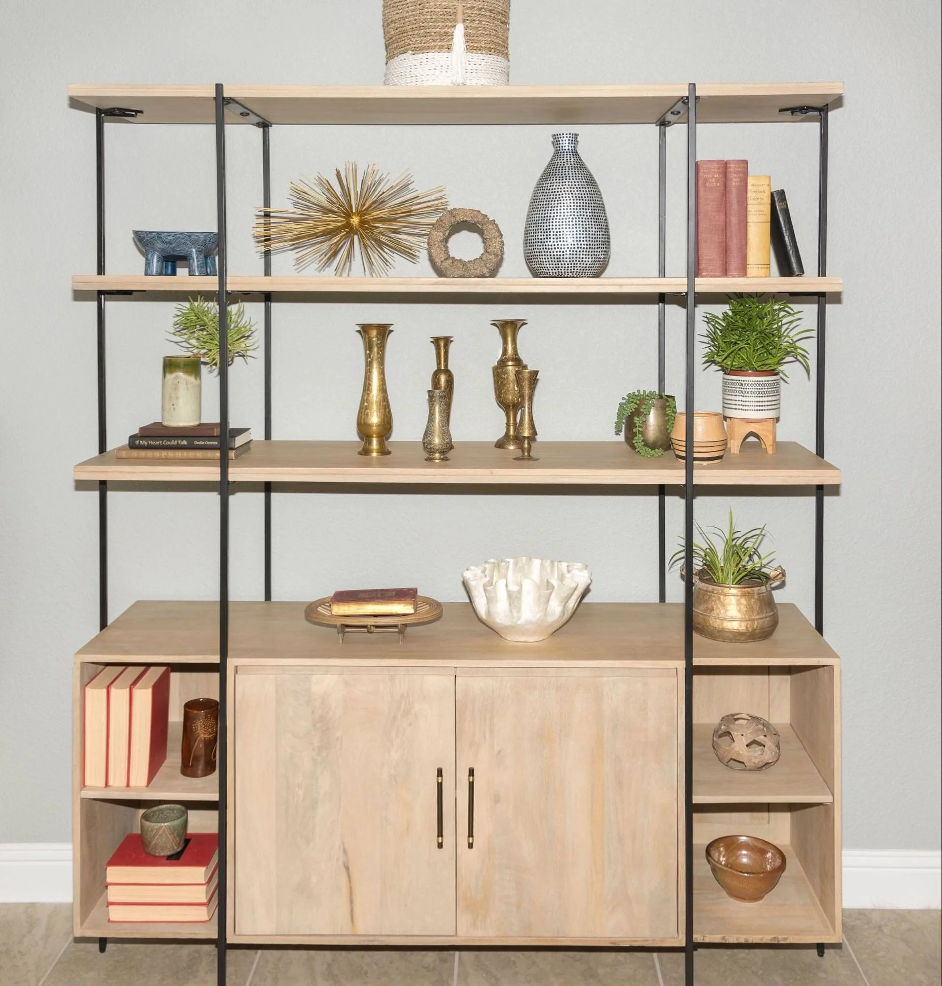
The client really wanted some shelving in her kitchen area and I thought this beautiful light wood piece would serve them well.
We added collected items like pottery, vintage gold vases, books and live plants!
BEFORE DINING
AFTER DINING
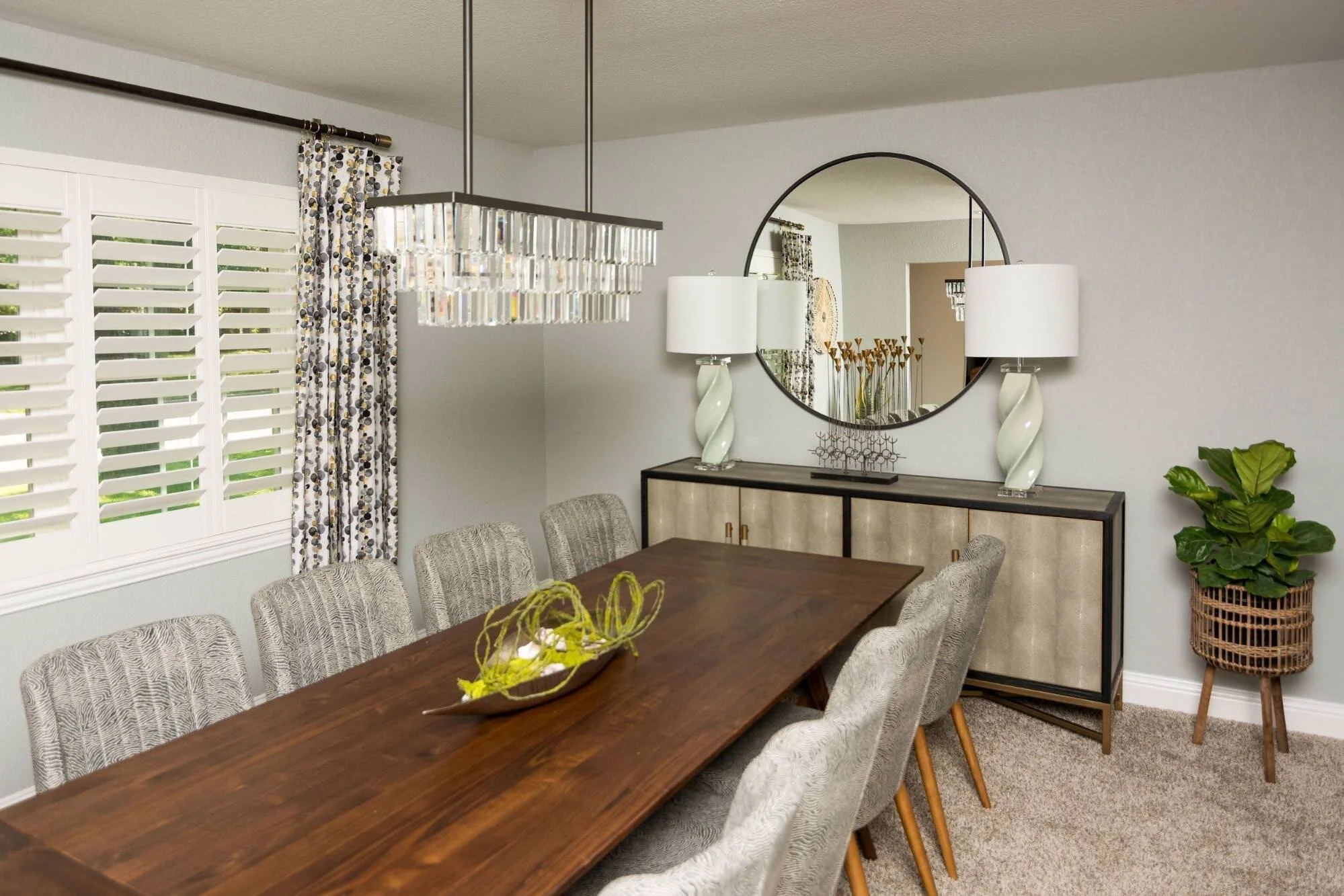
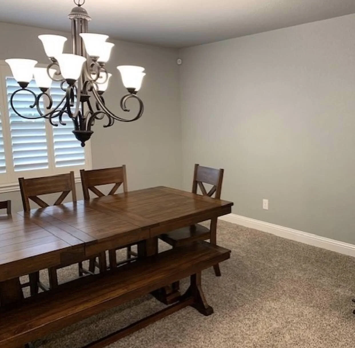
Big change, right? We took everything out of this room and started from scratch!
The modern, clean lined table has extensions on each end and it can seat 10!
BEFORE DINING
AFTER DINING
We had the chairs upholstered and I just love the pattern. Not too bold but still adds great pattern.
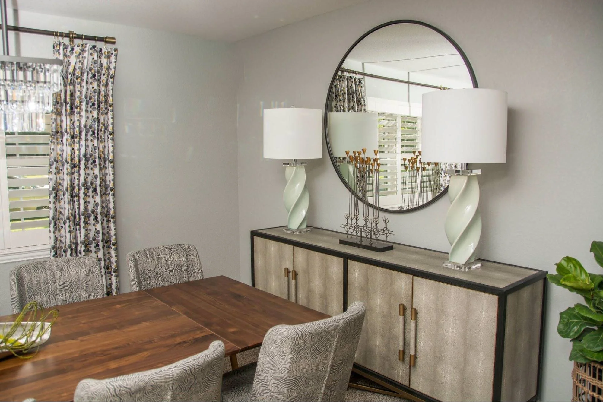
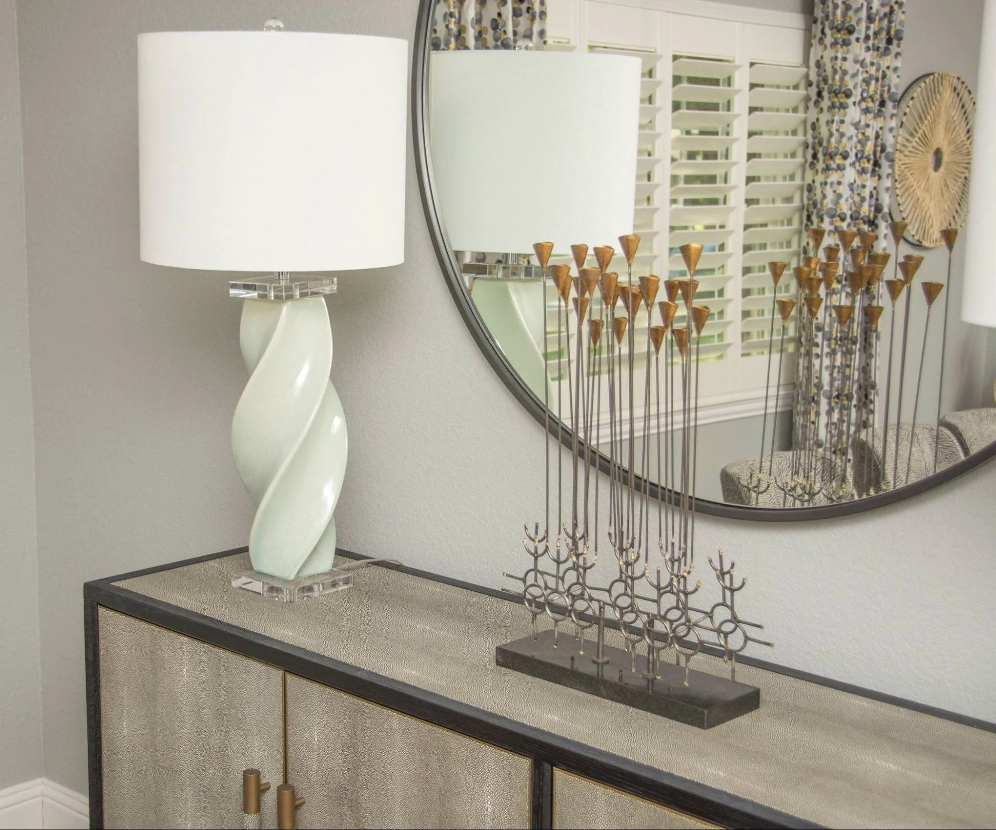
I added a round mirror because we had a lot of square going on in the room. The round mirror opened up the space too! The dining room is right off the entry so it really makes it inviting! Always make sure that what your mirror reflects is something pretty! This chandelier is certainly that!
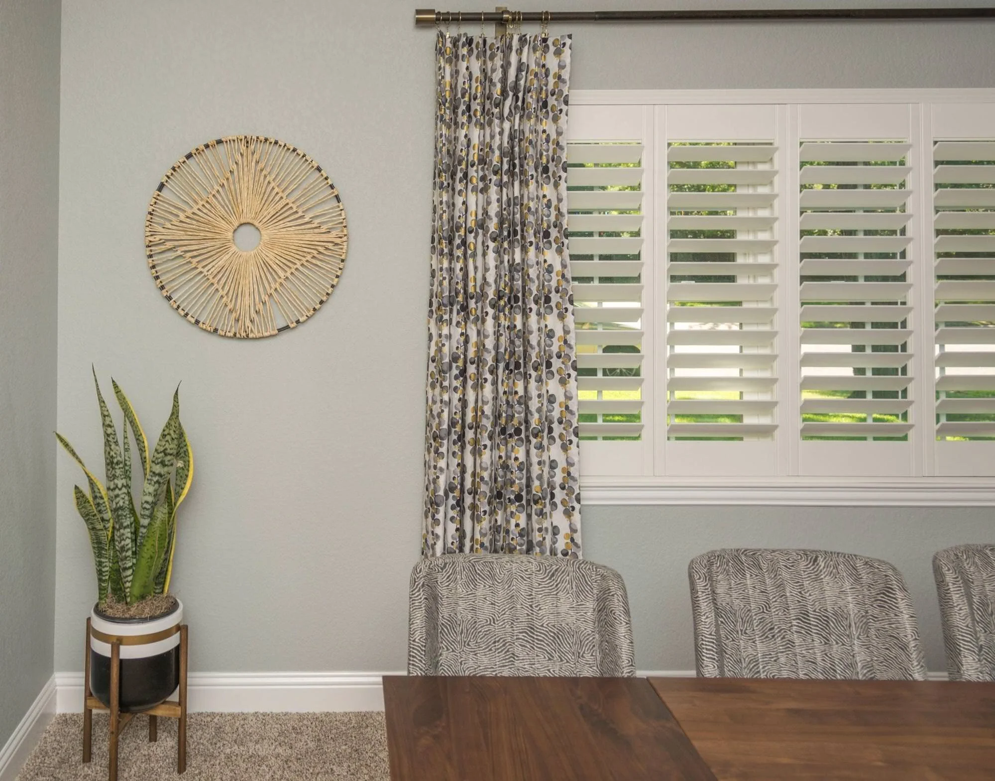
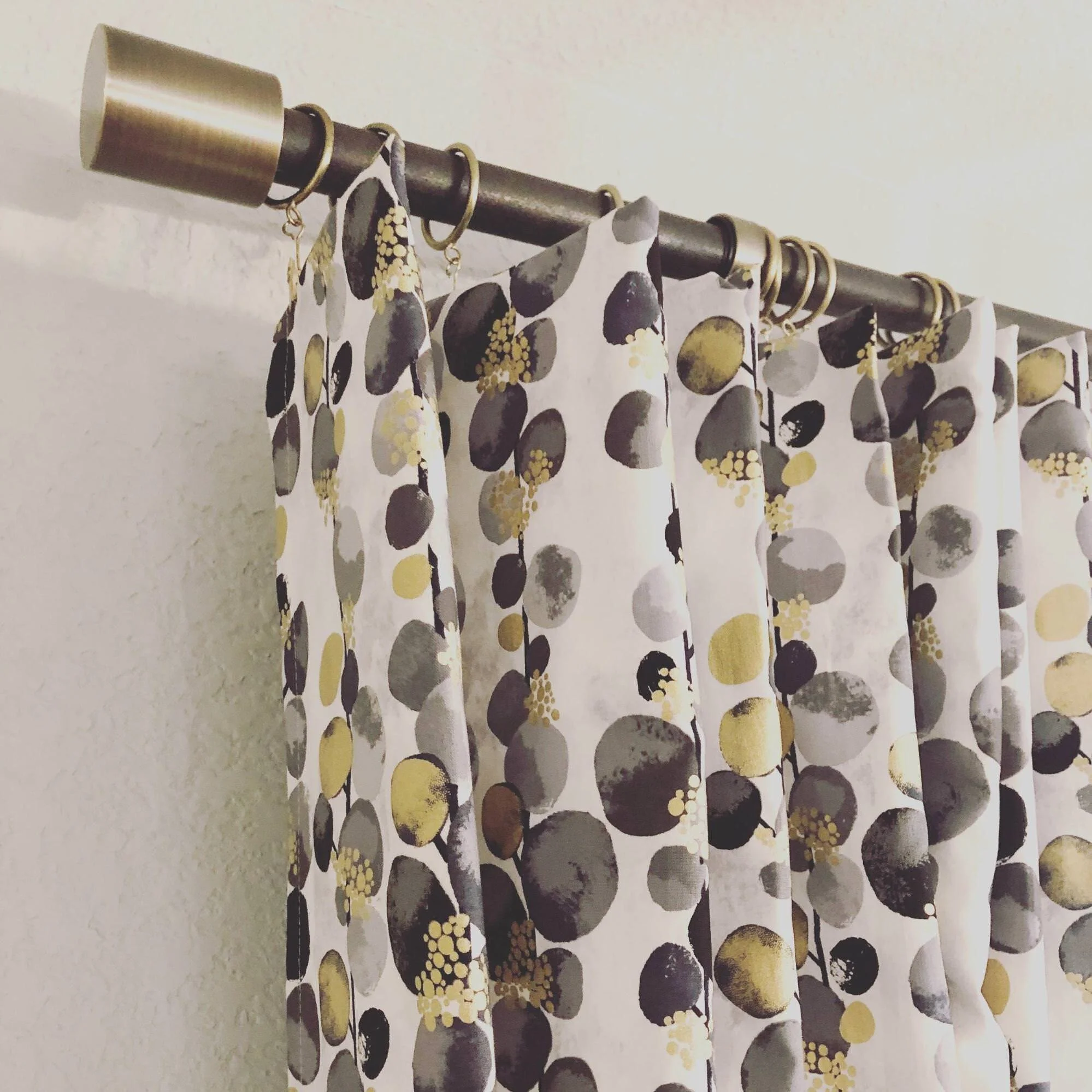
The draperies softened the room and added some fun but kept it sophisticated. The hardware with the black and gold, tie in with the buffet! As a designer, these are all the details that keep us up at night!
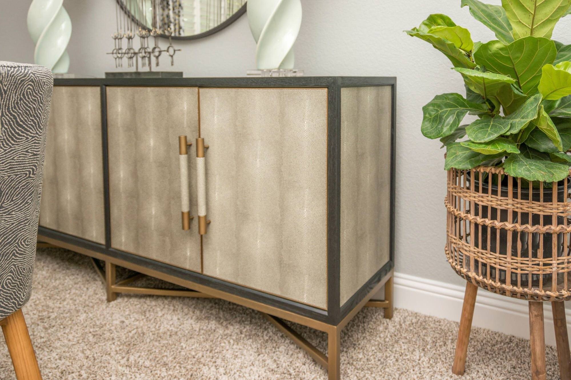
This buffet is like artwork in the room! The hardware and the details ❤️
Since the buffet has detail already, I felt like we didn’t need a lot of accessories on it. We kept it simple but it still makes a bold statement. The lamps with the acrylic bases say, wowza
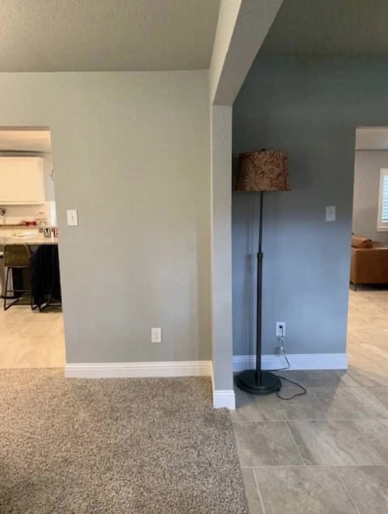
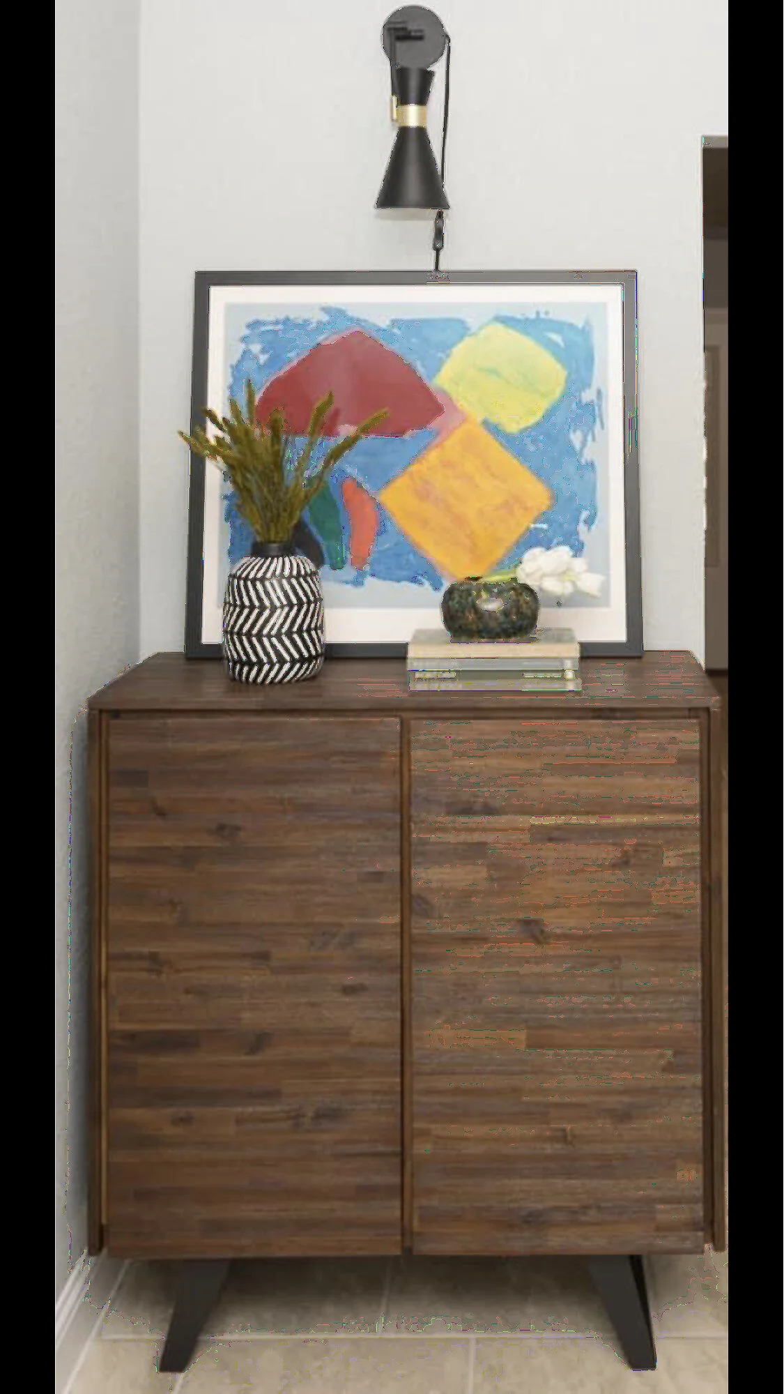
BEFORE ENTRY
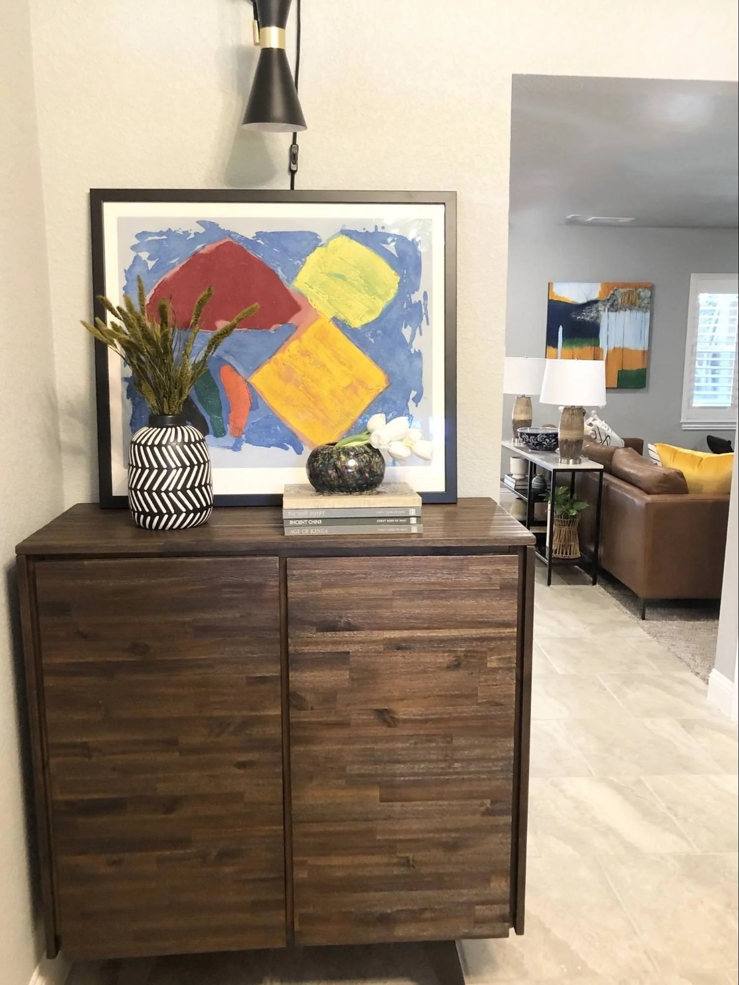
AFTER ENTRY
That’s a wrap!
How you and your family are keeping well! I’m going to be focusing on my youngest daughter's wedding the next few weeks so we are so excited!
Follow me on Instagram @ruthiedesigner
And Facebook to see more behind the scenes of designs I’m working on, as well as tips for your home!
