If you follow me on social media, you will know that I was in Highpoint, NC a few weeks ago. I was part of the Design Bloggers Tour and thought you might like to hear my thoughts about it.
What is the Design Bloggers tour?
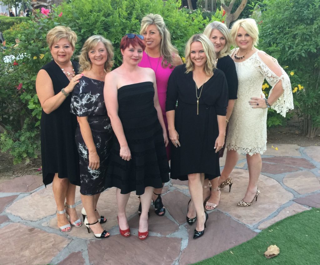
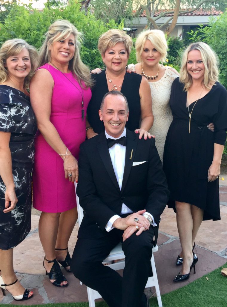
Ten of today's top design bloggers took a tour of some of High Point Market's spectacular Showrooms. We explored the styles of Spring Market and got the inside scoop about design trends through a designers eye. We gave our social media audience a tour as we went along using the hashtags #hptmkt2017 and #designbloggerstour.
It was developed in partnership with Esteem Media and sponsoring exhibitors.

We did walk over 10 miles from showroom to showroom and a lot of that was in the rain, but we were troopers and definitely used the umbrellas in our goodie bags provided by High Point Market and Crypton.

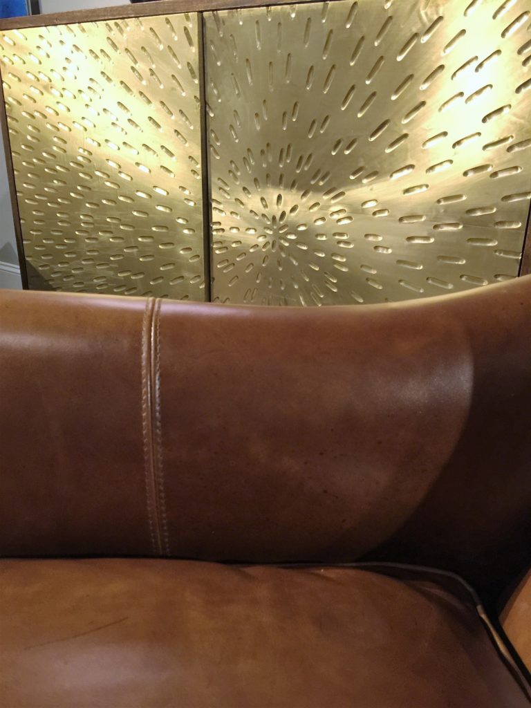
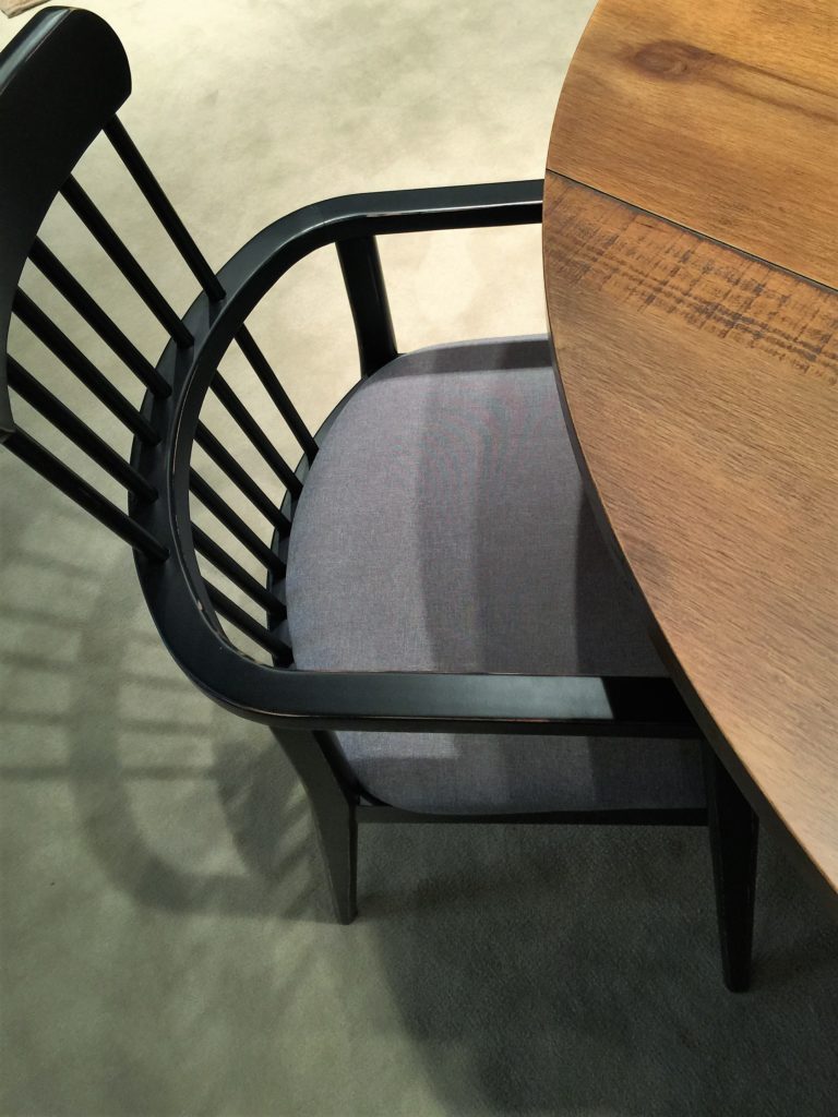
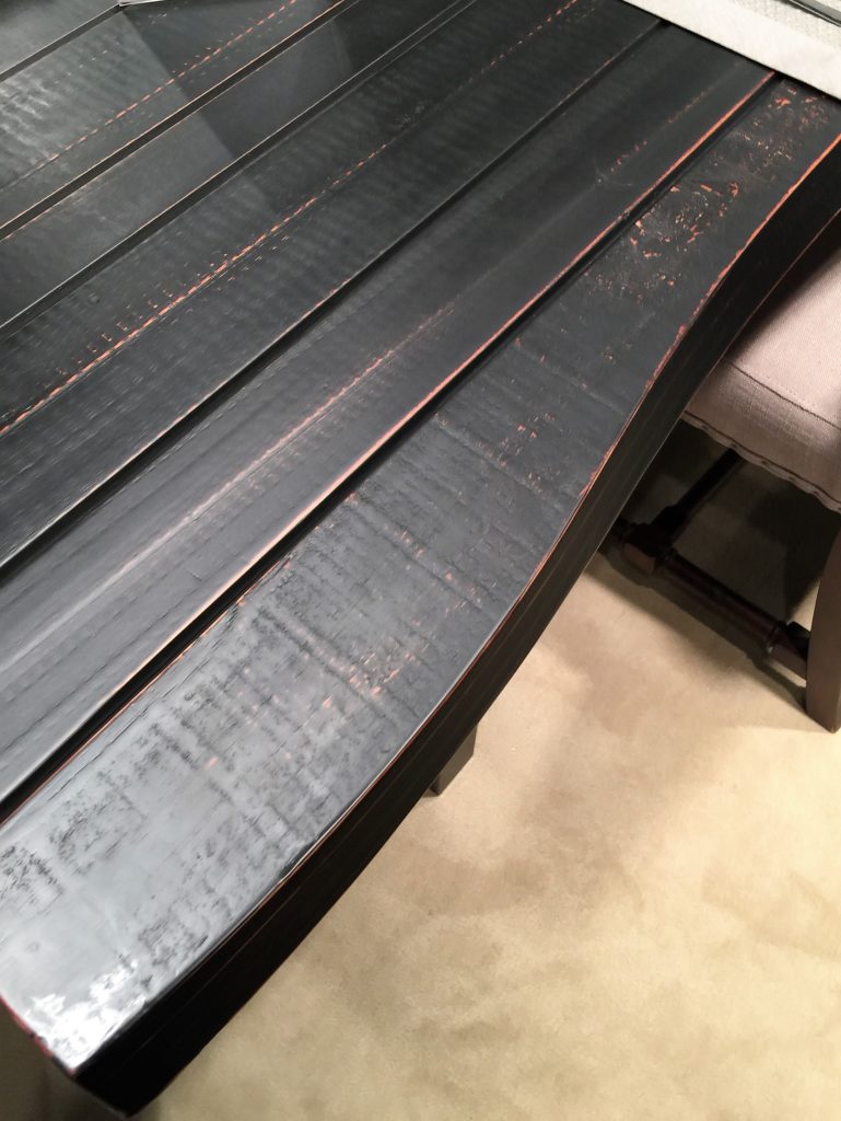
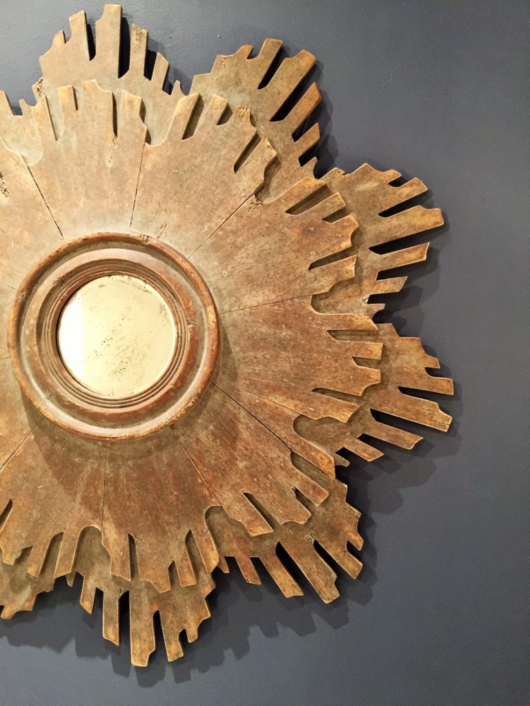
Since I'm a designer that LOVES texture, I thought I'd share with you some of the texture trends that caught my eye. It was an underlying trend in each showroom. Lots and lots of mixed textures and what made me extremely happy was the Africa Tribal vibe.

Being that I was born and raised in Africa, I have my own collection of African baskets and textiles. I do think that you could go over the top with this trend (like any trend) so the key is to do touches of it throughout your home. Textures always make a room more interesting.

My design love language is "All things bright, fresh, moody and textural" so you know this market made me elated because that is what I saw. Join me as I take you to each showroom and point out all the beautiful textures that create different moods.
Bernhardt Furniture
www.bernhardt.com

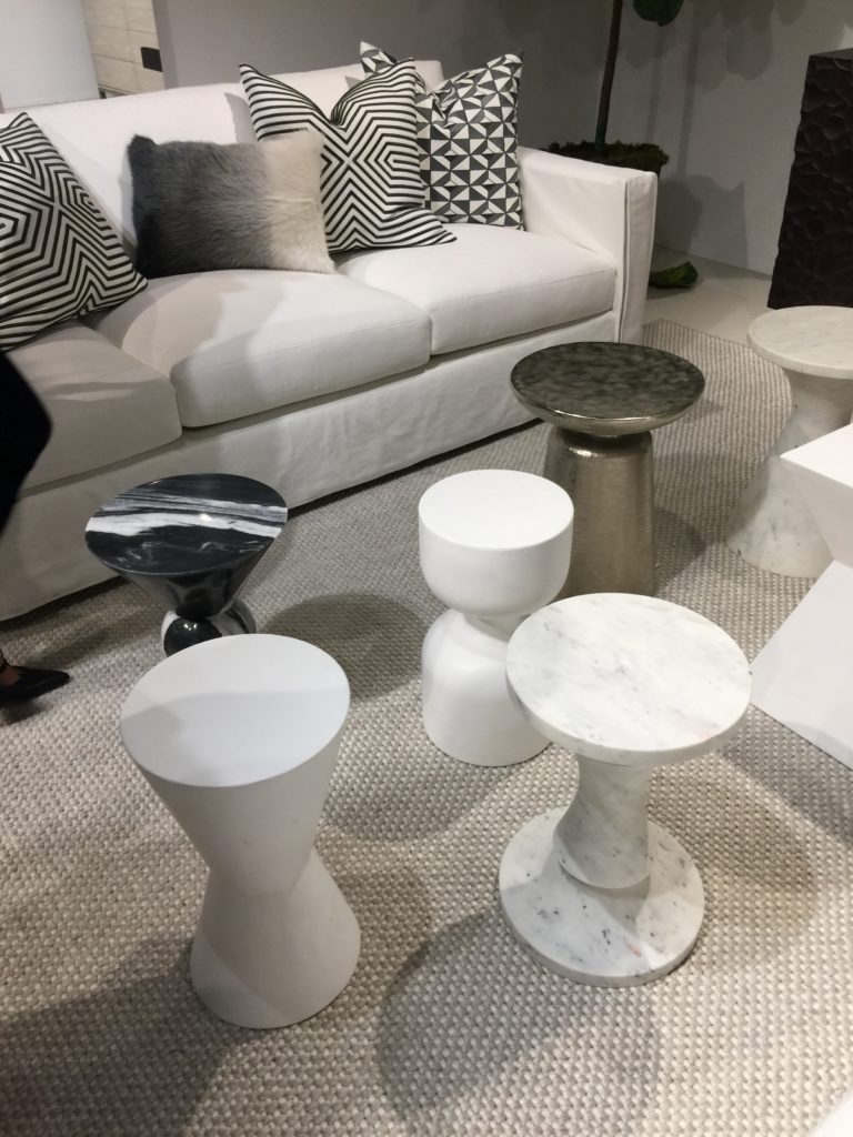
I so loved this grouping of round side/cocktail tables. This collection makes a nice statement and keeps it interesting. Especially since there is a mixture of metals, marble and a variety of stone. Notice the textured, nubby carpet and the variety of pillows on the sofa too. This look is very fresh and clean but still adds loads of texture which is a look I love.

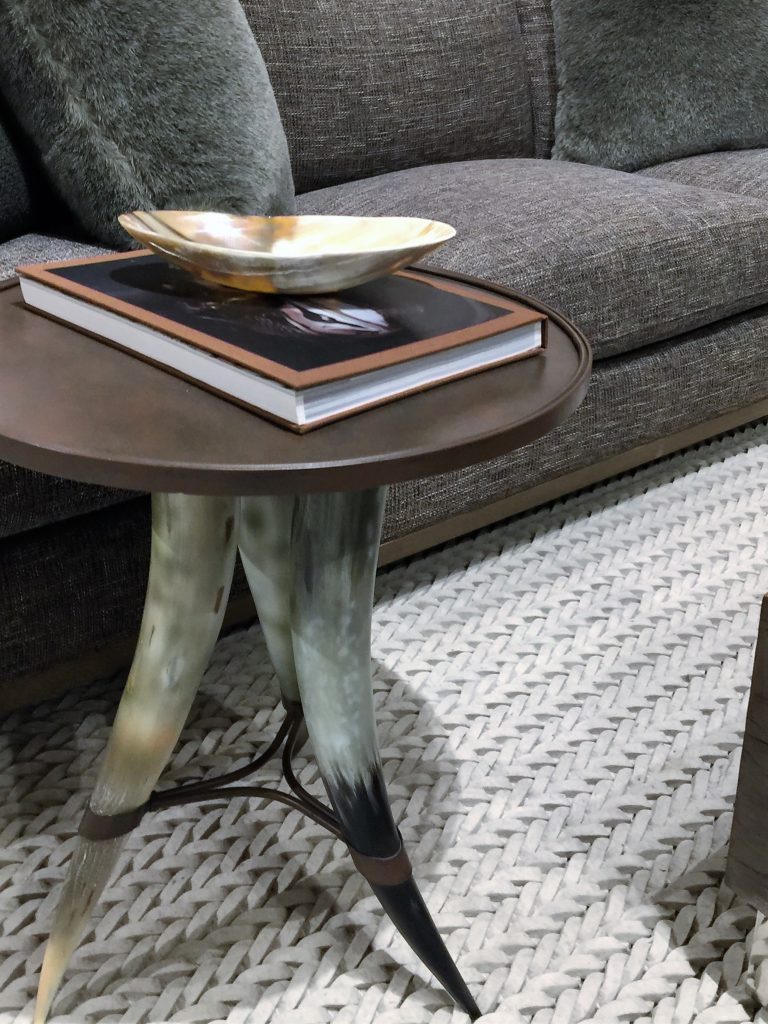
This horn table can add an eclectic feel to any room. Love the masculine feel it adds. The braded rug is fantastic too. Simply beautiful.

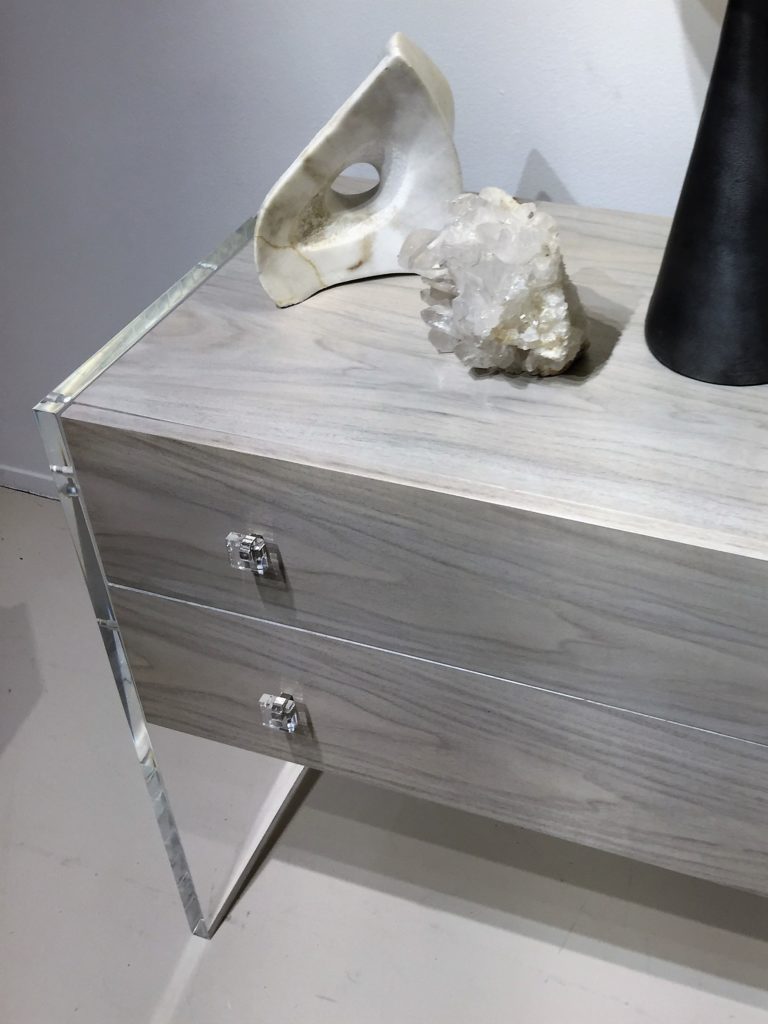
This acrylic block side table caught my eye immediately because it looks like ice. When decorating a space, using different elements like this can make your home feel collected and interesting. A great conversation piece too.

These wicker ottomans/stools are a nice change since they are white and not the typical brown wicker color. If you are wanting a more modern space, the white works well.

There was still a lot of acrylic this market and it was mixed with wood and other finishes which makes it very stylish and fun.

Crystal candlesticks up against a upholstered screen made a dramatic contrast of textures. I did see a lot of upholstered screens with nailheads as well. So many varieties to choose from. Upholstered screens work well to fill corners in a room and can be the art for the space if done in a beautiful fabric or stunning texture.

Here you have white washed driftwood in a large glass vase. I have this exact thing in my home and every time I pass it, it catches my eye. Having the driftwood painted, keeps it light and fresh.

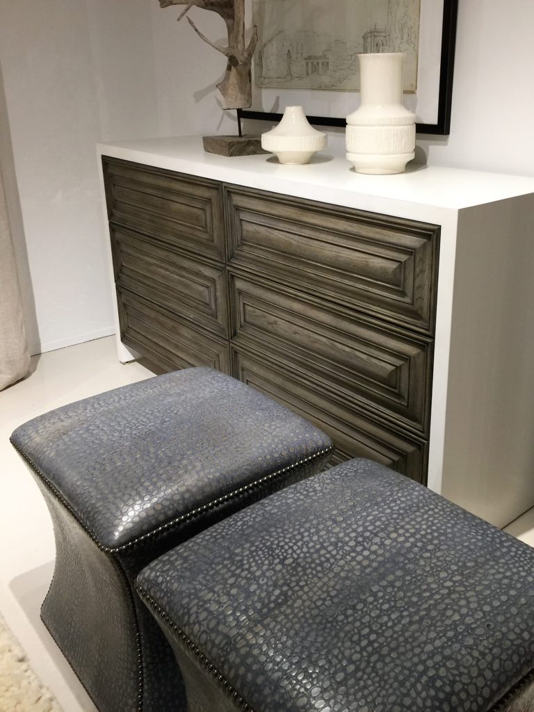
These crocodile ottomans, yes!

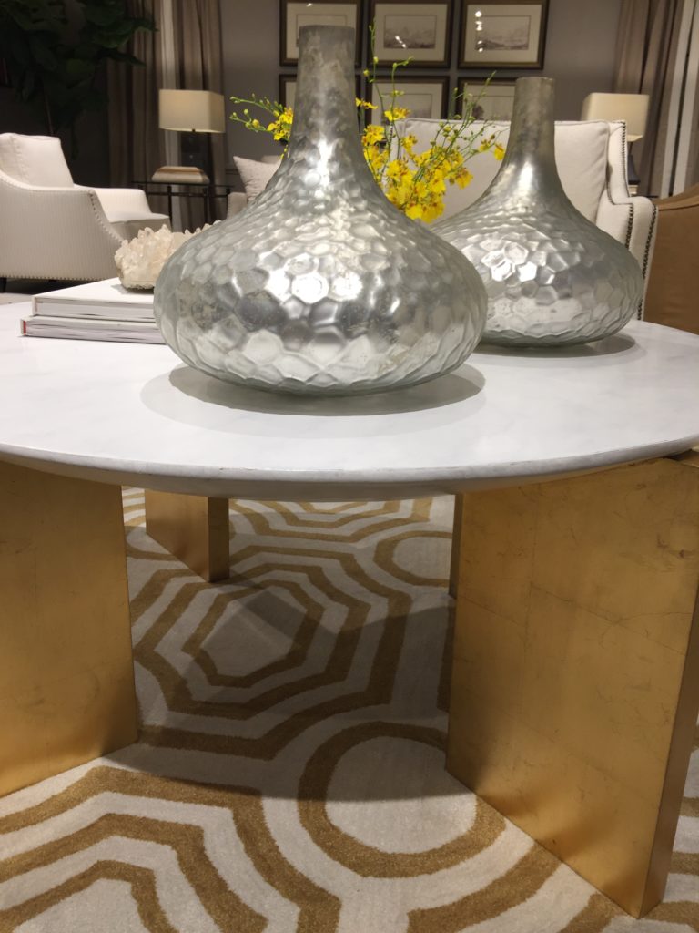
Mixed metals is all the rage too. Mixing gold and silver is a YES!

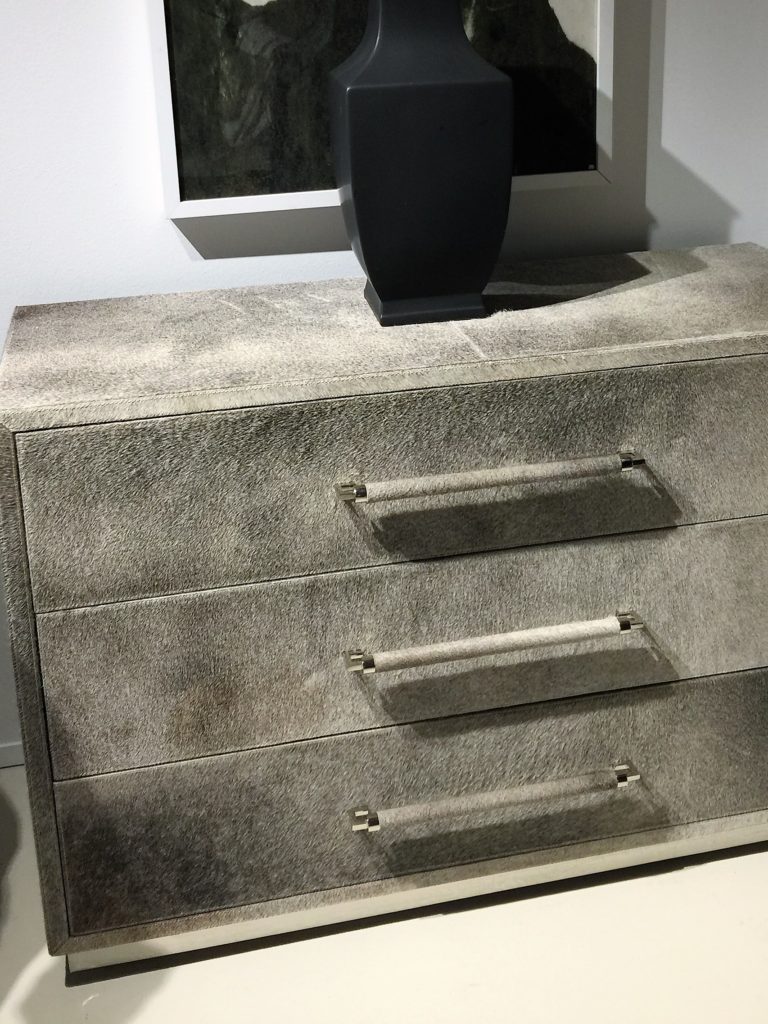
Lots of hide this market too. Love the gray with the silver.
Bunny Williams Home
www.bunnywilliams.com

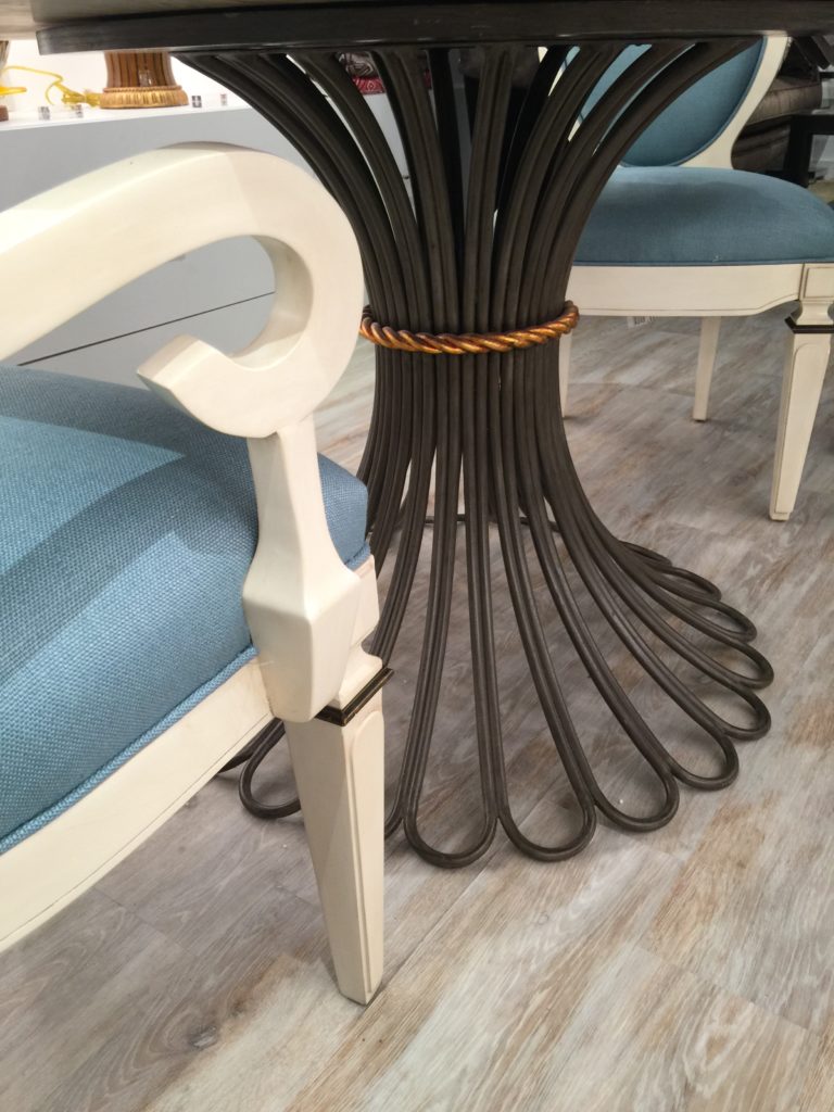
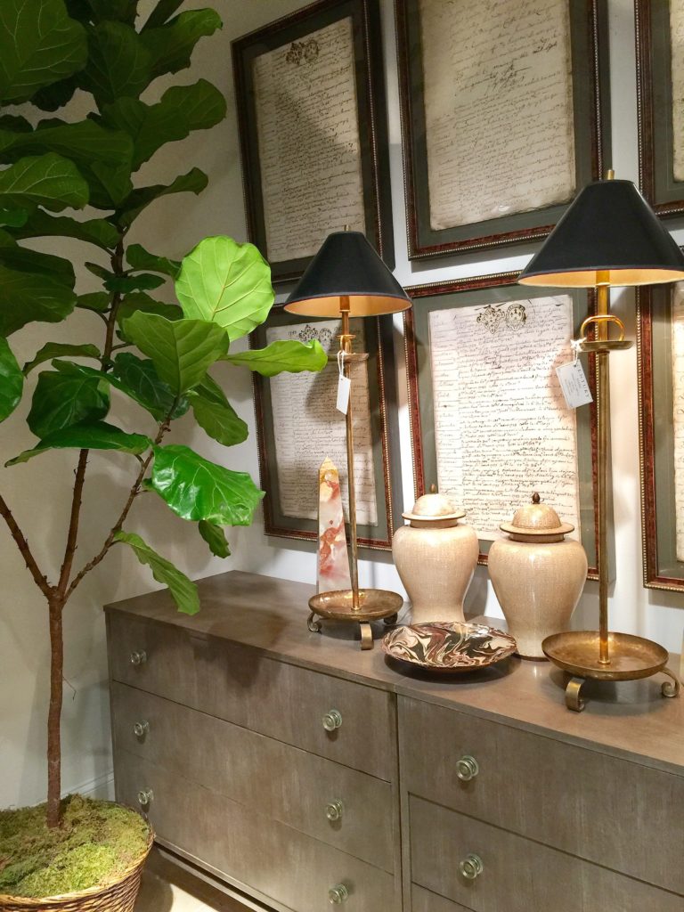
Don't you just love this table with it's wrought iron base and gilt rope accent?
Bunny Williams had a new collection this market. She is known for her collected look. Her collection was inspired from things from her own home. She is known for creating comfort and definitely concentrates on making the home look lived in and loved.

Even Bunny's collection had some ethnic baskets weaved in on her etergeres in the showroom. A beautiful mix of old and new.

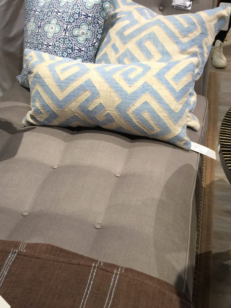
Named for the ruling clan of Kuba people, with their applied geometric patterns, Bunny's pillows are a nod to the celebrated tradition of women in textile design, but are made modern by the use of pre-softened 100% handwoven hemp.

This heroic bed with Greek Key meanders is made of hammered metal with hand-applied wrought iron finish.

This beautiful table has neoclassical references with graceful volutes supporting the tripod base. Hand carved with stylized coin details, it is hand-painted in a rustic light gray finish and has a dark gray, honed marble top.
Delightful tour of Bunny's new line and so enjoyed getting to hear her speak about it at one of the seminars.
Theodore Alexander
www.theodorealexander.com

The texture in this vignette stopped me in my tracks. I could so see this for a masculine bachelor pad. The panelled wall, textured glass pendants and gold vases on the unique stone side table gives off such a moody feel.

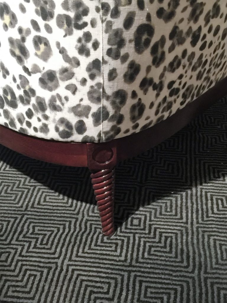
These spiral legs layered with a rich dark gray and black rug compliments the chair fabric beautifully.

I am always on the look out for interesting side tables like this. Silver base with a wood top adds reflective light to a room and can instantly brighten it up and break up all the wood that tends to be used for side tables.

I saw so many stunning chandeliers. What I love about this one is the metal and acrylic combination. Also, the reflection that this chandelier puts out on the ceiling makes it even more dramatic and creates a bit of romance. Everyone needs a touch of romance, right?
Century Furniture
http://www.centuryfurniture.com

This geometric fabric combined with a geometric rug is paired together perfectly. This texture combination sets my soul on fire.

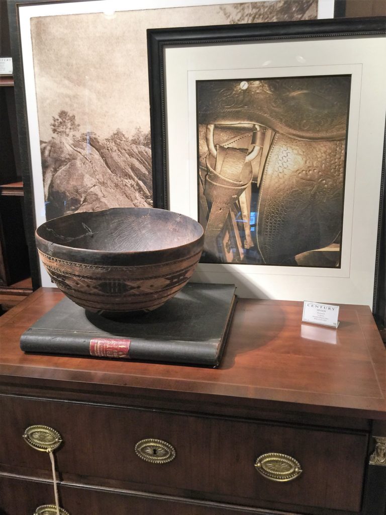
Century Furniture definitely knows how to create vignettes with a collected look, just like I like it. Pottery, stone, metal, glass and a pop of the outdoors to make the space come alive.

See how adding a tribal bowl in combination with this traditional furniture,makes is become more transitional.
Ruthie Tip: If you have some traditional furniture pieces in your home and you are feeling like you want a change, you don't have to get rid of them. To update your space, add in some accessories to break up the traditional vibe and it will transition the look into a more transitional look.

Stone and metal combination. Isn't this gold crocodile accessory cool? Great conversational piece for sure. 
A great bar cart with a mirrored top. Love the contrast with the white and metal.
Eastern Accents
http://www.easternaccents.com

Warm fuzzy rug with a skirted table.

Pillow with metal buttons. A fun unexpected touch for a decorative bed pillow.

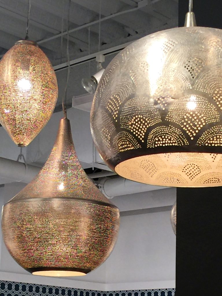
These Moroccan pendants caught my eye immediately. Again, I love the pattern they put out on the wall. They remind me of the ones I have in my outdoor cabana.

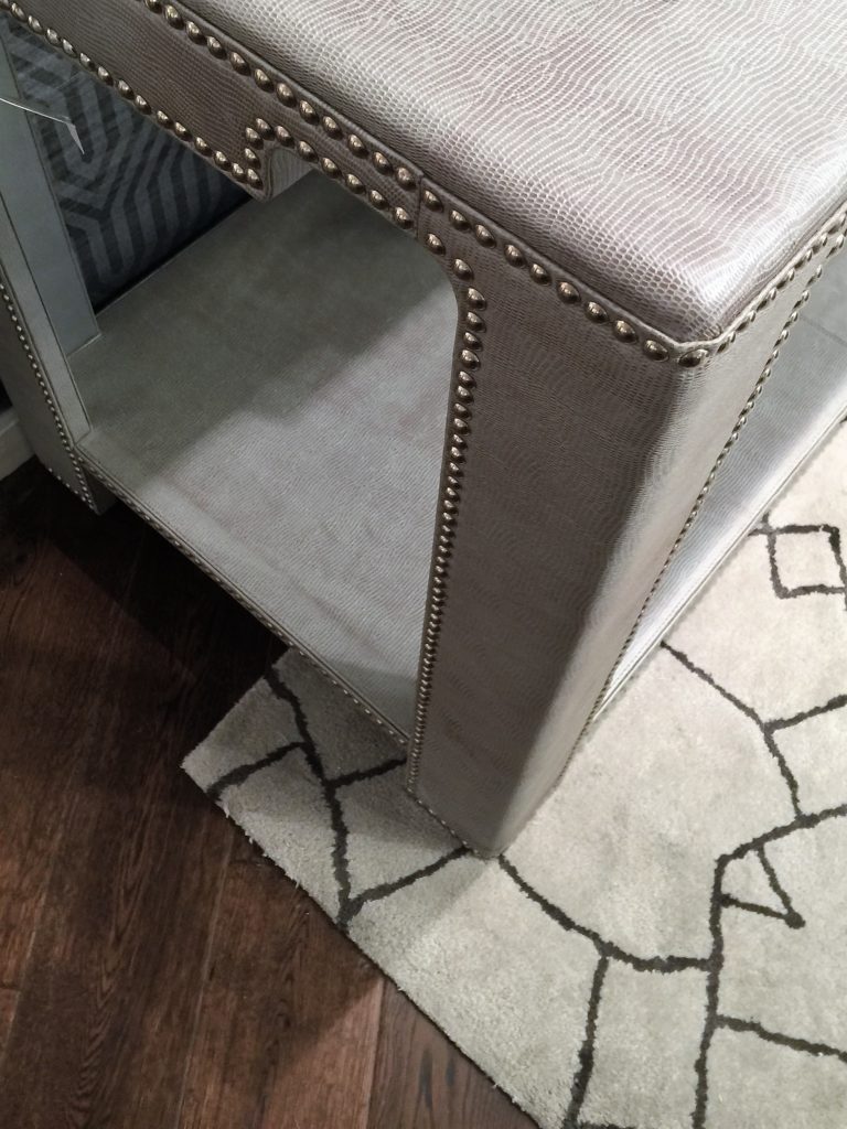
I love upholstered furniture, especially console tables. This one stopped me in my tracks. They add such a softness to the space.

Embroidered pillows are a great way to add texture to your bed! So elegant and sophisticated. Wallpaper is still everywhere too! I love how wallpaper can take a room to the next level, even if you just have one wall done.
Rachel Ashwell
www.shabbychic.com

Rachel was the first to come out with the Shabby Chic look. Her new line is filled with "shabby texture" all inspired by antiques and flea market items that she has loved over the years. The mix of old rugs with ruffles adds a casual comfort which is what she is known for.

She is known for her white shabby chic aesthetic. However, her new line has touch of colors including raspberry and teal.

Her goal was to create a furniture line with an authentic vintage feel.

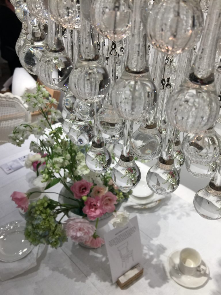
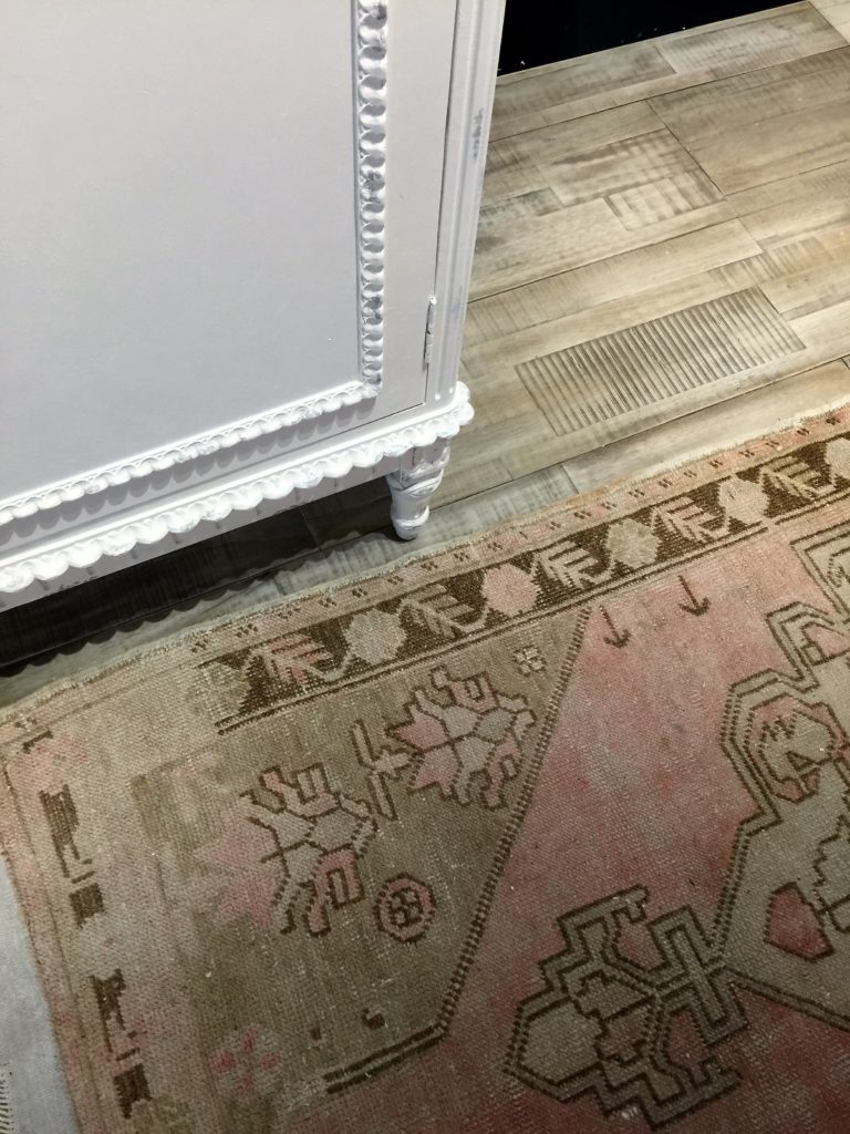
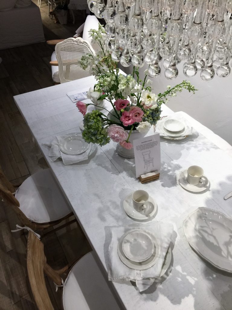
Love the collection of textures she incorporates together. Crystal, cotton slip covers, chippy paint, crystal hardware, lace lampshades, china plates and vintage rugs. All so different but make a beautiful combination.

Joybird
www.joybird.com

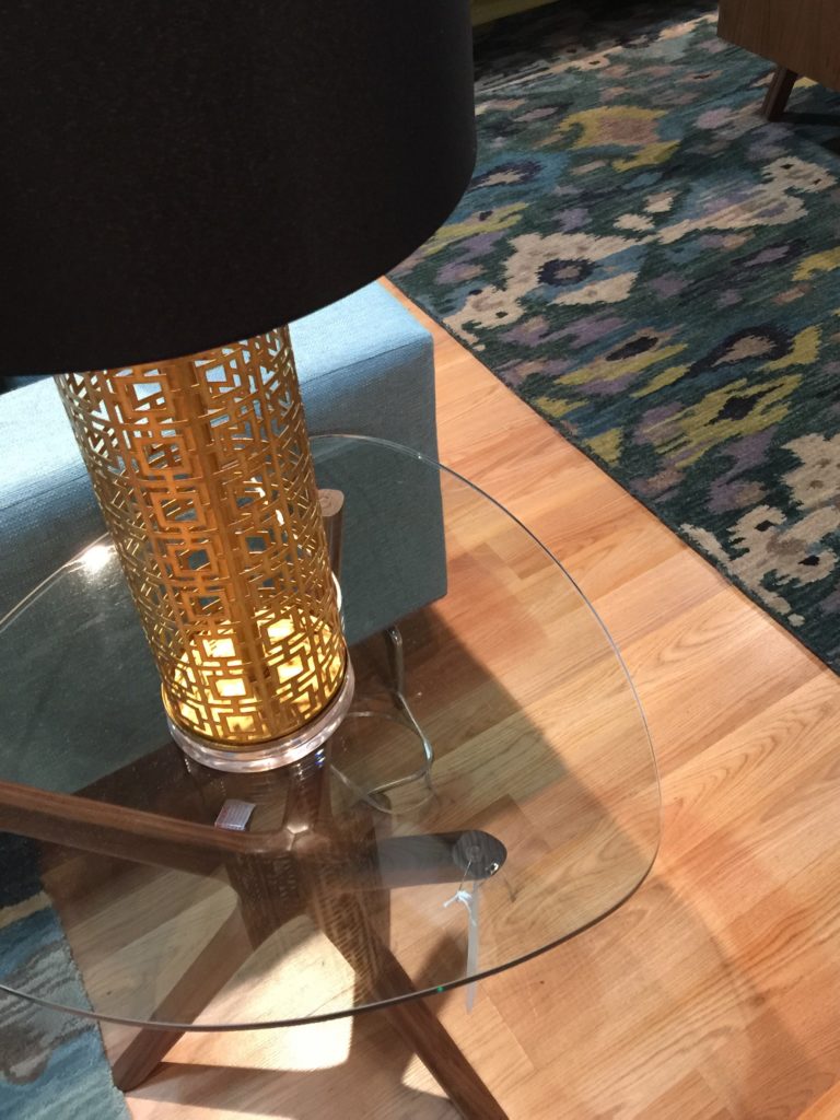
Glass and wood side table paired with a brass geometric lamp is lovely.

Love how they paired two coffee tables together that are different in texture but the same size. Note the rug, isn't it fab?

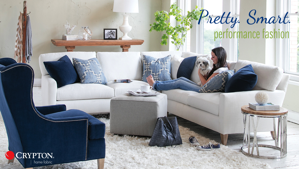
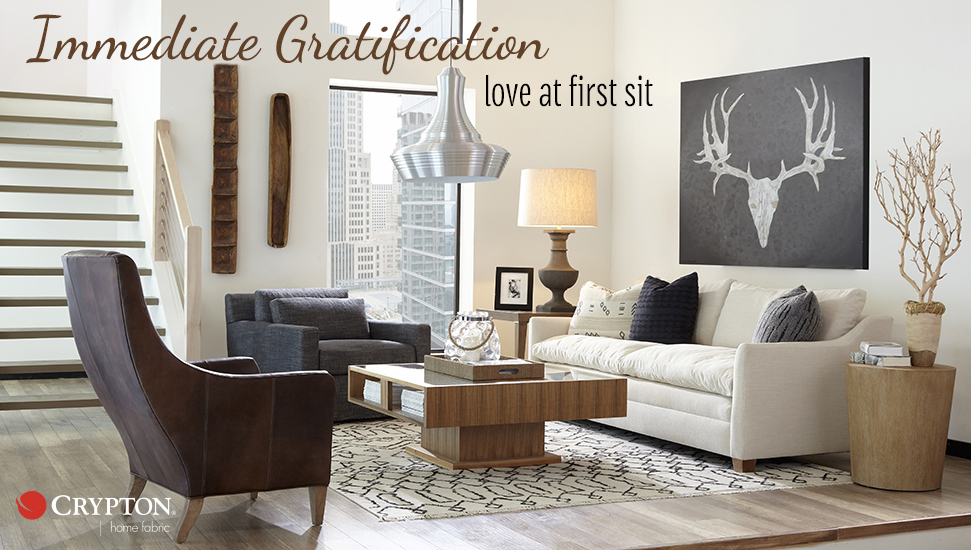
Fun, playful and textured pillows can make a sofa have more character. I'll be posting soon about Crypton and their fabulous family friendly fabrics.
Universal Furniture
www.universalfurniture.com

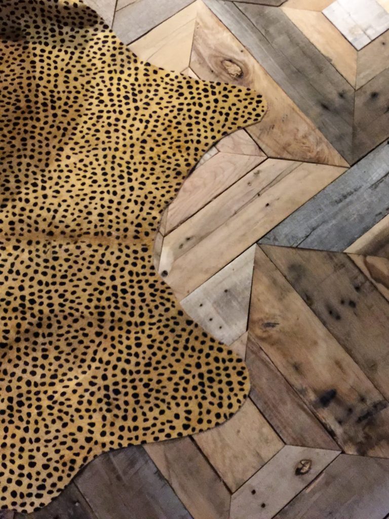
Cheetah print rug on top of rustic floors said hello to us as we entered.

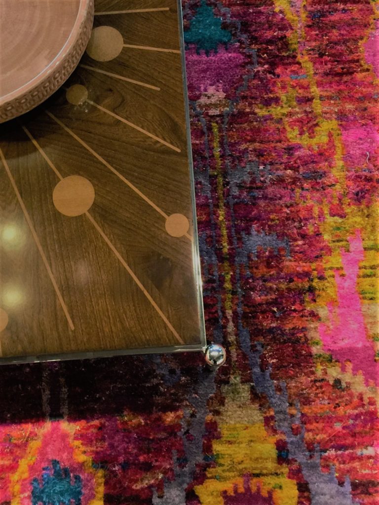
Colorful rugs combined with wood inlayed coffee tables.

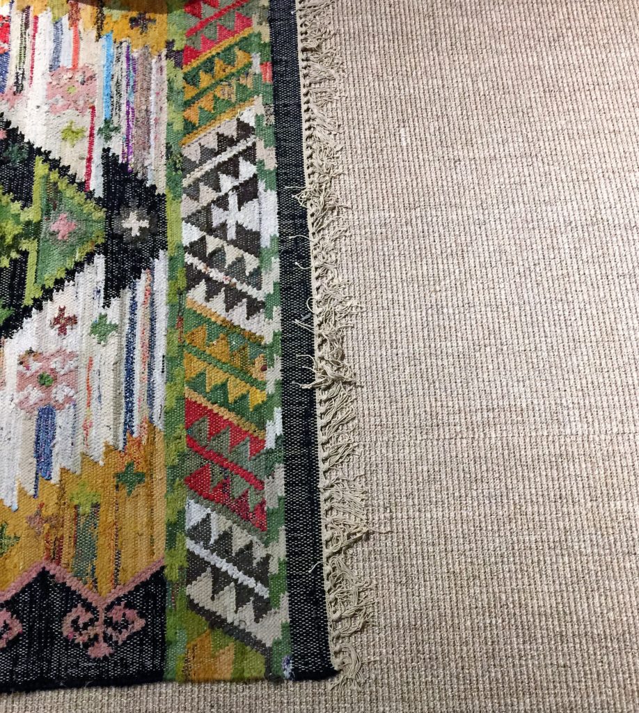
I saw lots of rug layering which is a great way to add warmth to a room.

Love this collection!

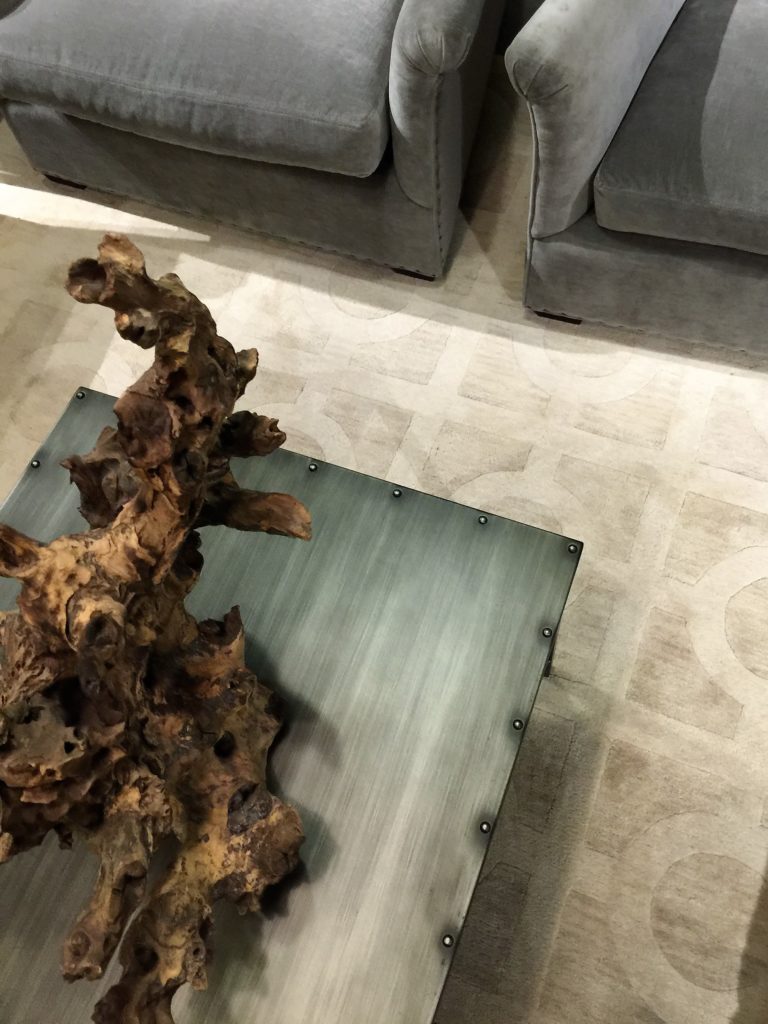
Driftwood on top of a metal table.

Amazing console with a wavy metallic finish.
Huntington House
www.huntingtonhouse.com

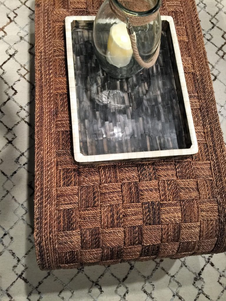
Wicker coffee table paired with a patterned rug and pearl inlayed tray.

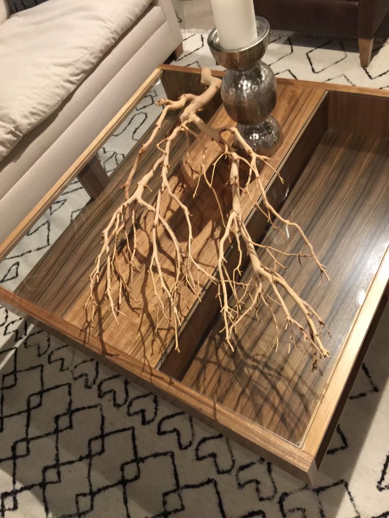
Branches placed on a tray, easy, easy and adds big drama.

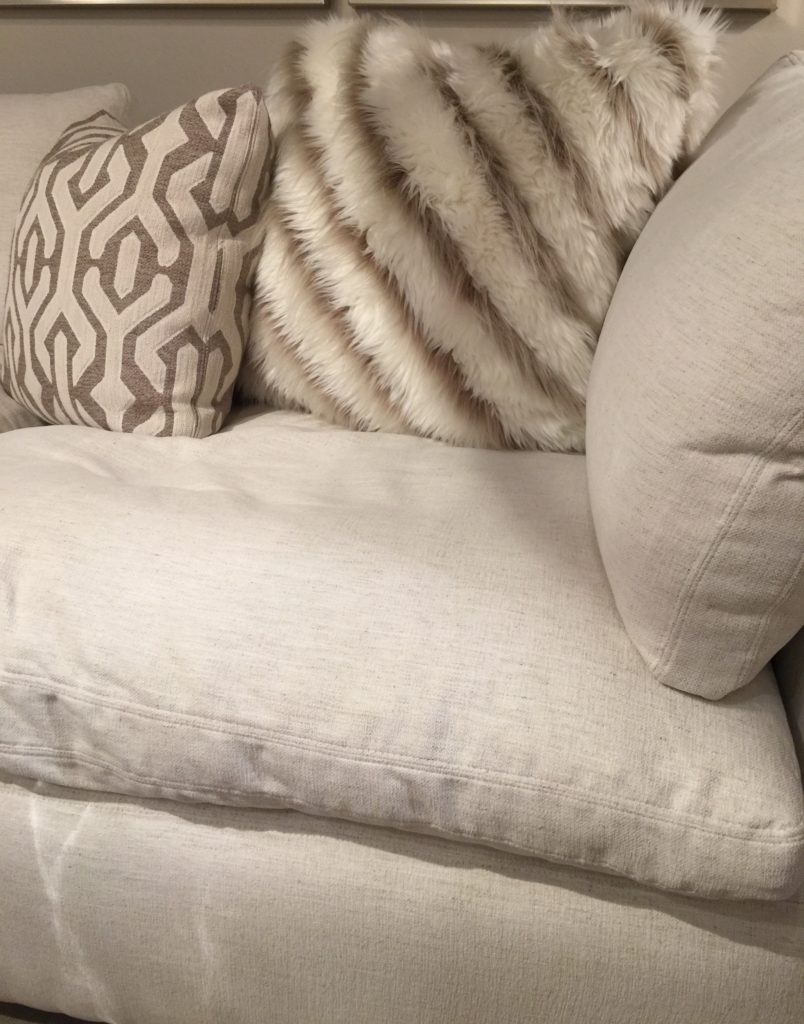
Everyone loves a fuzzy pillow, especially this design!

Leather and gold, yes!

Wood, silver and acrylic!
Artefama
www.artefamafurniture.com

Artefama Furniture makes furniture that resembles art. Art influenced by Italian, Spanish and German craftsmanship. Their platform bed caught my eye and I imagined myself in a tree house. Especially with the wooded backdrop. It brought the glamping out of me!

Their tables are all handcrafted and they have lots of finishes you can choose from.
Ruthie Tip: You don't have to have matching chairs with your table. Mix the finishes to create a more transitional look. #texturelove

The M/T Company
themtcompany.com

Suiting fabrics mixed with a touch of glam is always a winner.

Hello beautiful, so interesting.

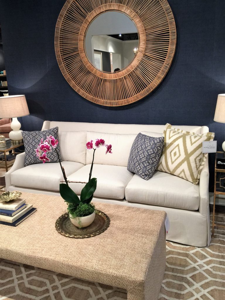
A basket mirror and a coffee table wrapped with loads of texture.

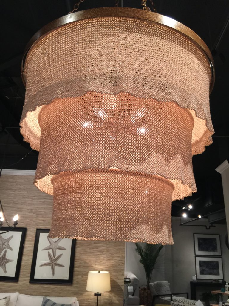
Very different chandelier and could be the one thing that makes a formal space more relaxed.
Ruthie Tip: When a formal room feels stiff and too staged, nobody uses it. A casual chandelier could be the one element that makes it feel less stuffy and more inviting which makes people use the space more often.
Nathan Anthony
www.nafurniture.com

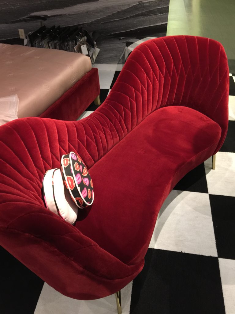
Velvet is definitely a texture that is in full swing. Just look at those curves and talk about texture!

Tufting is still in full swing as well.

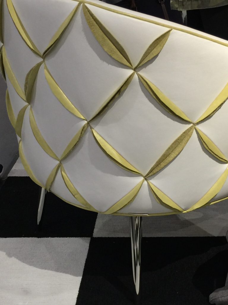
The Dali chair was my favorite because of the citrine leather petals. Gorgeous detail and would be the star of the room. The backs of chairs should be attractive right? Also, the legs on these chairs are so sexy.
Emporium Home
emporiumhome.com

Ashley Childress and her husband started their collection and it is inspired by her husbands love for geology. They have loved quartz and stone before the trend actually started. Just look at those knobs on that dresser.
Ruthie tip: If you have a dresser that needs to be dressed up a bit, add new hardware! It changes the entire look instantly.


Bold, glamorous and beautiful.

The texture in this showroom was spectacular. That agate sconce and fuzzy pillow made me want to touch and feel instantly.

My favorite piece was this console that was bone and mother of pearl. What a statement this would make in an entry!
That's a wrap! I'll be posting some more thoughts later on but hope you enjoyed my post.
As an entrepreneur, my philosophy is that you have to keep learning new things. If you plan on being successful in your industry, staying fresh and informed is crucial. As an Interior designer, I need events like this tour to keep me inspired so I can keep creating new designs that look fresh and new.
I heard a quote once:
"Input is the key to output"
and that is so true.
