Spring Fever Decorating

 
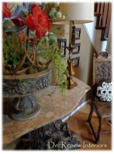
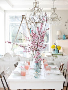
I've got spring fever and I'm going through my house and cleaning out and changing around like I do every year.  It's usually around my birthday that I start to get the feeling that I need a change.  I've moved some things from room to room and spruced some thing up a bit.  There is something about  open windows and sunshine that makes me feel like it's time for change.
 
 
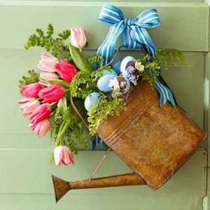
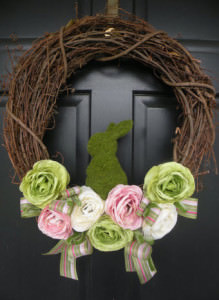
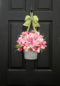
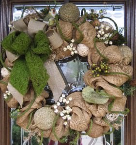
I made a new spring wreath for my door with items I had in my "extra's" bin for floral arrangements.  I love "using what you have" to make some beautiful.
 
 
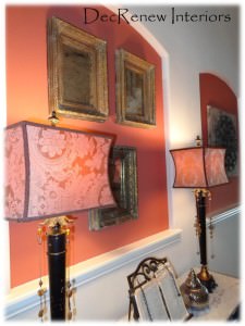
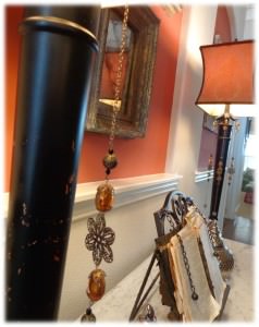
Moved some lamps around from other rooms and have gathered some things for my daughter's garage sale we are having in a few weeks.  She is raising money for her missions trip this summer and I love knowing that the things I no longer need can raise money for her to experience this wonderful opportunity in another country.
 
 
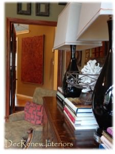
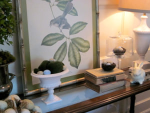
I also added added some new books here, there and everywhere.
 
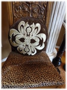
Recovered my little chair that is in my entry (below) with a new hide I found at an antique store.
 
 
I always enjoy change, even if it's in the small things.  It's a new beginning and I'm passionate about that!  This weekend I'm going to work around my pool and plant some flowers.
 
Creating luxurious, relaxed homes where family and friends can gather.
 

Visit my website, DecRenew Interiors to see my Design Portfolio and book your consultation today.


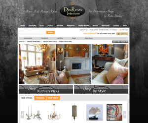
Shop Online at DecRenew Interiors

As some of you know, I've been working on getting an Online Store ready.  I'm happy to say that it is up and ready to go today!
 
 
You can shop for a variety of things for your home.  Everything from lamps, rugs, artwork, accessories, furniture, mirrors, etc.
 
 
I often get asked, "where do you shop?" and knew that it was a need for some of my clients that want to do shopping for themselves.  I can point you to items in my store and inspire you during our "Walk Thru" consultation and you can then shop away! 
 
Anyone can shop at my store and purchase directly online.
 
Make sure you check out "Ruthie's Picks" to see the items I LOVE and also see My Style!  I will have weekly clearance items and New Arrivals often!
 
 
HAPPY SHOPPING!
 
Visit my website DecRenew Interiors to see my Design Portfolio. 
 I'm known for creating luxurious, relaxed interiors on a budget!


House Beautiful in a day.

 
I always enjoy my ONE DAY installs.  My client and her husband just moved to their new home and hadn't a clue where to start with all of their decorating.  They were consolidating homes and had a bit of this and a bit of that and a lot of wonderful collections too!  They hired me to "use what they had" to make their home beautiful.
 
 
I met with them for a "Walk-thru" consultation first and I helped them select paint colors for certain rooms.  I then took an inventory of the items they had and made a list of some accessories that we could add to their mix to make the final reveal look more complete.  Doing "One Day" installs is one of my favorites, it's my passion!  I want everyone to be able to have a beautiful home and it doesn't always mean purchasing ALL brand new items.  Mixing it up and adding some creativity to your home is what makes it personal! 
 Isn't that what Pinterest is all about these days?
 
 
On the day of the install (a week later) I made them leave for the day (so they could be surprised) and we got to work!  Half way through the day, I heard the front door open and it was my client, she couldn't wait and wanted a peak....I immediately told her she wasn't allowed to peek :) and sent her on her way :)  She was just so excited and thought I'd let her see a glimpse into what we were doing.  I was just as excited :)
 
BEFORE
 
 AFTER
 
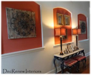
My team and I went through each room and pulled things from other rooms, shopped in closets, the garage, and even the patio.  We also placed some new items (lamps, accessories, pillows, wall art, mirrors, etc.) as well.   These three niches are something you see a lot in new houses. I don't like them because they limit what you can do and make new homeowners that don't have a clue about decorating even more frustrated!


I recommended they paint the insets Sherwin Williams "Foxy" to go with their rug and other furniture they have in the house.  In the past, I've wallpapered, faux finished, tiled with a metallic pearl tile, stenciled, etc. but for these niches it was more cost effective to paint them.
 
 
The  homeowners had a formal flair to their decorating style and I suggested that we break that up a bit. Adding old and new items, formal and casual, makes a room feel a lot warmer and more inviting.  I want rooms that I decorate to be spaces that people actually go in and enjoy!  Their house needs to have "lived in" spaces not just "for show" rooms.
 
 
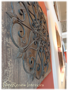
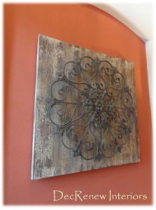
Adding the rustic panels to two of the niches added the casual, comfortable, rustic flair.  For the middle niche, I added three antiqued & distressed mirrors in gorgeous frames.  They look really stunning with the  buffet lamps I purchased for them.  
 
 
Their family Bible that has been passed down for generations was placed between the lamps because that is the one thing the homeowner really wanted!
 
 
BEFORE
 
 
The dining room was painted a wonderful sage green. 
 
AFTER
 
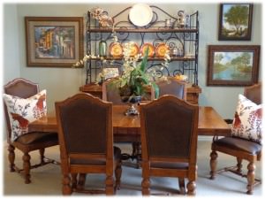
I took a leaf out of the table as it was way to big for the room.  The leaves can be added with no problem but for every day, it needed to be smaller. 
 
 
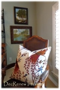
I grouped special artwork that was done by family together on one wall.  I added a few embroidered throw pillows for color (the same red that is in the entry niches) and they made this dining room come alive and united this room with the entry.  An "all natural" arrangement added to the table and it looks fresh and updated now. It brings me great joy when I can incorporate things that have special meaning to the family.
 
 
I spruced up their family room too.


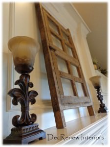
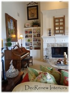
I found this old window in their garage and decided it would be beautiful on their mantel.  Again, breaking up the formal feel and adding a bit of character and "old world" charm.
 
Rearranged the bookshelves and added some height to the room with artwork and wrought iron.
 
 
The butler pantry got a new look with her collection of baskets.  We hung them on the wall because they are all so beautiful and did not need to be hidden in the closet.


The Master Bedroom got an animal print throw pillows to add to the mix and broke up the "matchy matchy" of her duvet set.
 
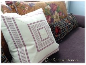
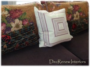
 The couch back pillows were getting worn and had lost their form so I got rid of those.  I then took the floral bed pillows off their bed and added them to the couch and I  must say it looks wonderful. I made a nice quiet reading/chatting space for the couple to sit and have coffee each day together.
 
 
It's amazing how a few throw pillows can "update" a space instantly.
 
 You have to have those things that are special to you close to you.  Placed this treasure on "HIS" side, so sweet and obviously hand made with LOVE!
 
 
The baby room got a few throw pillows and we moved things around a little.


The upstairs rooms got some freshening up too.  Their children come home a lot to visit so they wanted them to have some personality based on what each child likes.  Again, we "used what they had" and made it work beautifully. 
 
 
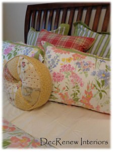
Ruthie's tip:  If you buy a "bed in a bag" mix it up with other pillows so it isn't so matchy.  I brought in the plaid pillow and the round pillow from another room and it happened to work perfectly.  It isn't always that easy but buying a few pillows that didn't come with the set is a great way to mix it up.


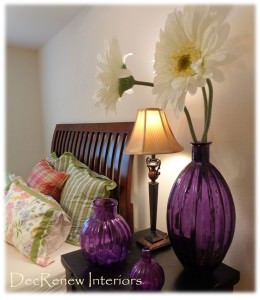
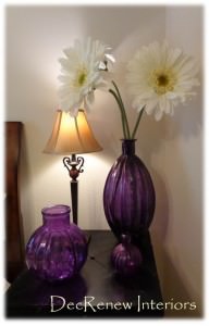
Found the large flowers in another room too and thought they deserved to be more of a focal point with these purple vases they already had.  I've made a shopping list for a few things the upstairs rooms need and will place them in Phase II of the project.
 
 
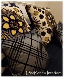
The pillows are stunning in the "Architects" room.


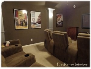
We had the theatre room painted a rich espresso and the columns got a nice silver metallic finish on them.  We hung new posters and this room is ready for the show to start!
 
 
It was a fun, exhausting but a very rewarding day! 
 
If you need help with your decorating, visit my website,
 DecRenew Interiors to see my Design Portfolio.
  Remodels, updates, one day decorating, hourly consultations and much more!

 
 
Follow me on Pinterest and be inspired!
 

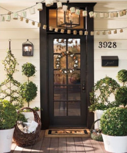
Ruthie's Easter/Spring Decorating Favorites

by:  Pottery Barn
 (Check out Pottery Barn's New Catalog, it has a fabulous new look)
 
Spring is seen as a time of growth, renewal, of new life (both plant and animal) being born.  We are all starting to think about Easter and the renewal that brings to our lives.  I love this time of year because we gather with our families and friends to celebrate the resurrection of our savior.   I love this quote:
 
"Our Lord has written the promise of resurrection, not only in books alone, but in every leaf in springtime." Martin Luther
 
Beautiful reminder as we watch things start to bloom and blossom.
 
 
Speaking of needing renewal, I've been diagnosed with Asthma which has put me in bed for a few days to try and get myself well after an ER visit and many, many breathing treatments.  Trying to figure out what triggers the attacks.  In the meantime, I'm looking at it as a time for rest and trying to appreciate that.  It's hard for me to sit still but I'm learning that it's necessary for our bodies to recover. 
 
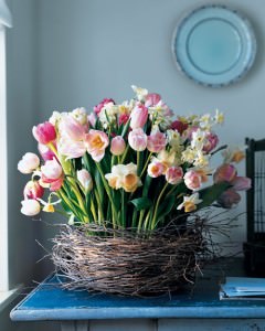
Martha Stewart Living
 
  So....what have I been doing while in bed?  You guessed it, catching up on Spring Ideas.  I've put together some images that are my favorites of the year.  For Easter, some like a formal table, some take their families to the park and some of us barbecue!  I've picked a few of my favorite Spring and Easter decor ideas to get your ideas flowing while you plan for this special time.  Thought I'd save you some Pinterest searching time. 
 
If you don't follow me on Pinterest already, click the link and start following me.  I'll do all the work for you and find the most inspiring images out there being pinned.
 
 
by: Focal Point Styling
 
Painted metallic eggs - Love this look.
 
 
(by  Focal Point Styling)
 
My absolute favorite color combinations!  So refreshing for a new spring color combination, instead of pink and green.
 
Here are some other amazing ideas from Pinterest for eggs.
 
 
White Sharpie!  Just imagine what else you could do with these color!
 
 
Decoupage with tissue paper!
 
 
Black Chalkboard Paint brilliance.
 
(by Dreamy Whites)
 
Love the Pink and White!
 
 
Classy Spring decor from Houzz.com
 
 
Gorgeous color combinations with a pop of mossy green.
 
  
Whimsical
 
 
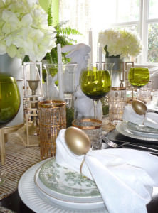
Perfect setting for a Spring brunch.


Cute as could be!
 
(Pinterest)
 
I posted this picture last year and still love it!
 
(Pinterest)
 
 
I love this collection of pink and yellow pots with a variety of potted plants.
 
(Houzz.com)
 
I have an umbrella, I'm totally going to do this!
 
(Dreamy Whites)
 
Fresh picks from the garden.
 
 
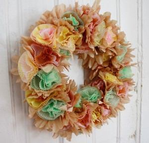
Wow, cupcake paper cups.  Very creative.
 
(I love when blogs or websites watermark their pictures)
 
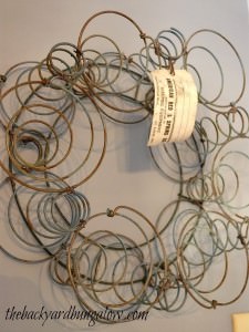
Spring into Spring with vintage bed springs. 
 
Tidymoms.com
 
These bunny cookies would make any tummy happy.
 
(Pinterest)
 
Burlap and moss is still all the rage this year.
 
 
but....my question of the day is, what do you think about this mesh ribbon?  I'm not that crazy about it but it seems to be everywhere in the crafting world.  I'd love to hear your personal opinion in my comments feed.
 
(Etsy.com)
 
Check out this link Midwest Living for some more wonderful spring ideas.
 
Happy Spring Everyone!
 
 
Follow me on Facebook to get weekly ideas to inspire you.
I'm known for creating luxurious and casual homes on a budget. 
 Bringing Family back home.  Visit my website see my portfolio @ DecRenew Interiors
 

Masculine Living Room Makeover

Yesterday I finished up a living room for a bachelor.  His home was in desperate need of warming up and most certainly didn't feel like a home.  It was a fun process and he did so well trusting me every step of the way! His mouth was wide open during the reveal and he kept saying "I just can't believe this is my house, it looks so different."
 
We definitely warmed up the space and made it very sophisticated and classy, within his budget.
 
BEFORE
 
 
AFTER
 
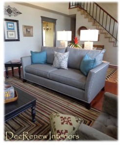
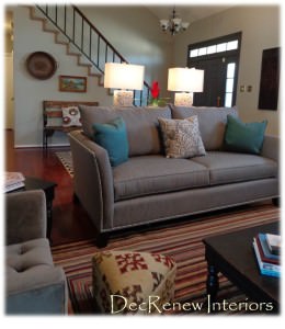
We painted the walls a soft gray.  We then painted the fireplace surround and the molding around the doors a rich darker gray that showcased the fireplace and doorways nicely.  I'm totally in love with this rug!
 
 
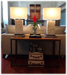
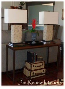
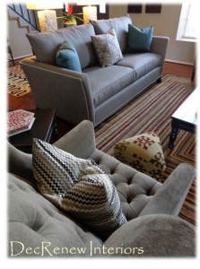
We added a new couch and 2 chairs.  Moved the existing set to his game room upstairs.  We added a clean console table behind the couch and accessorized it.  It is the first thing you see when you walk into his entryway and gives some separation to the spaces. 
 
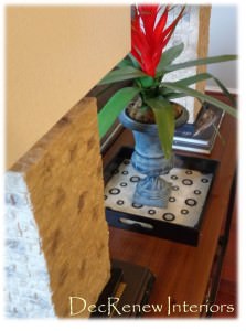
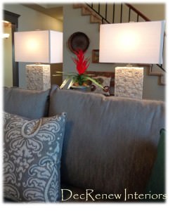
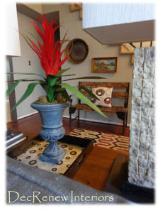
The stone lamps give incredible texture and add an instant masculine touch.  The red floral arrangement in the metal urn is so eye catching, yet simple.
 
 Old books and stacked suitcases fills the space underneath the console table and is a great place to keep misc. items that need to be stored away.  I also wanted the lamps to be a little higher so I stacked some coffee table books underneath each of them and now they are the perfect height.
 
Ruthie Tip: Take the covers off books to give them a more shophisticaed look.  Some book covers are too vibrant but without the jackets they can look better :)
 
BEFORE
 
 
This wall was off balance and needed something tall and colorful against this huge wall.
 
 
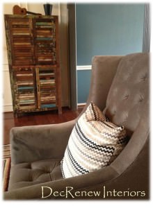
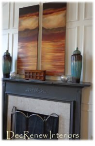
I found this wonderful rustic cabinet and it had all the colors we used for the entire space.  It was perfect to balance out the fireplace. The lovely paintings were down by a local artist here in Grapevine.  Mary Howe, with Divine Inspirations is an extremely talented artist. We commissioned her to do this set for us and she did a beautiful job.   They are so colorful and add the warm earth tones to the room.
 
You can see the dining room to the right that we painted a wonderful blue.  We have incorporated that blue with small splashes in the living room, including a touch of the blue in the paintings.
 
 
The two little Kilim footstools really add a nice eclectic feel to the room.
 
 
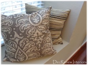
The side chairs are incredibly comfy with all their tufting and I loved the down filled gray and black chevron  pillows I placed on each chair.
 
BEFORE
 
 
His coffee table and end tables were really dated as they were but I had them painted a distressed black.  Now they look amazing in the room and it allowed us to stay within his budget.
 
He had the rug and it was my inspiration for the color palette for the room.  The couch is a rich gray and resembles a man's suit.  It just seemed to perfect for this gentleman.
 
It's comfy too and my client made sure he tried it out by lying down on it in the showroom :)  We also painted the inside of the front door to match the doorway trim. It really made a huge difference to the entry look.
 
The pillow on the bench in the entry looks so amazing with the kilim ottomans. 
 
  Phase II for him will be new lighting and draperies.
 
 
Large chess pieces on top of stacked books and a stone candle holder placed in a wooden bowl, add charm to the newly painted black coffee table.
 
BEFORE
 
 
The entry had no personality at all and the banister looked dated.
 
AFTER
 
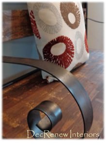
Our budget didn't allow us to add wrought iron spindles as we would have liked so instead, we had the railing painted black and stained the oak banister a darker walnut.  It instantly made the entry come alive and it now looks sharp and has some personality that's for sure.
 
 
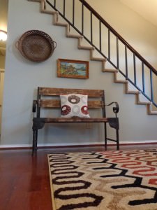
 The little rustic bench coordinates with the colorful cabinet we added next to the fireplace.  I hung an oil painting that his mother painted for him above the bench and thought it looked really nice with the basket, adding unexpected color and some history and charm.
 His mother's painting is now showcased as sentimental art should be.
 
BEFORE
 
 
AFTER
 
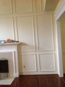
Doesn't the mantel surround look so much better?  The tile shows up beautifully now and before you hardly noticed it up against the white fireplace.
 
 
 Ruthie Tip: When hanging art on picture frame molding, I always ignore it and place it where I think it should go.  If you try to place it inside the molding it usually looks out of scale and awkward.
 
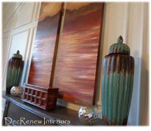
Two large ceramic jars and some other misc. accessories and it has now come alive.  This old box I found at an antique showroom is so charming and is great for storing pictures or maybe even cigars?
 
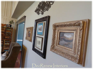
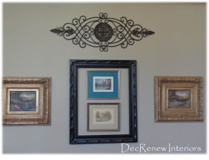
We decided to do a small gallery wall with some beautiful framed art collections and topped it off with a wrought iron medallion. 
 
 You have seen me use frames within frames before but I loved how this collection turned out.  I brought in the blue from the dining room on one of the mats. 
 
 
 The vintage men's pocket watch art, framed in these brushed gold traditional frames are perfect with all the textures and colors I've included. 
 
 
You can see that I've included, rustic, traditional, modern and eclectic all in one room and it works!
 
The tray really looks amazing with the pattern combinations we have incorporated.  Layering accessories is what makes a space come together so nicely.
 
Hope you enjoyed this tour of before and after photo's during this install process.
 
On another note......
 
I spent the weekend celebrating my oldest daughter's 16th Birthday!  Where has the time gone?  I surprised her and had this beautiful cake made by Kimm's Cakes.
 
 
It was gorgeous and most delicious!!!  If you have a need for a cake in the near future, she is the one to call.  We had the strawberry and it was out of this world amazing and moist.
 
I just landed in Los Angeles for the Design Bloggers Conference this next week. I'm excited about being around others who love Design and look forward to being inspired!
 
 
I


Do you want a luxurious  home where you can gather with friends and family?  Call Ruthie Today!