Kitchen remodels are always the hardest on my clients. It totally disrupts every day life. However, these clients were READY TO GO!
BEFORE
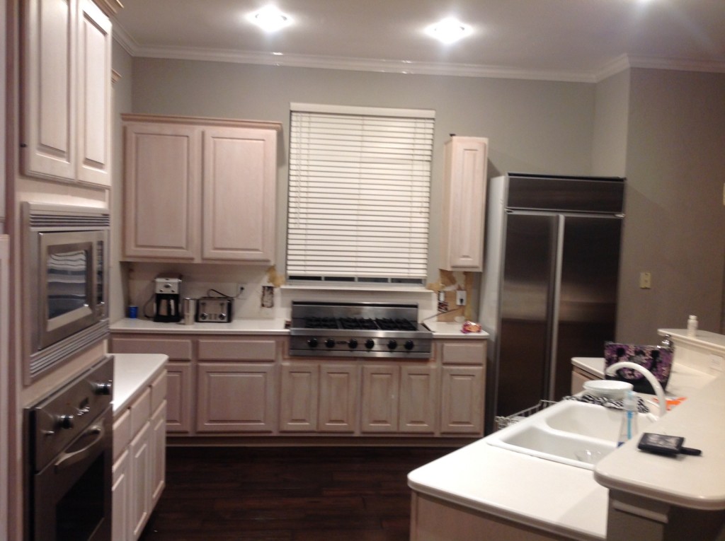
As you can see, the homeowner started the demo in the above picture but that is about as far as they got with this remodel. The fun thing about this client is that I have decorated other rooms in their home so I am very familiar with their style already. They wanted a dramatic kitchen and truly trusted me to make that happen (so honored that they trust me) I recommended that we paint the cabinets a dark navy and they were SO EXCITED and asked me to take it from there!
AFTER
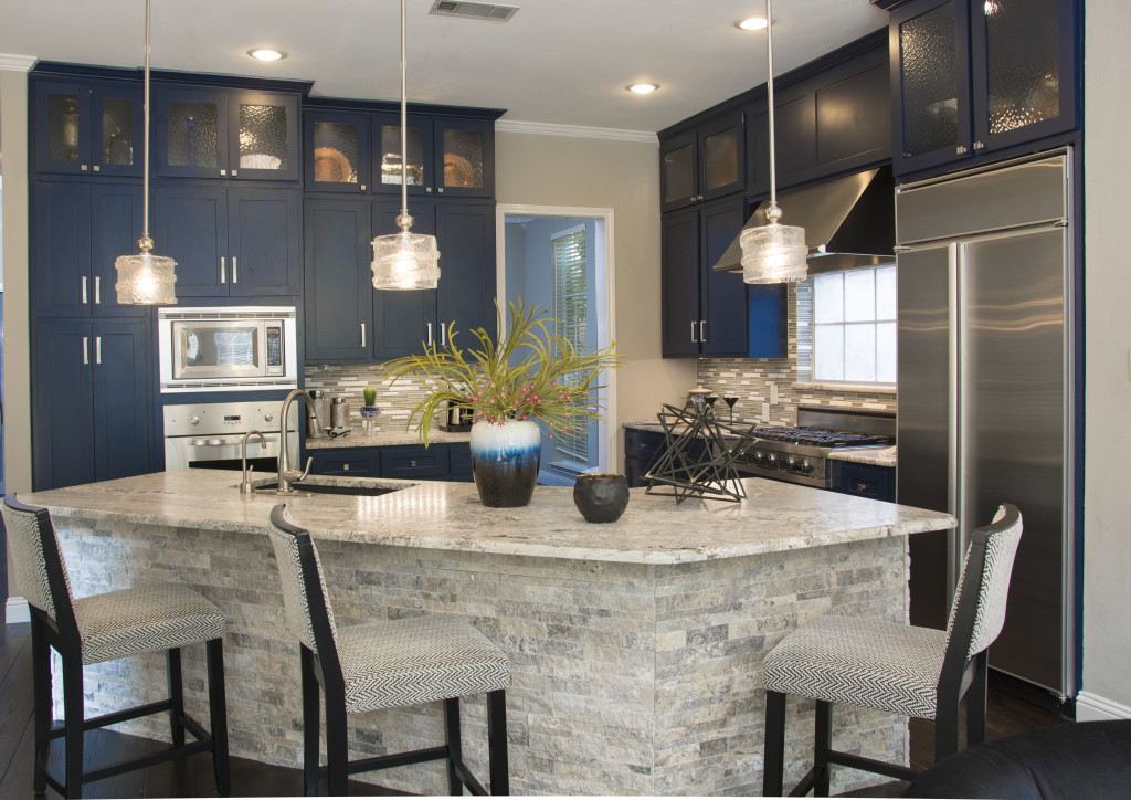
As you can see, even though we painted the cabinets a dark color, it didn't make the kitchen feel dark at all. With the bar all one level now and the light granite and stacked stone, it feels very open and light. The adjacent eat in dining area has lots of light pouring in too so that helps. As a decorator, I choose colors based on the space and what is going on in the room and surrounding rooms. Color is tricky and it is very important you hire a professional to help you choose just the right color for your space. The color that is right for this kitchen may be totally wrong for your kitchen.
BEFORE
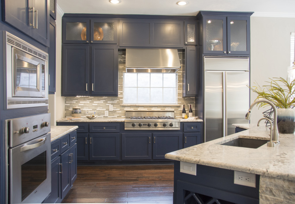
We added glass front cabinets to the top of her existing cabinets and refaced the doors to give them a more modern style. No need for brand new cabinets if the bones are good already. All the cabinets got pull out drawers put inside them which makes the kitchen much more functional. We kept the existing oven, stove and the client had the vent-a-hood already that she wanted us to work around.
The wood floors were replaced during our PHASE I last year. The granite was leathered to take away the shine. It really is amazing in person.
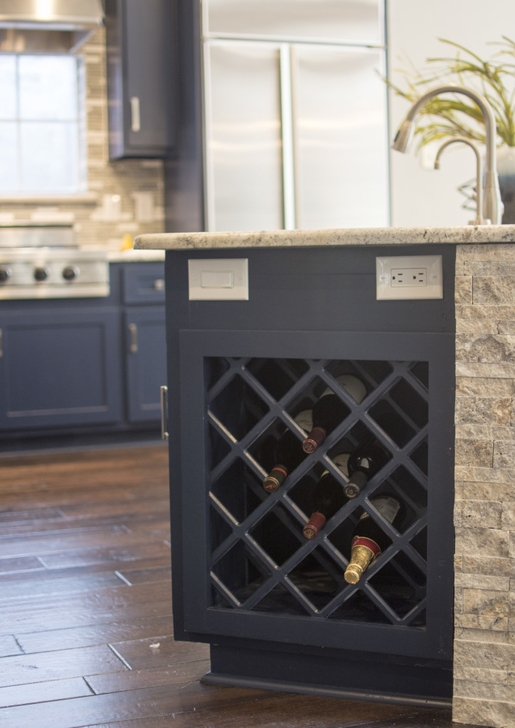
They had some cabinets that were not being used so we made them a wine cabinet to store their wine.
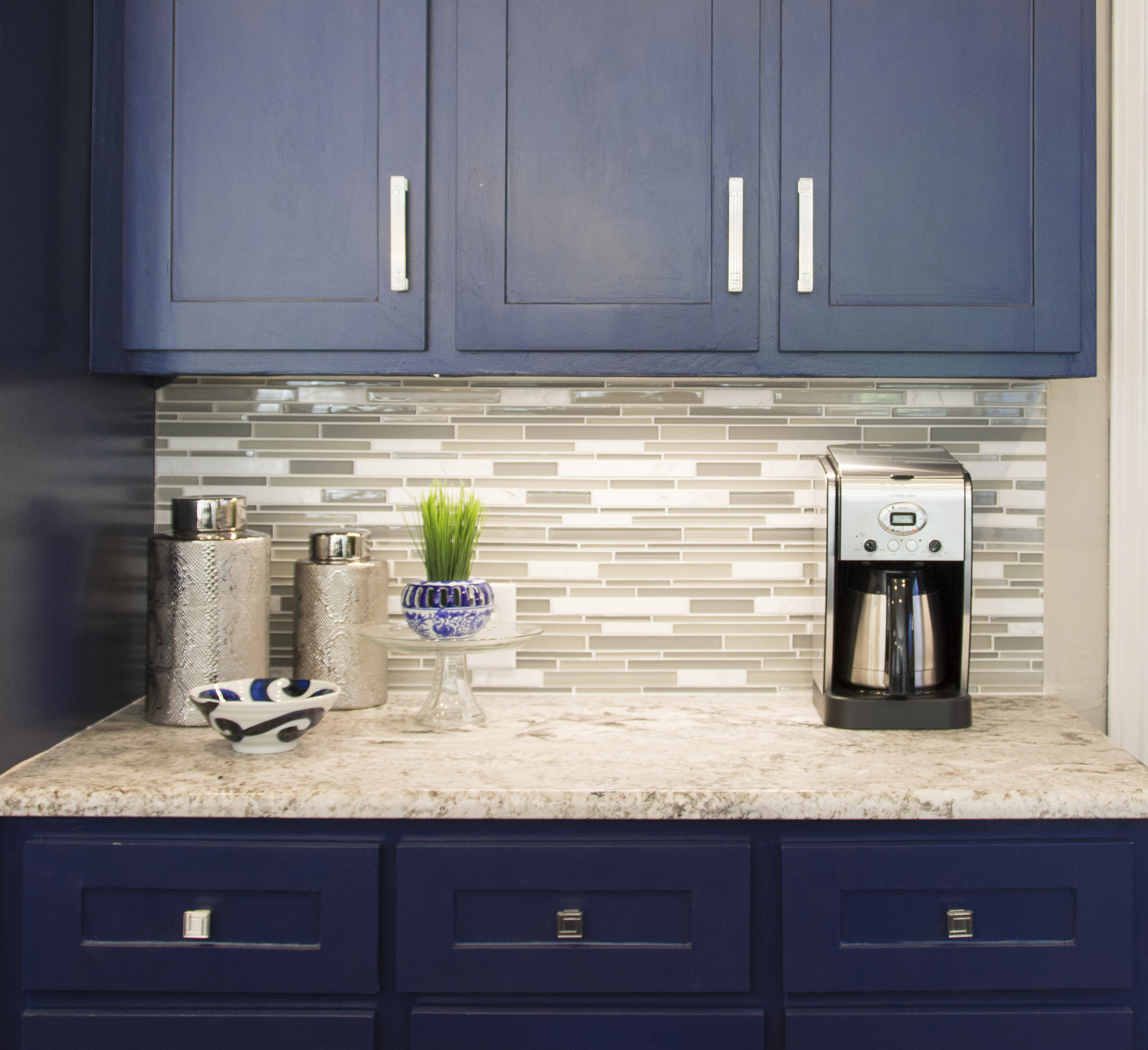
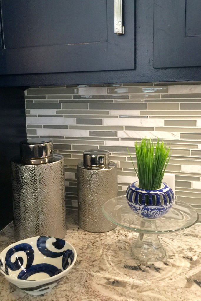
New backsplash and hardware and it turned out gorgeous! Hardware is the jewelry in the kitchen. Don't skimp on your selections, they can make your kitchen have so much style. They are not cheap but if you are wanting your kitchen to look classy, do it right!
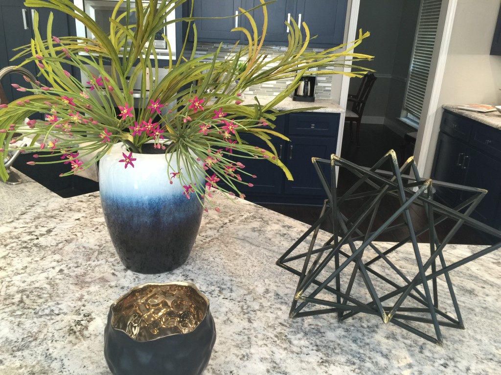
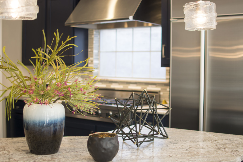
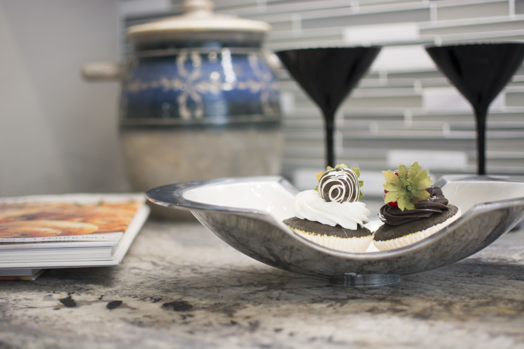
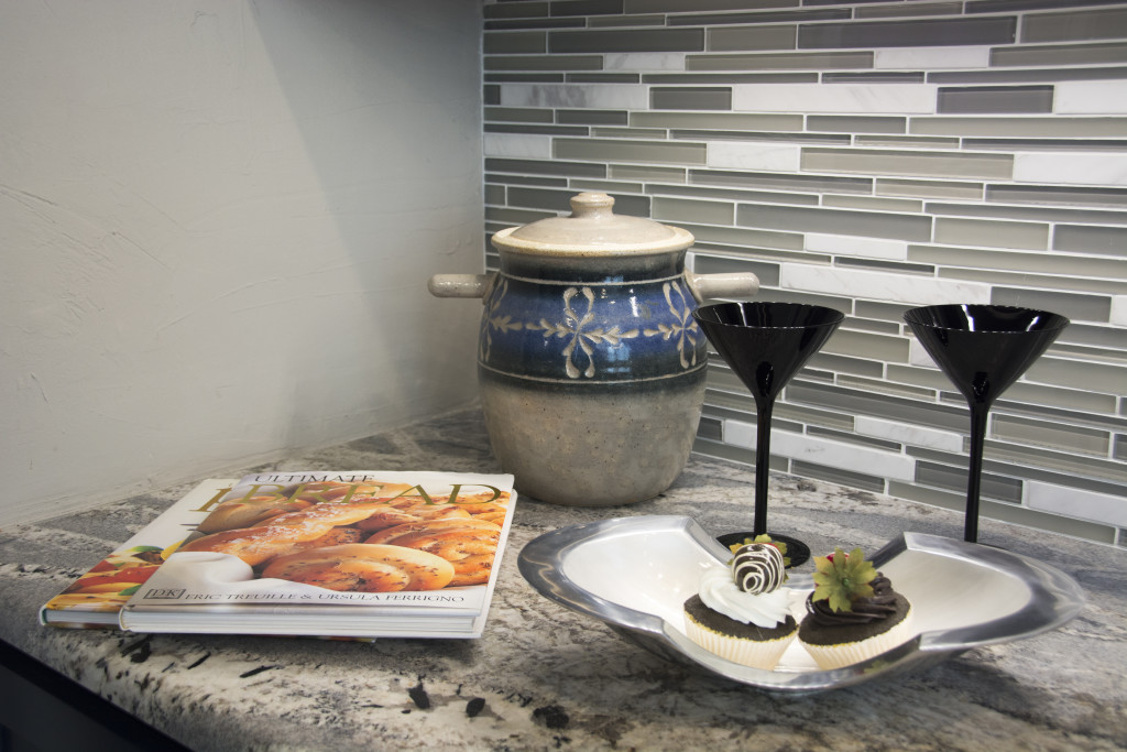
New accessories for the counter and it was a wrap.
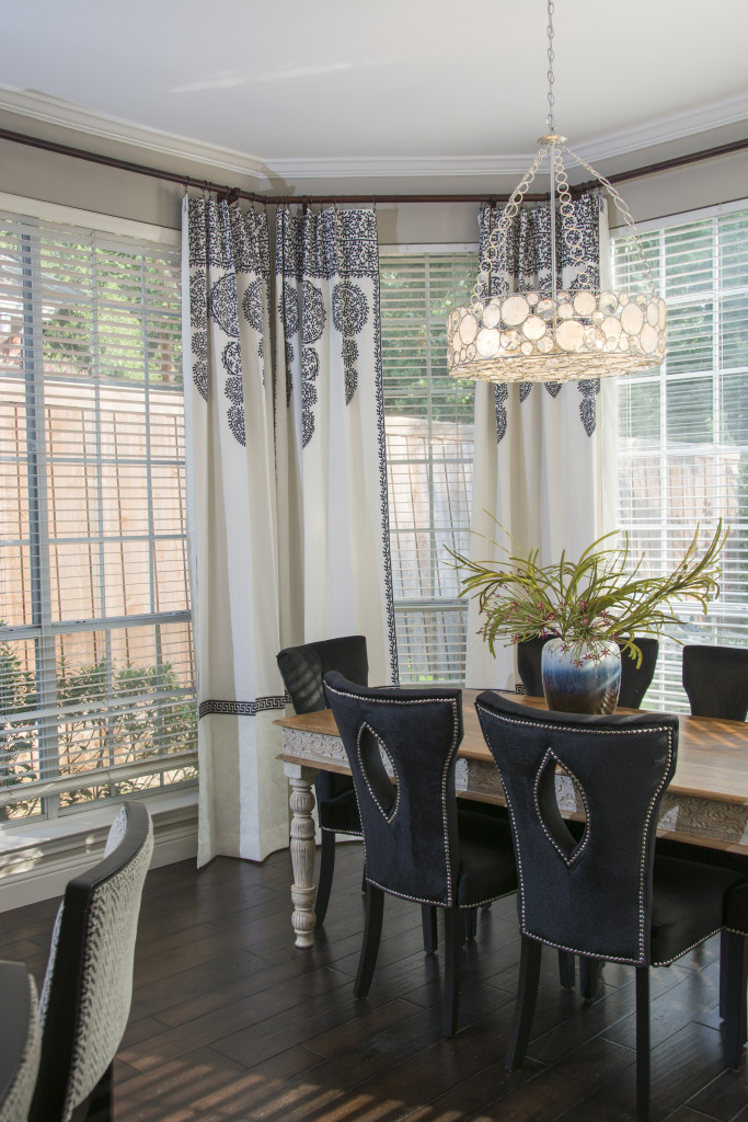
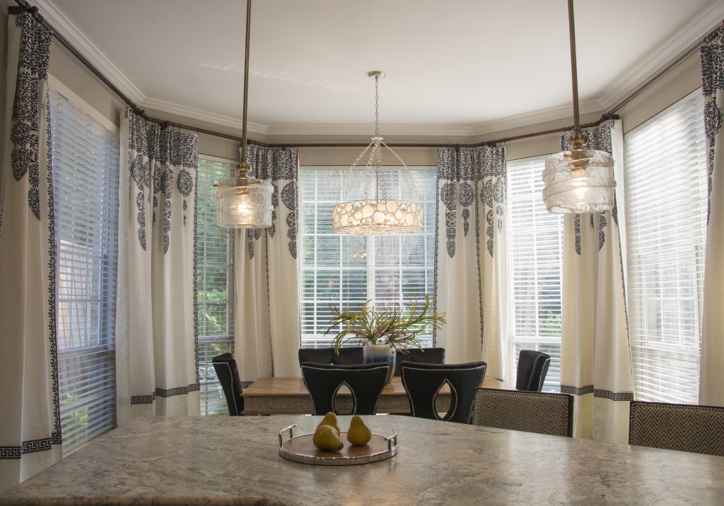
We then tackled the kitchen eating area. Added new drapes, new table, chairs, lighting and accessories.
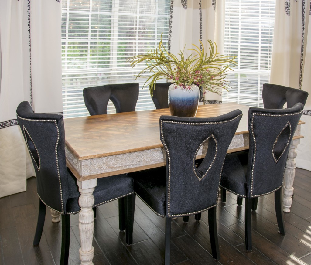
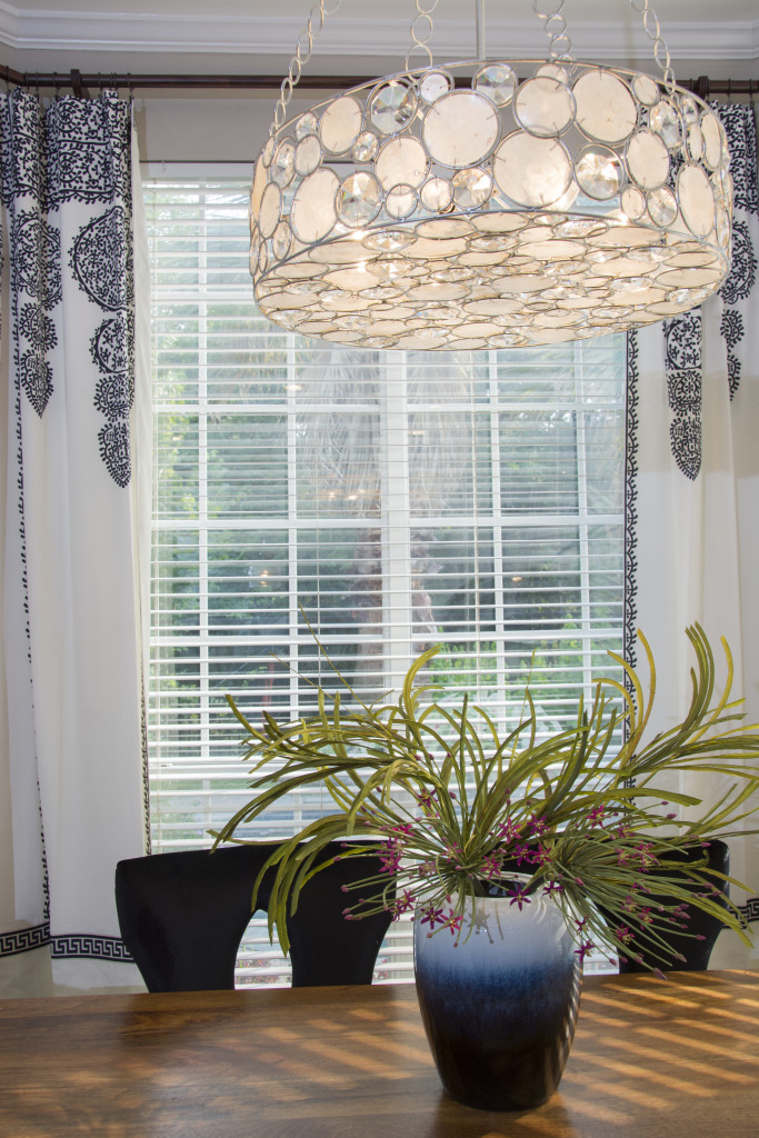
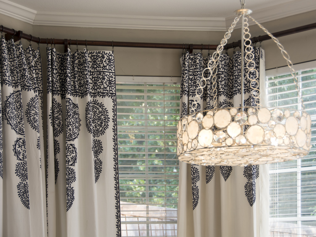
I found these fabulous blue and white drapes and got so excited. I adored the henna like design. However, they were too short for the space. I purchased them, found some fabric we could add to the bottom of them to make them the right length and added some trim and lining. They are now perfect in this room. Added light and not too much pattern. The rustic table is imported from India and can't be damaged by the kiddos in this house! Actually, the more you use it, the better it looks. Family friendly = fab
Isn't the chandelier spectacular with the pendant lighting? The chairs with the oval hole in the back makes this room feel more open and less crowded.
Thanks to my wonderful installer Reuben who spent lots of labor on this rod that continues all the way around the window. You can see how fab the pendants are below!
Thanks for joining me on this tour. As I was writing this post I received a text from my client saying this "OK Ruthie, you need to leave me a bunch more of your business cards!!!! I'm having a birthday party for my son and his baseball team and parents. The mom's want your contact info. I'm getting hand cramp from writing your number down." I always feel so blessed when I get feedback like that from my clients.
I'm off to finish off a bathroom remodel and another kitchen. Will post pictures soon. Hope it is a great LABOR DAY with friends and family!

