I always consider it an honor when a client refers me to a new client. What I love even more is when we have repeat clients for either a move, or in this case a rental property.
The homeowner was smart and hired my team to transform the space from something tired into something fresh and appealing! We helped her choose all the selections so she didn't have to worry about a thing.
BEFORE
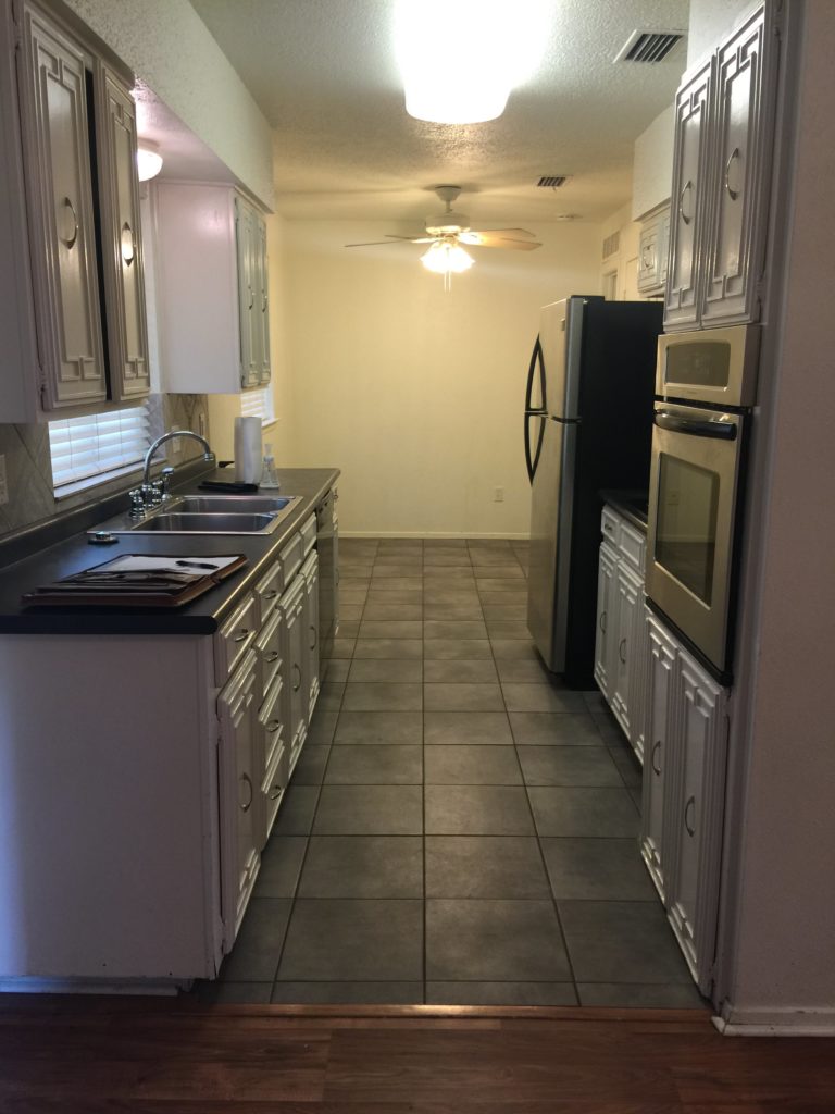
We removed the popcorn ceilings and the ugly soffit above the cabinets This allowed us to add brand new cabinets into the space which allowed more storage space.
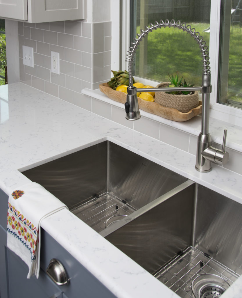
New quartz countertops, new subway backsplash too. I decided to paint the upper cabinets a very light gray and we selected a rich blue for the lower cabinets.What do you think of this combination? The existing cabinets were old and battered and also very busy with the design on the front.
BEFORE
AFTER
We chose a Shaker design for the cabinets which made it simpler and more classic. The hardware I selected is in keeping with the style of the home.
BEFORE
AFTER
BIG CHANGE FOR A SMALL SPACE!
I added this dark espresso shiplap wall because I felt the space needed some texture and strength. The space is really small so a bistro table with two chairs works beautifully.
A new deep sink will be awesome for the new home owners.
BEFORE
TINY BATHROOM REMODEL
AFTER
We took out the cabinet and added a new vanity with a marble top. New mirror and lighting and added shiplap behind the vanity wall for some pattern. I love the black and white tile we chose for the floor.
BEFORE
AFTER
The client was extremely happy and even more happy that we handled the entire project for her.


