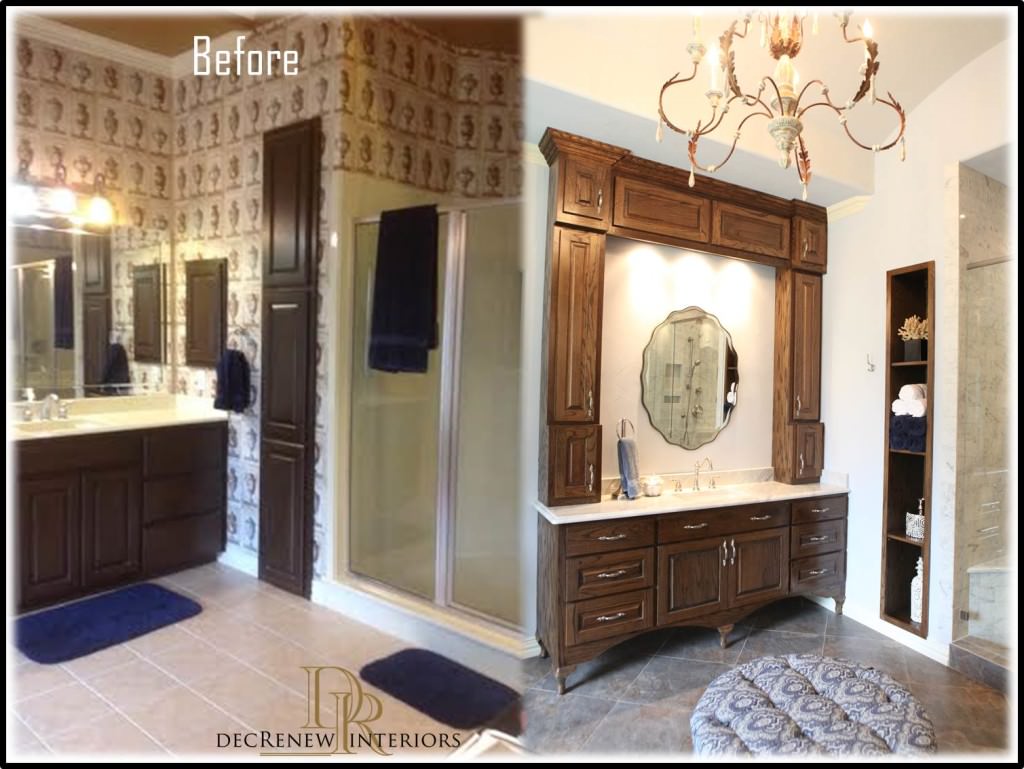
This summer we completed an amazing master bathroom renovation. We just had the remodel photographed so I thought I'd share the pictures with you.
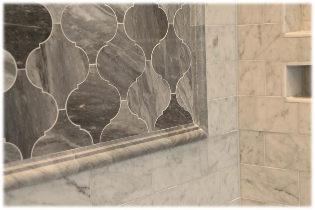
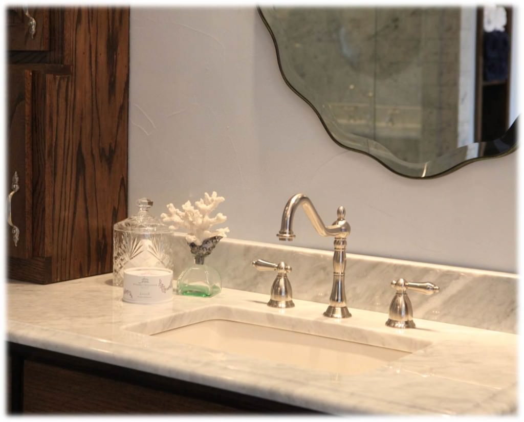
Carrera Marble countertops provide a modern take on a traditional look so that's what we chose for the countertops & shower surround.
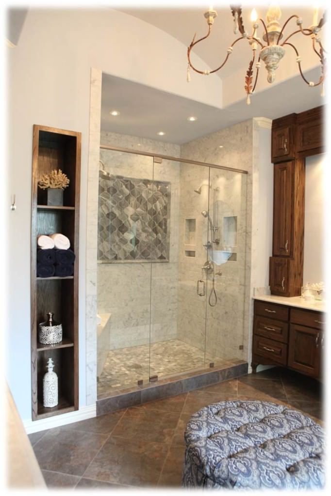
The gray veins in the marble makes a room look sophisticated and classy. The accent wall in the shower is my favorite. The large Arabesque pattern marble is stunning. The word Arabesque means " ornamental design consisting of intertwined flowing lines." I just love saying the word A-R-A-B-E-S-Q-U-E because it sounds cool.
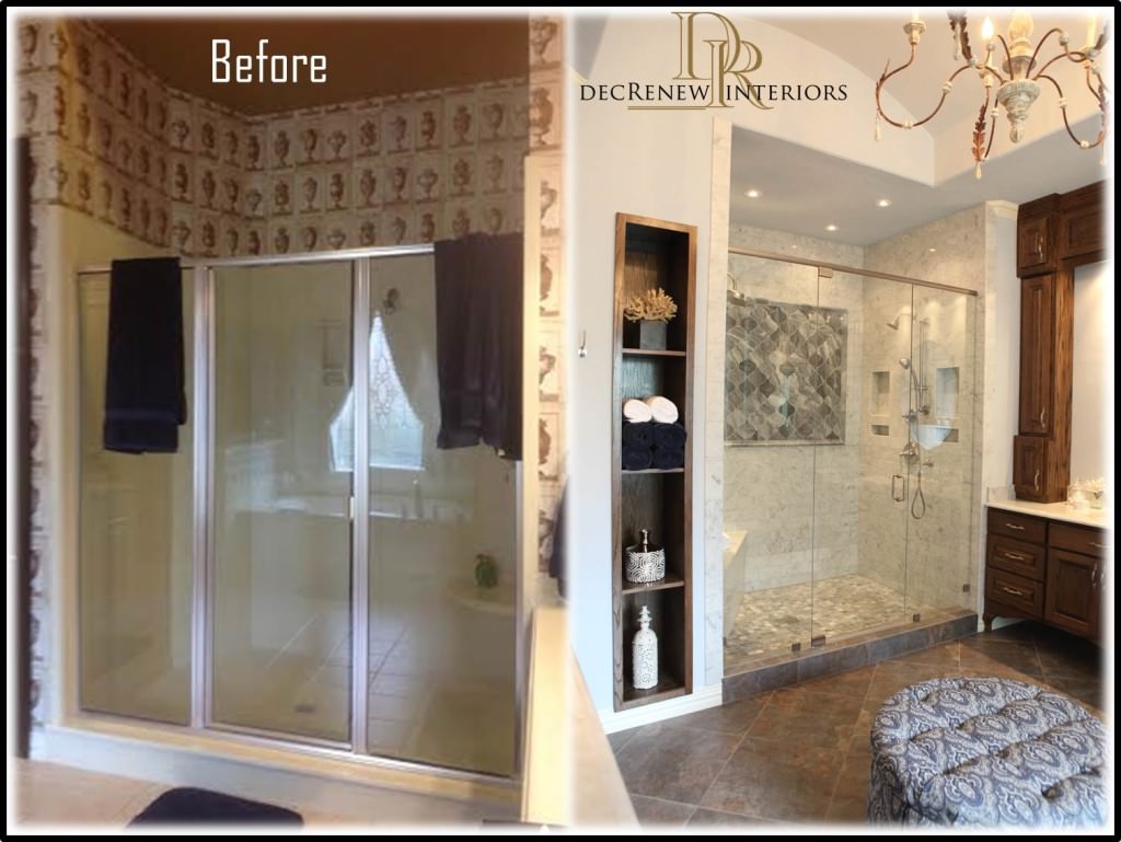
We enlarged the shower and took the marble tile all the way to the ceiling. Why have all that waisted space! We added niches and a bench so she can shave now without falling, LOL. I suggested a round ottoman for the space and my client found one she loved. It has a little chair that matches for her vanity area.
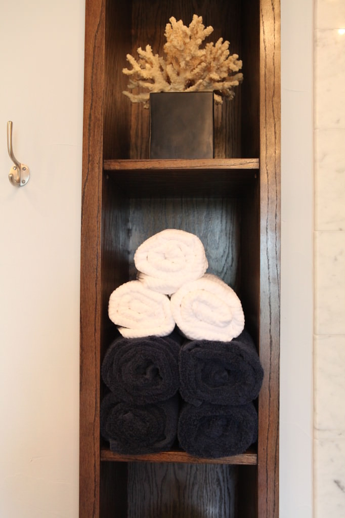
We took the doors off the built in storage so we could use it to display towels as well as accessories. The client never used that storage area so it wasn't a waste of space. Now it looks fantastic for accessories and rolled up decorative towels.
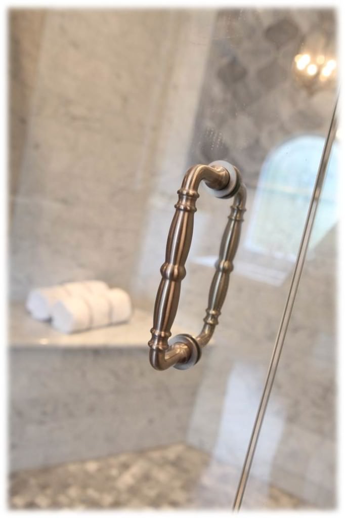
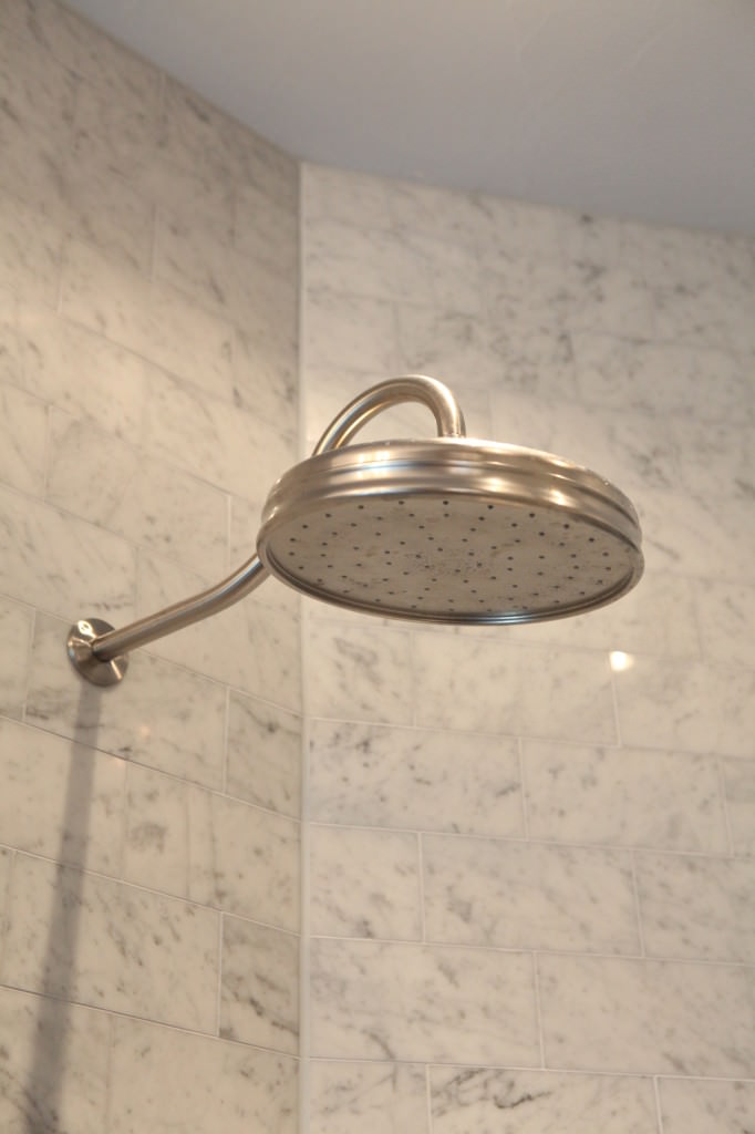
2 shower heads is also a big improvement for a big family.
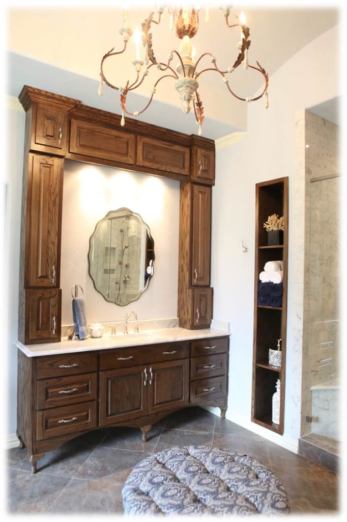
We took out the existing vanities and added new ones with overhead cabinets for more storage. I really loved the legs so you can see underneath the vanity, making the room seem bigger. The client loves antiques and has a lot of wood in the rest of her home so the mix of wood with stone was a great solution. The round scallopped mirrors soften the space too.
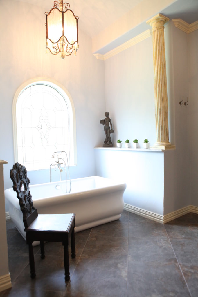
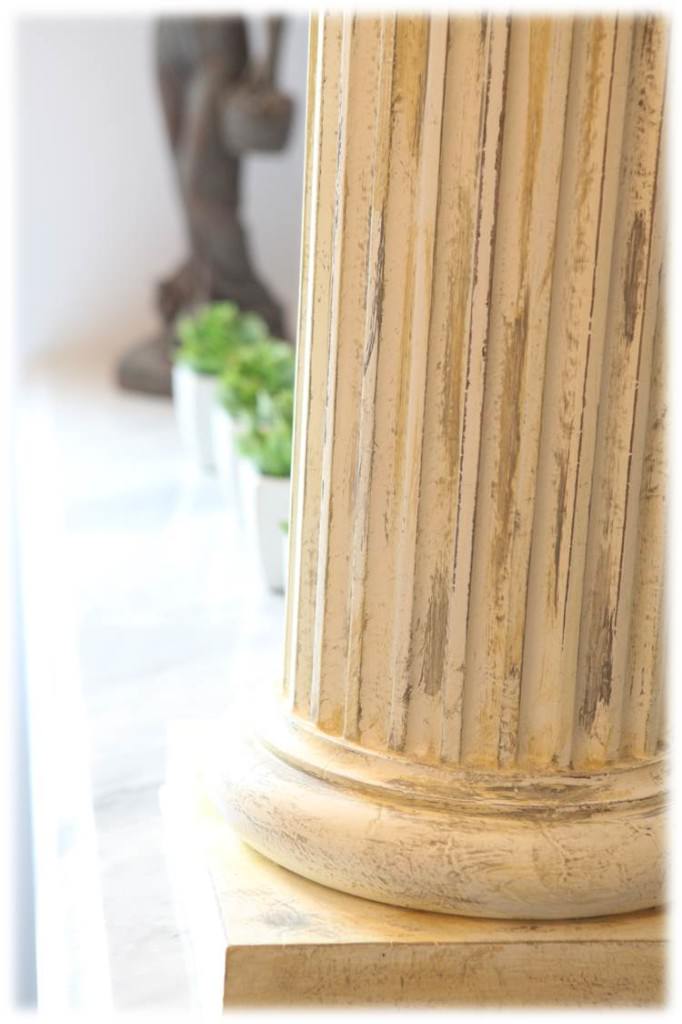
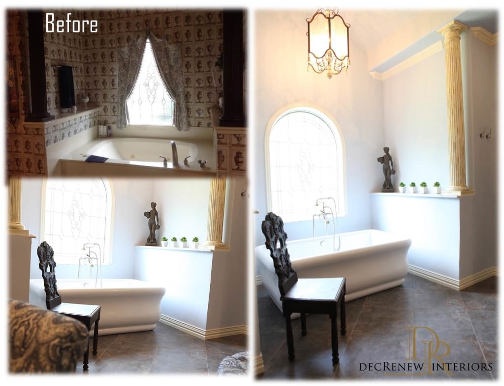
The bathtub was taken out completely and a free standing tub and bath faucet was installed. We kept the stained glass window but just enhanced the molding around it. We put marble on the column ledges and that looks to die for.
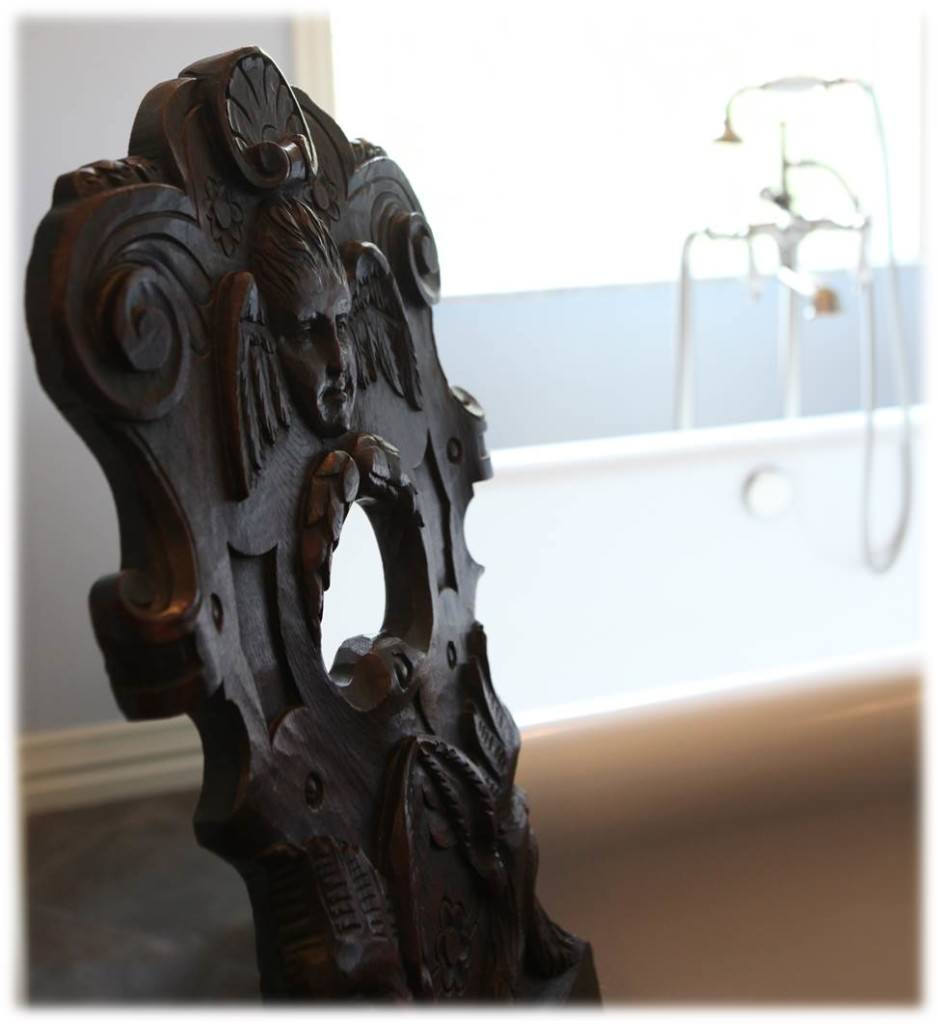
I'm in love with this vintage chair!
The columns were refinished in an "old world" finish the client really wanted, adding a texture to the space that makes it feel mysteriously aged.
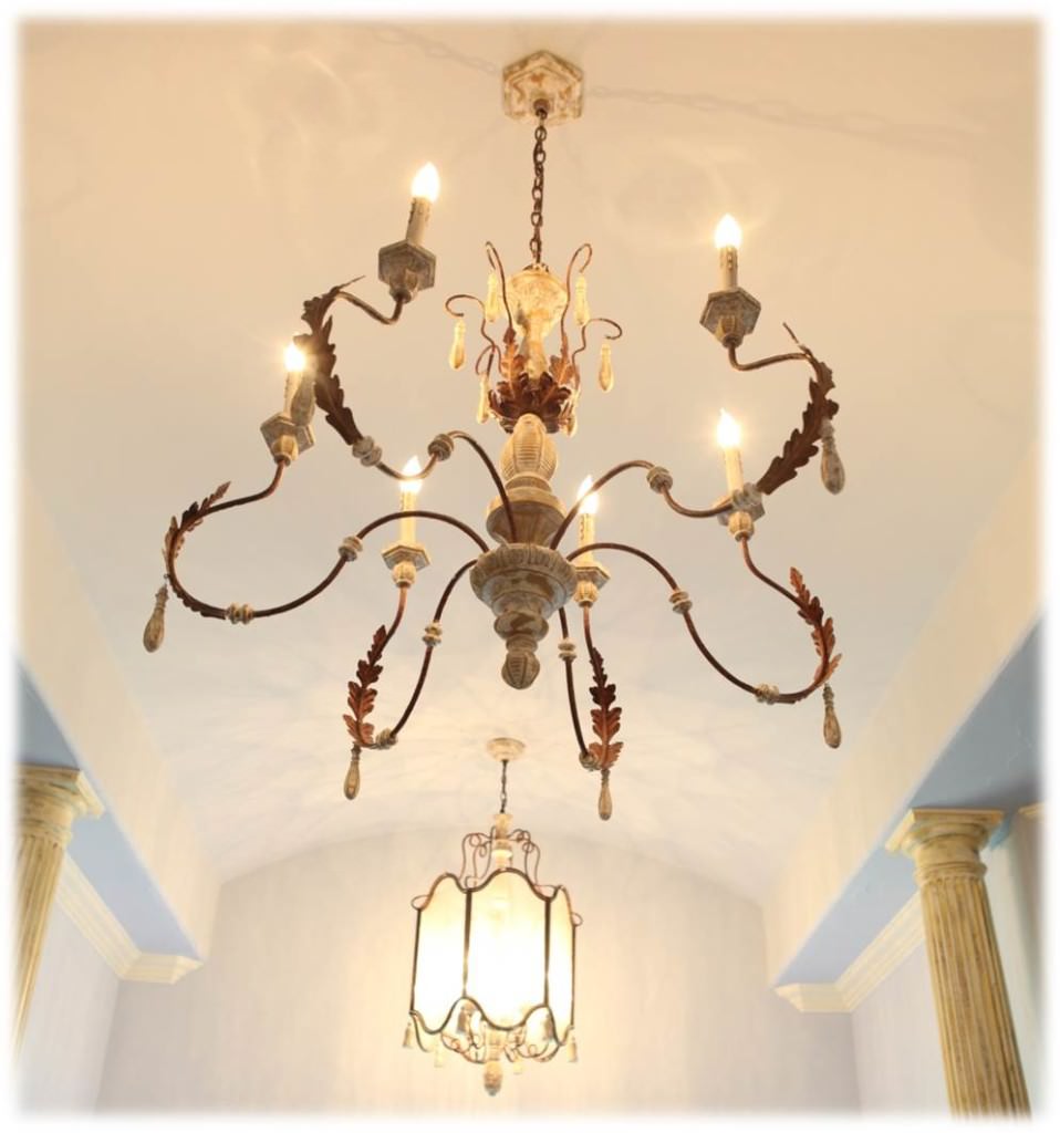
We added new lighting and that made the entire room come together beautifully, adding such charm. All on dimmers so the light could be adjusted accordingly.
So here are the BEFORE and AFTER shots!
Amazing transformation for a lucky couple and their beautiful family.
There will be loads of soaking in this tub, that's for sure!

