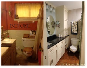
So it's been a 6 week process but we are finished with this "tiny" bathroom remodel.
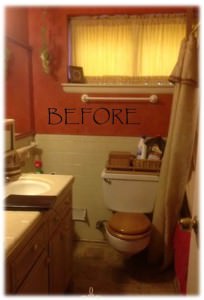
When my client first contacted me she was desperate for an update to her hall bathroom. She had NO storage and the bathroom was not functional for her family (teens involved here). Her priorities were to add as much storage as we could and a place where more than one person could get ready at the same time and to do it all within her allotted budget.
AFTER
Of course, like I always do for clients that are wanting me to handle the entire job for them, I put together a design plan for her with color suggestions, flooring and wall tile choices, cabinet color, hardware, shower curtain options, fixtures, lighting, etc.
She loved the design plan so we moved ahead right away!
Ruthie's tips for making a "tiny" bathroom feel bigger.
1. Bring the tile to the ceiling
2. Use larger tile so you have less grout lines
3. Use light, fresh colors
4. Add recessed lighting to add lots of light
5. Use curves to create softness (round mirrors, etc.)
6. Add a pocket door if you can
7. Maximize your storage so you don't have "stuff" all over the counters.
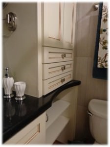
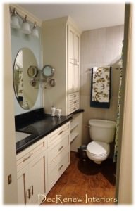
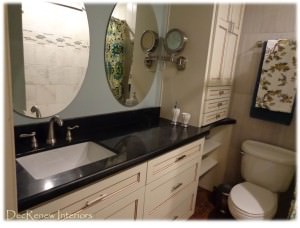
We ripped out the old cabinets and installed custom made ones. We installed new counter tops with a new under mount square sink. Didn't have room for 2 sinks but that's okay because storage was more of a priority for this client. 2 round mirrors were added instead of the large rectangular one.
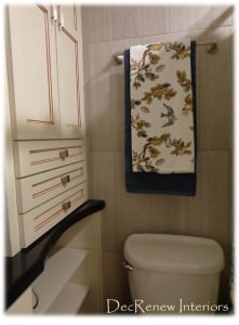
I recommended that we curve the counter top around the toilet area to give them more room. Of course we couldn't put cabinet doors underneath this part of the counter because then they wouldn't have been able to open them because of the toilet being in the way. Our solution was to do add adjustable shelving so they can add baskets of their choice for misc. storage. We hid the toilet paper roll in there too so that's nice :) New brushed nickel hardware really dressed up the cabinets as well. Notice how we mixed them too so they aren't all pulls. Knobs and pulls together look more interesting.
We added plugs to the inside of the cabinet so they can store their hairdryers there permanently!
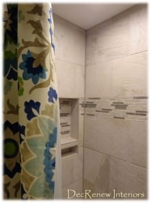
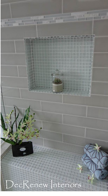
New tile and bathtub and a new niche for hair products. I love the little miniature shelf for razors, etc. We added small recessed lighting to the shower area too so they can see and have no excuse but to be squeaky clean!
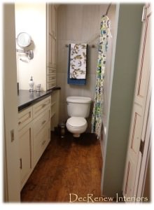
Big difference isn't it? The wall color was inspired by the medallion shower curtain I found. It really is a fresh, clean, inviting color.
The laminate wood floors really added a warm look to the space. She now has tons of cabinet space too so everything can be hidden and all things have a place.
We put a pocket door in as well so we could add cabinets to one of the walls without interfering with the door. Nice big, deep drawers for makeup and a lighted mirror that is attached to the cabinet that pulls out and magnifies for convenience, Eeeek!!!
It's a gorgeous space now and functional too.
Hope this bathroom inspired you to make a "tiny" bathroom into a "grander" space!
Visit my website, DecRenew Interiors to see my Design Portfolio.

