It is always such an honor when we have a client call us back to do another part of their home. We recently did an install for a master bedroom of a previous client, so I thought I’d show you some before and after shots of the transformation!
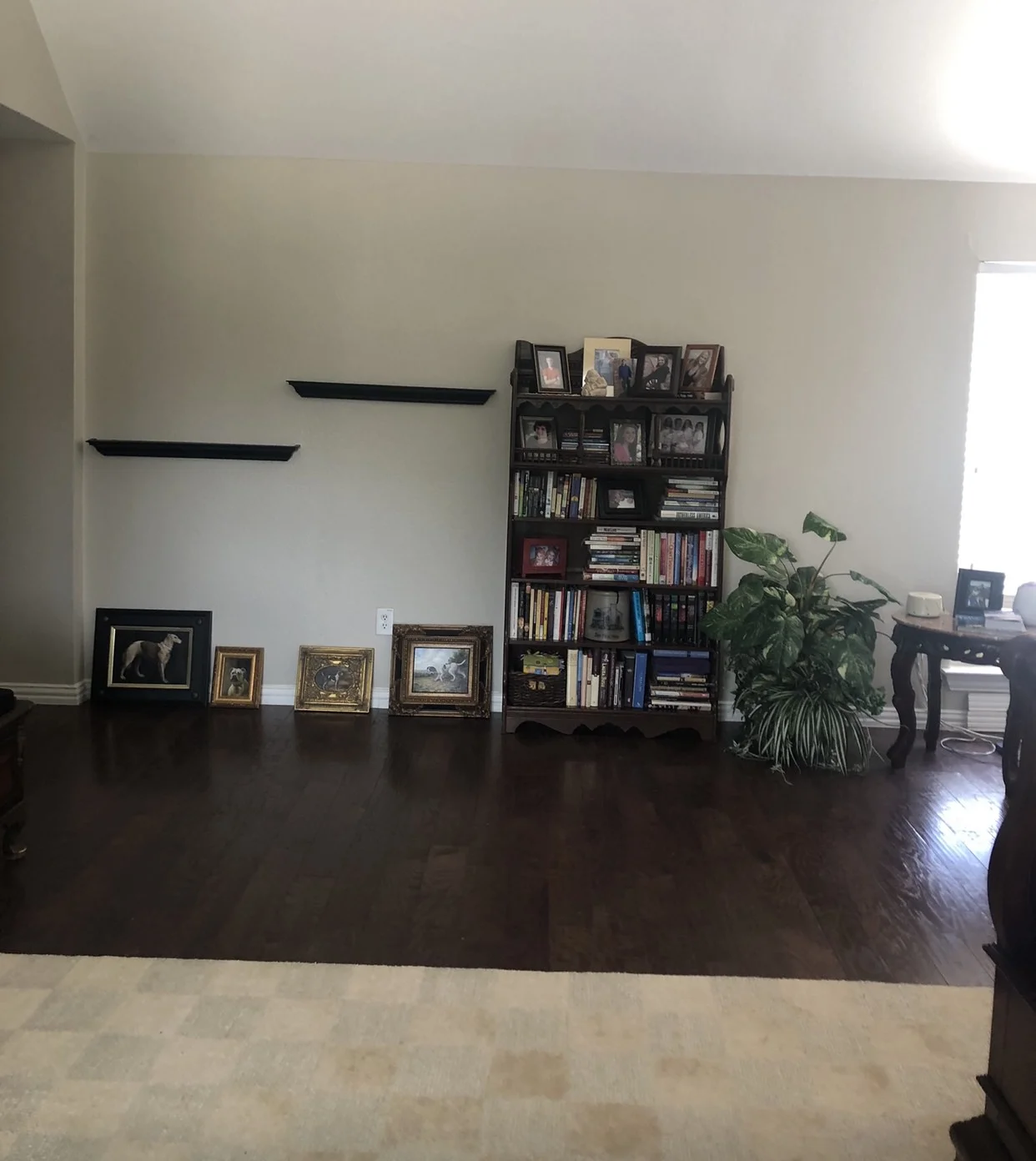
BEFORE
Although the client definitely had enough space to have a sitting room in their bedroom, they didn’t have one. We created a nice vignette so they could relax in the mornings or evenings together. I find that many people don’t take advantage of the fact that their master bedroom can be a refuge after a long day. My advice is to use it well!
AFTER
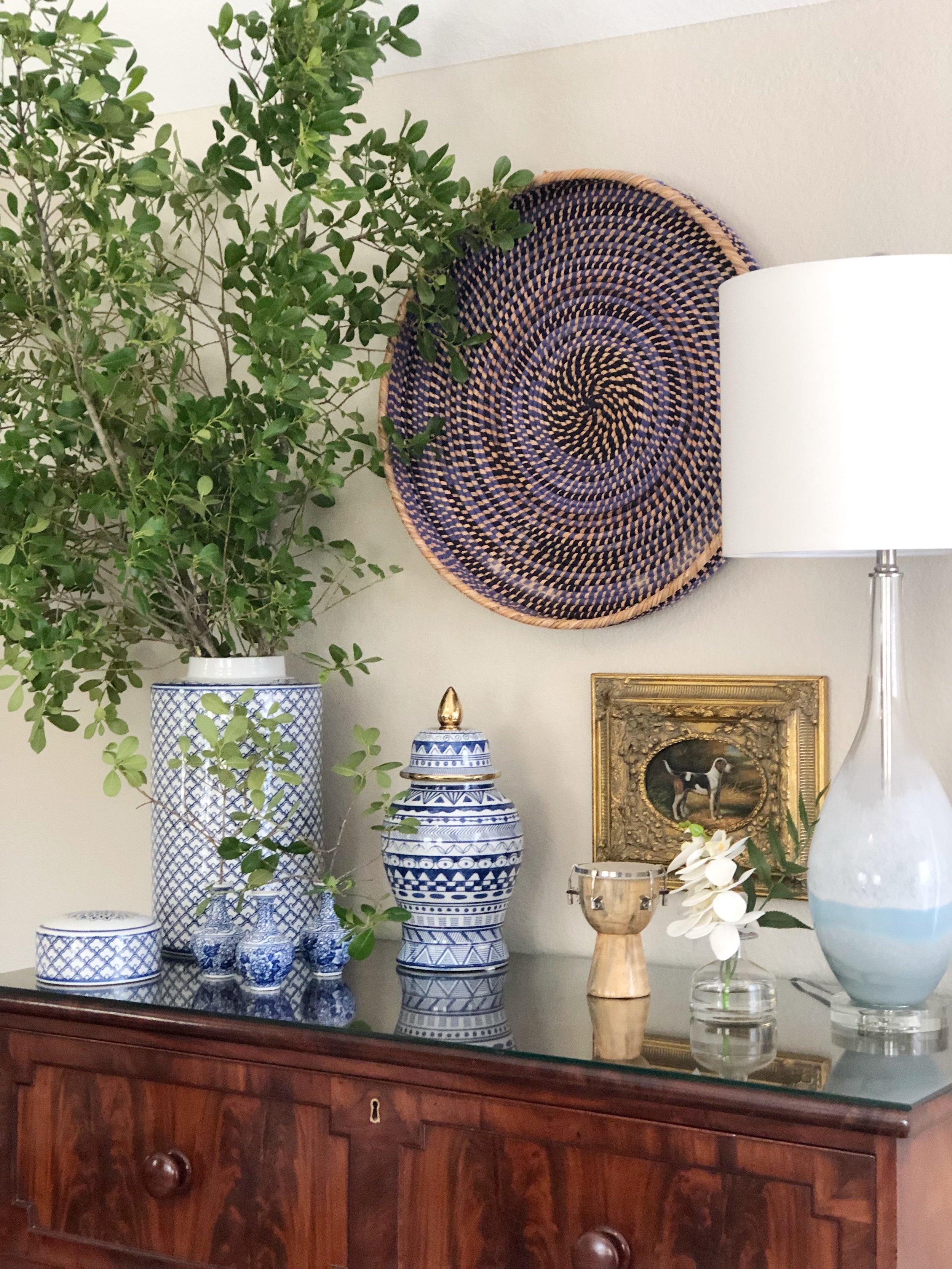
Perfection, right? We moved one of the dressers from next to their bed to this sitting area because it created some nice height for the vignette. The chairs are facing one another to create a space for great conversation. The ottoman allows them to put their feet up and relax.
The grouping of blue and white ginger jars paired with the round basket hung on the wall looks so amazing with the antique dresser.
The client had several dog prints that we couldn’t help but incorporate into our design. I love using items that clients already have to add a “collected” look to the space.
BEFORE “HER SIDE”
See the dresser we moved to the sitting area? Too big for best to her bed.
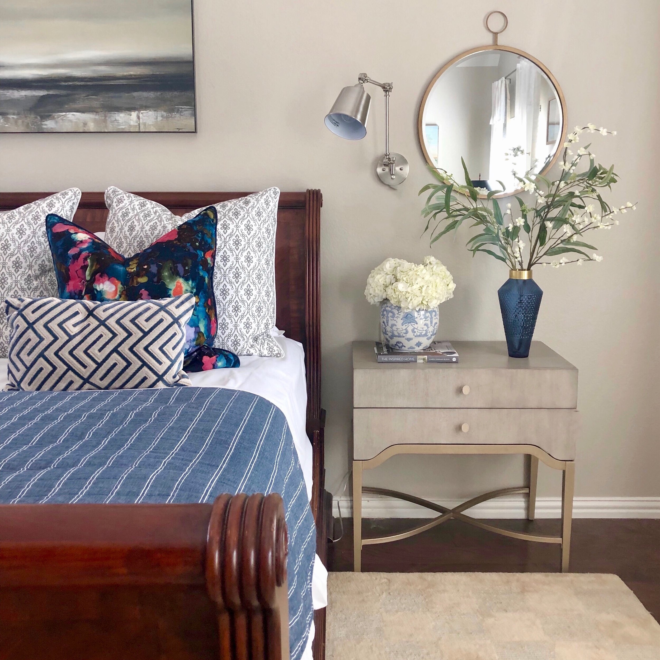
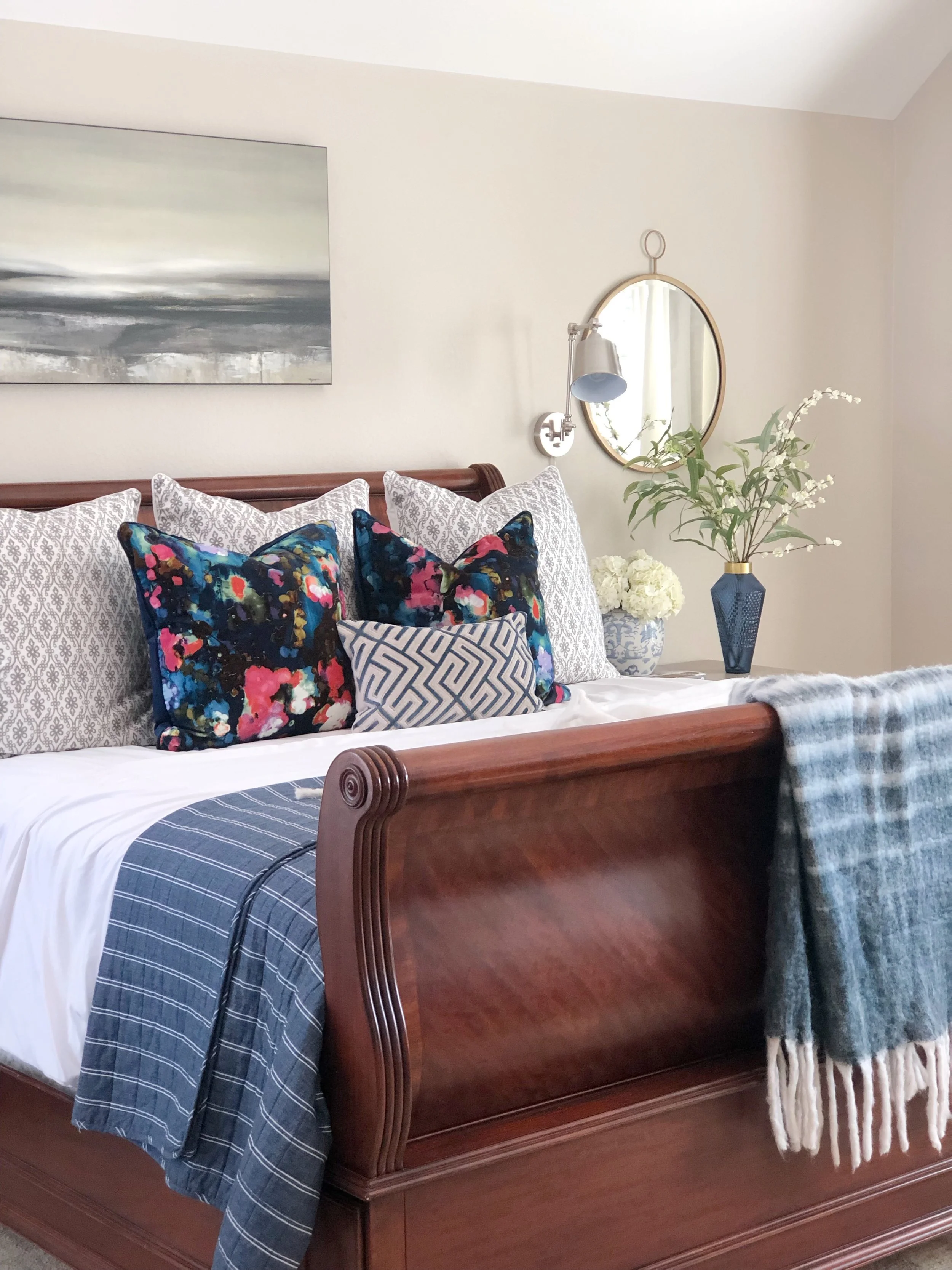
AFTER “HER SIDE”
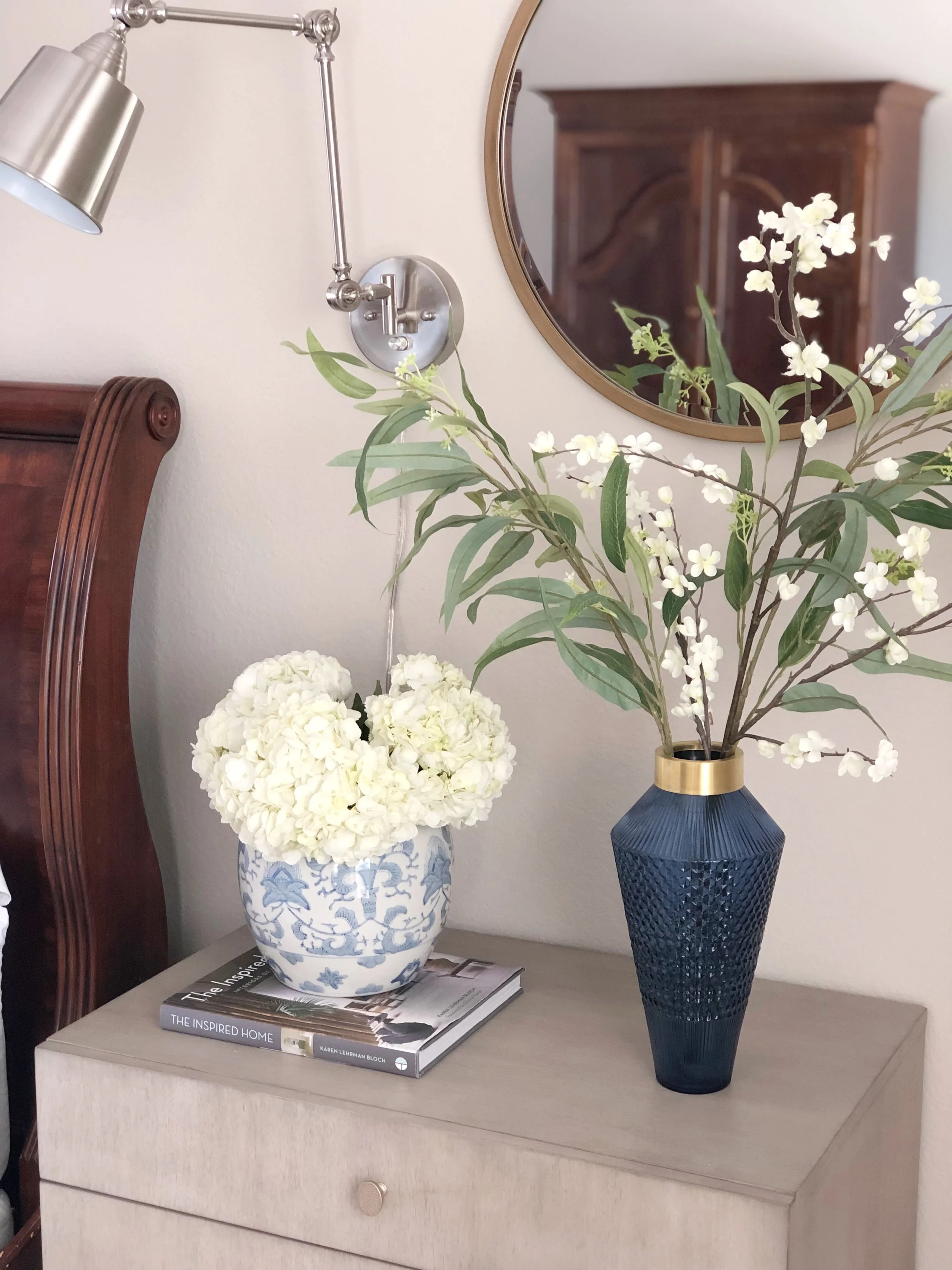
New side tables were in order. Although I loved the wood dressers , I didn’t want them to be overbearing. Lighter furniture helped to break up the darker tones. I chose the open bottom on these side tables because that makes the space feel bigger and less crowded. Scroll up to the before photo, see how much lighter it feels with the new side table?
Ruthie Tip: If you have a matching set of bedroom furniture, break it up by adding new side tables that are totally different. You don’t necessarily have to get all new furniture. Breaking it up can usually do the trick like it did above.
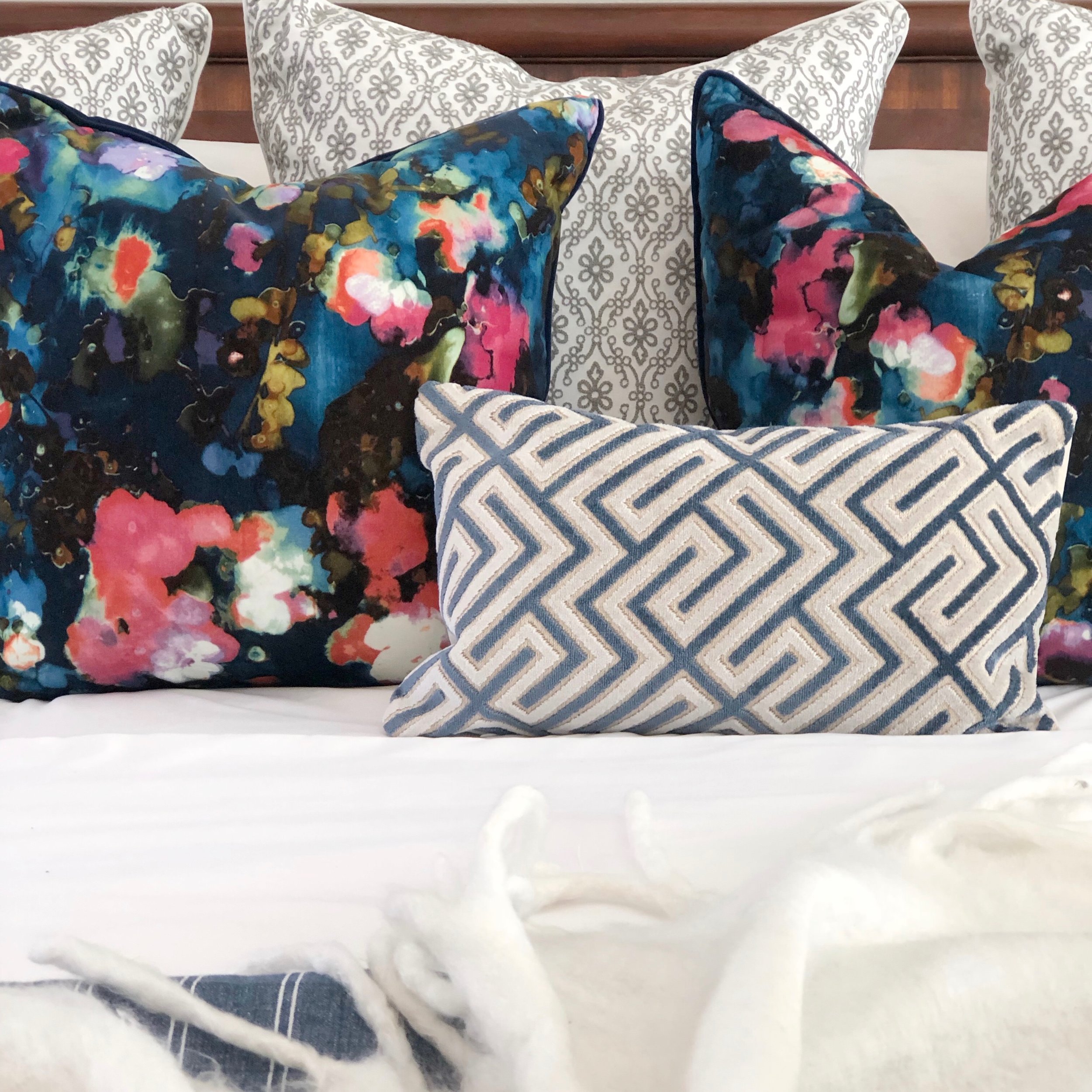
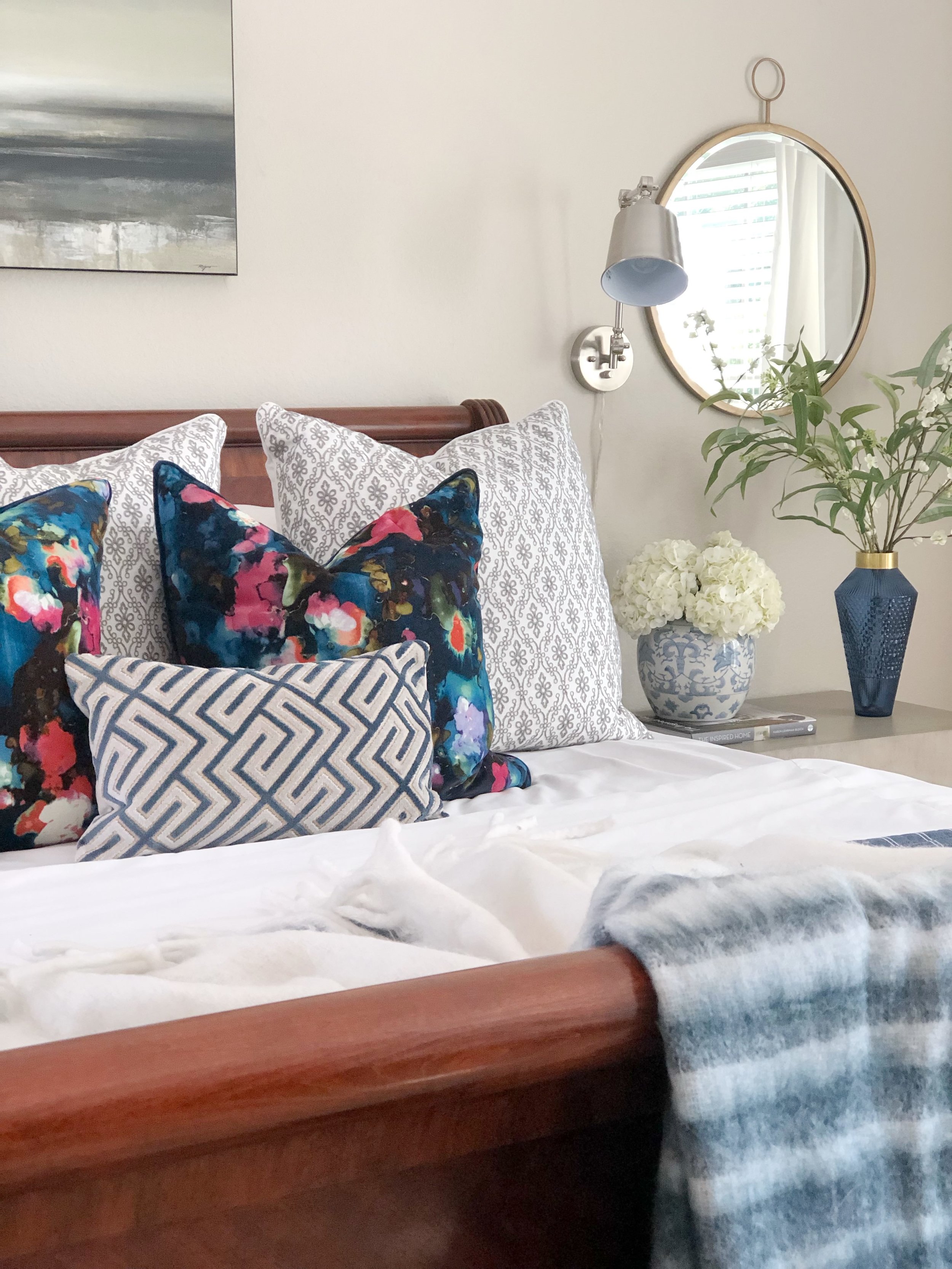
All I can say is the right pillows are everything in a bedroom.
Wouldn’t you agree?
We chose the art carefully and wanted it to feel serene.
The client had the silver light sconces and I like them because they are functional for reading in bed.
Ruthie Tip: It’s okay to pair gold and silver together like I did here. Notice the artwork has that silver in it. The key is just to make sure there is unity somewhere in the room, with the metal finishes you do use.
This Navy vase though???? Isn’t it gorgeous paired with the blue and white ginger jar filled with hydrangeas?
I’m not usually a fan of faux flowers, however I do love anything that makes you think it is real! This branch, leafy pieces work beautifully.
Such a cozy bed! Loving the blue and white throw!
The client had the rug and it was fairly new so we decided to use it in our new design. Especially since it was a gift from the parents ❤️
The new pillows makes the existing rug work wonders. It’s all about pairing the right things together.
BEFORE “HIS SIDE”
AFTER “HIS SIDE”
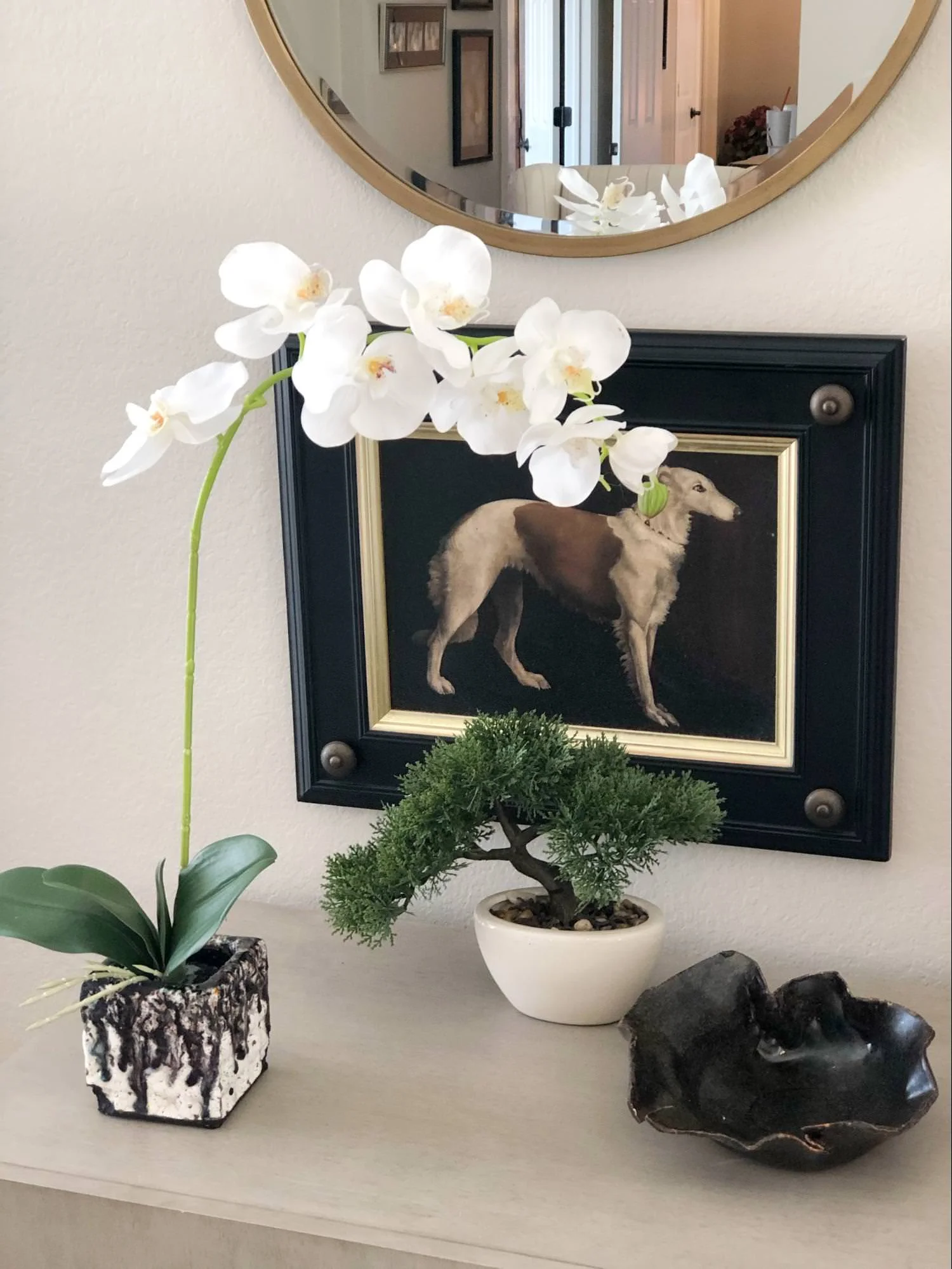
The bedside styling for his side needs to be just as amazing as hers. This piece of unique pottery will hold his ring, change, watch and maybe wireless headphones, all while looking fabulous. Nothing says masculine more than a Bonsai tree, don’t you think?
We also added new draperies to the room and that made it feel finished. The client had the drapery panels already, we just added trim to them. I layered two different trims together to make a bigger statement.
The reveal is always so exciting!
We added a few things to their bathroom to complete it for them.
A new bench and new rug!
New towels!
And accessories!
They loved their new space and can’t wait to hunker down and relax for the weekend.
Hope you do the same this weekend.


