Follow my on pinterest and be inspired!
Before & After "Old World" Kitchen Makeover
Just finished a kitchen and I have to say, they were one of the best clients I've worked with. They were enthusiastic, excited and so incredibly pleasant. I created a design plan for them based on some pictures they showed me of kitchens they loved and we took it from there.
BEFORE......drum roll please.....
The kitchen was in terrible need of an overhaul don't you think?
AFTER
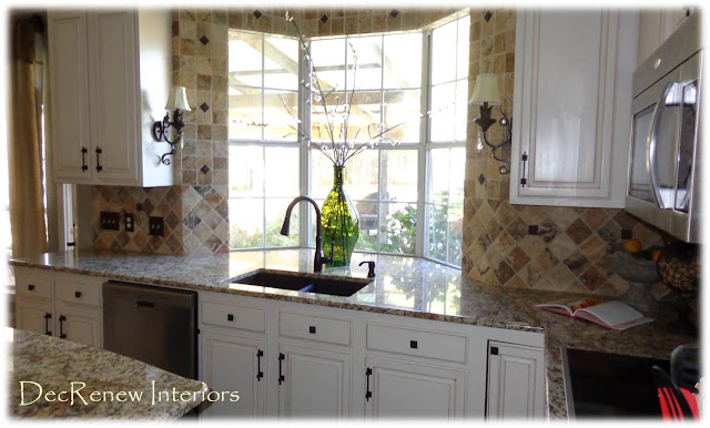
We lightened it up and made it happy.
AFTER
Installed tumbled stone tile all the way around the window and it makes a statement!
New floors and granite!
BEFORE
Good bye ceiling popcorn!
AFTER
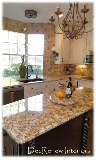
Took out fluorescent lighting and added recessed lighting and a chandelier. Added a coordinating light fixture above the sink.
I especially like the sconces we added to each end cabinet. She really wanted some bling!
All the lighting was installed with dimmers so you can create the ambiance you want.
Every kitchen needs a little accessorizing if a decorator is involved. Love jewel tones in a kitchen, especially with this beautiful granite.
New black, deep sink and new faucet and soap dispenser is a must.
We expanded the island, added a slide out drawer for the garbage can and attached some detailed columns to the island. A little distressing and it's just like the client wanted it!
Cabinet hardware always makes the kitchen come together!
We curved the island to make it a little bigger. The ceiling medallion added some old world charm which is what the homeowner really wanted.
We added molding to the top of the cabinets too so now they go all the way to the ceiling, making them more to scale for this kitchen.
BEFORE
Of course every kitchen needs to have a lazy Susan on their island. Made by special request!
BEFORE
AFTER
Installed double ovens just in time for the holiday season.
BEFORE
AFTER
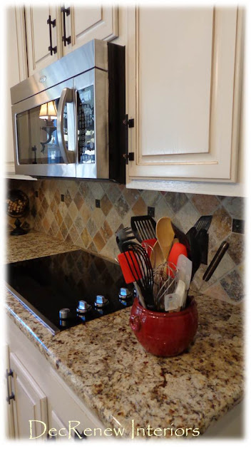
Added the microwave above the new stove top.
Under counter lighting is a must if you have gorgeous granite!
It's time for this couple to celebrate with a party!
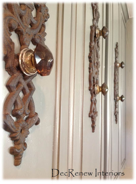
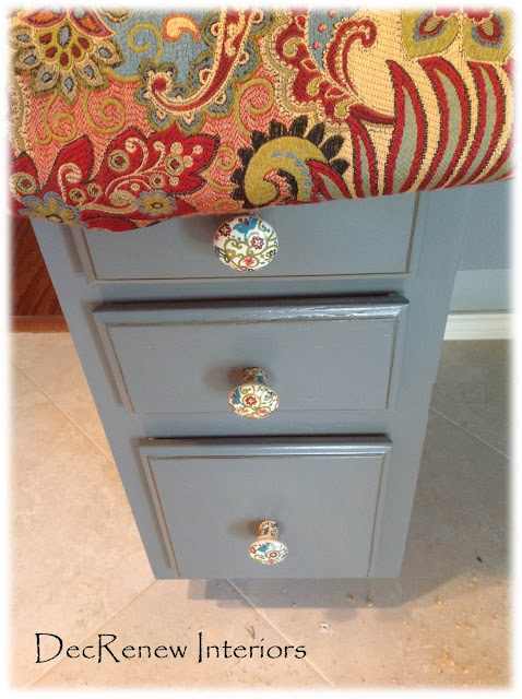
I created these knobs for their little desk area! Had to have a "Ruthie" touch somewhere!
There kitchen chairs will be reupholstered in this fun fabric (the client is taking on this project)
Don't you love the way the knobs on this built-in desk match the fabric so beautifully!
We added molding to these columns that were originally just sheetrock. Dresses it up and makes it smart!
New draperies and a new lamp and it's a wrap!
Can't wait to show you the kitchen we are finishing up next!
Visit my website DecRenew Interiors to see more before and after pictures as well as my design portfolio.
