We just finished an awesome install last week. What makes the install amazing is working with fun clients during the process. I have to say that this client was one of my favorites. As a designer, when the client is joyful and excited about their reveal, that makes it so rewarding!
They totally put their trust in me during the whole process which enabled me to do my job well.
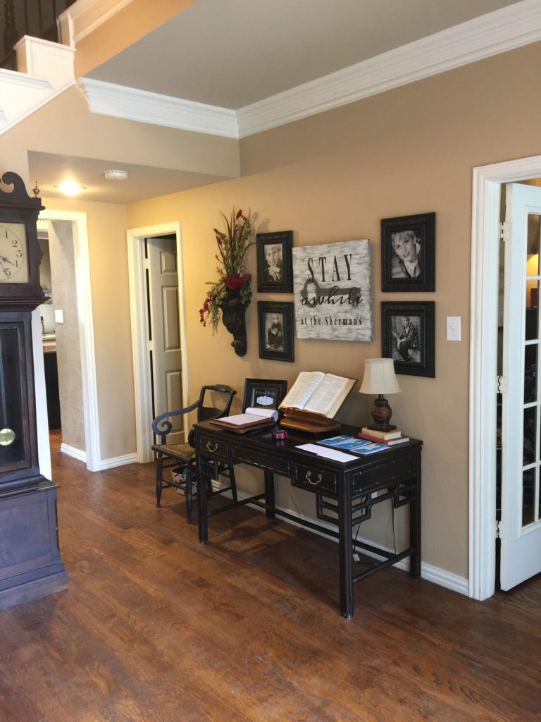
BEFORE ENTRY
The client hired me for the remodel portion of their home and then to finish it out with accessories, rugs, lighting and draperies.
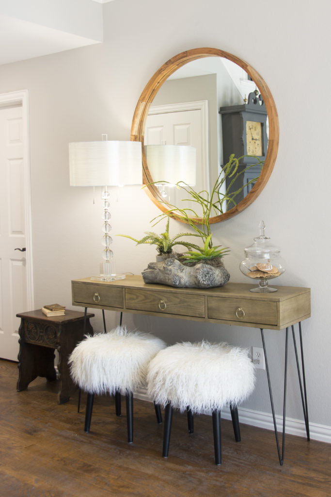
AFTER ENTRY
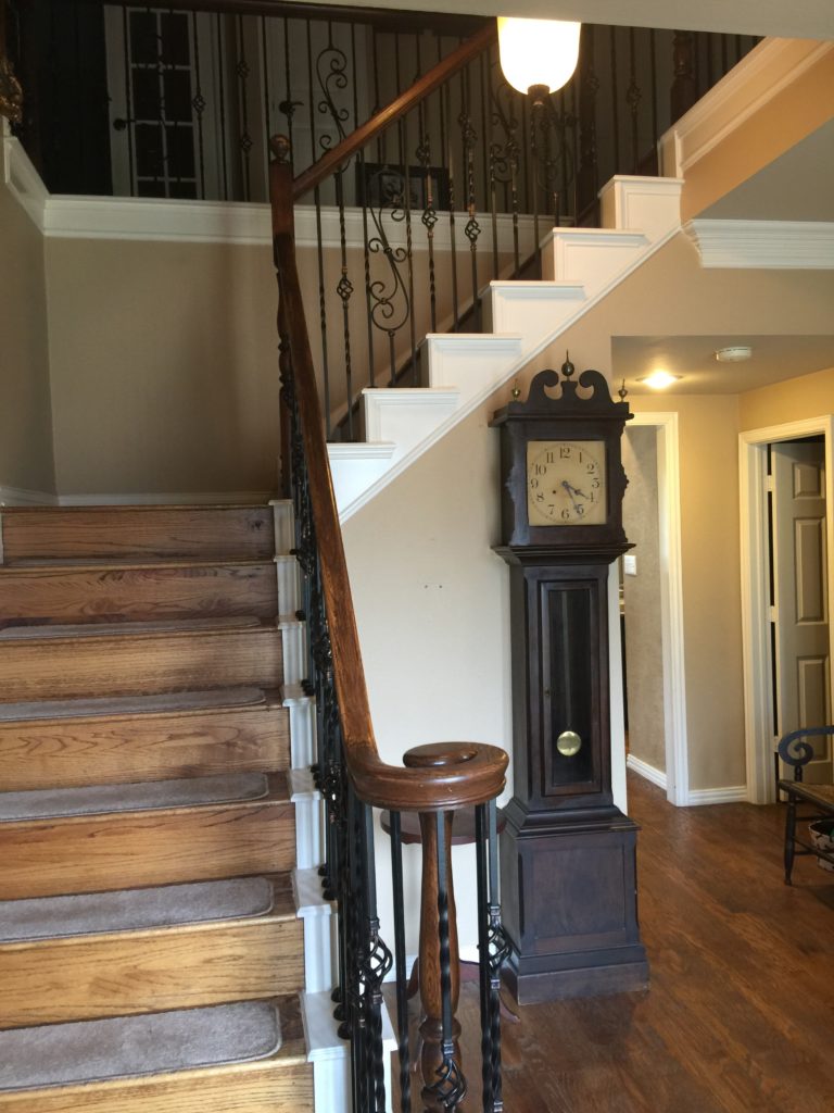
The entry had some great pieces but they just weren't making a statement. The desk in the entry was too deep for the space so we moved it to another room (see details on that in a later post).
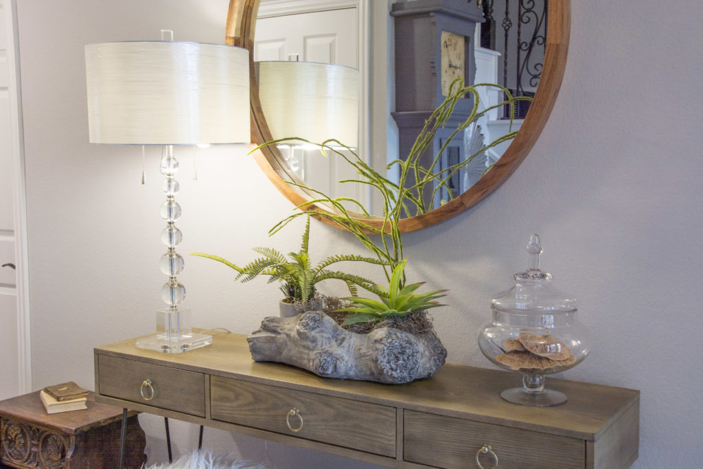
Ruthie Tip: In small spaces, I try to use anything that gives the illusion that the space is bigger. Example in this entry would be open legs on the console, a mirror, crystal lamp, glass vase and white stools.
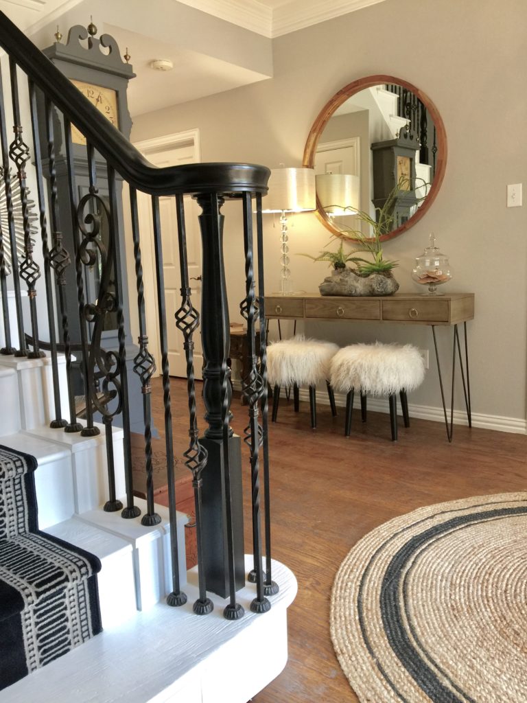
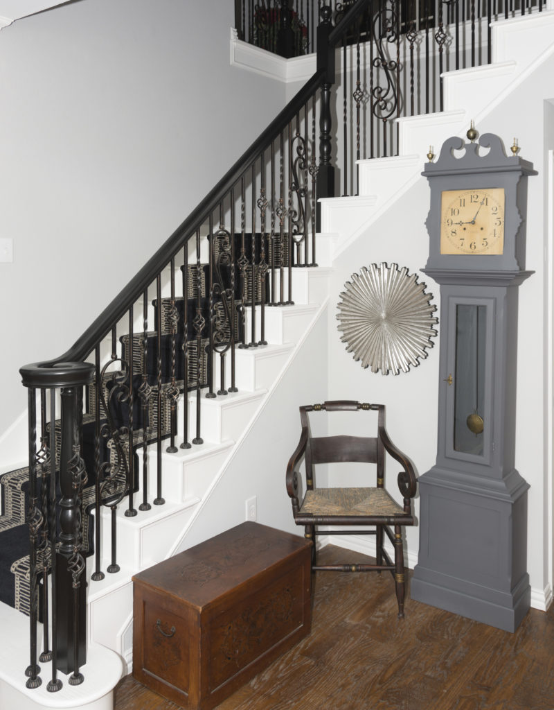
We painted the clock a pretty gray, added a round rattan rug (notice the black that ties into the stair runner) and slid some fuzzy ottomans underneath the console for some fun and a casual flair.
BEFORE ENTRY
AFTER ENTRY
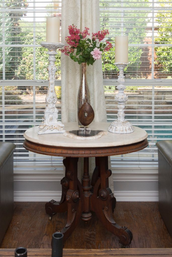
I incorporated some of the antiques that were spread out throughout the home because antiques mixed in with new items makes it look collected, not decorated.
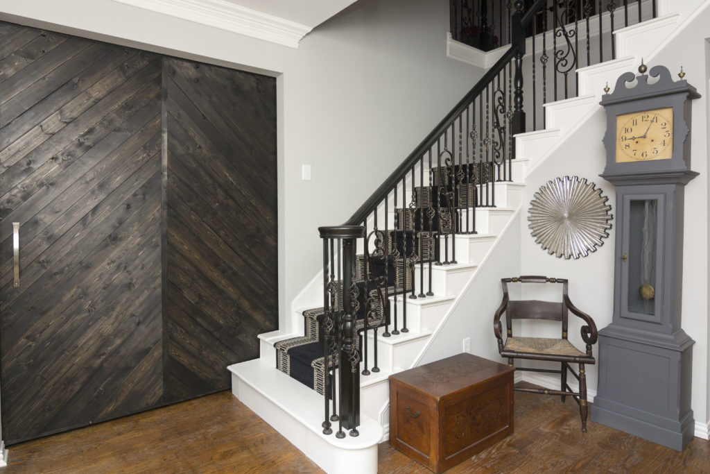
We painted the stairs white and added a black runner to the center of the staircase. We also painted the staircase railing black. We had a barn door custom made especially for the music room that adjoins the entry so they can close that room off. The detailing of the barn door is fabulous and can really be seen better from the inside of the music room (this is the back of the door).
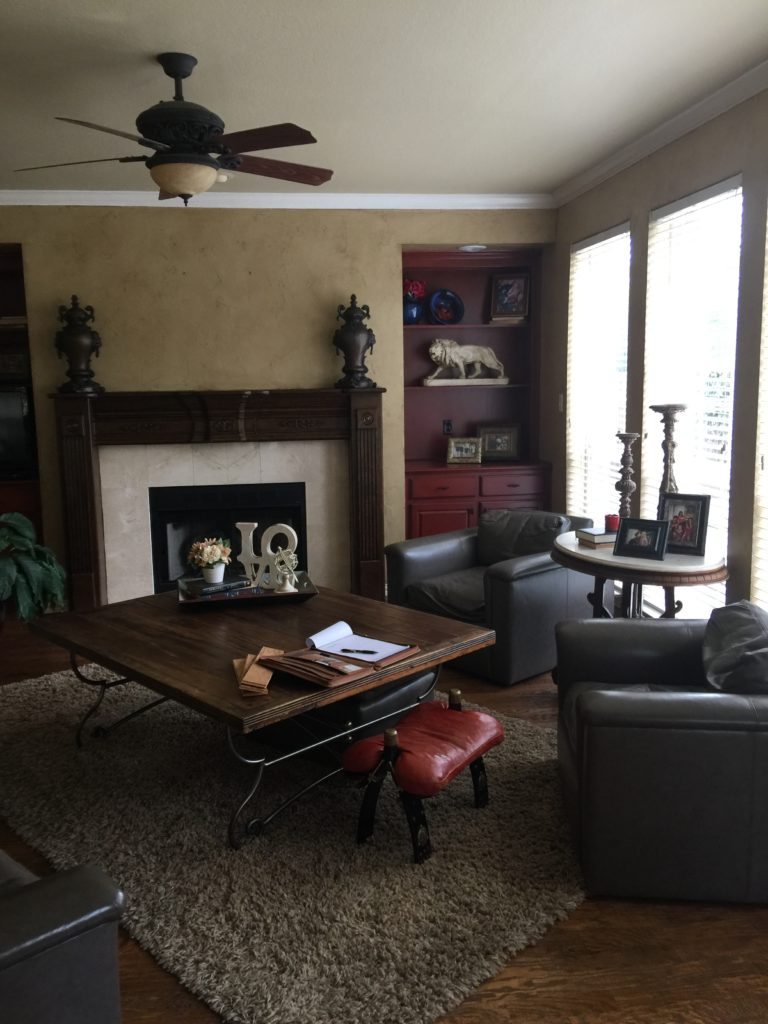
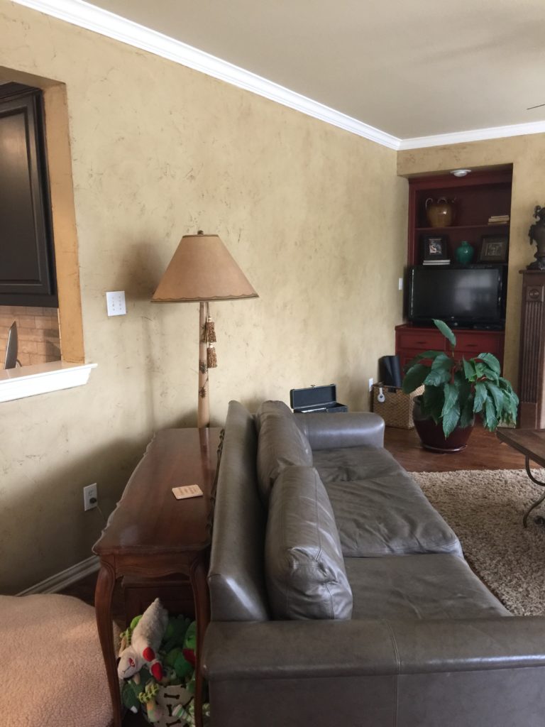
BEFORE FAMILY ROOM
Their family room needed some lightning up, that's for sure. The Tuscan "old world" theme was everywhere. She loves traditional and he loves a more contemporary style. I encouraged them that we could marry the two and get something that they would both like. I created a transitional look for them and they LOVED it.
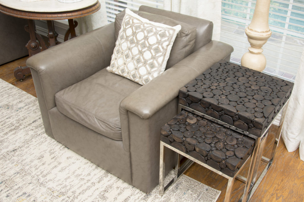
The leather sofa and 2 chairs were in decent shape so we reused them, along with the coffee table. We painted the entire downstairs walls as well as the bookshelves and mantel.
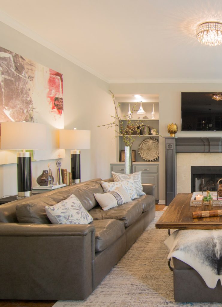
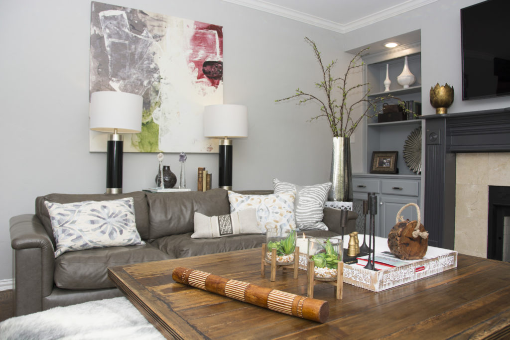
AFTER FAMILY ROOM
Amazing transformation, right?
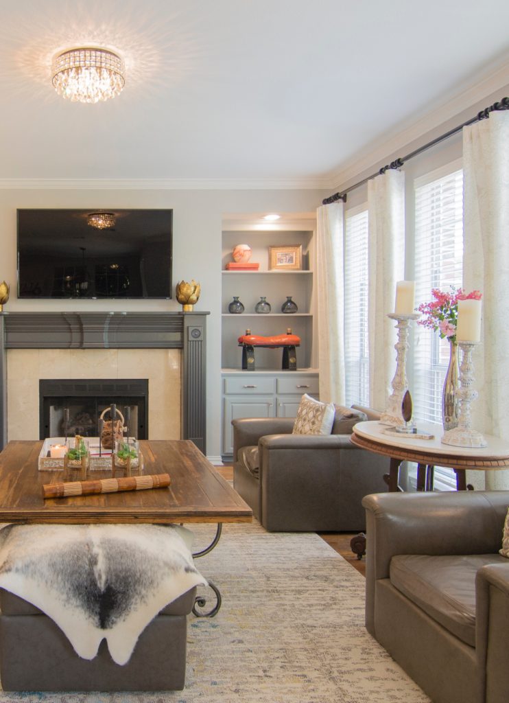
TV was moved to top of the mantel. Added new lighting, a new rug, draperies, artwork, coffee table & bookshelf accessories, side tables, lamps and pillows. It made a huge impact to the feel of the room. When people say, the details don't matter, THEY DO! Just look at the details above!
BEFORE
AFTER
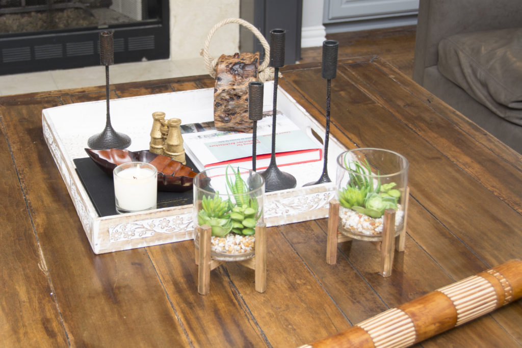
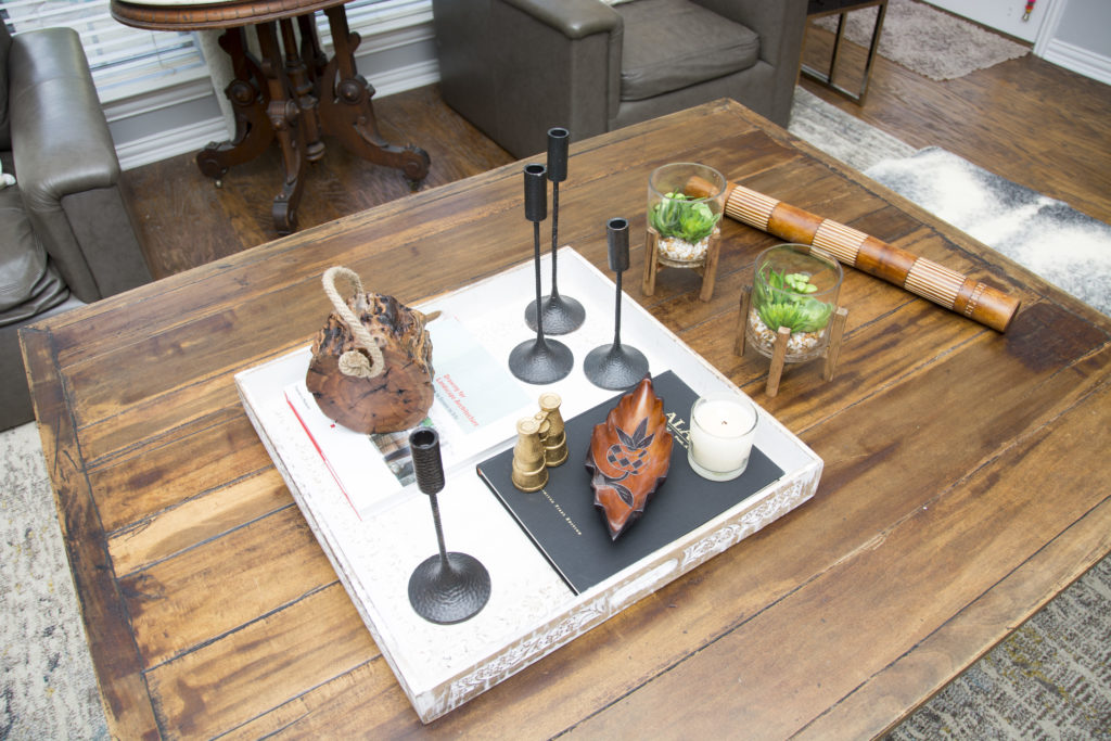
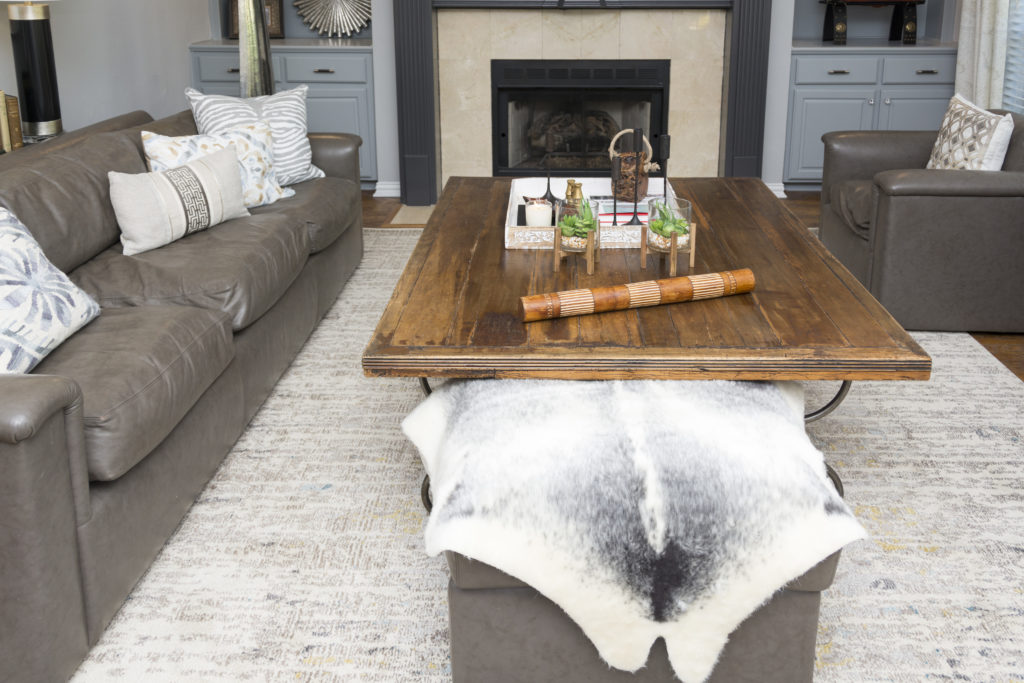
I love layering the coffee table accessories. The tray can be removed easily if they want to play games, etc. I collected all of these items over the month at different places I shop and it makes for a nice mix and loads to talk about when entertaining. I found the tiny binoculars and painted them gold (they are my fav).
The rain stick from Mexico is cool too.
Loved these gold candle holders.
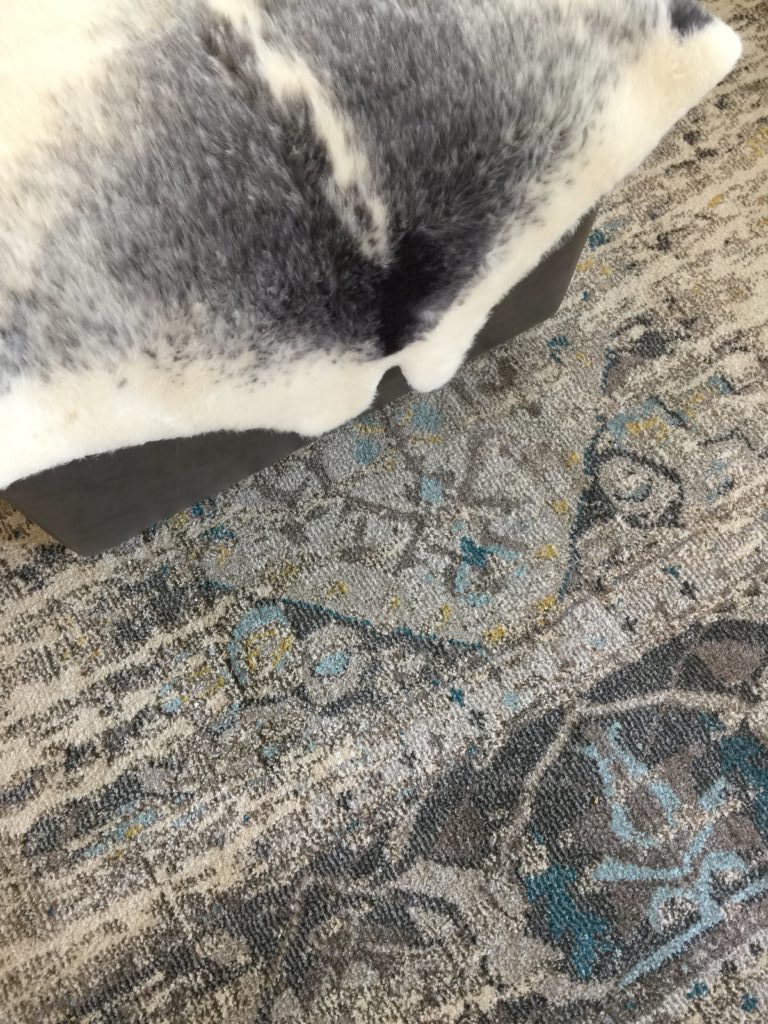
The rug!!!
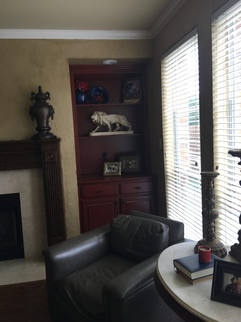
BEFORE BOOKSHELVES
AFTER BOOKSHELVES
The chairs swivel so they can easily watch TV and can pull in chairs from their dining room for extra seating when needed.
Ruthie Tip: Notice how we painted the candlesticks white with a gold leaf dusting? Reuse what you have!!!!!!!!!!!!!!
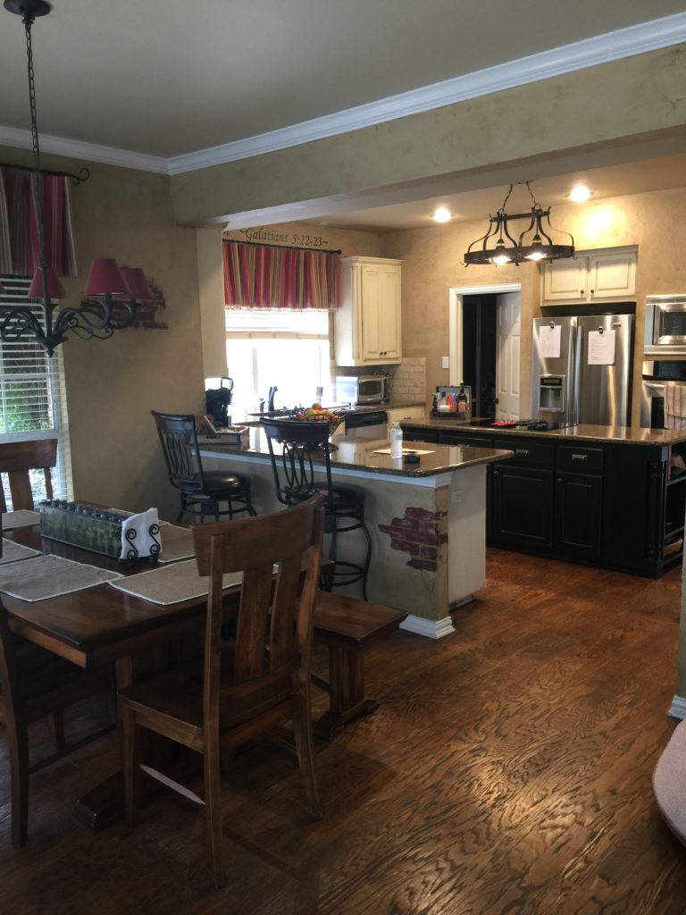
BEFORE KITCHEN
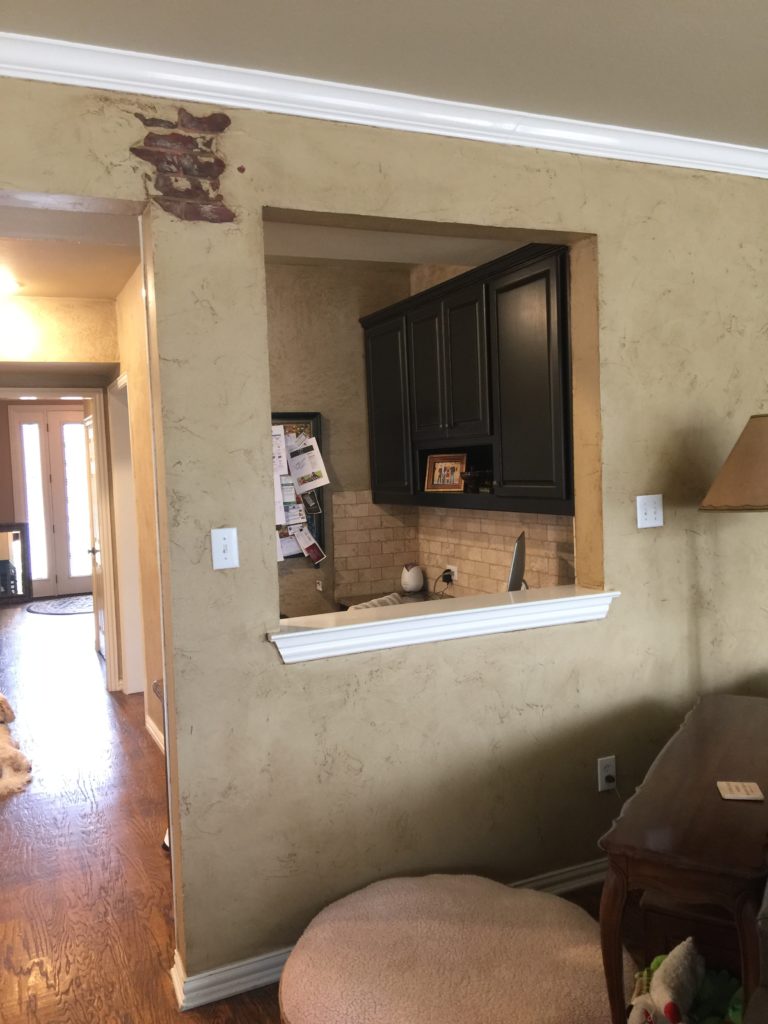
Notice the faux brickwork!! Remember when we use to love this?
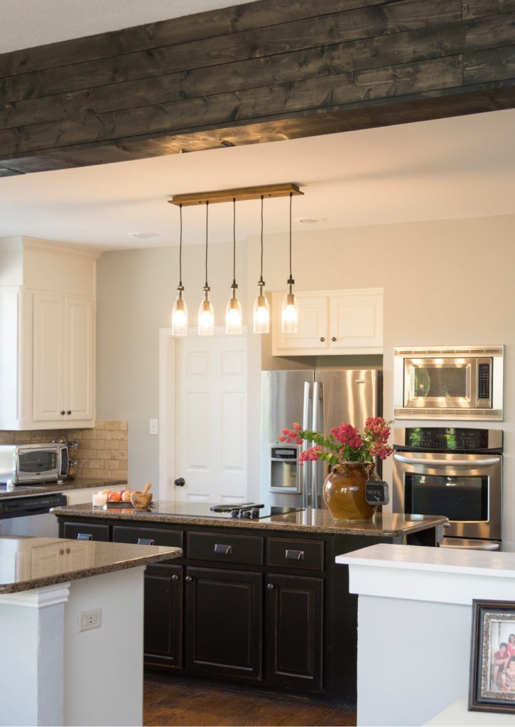
The kitchen felt closed off from the living room, due to the funny opening on the right. We took out the sheetrock column and opened that area up. We wrapped the support beam with rustic wood all the way across and stained it to match the barn door. It now feels so much more open.
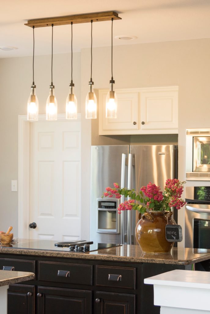
AFTER KITCHEN
We added new lighting in the kitchen, above the island.We took cabinets to the ceiling and that made a big impact to the kitchen vibe. It is now so much more updated, and we didn't have to gut the entire thing. I love how you can see the entry in this photo too! You can see here that the desk that was in the entry, is now a place in the living room to pay bills, etc., it is also painted cream.
The family room feels a part of the kitchen now!
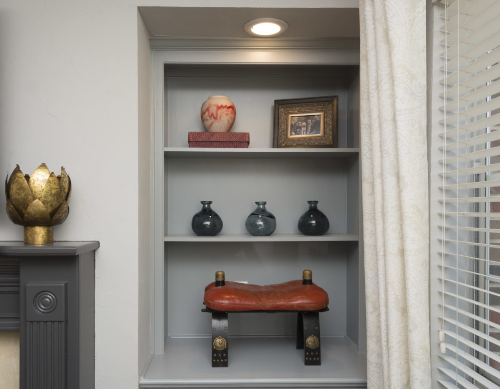
The client had this camel saddle and I thought it looked perfect on this shelf, rather than on the floor. The colors I incorporated on the bookshelves brings in the colors from the fantastic painting.
A animal print throw on the ottoman pulls the room together. Small detail but you can see how it makes a statement. Another small detail is that we added hardware to the drawers and cabinets under the bookshelves. They don't match but I love that! Leather pulls and crystal knobs!
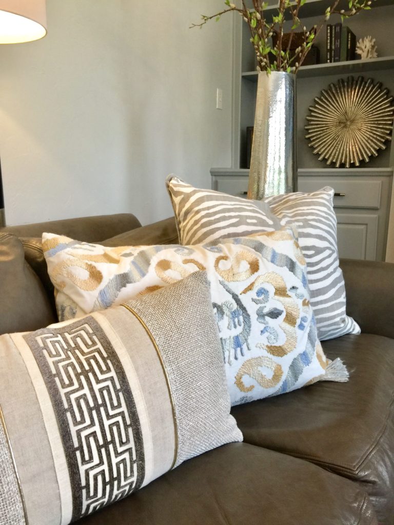
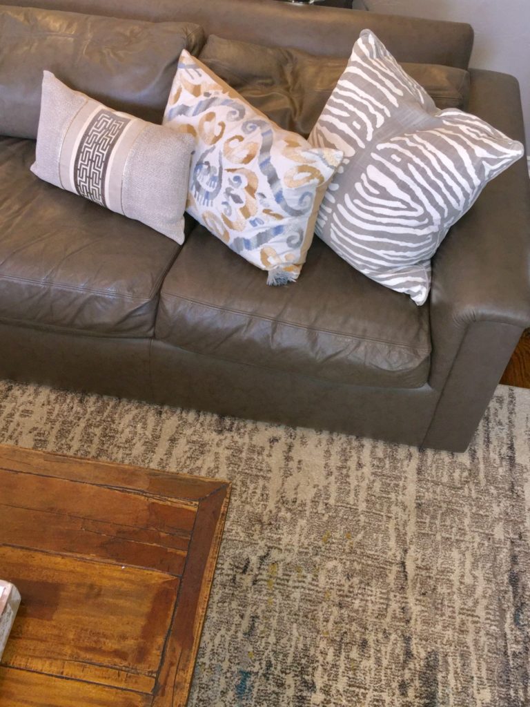
Pillows, pillows, pillows, and they don't all have to match! Texture, texture, texture. I love to mix it up.
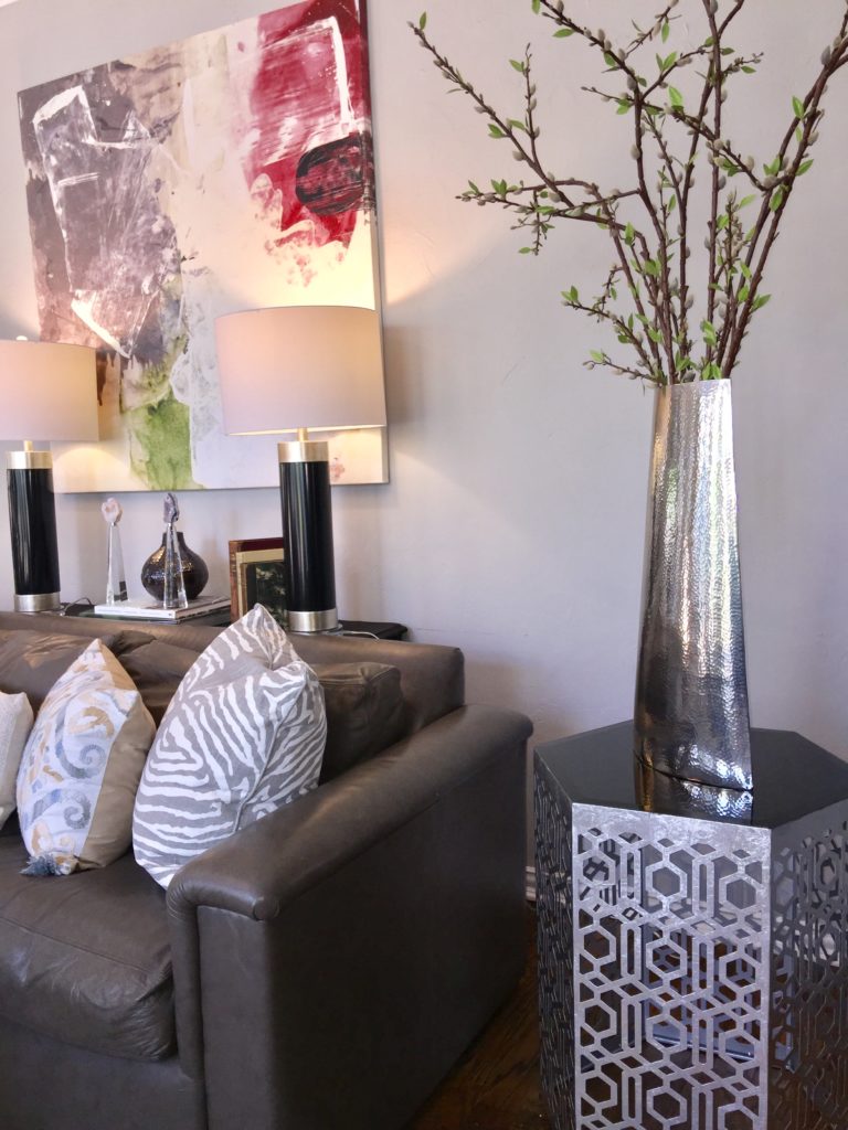
Fabulous, colorful artwork with gorgeous lamps on a console table that the client painted black for me with chalk paint.
Ruthie Tip: You can mix gold and silver! It makes it more interesting.
Here is the video of the reveal as well as a walk through video of the entire finished project.
[x_video_embed type="16:9"][/x_video_embed]
[x_video_embed type="16:9"][/x_video_embed]
I'm working on my next home as we speak!
Hope you mix it up this week in your HOME!
Hope it's a great week!
