SIMPLE, CLASSIC AND TO THE POINT.
I'm a true believer in making things simple and classic.
It's amazing how you can make a room look so fabulous just by adding something simple like the two leather wing back chairs at the end of this table. It's all about mixing it up! If this dining room table didn't have these chairs it would still be pretty but the chairs add such texture and a touch of class. It also makes the room feel a little more masculine. I believe that a room with true "class" is one that has a touch of masculine added to it.
The above room has a gorgeous antique table. Painting these antique chairs a glossy white breaks up the "matchy matchy" look and adds an eclectic flair to this room. Some would just freak out about painting antique furniture but it's okay! There is nothing wrong with mixing styles and bringing things up to date. I also LOVE the antique bench! The masculine flair in this room is the painting. It speaks volumes and again adds such class and sophistication because of the warm colors. It's all about the scale - see how the bench is the same height as the chairs, making this marriage work. Not a lot of fuss in this room, just classic and a look that lasts year after year! Simply gorgeous.
If this was my room I would have reupholstered the chairs in an animal print or maybe reupholster just the bench. Perfect addition to the space and it's a simple change up!!
Either one of these would work. I like the warmth of the first one.
It's not everybody's style but I love an eclectic twist. If you look into the living room you can see that the homeowner has plaid drapery fabric (gives a conservative/traditional feel to the room). Adding this animal print would break it up and make the rooms feel much more interesting. The tones of the fabric go with the painting so it all works together.
Which one is your favorite?
Remember you never want to "over decorate" with animal fabrics. If you use this fabric, don't use it anywhere else or any other animal print. You don't want to use too much of a good thing. So often I go into homes where the animal print is WAY overdone. Don't ruin a good thing by overdoing it!!
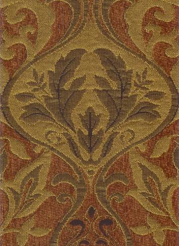
If you just CAN'T do the animal print then you could do this Tapestry Chenille.
I'd actually like to see this Tapestry fabric with the 1st fabric above.
Here they are together, pretty combination don't you think?
Your whole house doesn't have to be transformed all at once. Make small simple changes by thinking of little things that make a BIG difference.
Remember that I offer online consultations. You can send me your pictures of the room that you need help with and I can give you advice, suggestions & tips to help you make your home
SIMPLY BEAUTIFUL.
Ruthie
Go to my website at DecRenew Interiors to see my portfolio.


