 Well here are the before and after pictures! This couple contemplated moving and then decided that they wanted to make their current home comfortable and cozy and enjoy where they are now. I loved working with this family so much. I presented a vision to them with slides and pictures as well as an "estimated cost." From there we adjusted, tweaked, compromised and agreed that we would do what was absolutely necessary to make this home beautiful on their budget. They left for the day to shop, eat lunch out and much more while my team and I went to work. When we were finished I met them at their front door and let them in. They just stood there for a few minutes and starred - stunned. It was great fun!
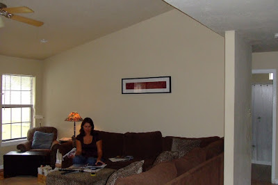 We chose the things that would make the most impact. Paint, replacing some key furniture pieces, drapes, rattan shades for the windows, rugs & large scale accessories. It worked! Take a look for yourselves! My camera didn't take great pictures because of the lighting (made me decide I need a better digital camera) so bare with me.
BEFORE LIVING
 We painted the fireplace surround, added drapes, a new rug,
 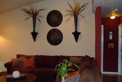 throw pillows, two small ottomans (for when the kids want to watch movies), wall accessories, & replaced the fan. Not a huge fan of fan's but in Texas it's a necessity. A room needs to be beautiful AND functional.
We also replaced the chair! Check it out, isn't it awesome. It's comfortable too. Thank you Victor from "Victor's Upholstery" for making me two wonderful round ottoman's to go with it!
 Here's a close up of the coffee table top too. Notice how nicely it goes with the round metal medallions I hung on the wall.
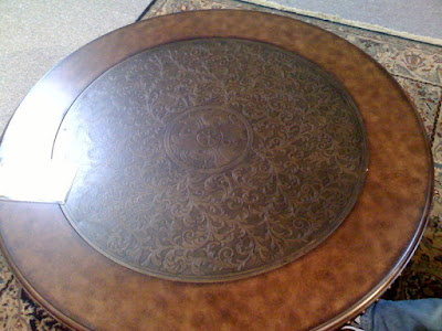
 It's all in the details.

AFTER ENTERTAINMENT CENTER
 We eliminated all the clutter. We created a nice work area in the master bedroom, instead of out in the living room. This gives my client a quiet work area away from the busy family area.
ENTRY
We couldn't cover up the air conditioning vent with a heavy piece of furniture so we used a console table that was open at the bottom. It also helped visually because the entry is really small. A big piece of furniture would have closed up the space and made it feel SMALLER. I'm going to suggest that the client paint the vent the red color that is in the entryway so it hides it. Adding a nice live fern would be nice here too. My client found this old mirror and I painted it for her to update it. The items on each side of the red platter are actually pieces of drift wood. I thought that would be a nice added touch instead of the typical candle display.
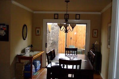
We had the kitchen painted a nice soft khaki color. Really made the crown molding stand out.
AFTER I found an old shutter and hung a wooden medallion on the center of it to give it some interest. I think it turned out great. Love the rustic feel it adds. I had the island painted with this same finish to tie the two together.
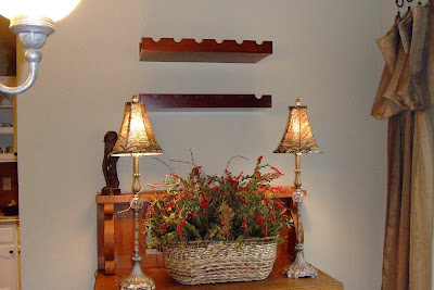
My client's came back from  being gone all day and walked in with a case of wine to add to the above wine rack.
Mary with Divine Inspirations painted the backslash. It was originally silver and she created a nice aged look so it now blends in with the existing back splash. Before it just look so unfinished and cold. Thank you Mary for making it just like the picture I gave you!
BEFORE
 AFTER
AFTER
We had the headboard wall and the foot board wall painted the same "mocha" color and then we added a sage green on the side walls. The painting above the bed brings those colors together. the mirrors behind the lamps are distressed metal and add a casual feel to the room. The lamps they had before were totally off scale. We used the client's existing bedding and added Euro shams and some throw pillows. I did keep in mind that the client may want to change out her bedspread in the near future and chose colors that would allow her to chose whatever she loved. Dark colors like chocolate brown work with just about everything. This room now feels like a hotel suite!
Overall I hope my client was INSPIRED, feels ORGANIZED & REFRESHED. I loved working with them and feel like it turned out BRILLIANT!

Also wanted to congratulate my client for the new movie she is in. "Pearl" Produced by the Chickasaw Nation, “Pearl” focuses on the tumultuous teen years of the late Pearl Carter Scott, a Chickasaw girl from Oklahoma who is well known as the youngest licensed pilot in America.
Make sure and go see it when it comes out!



 BEFORE MASTER BEDROOM
