I couldn't wait!


Remember my little treasure of a cabinet that I posted about last week?   Here is the link to the post.
 

BEFORE
 
BEFORE I painted it.
 
Well....I got inpatient (it looked so lonely sitting in my garage) and I didn't do exactly what I had anticipated doing when I blogged about it last week.  Chalk paint is always divine and saves you steps but I had some "chill out" time and decided to tackle this project.  For me, getting a paint brush in my hand, knowing there will be a fun result, makes me relax and rejuvenates me.  I know it seems nuts but I LOVE putting my paint clothes on and getting paint under my nails.  Some good rockin' music helps too!
 
I decided to "use what I had" as far as paint is concerned and just went for it!
 
AFTER
 
 
I used an off white paint, let it dry and then used a rough sandpaper to distress it!
 
I painted the wallpaper that was already on the back of the cabinet a nice warm chocolate color!
 
 
I usually don't like flowers but I thought these looked nice once they were painted.
 
 
I found a perfect little home for it and the end of the hallway by my bedroom!  Of course, I had to find a spot for what was there and that caused me to change a bunch of things in my living room.  Good grief, I love change but wasn't ready for one thing to lead into another :) 
 
 
This glass top table use to be in the hallway where my "new" piece is now.  I think it looks great in it's new home, next to my favorite chair!
 
Made sense to put these little guys in this wooden tray on top of the glass top table.  Like?
 
 My husband came home and it looked like a tornado had been through our house but I did get it in order eventually.
 
 
I loaded it with some unique accessories and now I'm a happy girl!  The best part is that it didn't cost me much and I was happy to get some "chill out" time.
 
Hope you have a fun long weekend!  Do a project and send me pictures!
 
Visit my website DecRenew Interiors to see my portfolio of before and after pictures
 and book your design consultation today!

Ceilings with attitude

(Valerie Deroy Interiors)

I've been doing a lot of "walk thru" consultations this month.  This consultation is where I spend 2 hours with my client and we walk thru their problem areas in their home and we come up with a solution.  I choose paint colors, give ideas & suggestions, answer questions they have about their thoughts and inspirations, help them choose the best flooring options, and help my client create a vision for their homes.  Nobody wants to be "stuck" with their decorating problems, I'm their solution so they can be "unstuck" and move forward with confidence.

(Adam Zollinger - Designer)
As you know, one of the best ways to make a statement in your home for the least amount of money, is to paint.  Painting is the first thing I recommend my clients to do! 
(Beverly Bradshaw Interiors)

I usually recommend that my clients paint their ceilings something other than white!  It always baffles their minds and they can't get it...until they "trust me" and do it in faith that I know what I'm doing. 

The above room is beautifully decorated!  However, when you look at the photo, what your eye goes to is the white line above the crown molding.  If they had painted the ceiling either the same brown or a lighter shade of brown it would make it much more restful to your eye.  Of course a hot pink ceiling or a blue ceiling (the color of the drapery or blanket) would have been my suggestions for this "girlie girl" room.  It also makes your crown molding come to life.  Why pay money to have this wonderful detail if it isn't even showcased?
(Liz Williams Interiors)
Don't be afraid to be bold.  I always say "if it makes you nervous, it's probably going to be what you love the most after you paint."
(RLH Studios)

Yes, even in small spaces!  This looks so rich.  Imagine it without the brown ceiling.  It wouldn't be near as effective and beautiful.  Yes, even in a small space!

(Rough Hollow Parade of Homes 2010)
A colorful ceiling can be what ties the room together. 
(SH Interiors)
It can make a statement in your home!
(Pinterest)
Go wild and crazy if you feel like it! Wyatt is going to wake up a happy boy in this room!
(Frederick and Frederick Architects)

Subtle is amazing too!

Make a statement on your patio's as well!

This homeowner painted their floor and ceiling the same color and it's to die for!
(Jennifer Brouwer Interiors)
Subtle and such a haven!  Beautiful job Jennifer!

Don't be afraid of change!

This technique is not for every space.  There are factors to consider.  It depends on the light in the room, the color that you are using and the way you want the room to feel.  Also remember, don't go overboard! Not every ceiling in your home should be painted a different color! 
When in doubt about what to do, call a professional!
(Witt Construction)
If you need coaching, call me for a "walk thru" consultation and let me help you make some decisions that will change the way you feel about your home!  Nobody wants to be STUCK!
Click the "fees" link to see my "walk thru" rates.
Visit my website DecRenew Interiors to see before and after pictures of my room transformations!

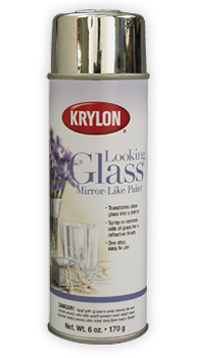
Krylon Looking Glass Mirror Spray Paint

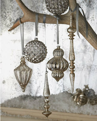
Pottery Barn
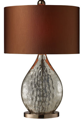
You've probably noticed how this mercury glass look is very in right now.
Well, I'm always looking for a DIY solution to these really expensive options and I've found my new favorite product of the week.   Krylon Looking Glass spray paint is the trick!  It's a distressed mirrored finish that can be used on anything glass.
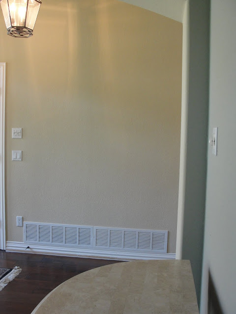
 While the surface is wet, spray it thoroughly with Looking Glass spray paint. The water will prevent the paint from completely adhering to the surface – exactly what’s required to achieve the characteristically blotchy look of genuine mercury glass. Let the paint dry overnight, and repeat the process to the darkness of your liking.

So just imagine what beauties you could make with these glass ornaments!
Hope you are inspired!  I'm getting busy!

Simply paint....to get radiance.

This is the AFTER picture of a front sitting room that just got painted 2 weeks ago.
AFTER
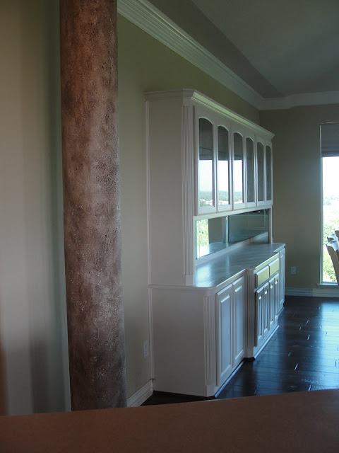
The walls and behind the built in cabinet were painted "Chat-room" from Sherman Williams.  The cabinets were painted "SW Kestral White" and we also took out the carpet and added dark-wood floors.
BEFORE
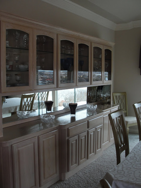
This pickled wood was looking shabby and dated and needed freshening up.
AFTER
(Flooring done by Nationwide Floors - Jeff Teller)

We are just in the beginning stages of this project.  Painting and flooring was first.  We still need the base trim touched up and this phase will be finished and ready for Phase II where all the finishing touches and the fun begins.  Lighting, hardware, furnishings, draperies, rugs, and accessories!
AFTER
This wall color is so restful and my client absolutely loves it!
  We will put all the shelves back but I probably won't use all of them.  They need to be spaced out a little more so they don't look so busy and cluttered.
BEFORE
The previous flooring was 12X12 tile and didn't add any character to this home. 
AFTER
We have character now!  Main hallways, dining room and living room were painted "Toasted Pine Nut" from Sherman Williams.  Doesn't the wood look gorgeous?   Of course pictures never make it look JUST like it is in person but you get the idea! 
You can see in the above picture how the two wall colors work together.
BEFORE
I encouraged the client to put wood floors throughout and it really has opened up the spaces.  From the moment you walk in you see wood floors!
AFTER
She has a breathtaking view of the lake right outside those beautiful floor to ceiling windows.  Now, after the painting has been done, the earth tones inside work with what is going on outside!  Previously the walls looked pink...yikes.
DURING - what a mess!
  I always to try to prepare my clients for this process but there is just no way to truly explain what goes on.  All this tile had to be jack hammered up!  I've got some clients that are having this done in their home next week and they are leaving town for the week so they don't have to deal with the mess and noise!
BEFORE
Built in cabinet in the dining room.  The color wasn't going to work with my design plan!
DURING the spray painting process.
AFTER
We also glazed the columns to take away the pink tones that were there originally.  We highlighted them so they now have a stronger presence in the room.
Once again, goodbye pink!

Hello warm tones. 
Hard to see wall colors in this photo but wanted to show you the view.  See what I mean?
Until Phase II begins, my client can now enjoy her view and the inside of her home now feels a part of the exterior!  
Here are a few inspiration photo's that I'm working with for PHASE II of this project.
(the decor is the personality and soul of the home)
Tuscan Style Magazine
Photographed by Michal Venera
Living Room Inspiration - I want warm hues, rich patterns and textures that give the space a radiance from within.
Tuscan Style Magazine
Entry Inspiration
Tuscan Style Magazine
Drapery Inspiration
Hope you enjoyed the tour!
Thank goodness for color and paint, we love you!

Paint or Wallpaper an Accent Wall

(Brown Davis Interiors)
I don't know about you, but I love to change things up, update and improve my home. However, I want to be able to do some of those quick transformations in a day or so.   There are times when we need to hire contractors to do big projects, etc. but I I LOVE to have attainable jobs that I can tackle without having to involve a crew of people or contractors.

My #3 quick tip for you to tackle over the next few summer months is:
PAINT OR WALLPAPER AN ACCENT WALL
Some of the most stunning ways to transform a space is by adding a color to one wall. It could be a kitchen wall, dining room wall, behind a china cabinet, a headboard wall, bookshelf walls, or even a ceiling.   The key to remember is......like anything, you don't want to go overboard with this concept.  A little goes a long way.  You don't want accent walls all over your home.  Choose one room and go for it!
(Ann Rue Interiors)
Painting the wall in this niche made it so inviting and warm.  This particular paint technique looks like venetian plaster but you could just paint it a wonderful chocolate brown and then glaze it if you wanted.  I love the scallop around this niche.  I'm usually not a fan of a skirted table but this one looks beautiful with the backdrop of the accent wall.
(Elad Gonen and Zeev Beech)
This dining room would be a little stark and cold if this wall hadn't been painted.  A painted wall makes for a great backdrop for your artwork.  I would die for a table that seats 16 so easily.  Cool how the lighting reflects against the color too.
(Cary Bernstein Architects)
A headboard wall is one of my favorite ways to use color.  It's especially wonderful if you don't have a headboard and need that grandeur behind your bed.
(George Interiors)
The fireplace surround probably didn't look like anything special until it was painted and now it looks like it is claiming the room and stands proud!  The color also brings out the architectural interest of the home that wasn't brought to your attention before.
(Imagine Living)
See adding a bold color can change EVERYTHING!
(Myriam Payne)
A red wall is always a great compliment to any room! This room looks especially good in red because of the wonderful imported chandelier.   Be careful when choosing a red wall, it can also dominate too much if you aren't careful.
(Jana Collins)
A wide stripe accent wall is a strong statement too. 
(Michelle Hinckley)
How about these stripes for an entryway?
WALLPAPER ACCENT WALLS
Some designers don't like paint or wallpapered accent walls but I'm one that LOVES the transition it gives to a space if done well.  These next few photo's are wallpapered accent walls that are absolutely done right! 
Ruthie's Design Therapist Tip:  Do not wallpaper with your spouse, it is the most stressful thing you can do to your marriage.  I learned from experience so trust me on this one! 
It can still be done in a day if you hire a wallpaper installer!!!
(Atmosphere Interior Design Inc.)
Don't you agree, this room is done right? 
(The Furniture Guild)
I don't know what it is about this wallpaper but it makes my blood pressure rise I love it so!
Beautiful addition to this bathroom, especially the way it coordinates with the flooring.
Imagine the fun you could have with the pattern on the towels!!
Such a fresh space.
LOVE!!
(Amorosa Designs)
This white and gray combination is spectacular!
(Jason Ball Interiors)
What about adding it to a work area.
(SB Architects)
or a ceiling?
(Veranda Magazine)
I don't know about you, but I'm ready to start painting and unrolling!
That big wall that you had no idea what to do with can be painted!!!!!
Hope you were inspired and added some of these ideas to your "to do" list this summer.
Contact Ruthie Staalsen @ DecRenew Interiors if you would like to set up a consultation to talk about your design needs...some things just can't be done alone.