I just finished a client's dining room and living room this week and was really excited with the outcome.
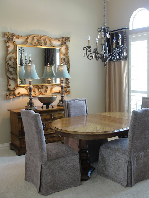
My client wanted to do some updates without having to replace all her furniture. In the dining room above, we took the large hutch off the buffet, added the incredible carved wood mirror and flanked each side of the buffet with these beautiful lamps. I fell in love with the lampshades because they are the same color as the living room which flows off this dining room.
She had wooden chairs that went with the dining room table and were really dated so we got rid of those and added these wonderful gray parson chairs. It really made this room much more stylish.
We were able to use the furniture that means something to them and has been passed down from a family member. Looks totally different when you add updated and grand items to the grouping. As you know, I'm a real fan of "using what you have"
The drapery panels really made the room look finished and added height, color and my client's classy personality to the room.
BEFORE
You remember me posting about this room and you saw the before and after when we finished painting. I've got pictures now of all the updates we did with accessories, etc.
The main problem with this space is that it lacked personality and the room felt stiff and formal. Being that it's the first room you see when you walk in, my client didn't want that impression because they aren't stiff, formal people. All the items were also off scale for this room too.
You can see the dining chairs I spoke about earlier in the above photo.
AFTER
My goal was to make this room much more alive, colorful and casual.
We took down the home made draperies and added plantation shutters. Now you can really see the beautiful pool outside which is the main focal point in this room. No draperies are needed!!!! We painted the walls this amazing blue and it compliments the pool perfectly, making the backyard area part of this room. The crown molding was painted in this stately slate color as well as the columns. It really made the space look so much more elegant and added pizzazz. We added a rug, new ottoman, pillows, console table with blown glass accessories and brought the floor lamp in from another room. We kept the client's existing artwork to save us money. Notice how we put the tree in a taller urn, it raised it up and made it more to scale for the room.
BEFORE
Very stiff and not much color.
AFTER
Added a variety of pillows to the couch which gives it an eclectic mix and makes the room so much more inviting, relaxed and so much less formal.
This wonderful lamp with the hanging crystals was one of my favorite accessories in the room.
I love throw pillows! Especially in a room where the couch isn't used "daily." You have to be practical about pillows and don't want them to interfere with every day use of the furniture.
So much better don't you think? You can see the beautiful wall color in this photo.
Love that this ottoman has a different fabric and color than the chair, giving an eclectic flair to the room. It totally works in this room because it pulls out the color of the walls as well as the color in the rug. Everything is now so much less "matchy matchy"
We added a glaze to the columns and that really made them stunning! The first thing you see when you walk into their home.
BEFORE
AFTER
We didn't miss anything. Niches can add so much to the end of a hallway if they are cared about.
We are going to add some green moss to this urn to finish it off.
Participating in Metamorphis Monday at betweennapsontheporch
Ruthie


