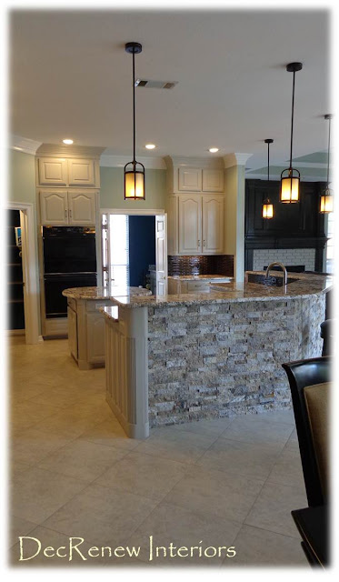
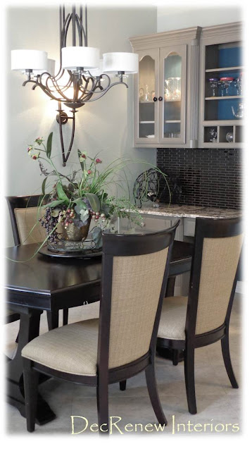
6 weeks later and we are done with this kitchen remodel. Haven't placed any accessories yet but my client had a grand baby yesterday!!!! Whew we made it just in time!!!
This couple wanted a classy, clean and fresh look with little fuss. They have raised their kids in this home, paid for graduations, college and weddings, etc. etc. It was now time for them to get the kitchen they so desperately wanted.
BEFORE
(sorry for the fuzzy photo but I really wanted you to get the idea of the horrible before)
AFTER
Took the cabinets to the ceiling, added crown molding and painted them a soft gray!
The stacked stone was the one thing that they were really scared about. It's now their FAVORITE thing about their kitchen.
The black ceramic back splash is out of this world. Pictures don't do it justice.
AFTER
The granite and stacked stone are the shining stars in this kitchen!
My client started off very scared of change but moved forward trusting me each step of the way as we followed the design I put together, just for them. I was so proud of her! She says she was stretched way beyond what she thought she could do and she is incredibly glad she took those risks. She LOVES everything now and so does her husband.
BEFORE
AFTER
We made the island round to give them more space and add some shape and interest.
BEFORE/AFTER
AFTER
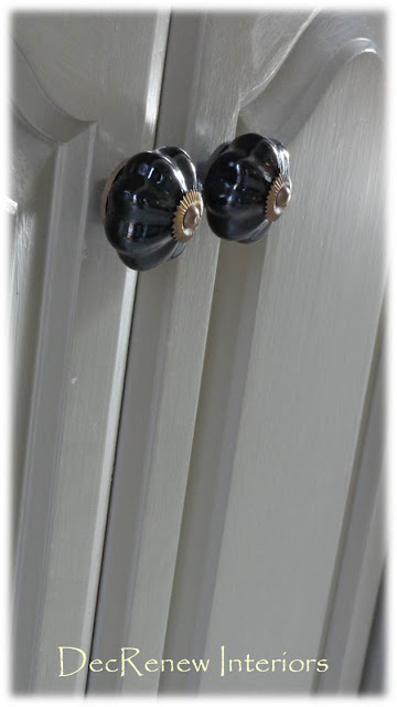
The gold door handles will be changed soon to brushed bronze by the homeowner.
See what I mean about the stacked stone? It's like art!
AFTER
All of her items she only uses once a year are stored up in the new cabinets.
AFTER
Recessed lighting and pendants make everything feel up to date.
Ruthie Tip: Don't overdo the recessed lighting, it can make a kitchen feel busy!
Such a great little work space! This backsplash makes my heart stop every time I see it!
BEFORE
AFTER
Good bye old lighting!
These wall sconces really add some beauty and character to the eating area and can be dimmed as needed for ambiance.
BEFORE
AFTER
Furniture shopping is next.
BEFORE/AFTER
We modified the mantel some by taking away the "fussy" molding. We painted the fireplace insert with heat resistant black paint. We didn't like the pink brick so we had it painted a similar color to the kitchen cabinets and then sanded them down. Instant change with paint! Dramatic don't you think? Amazing how much bigger the space feels now!
BEFORE
Yikes!
AFTER
We adjusted the entertainment center to house a bigger TV. Painted and added new hardware.
It will look amazing when it's all accessorized.
Don't skimp on your hardware!
The laundry room and pantry got some extra attention too. Painted this wonderful color blue called "under the sea" by Sherwin Williams. This color is also in their pantry and behind their bookshelves. A mini bar will be installed underneath the counter.
The hardware matches the color of the walls in the kitchen which is right off the laundry room. Great way to bring the rooms together!
Great colorful pantry!
Their dining room got a transformation too! Gone with the old floral wallpaper and in with a powerful red that makes a statement when you walk in. Hardwood floors were installed throughout the entire home all the way into the master bedroom!
Hope you enjoyed the tour!
Next, we are on to a big install this Friday. Installing brand new drapes, furniture and accessories for another wonderful client. Her entire downstairs will be transformed! I'm so excited and feeling blessed that I get to do what I absolutely love!
Follow me on Facebook
here


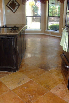


 You'll also notice that I had the railings painted black.
  This really helped add a classy look to the house. It looked awesome white but I wanted it to be less "traditional" and more casual. The black really added more charm to the staircase as well as making the lines less busy. This allows the faux painting to make more of a statement. Don't you think??
 Now he LOVES it a lot! I had confidence that it would work. Time to start moving the furniture back. The family has liked the fridge in the living room and say it's convenient for ice cream snacks. Sorry family, back to the kitchen it goes! Time to get things back to normal and DECORATE. I'm moving things around a little. Y'all know how I love change.


