We always count it a huge blessing when a client that has used our services contacts us again.
We just completed a design project last week for a client in Colleyville, Texas. They just had this home built and wanted us to do the decorating for their family room and entry as Phase I of their decorating project. Their style is transitional but really asked me to add in pieces that I thought would make their home more THEIRS. They wanted their old things to feel new in their new home. I loved that challenge and was honored that they trusted ME to do it for them.
THE ENTRY
The entry is a narrow hallway, so we needed to use a console table that had skinny lines. We found this gorgeous espresso Hooker piece that was perfect. I layered it with the most gorgeous blue and green artwork that the client fell in love with. We had it framed with a stained wood frame to give it more sophistication.
The concrete pot with bright green ferns really made the entry feel fresh and happy.
The client had these old vintage bottles that were her dad’s collection. I placed them underneath the console table because I loved the way the light reflected off them. I found them in an unpacked box during the install and just knew they must have special meaning. Dad would have been happy to see that his daughter now has his collection displayed so beautifully. I love it when I get to surprise the client!
If you know the way I decorate, you know that I like spaces to look collected, not too styled, but want my spaces to have a relaxed, casual vibe. I feel that when the room feels too styled, it feels like a showroom. Homes shouldn’t look like a retail showroom, they need to look like people live there. Having collections add that touch. Don’t you just love the stacked branches paired with the coral piece?
This coral piece has a story to it too. The client told the day she passed her CPA exam years ago, she and her husband went out to celebrate together in Galveston Island and stopped in a gift shop.
She bought this piece for her to remember her accomplishment. It represented new beginnings to her. Perfect that it is how placed in their entry as a symbol of new beginnings in this new gorgeous home. I found a piece of granite that is used as a cheese tray and layered it on the table with a quirky piece of pottery on top of it. Again, it just adds interest and makes inquiring minds want to touch and feel.
There is more to do in this entry, including a built-in upholstered bench, which will be part of Phase II.
On to the FAMILY ROOM
BEFORE
Can we just pause for a moment and look at the height of these windows!!!
AFTER
Looks comfy, right?
BEFORE
AFTER
Just glad my drapery installer isn’t afraid of heights. Yards and yards of fabric.
BEFORE
I found these chairs for the client! Great bones and a great quality, they were just tired and forgotten about.
AFTER
No longer tired! They turned out beautifully. Just look at the way the fabric is matched on the chairs. Thank you Kingstonfabrics.com for a job well done!
We took off the legs, reupholstered them in a new performance fabric by RevolutionPerformancefabrics.com and added swivels so they can watch the TV or swivel around and sit by the fire when that time comes.
The stacked stone fireplace makes such a statement, especially with the strength of the dark mantel. I love the way the chairs bring out that boldness.
I wanted the draperies to be striking but didn’t want them to overpower the room or compete with the fireplace stone. I think they are stunning with the rug and everything else going on in the room.
These Greek key candlesticks add simple detail to the mantel, along with the neutral painting.
BEFORE
The client already had the sofas and the other furniture in this room. We just added all the details. A new rug, sofa table, artwork, lighting and accessories!
AFTER
Big difference, right?
I’m always on the look out for interesting lamps. I found this set but they were white and distressed and looked more shabby chic than transitional. I just loved the lines on them with he curly details around the lampshade base. We painted them black and added the gold leaf and they instantly came to life. We added new shades to add a touch of masculine (they kind of look like a guy’s suit) and now we have custom lamps that nobody else has. These are the things you pay for when hiring a designer. I can see a treasure instantly and my passion is turning these treasures into showpieces that nobody else would have thought of. To me it is so much more fun than just walking into a showroom and purchasing a lamp.
Ruthie Tip: Don’t over style your console table behind the sofa. Keep it simple but use statement pieces. Also, find faux plants that look as real as possible. You would never know that these plants are fake, right?
Shells always add a “retreat” feeling to a room. Just love the color and texture they add. Using these blue and white vases really made the client happy too. Notice how we didn’t just use a few colors in this space. We added lots of different colors that all work together to make the room feel cohesive. Because we had the green velvet pillows on the swivel chairs, I knew I had to bring in that color again somewhere else in the room.
The fig tree, green pillow and green plants on sofa table make your eye see the connection. As a designer, there is a LOT of thought that goes into EVERY detail.
Also, notice that not all the pillows match! This makes it feel more casual and lived in.
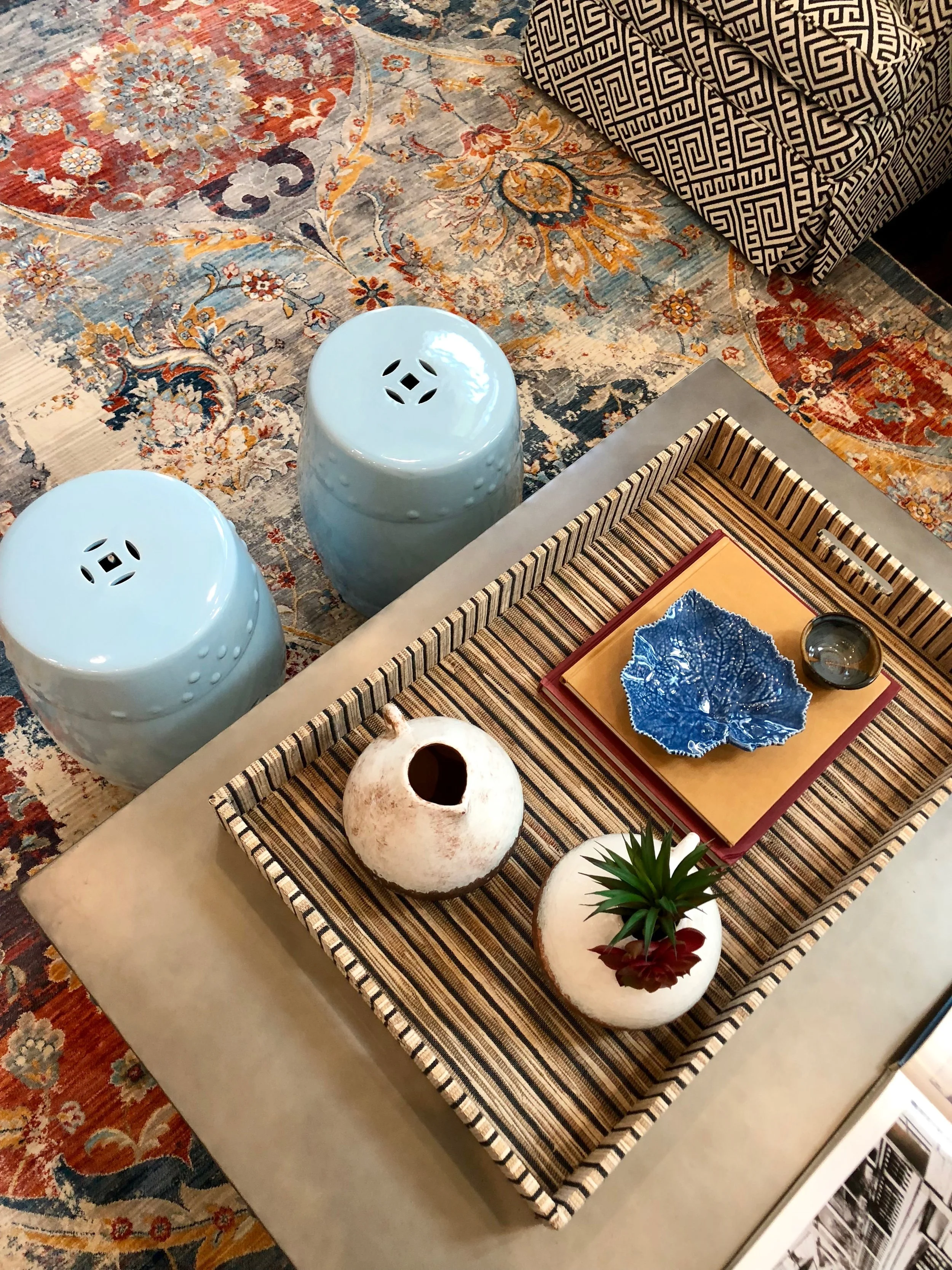
We added the light blue ceramic stools and they really add some character and a pop of fun to the room. I’m in love with this vintage rug.
We layered accessories on a textured grass cloth tray, so it can easily be removed if appetizers need to be served. Your space needs to be functional, not just gorgeous!
I found these rustic wood panels and knew that I would use them on either side of the TV. The TV wall is massive and needed items that would be the right scale without distracting TV watching. On install day, the client showed me some sconces she had and asked me if I thought I could use them. I instantly had a brain storm. I decided to attach the sconces to the panels and that quickly added more of a statement on that wall. Once we added the gold upholstered bench and pillows, I was thrilled with the vignette. We added some metal artwork above the television to create some height as well.
We are now ready for phase II so stay tuned and follow along on my Instagram stories to see behind the scenes of all the projects I’m working on.
Happy decorating!


